Discount retailers live on tight margins. A small change in discount rate, product mix, store location, or payment behavior can change the month’s profit story fast. The Discount Stores Dashboard in Excel gives store owners, retail managers, finance teams, and analysts a ready-to-use workbook for tracking revenue, net gross profit, total transactions, quantity sold, and total discount across multiple interactive pages.
This article walks through the template structure, dashboard pages, charts, data workflow, and best practices. The file is built in Microsoft Excel, uses pivot tables and slicers, and is designed so you can replace the sample Data sheet with your own discount-store records, then click Refresh All to update the full dashboard.
Discount Stores Dashboard in Excel
Key Features of Discount Stores Dashboard in Excel
- 5 main dashboard pages covering Overview, Sales Trend, Store Insights, Product Analysis, and Customer Trends.
- 5 executive KPI cards on the Overview page: Total Revenue, Net Gross Profit, Total Transactions, Total Quantity Sold, and Total Discount.
- Multiple slicers for quick filtering, helping users move from all-store performance to focused views in seconds.
- 20 chart views across revenue, gross profit, cost, quantity, discount, payment method, customer type, brand, category, region, store location, and salesperson performance.
- Editable Data sheet where users can add records in the same format and refresh the workbook.
- Support sheet with pivot tables used to keep the dashboard dynamic; it can be hidden after setup.
- Excel-native design with no SaaS subscription, no recurring per-user license, and no need to learn a separate BI platform.
Dashboard Pages Explanation
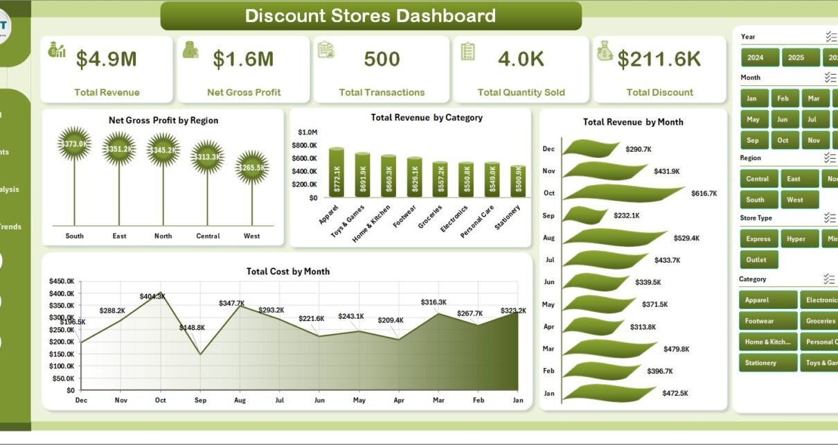
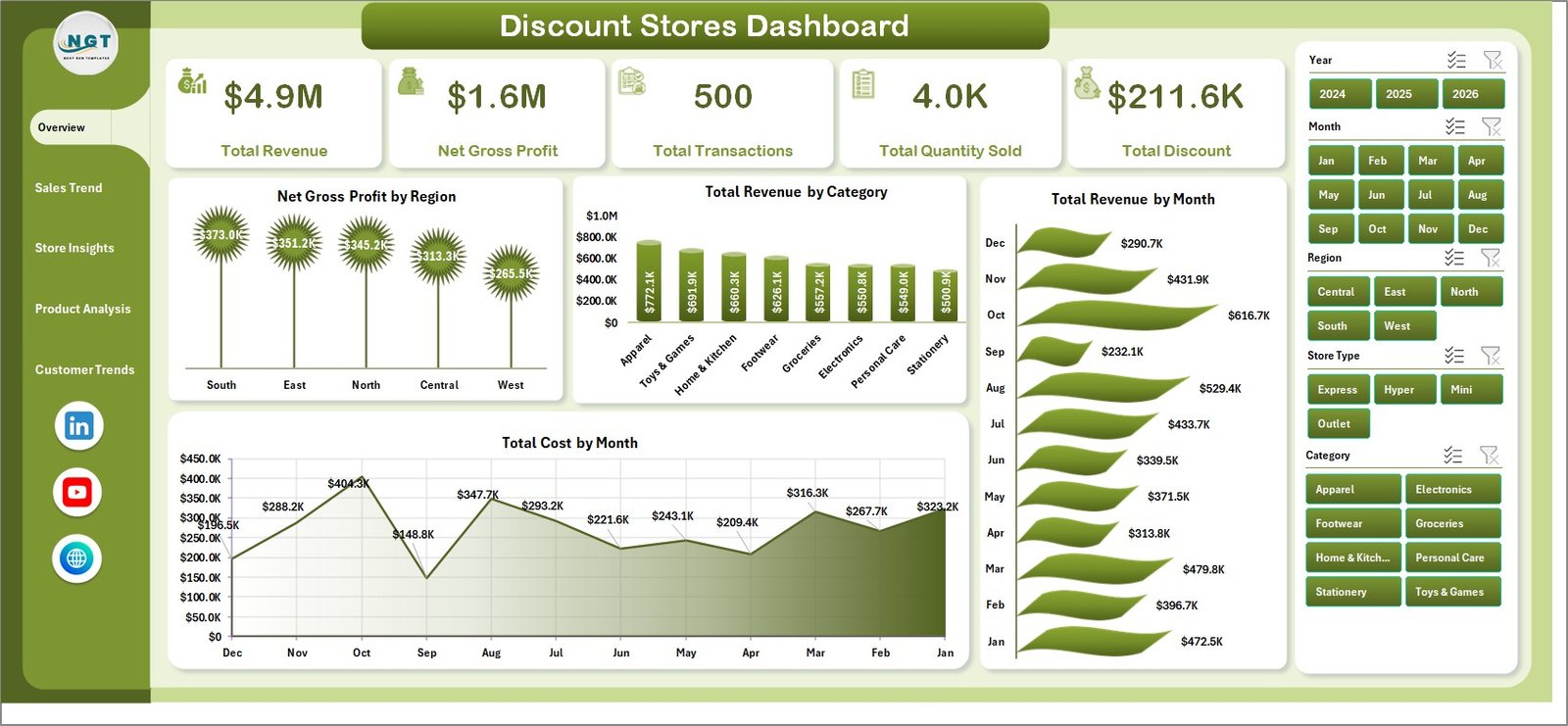
1. Overview Page
The Overview page is the management summary. At the top, KPI cards show Total Revenue, Net Gross Profit, Total Transactions, Total Quantity Sold, and Total Discount. These cards give the retail team a fast read on whether sales volume, profitability, and discounting are moving in the right direction.
The page also includes multiple slicers so users can filter the dashboard quickly. For example, a store manager can isolate a region, category, store location, or other field and immediately see the updated KPI cards and charts.
Net Gross Profit by Region compares profitability across regions, making it easier to spot areas where discounting or cost pressure may be reducing margin. Total Revenue by Category shows which product groups drive the largest share of sales.
Total Revenue by Month helps reveal seasonality, promotional spikes, and month-over-month growth. Total Cost by Month adds the cost view, so teams can compare revenue growth against cost movement instead of judging performance from sales alone.
Overview Page
2. Sales Trend
The Sales Trend page focuses on performance over time and across locations. It includes Profit Margin % by Month, Total Discount by Month, Total Revenue by Store Location, and Avg. Transaction Value by Month.
Profit Margin % by Month shows whether monthly profitability is improving or weakening after discounts and costs. Total Discount by Month helps measure the scale of promotion activity and whether discounting is increasing faster than revenue.
Total Revenue by Store Location compares store-level contribution, helping regional managers identify strong and weak branches. Avg. Transaction Value by Month reveals whether customers are spending more or less per purchase over time.
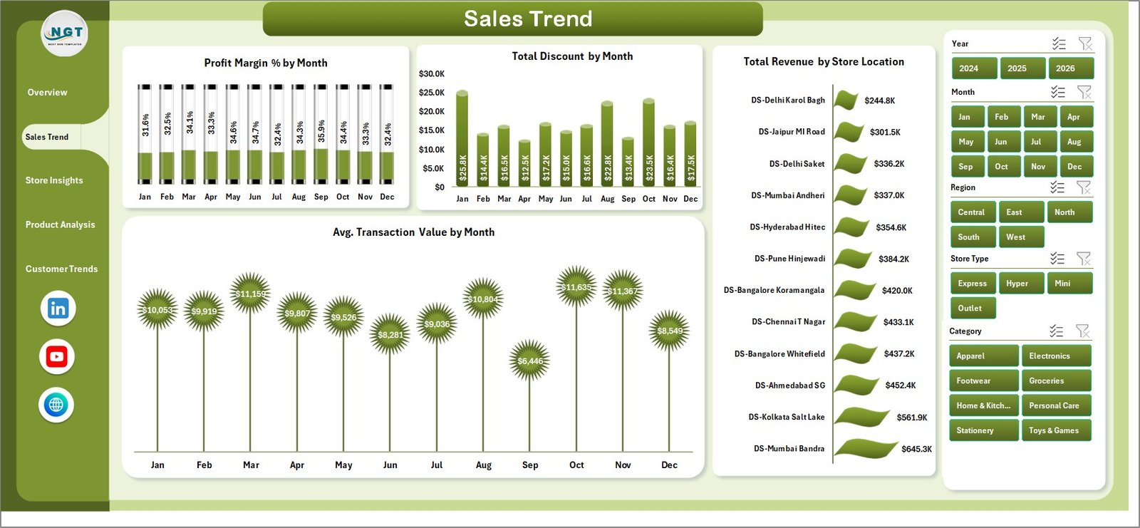
Sales Trend
3. Store Insights
The Store Insights page answers location and format questions. It includes Total Revenue by Store Type, Total Quantity Sold by Region, Net Gross Profit by Category, and Profit Margin % by Store Location.
Total Revenue by Store Type compares store formats such as large-format, outlet, neighborhood, or other retail structures used in your data. Total Quantity Sold by Region shows where sales volume is strongest.
Net Gross Profit by Category identifies categories that contribute meaningful profit after costs. Profit Margin % by Store Location helps reveal locations that sell strongly but may be over-discounting.
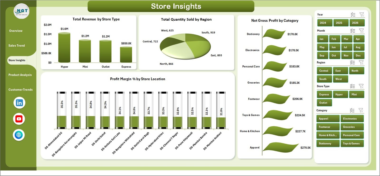
Store Insights
4. Product Analysis
The Product Analysis page goes deeper into status, brand, customer type, and category performance. It includes Total Revenue by Status, Total Cost by Brand, Profit Margin % by Customer Type, and Profit Margin % by Category.
Total Revenue by Status helps compare product or transaction status groups in the dataset. Total Cost by Brand highlights brands that carry the largest cost base and may need pricing or sourcing review.
Profit Margin % by Customer Type shows which customer groups are profitable after discounts. Profit Margin % by Category helps category managers decide where to protect pricing and where promotions can be used safely.
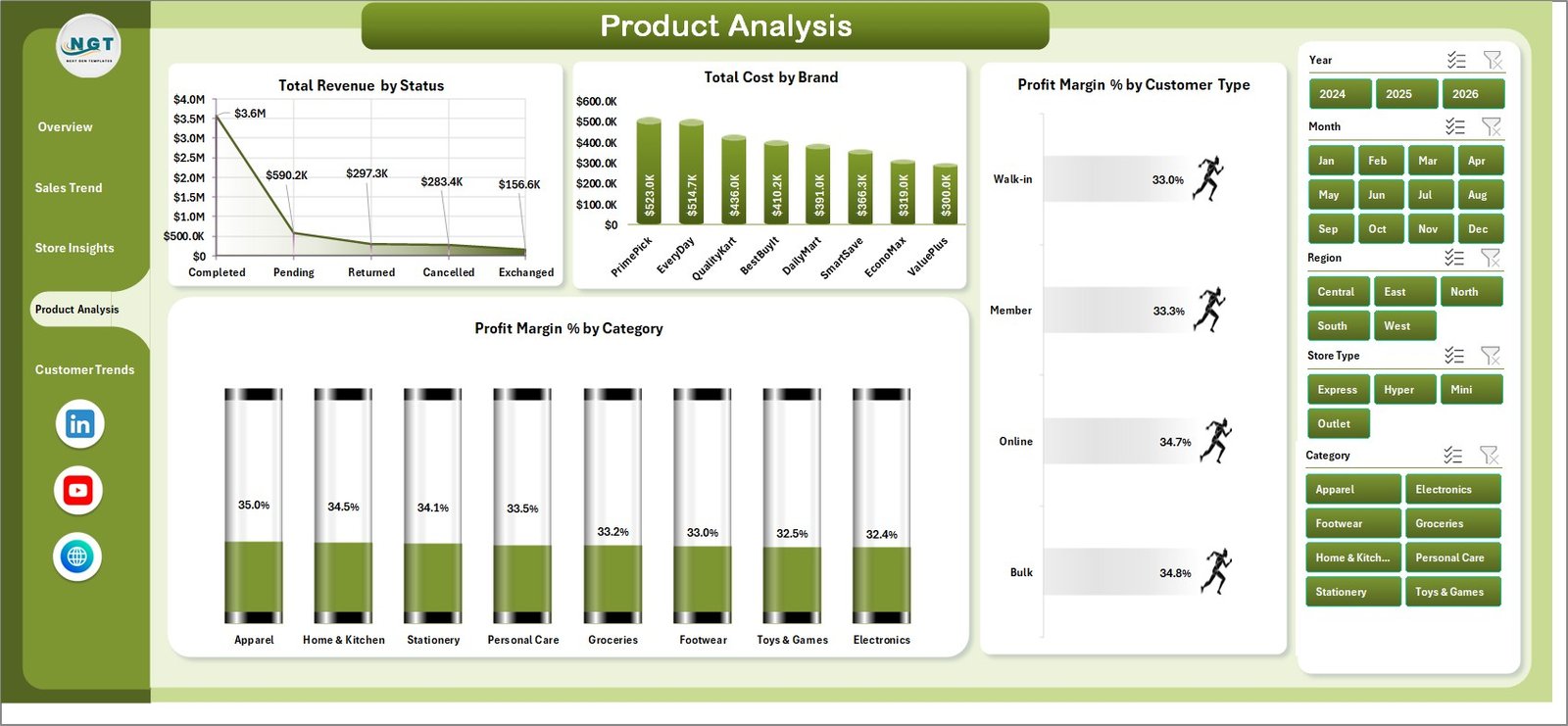
Product Analysis
5. Customer Trends
The Customer Trends page connects customer behavior to revenue and margin. It includes Total Revenue by Payment Method, Avg. Transaction Value by Customer Type, Profit Margin % by Region, and Total Revenue by Salesperson.
Total Revenue by Payment Method shows how payment choices relate to sales contribution. Avg. Transaction Value by Customer Type reveals which customer groups spend more per transaction.
Profit Margin % by Region gives a margin view across geography, while Total Revenue by Salesperson supports performance review for sales teams or store representatives.

Customer Trends
6. Data Sheet Tab
The Data sheet is the input area. This is where users add their own records in the same format as the sample data. Keeping the column names and structure consistent is important because the pivots and charts depend on those fields.
Once new data is added, users can refresh the workbook from the Excel ribbon. The dashboard pages then update from the refreshed pivot tables.
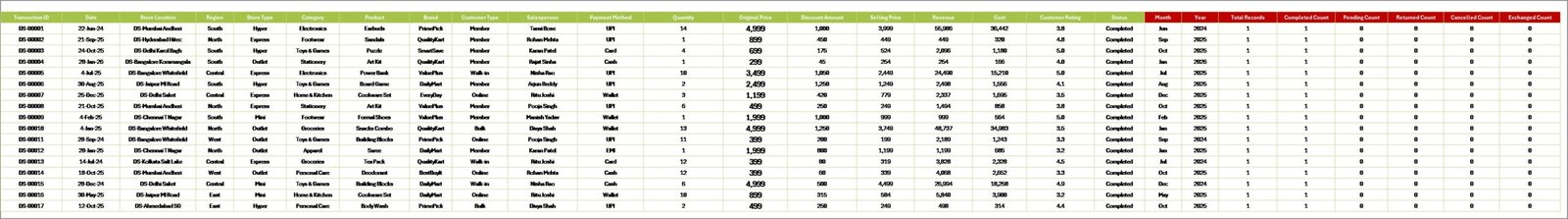
Data Sheet tab
7. Support Sheet
The Support sheet contains multiple pivot tables used to create the full dashboard dynamically. After updating the Data sheet, go to the Data tab in Excel and click Refresh All. All pivots refresh, and the connected charts update as well.
For a cleaner user experience, you can keep the Support sheet hidden after setup. This protects the backend structure while still allowing the front-end dashboard pages to work normally.

Support sheet tab
Discount Stores Dashboard in Excel vs. Google Sheets vs. Paid Retail SaaS – Feature Comparison
| Feature | Discount Stores Dashboard in Excel | Google Sheets alternative | Paid retail SaaS |
|---|---|---|---|
| Cost | $17.99 one-time | Low one-time cost | Monthly or annual subscription |
| Platform | Microsoft Excel | Google Sheets | Vendor cloud platform |
| Setup time | Under 10 minutes | Under 15 minutes | Days or weeks |
| Offline access | Yes | No | No |
| Discount analysis | Pre-built | Usually formula-based | Built in, but vendor-specific |
| Pivot table control | Full Excel control | Limited by browser workflow | Not usually exposed |
| Custom fields | Editable workbook | Editable sheet | Limited by plan |
| Share with link | Requires file sharing | Native | Native |
| Year-1 cost at 5 users | $17.99 total | Low fixed cost | Often hundreds or thousands of dollars |
Who Should Use This Template
This template is a good fit for discount-store owners, store managers, retail analysts, regional managers, category managers, finance teams, and consultants who need a practical reporting file in Excel. It is especially useful when the business already exports data from a POS, ERP, or sales system and needs a clean dashboard layer for monthly or weekly reporting.
It is not the right fit for teams that require live POS API sync, automated replenishment, enterprise-grade access permissions, or a fully mobile operational app. For those needs, a paid retail SaaS or custom BI implementation may be more appropriate.
Real-World Use Cases
A regional discount-store manager uses the Overview and Store Insights pages during weekly reviews to compare Net Gross Profit by Region and Profit Margin % by Store Location. When one location shows strong revenue but weaker margin, the team checks discounting and cost by category.
A category analyst uses Product Analysis to compare Total Cost by Brand and Profit Margin % by Category. This helps decide which brands should receive more shelf space and which categories need price protection.
A finance analyst uses Sales Trend and Customer Trends to connect Total Discount by Month with Avg. Transaction Value and Profit Margin %. This makes promotional reporting more complete than simply checking revenue growth.
Advantages of Discount Stores Dashboard in Excel
- Fast setup: replace the sample data, refresh pivots, and start reviewing the dashboard.
- Familiar platform: no need to train users on a new BI tool if they already use Excel.
- Margin-aware analysis: revenue, cost, discount, and profit views sit together.
- Flexible reporting: slicers and editable charts make it easier to adapt the workbook.
- Low fixed cost: one-time purchase instead of recurring SaaS fees.
Opportunities for Improvement
The dashboard is intentionally Excel-based, so it does not include automatic POS sync, real-time cloud sharing, or row-level security. Advanced teams can extend it with Power Query, connect it to exported CSV files, or rebuild the same logic in Power BI if they need automated refresh and enterprise distribution.
Best Practices
- Keep the Data sheet column headers unchanged.
- Use consistent category, brand, region, customer type, and store-location names.
- Refresh all pivots after every data update.
- Review discount trends alongside profit margin, not revenue alone.
- Keep a backup copy before making structural changes.
- Hide the Support sheet after setup to reduce accidental edits.
Explore Relevant Templates
You can download the product here: Discount Stores Dashboard in Excel. You may also like Sales Dashboard For Online Store in Excel, Dropshipping Dashboard in Excel, Thrift Stores Dashboard in Excel, and Furniture Retail Dashboard in Excel.
For Microsoft guidance on Excel PivotTables, see Microsoft Support: Create a PivotTable to analyze worksheet data.
Frequently Asked Questions
What is the Discount Stores Dashboard in Excel?
It is an Excel dashboard template for analyzing discount-store performance across revenue, gross profit, transactions, quantity, discounts, cost, store insights, product analysis, and customer trends.
How many sheets are included?
The workbook includes five main dashboard pages plus a Data sheet and a Support sheet, for seven key workbook tabs.
How do I update the dashboard?
Add your records to the Data sheet in the same format, then click Data > Refresh All in Microsoft Excel.
Can I use slicers?
Yes. The dashboard includes multiple slicers so you can filter the analysis quickly.
Can I hide the Support sheet?
Yes. The Support sheet contains pivot tables and can be hidden once the workbook is set up.
Do I need Power BI?
No. This template works in Microsoft Excel and does not require Power BI or any retail SaaS tool.
Can I customize the charts?
Yes. You can modify colors, labels, chart styles, fields, and workbook formatting using standard Excel features.
About the Author
Built by PK – Microsoft Certified Professional with 15+ years of Excel, Google Sheets, and Power BI experience. Founder of NextGenTemplates, reaching 300K+ subscribers across YouTube channels. Every template is hand-built and tested before release.
Conclusion
The Discount Stores Dashboard in Excel gives retail teams a practical way to understand revenue, discounts, gross profit, product performance, store location results, and customer trends from one workbook. Instead of reviewing disconnected reports, you can update the Data sheet, refresh the pivot tables, and use slicers to explore the dashboard pages.
For discount-store owners and retail managers who need a simple, editable, and low-cost analytics solution, this Excel dashboard is a strong fit.
Visit our YouTube channel for step-by-step Excel dashboard tutorials: youtube.com/@PKAnExcelExpert