Most charge point operators already have the data. It arrives as a monthly CSV from an operator portal – a few thousand session rows with a hub name, a charger type, a tariff plan, kWh delivered, revenue, a settlement status – and it sits there because nobody has time to turn it into something a finance meeting can read. The Electric Vehicle Charging Dashboard in Excel is built for exactly that gap: paste the export into one sheet, hit Refresh All, and read five report pages driven by four slicers. Electric Vehicle Charging Dashboard in Excel
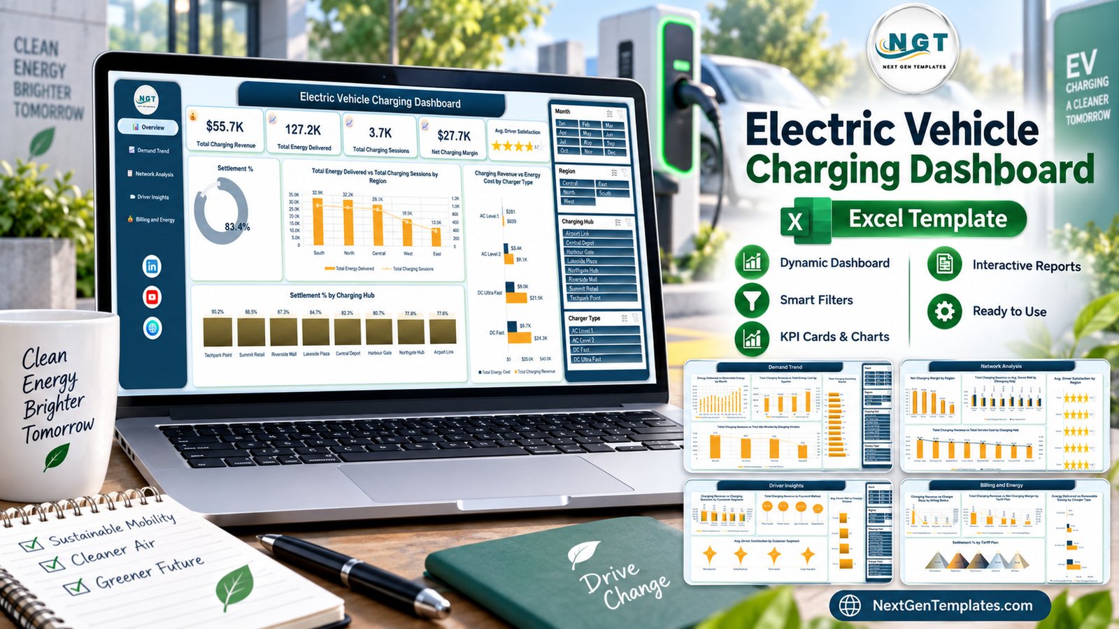
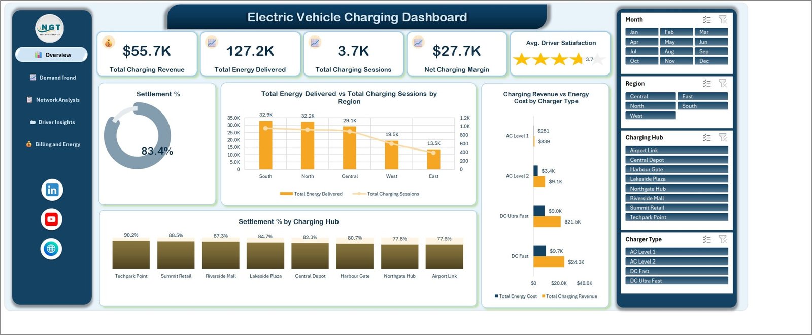
The sample build ships with 8 charging hubs, 5 regions, 4 charger types (AC Level 1, AC Level 2, DC Fast, DC Ultra Fast), 5 tariff plans and 12 months of records. Its demo figures read $55.7K total charging revenue, 127.2K total energy delivered, 3.7K charging sessions, $27.7K net charging margin and an average driver satisfaction of 3.7. Before we go further, the important caveat: this is a Microsoft Excel reporting template, not charging software. It does not connect to any charger, OCPP network, CPMS, billing platform or utility meter. It imports nothing automatically. Every utilisation, uptime, energy and revenue figure in the screenshots is buyer-entered demo data, and the workbook makes no claim about charger performance, energy accounting, grid compliance, tariff correctness or emissions reporting.
Key Features of the Electric Vehicle Charging Dashboard in Excel
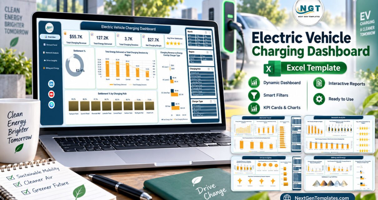
- Five report pages on one navigation rail – Overview, Demand Trend, Network Analysis, Driver Insights and Billing and Energy.
- Five KPI cards on the Overview: Total Charging Revenue, Total Energy Delivered, Total Charging Sessions, Net Charging Margin, and a star-rated Avg. Driver Satisfaction tile.
- Four slicers wired to every page – Month, Region, Charging Hub and Charger Type – so one click refilters all twenty charts at once.
- Charts named for the metric, not the chart type, e.g. Net Charging Margin by Region rather than “column chart 3”.
- Settlement reporting in three places – a headline Settlement % donut, Settlement % by Charging Hub, and Settlement % by Tariff Plan.
- Cost paired with revenue on four different axes, so margin is shown rather than left to the reader.
- Native Excel throughout – PivotTables, slicers, formulas and standard charts. No macros, no add-ins, no Power BI licence, works offline. Electric Vehicle Charging Dashboard in Excel
Dashboard Pages Explanation
Overview
The landing page. Five KPI tiles across the top, then a Settlement % donut reading 83.4% in the sample data, Total Energy Delivered vs Total Charging Sessions by Region (South 32.9K, North 32.2K, Central 29.1K, West 19.5K, East 13.5K), Charging Revenue vs Energy Cost by Charger Type, and a full Settlement % by Charging Hub ranking – Techpark Point 90.2%, Summit Retail 88.5%, Riverside Mall 87.3%, Lakeside Plaza 84.7%, Central Depot 82.3%, Harbour Gate 80.7%, Northgate Hub 77.8%, Airport Link 77.6%. Electric Vehicle Charging Dashboard in Excel
Demand Trend
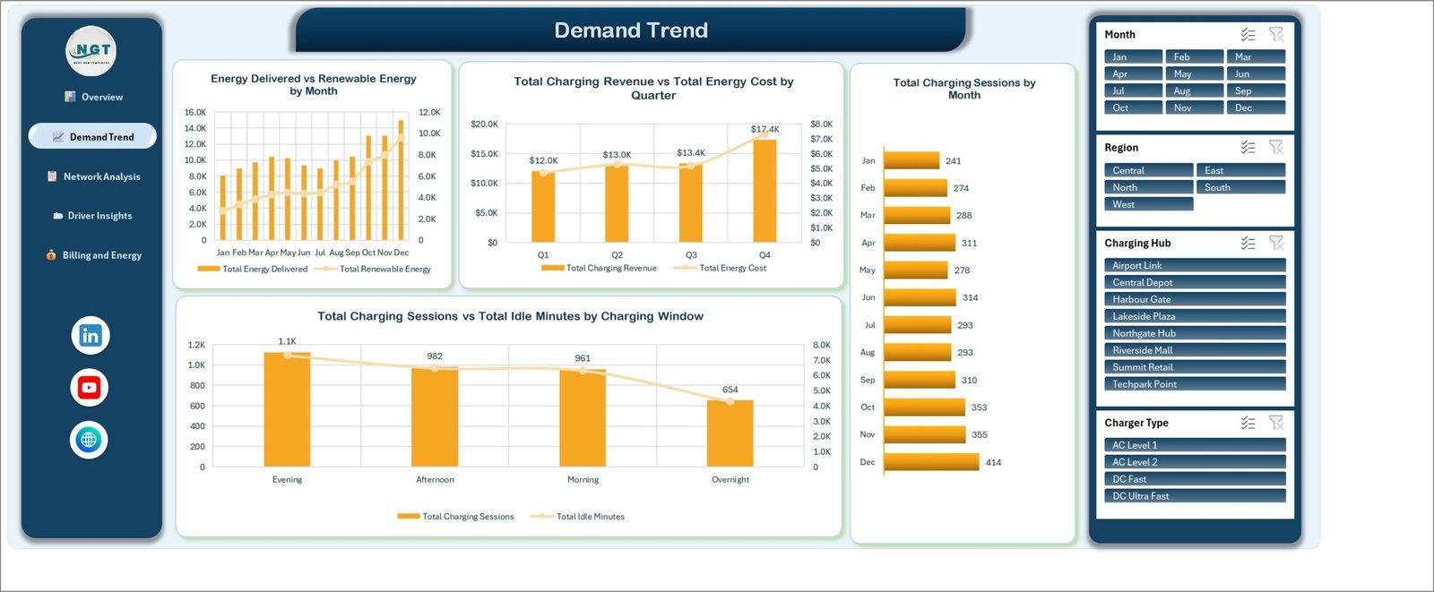
Where demand sits in time. Energy Delivered vs Renewable Energy by Month pairs a column series with a line. Total Charging Revenue vs Total Energy Cost by Quarter reads Q1 $12.0K, Q2 $13.0K, Q3 $13.4K and Q4 $17.4K. Total Charging Sessions by Month runs as a horizontal bar from Jan 241 to Dec 414. Total Charging Sessions vs Total Idle Minutes by Charging Window splits Evening 1.1K, Afternoon 982, Morning 961 and Overnight 654 – the single most useful chart for anyone deciding when to shift depot charging. Electric Vehicle Charging Dashboard in Excel
Network Analysis
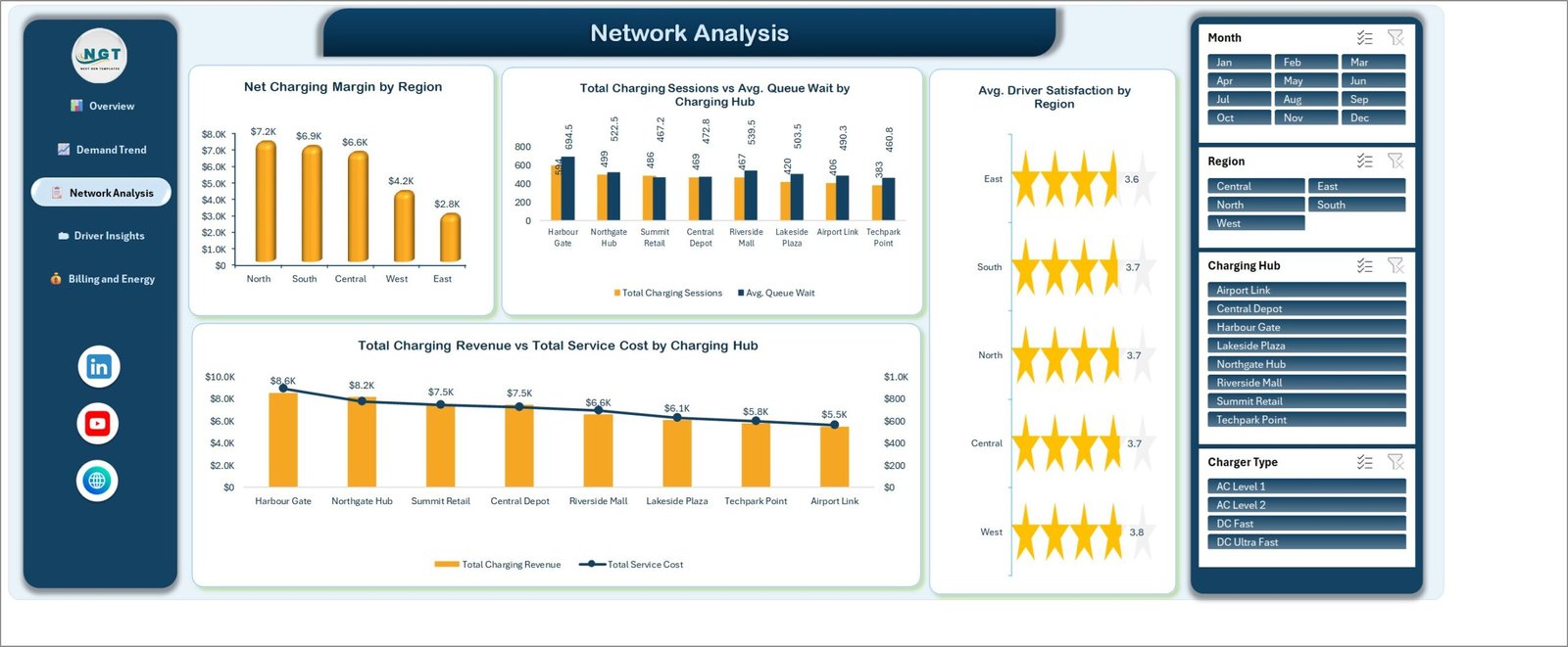
Site-by-site performance. Net Charging Margin by Region (North $7.2K, South $6.9K, Central $6.6K, West $4.2K, East $2.8K), Total Charging Sessions vs Avg. Queue Wait by Charging Hub, Avg. Driver Satisfaction by Region rendered as star rows between 3.6 and 3.8, and Total Charging Revenue vs Total Service Cost by Charging Hub from Harbour Gate at $8.6K down to Airport Link at $5.5K. Read the queue-wait chart next to the revenue chart and you get the trade-off the network is actually making.
Driver Insights
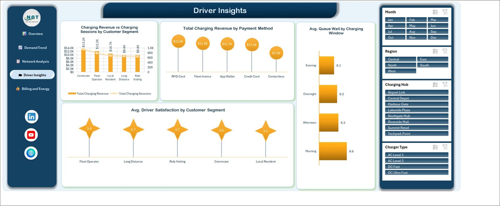
Who charges and how they pay. Charging Revenue vs Charging Sessions by Customer Segment covers Commuter ($13.2K), Fleet Operator ($12.2K), Local Resident ($10.7K), Long Distance ($9.8K) and Ride Hailing ($9.8K). Total Charging Revenue by Payment Method ranks RFID Card $12.8K, Fleet Invoice $11.9K, App Wallet $11.7K, Credit Card $11.4K and Contactless $7.9K. Alongside them sit Avg. Queue Wait by Charging Window and Avg. Driver Satisfaction by Customer Segment, where Fleet Operator leads at 3.9 and Local Resident trails at 3.5. Electric Vehicle Charging Dashboard in Excel
Billing and Energy
The commercial close. Charging Revenue vs Charge Point Days by Billing Status (Settled $46.5K, Pending $6.0K, Disputed $2.0K, Written Off $1.3K), Total Charging Revenue vs Net Charging Margin by Tariff Plan (Standard $19.9K, Peak Hour $12.8K, Fleet Contract $10.2K, Off Peak $8.6K, Promotional $4.3K), Settlement % by Tariff Plan, and Energy Delivered vs Renewable Energy by Charger Type.

Excel vs. Google Sheets vs. a Paid CPMS – Feature Comparison
| This Excel template | Google Sheets equivalent | Paid CPMS / charging SaaS | |
|---|---|---|---|
| Cost | One-time purchase | One-time purchase | Per-charger monthly fee, usually annual contract |
| Platform | Microsoft Excel, desktop | Browser, Google account | Vendor cloud platform |
| Setup time | Minutes – paste and refresh | Minutes – copy, paste, refresh | Weeks – hardware onboarding and tariff configuration |
| Real-time team collaboration | Via OneDrive or SharePoint | Yes, natively | Yes |
| Mobile access | Excel mobile app, read-focused | Yes, browser | Yes, dedicated app |
| Customisable fields | Fully – it is your workbook | Fully | Only what the vendor exposes |
| Share with a link | Via cloud storage | Yes | Yes, per seat |
| Year-1 cost at 5 users | The purchase price, once | The purchase price, once | Subscription x 5 seats plus per-charger fees |
| Live charger telemetry | No | No | Yes |
| Automated settlement and invoicing | No – reports the status you supply | No | Yes |
Who Should Use This Template
Charge point operators and site hosts running anything from a handful to a few dozen hubs and reporting monthly. Fleet and facilities managers who receive charging exports and have to explain the cost. Energy and sustainability analysts assembling a recurring pack. Consultants preparing a board review. And Excel users who want a working PivotTable-and-slicer model to take apart and learn from. Electric Vehicle Charging Dashboard in Excel
It is the wrong tool if you need live telemetry, remote charger control, automated OCPP or CPMS integration, an invoicing engine, regulator-grade energy or emissions reporting, or a multi-user system with logins. Those are platform problems, and a workbook should not pretend to solve them.
Real-World Use Cases
Retail property group, eight sites. Priya exports sessions monthly, refreshes, and reads Settlement % by Charging Hub. The two hubs at the bottom of the ranking are the agenda item for her operator call; the revenue-versus-service-cost chart tells her whether a poorly settling site is also an expensive one to keep running.
Last-mile delivery fleet. Daniel filters to Fleet Contract, compares net charging margin against the Standard plan, then checks Avg. Queue Wait by Charging Window – Morning runs highest at 8.6 in the sample data – to argue for moving depot charging to Overnight.
Quarterly energy review. Anita reads the quarterly revenue-versus-cost chart and the renewable split by charger type, exports both pages to PDF and drops them into the board pack, stating plainly in her notes that the renewable figure is supplier-reported rather than metered.
Advantages of the Electric Vehicle Charging Dashboard in Excel
- No platform lock-in. The file is yours; every formula and PivotTable is editable.
- Fast to adopt. A team already fluent in Excel needs no training, and there is no procurement cycle.
- Cost and revenue always paired. Four separate charts put the two side by side, which is where most home-made charging reports fall down.
- Consistent cross-filtering. Because all five pages share the same four slicers, a regional view stays a regional view as you move between them.
- Offline and portable. No account, no connection, no expiry – useful when the reporting happens on a site laptop.
Opportunities for Improvement
Two honest observations from working through the shipped build. First, on the Network Analysis and Billing and Energy pages several data labels are rotated to vertical to fit the plot area – Total Charging Sessions vs Avg. Queue Wait by Charging Hub is the clearest example. They are legible and they do not collide with the chart titles, but they are slower to read than horizontal labels, and widening those charts or dropping to every-other label is a five-minute change if it bothers you.
Second, the workbook reports actuals only. There is no target column and no variance calculation, so “is 77.6% settlement acceptable at Airport Link?” is a judgement you bring, not one the dashboard answers. If you want traffic lights against targets, the KPI Dashboard and KPI Scorecard lines are built for that instead. A third, smaller point: currency formatting assumes a single currency, so a multi-country operator needs to normalise before pasting.
Best Practices
- Keep the header row untouched. The PivotTables bind to column names; renaming a header silently breaks a chart.
- Normalise your category values before pasting – one spelling per hub, per tariff plan and per charger type. Mixed spellings are the most common reason a chart looks wrong.
- Refresh with Data > Refresh All, not by refreshing one PivotTable, so the KPI cards and charts stay in step. Microsoft’s own guidance on refreshing data connections in Excel is worth a read if your source is linked rather than pasted.
- Archive a copy per period. Save “2026-09 EV Charging Pack.xlsx” rather than overwriting one live file, so last month’s numbers stay reproducible.
- Clear every slicer before you share. A filtered workbook sent to a colleague reads as a full-network view and quietly is not.
- Say where the numbers came from. Add a line to the pack naming the export, the date range and anything supplier-reported rather than measured.
Explore Relevant Templates
- EV Charging Stations Dashboard in Excel – a station-level view of the same industry.
- EV Fleet Dashboard in Power BI – the vehicle side rather than the charger side.
- Micro-Mobility Platforms Dashboard in Excel – adjacent transport reporting.
- Drone Services Dashboard in Excel – the same five-page dashboard structure applied to another operations business.
- Data Warehousing Dashboard in Excel – if you want to see the pattern outside of transport.
Frequently Asked Questions
Does the template connect to chargers, an OCPP network or a CPMS?
No. It is a reporting workbook. It does not connect to any charger, OCPP network, CPMS, billing system or utility meter, and nothing imports automatically. You paste or link your own exported data, then refresh.
Are the numbers in the screenshots real operating figures?
No. All of them are buyer-entered demo data, shipped so the pages are readable before you load your own records. They are not benchmarks and should not be quoted as such.
How is this different from the EV Charging KPI Dashboard and KPI Scorecard?
Different templates with similar names. This is the analytical dashboard line – five pages, slicer-driven, actuals only. The KPI Dashboard and KPI Scorecard lines use a month picker with target-versus-actual traffic lights and a dedicated trend page. Pick the one whose layout matches the report you have to produce.
Do I need macros or a Power BI licence?
Neither. The workbook is native Excel – formulas, PivotTables, slicers and standard charts – and opens offline in Excel 2016 or later, or Microsoft 365, on Windows or Mac.
Can I add hubs, tariff plans or charger types of my own?
Yes. Add rows to the data sheet and refresh; the PivotTables pick up new category values automatically. Renaming an existing value is equally safe.
What is in the download?
One ZIP containing the .xlsx workbook and a user manual PDF. Download is instant and access does not expire.
About the Author
Built by PK – Microsoft Certified Professional with 15+ years of Excel, Google Sheets, and Power BI experience. Founder of NextGenTemplates, reaching 300K+ subscribers across YouTube channels. Every template is hand-built and tested before release.
Conclusion
If the charging data already exists and the problem is turning it into something a monthly meeting can act on, the Electric Vehicle Charging Dashboard in Excel is a short route there: one data sheet, five pages, four slicers, and no software to procure. Just keep the boundary clear in your own reporting – it presents the numbers you give it, the sample rows are demo data, and anything about charger performance, tariff correctness or emissions remains your source system’s claim, not the workbook’s.
Get the template here: Electric Vehicle Charging Dashboard in Excel on NextGenTemplates. For step-by-step Excel dashboard tutorials, subscribe at youtube.com/@PKAnExcelExpert.