In today’s fast-moving industrial world, engineering teams must maintain precision, productivity, and innovation — all while meeting tight deadlines and budgets. However, managing multiple performance indicators across departments can become overwhelming. That’s where the Engineering KPI Dashboard in Power BI comes in.
This powerful, ready-to-use dashboard provides real-time visibility into engineering metrics such as efficiency, project timelines, resource utilization, and quality performance — all in one place. Built on Power BI and powered by Excel data, it transforms raw numbers into meaningful insights that drive better decisions.
Click to Purchases Engineering KPI Dashboard in Power BI
What Is an Engineering KPI Dashboard in Power BI?
An Engineering KPI Dashboard is a visual performance-management system that consolidates key engineering metrics into interactive dashboards. It helps organizations monitor Month-to-Date (MTD) and Year-to-Date (YTD) results against targets, compare them to previous years, and identify areas that need attention.
When implemented in Microsoft Power BI, it becomes a live, dynamic analytics tool that updates automatically from your Excel data source. The result: you can measure, visualize, and improve engineering operations — without complex manual reporting.
Click to Purchases Engineering KPI Dashboard in Power BI
Why Use Power BI for Engineering KPI Tracking?
Power BI is the preferred choice for engineering analytics because it:
-
Connects seamlessly with Excel and other data systems.
-
Offers drag-and-drop dashboards with drill-through capability.
-
Supports real-time performance monitoring.
-
Delivers professional visuals that simplify complex data.
-
Enables collaboration through shared reports and dashboards.
This combination of power and flexibility makes Power BI ideal for engineering organizations that want accurate, actionable insights at their fingertips.
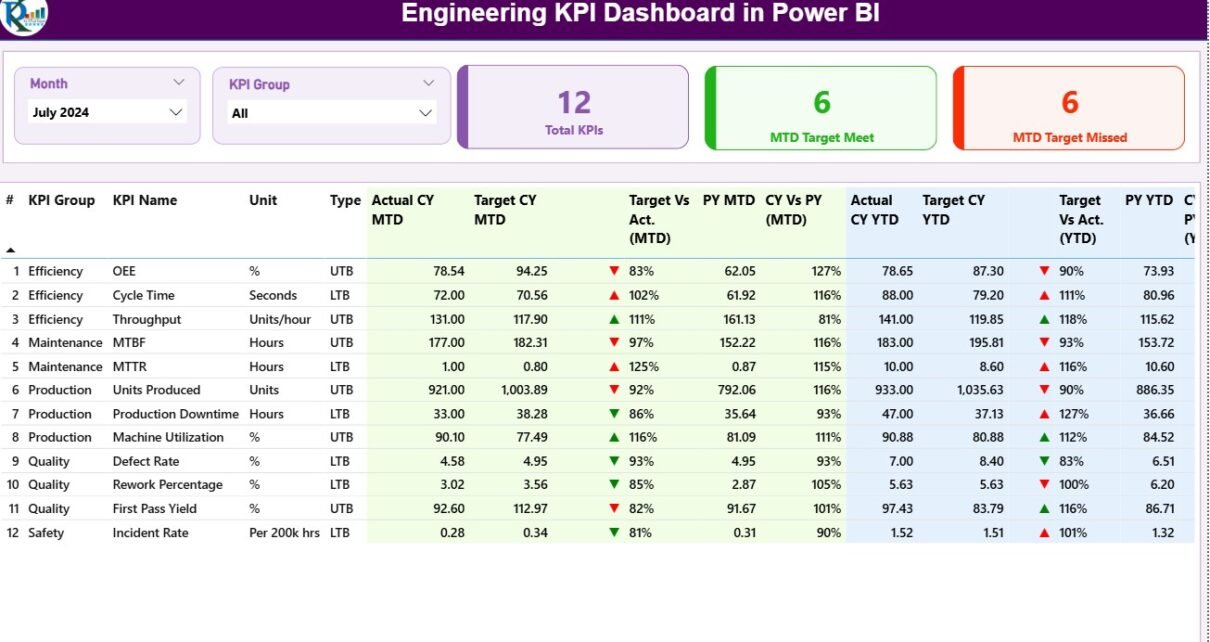
Structure of the Engineering KPI Dashboard in Power BI
The dashboard template is organized into three pages in the Power BI desktop file — each designed for a specific analytical purpose.
1️⃣ Summary Page – Your Performance Overview
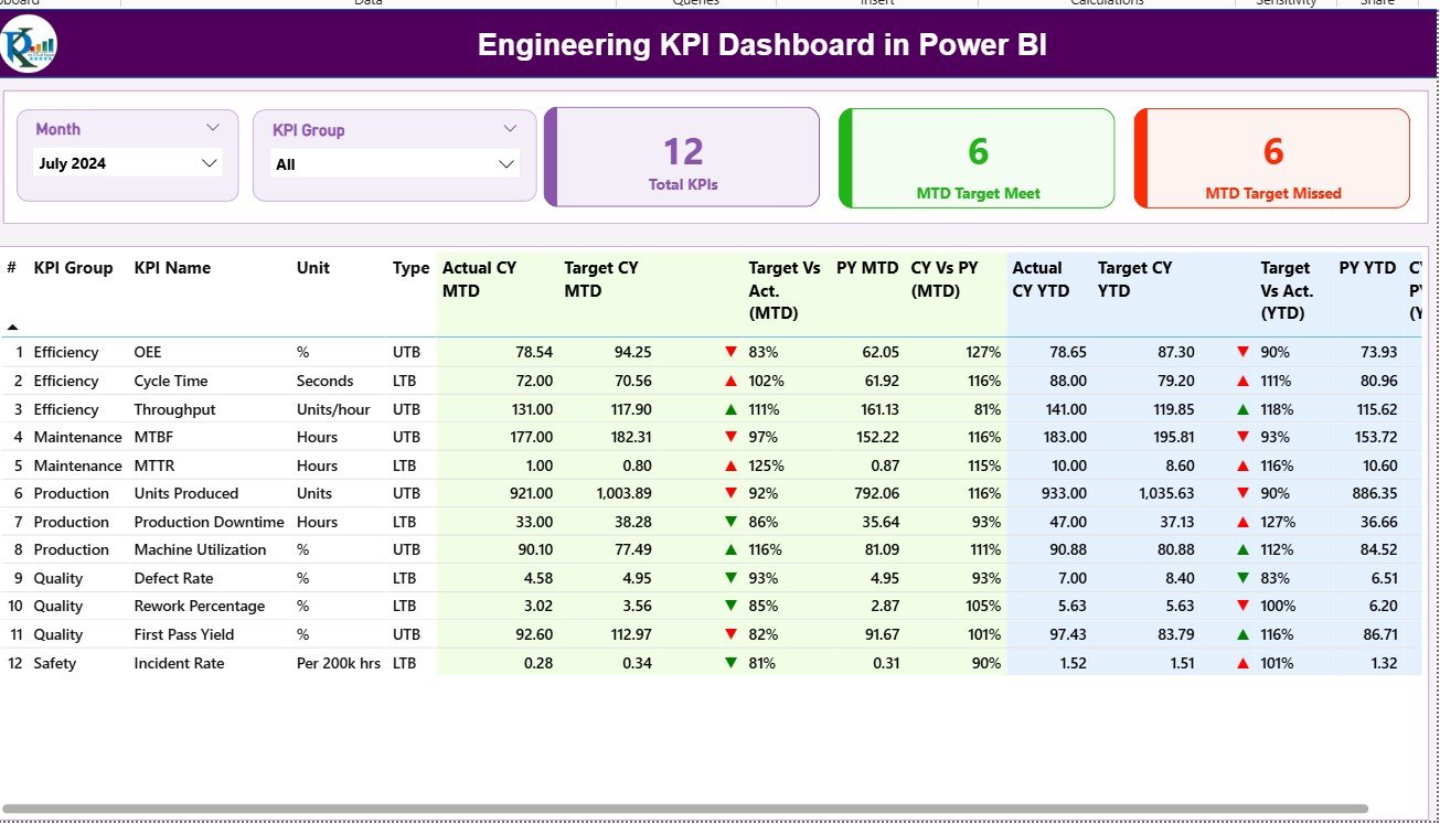
The Summary Page is the main view where you can analyze all engineering KPIs in one consolidated interface.
Key Features
-
Month and KPI Group Slicers
Select a specific month or KPI group to filter results dynamically. -
Performance Cards
Three cards display:-
Total KPI Count
-
MTD Target Met Count
-
MTD Target Missed Count
-
-
Detailed KPI Table
A comprehensive table lists every KPI with details such as:-
KPI Number
-
KPI Group
-
KPI Name
-
Unit of Measurement
-
Type (UTB – Upper the Better / LTB – Lower the Better)
-
Actual CY MTD vs Target CY MTD
-
MTD Icon (▲ or ▼ with green/red colors)
-
Target vs Actual % (MTD)
-
Previous Year MTD (PY MTD)
-
CY vs PY Comparison (MTD)
-
YTD Actual and Target Values
-
YTD Icons and % Comparison
-
This structured layout provides quick insights into whether performance is improving or declining — helping engineers act before issues escalate.
2️⃣ KPI Trend Page – Visualize Progress Over Time
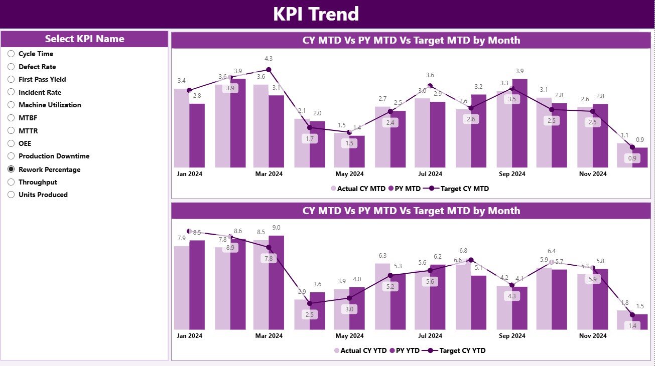
The KPI Trend Page is dedicated to analyzing trends for each KPI across months or years.
Key Features
-
Dynamic KPI Selection
Choose a specific KPI from the slicer (on the left panel) to view its detailed trend. -
Combo Charts
Two combo charts visualize Actuals, Targets, and Previous-Year values for both MTD and YTD periods.-
Chart 1: MTD Actual vs Target vs PY
-
Chart 2: YTD Actual vs Target vs PY
-
-
Comparative Analysis
Instantly see how the current year performs compared to the previous year — enabling fact-based performance discussions during engineering reviews.
3️⃣ KPI Definition Page – Your Drill-Through Reference
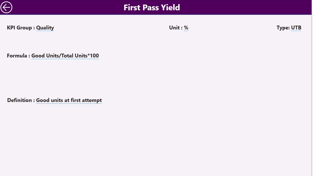
This hidden drill-through page stores detailed KPI metadata and definitions.
Key Features
-
Automatically accessed from the Summary Page through drill-through action.
-
Displays each KPI’s Formula, Definition, Unit, and Type.
-
Includes a Back Button at the top left corner to return to the main page.
This page ensures transparency and helps new users quickly understand how each KPI is calculated.
Excel Data Source Structure
The Engineering KPI Dashboard uses Excel as its primary data source, containing three important worksheets:
-
Input_Actual
-
Columns: KPI Name, Month (1st day of month), MTD, YTD values.
-
Purpose: Enter current year actual performance.
-
-
Input_Target
-
Columns: KPI Name, Month (1st day of month), MTD, YTD targets.
-
Purpose: Record monthly and annual targets.
-
-
KPI Definition
-
Fields: KPI Number, KPI Group, KPI Name, Unit, Formula, Definition, Type (LTB or UTB).
-
Purpose: Provide reference information for each metric.
-
By maintaining these three sheets, Power BI can refresh data automatically, ensuring up-to-date reporting without manual intervention.
How the Engineering KPI Dashboard Works
-
Data Collection: Excel captures raw KPI data for Actual and Target values.
-
Data Connection: Power BI imports the Excel file and establishes links between the three tables.
-
Calculation: DAX formulas calculate MTD and YTD variances and performance percentages.
-
Visualization: The Summary Page displays data with cards, tables, and icons.
-
Analysis: Users drill down to the KPI Trend page to identify root causes and improvement areas.
Everything runs seamlessly — from Excel input to Power BI visualization — without coding knowledge.
Click to Purchases Engineering KPI Dashboard in Power BI
Advantages of Using the Engineering KPI Dashboard in Power BI
1. Centralized Engineering Performance View
All KPIs — from production yield to resource efficiency — are consolidated in a single dashboard. No need for multiple spreadsheets or manual reports.
2. Data-Driven Decisions
Instantly see whether targets are met and identify trends that need attention. This enables faster, fact-based decisions.
3. Automated Updates
Once connected to Excel, the dashboard refreshes automatically — saving hours of manual work each month.
4. Improved Collaboration
Engineers, managers, and executives can view the same real-time metrics and work together to solve bottlenecks.
5. Visual Clarity
Color coding and icons help users quickly spot which KPIs are on track (green ▲) or lagging behind (red ▼).
6. Scalability
Easily add new KPIs or departments without rebuilding the dashboard. It grows with your engineering operations.
7. Historical Trend Tracking
With YTD and PY comparisons, you can see long-term improvement patterns and forecast future performance.
How to Implement the Engineering KPI Dashboard
-
List all key KPIs relevant to your engineering process.
-
Prepare your Excel file with the three sheets (Actual, Target, Definition).
-
Connect the Excel file to Power BI and load data.
-
Customize KPI cards and thresholds based on your targets.
-
Publish and share the dashboard with stakeholders.
This implementation can be completed within a few hours and offers long-term benefits for engineering management.
Click to Purchases Engineering KPI Dashboard in Power BI
Best Practices for the Engineering KPI Dashboard
-
✅ Use consistent data formats in Excel to avoid errors.
-
📊 Keep KPI definitions clear and update them regularly.
-
🔁 Refresh Power BI data weekly or monthly for accuracy.
-
🎯 Limit KPIs to critical metrics for clarity.
-
💡 Use conditional formatting to highlight under-performing areas.
-
🧠 Encourage department heads to own their KPIs and drive results.
-
🔒 Apply user-level security for sensitive data if published online.
Following these best practices ensures your dashboard remains accurate, useful, and easy to maintain.
Opportunities for Improvement
Even the best dashboards can evolve. Here are some ways to enhance yours:
-
Integrate data from ERP or MES systems for real-time updates.
-
Add trend forecasting using Power BI AI visuals.
-
Include department-wise drill-downs for deeper insights.
-
Set up automatic email alerts for critical KPI variances.
-
Combine Power Apps for data entry to make updates seamless.
These upgrades can take your dashboard from a reporting tool to a decision-intelligence system.
Conclusion
The Engineering KPI Dashboard in Power BI is an indispensable tool for modern engineering management. It turns scattered data into actionable insights — helping organizations optimize production, reduce costs, improve quality, and achieve strategic goals.
By combining Power BI’s visual analytics with Excel’s flexibility, this dashboard gives you the clarity you need to drive continuous improvement. Implement it today and empower your engineering teams to perform at their best.
Click to Purchases Engineering KPI Dashboard in Power BI
Frequently Asked Questions (FAQs)
1. What is the purpose of an Engineering KPI Dashboard in Power BI?
It tracks key performance indicators like productivity, efficiency, and quality to help engineering teams make data-driven decisions.
2. Can I customize the KPIs in the dashboard?
Yes, you can add, remove, or edit KPIs in the Excel source file and refresh Power BI to reflect changes.
3. How often should the dashboard be updated?
Most organizations update their dashboards monthly or weekly depending on project frequency and data availability.
4. Do I need coding skills to use Power BI?
No coding is required. Power BI’s drag-and-drop interface makes it user-friendly for all skill levels.
5. Can this dashboard connect to live data sources?
Yes. You can connect to databases, ERP systems, or cloud services for real-time data updates.
6. What KPIs are most important for engineering teams?
Typical ones include production yield, equipment downtime, defect rate, resource utilization, and cost variance.
7. Is the Engineering KPI Dashboard in Power BI suitable for small companies?
Absolutely. It’s scalable and affordable, making it ideal for small engineering firms as well as large enterprises.
Click to Purchases Engineering KPI Dashboard in Power BI
Visit our YouTube channel to learn step-by-step video tutorials