Running a fitness studio looks exciting from the outside. However, behind the scenes, you manage trainers, classes, memberships, schedules, customer feedback, and revenue targets—often at the same time. Because of that, you need fast and clear insights every day.
Yet, many studio owners still track performance using scattered spreadsheets or manual reports. As a result, they lose time, miss trends, and make decisions based on guesswork.
So, how do you monitor studio performance in one place, compare trends across locations and class types, and improve customer satisfaction without building a complex system?
Click to Purchases Fitness Studios Dashboard in Power BI
The answer is a Fitness Studios Dashboard in Power BI.
In this article, you will learn what this dashboard is, how it works, what pages it includes, what insights you can extract, and how to follow best practices to keep your reporting accurate and action-driven.
What Is a Fitness Studios Dashboard in Power BI?
A Fitness Studios Dashboard in Power BI is an interactive analytics solution that tracks fitness studio operations using visuals, slicers, and KPI cards. Instead of checking multiple reports, you view everything from one central dashboard.
Most importantly, it helps you answer key questions like:
-
Which studio location performs best?
-
Which class types generate the most booked slots?
-
Which membership types drive higher session revenue?
-
Which trainers get better ratings?
-
How do bookings and records change month by month?
Because Power BI supports interactive filters (slicers), you can drill down quickly and make faster decisions.
Why Do Fitness Studios Need a Dashboard?
Fitness studios rely on volume, retention, and experience. Therefore, even a small decline in ratings, bookings, or revenue can affect growth.
A dashboard helps because:
-
You identify trends early, so you act before issues grow
-
You track performance visually, so the data feels easy to read
-
You compare segments quickly, so you improve what matters
-
You save time, because the dashboard updates with refreshed data
In addition, Power BI makes this process even easier because it supports dynamic visuals, drill-through, and slicers.
What Data Does a Fitness Studios Dashboard Usually Track?
To build strong analysis, your dataset should include common studio operations data like:
-
Studio location
-
Class type
-
Membership type
-
Trainer name
-
Booked slots
-
Session duration
-
Session revenue
-
Customer rating
-
Session date/month
-
Records (transactions or attendance logs)
Because the dashboard uses visuals and cards, clean and consistent data matters a lot.
What Are the Key Features of the Fitness Studios Dashboard in Power BI?
This Fitness Studios Dashboard in Power BI includes 5 pages in the Power BI Desktop file. Each page focuses on a different angle of performance. Moreover, every page includes slicers (filters), so you can analyze quickly.
Here is the complete structure.
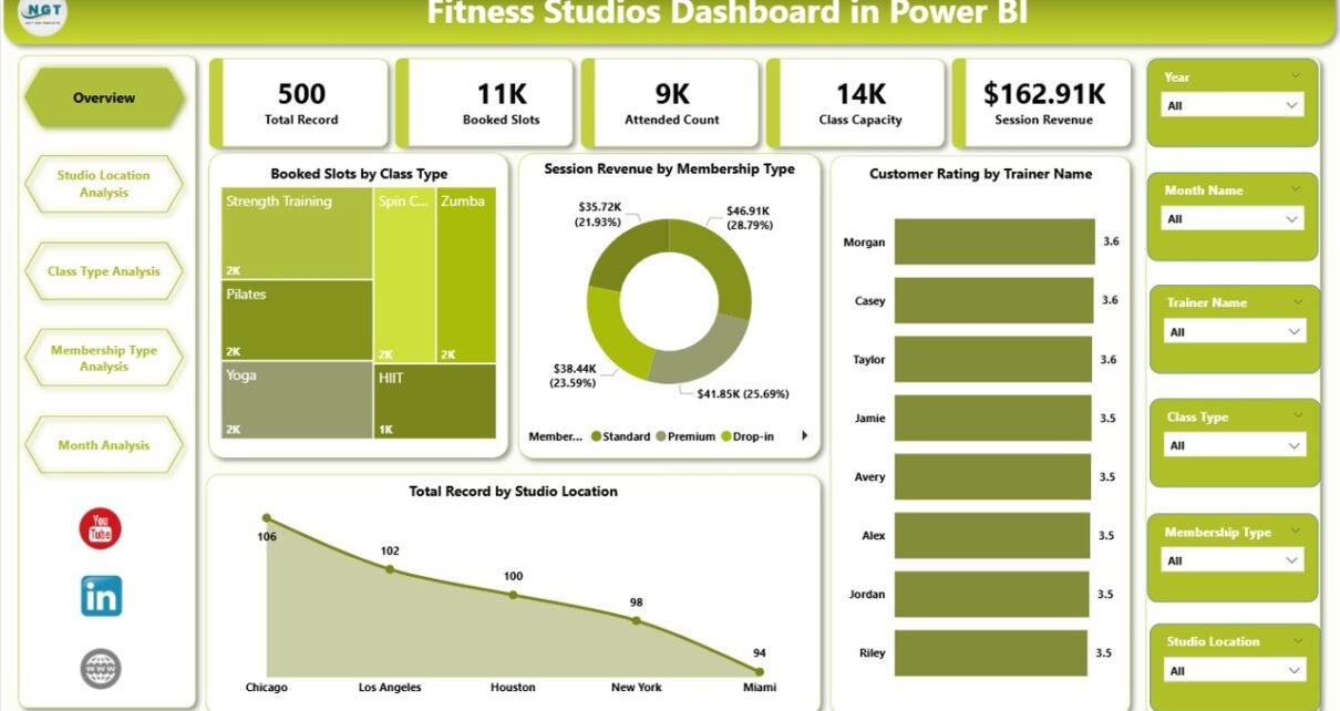
1) Overview Page: What Is Happening in Your Fitness Business Right Now?
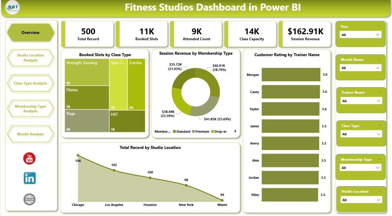
The Overview page acts as the main control panel of your entire dashboard. Since you start here, it should give you quick direction within seconds.
What you see on the Overview page
This page includes slicers and 5 KPI cards, along with key visuals:
KPI Cards / Highlights
-
Booked Slots by Class Type
-
Session Revenue by Membership Type
-
Customer Rating by Trainer Name
-
Total Record by Studio Location
-
(One more key card often includes a total such as Total Booked Slots or Total Revenue, depending on your layout)
Why this page matters
This page helps you quickly understand:
-
Which classes people book more
-
Which memberships generate more revenue
-
Which trainers keep customers happier
-
Which locations produce the most records
Therefore, you can decide what to focus on without opening multiple reports.
Insights you can get from Overview
-
Identify your highest demand class types
-
Spot top-performing membership plans
-
Find high-rated trainers and support low-rated ones
-
Compare studio locations instantly
In short, the Overview page tells you what is working and what needs attention.
2) Studio Location Analysis: Which Location Performs Best?
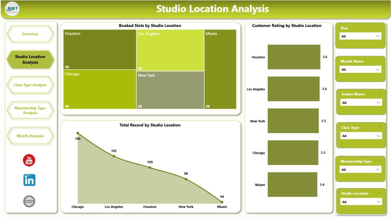
If you run multiple studio branches, location analysis becomes critical. Because each location works differently, you must compare bookings, ratings, and volume per studio.
What you see on this page
This is the second page of the dashboard and includes slicers plus 3 charts:
-
Booked Slots by Studio Location
-
Customer Rating by Studio Location
-
Total Record by Studio Location
Why this page matters
Even when your overall performance looks good, one location can silently underperform. Therefore, you must compare locations regularly.
Actionable insights from Studio Location Analysis
-
Which location gets the highest bookings
-
Which location receives better customer ratings
-
Which location generates more records (attendance/sessions/transactions)
Decisions you can make using this page
-
Improve staffing at underperforming studios
-
Add more popular classes to weaker locations
-
Train teams at low-rated locations
-
Adjust promotions based on local demand
As a result, each branch becomes more balanced and profitable.
3) Class Type Analysis: Which Classes Drive Bookings, Duration, and Revenue?
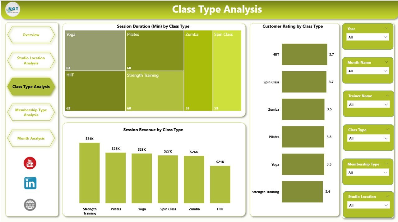
Class type is the heart of a fitness studio. Because customers choose studios based on class preference, you must track which class types deliver the best results.
What you see on this page
This is the third page and includes slicers plus 3 charts:
-
Customer Rating by Class Type
-
Session Duration by Class Type
-
Session Revenue by Class Type
Why this page matters
Not every class type works equally well. Some classes bring higher ratings, while others bring more revenue. Therefore, you must balance experience and profit.
Insights you can get from Class Type Analysis
Click to Purchases Fitness Studios Dashboard in Power BI
-
Which class types customers rate higher
-
Which class types run longer (and need better scheduling)
-
Which class types generate more revenue
Decisions you can take using this page
-
Add more slots for high-demand class types
-
Improve trainer allocation for low-rated classes
-
Adjust pricing or membership benefits for high-value classes
-
Reduce class types that waste time and bring low results
Because you see these trends visually, you can act faster.
4) Membership Type Analysis: Which Memberships Drive Engagement and Records?
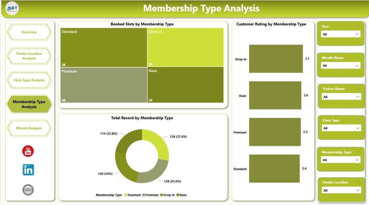
Membership types shape your studio revenue model. Therefore, you must track performance by membership plan so you can improve pricing, packages, and retention.
What you see on this page
This is the fourth page and includes slicers plus 3 charts:
-
Customer Rating by Membership Type
-
Booked Slot by Membership Type
-
Total Record by Membership Type
Why this page matters
A membership plan can bring revenue but still create unhappy customers. On the other hand, a cheaper plan can create loyal customers. Because of that, you must analyze both engagement and satisfaction.
Insights you can get from Membership Type Analysis
-
Which membership type creates better ratings
-
Which membership type drives more bookings
-
Which membership type produces more overall records
Decisions you can make using this page
-
Promote high-performing membership plans
-
Improve benefits for low-performing memberships
-
Create new packages based on demand patterns
-
Reduce churn by targeting plans with low satisfaction
As a result, you grow revenue while protecting customer experience.
5) Month Analysis: How Does Performance Change Month by Month?
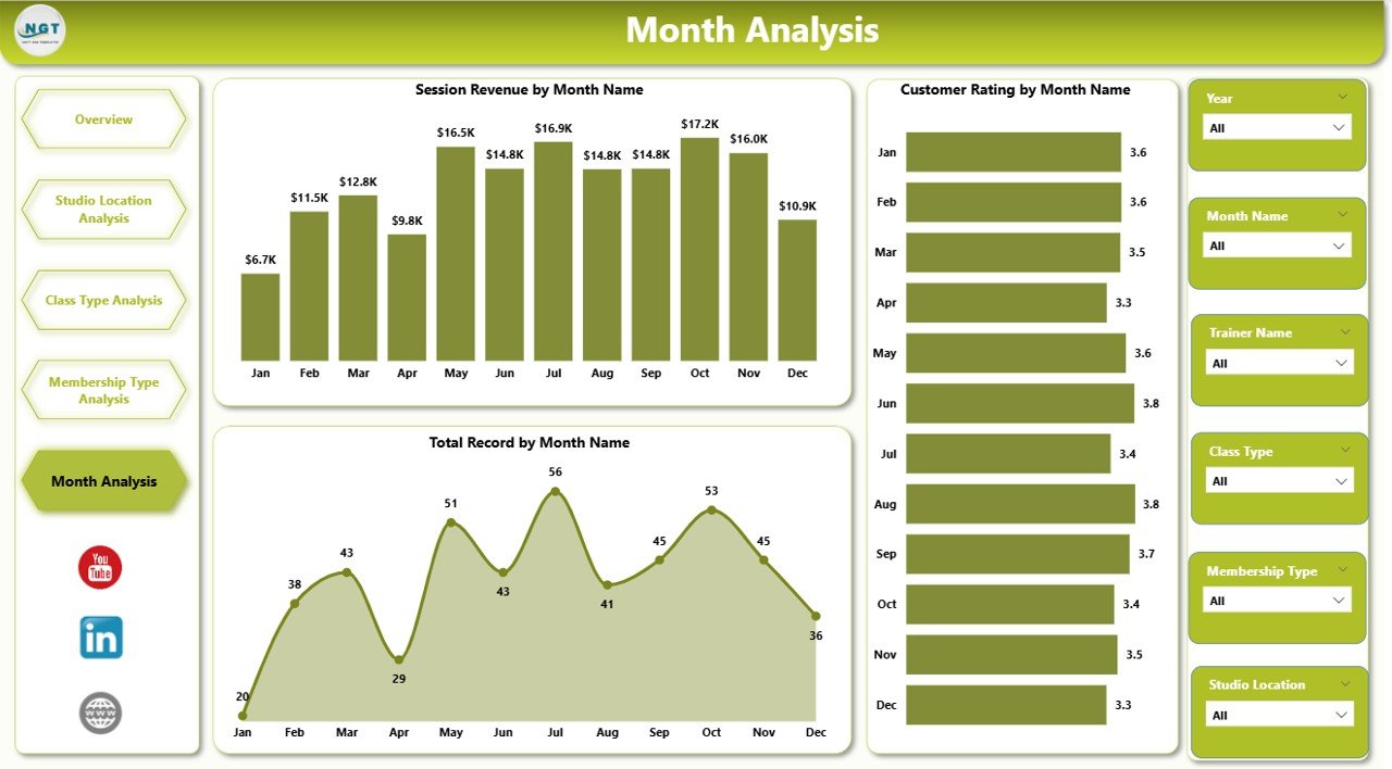
Monthly analysis helps you understand seasonality. Because fitness studios often follow seasonal patterns (new year rush, summer dips, festive months), tracking month-wise performance becomes essential.
What you see on this page
This is the fifth page and includes slicers plus 3 charts:
-
Customer Rating by Month
-
Booked Slot by Month
-
Total Record by Month
Why this page matters
Month-wise trends help you plan marketing, staffing, and class scheduling. Moreover, it helps you forecast revenue more accurately.
Insights you can get from Month Analysis
Click to Purchases Fitness Studios Dashboard in Power BI
-
Identify months with high bookings
-
Spot months with rating drops
-
Compare record volume across months
Decisions you can take using this page
-
Launch promotions before low-demand months
-
Increase trainer availability during peak months
-
Improve service quality in months with rating dips
-
Plan new program launches at the right time
Therefore, you stop reacting late and start planning early.
What KPIs Should You Track in a Fitness Studios Dashboard?
Although your dashboard visuals already cover key metrics, you can define KPIs clearly so teams follow the same meaning.
Here are useful KPIs for this dashboard:
-
Booked Slots (by class type, location, month, membership)
-
Session Revenue (by membership type, class type)
-
Customer Rating (by trainer, class type, location, month)
-
Total Records (volume indicator by location, month, membership)
-
Average Session Duration (by class type)
When you track these consistently, your dashboard becomes a decision tool, not just a report.
Advantages of Fitness Studios Dashboard in Power BI
A dashboard gives value only when it improves daily decisions. So, let’s look at the real advantages.
✅ 1) You get one complete view of performance
Instead of switching between files, you see bookings, ratings, and records in one place.
✅ 2) You make faster decisions with slicers
Because slicers filter instantly, you can drill down without extra work.
✅ 3) You improve customer experience using rating insights
When ratings fall, you take action quickly. Therefore, you protect retention.
✅ 4) You increase revenue with membership and class analysis
You identify which membership types and class types drive revenue. As a result, you focus on profitable areas.
✅ 5) You manage multi-location studios easily
Location comparison becomes simple. So, you fix weak branches faster.
✅ 6) You plan better with month trends
Monthly performance helps you prepare promotions and staffing in advance.
How Do You Build This Dashboard in Power BI?
Click to Purchases Fitness Studios Dashboard in Power BI
Even if you already have a template, it helps to know the general process. That way, you can update and expand the dashboard easily.
Step 1: Prepare your data
Ensure your dataset includes consistent columns such as:
-
Date/Month
-
Studio Location
-
Class Type
-
Membership Type
-
Trainer Name
-
Booked Slots
-
Session Revenue
-
Session Duration
-
Customer Rating
-
Record ID or Transaction ID
Step 2: Load data into Power BI
Use:
-
Excel file
-
CSV file
-
Google Sheets (via connectors)
-
Database source
Step 3: Create relationships (if multiple tables exist)
If you use separate tables (like Trainers, Locations, Calendar), create relationships properly. Otherwise, your charts will not filter correctly.
Step 4: Create measures for KPIs
Typical measures include:
-
Total Booked Slots
-
Total Revenue
-
Average Rating
-
Total Records
-
Average Session Duration
Step 5: Design pages with consistent layout
Keep:
-
Same slicer area on every page
-
Same font style
-
Same chart design patterns
Step 6: Test filters and drill-down
Before finalizing:
-
Check every slicer
-
Validate totals
-
Confirm that charts update correctly
Because dashboards need trust, you must verify numbers.
Best Practices for the Fitness Studios Dashboard in Power BI
If you follow best practices, your dashboard stays accurate, clean, and fast.
✅ 1) Use a consistent slicer strategy
Keep slicers in the same place on each page. Also, use the same slicer fields where possible.
✅ 2) Keep your measures clean and simple
Use clear measure names like:
-
Total Booked Slots
-
Avg Customer Rating
-
Total Session Revenue
Because clean naming improves teamwork, it reduces confusion.
✅ 3) Use the right charts for the right metrics
-
Use bar charts for comparisons (location, class type)
-
Use line charts for month trends
-
Use cards for quick KPI highlights
✅ 4) Track both experience and revenue
Ratings show experience, while revenue shows profit. Therefore, always balance both.
Click to Purchases Fitness Studios Dashboard in Power BI
✅ 5) Validate data before refresh
Check for:
-
Missing ratings
-
Incorrect date formats
-
Duplicate records
-
Negative revenue
-
Unrealistic session duration
✅ 6) Keep visuals focused
Avoid adding too many charts on one page. Instead, keep 3–5 visuals per page so users can read quickly.
✅ 7) Add tooltips for extra context
Tooltips help users understand values without cluttering the page.
✅ 8) Refresh data on a schedule
If you update weekly or daily, maintain a refresh routine. As a result, your dashboard stays reliable.
Common Mistakes to Avoid While Using a Fitness Dashboard
Even a strong dashboard fails when teams use it incorrectly. So avoid these mistakes:
-
Ignoring low-rated trainers and focusing only on revenue
-
Tracking bookings without checking session capacity
-
Not analyzing monthly seasonality
-
Comparing locations without matching class schedules
-
Using messy data with inconsistent naming (like “Yoga” vs “YOGA”)
If you avoid these mistakes, your insights stay accurate and useful.
Conclusion
A Fitness Studios Dashboard in Power BI helps you track studio performance across bookings, ratings, revenue, and records with clarity. Moreover, it helps you compare studio locations, class types, and membership plans in seconds.
Since this dashboard includes 5 powerful pages—Overview, Studio Location Analysis, Class Type Analysis, Membership Type Analysis, and Month Analysis—you can monitor your fitness business from every angle.
Most importantly, you can stop guessing and start improving performance using real data.
Frequently Asked Questions (FAQs) with Answers
What is a Fitness Studios Dashboard in Power BI?
A Fitness Studios Dashboard in Power BI is an interactive reporting tool that tracks bookings, revenue, customer ratings, and records using visuals and slicers.
How many pages are included in this Fitness Studios Dashboard?
This dashboard includes 5 pages: Overview, Studio Location Analysis, Class Type Analysis, Membership Type Analysis, and Month Analysis.
What are the main metrics tracked in the dashboard?
The main metrics include Booked Slots, Session Revenue, Customer Rating, Session Duration, and Total Records.
How does the Overview page help studio owners?
The Overview page shows key KPI cards and high-level trends so owners can quickly understand overall performance and identify priority areas.
Why is Studio Location Analysis important?
Studio Location Analysis helps compare performance across locations, so you can improve weak branches and scale successful ones.
How does Class Type Analysis improve scheduling?
It helps you see which class types deliver better ratings, longer sessions, and higher revenue. Therefore, you can schedule more high-performing classes.
What insights does Membership Type Analysis provide?
It shows which membership plans generate more bookings, better ratings, and higher record volume, so you can improve packages and retention.
Why should you track Month Analysis in a fitness business?
Month analysis shows seasonality trends, so you can plan promotions, staffing, and class schedules for peak and low-demand months.
Can this dashboard work for a single fitness studio?
Yes. Even a single studio benefits because you can still analyze class types, trainers, memberships, and month trends.
How often should I refresh the Power BI dashboard?
You should refresh based on your operations. Many studios refresh daily or weekly so decisions stay accurate and timely.
Visit our YouTube channel to learn step-by-step video tutorials