The Food Delivery Dashboard in Excel is a 5-page interactive analytics workbook tracking 18+ KPIs across orders, riders, restaurants, cities, and customer segments. Setup takes under 10 minutes — paste your daily order export into the Data sheet, click Refresh All, and every chart, slicer, and KPI card updates automatically. According to industry benchmarks, food delivery operators that monitor on-time delivery percentage, rider tip distribution, and cancellation rate weekly improve gross margins by 2–4 percentage points within a single quarter.
Cloud kitchen owners, food delivery aggregators, and restaurant operations managers waste hours every week stitching together CSV exports from NextGenTemplates partners, payment dashboards, and rider apps just to answer basic questions like “which cuisine is our highest revenue earner this month?” or “which rider has the worst on-time rate?”. The Food Delivery Dashboard in Excel consolidates all of that into one self-contained workbook with native pivot tables and slicers — no Power Query, no add-ins, no monthly SaaS fee. If you are evaluating Excel Dashboard Templates for restaurant or food delivery analytics, this is one of the most operationally complete options available.
Food Delivery Dashboard in Excel
Key Features of Food Delivery Dashboard in Excel
The Food Delivery Dashboard in Excel includes 5 interactive dashboard pages plus a Data sheet and a Support sheet — a 7-tab structure designed specifically for food delivery and aggregator analytics. Every page has its own slicer panel so a single-click filter on Cuisine, City, or Platform refreshes every chart and KPI on that page in real time. The Overview page surfaces the 5 metrics that matter most for daily operations review: Total Orders, Net Revenue, Total Order Value, Total Items Sold, and Average Customer Rating.
This dashboard tracks 18+ operational KPIs spanning the entire delivery workflow — from order intake (orders by cuisine, by platform, by month) to delivery execution (average delivery time by rider, by zone, total tips by rider, on-time delivery percentage) and through to customer-level analytics (net revenue by segment, payment-method mix, promo discount totals, segment-level cancellation rate). Each chart is built on a native Excel pivot table connected to a single Data sheet, so adding a new month of order data is a paste-and-Refresh-All operation rather than a chart-by-chart rebuild.
The entire workbook is 100% formula and pivot-driven — no VBA, no macros, no add-ins required. It works in Microsoft Excel 2016, 2019, 2021, 365, and Excel for the Web on both Mac and Windows. For aggregators tracking multi-channel performance, the dashboard works alongside the Food Delivery KPI Scorecard in Excel for monthly KPI scorecard reviews.
Dashboard Pages Explanation
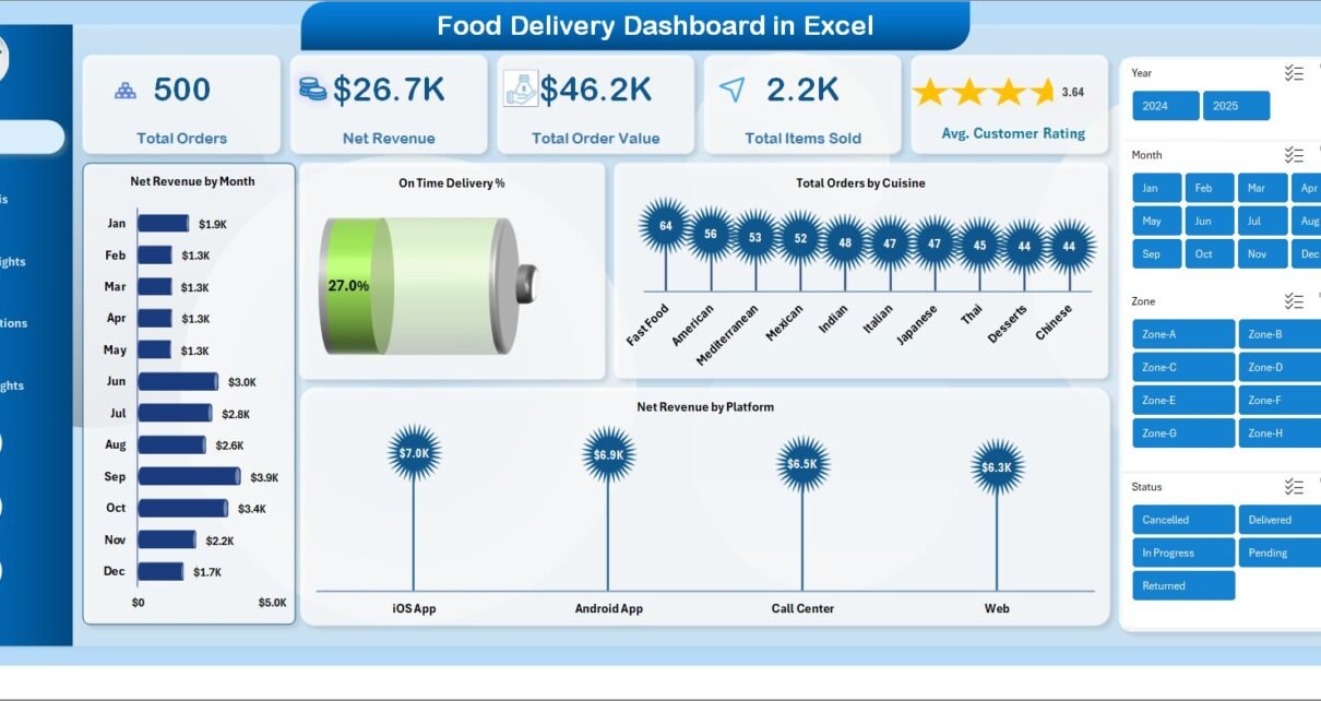
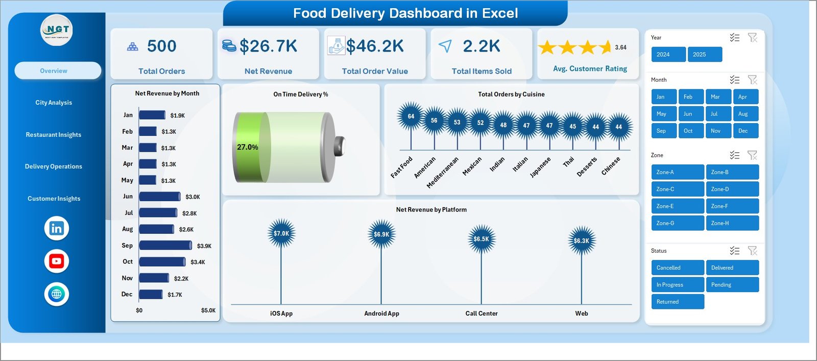
1 — Overview Page
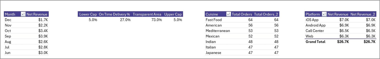
The Overview page is the executive summary tab. The top of the page displays five KPI cards giving you the high-level snapshot: Total Orders, Net Revenue, Total Order Value, Total Items Sold, and Average Customer Rating. Below the cards, four charts show the most-asked operational questions: Net Revenue by Month (a trend line for revenue seasonality), On-Time Delivery percentage (a gauge for delivery SLA performance), Total Orders by Cuisine (revenue mix by food category), and Net Revenue by Platform (Zomato vs Swiggy vs DoorDash vs your own app). Slicers at the top let you re-filter the entire page by Month, City, Cuisine, or Platform with a single click.
Overview Page
2 — City Analysis Page
The City Analysis page tells you where your money is being made and where deliveries are slipping. It includes four charts: Net Revenue by City (revenue concentration map), Total Order Value by Zone (zone-level GMV), Average Order Value by City (basket-size comparison across cities), and On-Time Delivery percentage by Zone (which zones have the worst rider performance). Aggregators running in 3+ cities use this page weekly to decide where to push promotions, which zones need additional rider supply, and which cities have a basket-size problem versus an order-volume problem.
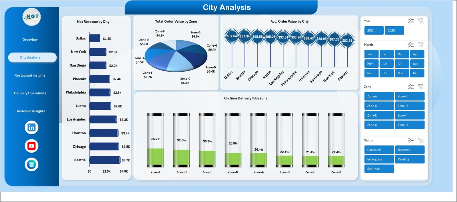
City Analysis
3 — Restaurant Insights Page
The Restaurant Insights page is where multi-restaurant aggregators identify their top earners and underperformers. Four charts break it down: Net Revenue by Restaurant (your revenue Pareto), Total Order Value by Cuisine (which cuisine categories drive GMV), Total Items Sold by Item Category (volume movers like beverages, desserts, mains), and Average Order Value by Cuisine (which cuisines have the best basket economics). For cloud-kitchen operators running multiple brands from one kitchen, this page surfaces which brand is actually pulling its weight on revenue per order — not just order count.
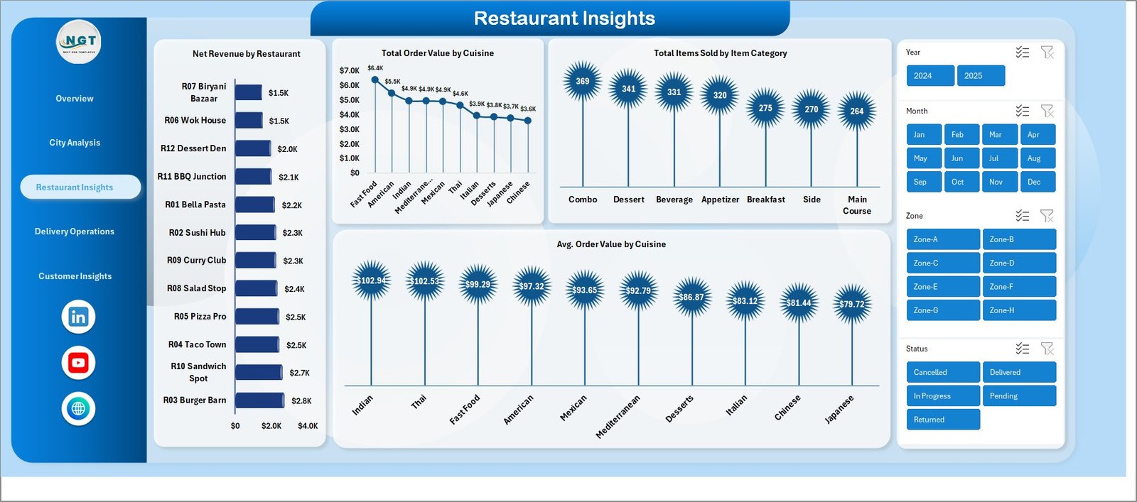
Restaurant Insights
4 — Delivery Operations Page
The Delivery Operations page is a fleet-management view for rider performance and order-status throughput. Four charts: Average Delivery Time by Rider (rider speed leaderboard), Total Orders by Status (Delivered, Cancelled, In-transit, Returned mix), Average Delivery Time by Zone (which zones add minutes to every order), and Total Tips by Rider (rider customer-satisfaction proxy). Operations managers use this page in Monday morning rider huddles — the slowest riders and the highest-cancellation zones jump out within seconds, making it easy to assign coaching priorities.
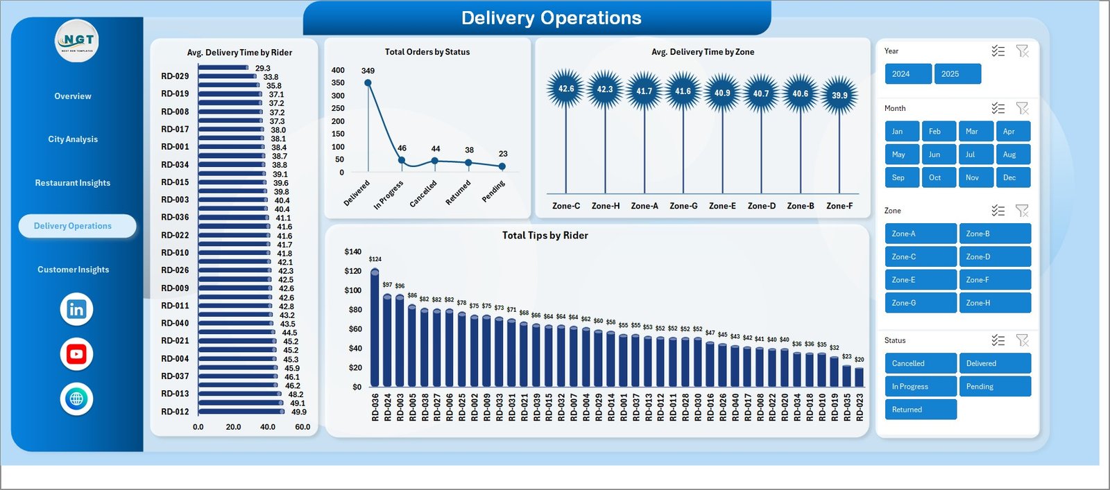
Delivery Operations
5 — Customer Insights Page
The Customer Insights page connects revenue to behaviour. Four charts: Net Revenue by Customer Segment (New vs Repeat vs VIP revenue mix), Total Orders by Payment Method (UPI, Card, COD, Wallet share), Total Discount by Promo Used (which promo codes are eating margin), and Cancellation Percentage by Customer Segment (which segments are unreliable). Marketing managers use the promo-discount chart specifically — it surfaces which promo codes are subsidising orders that would have come anyway versus which codes are actually driving incremental new-customer revenue.
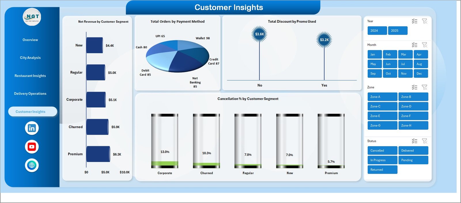
Customer Insights
6 — Data Sheet
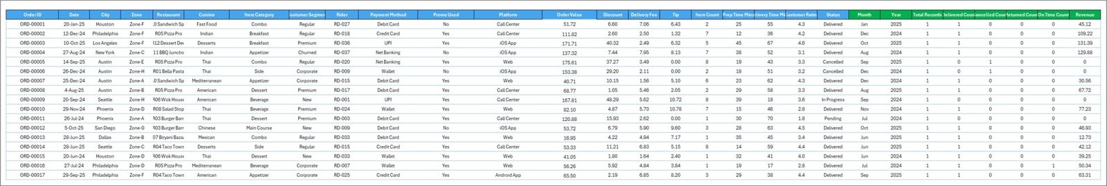
This is the single source of truth for the entire dashboard. Replace the sample order data with your own export — keep the column headers identical (Order ID, Date, City, Zone, Cuisine, Restaurant, Item Category, Items Sold, Order Value, Discount, Net Revenue, Platform, Payment Method, Customer Segment, Rider, Delivery Time, Status, Tip, Promo Used, Customer Rating). Once pasted, go to the Data tab in the ribbon and click Refresh All. Every chart, KPI card, and slicer on every page updates automatically.
Data Sheet
7 — Support Sheet
The Support sheet contains all the pivot tables that power the dashboard charts. You do not normally need to touch this sheet — after pasting new data and clicking Refresh All, every pivot in the Support sheet rebuilds itself and feeds the connected charts on the dashboard pages. You can hide this sheet for a cleaner experience: right-click the tab name and select Hide. Unhide it any time you need to inspect the underlying calculations.
Support Sheet
Food Delivery Dashboard in Excel vs. Google Sheets vs. Toast / Square POS — Feature Comparison
| Feature | Food Delivery Dashboard in Excel | Google Sheets Equivalent | Toast / Square / Lightspeed POS |
|---|---|---|---|
| One-time price | $17.99 | $9.99 | $69 – $399 / month |
| Recurring fees | None | None | $828 – $4,788 / year |
| Platform | Microsoft Excel (desktop + web) | Google Sheets (browser) | Cloud SaaS |
| Setup time | Under 10 minutes | Under 10 minutes | 2 – 6 weeks onboarding |
| Works offline | ✅ Yes | ❌ Internet required | ❌ Cloud only |
| Customisable KPIs / charts | ✅ Unlimited | ✅ Unlimited | ⚠️ Limited to POS fields |
| Slicer-based filtering | ✅ Native Excel slicers | ⚠️ Manual filter views | ✅ Built-in |
| Multi-platform aggregator data | ✅ One dataset, any source | ✅ Manual | ❌ Tied to single POS |
| Year-1 cost at 5 users | $17.99 total | $9.99 total | $4,140 – $23,940 |
For food delivery operators that want operational visibility without paying $4,000+ per year for a POS analytics module, the Food Delivery Dashboard in Excel sits in the sweet spot.
Who Should Use This Template
👉 Click here to Purchase the Food Delivery Dashboard in Excel
✅ Perfect for:
- Cloud kitchen owners running 1–10 brands from a single kitchen, tracking which brand and cuisine actually drives net revenue
- Food delivery aggregator operations managers reviewing rider performance, on-time delivery, and zone-level cancellation rates weekly
- Multi-restaurant chain owners (3–50 outlets) consolidating Zomato, Swiggy, DoorDash, and own-app orders into one weekly performance review
- F&B consultants who deliver monthly performance dashboards to restaurant clients without paying for a POS analytics subscription per client
❌ Not a fit if:
- You need real-time POS integration with automatic order syncing every 30 seconds
- You require enterprise-grade SOC 2 compliance, SSO, and role-based access controls for 100+ users
- You do not have Microsoft Excel — consider the Franchise Performance Dashboard in Google Sheets as a browser-based alternative
Real-World Use Cases
Aarav runs a 4-brand cloud kitchen in Bengaluru. Each brand sells on Zomato, Swiggy, and his own delivery app. Before this dashboard, his Saturday afternoons were spent in three browser tabs comparing CSV exports. Now he pastes a single combined export into the Data sheet on Sunday morning, hits Refresh All, and reviews the Restaurant Insights page in 15 minutes — instantly seeing that his “Healthy Bowls” brand has the highest average order value but his “Late Night Biryani” brand drives 3× more orders. He used the data to shut down a fourth underperforming brand last quarter, saving roughly $2,200 a month in cloud-kitchen rent.
Maria manages delivery operations for a 12-restaurant Italian chain in Madrid. She uses the Delivery Operations page every Monday morning during the rider huddle. The Average Delivery Time by Rider chart is projected onto the screen, and the bottom-three riders sit through a 10-minute coaching block. On-time delivery percentage rose from 78% to 89% within four months — and she switched off her old €99/month Zapier-based reporting workflow because the dashboard refreshed in 8 seconds versus 14 minutes.
Daniel is an F&B consultant in Toronto. He uses the Food Delivery Dashboard in Excel as a client deliverable — replacing the sample data with each client’s monthly export and re-skinning the colour scheme. Each client engagement that previously took him 12–14 hours of dashboard-building now takes under 3 hours of data-prep. He delivers more polished reports and bills the same hourly rate, effectively quadrupling his consulting margin.
Advantages of Food Delivery Dashboard in Excel
The biggest win is the one-time $17.99 price tag versus $828–$4,788 in annual SaaS fees for comparable POS analytics. You own the file forever and can copy it, modify it, share it with your accountant, or rebrand it for client reporting without licence restrictions.
The dashboard’s native pivot table architecture means it scales — pasting 50,000 rows of order data refreshes in under 4 seconds on a standard laptop. There is no formula recalculation chain that bogs down with volume; pivot tables are designed for exactly this kind of operational reporting.
Because there are no macros, no VBA, and no add-ins, the file works identically on Excel for Mac, Excel for Windows, and Excel for the Web through OneDrive. You can paste data on a Mac and review the dashboard on an iPad through Excel Online — the same cross-platform parity that paid SaaS tools advertise but at zero recurring cost. For a similar slicer-driven dashboard in a different food-service context, see the Restaurant P and L Dashboard in Power BI.
Opportunities for Improvement
The dashboard does not include automated data import from delivery platforms — Zomato, Swiggy, DoorDash, and Uber Eats each have their own API and CSV export schemas. Operators currently paste consolidated CSV exports manually. Advanced users can connect the Data sheet to a folder of CSV exports through Power Query for semi-automated refresh.
The template does not include rider GPS tracking, customer chat logs, or live order-status feeds — those require a real-time POS or aggregator API integration. The dashboard is designed for operational reporting (daily, weekly, monthly review) rather than live operations control.
For chains operating in 5+ countries with multi-currency reporting, currency conversion is not built in. Either run the dashboard once per currency or add a simple lookup table for currency conversion in the Data sheet.
Best Practices
Refresh weekly, not daily. Operational dashboards become noisy with daily refreshes. Pick a day (Monday morning works for most operators) and review the previous week’s data. The trend lines tell a clearer story over 7-day windows than over 1-day windows.
Use slicers actively. The dashboard’s value compounds when you filter — start by viewing all data, then slice by City to see if one city is dragging the chain down, then by Cuisine to see if one menu category is at fault. Most operators only use the dashboard at the unfiltered level and miss 70% of the insight.
Run the Cancellation by Segment chart monthly. Customer segments with cancellation rates above 8% are a leading indicator of churn. Use the Customer Insights page to identify high-cancellation segments early and target them with retention promo codes before they stop ordering altogether.
Back up your file monthly. Save dated copies (FoodDelivery_2026_05.xlsx) to OneDrive or Google Drive. Historical snapshots let you build year-over-year comparisons later — something a SaaS dashboard cannot easily replicate without a paid analytics tier. Microsoft has a helpful Excel knowledge base if you need refreshers on Refresh All, slicers, or pivot table connections.
Explore Relevant Templates
📌 Food Delivery KPI Scorecard in Excel — Track food delivery KPIs with structured MTD/YTD analysis, Actual vs Target indicators, and trend charts.
📌 Restaurant P and L Dashboard in Power BI — Multi-restaurant P&L analytics with revenue, food cost, labour cost, and net profit visualisations.
📌 Catering Services KPI Dashboard in Excel — KPI dashboard for catering operations with event-level revenue and cost tracking.
📌 Restaurants & Food Services KPI Dashboard in Power BI — Power BI version with the same operational structure for food-service multi-location chains.
📌 Food and Beverage Report in Excel — Lightweight reporting template for single-restaurant F&B managers tracking sales and cost mix.
Frequently Asked Questions
👉 Click here to Purchase the Food Delivery Dashboard in Excel
What KPIs does the Food Delivery Dashboard in Excel track?
The Food Delivery Dashboard in Excel tracks 18+ KPIs including Total Orders, Net Revenue, Total Order Value, Items Sold, Average Customer Rating, On-Time Delivery percentage, Average Delivery Time by Rider, Total Tips by Rider, Cancellation percentage by Customer Segment, and Total Discount by Promo Used — across 5 interactive dashboard pages.
How long does it take to set up the Food Delivery Dashboard?
Setup takes under 10 minutes. Open the Excel file, paste your order export into the Data sheet keeping the column headers identical, and click Refresh All in the Data ribbon. Every chart, KPI card, and slicer on all 5 dashboard pages updates automatically with no formula edits required.
Does the Food Delivery Dashboard in Excel work with Zomato, Swiggy, and DoorDash data?
Yes. The Data sheet accepts a consolidated order export from any food delivery platform — Zomato, Swiggy, DoorDash, Uber Eats, Grubhub, or your own delivery app. Map your platform’s columns to the dashboard’s column headers once, and every subsequent refresh works the same way.
How does this Excel dashboard compare to Toast or Square for Restaurants?
Toast and Square cost $69–$399 per month with $828–$4,788 in annual fees. The Food Delivery Dashboard in Excel costs $17.99 one-time, works offline, and provides operational reporting across orders, riders, restaurants, cities, and customer segments without recurring SaaS fees or vendor lock-in.
Does this template work on Mac and Excel for the Web?
Yes. The Food Delivery Dashboard in Excel uses native pivot tables and slicers — no VBA, no macros, no add-ins. It works on Excel for Mac (2016 and later), Excel for Windows, and Excel for the Web through OneDrive or SharePoint with full feature parity.
Can I add new cities, cuisines, or platforms to the dashboard?
Yes. The dashboard is dimension-agnostic — adding a new city, cuisine, restaurant, rider, or platform is simply a matter of adding rows to the Data sheet. Refresh All rebuilds every pivot table, and the new dimension automatically appears in every relevant slicer and chart.
Is there a Google Sheets or Power BI version of this dashboard?
For a cloud-based alternative, the Franchise Performance Dashboard in Google Sheets covers similar multi-location food-service analytics. For Power BI, the Restaurants & Food Services KPI Dashboard in Power BI offers a comparable structure with DAX-driven measures.
About the Author
Built by PK — Microsoft Certified Professional with 15+ years of Excel, Google Sheets, and Power BI experience. Founder of NextGenTemplates, reaching 300K+ subscribers across YouTube channels (@PK-AnExcelExpert, @NextGenTemplates). Every template is hand-built and tested before release.
Conclusion
The Food Delivery Dashboard in Excel turns scattered order exports from Zomato, Swiggy, DoorDash, Uber Eats, and your own delivery app into a single 5-page interactive workbook with slicers, pivot tables, and KPI cards covering every part of the food-delivery operational stack — orders, riders, restaurants, cities, and customers. At a one-time $17.99, it replaces $4,000+/year POS analytics modules without sacrificing depth, customisation, or speed.
👉 Click here to Purchase the Food Delivery Dashboard in Excel
✅ Instant download · One-time payment · No subscription · Lifetime access
🎥 Visit our YouTube channel for step-by-step video tutorials: Youtube.com/@PK-AnExcelExpert
📅 Last updated: May 2026