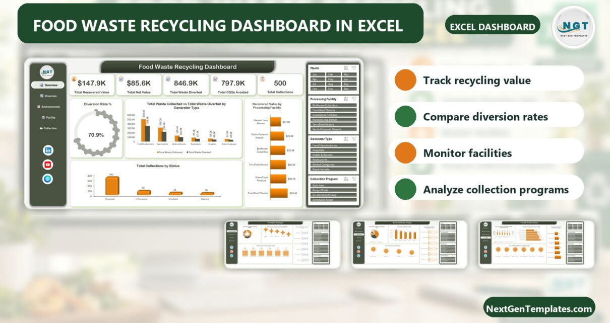
Food waste reporting becomes difficult when value, diversion, emissions, facilities, and collection programs live in separate files. The Food Waste Recycling Dashboard in Excel brings those perspectives into five connected pages. Its sample overview summarizes $147.9K recovered value, $85.6K net value, 846.9K waste diverted, 797.9K CO2e avoided, 500 collections, and a 70.9% diversion rate. Those figures are demonstration data, not promised results. The value of the template is the reporting structure: a food waste recycling Excel dashboard that helps teams review the data they enter, compare facilities, and discuss diversion performance in one familiar Microsoft Excel workbook.
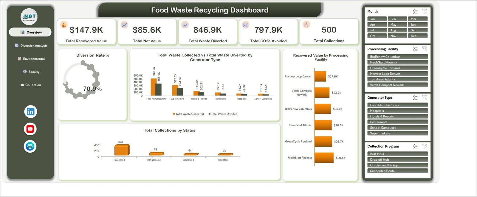
Overview page with key totals, diversion rate, facility value, collection status, and slicers.
Key Features of Food Waste Recycling Dashboard in Excel
The workbook is built around five reporting questions: what happened overall, where waste was diverted, what environmental indicators show, how facilities compare, and how collection programs perform.
- Five dashboard pages for overview, diversion, environmental impact, facility performance, and collection programs.
- Headline cards for recovered value, net value, waste diverted, CO2e avoided, and collection count.
- Month, processing facility, generator type, and collection program slicers on relevant pages.
- Views for recycling methods, generator types, regions, facilities, certifications, and program mix.
- Editable Excel format supported by a customer user manual.
The workbook is a reporting template. It does not claim live integrations, route optimization, automated compliance submission, or certified carbon accounting.
Dashboard Pages Explanation
1. Overview
The overview is designed for a fast monthly read. Five KPI cards sit above charts for diversion rate, collected versus diverted waste by generator type, recovered value by processing facility, and collections by status. A sustainability manager can use it to frame a meeting before opening the detailed pages.
2. Diversion Analysis
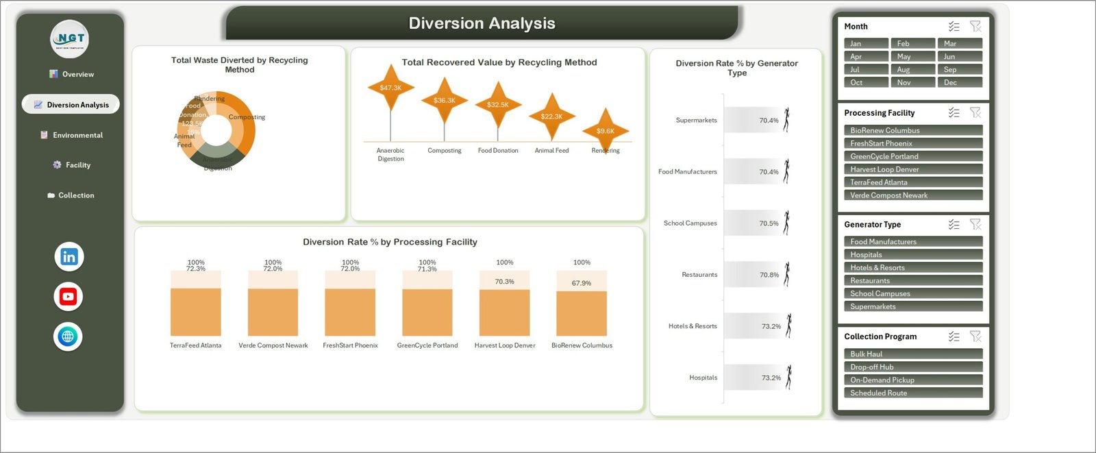
Diversion Analysis compares methods, recovered value, generator types, and facilities.
This page compares total waste diverted and recovered value across anaerobic digestion, composting, food donation, animal feed, and rendering. It also displays diversion rates by generator type and processing facility. The page makes the food diversion dashboard useful for conversations about channel mix rather than a single top-line percentage.
3. Environmental Impact
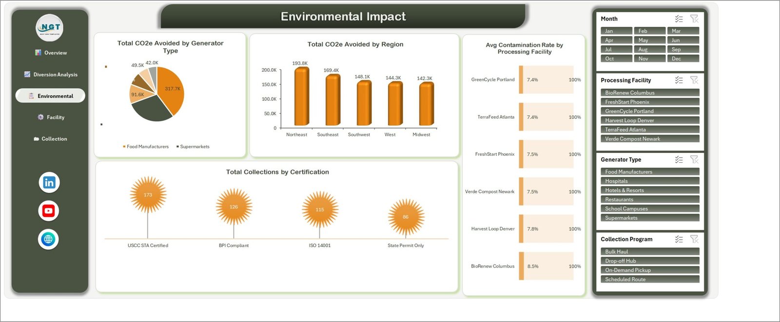
Environmental indicators are separated by generator, region, facility, and certification.
The environmental page presents CO2e avoided by generator type and region, average contamination rate by facility, and collections by certification. These visuals can support internal analysis, but teams should use their approved methodologies and source systems for audited or statutory environmental claims.
4. Facility Performance
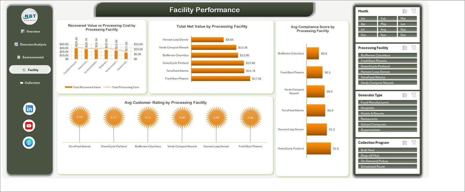
Facility Performance compares value, cost, net value, compliance score, and rating.
The food waste management dashboard compares recovered value with processing cost, total net value, average compliance score, and average customer rating for the sample facilities. This separation helps users distinguish financial recovery from service and compliance indicators.
5. Collection Programs
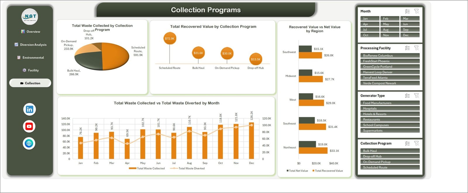
Program and regional views complement the monthly collected-versus-diverted trend.
The collection page compares scheduled routes, bulk haul, on-demand pickup, and drop-off hubs. It also shows regional recovered versus net value and a month-by-month collected versus diverted trend.
Food Waste Recycling Dashboard in Excel vs. Google Sheets vs. Paid Waste SaaS – Feature Comparison
| Feature | Excel dashboard | Google Sheets alternative | Paid waste SaaS |
|---|---|---|---|
| Commercial model | One-time template | Template or custom build | Recurring subscription |
| Primary platform | Microsoft Excel | Web browser | Vendor platform |
| Setup | Map and replace sample data | Copy and configure | Onboarding project |
| Live collaboration | Depends on Microsoft 365 setup | Native | Usually included |
| Offline work | Supported by desktop Excel | Limited | Varies |
| Five-page analysis | Included | Depends on template | Configurable |
| Route execution | Not included | Not included by default | May be included |
Microsoft explains how slicers filter data in Excel. That familiar interaction is one reason an Excel reporting layer can work well for teams already using desktop spreadsheets.
Who Should Use This Template
The template can fit composting and anaerobic digestion operators, food donation networks, supermarket and hospitality sustainability teams, food manufacturers, school or hospital facilities teams, and consultants who receive structured collection records. The buyer should be comfortable validating source data in Excel. Teams that need live dispatch, customer accounts, sensor feeds, formal chain-of-custody controls, or regulated submissions should use dedicated systems instead of treating a spreadsheet as an operational platform.
Real-World Use Cases
Monthly sustainability review
Maya prepares the overview and environmental pages for a leadership discussion, then traces questions back to the validated source records.
Facility comparison
Daniel reviews value, cost, net value, contamination, compliance, and rating patterns across facilities before choosing where to investigate.
Collection program planning
Priya compares scheduled routes, bulk haul, on-demand pickup, and drop-off hubs, then shares observations with operations staff. The dashboard supports analysis; it does not optimize routes.
Advantages of Food Waste Recycling Dashboard in Excel
The strongest advantage is focus. The workbook keeps the central recycling questions visible without asking users to learn a new SaaS platform. It combines financial, diversion, environmental, facility, and program views; supports familiar Excel filtering; and can be edited on a working copy. The one-time price also makes the template easier to evaluate than a multi-user subscription.
A shared vocabulary for reviews
Putting recovered value, net value, diverted volume, avoided emissions, collection status, contamination, and program mix in one workbook gives meetings a consistent vocabulary. Instead of presenting isolated charts, an analyst can start at the overview and move to a more specific page when someone asks what drove a result. This is especially useful when finance, operations, and sustainability teams need to discuss the same reporting period from different perspectives.
Detail without an overloaded landing page
The overview does not try to carry every chart. Diversion, environmental, facility, and collection questions have their own pages. That structure keeps the opening view readable while preserving enough detail for follow-up analysis. It also makes screenshots easier to use in internal presentations, provided the figures have been checked and the reporting period is labelled clearly.
Opportunities for Improvement
No template fits every operation. Buyers may need to adapt field mappings, units, facility names, certification labels, regional groupings, or visual thresholds. Automatic data connections, role permissions, route optimization, mobile data collection, audit trails, and formal emissions methodologies are outside the verified product scope. Any customization should be tested against a protected original file.
Best Practices
- Keep an untouched copy of the download.
- Read the user manual before replacing sample data.
- Standardize units, dates, facility names, and categories in the source records.
- Reconcile collection counts and financial totals before refreshing management views.
- Test each slicer and page after importing data.
- Document your CO2e and diversion calculation methods separately.
- Label draft, reviewed, and approved reporting versions clearly.
Separate source quality from dashboard design
A polished chart cannot repair inconsistent source records. Decide how to treat rejected collections, partial weights, duplicate pickups, mixed units, missing facility names, and late corrections before importing data. Keep those rules in a short data dictionary so month-to-month comparisons remain meaningful.
Use the dashboard as a review layer
For each reporting cycle, reconcile the headline totals to the source extract, inspect unusual changes at facility and program level, and have an accountable reviewer sign off the final version. If a figure will be used externally, confirm that its methodology and evidence meet the applicable organizational or regulatory standard.
Explore Relevant Templates
For another recycling workflow, read about the E-waste Recycling Dashboard in Excel. Teams comparing infrastructure can explore the Recycling Infrastructure Dashboard in Excel. For a wider sustainability reporting perspective, see the ESG Reporting Dashboard in Excel.
Frequently Asked Questions
What files are included?
The customer ZIP contains the Excel workbook and the Excel Dashboard user manual.
How many dashboard pages are included?
Five: Overview, Diversion Analysis, Environmental Impact, Facility Performance, and Collection Programs.
Which filters are visible?
The dashboard screenshots show month, processing facility, generator type, and collection program slicers on relevant pages.
Can it track composting and food donation?
The sample Diversion Analysis page includes composting, food donation, anaerobic digestion, animal feed, and rendering categories. Buyers should map their own approved categories carefully.
Does the workbook automate regulatory reporting?
No. It is an analysis and presentation template, not a regulatory filing system.
Does it include live system integrations?
No automatic integration is claimed. Prepare source data in the structure expected by the workbook.
Where can I download it?
Get the Food Waste Recycling Dashboard in Excel from NextGenTemplates.
About the Author
Built by PK – Microsoft Certified Professional with 15+ years of Excel, Google Sheets, and Power BI experience. Founder of NextGenTemplates, reaching 300K+ subscribers across YouTube channels. Every template is hand-built and tested before release.
Conclusion
The Excel recycling dashboard template provides a practical five-page reporting structure for teams that already collect food-recovery data. It will not replace operational or compliance software, but it can make monthly analysis clearer and more consistent. Review the screenshots, confirm the scope, and download the Food Waste Recycling Dashboard in Excel when it matches your workflow. For more Excel tutorials, visit PK: An Excel Expert on YouTube.