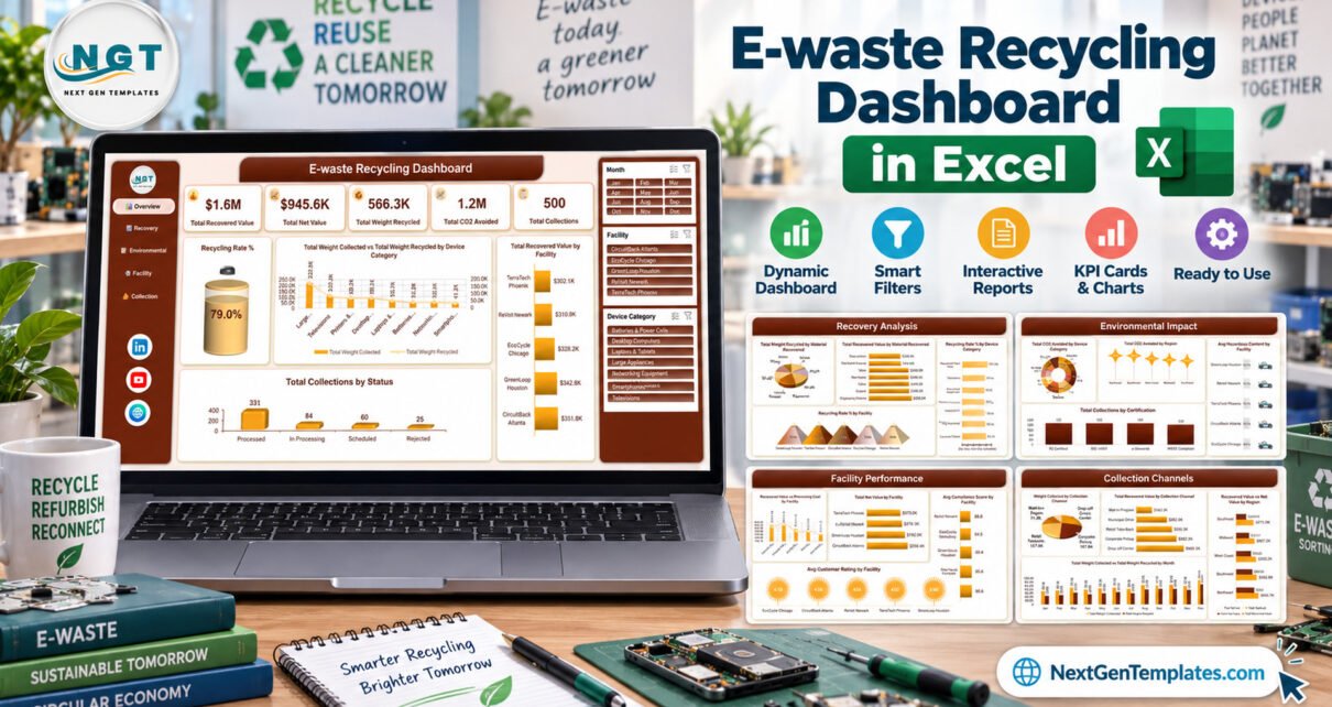
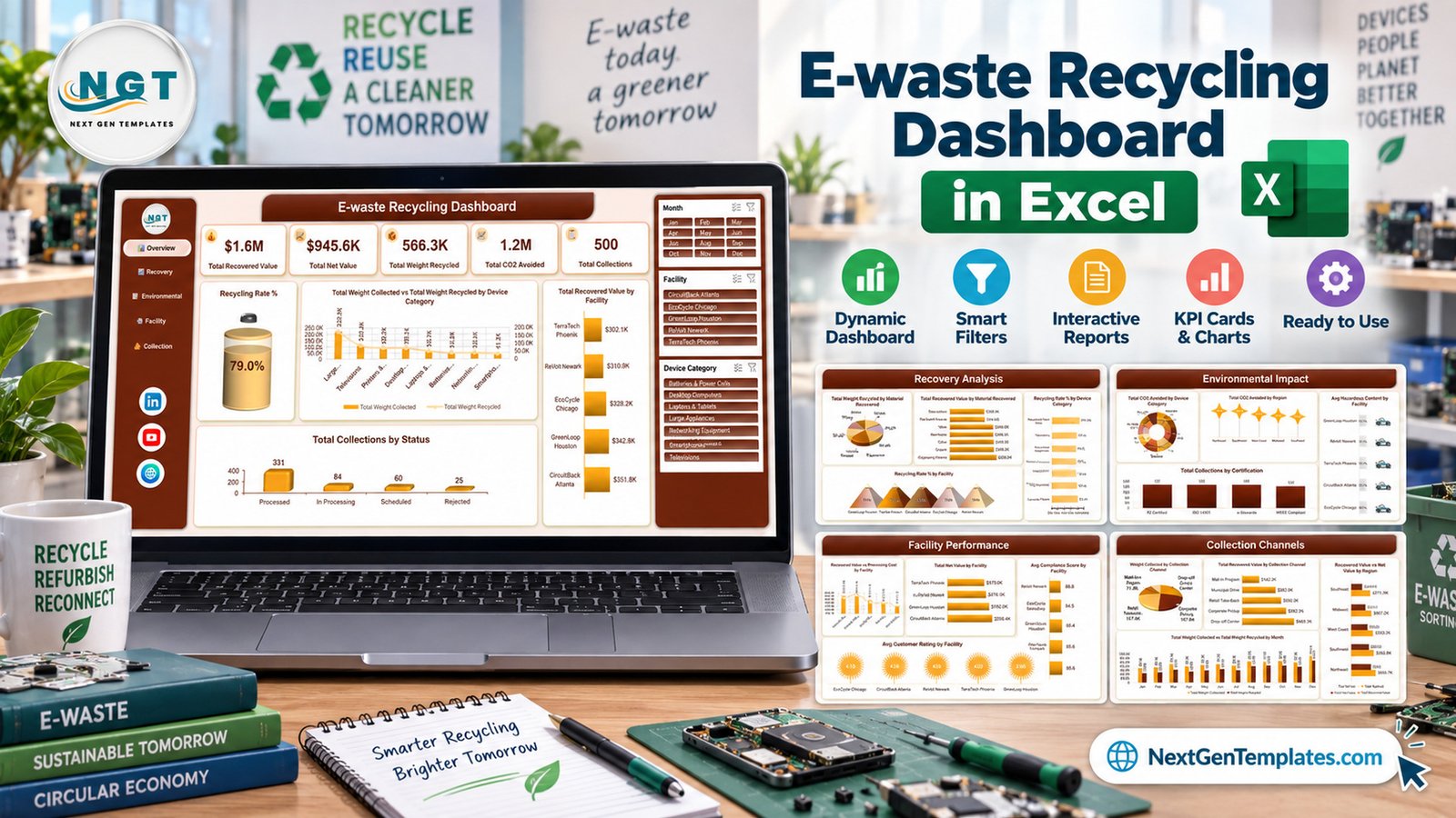
The E-waste Recycling Dashboard in Excel is a seven-tab workbook that turns a flat collection log into five slicer-driven report pages. It ships with 500 demo records spread across 20 data columns, drives 20 charts and 5 KPI cards, and gives you three slicers — Month, Facility and Device Category — that filter every page at once. There are no macros anywhere in the file.
Electronic waste is one of the fastest-growing waste streams in the world, and most small recyclers, ITAD firms and corporate IT teams still track it in a spreadsheet that nobody can chart. This template is that spreadsheet, already charted. Before going further, one thing needs saying plainly: this is a reporting template over data you type or paste in. It is not a compliance system, not a certificate, and not proof of anything.
What This Template Does Not Do
This section comes first on purpose, because e-waste is a regulated trade and the wrong assumption here is expensive. The E-waste Recycling Dashboard in Excel does not:
- Establish compliance with the WEEE Directive, the Basel Convention, RoHS, R2 or e-Stewards certification, EPA or state e-waste rules, or any hazardous-waste, transboundary-shipment or extended-producer-responsibility regime.
- Constitute a waste transfer note, consignment note, certificate of destruction, data-destruction certificate, chain-of-custody record or recycling certificate. It has no legal standing of any kind.
- Verify downstream processing, actual recovery rates, or whether any material was genuinely recycled rather than landfilled or exported.
- Measure or verify emissions, diversion or carbon savings. Every tonnage, recovery-rate and CO2-equivalent figure in the file is buyer-entered demo data, not a calculation the workbook performs from physical evidence.
Where the workbook shows a certification KPI, treat it as a place to record what a certified processor has confirmed to you — never as the evidence itself.
Key Features of the E-waste Recycling Dashboard in Excel
- Seven tabs. Overview, Recovery Analysis, Environmental Impact, Facility Performance, Collection Channels, Data and Support.
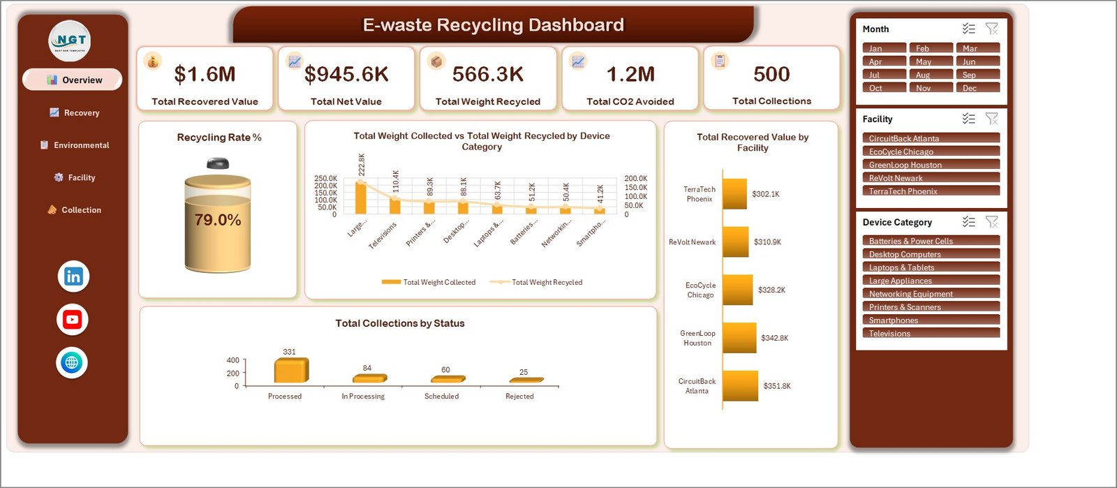
- Five KPI cards. Total Recovered Value, Total Net Value, Total Weight Recycled, Total CO2 Avoided and Total Collections. On the shipped demo data they read $1.6M, $945.6K, 566.3K, 1.2M and 500.
- Twenty charts, four per page. Chart naming follows a plain {Metric} by {Category} pattern throughout.
- Three slicers. Month (Jan to Dec), Facility (5 sites) and Device Category (8 categories).
- One pivot cache. Every visual reads from the same Data sheet, so there is no second copy of your numbers drifting out of sync.
- No macros. Pivot tables, pivot charts and slicers only. Excel 2016 and later, Mac, and Microsoft 365.
Dashboard Pages Explanation
Page 1: Overview
The five KPI cards sit across the top, with a Recycling Rate % gauge reading 79.0% on the demo data. Three charts follow: Total Weight Collected vs Total Weight Recycled by Device Category, Total Recovered Value by Facility, and Total Collections by Status (Processed 331, In Processing 84, Scheduled 60, Rejected 25).
Page 2: Recovery Analysis
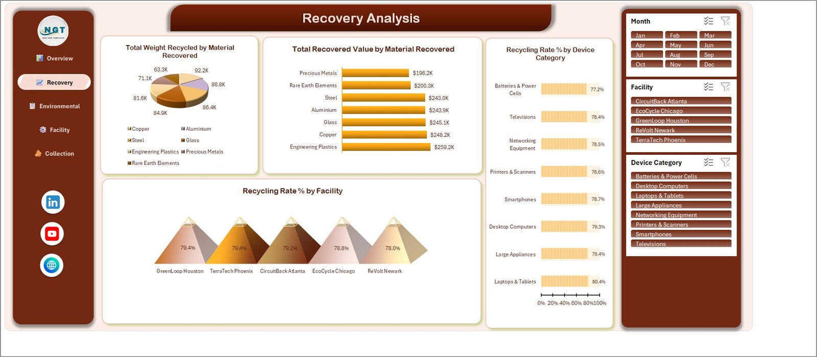
Total Weight Recycled by Material Recovered covers seven materials — Copper, Aluminium, Steel, Glass, Engineering Plastics, Precious Metals and Rare Earth Elements. Alongside it sit Total Recovered Value by Material Recovered, Recycling Rate % by Device Category and Recycling Rate % by Facility.
Page 3: Environmental Impact
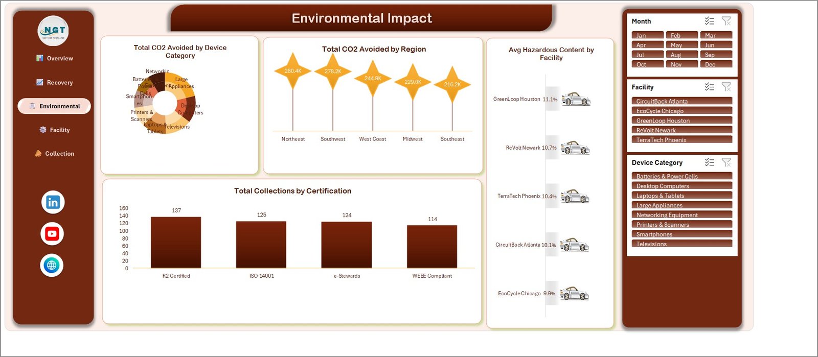
Total CO2 Avoided by Device Category, Total CO2 Avoided by Region, Avg Hazardous Content by Facility and Total Collections by Certification. That last chart counts how many of your own records you have tagged R2 Certified, ISO 14001, e-Stewards or WEEE Compliant. It is a log of what your processor told you, nothing more.
Page 4: Facility Performance
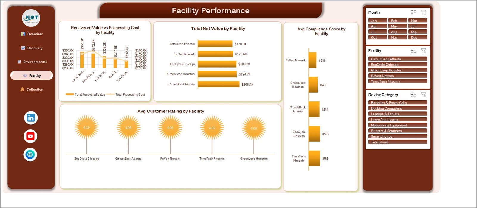
Recovered Value vs Processing Cost by Facility, Total Net Value by Facility, Avg Compliance Score by Facility and Avg Customer Rating by Facility. This is the page a multi-site operator will live on.
Page 5: Collection Channels
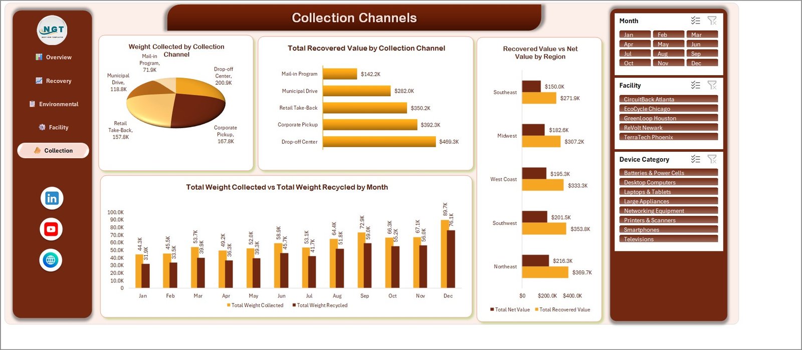
Weight Collected by Collection Channel across Drop-off Center, Corporate Pickup, Retail Take-Back, Municipal Drive and Mail-in Program; Total Recovered Value by Collection Channel; Recovered Value vs Net Value by Region; and Total Weight Collected vs Total Weight Recycled by Month for all twelve months.
Data sheet and Support sheet
The Data sheet holds 500 demo rows across 20 columns: Record ID, Date, Facility, Device Category, Collection Channel, Weight Collected Kg, Weight Recycled Kg, Residual Waste Kg, Material Rate Per Kg, Recovered Material Value, Processing Cost, Net Value, CO2 Avoided Kg, Hazardous Content Percentage, Compliance Score, Customer Rating, Material Recovered, Certification, Region and Status. Helper columns for Month, Year and the four status counts sit to the right. The Support sheet carries contact and licence information.
Do the Demo Numbers Reconcile?
We checked, because dashboards of this kind often do not. Every cross-page total in the shipped sample data ties out:
- The seven material weights on page 2 add to 566.3K — the Total Weight Recycled card on page 1.
- The seven material values add to roughly $1,635.9K, and the five facility bars to $1,635.8K — both round to the $1.6M Total Recovered Value card.
- The five facility net-value bars on page 4 add to $945.6K — the Total Net Value card exactly.
- Status counts (331 + 84 + 60 + 25) and certification counts (137 + 125 + 124 + 114) each add to 500 — the Total Collections card.
- The five regional CO2 figures add to 1,248.7K, which rounds to the 1.2M card.
- Monthly collected weight totals 717.1K and monthly recycled 566.4K. 566.3 divided by 717.2 is 78.96% — the 79.0% gauge on page 1.
E-waste Recycling Dashboard in Excel vs. a Google Sheets Build vs. Paid EHS/ESG Software
| Feature | This Excel Template | Google Sheets build | Paid EHS/ESG software |
|---|---|---|---|
| Cost | $17.99 one-time | Free tool, your build time | $300–$1,500 / month |
| Platform | Microsoft Excel, offline | Browser, Google account | Vendor cloud |
| Setup time | Under 10 minutes ✅ | Days to build from scratch | Weeks of implementation |
| Real-time team collaboration | Via OneDrive / SharePoint | Native ✅ | Native ✅ |
| Works with no internet | Yes ✅ | No | No |
| Customisable fields and charts | Fully ✅ | Fully | Vendor-defined |
| Verified chain of custody | No — you record it | No | Often included ✅ |
| Audited regulatory reporting | No — you record it | No | Yes ✅ |
| Year-1 cost at 5 users | $17.99 ✅ | $0 plus build time | $3,600–$18,000 |
For a recycler or ITAD team that wants its own collection log charted this week without a $300-a-month platform, this template sits in the sweet spot — provided the audited, verified parts stay with your certified processor and your regulator.
Who Should Use This Template
Perfect for:
- Small and mid-sized e-waste recyclers and ITAD firms running a handful of collection sites
- Facilities and sustainability managers who already keep the collection log in a spreadsheet
- Corporate IT teams reporting internally on retired device volumes and recovered value
- Consultants, trainers and students who want a realistic recycling reporting model to adapt
Not a fit if:
- You need a document with legal standing — a consignment note, certificate of destruction or data-destruction certificate
- You need audited WEEE, Basel, RoHS, R2, e-Stewards or EPA reporting
- You need weighbridge, scale or ERP integration; entry here is manual
- You want verified downstream proof that material was recycled
Real-World Use Cases
Marcus runs collections for a five-site electronics recycler. Each month he pastes the weighbridge export into the Data sheet and uses the Facility slicer to show every site manager their own recovered value against processing cost, instead of mailing out five different spreadsheets.
Priya is a sustainability analyst at a mid-sized bank. Each quarter she logs which retired laptops and networking equipment went to which processor, tags the certification her vendor declared, and lifts the Environmental Impact page into her internal report — with a footnote that the CO2 numbers are vendor-supplied estimates rather than measurements.
Dan teaches an operations-analytics module. He hands students the workbook as a worked example of a pivot-driven Excel dashboard and asks them to find where the demo data reconciles across pages, and where a chart label has been placed badly.
Advantages of the E-waste Recycling Dashboard in Excel
- It is a one-time purchase. Five users for a year costs $17.99, against $3,600 or more for the cheapest comparable EHS platform.
- It runs offline. A weighbridge office with poor connectivity can still update it.
- It is honest about what it is. The workbook charts your log. It never dresses that up as verification.
- It is fully editable. Every chart, colour and column is yours to change — no vendor-defined fields.
- One data sheet. Twenty columns in one flat table, which is the shape most collection logs already have.
Opportunities for Improvement
Two cosmetic defects ship with the current build and we would rather name them than let you find them:
- On the Environmental Impact page, the donut chart’s category labels overlap each other and the ring, and “Networking Equipment” is clipped to “Networkin”.
- On the Facility Performance page, the secondary value-axis labels on the Recovered Value vs Processing Cost chart are crowded into each other, and the facility names on its category axis are truncated.
Category names are also truncated on the page 1 device-category chart. Both are chart-layout issues, easily fixed by widening the plot area or rotating the labels; the underlying numbers are correct and reconcile across pages. Beyond that, the file has no weighbridge or ERP connector, no multi-year comparison page, and no user-level permissions.
Best Practices
- Keep your list values spelled consistently. Facility, Device Category, Collection Channel, Material Recovered, Certification, Region and Status all drive slicers and chart categories; one stray spelling creates a phantom category.
- Record the certification your processor declares, and keep the actual certificate somewhere auditable outside the workbook.
- Refresh with Ctrl+Alt+F5 after every paste, so all pivots update together.
- Label any CO2 figure you publish as an estimate and state where it came from.
- Keep one row per collection event rather than aggregating by month; the monthly view is built for you already.
Explore Relevant Templates
- Recycling Infrastructure Dashboard in Excel — the closest sibling, built around recycling plants and capital projects.
- Recycling Infrastructure Dashboard in Power BI — the Power BI route to the same subject.
- ESG Environmental Dashboard in Excel — broader environmental reporting across emissions, energy and waste.
- Green Building Certification Dashboard in Excel — a certification-tracking dashboard with the same reporting-only caveats.
- Scrap Record Data Entry System in Excel — if you need a form-driven entry tool rather than a dashboard.
Also available as: a Waste Reduction KPI Dashboard in Google Sheets for teams that live in Google Sheets. Note that the KPI Dashboard and KPI Scorecard lines are different template families from this analytical dashboard — they are built around a month picker and traffic-light scoring, not five slicer-driven report pages.
Frequently Asked Questions
Does the E-waste Recycling Dashboard in Excel make our e-waste handling compliant, or certify destruction?
No. It is a reporting template over numbers you enter. It creates no compliance with WEEE, Basel, RoHS, R2, e-Stewards or EPA rules, and it is not a certificate of destruction, data-destruction certificate or chain-of-custody record. Those come from a certified processor and your regulator.
Are the tonnages, recovery rates and CO2 figures real?
No. Every figure in the screenshots is demo data shipped with the file. The workbook charts what you type; it does not weigh anything, verify a recovery rate, or calculate carbon savings from physical evidence.
What does the certification chart actually show?
It counts how many of your own collection records you tagged R2 Certified, ISO 14001, e-Stewards or WEEE Compliant. It records what a certified processor confirmed to you. It is never the evidence itself.
How long does setup take?
Under ten minutes if your data is already in one flat table. Paste into the 20 columns on the Data sheet, refresh the pivots, and all five pages update. Consolidating several site spreadsheets first will take longer.
How does this compare to paid EHS or ESG software?
Paid platforms cost $300 to $1,500 a month and give you audited reporting and verified chain of custody. This template costs $17.99 once and gives you charts over your own log. They solve different problems; many teams run both.
Which Excel versions does it work with?
Excel 2016 and later on Windows and Mac, plus Microsoft 365. It uses pivot tables, pivot charts and slicers, with no macros, so there is nothing to enable. Excel for the web renders the pages but slicer behaviour is limited.
Is this the Excel edition or the KPI Dashboard edition?
This is the Excel analytical dashboard edition — five slicer-driven report pages in a .xlsx workbook. The near-identically-named KPI Dashboard and KPI Scorecard lines are separate templates with a different structure. Check the product title before buying.
About the Author
Built by PK — Microsoft Certified Professional with 15+ years of Excel, Google Sheets and Power BI experience. Founder of NextGenTemplates, reaching 300K+ subscribers across YouTube channels. Every template is hand-built and tested before release.
Conclusion
If you already keep an e-waste collection log and simply need it charted, the E-waste Recycling Dashboard in Excel does that in under ten minutes and costs less than one month of any comparable platform. Just keep the boundary clear in your own reporting: it charts what you record, and the verification, certification and legal paperwork stay with your certified processor and your regulator.
🔗 Click here to purchase the E-waste Recycling Dashboard in Excel
✅ Instant download · One-time payment · No subscription
🎥 More tutorials: YouTube.com/@PK-AnExcelExpert
Last updated: September 2026