Managing healthcare costs effectively is one of the most critical challenges for hospitals, clinics, and health organizations today. To achieve financial stability while maintaining quality care, healthcare providers must monitor performance metrics consistently. That’s exactly where the Healthcare Cost Efficiency KPI Dashboard in Excel comes in handy.
In this detailed article, we’ll explore everything you need to know about this powerful dashboard. From what it is and how it works, to the benefits and best practices, we’ll walk you through it all in a clear, engaging, and beginner-friendly way.
Click to Purchases Healthcare Cost Efficiency KPI Dashboard in Excel
What Is a Healthcare Cost Efficiency KPI Dashboard in Excel?
A Healthcare Cost Efficiency KPI Dashboard is an Excel-based template designed to monitor and analyze key cost-related performance indicators in a healthcare setting. These KPIs help identify overspending, track budget usage, monitor financial targets, and ensure cost-effectiveness in daily operations.
With this dashboard, you no longer need to guess where your money is going or struggle with disorganized data. Everything is automated, visual, and interactive—all in Excel!
Why You Need a Cost Efficiency Dashboard in Healthcare
Healthcare costs continue to rise due to medical inflation, technology upgrades, and administrative expenses. Having a centralized system to track key financial KPIs helps organizations:
-
Detect inefficiencies early
-
Compare current performance with targets and previous years
-
Reduce unnecessary expenses
-
Improve decision-making based on real data
And the best part? You can do it all with Excel, which is accessible, customizable, and widely used.
🧩 Key Components of the Dashboard Template
This powerful Excel dashboard comes with 7 smartly designed worksheet tabs, each serving a specific purpose:
📌 1. Home Sheet (Navigation Panel)
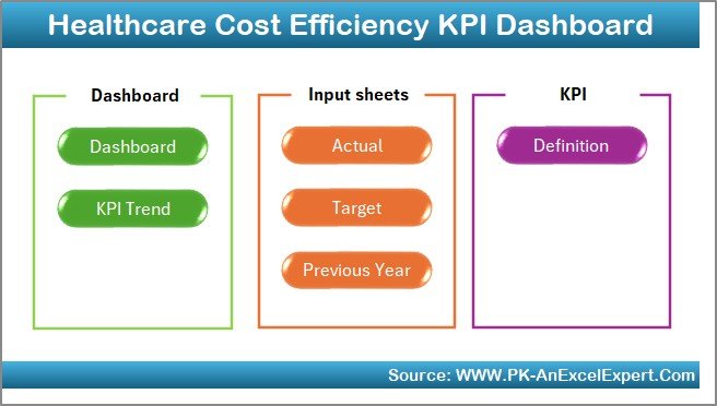
This is the control center of your dashboard. It contains six clickable buttons that allow you to quickly navigate to the relevant worksheet. No more scrolling endlessly—jump to any section instantly!
📊 2. Dashboard Sheet (Main Dashboard View)
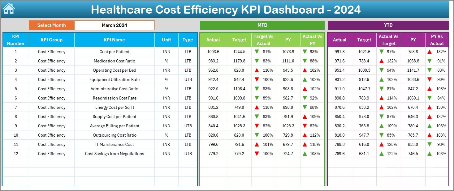
This is where the real magic happens. It allows you to:
-
Select any month from a drop-down in cell D3
-
View MTD (Month-To-Date) and YTD (Year-To-Date) KPIs
-
Compare data with Target and Previous Year (PY)
-
Instantly see performance using conditional formatting arrows (up/down)
-
Track financial progress in a visually compelling way
All metrics update automatically when you change the month, offering a dynamic, real-time view.
Click to Purchases Healthcare Cost Efficiency KPI Dashboard in Excel
📈 3. KPI Trend Sheet (Interactive KPI Trends)
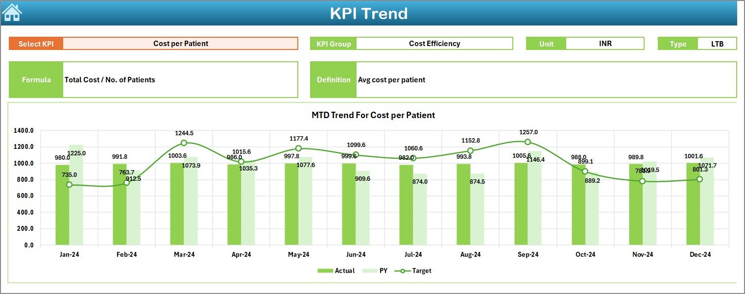
This sheet offers in-depth tracking of each KPI.
-
Select a KPI name from a drop-down in cell C3
-
View KPI Group, Unit, Type (UTB or LTB), Formula, and Definition
-
See MTD and YTD trends in charts, comparing Actual vs Target vs Previous Year
It’s perfect for identifying patterns and seasonal fluctuations.
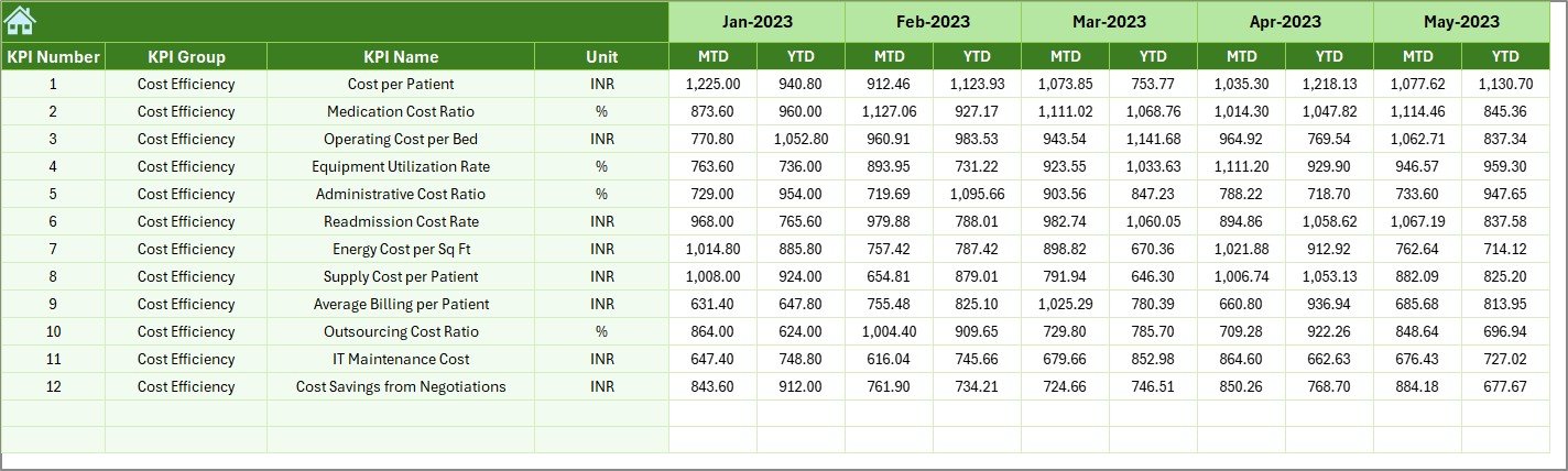
✍️ 4. Actual Numbers Input Sheet
This is your data entry hub for actual performance values.
-
Change the base month in cell E1
-
Enter both MTD and YTD numbers for each KPI
-
Supports month-wise entry for more accurate analysis
Accurate input here ensures accurate insights across the dashboard.
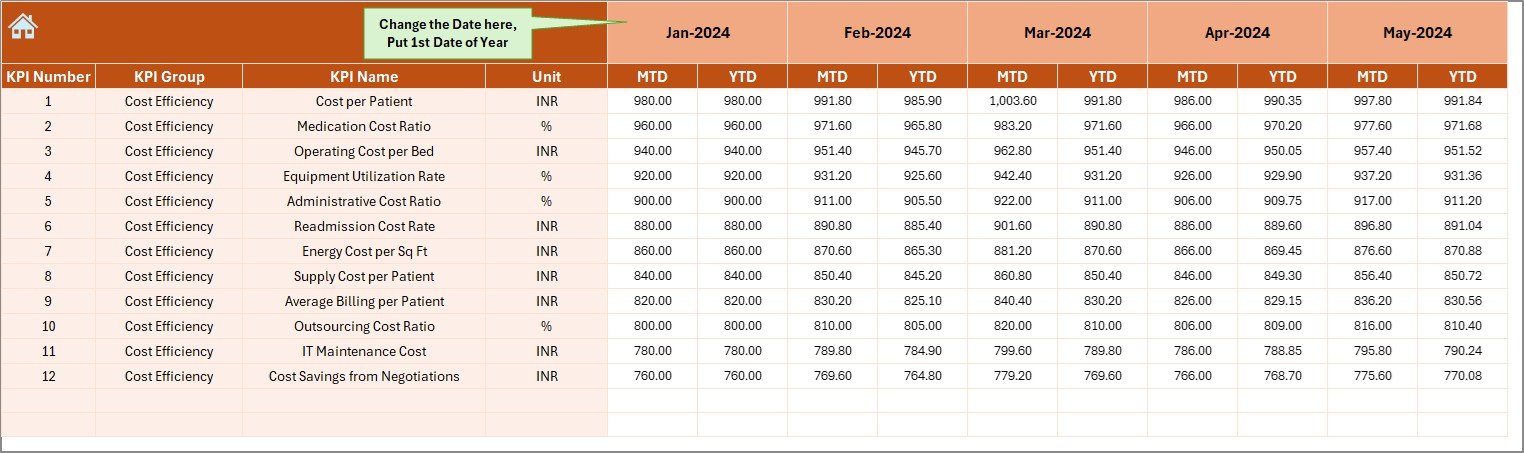
🎯 5. Target Sheet
In this tab, you’ll enter the monthly and yearly targets for each KPI.
-
Supports both MTD and YTD targets
-
Aligns your performance data with strategic financial goals
Setting targets is essential for measuring efficiency—this sheet makes it easy.
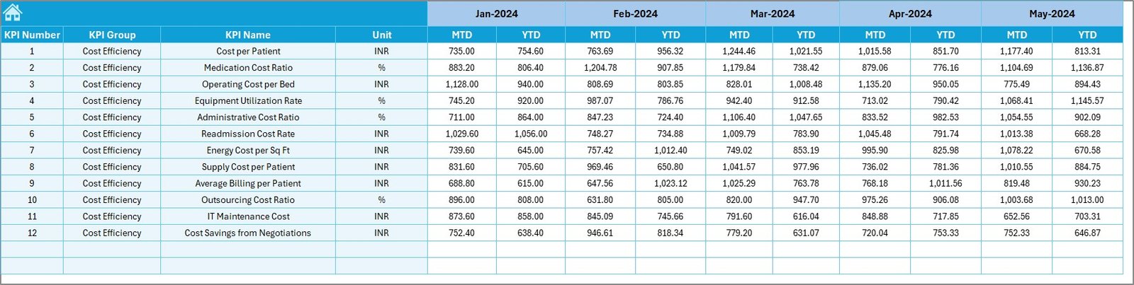
📅 6. Previous Year Number Sheet
Here, you can enter the historical performance data (last year’s MTD and YTD values).
-
Enables year-over-year comparison
-
Identifies trends and anomalies in cost patterns
📘 7. KPI Definition Sheet
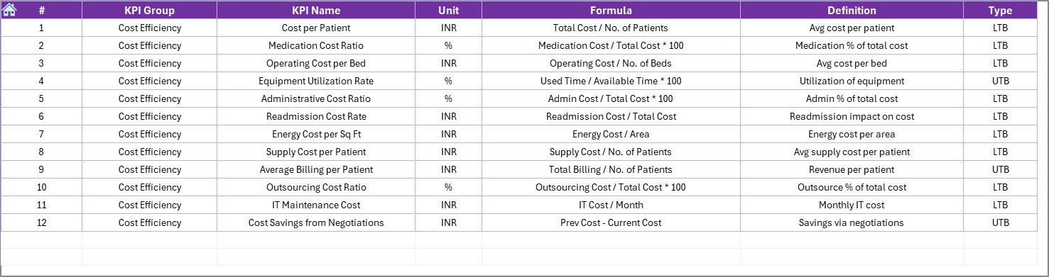
This acts as your reference sheet:
-
List of KPI Names, Groups, Units
-
Formulas used for each KPI
-
Clear and concise definitions
-
Classification as UTB (Upper the Better) or LTB (Lower the Better)
This documentation ensures everyone in your team understands what each metric means.
✅ Advantages of the Healthcare Cost Efficiency KPI Dashboard
Using this Excel dashboard template can offer a range of practical benefits:
💡 Data-Driven Cost Control
Get real-time insights into healthcare expenditures, helping you cut down waste and manage budgets effectively.
📉 Trend Analysis for Better Planning
MTD and YTD trend charts help you see where you’re going over time—useful for budgeting and forecasting.
⏱️ Saves Time and Effort
Instead of compiling reports manually, use auto-updating sheets and interactive visuals to save hours of work.
📈 Informed Decision Making
Compare actuals with targets and previous years, making it easier to take corrective actions on time.
📁 Easy to Customize
This template is 100% Excel-based—no complicated tools or coding required. You can adjust it based on your specific KPIs.
🏆 Best Practices for Using This KPI Dashboard
To get the best out of your Healthcare Cost Efficiency KPI Dashboard, follow these expert tips:
1. Define Clear KPI Goals
Make sure each KPI has a specific target aligned with your hospital or clinic’s financial goals.
2. Keep Your Data Updated
Enter MTD and YTD values regularly to get real-time accuracy. Set a weekly or monthly update routine.
3. Train Your Team
Ensure the finance or operations staff understand how to use the dashboard and interpret its insights.
4. Audit Your Inputs
Occasionally validate the data you’ve entered—small errors can affect overall results and decisions.
5. Use Visual Cues Wisely
Conditional formatting (like up/down arrows) should be intuitive and consistent. Red for below target, green for above target works well.
6. Review Trends, Not Just Numbers
Trends help you plan long-term. Use the KPI Trend sheet to spot seasonality or repeated issues.
What KPIs Should You Track for Cost Efficiency?
Here are some commonly used KPIs you can include in this dashboard:
-
Operating Cost per Patient
-
Supply Chain Cost Variance
-
Equipment Maintenance Cost
-
Overtime Labor Cost
-
Insurance Claim Denials
-
Pharmaceutical Expense Ratio
-
Administrative Cost Ratio
-
Bed Occupancy Rate
-
Energy Consumption per Square Foot
-
Average Length of Stay (ALOS)
-
Uncompensated Care Costs
-
Revenue Cycle Time
These KPIs help you manage operational, clinical, and administrative costs more effectively.
How to Download and Start Using This Excel Dashboard
This template is plug-and-play. Once you download it:
-
Go to the KPI Definition Sheet and enter your KPIs.
-
Add your Targets, Actuals, and Previous Year data in their respective sheets.
-
Switch to the Dashboard tab and select your month.
-
Watch as all charts, cards, and comparisons update instantly.
Conclusion: Take Control of Your Healthcare Costs with Excel
The Healthcare Cost Efficiency KPI Dashboard in Excel is more than just a spreadsheet—it’s a strategic financial tool. It gives you visibility into where money is being spent, how your performance compares to goals, and what steps you need to take next. And since it’s in Excel, it’s easy to use, customize, and scale.
In today’s data-driven healthcare environment, tracking cost efficiency is no longer optional—it’s essential. So why wait? Equip your team with this dashboard and drive smarter, leaner, and more efficient financial operations starting today.
❓ Frequently Asked Questions (FAQs)
1. What is the purpose of a healthcare KPI dashboard?
It helps healthcare facilities track financial and operational metrics to improve efficiency and control costs.
2. Can I use this Excel dashboard without technical skills?
Yes! It is designed for ease of use. Anyone with basic Excel knowledge can navigate and update it.
3. Are the KPIs customizable?
Absolutely. You can add, remove, or modify KPIs based on your organization’s needs using the KPI Definition tab.
4. How often should I update the data?
Ideally, you should update it monthly to get accurate MTD and YTD insights. Weekly updates work well for active monitoring.
5. Can I use this dashboard for multiple departments?
Yes, you can duplicate the template and track different departments or cost centers independently.
6. Does the dashboard include charts and visuals?
Yes, it has built-in trend charts, performance comparisons, and conditional formatting visuals.
7. Is there any automation involved?
While Excel doesn’t have macros in this template, formulas and drop-downs are used for automatic updates and visualizations.
Visit our YouTube channel to learn step-by-step video tutorials