In today’s competitive home appliances industry, businesses must track performance metrics closely to stay efficient, profitable, and customer-focused. Managing product performance, sales efficiency, service quality, and operational costs can be overwhelming if the data remains scattered across multiple reports.
That’s where a Home Appliances KPI Dashboard in Power BI becomes a game-changer.
This ready-to-use Power BI dashboard consolidates key performance indicators (KPIs) into a single interactive interface. It transforms your Excel data into powerful visuals, helping you monitor targets, analyze trends, and make data-driven decisions effortlessly.
Click to Purchases Home Appliances KPI Dashboard in Power BI
What Is a Home Appliances KPI Dashboard in Power BI?
A Home Appliances KPI Dashboard in Power BI is a dynamic tool designed to visualize and analyze critical performance metrics for home appliance companies. It provides a comprehensive overview of operational, financial, and customer-related KPIs.
Instead of manually reviewing lengthy spreadsheets, this dashboard automates the analysis process. With a few clicks, you can see whether sales are meeting targets, how current performance compares to last year, and which departments or product categories require attention.
Structure of the Dashboard
This dashboard is structured into three interactive pages in the Power BI Desktop file — each serving a unique analytical purpose:
-
Summary Page
-
KPI Trend Page
-
KPI Definition Page
Let’s go through each page step by step.
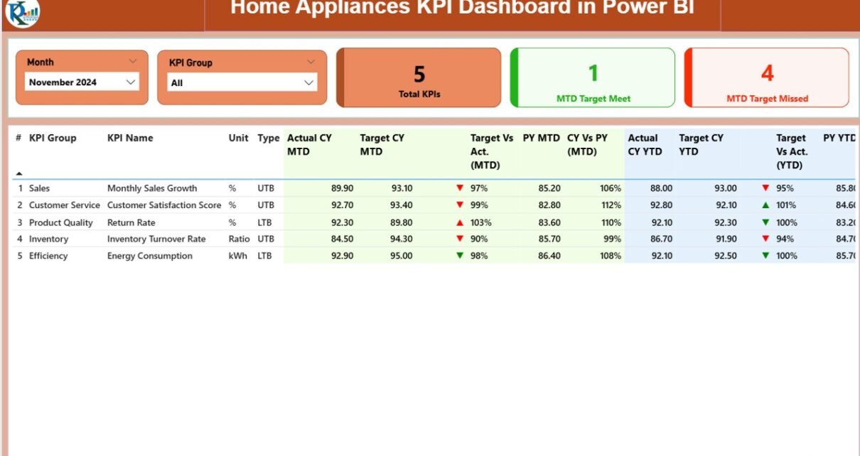
Summary Page – The Central Performance Overview
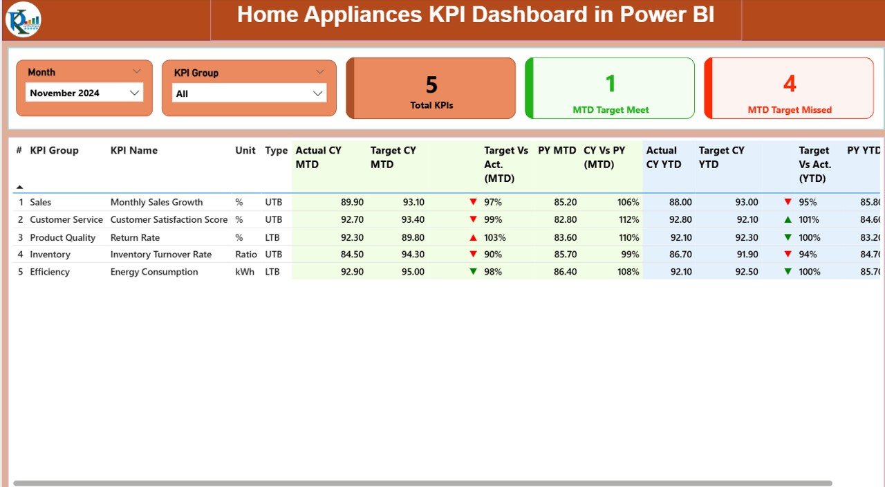
The Summary Page acts as the primary view of your dashboard — the control center where all key metrics come together.
At the top, you’ll find:
-
Month Selector – Choose the reporting month to filter all visuals.
-
KPI Group Slicer – Narrow down performance data by category or business area.
Beneath the slicers, you’ll find three KPI cards:
-
Total KPIs Count – Displays the total number of tracked KPIs.
-
MTD Target Met Count – Shows how many KPIs achieved their month-to-date targets.
-
MTD Target Missed Count – Indicates KPIs that fell below their targets.
This quick summary gives you an instant pulse of business performance.
Detailed KPI Table
Below the cards, a detailed table presents all KPI data, including:
-
KPI Number: Sequential identifier for easy reference.
-
KPI Group: Category (e.g., Sales, Production, Service, Quality).
-
KPI Name: Specific KPI such as “Sales Conversion Rate” or “Customer Complaints %.”
-
Unit: Measurement unit (e.g., %, USD, Units).
-
Type: Defines if the KPI is “UTB – Upper the Better” or “LTB – Lower the Better.”
-
Actual CY MTD: Actual month-to-date value for the current year.
-
Target CY MTD: Target month-to-date value for the current year.
-
MTD Icon: Red or green arrows (▼ or ▲) visually highlight whether the target was achieved.
-
Target vs Actual (MTD): Percentage difference between actual and target values.
-
PY MTD: Previous year’s month-to-date value.
-
CY vs PY (MTD): Comparison ratio between current and previous year’s MTD values.
-
Actual CY YTD: Year-to-date actual numbers.
-
Target CY YTD: Year-to-date target numbers.
-
YTD Icon: Red or green arrow indicator for yearly performance.
-
Target vs Actual (YTD): YTD performance ratio (Actual ÷ Target).
-
PY YTD: Previous year’s YTD number.
-
CY vs PY (YTD): Year-over-year performance ratio.
These visuals make it easy to spot performance gaps, successful areas, and long-term improvement trends.
KPI Trend Page – Tracking Monthly and Yearly Progress
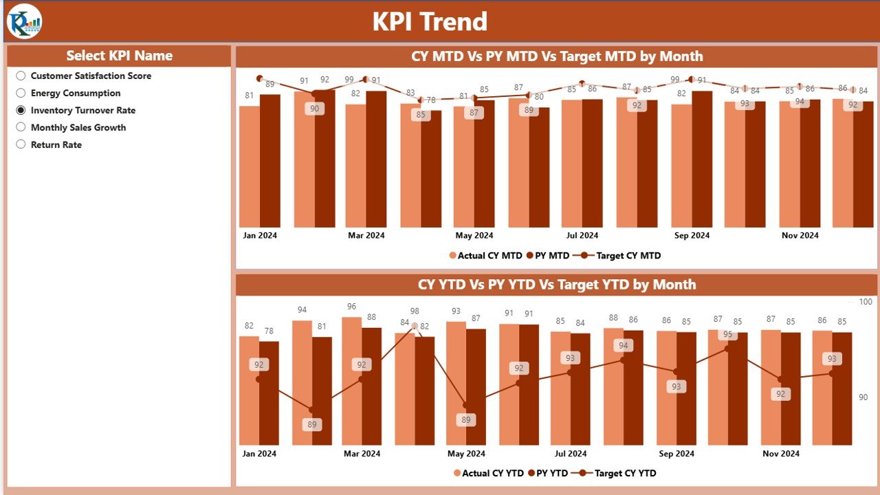
The KPI Trend Page dives deeper into the story behind each metric. Here, you can analyze progress over time and compare how performance evolves across months or years.
Key Elements of the Trend Page
-
KPI Selector: Choose a specific KPI using the dropdown slicer on the left.
Dual Combo Charts:
- Chart 1: Displays MTD (Month-to-Date) Actuals, Targets, and Previous Year data.
- Chart 2: Displays YTD (Year-to-Date) Actuals, Targets, and Previous Year data.
Each line in the combo chart represents a timeline of performance, allowing you to quickly identify whether your metrics are improving, stagnating, or declining.
Why It Matters
Trend analysis helps management teams understand:
-
Seasonal performance variations.
-
The impact of marketing campaigns.
-
Product performance across quarters.
-
Long-term sustainability of targets.
You can use this view during management reviews or strategy meetings to make informed decisions.
KPI Definition Page – Detailed KPI Insights
Click to Purchases Home Appliances KPI Dashboard in Power BI
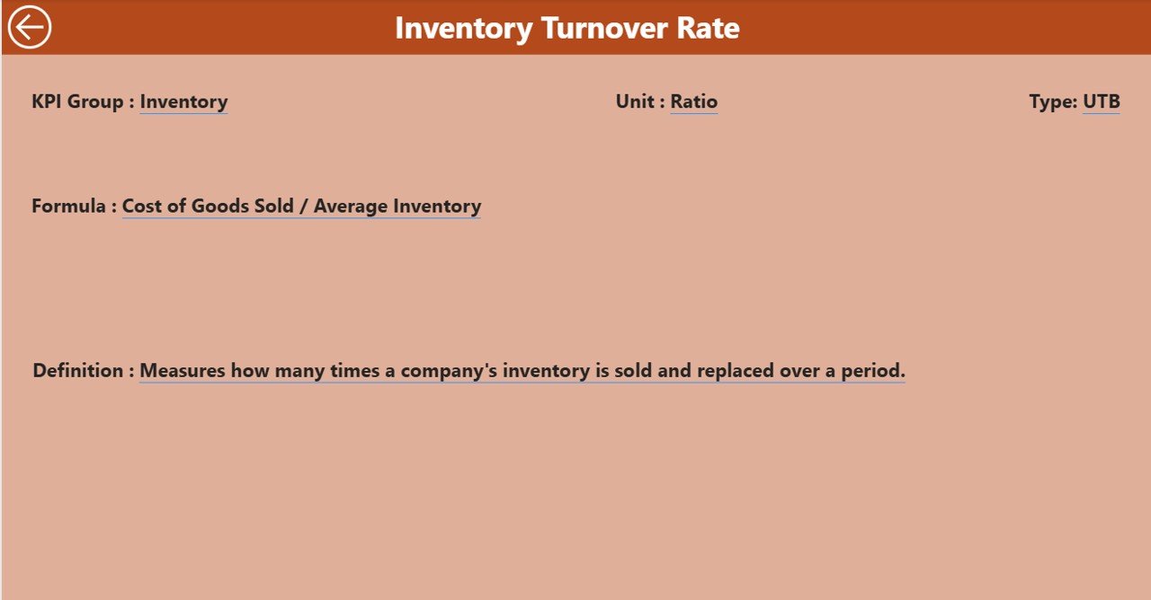
The KPI Definition Page is a hidden drill-through page that serves as your reference center.
When you right-click on any KPI in the Summary Page and select “Drill Through,” Power BI takes you to this page.
Here, you’ll find complete details for that KPI, including:
-
KPI Number
-
KPI Name
-
KPI Group
-
Unit of Measurement
-
Formula Used
-
Definition
-
Type (LTB or UTB)
Easy Navigation
A Back Button is available at the top-left corner of this page, letting you return to the Summary Page smoothly.
This feature enhances the user experience and ensures transparency for each KPI.
Excel Data Source Setup
The Power BI file is powered by an Excel data source that stores all base numbers. The Excel workbook includes three worksheets:
-
Input_Actual Sheet
-
Fill in the actual numbers for each KPI.
-
Include: KPI Name, Month (use the first date of each month), MTD, and YTD values.
-
-
Input_Target Sheet
-
Enter the target numbers for the same KPIs.
-
Include: KPI Name, Month, MTD, and YTD values.
-
-
KPI Definition Sheet
-
Enter the descriptive details for every KPI.
-
Include: KPI Number, KPI Group, KPI Name, Unit, Formula, Definition, and Type (LTB/UTB).
-
Once the data is entered, Power BI automatically refreshes visuals and updates all metrics in real time.
Key Benefits of Using the Home Appliances KPI Dashboard in Power BI
Tracking home appliance performance through Power BI offers both strategic and operational benefits. Let’s explore them below:
🎯 Centralized Data Monitoring
All your KPIs—sales, production, service quality, and financials—are visible in one place. You no longer need multiple reports or manual calculations.
📊 Real-Time Insights
With live connections to Excel, Power BI refreshes data instantly. You get up-to-date visuals every time the data changes.
⚙️ Improved Decision-Making
By comparing current and previous performances, managers can make proactive decisions instead of reactive ones.
🕒 Time Efficiency
Automation replaces repetitive data entry and chart creation, saving hours every week.
🎨 Visual Clarity
Conditional formatting and color-coded arrows make data interpretation simple for both analysts and executives.
📈 Trend Forecasting
Historical comparisons empower you to forecast future sales, production needs, or service workloads more accurately.
💬 Better Collaboration
You can publish the dashboard to Power BI Service and share it securely with your team, enabling collaborative performance tracking.
How to Use the Home Appliances KPI Dashboard Effectively
To get the most from this tool, follow these simple steps:
-
Prepare Your Excel Data:
Ensure that the actual and target numbers are properly structured and formatted. -
Load Data into Power BI:
Use Power Query to connect your Excel workbook. Click “Refresh” anytime you make data changes. -
Adjust Slicers:
Select the reporting month or KPI group to filter dashboard visuals dynamically. -
Drill Through for Details:
For deeper analysis, right-click any KPI and navigate to its Definition Page. -
Export or Share:
You can export visuals to PDF or publish the dashboard to Power BI Service for wider access.
Advantages of Home Appliances KPI Dashboard in Power BI
Here’s why organizations in the home appliances sector love this dashboard:
✅ Simplifies complex reporting tasks.
✅ Enhances transparency across departments.
✅ Encourages a performance-driven culture.
✅ Identifies bottlenecks in real time.
✅ Improves alignment between targets and outcomes.
✅ Empowers executives with self-service analytics.
✅ Reduces dependency on IT or data teams for reporting.
Use Cases of the Home Appliances KPI Dashboard
This dashboard is versatile and fits multiple operational areas:
🏷️ Sales and Marketing
-
Track monthly revenue vs. target.
-
Analyze product category performance.
-
Identify top-selling regions or stores.
🏭 Production and Supply Chain
-
Measure manufacturing efficiency.
-
Track product defect rates or repair requests.
-
Compare output across plants.
👩💻 Customer Service
-
Monitor complaint resolution rates.
-
Evaluate customer satisfaction and NPS.
-
Identify trends in support requests.
💰 Finance and Profitability
Click to Purchases Home Appliances KPI Dashboard in Power BI
-
Review cost variance, gross margin %, or return rates.
-
Compare YTD results against annual goals.
🧍 Human Resources
-
Track staff productivity, training compliance, and attendance KPIs.
Best Practices for the Home Appliances KPI Dashboard in Power BI
To maintain accuracy and efficiency, follow these recommended best practices:
1️⃣ Keep KPI Definitions Consistent
Ensure all team members understand how each KPI is calculated. Use the KPI Definition Page as your single source of truth.
2️⃣ Automate Data Refresh
Schedule Power BI to refresh your data daily or weekly so visuals always show the latest results.
3️⃣ Use Conditional Formatting
Leverage red/green icons and arrows to highlight performance deviations clearly.
4️⃣ Review Trends Regularly
Compare MTD and YTD trends every month to catch potential issues early.
5️⃣ Secure Data Access
Use Power BI roles and permissions to control who can view or edit sensitive business data.
6️⃣ Keep Your Dashboard Design Simple
Avoid clutter. Focus on KPIs that truly matter to your business goals.
7️⃣ Archive Historical Data
Store older KPI data in a separate Excel file or Power BI dataset to maintain performance while keeping historical reference intact.
Future Enhancements You Can Add
You can expand this dashboard by integrating:
-
Power Automate for email alerts on missed KPIs.
-
Power Query for automatic Excel uploads.
-
AI visuals like key influencer charts to predict outcomes.
-
Custom color themes to match your corporate identity.
These upgrades make your dashboard more intelligent and engaging.
Why Power BI Is Ideal for KPI Dashboards
Power BI is an exceptional platform for KPI reporting because it combines data visualization, automation, and cloud sharing in one solution. For the home appliances sector—where product lines, markets, and operations are highly dynamic—Power BI ensures you always stay informed.
Compared to traditional Excel reports, Power BI:
-
Offers live visualizations instead of static charts.
-
Handles large datasets seamlessly.
-
Supports advanced DAX formulas for calculations.
-
Allows secure online collaboration via Power BI Service.
Conclusion
The Home Appliances KPI Dashboard in Power BI is more than a reporting tool — it’s a performance intelligence system. It simplifies monitoring, drives accountability, and transforms raw data into actionable insights.
From executives to analysts, everyone can benefit from real-time tracking, trend visualization, and interactive drill-downs. Whether you manage manufacturing, sales, or service operations, this dashboard ensures every KPI stays aligned with business goals.
Frequently Asked Questions (FAQs)
1. What data source is used in the Home Appliances KPI Dashboard?
This dashboard uses an Excel file with three tabs: Actuals, Targets, and KPI Definition. Power BI reads data from these sheets and visualizes the metrics dynamically.
2. How often can I refresh the data?
You can refresh it manually in Power BI Desktop or automatically on a schedule using Power BI Service.
3. Can I add more KPIs to the dashboard?
Yes. Simply update the KPI Definition sheet and corresponding data in Actuals and Target sheets. Then refresh the Power BI model.
4. What do LTB and UTB mean?
-
LTB (Lower the Better) means smaller values indicate better performance (e.g., defects %).
-
UTB (Upper the Better) means higher values indicate better performance (e.g., sales revenue).
5. How do the up and down arrows work?
Conditional formatting applies green ▲ for met targets and red ▼ for missed ones, providing an instant visual cue.
6. Can I publish this dashboard online?
Absolutely! You can publish it to Power BI Service, share it with stakeholders, and even embed it into SharePoint or Teams.
7. Who can use this dashboard?
It’s ideal for manufacturing managers, finance teams, analysts, and executives working in home appliance production, sales, or after-sales operations.
Visit our YouTube channel to learn step-by-step video tutorials
Watch the step-by-step video tutorial:
Click to Purchases Home Appliances KPI Dashboard in Power BI