International aid organizations handle complex projects. They manage funds, monitor field activities, track beneficiaries, and report impact to donors. However, many teams still use scattered spreadsheets. As a result, leaders struggle to see the full picture.So, how can international aid organizations track performance clearly and accurately?You need an International Aid KPI Dashboard in Excel.This ready-to-use Excel dashboard helps organizations monitor Monthly (MTD) and Year-to-Date (YTD) performance. Moreover, it allows users to compare Actual vs Target and Previous Year results instantly. Therefore, decision-makers can act faster and improve project impact.In this complete guide, you will learn:
- What an International Aid KPI Dashboard in Excel
- Why organizations need it
- A detailed explanation of all 7 worksheets
- Key KPIs to track
- Advantages of International Aid KPI Dashboard in Excel
- Best Practices for the International Aid KPI Dashboard
- Frequently Asked Questions with Answers
Click to buy International Aid KPI Dashboard in Excel
What Is an International Aid KPI Dashboard in Excel?
An International Aid KPI Dashboard in Excel is a structured performance tracking tool. It helps NGOs, humanitarian agencies, donor-funded programs, and relief organizations monitor their key performance indicators in one centralized system.
Instead of reviewing multiple reports, you can:
- Track MTD and YTD performance
- Compare Actual vs Target values
- Analyze Previous Year comparisons
- Monitor KPI trends visually
- Access detailed KPI definitions
Because Excel remains widely used across organizations, this dashboard provides flexibility and ease of use. Furthermore, it does not require advanced software knowledge.
Why Do International Aid Organizations Need a KPI Dashboard?
International aid operations involve multiple projects, regions, donors, and reporting requirements. Therefore, teams must track performance regularly.
Without a dashboard:
- Reports become delayed
- Data inconsistencies increase
- Leaders miss warning signs
- Donor reporting becomes stressful
However, with an International Aid KPI Dashboard in Excel:
- Teams access performance instantly
- Managers identify gaps quickly
- Stakeholders receive structured reports
- Accountability improves significantly
As a result, organizations strengthen transparency and improve funding credibility.
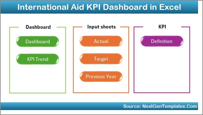
What Are the Key Features of the International Aid KPI Dashboard in Excel?
This ready-to-use template includes 7 structured worksheets. Each sheet plays a specific role. Let’s understand them clearly.
Summary Page – Your Navigation Center
The Summary Page acts as an index sheet.
Here, you will find:
- 6 navigation buttons
- Quick jump to respective worksheets
- Easy movement across the dashboard
Therefore, users do not waste time searching through tabs. Instead, they move instantly to the required section.
Click to buy International Aid KPI Dashboard in Excel
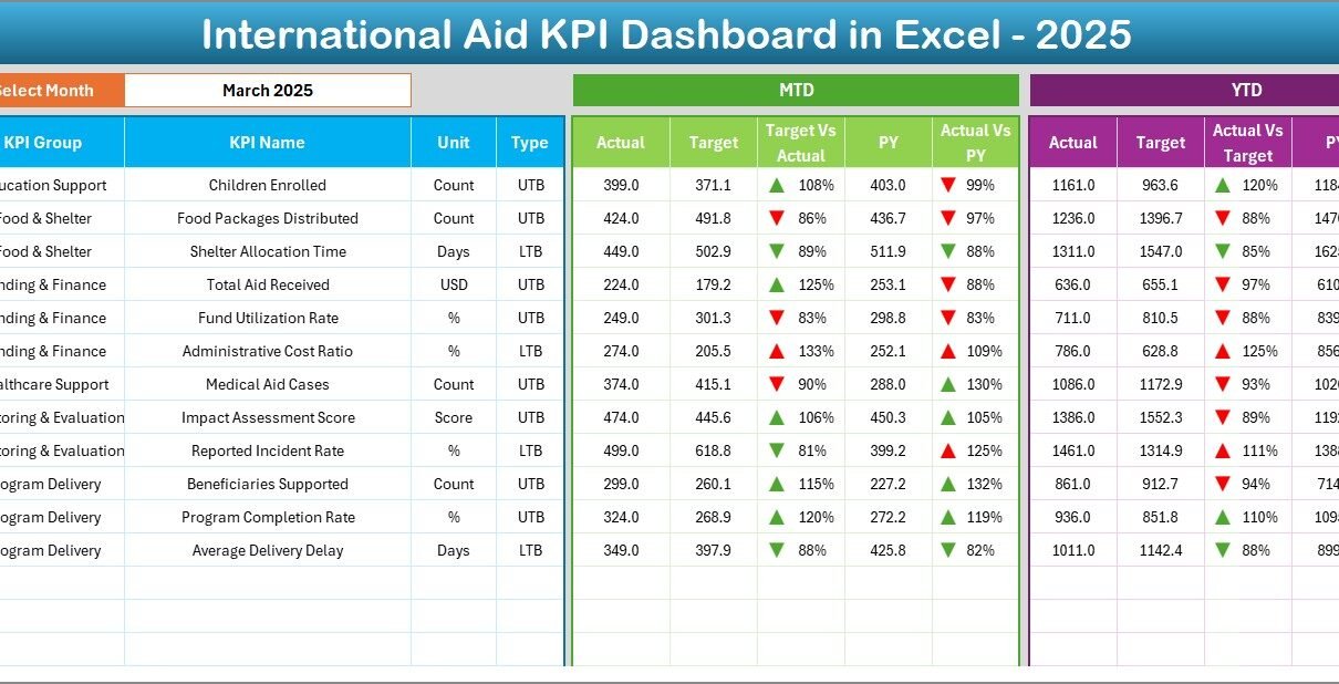
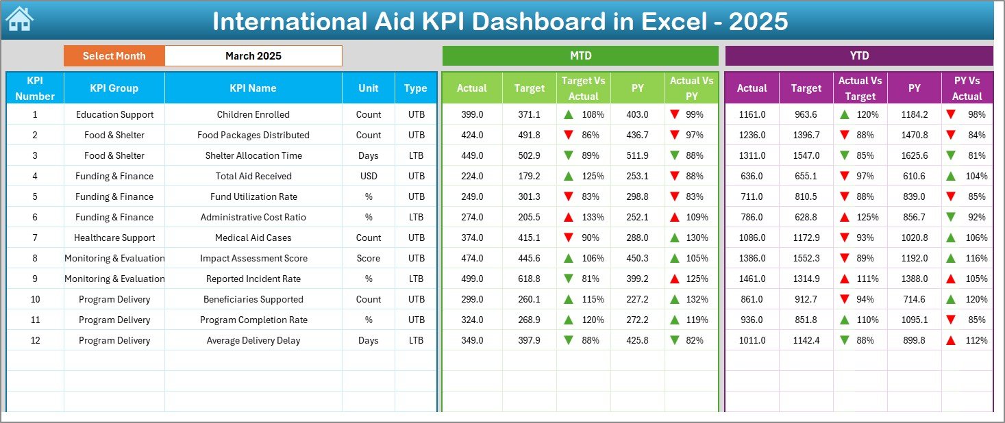
Dashboard Sheet – The Main Performance Overview
This sheet serves as the heart of the system.
On Range D3, you can select the Month from a drop-down list. Once you select a month, the entire dashboard updates automatically.
What Does the Dashboard Show?
MTD (Month-to-Date) Section:
- Actual
- Target
- Previous Year
- Target vs Actual comparison
- PY vs Actual comparison
- Conditional formatting with up/down arrows
YTD (Year-to-Date) Section:
- Actual
- Target
- Previous Year
- Target vs Actual
- PY vs Actual
- Visual indicators for performance
Therefore, leadership can instantly see whether KPIs improve or decline.
Moreover, conditional formatting arrows make performance interpretation very simple.
Click to buy International Aid KPI Dashboard in Excel
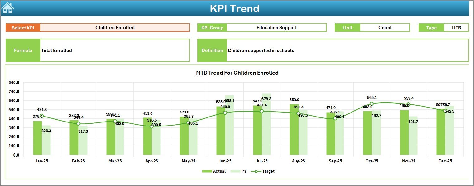
Trend Sheet – KPI Performance Over Time
The Trend Sheet helps users analyze one KPI at a time.
On Range C3, you can select the KPI name from a drop-down list.
Once selected, Excel displays:
- KPI Group
- Unit of Measurement
- KPI Type (Lower the Better or Upper the Better)
- KPI Formula
- KPI Definition
Additionally, the sheet shows:
- MTD Trend Chart (Actual, Target, PY)
- YTD Trend Chart (Actual, Target, PY)
As a result, teams understand performance patterns clearly. Furthermore, they identify seasonal variations or recurring issues.
Click to buy International Aid KPI Dashboard in Excel
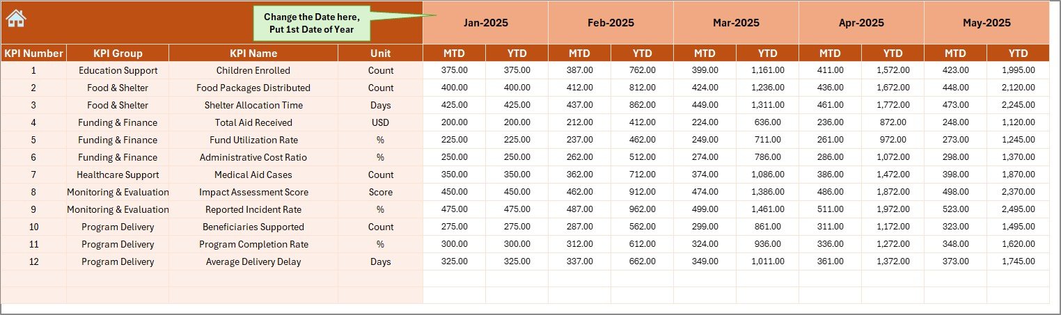
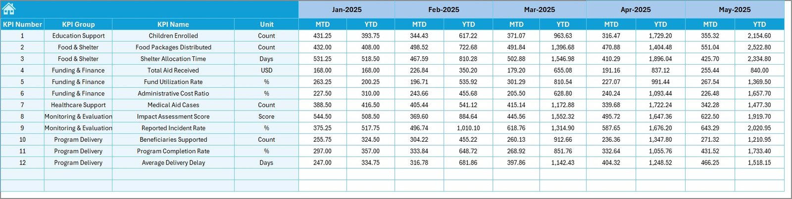
Actual Numbers Input Sheet – Data Entry Control
In this sheet, users enter:
- MTD actual numbers
- YTD actual numbers
On Range E1, users define the starting month of the year. Therefore, the system adjusts calculations accordingly.
Because this sheet separates data entry from reporting, it reduces formula errors.
Target Sheet – Monthly Goal Setting
This sheet allows users to enter:
- Monthly MTD targets
- Monthly YTD targets
Targets provide direction. Without them, teams cannot measure success. Therefore, this sheet ensures structured planning.
Click to buy International Aid KPI Dashboard in Excel
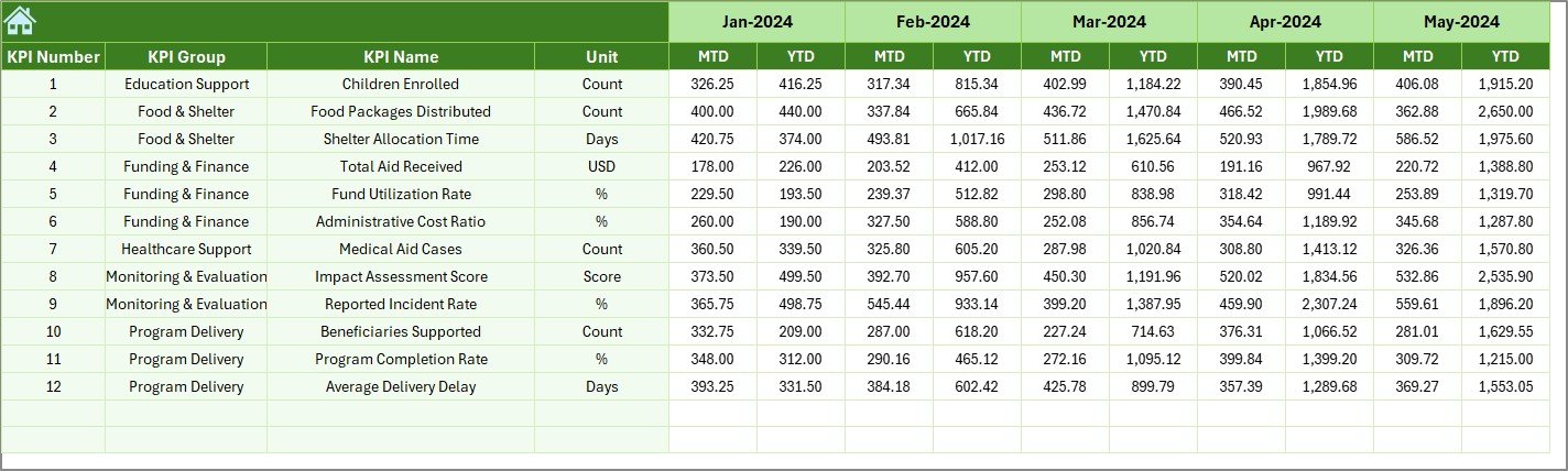
Previous Year Number Sheet – Historical Comparison
In this tab, users enter:
- Previous year MTD numbers
- Previous year YTD numbers
Historical comparison helps leaders understand growth trends. Consequently, they can evaluate long-term progress.
Click to buy International Aid KPI Dashboard in Excel
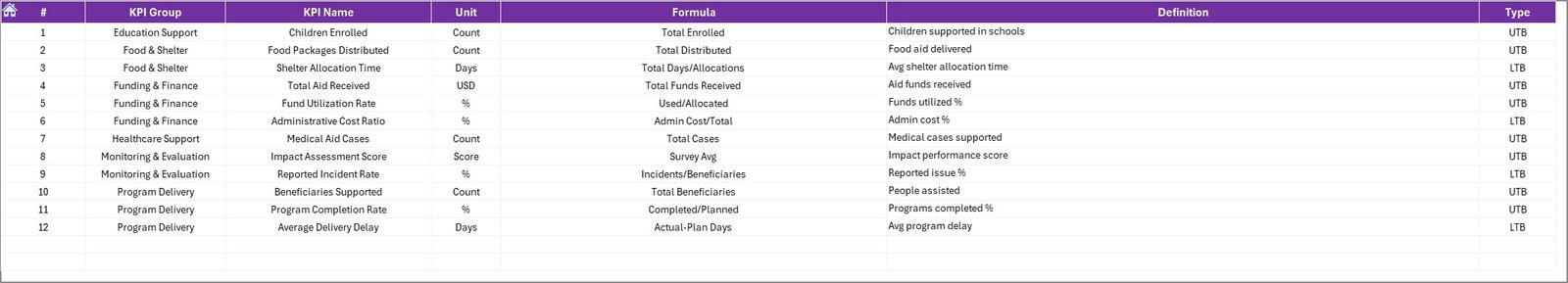
KPI Definition Sheet – Documentation & Clarity
This sheet stores:
- KPI Name
- KPI Group
- Unit
- Formula
- KPI Definition
Because definitions remain centralized, all stakeholders interpret KPIs consistently.
Click to buy International Aid KPI Dashboard in Excel
What KPIs Can You Track in an International Aid KPI Dashboard?
Although organizations can customize KPIs, here are common examples:
Financial KPIs
- Fund Utilization Rate
- Budget Variance %
- Cost per Beneficiary
- Donor Funding Growth
Operational KPIs
- Projects Completed on Time
- Beneficiaries Served
- Relief Distribution Efficiency
- Supply Delivery Lead Time
Impact KPIs
- Education Access Rate
- Health Coverage Improvement
- Community Participation Rate
- Poverty Reduction %
Compliance KPIs
- Audit Completion Rate
- Reporting Timeliness
- Documentation Accuracy
Because the dashboard supports UTB and LTB KPI types, it adapts to various measurement needs.
Advantages of International Aid KPI Dashboard in Excel
Improves Transparency
Organizations can show donors exact performance metrics. Therefore, trust increases significantly.
Enhances Decision-Making
Leaders analyze trends quickly. Consequently, they act before issues escalate.
Simplifies Reporting
Instead of building reports manually, teams generate insights instantly.
Saves Time
Automated calculations reduce manual effort. Therefore, teams focus on impact rather than spreadsheets.
Encourages Accountability
When teams see clear targets and comparisons, they take responsibility seriously.
Supports Historical Analysis
Previous year comparisons help measure growth and sustainability.
How Does the International Aid KPI Dashboard Improve Monitoring?
The dashboard supports three levels of monitoring:
Monthly Monitoring
Track short-term goals and correct issues immediately.
Quarterly Monitoring
Evaluate project milestones and budget performance.
Annual Monitoring
Measure strategic impact and long-term outcomes.
Because Excel updates instantly after month selection, leaders always stay informed.
Best Practices for the International Aid KPI Dashboard
To maximize value, follow these best practices:
Define Clear KPIs
Choose measurable and realistic KPIs. Avoid vague metrics.
Update Data Regularly
Enter MTD data monthly without delay. Consistency ensures accuracy.
Review Trends, Not Just Numbers
Analyze patterns instead of focusing on a single month.
Maintain Clean Data Entry
Avoid duplicate entries. Verify numbers before submission.
Align KPIs with Donor Requirements
Ensure KPIs match funding objectives.
Train Team Members
Educate staff on how to interpret arrows and comparisons.
Backup Data Frequently
Save copies to prevent data loss.
How to Use the International Aid KPI Dashboard in Excel?
Follow these steps:
- Enter KPI details in the KPI Definition sheet.
- Input Target numbers in the Target sheet.
- Enter Previous Year data.
- Input Actual monthly numbers.
- Go to Dashboard sheet.
- Select the month from D3.
- Analyze MTD and YTD comparisons.
- Use Trend sheet for deep analysis.
Because the system follows a structured flow, users can operate it easily.
How Does Conditional Formatting Improve KPI Interpretation?
The dashboard uses up and down arrows.
- Up arrow = Positive performance
- Down arrow = Negative performance
Therefore, users understand performance without complex analysis.
Visual indicators improve speed and clarity.
Who Can Benefit from the International Aid KPI Dashboard in Excel?
- International NGOs
- Humanitarian Agencies
- UN Projects
- Government Aid Departments
- CSR Foundations
- Development Consultants
- Monitoring & Evaluation Teams
Because Excel remains accessible worldwide, teams can implement this dashboard easily.
Conclusion
International aid organizations operate in complex environments. They manage funds, deliver services, and report impact regularly. However, without structured monitoring, performance visibility becomes difficult.
The International Aid KPI Dashboard in Excel provides a powerful yet simple solution. It combines MTD and YTD comparisons, trend charts, KPI definitions, and structured data entry in one centralized system.
Moreover, it improves transparency, accountability, and decision-making. Therefore, organizations strengthen donor confidence and maximize humanitarian impact.
If you want better performance tracking and clear reporting, this dashboard offers the ideal solution.
Frequently Asked Questions with Answers
What is the purpose of an International Aid KPI Dashboard in Excel?
It helps organizations track performance metrics, compare targets, and monitor trends in one structured Excel file.
Can I customize the KPIs in this dashboard?
Yes. You can modify KPI names, groups, units, and formulas in the KPI Definition sheet.
Does the dashboard support both MTD and YTD tracking?
Yes. It tracks both Month-to-Date and Year-to-Date performance automatically.
Do I need advanced Excel skills to use this dashboard?
No. Basic Excel knowledge is enough to operate the template.
Can this dashboard support donor reporting?
Yes. It provides structured data that you can use in donor reports and presentations.
How often should I update the dashboard?
You should update it monthly. Regular updates ensure accurate monitoring.
Can small NGOs use this dashboard?
Absolutely. Small and large organizations can use it effectively.
Visit our YouTube channel to learn step-by-step video tutorials
Watch the step-by-step video tutorial: