International aid organizations manage millions of dollars, thousands of beneficiaries, and multiple programs across regions. However, many teams still rely on scattered spreadsheets and manual reports. As a result, leaders struggle to track fund utilization, beneficiary reach, and program impact in real time.
So, how can international aid agencies measure performance clearly, compare targets with actual results, and improve accountability?
Click to buy International Aid KPI Dashboard in Power BI
You need an International Aid KPI Dashboard in Power BI.
This ready-to-use Power BI solution transforms structured Excel data into interactive visual insights. Moreover, it helps decision-makers monitor MTD and YTD performance, track year-over-year progress, and quickly identify gaps. Instead of reviewing dozens of reports, you can filter data, drill into KPIs, and make faster decisions.
In this detailed guide, you will learn:
- What an International Aid KPI Dashboard in Power BI is
- Why aid organizations need it
- A full explanation of all 3 dashboard pages
- How Excel integrates with Power BI
- Advantages of International Aid KPI Dashboard in Power BI
- Best Practices for the International Aid KPI Dashboard
- Frequently Asked Questions with Answers
Let’s explore everything step by step.
What Is an International Aid KPI Dashboard in Power BI?
An International Aid KPI Dashboard in Power BI is a centralized performance monitoring system. It helps NGOs, government agencies, and global aid organizations track key performance indicators in one interactive report.
Instead of using multiple spreadsheets, you capture actual and target data in Excel. Then, Power BI converts that data into visual charts, KPI cards, and trend analysis.
Because the dashboard uses slicers, icons, and comparison metrics, users can:
- Monitor monthly performance
- Track year-to-date impact
- Compare current year with previous year
- Identify target achievement gaps
- Drill into KPI definitions instantly
Therefore, leadership teams gain complete visibility across programs, funding categories, and operational metrics.
Why Do International Aid Organizations Need a KPI Dashboard?
International aid programs operate in complex environments. They manage funds, logistics, health initiatives, education projects, food distribution, and emergency relief operations. However, without proper tracking, organizations face serious challenges.
For example:
- Program managers cannot see target vs actual progress quickly
- Donors demand transparency and impact reports
- Finance teams struggle to track fund allocation
- Regional teams lack performance visibility
- Executives cannot compare performance year over year
Therefore, organizations need a structured dashboard.
Moreover, when you use a Power BI KPI dashboard, you:
- Improve accountability
- Increase transparency
- Strengthen donor confidence
- Enhance performance monitoring
- Support data-driven decisions
As a result, your organization improves both efficiency and credibility.
Dashboard Structure: 3 Powerful Pages Explained
The International Aid KPI Dashboard in Power BI includes three structured pages. Each page serves a clear purpose and provides specific insights.
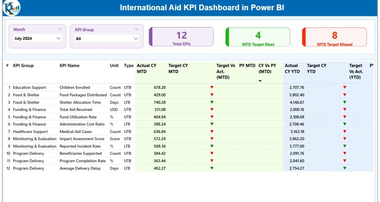
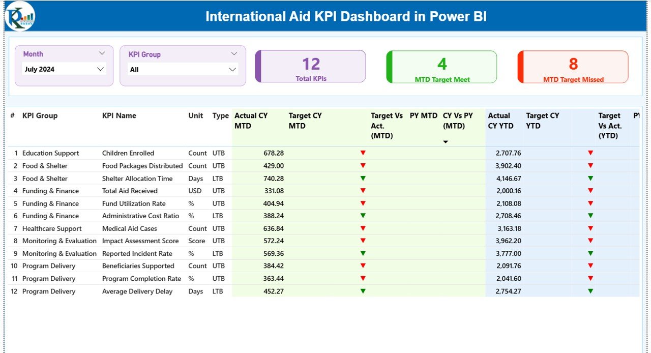
What Does the Summary Page Show?
The Summary Page acts as the command center of the dashboard.
At the top, you will find:
- Month Slicer
- KPI Group Slicer
Because of these slicers, users can filter the report instantly.
KPI Cards on the Summary Page
The dashboard displays three key cards:
- Total KPIs Count
- MTD Target Meet Count
- MTD Target Missed Count
These cards immediately show performance health. Therefore, leadership can understand results within seconds.
Detailed KPI Table
Below the cards, the dashboard displays a detailed KPI table with the following columns:
- KPI Number – Sequence number of the KPI
- KPI Group – Category of KPI (Health, Education, Finance, etc.)
- KPI Name – Specific performance metric
- Unit – Measurement unit (%, $, count, etc.)
- Type – LTB (Lower the Better) or UTB (Upper the Better)
MTD (Month-to-Date) Metrics
- Actual CY MTD – Current Year MTD actual value
- Target CY MTD – Current Year MTD target value
- MTD Icon – ▲ Green or ▼ Red indicator
- Target vs Actual (MTD) – Formula: Actual / Target
- PY MTD – Previous Year MTD
- CY vs PY (MTD) – Current Year MTD / Previous Year MTD
YTD (Year-to-Date) Metrics
- Actual CY YTD
- Target CY YTD
- YTD Icon – Green or Red indicator
- Target vs Actual (YTD) – Actual / Target
- PY YTD
- CY vs PY (YTD) – Current YTD / Previous YTD
Because the table includes both MTD and YTD comparisons, decision-makers can analyze short-term and long-term performance simultaneously.
Click to buy International Aid KPI Dashboard in Power BI
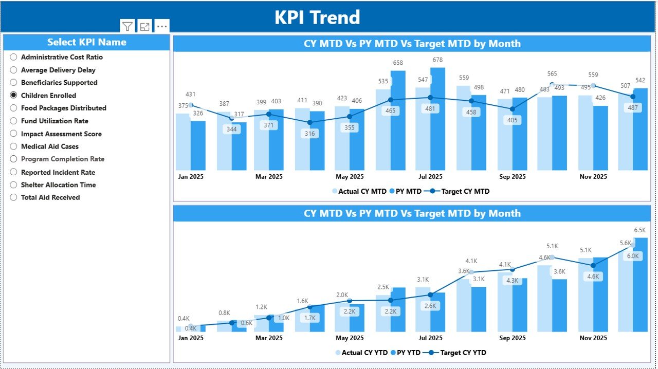
What Does the KPI Trend Page Show?
The KPI Trend page focuses on visual analysis.
On this page, you will find:
- Two combo charts
- A KPI Name slicer on the left
MTD Trend Chart
The first combo chart displays:
- Current Year Actual (MTD)
- Previous Year (MTD)
- Target (MTD)
Therefore, users can see trends month by month.
YTD Trend Chart
The second combo chart shows:
- Current Year Actual (YTD)
- Previous Year (YTD)
- Target (YTD)
Because this page shows trend lines, managers can identify patterns, seasonality, and performance improvement over time.
Click to buy International Aid KPI Dashboard in Power BI
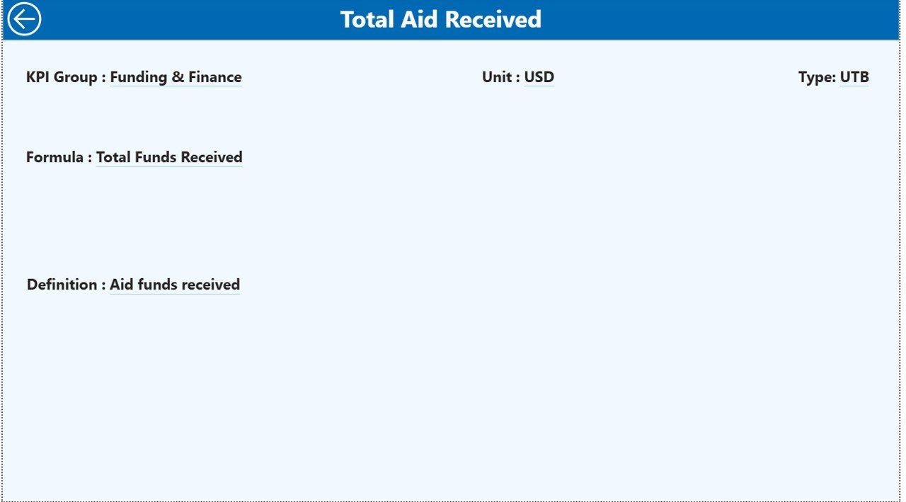
What Is the KPI Definition Page?
The KPI Definition Page acts as a drill-through page. Although it remains hidden, users can access it from the Summary Page.
When users drill through, they can see:
- KPI Number
- KPI Group
- KPI Name
- Unit
- Formula
- Definition
- Type (LTB or UTB)
Therefore, this page improves transparency. Moreover, it ensures everyone understands how the KPI works.
To return, users simply click the Back Button at the top left corner.
Click to buy International Aid KPI Dashboard in Power BI
How Does the Excel Data Source Work?
The dashboard uses an Excel file as the data source. This structure keeps data entry simple and organized.
You must fill three worksheets:
Input_Actual Sheet
Here, you enter:
- KPI Name
- Month (first date of month)
- MTD Value
- YTD Value
This sheet captures real performance data.
Input_Target Sheet
Here, you enter:
- KPI Name
- Month
- MTD Target
- YTD Target
This sheet defines expected performance levels.
Click to buy International Aid KPI Dashboard in Power BI
KPI Definition Sheet
Here, you fill:
- KPI Number
- KPI Group
- KPI Name
- Unit
- Formula
- Definition
- Type (LTB or UTB)
Because Power BI connects directly to Excel, the dashboard updates instantly after refresh.
Advantages of International Aid KPI Dashboard in Power BI
Now let’s discuss the real benefits.
- Improved Transparency
Organizations clearly show how funds perform. Therefore, donors gain confidence.
- Faster Decision Making
Leaders identify underperforming KPIs quickly. As a result, they take corrective action faster.
- Real-Time Monitoring
Because Power BI refreshes data easily, teams track performance without delay.
- Better Target Tracking
The dashboard compares actual vs target automatically. Therefore, managers focus on performance gaps immediately.
- Historical Comparison
The CY vs PY comparison helps teams measure long-term growth and improvement.
- Easy Drill-Through Analysis
Users can explore KPI definitions instantly. Consequently, they reduce confusion.
- Simple Data Management
Since the system uses Excel as a data source, teams do not need complex databases.
Best Practices for the International Aid KPI Dashboard
To get maximum value, follow these best practices.
- Define Clear KPIs
First, choose KPIs that reflect program impact. Avoid unnecessary metrics.
- Use Consistent Units
Ensure units remain consistent across months and years.
- Update Data Monthly
Update actual and target data regularly. Otherwise, reports lose accuracy.
- Review Target Logic
Set realistic but challenging targets. Therefore, teams stay motivated.
- Monitor LTB and UTB Carefully
Clearly define whether lower values indicate better performance.
- Train Staff on Dashboard Usage
Ensure teams understand slicers, drill-through options, and icons.
- Conduct Monthly Review Meetings
Use the dashboard in leadership meetings to drive accountability.
How Does This Dashboard Improve Donor Reporting?
Donors demand impact evidence. Therefore, organizations must present clear data.
With this dashboard, you can:
- Show MTD progress
- Present YTD impact
- Demonstrate target achievement
- Compare current year vs previous year
- Provide visual charts for board meetings
As a result, you strengthen funding opportunities.
Conclusion
International aid organizations operate in challenging environments. They manage funds, deliver services, and measure impact under pressure. However, without structured monitoring, performance gaps remain hidden.
The International Aid KPI Dashboard in Power BI solves this problem.
It provides:
- Clear MTD and YTD tracking
- Target vs actual comparison
- Visual trend analysis
- Drill-through KPI transparency
- Easy Excel-based data integration
Therefore, your organization gains clarity, accountability, and performance improvement.
If you want better reporting, stronger donor confidence, and data-driven decisions, this dashboard becomes your essential performance management tool.
Frequently Asked Questions with Answers
- What is the purpose of an International Aid KPI Dashboard?
It helps organizations monitor performance, track targets, and analyze impact using Power BI visuals.
- Can I use Excel as the data source?
Yes. The dashboard connects directly to Excel files with three sheets: Input_Actual, Input_Target, and KPI Definition.
- What does LTB and UTB mean?
LTB means Lower the Better. UTB means Upper the Better.
- How often should I update the data?
You should update the data monthly for accurate MTD and YTD reporting.
- Can I customize the KPIs?
Yes. You can add or modify KPIs in the KPI Definition sheet.
- Does the dashboard show year-over-year comparison?
Yes. It calculates CY vs PY for both MTD and YTD automatically.
- Is this dashboard suitable for NGOs and government agencies?
Yes. Any organization that tracks aid performance can use it effectively.
Visit our YouTube channel to learn step-by-step video tutorials
Watch the step-by-step video tutorial:
Click to buy International Aid KPI Dashboard in Power BI