Metro rail projects involve massive investments, tight timelines, public accountability, and strict performance expectations. Therefore, project authorities must track progress, cost, quality, and efficiency continuously. However, when data stays scattered across Excel files, manual reports, and static presentations, decision-making becomes slow and risky.
This is exactly where a Metro Rail Projects KPI Dashboard in Power BI becomes essential.
A Metro Rail Projects KPI Dashboard in Power BI converts raw project data into meaningful visuals. Moreover, it enables leadership teams, project managers, and engineers to monitor real-time performance across multiple KPIs from one centralized dashboard. As a result, teams gain clarity, speed, and control throughout the project lifecycle.
In this detailed guide, you will learn what a Metro Rail Projects KPI Dashboard in Power BI is, how it works, why it matters, its structure, features, advantages, best practices, and frequently asked questions. Additionally, the language remains simple, practical, and business-focused to ensure easy understanding.
Click to buy Metro Rail Projects KPI Dashboard in Power BI
What Is a Metro Rail Projects KPI Dashboard in Power BI?
A Metro Rail Projects KPI Dashboard in Power BI is a ready-to-use analytical solution designed to monitor key performance indicators related to metro rail planning, construction, execution, and operations.
Instead of reviewing hundreds of rows in Excel, this dashboard presents:
- KPI status at a glance
- Month-to-Date (MTD) and Year-to-Date (YTD) performance
- Target vs Actual comparisons
- Current Year vs Previous Year trends
- KPI definitions and formulas in one place
As a result, stakeholders can evaluate project health instantly and take corrective action early.
Why Do Metro Rail Projects Need a KPI Dashboard?
Metro rail projects involve multiple contractors, departments, timelines, and cost structures. Therefore, monitoring performance manually creates delays and errors. Moreover, leadership teams need fast and reliable insights to manage risks proactively.
A KPI dashboard helps because:
- It centralizes performance data
- It highlights target achievements and misses clearly
- It improves accountability across departments
- It supports faster and data-driven decisions
- It reduces dependency on manual reporting
Consequently, metro rail authorities can maintain transparency, efficiency, and control throughout the project lifecycle.
How Does a Metro Rail Projects KPI Dashboard in Power BI Work?
This dashboard uses Excel as the data source and Power BI as the visualization layer. First, users enter actual and target KPI values into structured Excel sheets. Then, Power BI connects to this data and refreshes all visuals automatically.
Because of this setup:
- Data entry remains simple and flexible
- Dashboard updates remain fast and accurate
- No advanced technical skills are required
- Teams can scale KPIs easily over time
Thus, the solution works well for both small project units and large metro rail networks.
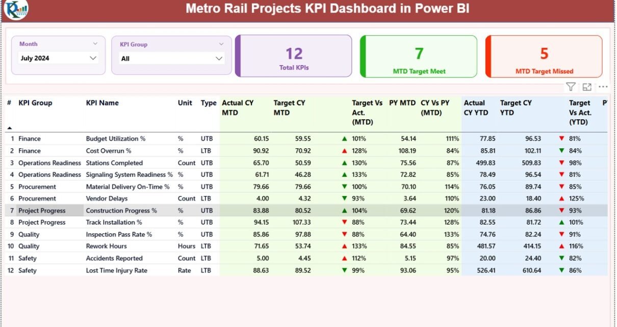
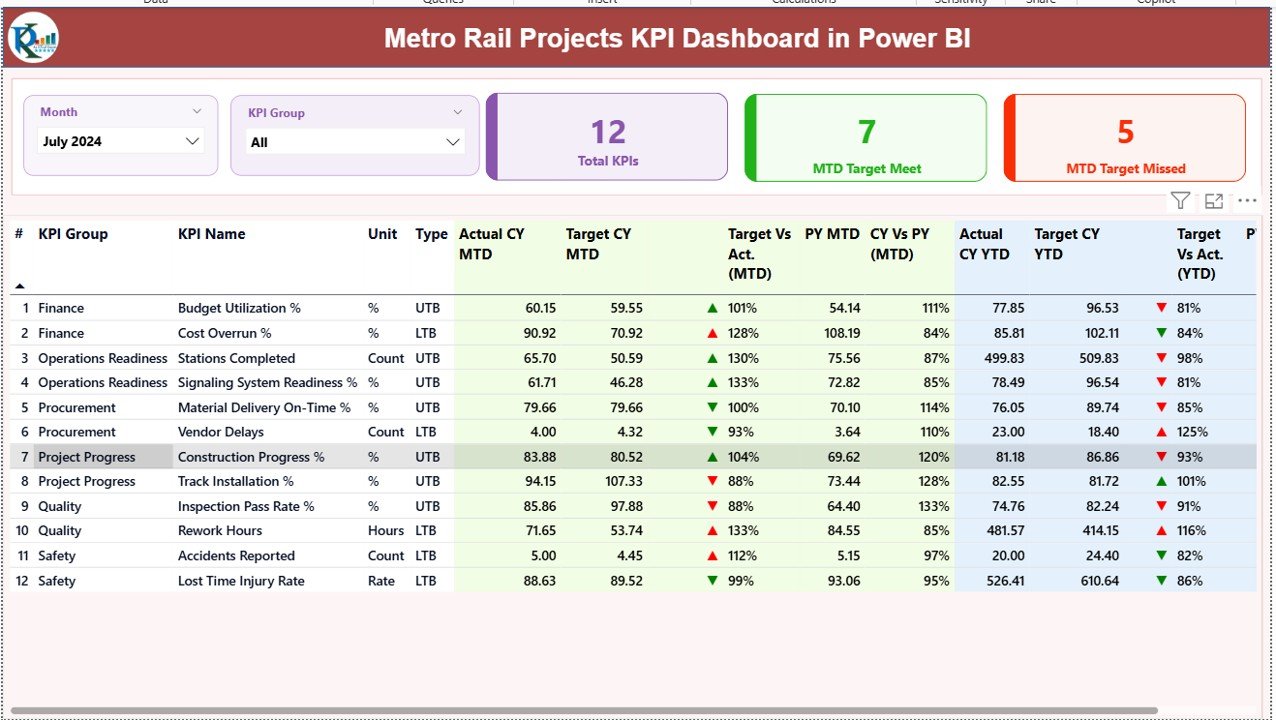
What Are the Key Pages in the Metro Rail Projects KPI Dashboard?
The Metro Rail Projects KPI Dashboard in Power BI includes three structured analytical pages. Each page serves a specific purpose and together they provide complete performance visibility.
Summary Page
The Summary Page acts as the central control panel of the dashboard.
Key Controls on the Summary Page
At the top of the page, you will find:
- Month Slicer – to select the reporting month
- KPI Group Slicer – to filter KPIs by category
Because of these slicers, users can instantly focus on specific time periods and KPI groups.
KPI Cards on the Summary Page
The summary page displays three important KPI cards:
- Total KPIs Count
- MTD Target Meet Count
- MTD Target Missed Count
These cards provide an instant snapshot of project performance for the selected month.
Detailed KPI Performance Table
Below the cards, the dashboard shows a detailed KPI table with the following columns:
- KPI Number – Unique sequence for each KPI
- KPI Group – Category of the KPI
- KPI Name – Name of the KPI
- Unit – Measurement unit
- Type – LTB (Lower the Better) or UTB (Upper the Better)
MTD Performance Indicators
For Month-to-Date analysis, the dashboard displays:
- Actual CY MTD – Current year actual MTD value
- Target CY MTD – Current year target MTD value
- MTD Icon – Green ▲ or Red ▼ to indicate target status
- Target vs Actual (MTD) – Actual ÷ Target percentage
- PY MTD – Previous year MTD value
- CY vs PY (MTD) – Current year vs previous year comparison
Because of these indicators, teams can quickly detect underperforming KPIs.
YTD Performance Indicators
For Year-to-Date analysis, the dashboard shows:
- Actual CY YTD – Current year actual YTD value
- Target CY YTD – Current year target YTD value
- YTD Icon – Visual indicator for target status
- Target vs Actual (YTD) – Actual ÷ Target percentage
- PY YTD – Previous year YTD value
- CY vs PY (YTD) – Year-over-year performance comparison
Thus, the summary page delivers complete KPI visibility in one screen.
Click to buy Metro Rail Projects KPI Dashboard in Power BI
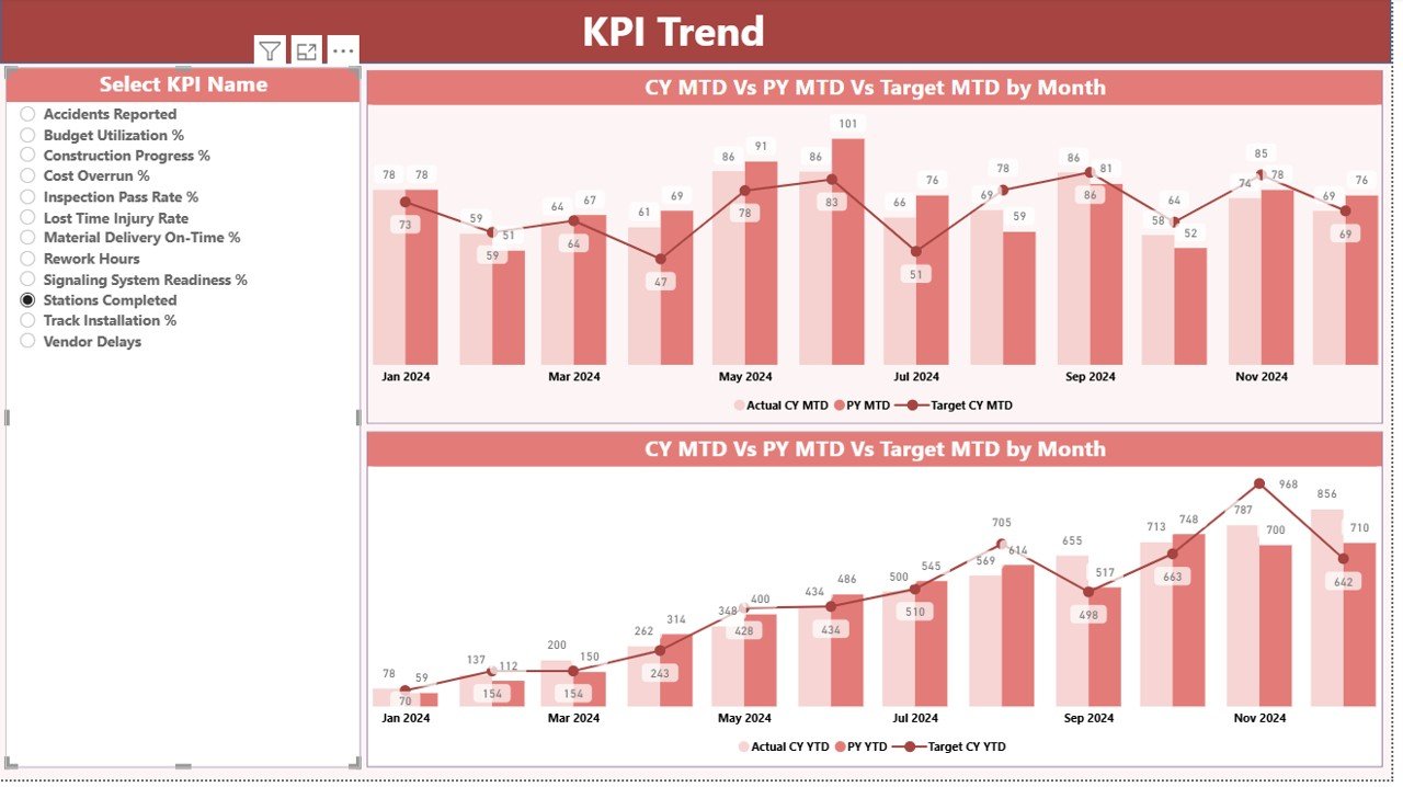
KPI Trend Page
The KPI Trend Page focuses on performance trends over time.
Key Features of the KPI Trend Page
- KPI selection slicer on the left
- Two combo charts for MTD and YTD analysis
- Actual, Target, and Previous Year comparisons
Trend Charts
Trend charts help users:
- Understand performance direction
- Identify seasonality and fluctuations
- Compare actuals with targets visually
- Spot early warning signs
As a result, project teams can act before issues escalate.
Click to buy Metro Rail Projects KPI Dashboard in Power BI
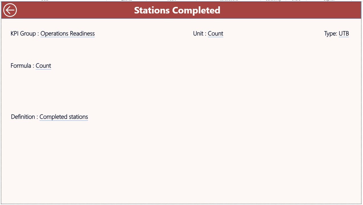
KPI Definition
The KPI Definition Page serves as a drill-through reference page.
Key Information on the KPI Definition Page
This page displays:
- KPI Number
- KPI Group
- KPI Name
- Unit of measurement
- KPI Formula
- KPI Definition
- KPI Type (LTB or UTB)
Because this page stays hidden, users access it only through drill-through from the summary page. Additionally, a back button allows easy navigation to the main dashboard.
Click to buy Metro Rail Projects KPI Dashboard in Power BI
How Does the Excel Data Source Work?
The dashboard uses an Excel file with three structured worksheets. This design ensures easy data entry and maintenance.
Input_Actual Sheet
In this sheet, users enter:
- KPI Name
- Month (first date of the month)
- MTD Actual value
- YTD Actual value
Input_Target Sheet
In this sheet, users enter:
- KPI Name
- Month (first date of the month)
- MTD Target value
- YTD Target value
KPI Definition Sheet
In this sheet, users define:
- KPI Number
- KPI Group
- KPI Name
- Unit
- Formula
- Definition
- KPI Type (LTB or UTB)
Because of this structure, data remains consistent and easy to audit.
Advantages of Metro Rail Projects KPI Dashboard in Power BI
Using a KPI dashboard delivers several business advantages.
Centralized Performance Monitoring
All KPIs stay in one dashboard. Therefore, teams avoid scattered files and conflicting reports.
Faster Decision-Making
Visual indicators highlight issues instantly. As a result, leadership reacts faster.
Improved Transparency
Everyone views the same data. Consequently, accountability improves.
Reduced Manual Effort
Automated calculations replace manual formulas. Thus, reporting time drops significantly.
Scalable KPI Management
Teams can add or modify KPIs easily as project needs evolve.
Best Practices for Metro Rail Projects KPI Dashboard in Power BI
To maximize dashboard value, follow these best practices.
Keep KPI Definitions Clear
Always define KPIs clearly in the KPI Definition sheet. This avoids confusion.
Update Data Regularly
Enter actual and target data monthly without delays. Fresh data ensures accuracy.
Use Correct KPI Types
Set LTB and UTB correctly. This ensures icons display properly.
Avoid Overloading KPIs
Track only meaningful KPIs. Too many metrics reduce focus.
Review Trends Periodically
Check trend charts monthly to detect early risks.
Who Should Use This Dashboard?
This dashboard works well for:
- Metro Rail Authorities
- Project Management Units (PMUs)
- Engineering & Planning Teams
- Finance & Cost Control Teams
- Government Infrastructure Agencies
- EPC Contractors
Because the dashboard remains flexible, it fits both small and large metro rail projects.
How Does This Dashboard Improve Project Governance?
Strong governance requires timely insights. This dashboard supports governance by:
- Highlighting missed targets
- Supporting audit-ready reporting
- Enabling data-backed reviews
- Improving cross-team alignment
As a result, leadership maintains stronger control over project outcomes.
Can This Dashboard Be Customized?
Yes, teams can customize:
- KPI groups
- KPI formulas
- Visual formatting
- Additional slicers
- New trend charts
Therefore, the dashboard adapts easily to project-specific needs.
Conclusion
A Metro Rail Projects KPI Dashboard in Power BI transforms complex project data into clear, actionable insights. Instead of relying on manual tracking, teams gain real-time visibility into performance, risks, and progress.
Because this dashboard combines structured Excel inputs with powerful Power BI visuals, it delivers clarity, speed, and control. Moreover, it supports better governance, faster decisions, and improved project outcomes.
For metro rail projects facing tight deadlines and public scrutiny, this dashboard becomes an essential performance management tool.
Frequently Asked Questions (FAQs)
What is a Metro Rail Projects KPI Dashboard in Power BI?
It is a visual dashboard that tracks metro rail project KPIs using Excel data and Power BI visuals.
Can non-technical users update the data?
Yes. Users only need to update Excel sheets. Power BI refreshes automatically.
Does this dashboard support MTD and YTD analysis?
Yes. It includes both MTD and YTD performance with target and previous year comparisons.
Can we add new KPIs later?
Yes. You can add KPIs easily through the Excel input sheets.
Does the dashboard support drill-through?
Yes. Users can drill through to the KPI Definition page for detailed information.
Visit our YouTube channel to learn step-by-step video tutorials
Watch the step-by-step video tutorial:
Click to buy Metro Rail Projects KPI Dashboard in Power BI