Customer loyalty decides business growth. However, many organizations still track customer feedback in scattered spreadsheets. As a result, leaders struggle to measure satisfaction, response time, and resolution rates clearly.So, how can you monitor customer loyalty, support performance, and follow-up requirements in one powerful system.You need an NPS Dashboard in Power BI.This ready-to-use dashboard transforms raw survey data into interactive insights. Moreover, it helps managers track NPS ratings, survey volume, case resolution rates, and response time instantly. Instead of manually reviewing data, you can filter by region, product, channel, or month and make smarter decisions faster.In this complete guide, you will learn:
- What an NPS Dashboard in Power BI is
- Why your business needs it
- A detailed explanation of all 5 dashboard pages
- Key metrics you can track
- Advantages of the NPS Dashboard in Power BI
- Best practices to use it effectively
- Frequently Asked Questions with answers
Click to buy NPS Dashboard in Power BI
What Is an NPS Dashboard in Power BI?
An NPS Dashboard in Power BI is an interactive reporting solution that helps businesses measure customer loyalty using Net Promoter Score (NPS).
NPS measures customer satisfaction by asking one simple question:
Why Do Businesses Need an NPS Dashboard in Power BI?
Customer feedback drives growth. However, raw data alone does not help. You need visibility.
Here is why organizations adopt an NPS Dashboard:
- It centralizes survey data in one place
- It highlights weak service areas quickly
- It tracks response time and resolution rate
- It identifies follow-up requirements
- It supports data-driven decisions
Moreover, leadership teams can monitor trends monthly. Therefore, they can improve service quality before issues grow.
Complete Explanation of All 5 Pages of NPS Dashboard in Power BI
This ready-to-use solution contains 5 fully interactive dashboard pages inside Power BI Desktop. Each page includes slicers (filters) to drill down by date, region, product, or channel.
Let’s explore each page in detail.
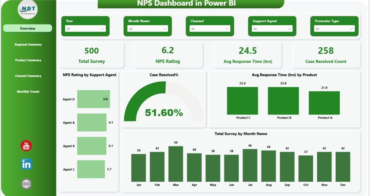
Overview Page – What Is the Overall Customer Loyalty Status?
The Overview Page acts as the main control center.
KPI Cards on the Overview Page
You will see 4 important KPI cards:
- Total Survey Count
- NPS Rating
- Average Response Time (Hours)
- Case Resolved Count
These cards instantly show performance health.
Key Visuals on Overview Page
- NPS Rating by Support Agent
- Case Resolved %
- Average Response Time by Product
- Total Survey by Month Name
With these visuals, managers can quickly identify:
- Which agent delivers higher satisfaction
- Which product causes delays
- Whether surveys increase monthly
Because everything appears in one place, decision-makers save time and act faster.

Click to buy NPS Dashboard in Power BI
Regional Summary – Which Region Performs Best?
The Regional Summary page focuses on geographical performance.
Charts Included
- Case Resolved % by Region
- Average Response Time (Hours) by Region
- NPS Rating by Region
- Follow-Up Required % by Region
This page answers critical questions:
- Does one region struggle with delays?
- Does any region receive lower satisfaction scores?
- Where do follow-ups increase?

Click to buy NPS Dashboard in Power BI
Product Summary – Which Product Drives Satisfaction or Complaints?
Products directly impact customer loyalty. Therefore, this page focuses on product-level analysis.
Charts Included
- NPS Rating by Product
- Total Survey by Product
- Case Resolved % by Product
- Follow-Up Required % by Product
With this page, you can identify:
- Which product receives maximum surveys
- Which product causes high follow-ups
- Which product generates strong promoter scores

Click to buy NPS Dashboard in Power BI
Channel Summary – Which Channel Performs Better?
Customers interact through multiple channels such as:
- Phone
- Chat
- Social Media
This page analyzes channel performance.
Charts Included
- NPS Rating by Channel
- Total Survey by Channel
- Case Resolved % by Channel
- Follow-Up Required % by Channel
With this analysis, managers can understand:
- Whether chat support resolves cases faster
- Whether email delays affect satisfaction
- Which channel generates more detractors
As a result, businesses can optimize communication strategies effectively.

Click to buy NPS Dashboard in Power BI
Monthly Trends – How Is Customer Loyalty Changing Over Time?
Tracking trends matters. Therefore, the Monthly Trends page helps monitor performance evolution.
Charts Included
- NPS Rating by Month Name
- Case Resolved % by Month Name
- Follow-Up Required % by Month Name
This page shows patterns clearly.
For example:
- If NPS drops for 3 consecutive months, leadership must investigate immediately.
- If resolution rate improves steadily, teams can continue current strategies.
Because Power BI updates automatically, you can monitor trends in real time.

Click to buy NPS Dashboard in Power BI
Key Metrics Tracked in the NPS Dashboard
The dashboard tracks several essential KPIs:
- Net Promoter Score (NPS)
- Total Survey Responses
- Promoters %, Passives %, Detractors %
- Case Resolved %
- Average Response Time (Hours)
- Follow-Up Required %
- Agent-Level Performance
- Region-Level Satisfaction
- Product-Level Complaints
These metrics together create a 360-degree view of customer experience.
Advantages of NPS Dashboard in Power BI
An NPS Dashboard delivers powerful business value.
Centralized Reporting
You can track surveys, response time, and resolution in one system. Therefore, you avoid scattered Excel sheets.
Real-Time Insights
Power BI refreshes data instantly. As a result, leaders make quick decisions.
Better Accountability
You can evaluate agent, region, and channel performance clearly. Consequently, teams stay accountable.
Faster Problem Detection
If NPS drops or follow-ups increase, managers notice immediately. Thus, they take corrective action faster.
Improved Customer Retention
When businesses improve satisfaction, customer loyalty increases. Eventually, revenue grows.
Best Practices for the NPS Dashboard in Power BI
To maximize value, follow these best practices:
Collect Clean Survey Data
Ensure accurate ratings and response time data. Otherwise, insights may mislead.
Monitor Trends Monthly
Do not check NPS only once. Instead, track month-over-month changes consistently.
Focus on Detractors
Contact detractors quickly. Therefore, you can recover relationships.
Reduce Response Time
Shorter response time improves satisfaction. Hence, track this KPI closely.
Use Filters Smartly
Leverage slicers to analyze by region, product, and channel.
Share Dashboard with Leadership
Encourage managers to review the dashboard weekly.
When teams follow these practices, they improve service quality significantly.
How Does NPS Dashboard Improve Business Performance?
The dashboard directly impacts business growth.
First, it identifies service gaps.
Second, it tracks resolution efficiency.
Third, it supports proactive engagement.
Moreover, satisfied customers often recommend brands. Consequently, referral rates increase.
According to industry studies, companies with high NPS grow 2x faster than competitors. Therefore, monitoring NPS becomes essential for long-term success.
How to Implement an NPS Dashboard in Power BI?
You can implement it in simple steps:
- Collect survey data in Excel
- Import data into Power BI
- Create calculated NPS measures
- Build interactive visuals
- Add slicers for filtering
- Publish dashboard to Power BI Service
Once you set up the dashboard, you can update data regularly.
Conclusion – Why Should You Use an NPS Dashboard in Power BI?
Customer loyalty drives sustainable growth. However, businesses must measure it accurately.
An NPS Dashboard in Power BI helps you track satisfaction, resolution rates, and response time in one interactive system. Moreover, it highlights weak areas instantly and supports faster decision-making.
If you want better customer experience, stronger brand reputation, and improved retention, this dashboard offers the perfect solution.
Therefore, start tracking your NPS performance today and turn feedback into growth.
Frequently Asked Questions (FAQs)
- What is a good NPS score?
A score above 50 indicates strong customer loyalty. However, industries differ.
- How often should businesses review NPS data?
You should review NPS monthly. Additionally, monitor weekly for support teams.
- Can small businesses use an NPS Dashboard in Power BI?
Yes. Small businesses can easily track survey data and improve customer experience.
- What data is required to build an NPS Dashboard?
You need survey rating, customer details, agent name, region, product, response time, resolution status, and follow-up flag.
- Does Power BI automatically calculate NPS?
Yes. You can create DAX measures to calculate promoters %, detractors %, and final NPS score.
- How does response time impact NPS?
Faster response time increases satisfaction. Therefore, tracking it remains essential.
Visit our YouTube channel to learn step-by-step video tutorials
Watch the step-by-step video tutorial:
Click to buy NPS Dashboard in Power BI