Modern organizations operate in a fast-moving environment where efficiency, cost control, and performance visibility determine success. However, many companies still rely on scattered spreadsheets, manual reporting, and delayed updates. As a result, managers struggle to monitor operational costs, completion rates, department performance, and regional efficency in real time.So, how can organizations gain complete operational visibility without investing in expensive enterprise software?You need an Operations Dashboard in Power BI.
This powerful and interactive dashboard converts raw operational data into meaningful insights. Instead of reviewing multiple reports, leaders can track costs, monitor productivity, analyze delays, and evaluate performance — all in one centralized interface.
In this detailed guide, you will learn:
- What an Operations Dashboard in Power BI is
- Why operations teams need performance dashboards
- Detailed explanation of all 5 dashboard pages
- Key operational KPIs included
- Advantages of the Operations Dashboard in Power BI
- Best practices for using the dashboard effectively
- Frequently asked questions with answers
Click to buy Operations Dashboard in Power BI
What Is an Operations Dashboard in Power BI?
An Operations Dashboard in Power BI is a ready-to-use interactive reporting solution designed to monitor operational performance, cost efficiency, timelines, and productivity metrics in one place.
Instead of analyzing disconnected Excel files, organizations can:
- Track planned vs actual costs
- Monitor operational completion rates
- Analyze department performance
- Evaluate regional efficiency
- Measure operational delays
- Identify performance bottlenecks quickly
Because Power BI provides dynamic visuals and slicers, users can filter data instantly and explore insights from multiple perspectives.
As a result, decision-makers act faster and improve operational outcomes.
Why Do Organizations Need an Operations Dashboard?
Operations teams manage complex workflows every day. They coordinate departments, monitor production timelines, control budgets, and ensure targets get completed on schedule. However, without structured analytics, teams often face serious challenges.
Common Operational Challenges
- Data scattered across multiple systems
- Lack of real-time performance visibility
- Difficulty tracking delays
- Poor cost control monitoring
- Slow reporting processes
- Limited accountability across departments
Therefore, organizations require a centralized dashboard that delivers clarity and control.
An Operations Dashboard solves these problems by transforming operational data into actionable intelligence.
What Makes Power BI Ideal for Operations Dashboards?
Power BI offers powerful analytics capabilities that perfectly match operational reporting needs.
Key Reasons to Use Power BI
- Interactive visualizations
- Real-time filtering using slicers
- Automated data refresh
- Drill-down analysis
- Easy sharing across teams
- Scalable reporting environment
Moreover, Power BI allows managers to explore performance without technical expertise.
Overview of the Operations Dashboard in Power BI
This dashboard contains five analytical pages, each designed to answer specific operational questions. Together, they provide a complete performance monitoring system.
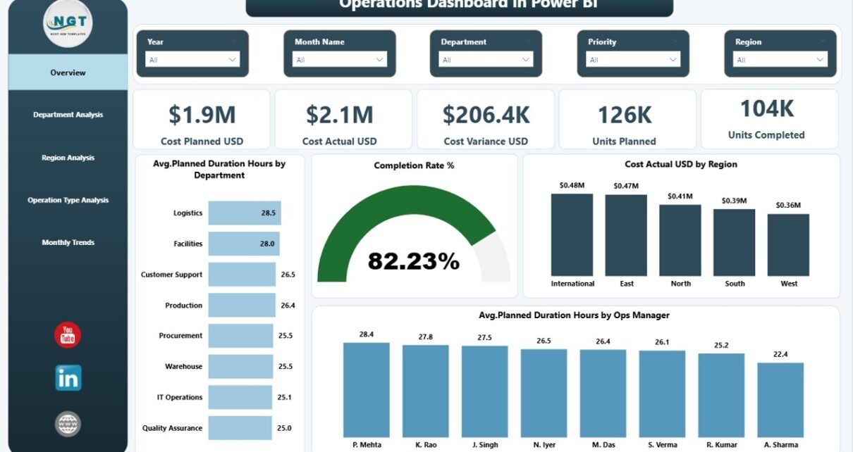
Overview Page – How Is Overall Operational Performance?
The Overview Page acts as the command center of the dashboard. It delivers a high-level snapshot of operational performance.
KPI Cards Available
- Cost Planned (USD)
- Cost Actual (USD)
- Cost Variance
- Units Planned
- Units Completed
These cards instantly show whether operations stay on track.
Charts Included
- Average Planned Duration Hours by Department
- Completion Rate %
- Cost Actual USD by Region
- Average Planned Duration Hours by Operations Manager
Because this page summarizes performance quickly, executives can understand operational health within seconds.
Click to buy Operations Dashboard in Power BI
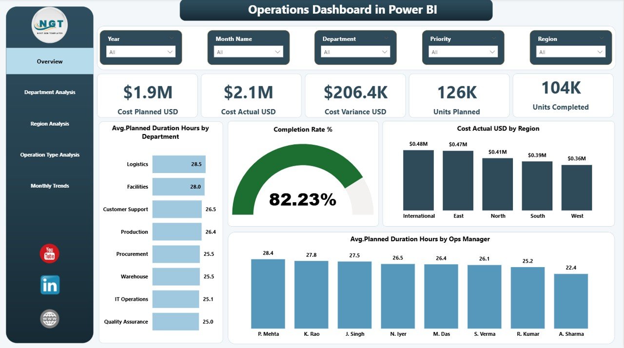
Department Analysis – Which Departments Perform Best?
Departments play a critical role in operational success. Therefore, managers must analyze departmental efficiency regularly.
Charts Available
- Average Actual Duration Hours by Department
- Average Delay Hours by Department
- Cost Actual USD by Department
- Units Completed vs Units Planned by Department
With this analysis, managers can:
- Identify underperforming departments
- Detect operational delays early
- Optimize resource allocation
- Improve productivity planning
Consequently, leadership teams make data-driven decisions instead of assumptions.
Click to buy Operations Dashboard in Power BI
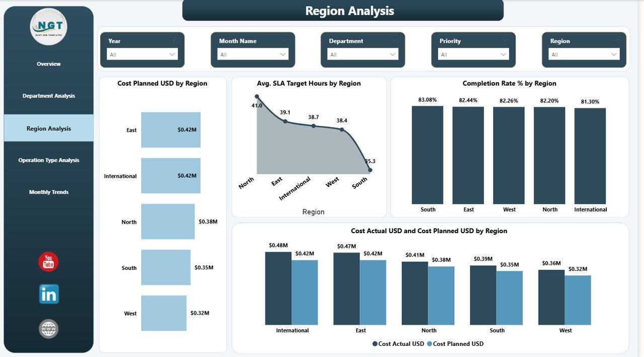
Region Analysis – How Do Different Regions Compare?
Operations often vary across regions due to workforce, logistics, or infrastructure differences. Hence, regional comparison becomes essential.
Charts Included
- Cost Planned USD by Region
- Average SLA Target Hours by Region
- Completion Rate % by Region
- Cost Actual vs Cost Planned USD by Region
This page helps organizations:
- Compare regional efficiency
- Control regional spending
- Improve SLA performance
- Identify high-performing locations
As a result, companies optimize operational strategies geographically.
Click to buy Operations Dashboard in Power BI
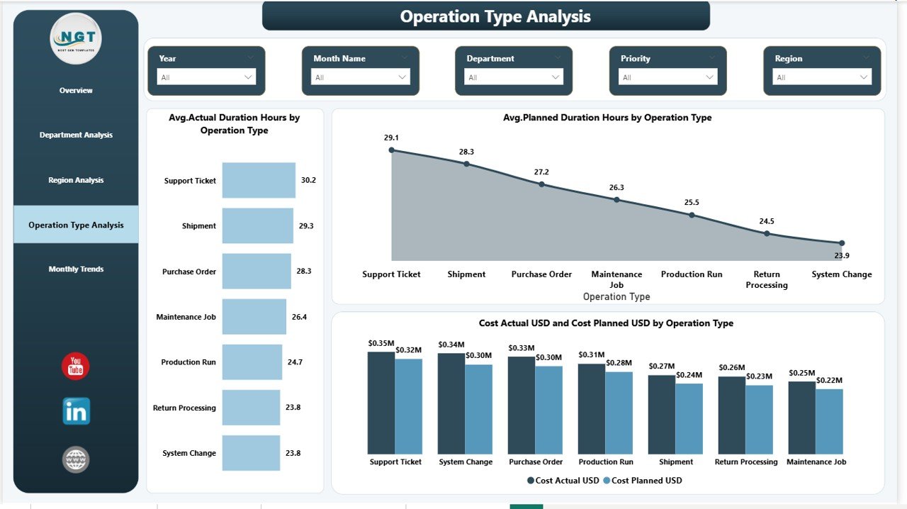
Operation Type Analysis – Which Operations Drive Costs and Delays?
Not all operations behave the same way. Some operations require more time, resources, or budget.
Charts Included
- Average Actual Duration Hours by Operation Type
- Average Planned Duration Hours by Operation Type
- Cost Actual vs Cost Planned USD by Operation Type
Using this page, teams can:
- Analyze complexity differences
- Detect inefficient operation types
- Improve scheduling accuracy
- Reduce operational waste
Therefore, organizations gain deeper insight into operational processes.
Click to buy Operations Dashboard in Power BI
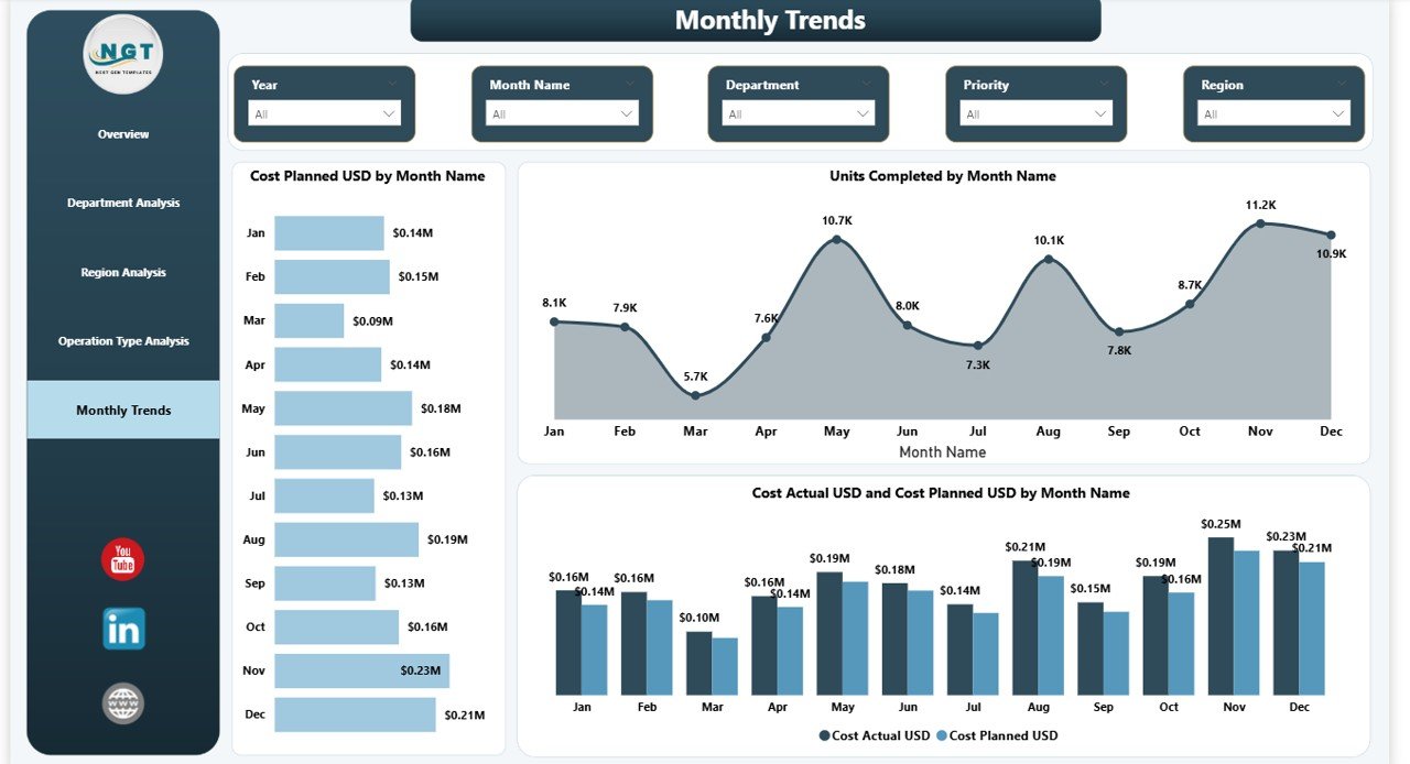
Monthly Trends – How Does Performance Change Over Time?
Trend analysis reveals patterns that single reports cannot show.
Charts Included
- Cost Planned by Month Name
- Units Completed by Month Name
- Cost Actual vs Cost Planned USD by Month Name
This page enables users to:
- Monitor operational growth
- Identify seasonal trends
- Forecast future performance
- Improve long-term planning
Consequently, leadership shifts from reactive management to proactive planning.
Click to buy Operations Dashboard in Power BI
Key KPIs Tracked in the Operations Dashboard
The dashboard focuses on measurable operational indicators.
Cost KPIs
- Planned Cost
- Actual Cost
- Cost Variance
Productivity KPIs
- Units Planned
- Units Completed
- Completion Rate %
Efficiency KPIs
- Planned Duration Hours
- Actual Duration Hours
- Delay Hours
Performance KPIs
- SLA Target Hours
- Department Efficiency
- Regional Performance
Together, these KPIs create a complete operational performance framework.
Advantages of Operations Dashboard in Power BI
Organizations experience significant benefits after implementing this dashboard.
Real-Time Decision Making
Managers access live performance insights and respond quickly to issues.
Improved Cost Control
Planned vs actual comparisons highlight budget deviations immediately.
Higher Operational Efficiency
Teams identify delays and remove bottlenecks faster.
Centralized Reporting
All operational metrics exist in one dashboard instead of multiple files.
Better Accountability
Department and manager performance becomes transparent.
Data-Driven Culture
Employees rely on facts instead of assumptions.
How Does the Dashboard Improve Operational Strategy?
The dashboard does more than display numbers. It supports strategic improvements.
It Helps Organizations:
- Optimize workforce planning
- Improve scheduling accuracy
- Reduce operational waste
- Enhance regional performance
- Forecast operational costs
- Strengthen performance monitoring
Therefore, leaders move from reactive management to predictive operations.
Best Practices for the Operations Dashboard in Power BI
To maximize value, organizations should follow proven best practices.
- Maintain Clean Data Sources
Always standardize operational data before importing it into Power BI.
- Update Data Regularly
- Frequent updates ensure accurate decision-making.
- Define Clear KPI Ownership
- Assign responsibility for each KPI to specific teams.
- Use Filters Strategically
- Encourage managers to analyze performance by department, region, and time.
- Focus on Actionable Metrics
- Avoid tracking unnecessary metrics that do not drive decisions.
- Review Trends Monthly
- Trend analysis helps detect long-term operational issues early.
- Train Users Properly
- Provide simple training so teams understand dashboard insights.
Who Can Benefit from an Operations Dashboard in Power BI?
Many industries can use this dashboard effectively.
Ideal Users Include:
- Manufacturing companies
- Logistics organizations
- Service operations teams
- Project management offices
- Construction companies
- Facility management teams
- Operations managers and executives
Because operations exist in every industry, this dashboard adapts easily to different business models.
How Does This Dashboard Support Data-Driven Leadership?
Modern leadership depends on accurate insights. When leaders see performance clearly, they act confidently.
The dashboard enables leaders to:
- Monitor execution progress daily
- Compare performance objectively
- Identify risks early
- Allocate resources efficiently
- Improve operational transparency
As a result, organizations build stronger operational governance.
Future of Operations Analytics with Power BI
Operations analytics continues evolving rapidly. Companies increasingly adopt data-driven management to stay competitive.
Future trends include:
- AI-driven forecasting
- Predictive maintenance analytics
- Automated anomaly detection
- Real-time IoT integration
- Advanced operational simulations
Power BI already supports many of these capabilities, which makes it a future-ready platform.
Conclusion: Why Every Organization Needs an Operations Dashboard in Power BI
Operational success depends on visibility, accuracy, and speed. Without structured reporting, organizations struggle to control costs, manage productivity, and maintain efficiency.
The Operations Dashboard in Power BI solves these challenges by delivering a centralized, interactive, and data-driven reporting environment.
Because it combines cost tracking, performance monitoring, departmental analysis, regional comparison, and trend evaluation, organizations gain complete operational clarity.
Ultimately, teams work smarter, leaders decide faster, and operations become more efficient.
Frequently Asked Questions with Answers
What is an Operations Dashboard in Power BI used for?
It helps organizations monitor operational performance, costs, productivity, and efficiency through interactive visual reports.
Can small businesses use this dashboard?
Yes. Small and medium businesses benefit greatly because Power BI scales easily according to data size.
Does the dashboard require advanced technical skills?
No. Users can interact using filters and visuals without technical knowledge.
How often should data be updated?
Organizations should update data daily or weekly depending on operational volume.
Can the dashboard track multiple regions?
Yes. Regional analysis allows performance comparison across locations.
Is Power BI better than Excel for operations dashboards?
Power BI offers stronger visualization, automation, and interactive analytics compared to traditional Excel reports.
Can this dashboard support decision-making?
Yes. It provides real-time insights that help leaders make faster and more accurate decisions.
Visit our YouTube channel to learn step-by-step video tutorials
Watch the step-by-step video tutorial:
Click to buy Operations Dashboard in Power BI