Managing a refinery involves thousands of daily decisions. Leaders must control costs, reduce downtime, optimize energy usage, and increase output at the same time. However, when teams rely on scattered reports and static spreadsheets, decision-making slows down. As a result, risks increase and profitability suffers.
That is exactly why a Refinery Dashboard in Power BI plays a critical role in modern refinery management.
In this in-depth and SEO-friendly guide, you will learn what a Refinery Dashboard in Power BI is, why it matters, how it works, what each dashboard page shows, its advantages, best practices, and frequently asked questions. Moreover, this article explains everything in simple and clear language so that operations teams, plant managers, and executives can apply these insights immediately.
Click to Purchases Refinery Dashboard in Power BI
What Is a Refinery Dashboard in Power BI?
A Refinery Dashboard in Power BI is an interactive analytics solution built using Microsoft Power BI to monitor refinery performance in real time.
Instead of reviewing long operational reports, decision-makers view:
-
Downtime metrics
-
Operating costs
-
Energy consumption
-
Output volumes
-
Revenue trends
Because Power BI supports dynamic visuals, slicers, and drill-downs, the dashboard converts raw refinery data into meaningful insights. Consequently, teams gain clarity, speed, and confidence in their decisions.
Why Do Refineries Need a Power BI Dashboard?
Refineries operate under tight margins and strict safety standards. Therefore, leaders must track performance continuously.
A Refinery Dashboard in Power BI helps because it:
-
Centralizes operational, financial, and energy data
-
Highlights inefficiencies instantly
-
Supports faster corrective actions
-
Improves cost control and productivity
-
Enhances transparency across departments
Moreover, Power BI dashboards eliminate manual reporting efforts. As a result, teams focus more on optimization and less on data preparation.
How Does a Refinery Dashboard in Power BI Work?
A Refinery Dashboard in Power BI follows a simple and effective flow:
-
Data Collection
The dashboard pulls data from ERP systems, Excel files, sensors, or databases. -
Data Modeling
Power BI cleans, relates, and structures data into a reliable model. -
KPI Calculation
Measures calculate downtime, cost, revenue, and energy KPIs. -
Visualization
Charts, cards, and tables present insights visually. -
Interaction
Slicers allow users to filter by location, department, product, or time.
Because of this structure, stakeholders explore data without technical effort.
What Are the Key Pages in a Refinery Dashboard in Power BI?
A well-designed Refinery Dashboard includes five analytical pages, each serving a specific decision-making purpose.
1. What Does the Overview Page Show in a Refinery Dashboard?

The Overview Page acts as the command center of the dashboard.
Key Elements on the Overview Page
Slicers
-
Refinery Location
-
Department
-
Product Type
-
Time Period
KPI Cards
-
Total Downtime
-
Operating Cost
-
Total Output Volume
-
Total Revenue
Charts Included
-
Downtime by Operating Status
-
Operating Cost by Refinery Location
-
Output Volume by Department
-
Revenue by Product Type
Why Does the Overview Page Matter?
This page gives leadership a high-level snapshot. As a result, executives quickly identify problem areas and take action.
Click to Purchases Refinery Dashboard in Power BI
2. How Does the Refinery Location Analysis Page Improve Performance?
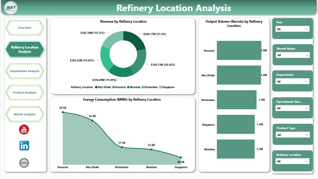
The Refinery Location Analysis Page compares performance across different refinery sites.
Charts on This Page
-
Revenue by Refinery Location
-
Output Volume by Refinery Location
-
Energy Consumption by Refinery Location
Key Insights Gained
-
Identify top-performing and underperforming sites
-
Compare energy efficiency across locations
-
Optimize resource allocation
Because location-based analysis reveals hidden inefficiencies, managers improve operational balance across plants.
3. What Can You Analyze Using the Department Analysis Page?
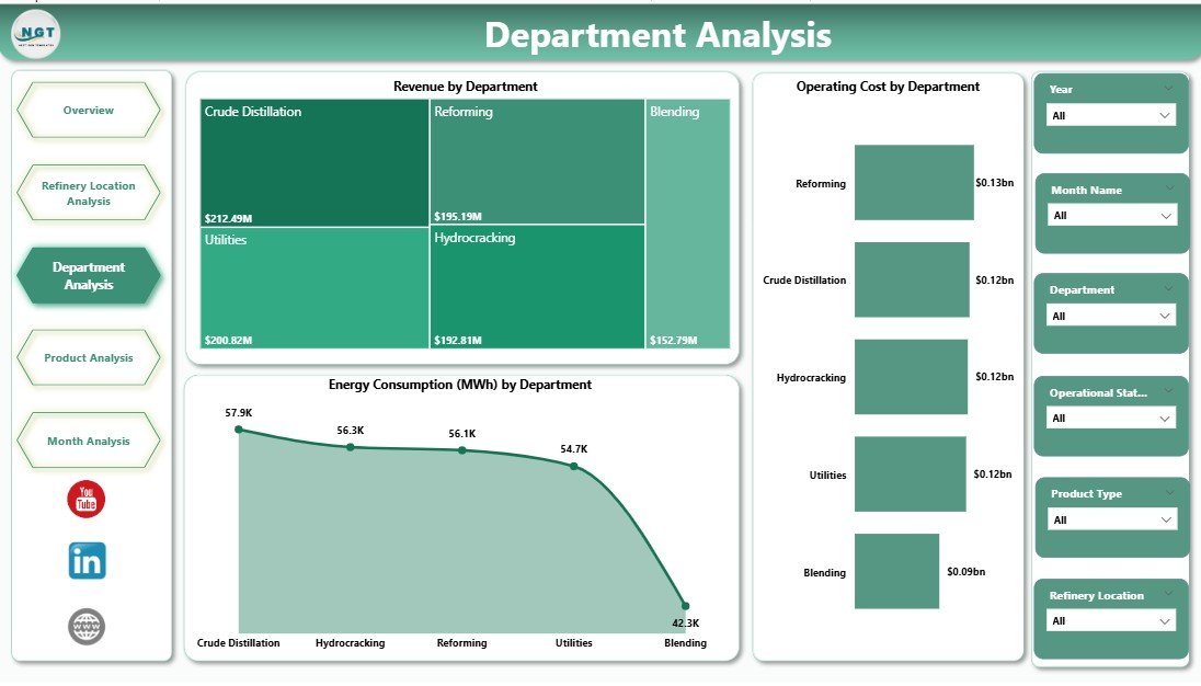
The Department Analysis Page focuses on internal operational efficiency.
Charts on This Page
-
Revenue by Department
-
Energy Consumption by Department
-
Operating Cost by Department
Why Department Analysis Matters
Each department affects refinery performance differently. Therefore, this page helps:
-
Control department-level costs
-
Reduce energy waste
-
Improve accountability
As a result, department heads align performance with refinery goals.
4. How Does Product Analysis Support Better Product Decisions?
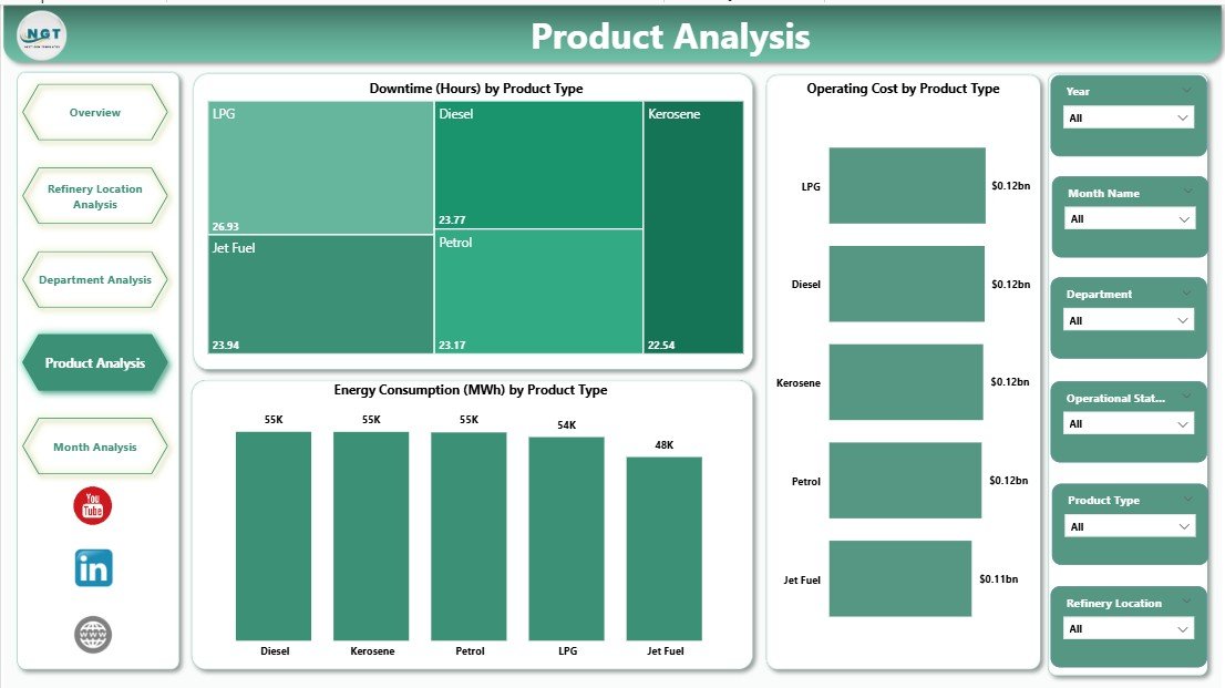
The Product Analysis Page evaluates performance by production type.
Charts on This Page
-
Downtime by Product Type
-
Operating Cost by Product Type
-
Energy Consumption by Product Type
Business Benefits
-
Identify products causing frequent downtime
-
Compare profitability across product lines
-
Optimize production planning
Because product-level insights drive profitability, this page supports strategic decisions.
5. Why Are Monthly Trends Important in a Refinery Dashboard?
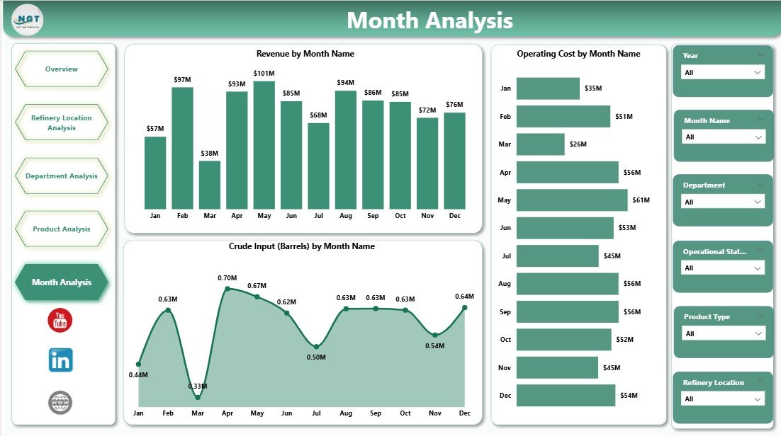
The Monthly Trends Page tracks performance over time.
Charts on This Page
-
Revenue by Month
-
Operating Cost by Month
-
Crude Input by Month
Insights from Monthly Trends
-
Detect seasonal demand patterns
-
Monitor cost escalation early
-
Align crude input with output demand
Trend analysis ensures that refinery leaders plan proactively rather than reactively.
What KPIs Can You Track Using a Refinery Dashboard in Power BI?
A Refinery Dashboard supports a wide range of KPIs, including:
-
Total Downtime Hours
-
Downtime by Status
-
Operating Cost per Unit
-
Energy Consumption per Unit
-
Revenue per Product
-
Output Volume by Department
-
Crude Input Utilization
-
Cost-to-Revenue Ratio
These KPIs guide daily, monthly, and strategic decisions.
Advantages of a Refinery Dashboard in Power BI
A Refinery Dashboard in Power BI delivers measurable value across operations.
Key Advantages
-
✅ Centralized refinery performance visibility
-
✅ Faster data-driven decisions
-
✅ Reduced operational costs
-
✅ Improved energy efficiency
-
✅ Lower downtime and losses
-
✅ Easy scalability and customization
-
✅ Real-time and interactive reporting
Because Power BI dashboards update dynamically, teams always work with current data.
What Challenges Do Refineries Face Without a Dashboard?
Without a centralized dashboard, refineries often struggle with:
-
Disconnected data sources
-
Delayed reporting cycles
-
Limited visibility into inefficiencies
-
Manual and error-prone analysis
-
Poor cross-department coordination
However, a Refinery Dashboard in Power BI eliminates these challenges effectively.
Best Practices for the Refinery Dashboard in Power BI
To maximize value, teams should follow proven best practices.
Best Practices
-
🔹 Define clear KPIs aligned with business goals
-
🔹 Maintain clean and consistent data sources
-
🔹 Use standardized naming conventions
-
🔹 Limit visuals to decision-focused metrics
-
🔹 Use slicers instead of multiple reports
-
🔹 Validate measures regularly
-
🔹 Train users on dashboard interpretation
When teams follow these practices, dashboards deliver long-term value.
How Can Refineries Use This Dashboard for Strategic Planning?
Click to Purchases Refinery Dashboard in Power BI
A Refinery Dashboard in Power BI supports strategic planning by:
-
Forecasting revenue trends
-
Identifying cost-saving opportunities
-
Improving capital allocation decisions
-
Supporting sustainability initiatives
-
Enhancing compliance reporting
Therefore, the dashboard becomes more than a reporting tool. It becomes a strategic asset.
Who Should Use a Refinery Dashboard in Power BI?
This dashboard benefits multiple stakeholders:
-
Refinery Managers
-
Operations Heads
-
Energy Managers
-
Finance Teams
-
Plant Engineers
-
Executive Leadership
Because each role views data through slicers, everyone gains relevant insights.
How Does Power BI Improve Collaboration in Refineries?
Power BI enables collaboration through:
-
Shared dashboards
-
Role-based access
-
Consistent data definitions
-
Cloud and desktop access
As a result, teams align decisions and avoid conflicting reports.
Conclusion: Why Is a Refinery Dashboard in Power BI Essential Today?
A Refinery Dashboard in Power BI transforms complex refinery data into actionable intelligence. It improves visibility, reduces costs, minimizes downtime, and supports smarter decisions across locations, departments, products, and time periods.
In today’s competitive and energy-intensive environment, refineries cannot afford delayed insights. Therefore, adopting a Power BI-based refinery dashboard ensures operational excellence and long-term profitability.
Frequently Asked Questions About Refinery Dashboard in Power BI
What is a Refinery Dashboard in Power BI used for?
A Refinery Dashboard in Power BI monitors operational, financial, and energy performance in one interactive view.
Can Power BI handle large refinery datasets?
Yes. Power BI efficiently handles large datasets using optimized data models and measures.
Does the dashboard support real-time data?
Yes. Power BI supports scheduled and real-time data refresh based on data sources.
Can users filter data by location and department?
Yes. Slicers allow filtering by refinery location, department, product, and time.
Is the dashboard customizable?
Yes. Teams can add KPIs, charts, and pages based on refinery requirements.
Does the dashboard help reduce downtime?
Yes. Downtime analysis highlights problem areas and supports preventive actions.
Can non-technical users use this dashboard?
Yes. Power BI dashboards offer intuitive visuals and simple interactions.
Is Power BI suitable for long-term refinery analytics?
Yes. Power BI supports historical trend analysis and strategic planning.
Visit our YouTube channel to learn step-by-step video tutorials