Modern refinery projects are complex, capital-intensive, and time-sensitive. Therefore, project managers, engineering teams, and leadership groups must track performance accurately at every stage. However, when teams rely on scattered Excel files, static reports, or manual tracking methods, they lose visibility, speed, and control. As a result, delays, cost overruns, and missed targets become common challenges.
This is exactly where a Refinery Project KPI Dashboard in Power BI delivers exceptional value. It transforms raw project data into structured KPIs, interactive visuals, and clear performance indicators. Moreover, it enables refinery teams to monitor progress, compare targets versus actuals, and take faster, data-driven decisions.
In this detailed and SEO-friendly guide, you will learn everything about the Refinery Project KPI Dashboard in Power BI. We will cover how it works, its page structure, KPI logic, Excel data design, advantages, best practices, and frequently asked questions. By the end, you will clearly understand how this dashboard strengthens project governance in refinery environments.
What Is a Refinery Project KPI Dashboard in Power BI?
A Refinery Project KPI Dashboard in Power BI is a centralized performance monitoring and analytics solution designed to track key performance indicators related to refinery projects.
Instead of managing project data across multiple Excel sheets or disconnected systems, this dashboard consolidates all KPIs into a single interactive Power BI report. Consequently, project teams gain instant visibility into Month-to-Date (MTD) and Year-to-Date (YTD) performance.
Additionally, this dashboard uses Excel as its data source. Therefore, teams can maintain simplicity while still benefiting from enterprise-level analytics. Because of this combination, refinery organizations can implement the dashboard quickly without complex system integrations.
Why Do Refinery Projects Need a KPI Dashboard?
Refinery projects involve engineering milestones, safety targets, budgets, schedules, and resource utilization. Therefore, tracking performance manually often creates delays and inconsistencies.
A Refinery Project KPI Dashboard in Power BI solves these issues by delivering:
- Real-time visibility into project KPIs
- Clear comparison between actual, target, and previous year performance
- Visual indicators that highlight risks early
- Faster decision-making for project leaders
As a result, refinery teams can maintain control, accountability, and transparency throughout the project lifecycle.
How Does a Refinery Project KPI Dashboard in Power BI Work?
The dashboard works by combining structured Excel data with Power BI’s interactive visualization engine. First, users update KPI data in predefined Excel templates. Next, Power BI refreshes the visuals automatically. Finally, decision-makers analyze performance using slicers, tables, and charts.
Because of this workflow, teams reduce manual effort and improve reporting accuracy.
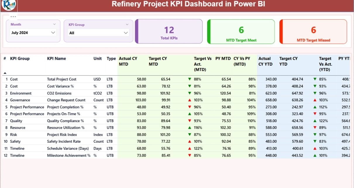
Page Structure of Refinery Project KPI Dashboard in Power BI
The dashboard includes three well-structured pages, each designed to serve a specific analytical purpose.
Summary Page – How Does It Provide a Complete KPI Overview?
The Summary Page acts as the central control panel of the dashboard. It delivers a high-level overview of all refinery project KPIs in one place.
Key Elements of the Summary Page
- Month Slicer
Allows users to select the reporting month instantly.
KPI Group Slicer
Enables filtering KPIs by category or project area.
KPI Cards
Total KPIs Count
MTD Target Met Count
MTD Target Missed Count
These cards immediately highlight overall project performance.
Detailed KPI Table on Summary Page
Below the cards, the dashboard displays a comprehensive KPI table with the following columns:
- KPI Number
Shows the sequence number of each KPI. - KPI Group
Represents the category or functional area of the KPI. - KPI Name
Displays the KPI title clearly.
Unit
Defines the unit of measurement.
Type (LTB or UTB)
LTB: Lower the Better
UTB: Upper the Better
MTD Performance Metrics
- Actual CY MTD
Current Year actual Month-to-Date value. - Target CY MTD
Current Year target Month-to-Date value. - MTD Icon
Shows ▲ (green) or ▼ (red) to indicate performance status. - Target vs Actual (MTD)
Calculated using:
Actual MTD / Target MTD - PY MTD
Previous Year Month-to-Date value. - CY vs PY (MTD)
Calculated using:
Current Year MTD / Previous Year MTD
YTD Performance Metrics
- Actual CY YTD
Current Year actual Year-to-Date value. - Target CY YTD
Current Year target Year-to-Date value. - YTD Icon
Uses visual arrows to show performance status. - Target vs Actual (YTD)
Calculated using:
Actual YTD / Target YTD - PY YTD
Previous Year Year-to-Date value. - CY vs PY (YTD)
Calculated using:
Current Year YTD / Previous Year YTD
Because of this structured table, users can analyze multiple dimensions of project performance at once.

KPI Trend Page – How Does It Help Track Performance Over Time?
The KPI Trend Page focuses on visual trend analysis. It allows users to see how KPIs evolve over time rather than viewing only static numbers.
Key Features of KPI Trend Page
- Two Combo Charts
MTD Trend Chart
YTD Trend Chart
Each chart displays:
- Current Year Actual
- Previous Year Actual
- Target Values
- KPI Name Slicer
Users can select any KPI to view its trend instantly.
Because of these visuals, teams can quickly identify improvement patterns or performance drops.

KPI Definition Page – Why Is It Important?
The KPI Definition Page is a hidden drill-through page. It provides deeper clarity about each KPI.
What Does the KPI Definition Page Show?
- KPI Formula
- KPI Definition
- KPI Unit
- KPI Type (LTB or UTB)
Users can drill through from the Summary Page to view detailed explanations. After reviewing, they can return easily using the back button.
As a result, all stakeholders maintain a consistent understanding of KPIs.

Excel Data Model Used in Refinery Project KPI Dashboard
The dashboard uses Excel as its data source, which ensures flexibility and simplicity.
Excel Worksheets Required
Input_Actual Sheet
In this sheet, users enter actual performance data:
- KPI Name
- Month (first date of the month)
- MTD Actual Value
- YTD Actual Value
Input_Target Sheet
In this sheet, users enter target values:
- KPI Name
- Month (first date of the month)
- MTD Target Value
- YTD Target Value
KPI Definition Sheet
This sheet defines the KPI structure:
- KPI Number
- KPI Group
- KPI Name
- Unit
- Formula
- Definition
- Type (LTB or UTB)
Because of this design, data entry remains simple and controlled.
Advantages of Refinery Project KPI Dashboard in Power BI
Centralized Project Monitoring
The dashboard consolidates all refinery project KPIs into one interactive report. As a result, teams avoid scattered files and manual consolidation.
Faster Decision-Making
Because visuals update instantly, decision-makers act faster and more confidently.
Clear Target vs Actual Tracking
MTD and YTD comparisons highlight gaps early and prevent surprises.
Trend-Based Insights
Trend charts reveal patterns that static reports often miss.
Improved Accountability
Defined KPIs and transparent reporting improve ownership across teams.
Easy Excel Integration
Teams can update data without advanced technical skills.
Best Practices for the Refinery Project KPI Dashboard in Power BI
Define KPIs Clearly Before Implementation
Always document KPI definitions, formulas, and units before using the dashboard.
Maintain Consistent Data Entry
Ensure that month dates follow the same format and structure.
Review KPI Performance Monthly
Schedule regular performance reviews using MTD and YTD insights.
Use KPI Groups Strategically
Group KPIs logically to improve analysis and storytelling.
Train Users on Drill-Through Features
Educate teams on how to access KPI definitions for clarity.
Refresh Data Regularly
Udate Excel files on a fixed schedule to keep insights current.
Who Can Benefit from a Refinery Project KPI Dashboard in Power BI?
- Project Managers
- Engineering Teams
- Refinery Operations Leaders
- PMO Offices
- Finance and Cost Control Teams
- Executive Leadership
Each group gains faster access to accurate project insights.
How Does This Dashboard Improve Refinery Project Governance?
This dashboard strengthens governance by creating transparency, accountability, and standardization. Because KPIs remain visible and comparable, teams align better with project goals.
Moreover, leadership can intervene early when performance deviates from targets.
Conclusion: Why Is a Refinery Project KPI Dashboard in Power BI a Must-Have?
A Refinery Project KPI Dashboard in Power BI is not just a reporting tool. Instead, it is a strategic asset for modern refinery projects. It simplifies complex data, enhances visibility, and drives data-driven decisions.
By combining Excel-based data entry with Power BI analytics, this dashboard delivers speed, clarity, and control. Therefore, refinery organizations that adopt it gain a significant advantage in managing large-scale projects effectively.
Frequently Asked Questions (FAQs)
What is the main purpose of a Refinery Project KPI Dashboard in Power BI?
The main purpose is to monitor project performance using KPIs, targets, trends, and comparisons in one interactive dashboard.
Can I use Excel as the only data source?
Yes, this dashboard uses Excel as its primary data source, which keeps implementation simple.
What does LTB and UTB mean in KPIs?
LTB means Lower the Better, while UTB means Upper the Better. How often should I update the data?
You should update data monthly or as per project reporting cycles.
Can this dashboard handle multiple refinery projects?
Yes, by using KPI groups and filters, you can track multiple projects efficiently.
Do I need advanced Power BI skills to use this dashboard?
No, basic Power BI navigation knowledge is sufficient.
How does the dashboard show performance status?
It uses green and red arrow icons to indicate whether KPIs meet or miss targets.
Visit our YouTube channel to learn step-by-step video tutorials
Watch the step-by-step video tutorial: