In today’s fast-paced and customer-driven world, the success of supply chain operations depends heavily on performance visibility and continuous improvement. Whether you’re managing inventory, shipments, warehouse operations, or supplier relationships, tracking the right KPIs (Key Performance Indicators) is essential. That’s exactly where the Supply Chain and Logistics Quality Assurance KPI Dashboard in Excel becomes your ultimate tool for operational excellence.
This article dives deep into how this dashboard works, why it matters, and how you can use it to track and improve your supply chain performance effectively.
Click to Purchases Supply Chain and Logistics Quality Assurance KPI Dashboard in Excel
What is a Supply Chain and Logistics Quality Assurance KPI Dashboard?
A Supply Chain and Logistics Quality Assurance KPI Dashboard is a powerful Excel-based tool that helps supply chain professionals monitor, analyze, and enhance performance using real-time and historical data. It brings your key metrics to one place, visualizes trends, and compares performance against targets, allowing you to make faster and smarter decisions.
Unlike generic dashboards, this one is tailored specifically for quality assurance metrics within supply chain and logistics, including supplier performance, delivery accuracy, order cycle time, damage rates, and many more.
What Makes This Excel Dashboard Stand Out?
Let’s walk through the seven dynamic worksheet tabs that make this dashboard not just functional, but transformational.
Home Sheet – Your Navigation Hub

The Home Sheet is your control center. With six intuitive buttons, it lets you jump instantly to any section of the dashboard. No more endless scrolling or searching—just click and go.
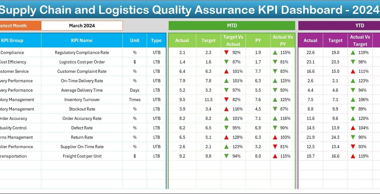
Dashboard Sheet – Monthly Snapshot with Conditional Insights

This is the heart of the dashboard. Here’s what it offers:
-
Month Selection Drop-down (D3): Instantly change the view to any month and the data auto-updates across the sheet.
KPIs Displayed: For each KPI, the dashboard shows:
- MTD (Month-to-Date): Actual, Target, Previous Year
- YTD (Year-to-Date): Actual, Target, Previous Year
Visual Indicators: Arrows show performance trends:
- Green upward arrow: Above target or improved from last year
- Red downward arrow: Below target or declined performance
This visual approach makes it easy to identify issues at a glance and take action proactively.
KPI Trend Sheet – Analyze KPI Performance Over Time

Click to Purchases Supply Chain and Logistics Quality Assurance KPI Dashboard in Excel
Want to drill deeper into how each KPI performs month after month? This is where you go.
-
Drop-down Selection (C3): Choose any KPI to analyze.
-
KPI Metadata: See KPI Group, Unit, Type (UTB or LTB), Formula, and Definition.
-
Charts: Track MTD and YTD trends for Actual, Target, and Previous Year values using clean line charts.
This sheet empowers you to identify patterns, seasonal fluctuations, or improvement opportunities.
Actual Numbers Input Sheet – Feed the Engine

Here, you input the real performance numbers for each KPI.
-
Dynamic Month Selector (E1): Enter the starting month, and the sheet updates accordingly.
-
Simple Format: Just enter MTD and YTD actuals. Everything else updates automatically across the dashboard.
It’s designed to be user-friendly even for non-technical users.
Target Sheet – Set the Benchmark

This is where you define your monthly and yearly goals for each KPI.
-
Enter both MTD and YTD target values
-
Set realistic benchmarks based on your business strategy
-
Ensures that dashboard comparisons remain meaningful
Previous Year Numbers Sheet – Historical Benchmarking

Past data offers valuable insights. This sheet lets you input Previous Year’s KPI performance in a similar structure as the current year. It helps in:
-
Year-over-Year (YoY) comparisons
-
Evaluating improvement trends
-
Creating realistic goals based on historical performance
KPI Definition Sheet – Understand Every KPI

Click to Purchases Supply Chain and Logistics Quality Assurance KPI Dashboard in Excel
Understanding the meaning behind each KPI is crucial for effective use. This sheet includes:
-
KPI Name
-
KPI Group
-
Unit
-
Formula
-
Definition
-
KPI Type (Lower the Better or Upper the Better)
Whether you’re new to supply chain management or a seasoned pro, this sheet helps align the entire team around a shared understanding.
Why KPIs Matter in Supply Chain and Logistics
Now, let’s take a step back. Why should you even care about all these numbers?
Because KPIs are the compass of your supply chain. They guide decision-making, help spot inefficiencies, and highlight areas for improvement. Here are just a few KPIs this dashboard can track:
-
Order Accuracy (%)
-
On-Time Delivery (%)
-
Inventory Turnover
-
Order Cycle Time (days)
-
Return Rate (%)
-
Damage Rate (%)
-
Supplier Defect Rate (%)
-
Freight Cost per Unit
Each one tells a story about your operations.
Advantages of Using a KPI Dashboard in Excel
Let’s explore the core benefits of this Excel-based tool:
🔍 Clarity and Visibility
You get a centralized view of all KPIs in one place. No need to compile reports from various systems.
🧠 Data-Driven Decision Making
Compare MTD, YTD, Target, and Previous Year values side by side. Instantly spot gaps or improvements.
🎯 Goal Alignment
Keep your team focused with clear benchmarks for success.
📈 Trend Monitoring
Easily analyze performance over time using built-in charts and trend lines.
🕒 Save Time
Eliminate manual tracking and create automated reports with a few clicks.
🎨 Fully Customizable
Since it’s built in Excel, you can add your own branding, extra columns, or more charts as needed.
Best Practices for Using the Supply Chain KPI Dashboard
To get the most out of your dashboard, keep the following tips in mind:
1. Keep Your Data Clean
Garbage in, garbage out. Make sure the numbers you enter are accurate and verified.
2. Review Monthly and Quarterly
Set regular check-ins to review your KPI trends and course-correct as needed.
3. Involve the Team
Share the dashboard with warehouse managers, procurement leads, and logistics coordinators. Everyone should understand what matters and why.
4. Customize KPIs as Needed
Not all businesses are the same. Tailor your KPIs to reflect what really drives your supply chain.
5. Add Conditional Formatting
Make use of Excel’s conditional formatting to highlight risks or performance dips visually.
Who Can Use This Dashboard?
This template is ideal for:
-
Supply Chain Managers
-
Logistics Coordinators
-
Warehouse Supervisors
-
Procurement Teams
-
Quality Assurance Analysts
-
Operations Managers
Whether you’re in retail, manufacturing, e-commerce, healthcare, or automotive, this dashboard adapts to your needs.
Real-Life Use Case Example
Imagine this:
You manage a logistics company and want to reduce your Order Cycle Time. You enter data in the dashboard and notice that from Jan to March, cycle time is increasing while on-time delivery is falling. You dig into the KPI Trend Sheet, and discover that the spike coincided with a change in your supplier.
You use this insight to renegotiate your terms or find alternative suppliers—saving costs and improving customer satisfaction.
That’s the power of data.
Conclusion
A Supply Chain and Logistics Quality Assurance KPI Dashboard in Excel is more than a spreadsheet. It’s a decision-making powerhouse. With features like dynamic month selection, MTD/YTD comparisons, performance arrows, and detailed trend analysis, this dashboard gives you everything you need to run a world-class supply chain.
It’s time to move beyond scattered reports and reactive decisions. With this tool, you’re always ahead, always informed, and always in control.
❓Frequently Asked Questions (FAQs)
✅ What KPIs are included in the dashboard?
The dashboard includes KPIs like:
-
Order Accuracy
-
On-Time Delivery
-
Inventory Turnover
-
Return Rate
-
Supplier Defect Rate
And many more, depending on your customization.
✅ Is this dashboard suitable for beginners?
Absolutely. Even if you’re not an Excel expert, the dashboard is designed to be user-friendly with dropdowns, instructions, and clean layouts.
✅ Can I customize the dashboard for my company?
Yes! Since it’s in Excel, you can:
-
Add new KPIs
-
Change branding
-
Modify chart types
-
Adjust formulas
✅ How often should I update the data?
It’s best to update monthly, but for fast-moving supply chains, weekly updates may provide even better visibility.
✅ Can I track Year-over-Year performance?
Yes. The dashboard compares current numbers with the previous year’s data to help you measure growth or decline.
✅ What does LTB or UTB mean?
These refer to KPI performance types:
-
LTB (Lower the Better): Example – Damage Rate
-
UTB (Upper the Better): Example – On-Time Delivery
Click to Purchases Supply Chain and Logistics Quality Assurance KPI Dashboard in Excel
Visit our YouTube channel to learn step-by-step video tutorials