Introduction: The Technology Report in Excel is a 4-sheet pivot-table-driven template built for IT directors, PMO leads, and technology finance analysts who need a monthly view of budget, spend, and issue-resolution performance — without deploying a $20-per-user-per-month ITSM platform. The Summary Page tracks 5 KPIs alongside 5 interactive charts covering Spent % by Category, Budget vs Spend by Department, Issue Resolved by Region, Budget vs Spend by Month, and Budget vs Spend by Project Name. A separate Report Page with slicer and information table handles PMO-level drilldowns and steering committee reviews.
In this article we’ll walk through the full structure of the Technology Report in Excel, compare it against Google Sheets alternatives and paid ITSM platforms (ServiceNow, Jira Service Management), cover who it’s built for and where it doesn’t fit, and answer the most common questions we hear from IT teams evaluating it.
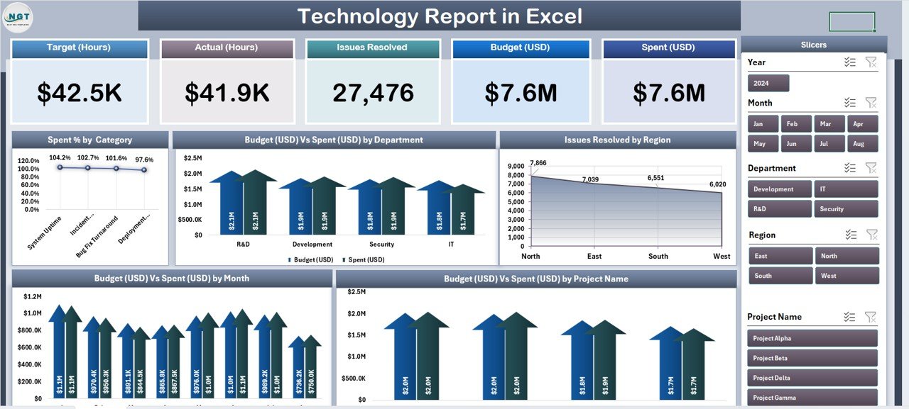
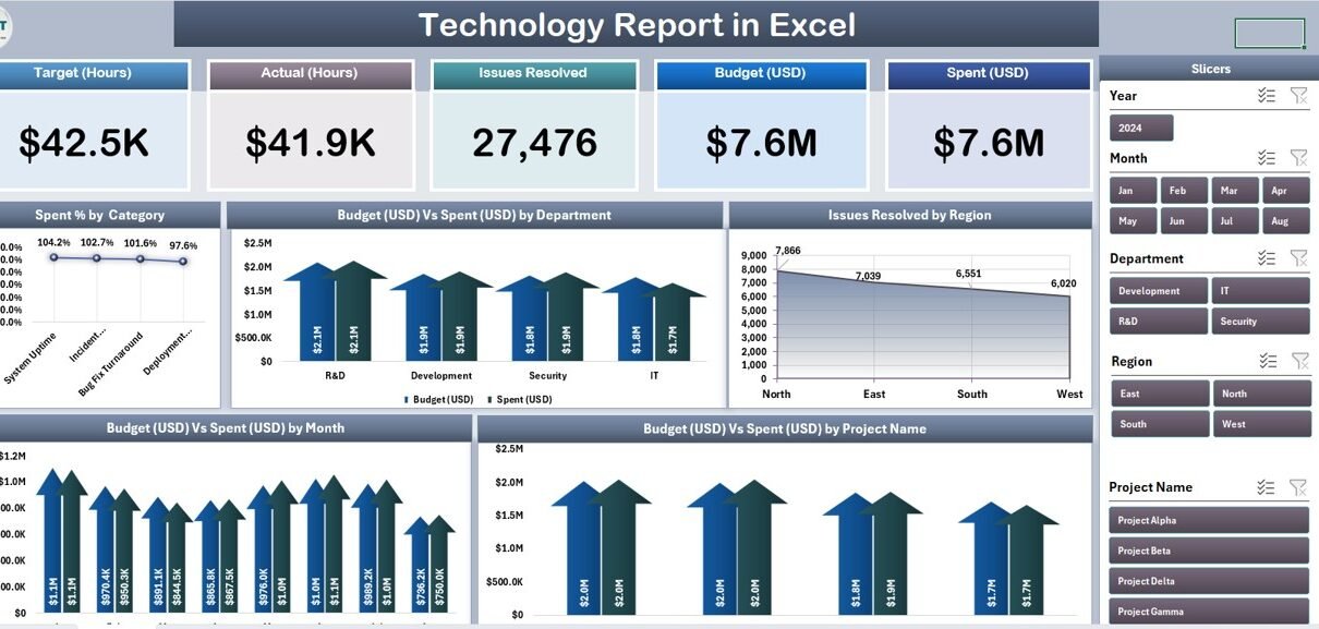
Technology Report in Excel – Summary Page
Key Features of the Technology Report in Excel
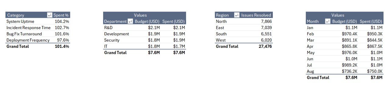
5 KPI cards + 5 interactive charts on the Summary Page. The top row of the Summary Page holds 5 card-style KPIs that give leadership an instant read on IT health. Below them, 5 interactive pivot charts handle the core analytical questions: Spent % by Category, Budget vs Spend by Department, Issue Resolved by Region, Budget vs Spend by Month, and Budget vs Spend by Project Name. Every visual is wired to pivot tables on a hidden Support sheet, so one data refresh updates the entire report.
Right-side slicer panel for one-click filtering. A column of slicers on the right of the Summary Page filters every card and chart simultaneously. Pick a department, region, or project from any slicer and the whole page recomputes — useful when the CFO asks “what does this look like for just Bengaluru ops?” mid-meeting.
Dedicated Report Page with information table. The second worksheet gives PMO teams a line-item view. A left-side slicer drives a structured table where you can drill into project-level or ticket-level records. This is the page you print or export for monthly steering committee packs.
Clean Data sheet with fixed column structure. The third sheet is where your IT project and ticket data lives. Columns include Project Name, Department, Region, Category, Budget, Spend, Issue Resolved count, Status, Month, and Date. Keep the headers identical — every pivot table references them.
Hidden Support sheet with all pivot tables. The fourth sheet holds every pivot that feeds the Summary Page. After updating Data, click Data → Refresh All in the Excel ribbon and every KPI card, chart, and slicer refreshes in one pass. Hide this sheet before sharing the file externally.
100% pivot-table architecture, no VBA. The template contains zero macros, zero VBA, and no external data connections. It runs identically on Windows Excel and Mac Excel 2016 or later. For Microsoft’s official guidance on pivot tables and slicers, see the Microsoft Support documentation on PivotTables.
Dashboard Pages Explanation
Summary Page. The main dashboard view. 5 KPI cards sit across the top row and respond to every slicer change. Below them, the 5 pivot charts tell the full story: Spent % by Category breaks IT budget across software, hardware, cloud, services, and licensing; Budget vs Spend by Department pairs allocations against actual spend for every business department IT serves; Issue Resolved by Region ranks regions by tickets closed in the period; Budget vs Spend by Month shows the 12-month trend; and Budget vs Spend by Project Name ranks every initiative by burn rate.
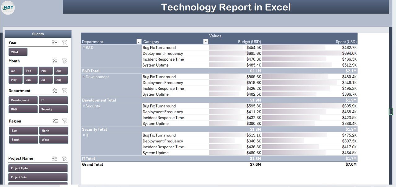
Report Page with slicer and information table
Report Page. A second worksheet with a left-side slicer driving an information table. Use it to pull filtered project lists for department-level reviews, finance reconciliations, or steering committee handouts. The slicer filters the table instantly so you can shift from a 200-row master view to a 12-row department-specific view in one click.
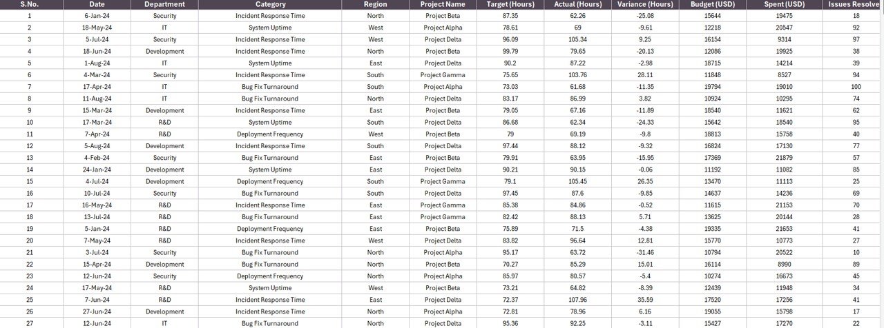
Data Sheet – paste your IT project data here
Data Sheet. Raw input. Paste your IT project and ticket data into the fixed column structure and the pivots take care of everything downstream. Typical sources that feed into this sheet: Jira exports, ServiceNow CSV extracts, Airtable project logs, ZenDesk ticket reports, or even a manually maintained project tracker your PMO updates weekly.
Support Sheet with pivot tables driving every chart
Support Sheet. The engine room. Multiple pivot tables here are the actual data source for every card, chart, and slicer on the Summary Page. After updating Data, click Data → Refresh All. Keep this sheet hidden for day-to-day users.
Technology Report in Excel vs. Google Sheets Equivalent vs. ServiceNow / Jira Service Management — Feature Comparison
| Feature | Technology Report in Excel | Google Sheets equivalent | ServiceNow / Jira Service Management |
|---|---|---|---|
| Cost | $7.99 one-time | ~$10 one-time template | $20–$100 / user / month |
| Platform | Microsoft Excel (desktop) | Google Sheets (browser) | Web + mobile SaaS |
| Works offline | ✅ Yes | ❌ Requires internet | ❌ Requires internet |
| Setup time | Under 10 minutes | ~15 minutes | 6–16 weeks onboarding |
| Pre-built IT charts | ✅ 5 out of the box | Build from scratch | Configurable reports |
| Per-user licence fees | None | None | $20+ per user / month |
| Data stays on your device | ✅ Yes | ❌ Cloud | ❌ Vendor cloud |
| Year-1 cost at 5 users | $7.99 | ~$10 | $1,200 – $6,000 |
For IT teams and PMOs that want budget, spend, and issue-resolution visibility without paying $1,200+ per year in ServiceNow or Jira licences, the Technology Report in Excel sits in the sweet spot.
Who Should Use This Template
Perfect for:
- IT directors and CIOs at 10–500 person companies who need a repeatable monthly technology spend and service report
- PMO leads tracking 5–50 active IT projects across multiple departments and regions
- IT finance analysts reconciling departmental chargebacks against budget allocations
- MSPs and IT consultants delivering monthly scorecards to 3–20 client organizations
- Operations leaders who haven’t yet committed to a $100/user/month ITSM platform
Not a fit if:
- You run 500+ active projects and need SOC 2, SSO, and ITIL-certified workflows — use ServiceNow or BMC Helix
- You need real-time incident auto-routing, SLA automation, or CMDB integration — use Jira Service Management or Freshservice
- Your team operates entirely in Google Workspace — browse our Google Sheets Dashboards collection instead
Real-World Use Cases
Rohit runs IT for a 220-person fintech startup in Bengaluru. He uses the Technology Report in Excel at every monthly steering committee to walk the CFO through Budget vs Spend by Project Name, flag the 2–3 projects burning faster than plan, and show the Spent % by Category split between cloud, software licences, and services. His CFO approved a $180K infrastructure refresh mid-cycle because the monthly trend chart made the capacity case obvious. Previously, Rohit spent two days every month rebuilding these views in PowerPoint — now it’s a 15-minute refresh.
Priyanka leads a 5-person PMO at a mid-market pharma company in Mumbai. She points the template at her quarterly project data export and uses Issue Resolved by Region to balance incident-response staffing across her three regional IT teams. When her Delhi region showed 60% more resolved issues than Bengaluru with identical headcount, she redeployed two L2 engineers — closing tickets 40% faster without adding payroll. That one staffing decision, driven by a single chart in this report, paid for the template 10,000 times over.
Marco is an IT consultant in Austin running monthly scorecards for 8 SMB clients. He can’t justify $75/user/month for ServiceNow across his client base, and his clients can’t either. He drops each client’s project data into this Excel report, keeps the Support sheet hidden, and delivers a branded Technology Report on day 3 of each month instead of day 10 — keeping his billable hours on strategy work rather than spreadsheet rebuilding.
Advantages of the Technology Report in Excel
Immediate time savings for recurring reporting. The first month you use it, you save 4–8 hours. Every month after, you save the same 4–8 hours. At a mid-market IT manager’s fully-loaded cost of roughly $75/hour, the template pays for itself in the first month and returns roughly $300–$600 per month thereafter.
Budget defensibility at steering committee. The Budget vs Spend by Month trend chart and Budget vs Spend by Project Name ranking turn budget conversations from “trust me” arguments into “look at the chart” conversations. CFOs respond differently to visual evidence.
Data sovereignty for commercially sensitive IT data. Every line item — vendor contract rates, cloud bills, project chargebacks — stays on your device. No cloud exposure, no third-party data processor, no audit risk from sending IT cost data to a SaaS vendor’s servers.
No vendor lock-in. Your team doesn’t need to learn a new platform, pass an ITSM certification, or renew a licence next year. Excel is already on the laptop.
Opportunities for Improvement
Being honest about where this template stops is important — an accurate picture builds more trust than overselling.
No real-time incident ingestion. The template doesn’t auto-pull from ServiceNow, Jira, or any ticketing API. You export data, paste it in, click refresh. If your use case demands live incident routing and auto-escalation, this isn’t the right tool — ServiceNow or Jira Service Management is.
Single-user editing at a time. Excel desktop files aren’t designed for 10 analysts concurrently editing the same report. If your team needs simultaneous multi-user editing, consider the Google Sheets version or share via OneDrive with co-authoring enabled.
Works best with structured data. The pivot architecture assumes clean column headers and consistent data types. If your source data is messy (inconsistent department spellings, null dates, free-text status values), you’ll need to clean it before pasting — or the pivots produce messy outputs.
Best Practices
Set up a monthly refresh cadence. Pick a date — the 3rd working day of each month works well — when finance has closed the previous month. Do the refresh on that date every month. Your leadership will start expecting the report at that time and you’ll look organized without extra effort.
Rename projects consistently. The Budget vs Spend by Project Name chart aggregates by the exact string value in the Project Name column. “Migration – Phase 1”, “Migration Phase 1”, and “Migration P1” become three separate bars on the chart. Agree on naming conventions up front.
Use the Report Page for drilldowns during meetings. When someone asks “wait, what’s driving the Marketing department overspend?” — switch to the Report Page, pick “Marketing” in the slicer, and you have the line-item answer in 5 seconds. This is a far more powerful meeting moment than “let me get back to you.”
Save monthly snapshots. At the end of each month’s refresh, save a copy of the file as Technology-Report-YYYY-MM.xlsx. You’re building a historical archive for free.
Explore Relevant Templates
🔹 Office IT Helpdesk Dashboard in Excel — Deeper ticket-level view into IT helpdesk performance, resolution times, and technician load.
🔹 IT Helpdesk Ticket Management System V1.0 — Full VBA-powered ticket logging, assignment, and tracking system for IT teams managing daily incident flow.
🔹 IT Dashboard in Google Sheets — Browser-based version of the same analytics for teams that live in Google Workspace.
🔹 Office IT Helpdesk Dashboard in Power BI — Power BI counterpart with a 5-page interactive report model.
🔹 Product Inventory Report in Excel — Same 4-sheet report structure applied to inventory and stock management.
Also browse all our Excel Dashboard Templates.
Frequently Asked Questions
What KPIs does the Technology Report in Excel track?
The Technology Report tracks 5 headline KPIs on the Summary Page shown as card visuals, plus 5 interactive charts: Spent % by Category, Budget vs Spend by Department, Issue Resolved by Region, Budget vs Spend by Month, and Budget vs Spend by Project Name. Every metric auto-updates when you refresh the pivot tables on the Support sheet.
How does this compare to ServiceNow or Jira Service Management?
ServiceNow typically runs $100+ per user per month and Jira Service Management starts around $20 per agent per month — reaching $6,000+ per year at 5 agents. The Technology Report in Excel is a $7.99 one-time purchase with no per-user fees, works offline, and keeps IT budget data on your device rather than in a vendor cloud.
How long does setup take?
Setup takes under 10 minutes. Open the .xlsx file, paste your IT project and ticket data into the Data sheet (keep the column headers identical), then click Data → Refresh All. Every card, chart, and slicer on the Summary Page updates automatically. There are no formulas to edit and no VBA to configure.
Does the Technology Report in Excel work on Mac?
Yes. The Technology Report in Excel is built entirely with pivot tables and slicers — no VBA, no macros — so it runs identically on Windows Excel and Mac Excel 2016 or later. No internet connection is required at any point during setup or daily use.
Can I add my own departments, regions, or project categories?
Yes. Add new departments, regions, categories, or project names directly to the Data sheet. After adding rows, click Data → Refresh All in the ribbon and every pivot table on the Support sheet picks up the new values and populates the Summary Page charts automatically.
Is my IT budget data safe with this template?
Data stays on your device. The Technology Report in Excel doesn’t connect to any cloud service, API, or external database. Project-level budgets, vendor costs, and chargeback data never leave your machine — a critical advantage over cloud-based ITSM platforms where third parties can access your commercial data.
Can multiple team members use the same file?
Yes. Email the .xlsx file or share it via OneDrive, Dropbox, or SharePoint. There’s no per-user licence — PMO, IT finance, and department leads can all open and filter the Technology Report freely with any Microsoft Excel installation.
About the Author
Built by PK — Microsoft Certified Professional with 15+ years of Excel, Google Sheets, and Power BI experience. Founder of NextGenTemplates, reaching 300K+ subscribers across YouTube channels. Every template is hand-built and tested before release.
Conclusion
The Technology Report in Excel is a practical, production-ready template for IT leaders and PMO teams who need monthly budget, spend, and service visibility without taking on a multi-thousand-dollar ITSM subscription. Four sheets, five KPIs, five charts, one refresh per month.
👉 Click here to Purchase the Technology Report in Excel — $7.99 one-time · Instant download · No subscription.
📅 Last updated: April 2026
🎥 Visit our YouTube channel for step-by-step video tutorials
👉 Youtube.com/@PK-AnExcelExpert