The ticketing and live events industry runs on timing, accuracy, and fast decisions. Concerts, sports events, exhibitions, and festivals generate huge volumes of data every month. Ticket sales, attendance, revenue, refunds, and performance targets change constantly. Therefore, event organizers and ticketing teams must track KPIs clearly and quickly.
However, when teams rely only on static Excel reports, analysis becomes slow and confusing. As a result, opportunities get missed, and performance issues stay hidden for too long.
That is why a Ticketing and Live Events KPI Dashboard in Power BI becomes a game-changing solution. It transforms raw Excel data into interactive visuals, KPI cards, slicers, and trend charts. Moreover, it allows teams to monitor MTD, YTD, targets, and previous-year performance in one centralized dashboard.
In this in-depth article, you will learn what a Ticketing and Live Events KPI Dashboard in Power BI is, why it matters, how it works, its structure, key pages, advantages, best practices, and frequently asked questions. Additionally, you will see how this dashboard supports faster, smarter, and more confident decisions for live events.
Click to Purchases Ticketing and Live Events KPI Dashboard in Power BI
What Is a Ticketing and Live Events KPI Dashboard in Power BI?
A Ticketing and Live Events KPI Dashboard in Power BI is an interactive business intelligence dashboard built using Power BI. It connects to an Excel data source and visually presents key ticketing and event performance metrics.
Instead of scanning rows of numbers, decision-makers see:
-
KPI cards
-
Conditional icons
-
Percentage comparisons
-
Trend charts
-
Drill-through KPI details
Because Power BI updates visuals dynamically, users analyze performance instantly by selecting months, KPI groups, or individual KPIs.
Why Do Ticketing and Live Events Businesses Need a Power BI KPI Dashboard?
Ticketing and live events operate in a high-pressure environment. Every event has a limited time window to succeed. Therefore, teams need real-time visibility into performance.
Key Reasons to Use This Dashboard
-
You track ticket sales and revenue clearly
-
You compare actual performance against targets easily
-
You monitor MTD and YTD progress in real time
-
You analyze year-over-year growth or decline
-
You identify underperforming KPIs quickly
As a result, teams move from reactive reporting to proactive decision-making.
Click to Purchases Ticketing and Live Events KPI Dashboard in Power BI
How Does the Ticketing and Live Events KPI Dashboard in Power BI Work?
This dashboard follows a simple yet powerful flow.
-
Data gets captured in an Excel file
-
Power BI connects to the Excel sheets
-
DAX measures calculate MTD, YTD, and comparisons
-
Visuals update automatically based on slicers
Because of this structure, users only maintain Excel data, while Power BI handles all calculations and visuals.
What Are the Key Features of the Ticketing and Live Events KPI Dashboard in Power BI?
This ready-to-use dashboard includes 3 well-designed pages. Each page focuses on a specific type of analysis and user need.
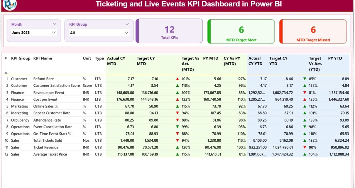
1. Summary Page: What Does the Main Dashboard Show?

The Summary Page acts as the control center of the dashboard.
Top-Level Slicers
-
Month slicer
-
KPI Group slicer
These slicers allow users to filter the entire dashboard instantly.
KPI Cards on the Summary Page
-
Total KPIs Count
-
MTD Target Met Count
-
MTD Target Missed Count
Because these cards appear at the top, users understand overall performance immediately.
Detailed KPI Table on the Summary Page
Below the KPI cards, the dashboard shows a detailed KPI table with rich insights.
Columns Explained
-
KPI Number – Sequential identifier of the KPI
-
KPI Group – Category of the KPI
-
KPI Name – Name of the KPI
-
Unit – Unit of measurement
-
Type – UTB (Upper the Better) or LTB (Lower the Better)
MTD Performance Columns
-
Actual CY MTD – Current year actual MTD value
-
Target CY MTD – Current year target MTD value
-
MTD Icon – ▲ or ▼ with green/red color
-
Target vs Actual (MTD) – Actual ÷ Target (%)
-
PY MTD – Previous year MTD value
-
CY vs PY (MTD) – CY MTD ÷ PY MTD (%)
YTD Performance Columns
-
Actual CY YTD – Current year actual YTD value
-
Target CY YTD – Current year target YTD value
-
YTD Icon – ▲ or ▼ with green/red color
-
Target vs Actual (YTD) – Actual ÷ Target (%)
-
PY YTD – Previous year YTD value
-
CY vs PY (YTD) – CY YTD ÷ PY YTD (%)
Therefore, users compare performance across targets and years in one single table.
Click to Purchases Ticketing and Live Events KPI Dashboard in Power BI
2. KPI Trend Page: How Do You Analyze Performance Trends?

The KPI Trend Page focuses on time-based analysis.
Key Elements of the KPI Trend Page
-
KPI Name slicer on the left
-
Two combo charts
Combo Charts Explained
-
MTD Trend Chart
-
Current Year Actual
-
Previous Year Actual
-
Target
-
-
YTD Trend Chart
-
Current Year Actual
-
Previous Year Actual
-
Target
-
Because these charts combine bars and lines, trends become clear instantly.
3. KPI Definition Page: Why Is Drill-Through Important?

The KPI Definition Page acts as a drill-through page.
Key Characteristics
-
Page remains hidden from navigation
-
Users access it via drill-through from the Summary Page
-
Includes KPI Formula and KPI Definition
Navigation Feature
-
Back button at the top-left corner
-
Returns users to the Summary Page easily
This design improves clarity while keeping the main dashboard clean.
What Excel Data Is Used for This Power BI Dashboard?
The dashboard uses an Excel file as its data source. This approach keeps data entry simple and flexible.
1. Input_Actual Sheet: Where Do You Enter Actual Data?
In the Input_Actual sheet, users enter:
-
KPI Name
-
Month (first date of the month)
-
MTD Actual value
-
YTD Actual value
This sheet drives all actual performance visuals.
2. Input_Target Sheet: How Are Targets Managed?
In the Input_Target sheet, users enter:
-
KPI Name
-
Month (first date of the month)
-
MTD Target value
-
YTD Target value
Power BI automatically compares these targets with actual values.
Click to Purchases Ticketing and Live Events KPI Dashboard in Power BI
3. KPI Definition Sheet: How Are KPIs Standardized?
The KPI Definition sheet includes:
-
KPI Number
-
KPI Group
-
KPI Name
-
Unit
-
Formula
-
Definition
-
Type (UTB or LTB)
This sheet ensures consistency across all visuals and calculations.
What KPIs Can You Track with This Dashboard?
This dashboard supports a wide range of ticketing and live events KPIs, such as:
-
Tickets Sold
-
Ticket Revenue
-
Average Ticket Price
-
Attendance Rate
-
Capacity Utilization
-
Refund Rate
-
No-Show Percentage
-
Revenue per Event
-
Ticket Sales Growth
You can customize KPIs easily based on business needs.
Click to Purchases Ticketing and Live Events KPI Dashboard in Power BI
Advantages of Ticketing and Live Events KPI Dashboard in Power BI
Using this dashboard delivers strong operational and strategic benefits.
Key Advantages
-
📊 Interactive and real-time visuals
-
🎯 Clear target vs actual tracking
-
📈 MTD and YTD trend analysis
-
🔍 Drill-through KPI transparency
-
⏱️ Faster decision-making
-
📂 Excel-based data entry simplicity
As a result, teams gain full control over event performance.
How Does This Dashboard Improve Decision-Making?
This dashboard supports decisions at every level.
-
Helps adjust ticket pricing strategies
-
Identifies weak-performing KPIs early
-
Supports marketing and promotion planning
-
Improves event capacity utilization
-
Enhances revenue forecasting accuracy
Because insights appear instantly, teams act faster and smarter.
Best Practices for the Ticketing and Live Events KPI Dashboard in Power BI
To get maximum value, follow these best practices:
-
✅ Update Excel data regularly
-
✅ Use consistent KPI definitions
-
✅ Validate target values carefully
-
✅ Review MTD performance weekly
-
✅ Analyze YTD trends monthly
-
✅ Keep slicers simple and relevant
-
✅ Avoid unnecessary visuals
Following these practices ensures long-term accuracy and usability.
Who Should Use This Power BI Dashboard?
This dashboard fits multiple roles and industries.
Ideal Users
-
Event Managers
-
Ticketing Operations Teams
-
Venue Owners
-
Concert Promoters
-
Sports Event Organizers
-
Revenue and Finance Teams
Because Power BI offers an intuitive interface, adoption remains easy.
How Is This Power BI Dashboard Better Than Excel-Only Dashboards?
Compared to Excel-only dashboards, Power BI offers:
-
Interactive slicers
-
Dynamic visuals
-
Drill-through capabilities
-
Better performance with large data
-
Professional reporting experience
Therefore, Power BI takes KPI tracking to the next level.
Click to Purchases Ticketing and Live Events KPI Dashboard in Power BI
Can You Customize the Ticketing and Live Events KPI Dashboard in Power BI?
Yes, customization remains simple.
You can:
-
Add or remove KPIs
-
Modify KPI formulas
-
Change targets
-
Adjust visuals and themes
-
Extend the dashboard with new pages
Thus, the dashboard grows with your business.
Conclusion: Why Choose a Ticketing and Live Events KPI Dashboard in Power BI?
A Ticketing and Live Events KPI Dashboard in Power BI turns raw Excel data into meaningful, actionable insights. It improves visibility, accuracy, and speed of analysis. Moreover, it eliminates manual reporting and empowers teams with interactive, real-time performance tracking.
If you manage ticketing or live events, this dashboard helps you stay ahead, meet targets confidently, and drive consistent growth.
Frequently Asked Questions (FAQs)
What is a Ticketing and Live Events KPI Dashboard in Power BI?
It is an interactive dashboard that tracks ticket sales, revenue, and event KPIs using MTD, YTD, targets, and trend analysis.
Do I need Power BI expertise to use this dashboard?
No. You only need basic Power BI navigation skills. Data entry happens in Excel.
Can I add new KPIs to the dashboard?
Yes. You can add KPIs by updating the Excel KPI Definition and input sheets.
Does this dashboard support year-on-year comparison?
Yes. It includes previous year MTD and YTD comparisons.
Is this dashboard suitable for large event organizations?
Yes. Power BI handles large datasets efficiently.
Can I use this dashboard for different event types?
Yes. You can use it for concerts, sports events, exhibitions, and festivals.
How often should I refresh the dashboard?
You should refresh it whenever Excel data updates, ideally weekly or monthly.
Click to Purchases Ticketing and Live Events KPI Dashboard in Power BI
Visit our YouTube channel to learn step-by-step video tutorials