Global markets move fast, and investment managers need accurate insights at the right time. Sovereign wealth funds (SWFs) deal with billions of dollars, long-term strategies, and complex portfolios spread across asset classes, regions, and industries. Because of this, teams often struggle when they track investment activities in scattered spreadsheets or static reports. They lose clarity and miss early signals that could help them protect or grow capital.
A Sovereign Wealth Funds Dashboard in Power BI solves this problem. It gives every decision-maker a clear, real-time, and interactive view of investment performance. This article explains everything about the dashboard—from key features and benefits to best practices and common questions. You will also learn how this dashboard supports smarter and faster investment decisions.
Click to Purchases Sovereign Wealth Funds Dashboard in Power BI
What Is a Sovereign Wealth Funds Dashboard in Power BI?
A Sovereign Wealth Funds Dashboard in Power BI is a ready-to-use analytical tool that tracks investments, returns, risks, asset classes, market distribution, and satisfaction scores. It converts raw Excel data into simple visual stories using charts, cards, slicers, and dynamic filters.
The dashboard helps analysts and executives understand:
-
Where the money goes
-
How investments perform
-
Which regions deliver stable returns
-
Which sectors show high volatility
-
How asset classes grow over time
-
Which months show strong or weak performance
Since Power BI updates the visuals instantly, users track the entire investment lifecycle without switching between files. This improves visibility and leads to more confident decisions.
Click to Purchases Sovereign Wealth Funds Dashboard in Power BI
Why Do Sovereign Wealth Funds Need a Power BI Dashboard?
Sovereign wealth funds manage large and diverse portfolios. These portfolios include equities, bonds, real estate, infrastructure, private equity, energy assets, and strategic long-term holdings. Without the right dashboard, investment teams take more time to interpret data.
A Power BI dashboard helps because it:
-
Shows real-time insights
-
Helps detect risk early
-
Improves accountability
-
Supports long-term planning
-
Reduces manual reporting work
-
Makes compliance easier
In short, the dashboard helps teams track performance, compare results, and act with confidence.
What Are the Key Features of the Sovereign Wealth Funds Dashboard in Power BI?
The dashboard includes five analytical pages, each offering a unique view of investment performance.
1. Overview Page: How Does It Provide a Complete Investment Snapshot?
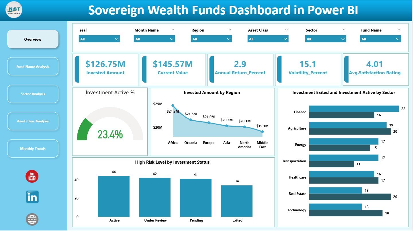
The Overview Page serves as the main control center of the entire dashboard. It contains slicers on the right side that allow users to filter data quickly. Users track major investment KPIs through five key cards:
-
Investment Amount
-
Current Value
-
Annual Return %
-
Volatility %
-
Average Satisfaction Rating
These cards help users understand the big picture in seconds. Below the cards, the dashboard displays detailed insights through four important charts:
-
Investment Active %
-
Invested Amount by Region
-
Investment Exited vs. Active by Sector
-
High-Risk Level by Investment Status
Together, these visuals present the health of the entire investment portfolio.
Click to Purchases Sovereign Wealth Funds Dashboard in Power BI
2. Fund Name Analysis: Why Should Funds Be Compared Individually?
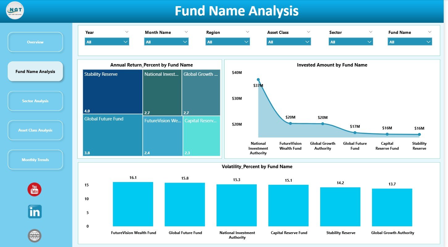
Each sovereign wealth fund often manages multiple investment programs or portfolios. The Fund Name Analysis page helps users compare individual funds across important metrics.
This page includes three useful charts:
-
Annual Return % by Fund Name
-
Invested Amount by Fund Name
-
Volatility % by Fund Name
With these insights, analysts quickly identify:
-
High-performing funds
-
Underperforming funds
-
Funds with increasing volatility
-
Funds that require strategic attention
Comparing funds side-by-side builds a solid foundation for long-term planning.
Click to Purchases Sovereign Wealth Funds Dashboard in Power BI
3. Sector Analysis: Which Sectors Deliver Consistent Results?
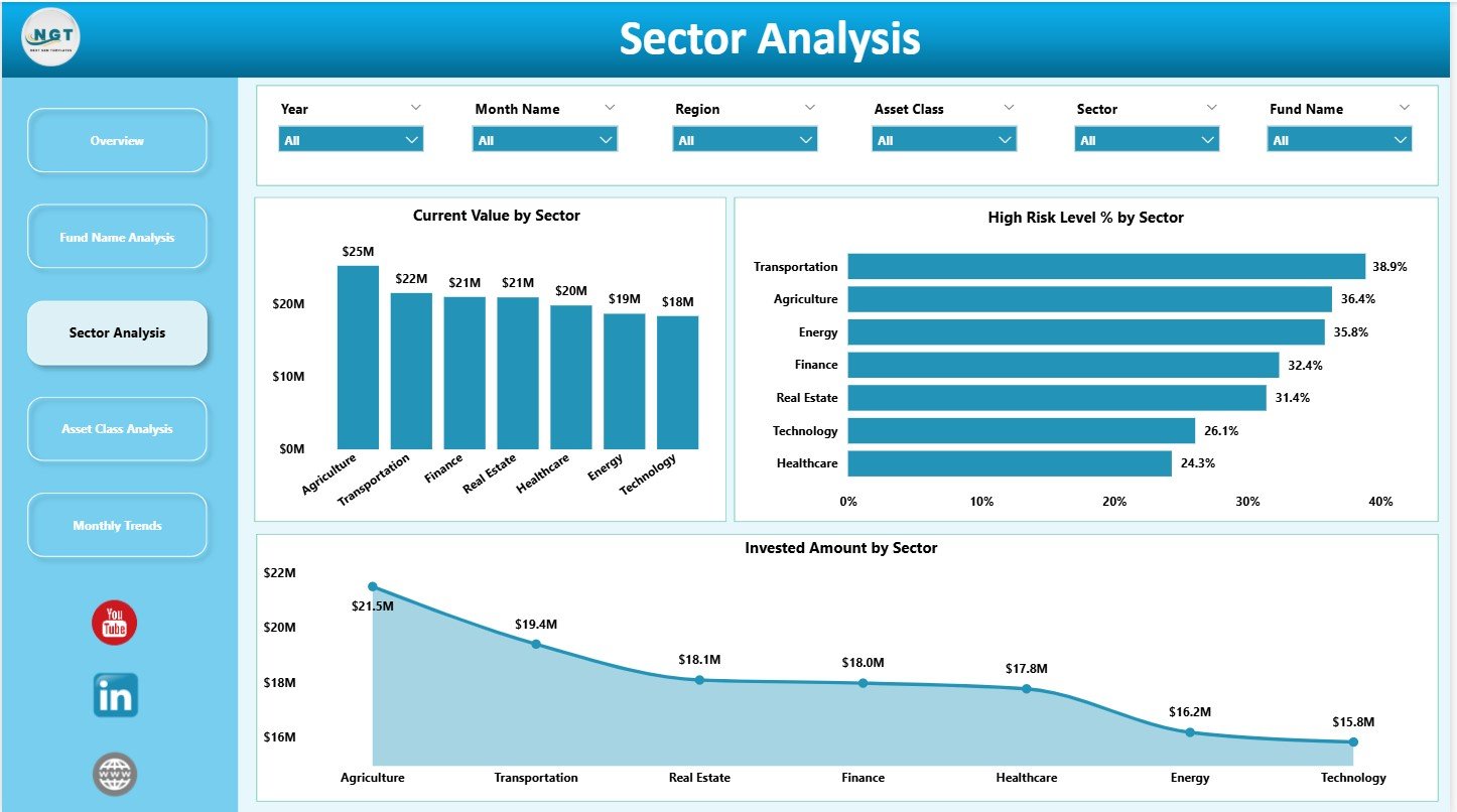
Sectors do not behave the same in every economic cycle. The Sector Analysis page helps teams understand how different sectors perform. It includes:
-
Current Value by Sector
-
High-Risk Level % by Sector
-
Invested Amount by Sector
When managers use these charts, they see which sectors offer:
-
High potential
-
Increasing risk
-
Strong market stability
-
Poor returns
This page supports diversification strategies and helps teams plan future investments more wisely.
Click to Purchases Sovereign Wealth Funds Dashboard in Power BI
4. Asset Class Analysis: How Do Asset Classes Shape Overall Portfolio Growth?
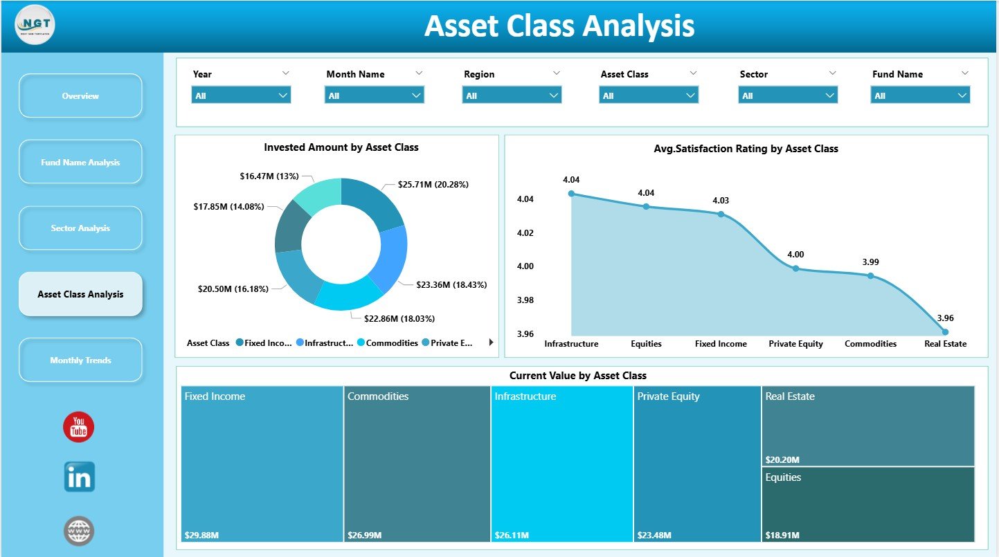
Sovereign wealth funds invest across various asset classes. The Asset Class Analysis page shows how each asset class contributes to performance. It includes:
-
Invested Amount by Asset Class
-
Average Satisfaction Rating by Asset Class
-
Current Value by Asset Class
Users learn how well each asset class performs. They also see which areas need more focus. This helps investment leaders balance risk and return across the entire portfolio.
5. Monthly Trends: How Do Month-to-Month Patterns Improve Strategy?
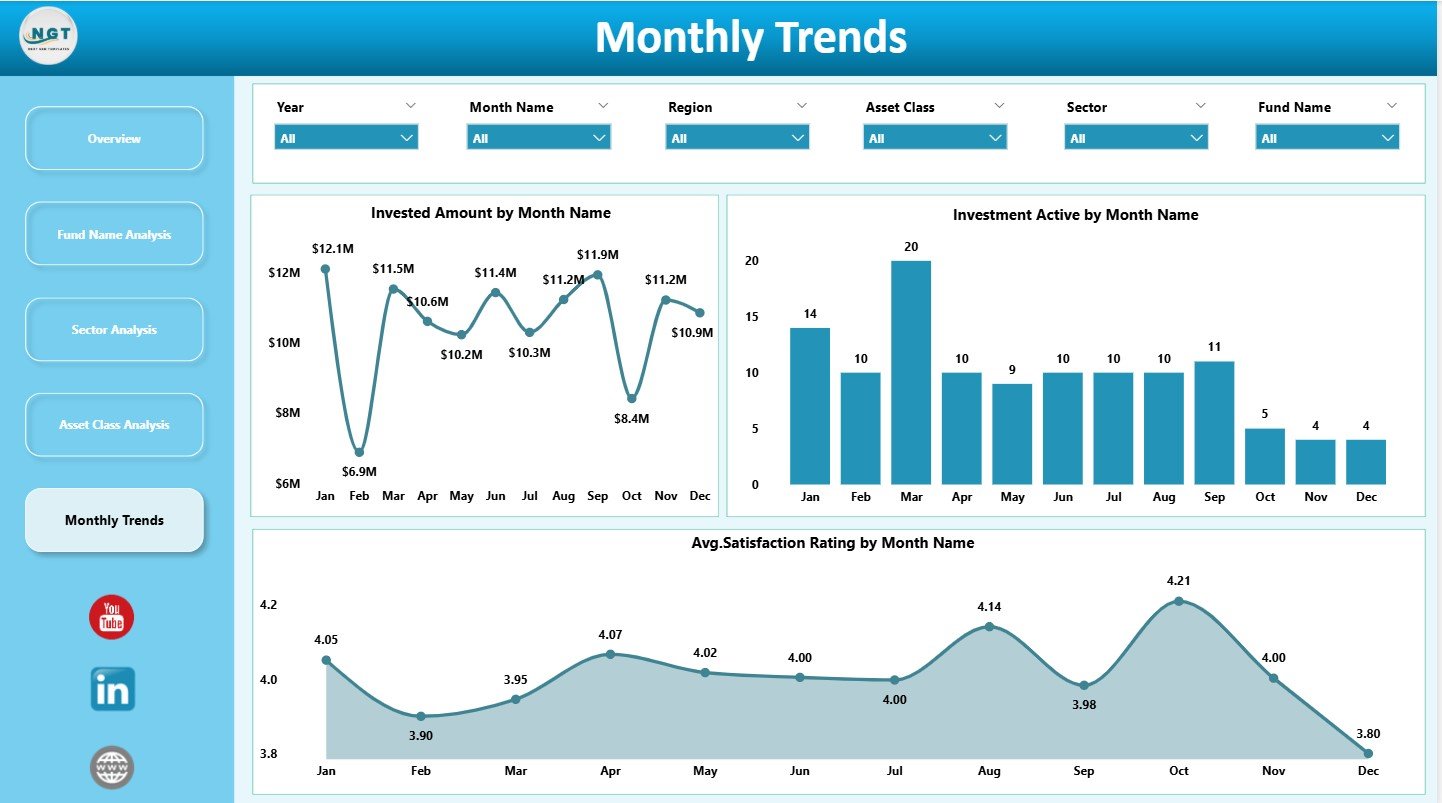
Investment performance changes every month. The Monthly Trends page highlights these changes through three important visuals:
-
Invested Amount by Month Name
-
Investment Active % by Month Name
-
Average Satisfaction Rating by Month Name
The page reveals seasonality, trends, and performance patterns. This helps teams understand when investments grow, stabilize, or decline.
How Does the Dashboard Improve Investment Decision-Making?
A Sovereign Wealth Funds Dashboard in Power BI simplifies the decision-making process. Here’s how:
✔ Shows real-time performance
Teams instantly see how the portfolio behaves.
✔ Improves transparency
Every stakeholder sees consistent data across funds.
✔ Helps detect early signals
High volatility and risk levels appear clearly on charts.
✔ Enhances planning
Historical trends and sector insights improve forecasting.
✔ Saves time
Users automate reporting instead of compiling manual spreadsheets.
Click to Purchases Sovereign Wealth Funds Dashboard in Power BI
Advantages of a Sovereign Wealth Funds Dashboard in Power BI
A comprehensive dashboard delivers several advantages. Let’s explore them in detail:
1. Faster and Smarter Decisions
Users see clear metrics and charts, which helps them act without delays.
2. Better Risk Management
The dashboard highlights high-risk investments so analysts manage threats early.
3. Increased Transparency Across Teams
Everyone sees the same insights, which creates trust and removes confusion.
4. Improved Portfolio Balance
Sector and asset class insights help managers balance exposure and maintain stability.
5. Clearer Reporting Structure
Power BI makes it simple to present insights to executives, boards, and audit teams.
6. Stronger Long-Term Strategy
Historical and monthly trends guide future actions and strategic allocation.
7. Easy Navigation and Interactivity
Slicers, filters, and visuals help users explore insights without technical knowledge.
What Are the Best Practices for a Sovereign Wealth Funds Dashboard in Power BI?
You can improve the dashboard experience by following these best practices:
1. Use Consistent KPI Definitions
Keep clear definitions for return, volatility, risk levels, and satisfaction ratings.
2. Refresh Data Regularly
Update the data daily or weekly to maintain accuracy.
3. Use Suitable Visuals
Pick charts that show trends and comparisons clearly.
4. Group Investments by Relevant Categories
Organize data by region, sector, asset class, and fund name.
5. Add Data Quality Checks
Review missing values and inconsistent records before loading data.
6. Keep Navigation Simple
Use slicers, buttons, and page navigators to improve user experience.
7. Highlight KPIs with Colors
Use conditional formatting to show positive or negative performance.
8. Avoid Overloading Pages
Keep each page clean and focused on specific insights.
How to Use the Dashboard Effectively?
Investors and analysts can use the dashboard in several ways:
-
Track long-term performance
-
Compare sectors for diversification
-
Evaluate asset classes for strong returns
-
Detect volatile investments early
-
Review monthly growth patterns
-
Monitor satisfaction levels
A well-designed dashboard becomes a powerful investment monitoring tool.
Conclusion
A Sovereign Wealth Funds Dashboard in Power BI helps investment teams gain complete visibility over portfolio performance. It highlights returns, risk levels, sector behavior, asset class growth, and regional distribution. Because the dashboard uses interactive visuals, decision-makers understand trends quickly and respond with confidence.
This dashboard supports better planning, deeper insights, and stronger control over investment strategies. In today’s fast-moving world, every sovereign wealth fund needs a tool like this to stay ahead.
Click to Purchases Sovereign Wealth Funds Dashboard in Power BI
Frequently Asked Questions (FAQs)
1. What is a Sovereign Wealth Funds Dashboard in Power BI?
It is an analytical dashboard that tracks investment value, returns, risks, asset classes, and monthly trends using interactive visuals.
2. Who uses this dashboard?
Investment managers, research analysts, financial officers, executives, and compliance teams use it to track performance.
3. Why is Power BI suitable for sovereign wealth funds?
Power BI handles large datasets, updates visuals instantly, and allows deep data exploration.
4. What KPIs does the dashboard track?
It tracks investment amount, current value, annual return %, volatility %, and satisfaction ratings.
5. Can this dashboard help with long-term planning?
Yes, it shows monthly and yearly trends that support forecasting and strategic decision-making.
6. Does the dashboard support diversification analysis?
Yes, it includes sector, region, asset class, and fund name comparisons.
7. Is the dashboard easy to use?
Yes, even beginners understand it because it uses simple visuals and filters.
Click to Purchases Sovereign Wealth Funds Dashboard in Power BI
Visit our YouTube channel to learn step-by-step video tutorials

