Cybersecurity Operations Center Dashboard in Excel helps SOC teams turn scattered incident logs into a clear management dashboard for incidents, alert investigation, estimated loss, threat score, detection minutes, containment time, recovery hours, escalation percentage, and analyst workload. Security teams are often expected to explain incident trends quickly, but live SIEM tools do not always produce business-friendly Excel reports for leadership meetings. This workbook fills that reporting gap with 5 dashboard pages, 5 executive KPI cards, interactive slicers, a structured Data Sheet, and a pivot-powered Support Sheet.
Download the Cybersecurity Operations Center Dashboard in Excel from NextGenTemplates.
Key Features of Cybersecurity Operations Center Dashboard in Excel
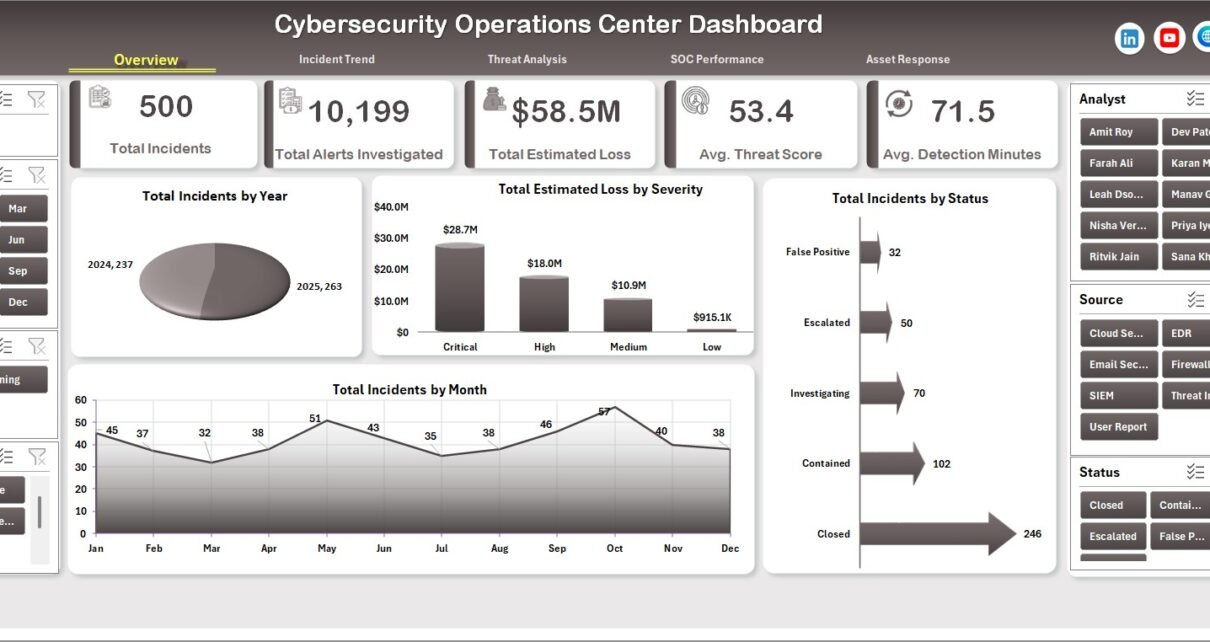
- 5 executive KPI cards for Total Incidents, Total Alerts Investigated, Total Estimated Loss, Avg. Threat Score, and Avg. Detection Minutes.
- 5 dashboard pages for Overview, Incident Trend, Threat Analysis, SOC Performance, and Asset Response.
- 18+ chart views across year, severity, status, month, quarter, source, incident type, asset type, priority, analyst, shift, region, and business unit.
- Interactive slicers for quick filtering without rebuilding PivotTables or charts.
- Data Sheet tab where users replace sample data with their own SOC records in the same format.
- Support Sheet tab with pivot tables that power the dashboard and can be hidden after setup.
- Excel-native workflow using Refresh All after updating the data.
Dashboard Pages Explanation
1. Overview Page
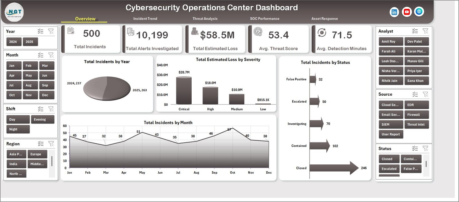
The Overview Page gives leadership a high-level summary of SOC activity. At the top, the dashboard shows Total Incidents, Total Alerts Investigated, Total Estimated Loss, Avg. Threat Score, and Avg. Detection Minutes so teams can quickly understand workload, investigation volume, business impact, security risk, and response speed.
Total Incidents by Year: This chart shows incident volume by year, helping teams identify whether the SOC workload is growing or improving over time. It is useful for annual security reviews and capacity planning.
Total Estimated Loss by Severity: This chart connects financial impact with incident severity. It helps leaders prioritize high-severity risks that create the highest estimated loss.
Total Incidents by Status: This view shows where incidents sit in the response workflow. It helps managers see whether too many cases are open, pending, contained, escalated, or closed.
Total Incidents by Month: This monthly chart highlights recurring spikes and trend changes. SOC managers can use it to plan staffing and review seasonal security pressure.
2. Incident Trend
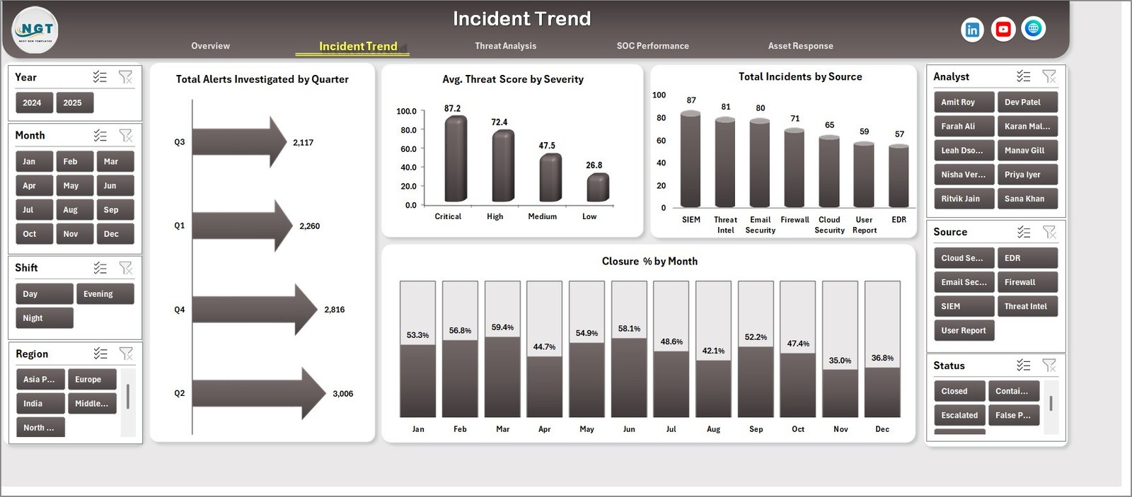
The Incident Trend tab focuses on investigation workload, severity scoring, incident source, and closure progress. Total Alerts Investigated by Quarter helps SOC leaders understand how investigation effort changes across the year. Avg. Threat Score by Severity shows whether severity labels match actual threat intensity. Total Incidents by Source reveals which monitoring tools, systems, or reporting channels are generating the most work. Closure % by Month shows whether the team is keeping up with incident volume.
3. Threat Analysis
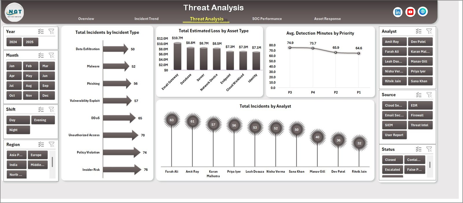
The Threat Analysis page explains what types of incidents are occurring and which assets are affected. Total Incidents by Incident Type shows whether phishing, malware, unauthorized access, data exposure, endpoint alerts, or other categories dominate the workload. Total Estimated Loss by Asset Type shows which asset groups create the largest business exposure. Avg. Detection Minutes by Priority reviews detection speed by urgency. Total Incidents by Analyst supports workload balancing and coaching.
4. SOC Performance
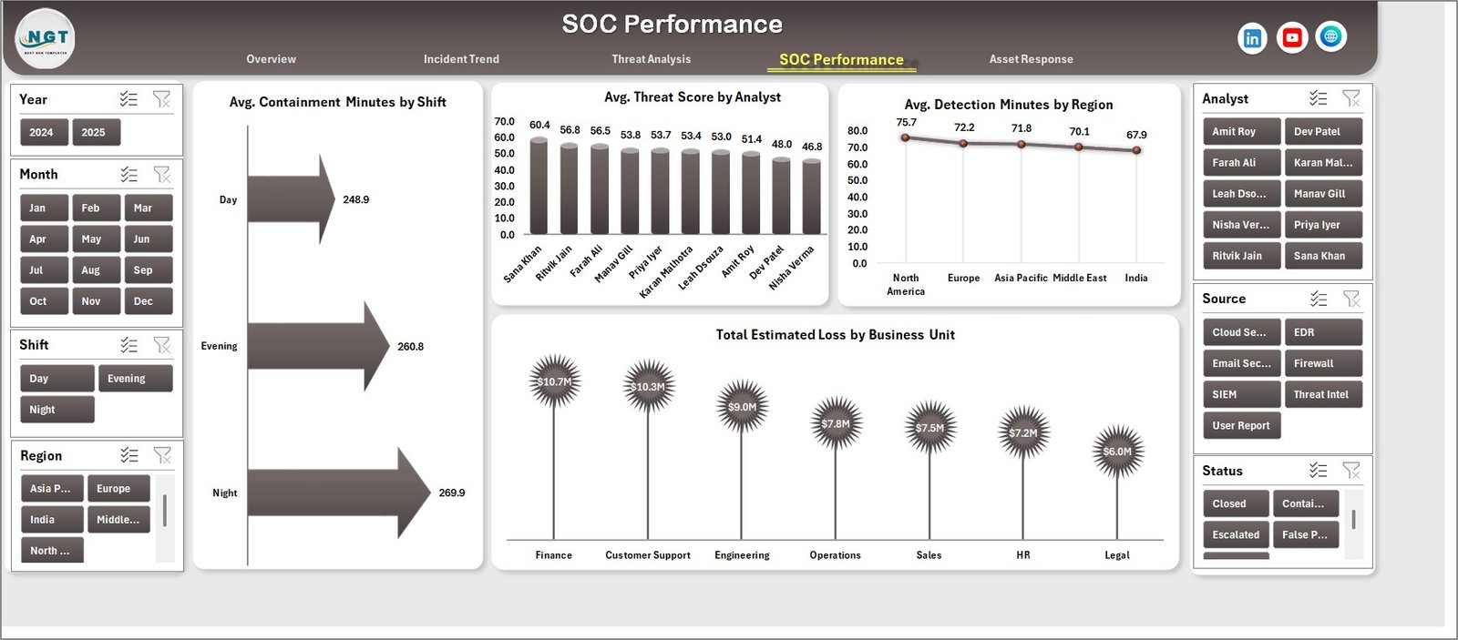
The SOC Performance page helps managers review containment, analyst case mix, regional detection speed, and business-unit impact. Avg. Containment Minutes by Shift shows whether specific operating shifts need support. Avg. Threat Score by Analyst helps explain case complexity. Avg. Detection Minutes by Region highlights regional response gaps. Total Estimated Loss by Business Unit shows where security incidents create the most financial exposure.
5. Asset Response
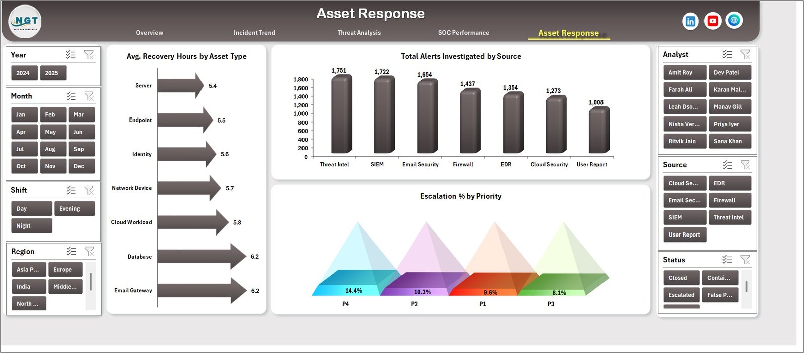
The Asset Response page is useful for post-incident and operational recovery reviews. Avg. Recovery Hours by Asset Type identifies which systems or assets take longer to restore. Total Alerts Investigated by Source compares investigation workload across sources. Escalation % by Priority shows where urgent issues require senior attention or additional process control.
6. Data Sheet Tab
The Data Sheet is where users add the source data. Keep the same column format, replace the sample records with your own SOC incident records, and then refresh the workbook. This keeps all dashboard cards, slicers, charts, and pivots aligned with the same reporting structure.

7. Support Sheet
The Support Sheet contains the pivot tables used to create the entire dashboard dynamically. After updating the Data Sheet, go to the Data tab in the Excel Ribbon and click Refresh All. Microsoft also explains the official PivotTable refresh workflow here: Refresh PivotTable data. You can keep the Support Sheet hidden for a cleaner user experience.

Cybersecurity Operations Center Dashboard in Excel vs. Google Sheets vs. Paid SIEM/SaaS – Feature Comparison
| Feature | This Excel Dashboard | Google Sheets Alternative | Paid SIEM/SaaS Alternative |
|---|---|---|---|
| Cost | $17.99 one-time | Template cost or manual build | $10,000-$100,000+ per year |
| Platform | Microsoft Excel | Google Sheets | Vendor cloud or on-prem platform |
| Setup time | Open, replace data, refresh | Copy sheet and configure sharing | Implementation and integrations |
| Real-time team collaboration | Possible through OneDrive or SharePoint | Native collaboration | Usually seat-based |
| Mobile access | Excel mobile with limits | Google Sheets app | Usually available |
| Customizable fields | Fully editable workbook | Editable sheet structure | Limited by vendor settings |
| Share with link | Possible through cloud storage | Native link sharing | Usually login required |
| Year-1 cost at 5 users | $17.99 total | Template cost or internal build time | $10,000-$100,000+ |
| SOC reporting analytics | Included across 5 pages | Requires custom setup | Usually requires configuration |
Who Should Use This Template
This template is useful for SOC managers, CISOs, cybersecurity analysts, incident response teams, IT managers, compliance reviewers, MSPs, and consultants who need a clean Excel reporting layer for incidents, investigation workload, threat score, loss, detection, containment, recovery, escalation, analyst workload, and business-unit exposure.
It is especially useful when the team already collects records from a SIEM, ticketing system, EDR console, help desk tool, or spreadsheet but needs a polished dashboard for management reporting.
Real-World Use Cases
Arjun, SOC manager: Arjun updates the Data Sheet every Friday, clicks Refresh All, and uses the Overview and Incident Trend pages to brief leadership on incident volume, alert investigation, estimated loss, and closure percentage.
Meera, security analyst: Meera reviews Threat Analysis to understand which incident types and asset types create the highest risk. She uses Avg. Detection Minutes by Priority to identify delayed detection patterns.
Daniel, CISO: Daniel uses SOC Performance and Asset Response to compare response speed by shift, loss by business unit, escalation rate by priority, and recovery hours by asset type before monthly cyber risk meetings.
Advantages of Cybersecurity Operations Center Dashboard in Excel
- It creates a structured reporting layer without replacing your SIEM or security tools.
- It works in Excel, so many business users can review the dashboard without learning a new platform.
- It connects executive KPI cards with detailed pages for trend, threat, response, and performance analysis.
- It supports fast filtering through slicers, which makes review meetings easier.
- It can be customized by Excel users who want to adjust fields, colors, charts, or pivot tables.
Opportunities for Improvement
This dashboard is not a live monitoring system. It does not collect logs, create alerts, run correlation rules, trigger playbooks, or automate incident response. Teams that need live SOC monitoring should continue using a SIEM, SOAR, EDR, or ticketing system. This workbook is best used as a reporting and leadership review template after incident data has been exported or prepared.
Best Practices
- Keep the Data Sheet column format consistent when adding records.
- Use standardized values for severity, status, source, priority, analyst, region, shift, and asset type.
- Refresh all pivots after each data update.
- Review detection and containment metrics separately because they explain different parts of the response process.
- Hide the Support Sheet in user-facing copies, but keep it available for maintenance.
- Store the workbook in an approved secure location because security incident records may be sensitive.
Explore Relevant Templates
You may also like Cybersecurity Report in Excel for incident reporting and financial impact analysis, Cyber Law Advisory Dashboard in Excel for legal and compliance advisory reporting, and Cloud Hosting Services Dashboard in Power BI for IT operations analytics.
Browse more Excel Dashboard templates on NextGenTemplates.
Frequently Asked Questions
What does the Cybersecurity Operations Center Dashboard in Excel track?
It tracks total incidents, alerts investigated, estimated loss, threat score, detection minutes, containment minutes, recovery hours, closure percentage, escalation percentage, source, severity, status, incident type, asset type, priority, analyst, shift, region, and business unit.
Is this dashboard a SIEM replacement?
No. It is an Excel reporting dashboard. It does not collect logs, generate live alerts, run correlation rules, or automate response workflows.
Can I use my own SOC data?
Yes. Replace the sample rows in the Data Sheet with your own incident records while keeping the same column format, then click Refresh All.
Do I need advanced Excel skills?
No. Basic Excel users can update the Data Sheet and refresh the dashboard. Advanced users can customize pivots, charts, and slicers.
Can the Support Sheet be hidden?
Yes. The Support Sheet can be hidden after setup while still powering the pivot tables and charts.
Can I customize the dashboard pages?
Yes. You can edit fields, labels, colors, charts, slicers, pivot tables, and formulas because this is a standard Excel workbook.
About the Author
Built by PK – Microsoft Certified Professional with 15+ years of Excel, Google Sheets, and Power BI experience. Founder of NextGenTemplates, reaching 300K+ subscribers across YouTube channels. Every template is hand-built and tested before release.
Conclusion
The Cybersecurity Operations Center Dashboard in Excel gives SOC and IT security teams a clear way to report incidents, alerts investigated, estimated loss, threat score, detection time, containment time, recovery, escalation, and workload in one workbook. It does not replace live security tooling, but it makes management reporting much easier when your team needs a clean Excel dashboard for reviews.
Click here to purchase Cybersecurity Operations Center Dashboard in Excel
For step-by-step tutorials, visit Youtube.com/@PKAnExcelExpert.
Last updated: May 31, 2026