The cement industry runs with high pressure because production teams handle huge volumes of raw materials, fuel, clinker, cement bags, dispatch cycles, and customer orders every day. As operations grow, data increases, and Excel files become large. Teams switch between multiple sheets to track production, downtime, dispatch, and energy consumption. As a result, reporting takes time, mistakes increase, and decision-making slows down.
A Cement Industry Dashboard in Excel solves these issues with a clean, ready-to-use analytical system. It brings every key metric into one place and presents insights with charts, slicers, and automated summaries. Since the dashboard stays inside Excel, users enjoy flexibility without learning new software.
In this article, you will learn what this dashboard is, how it works, why it matters, and how each page helps teams understand plant performance clearly. You will also see the advantages, best practices, and answers to the most common questions related to cement operations reporting.
Click to Purchases Cement Industry Dashboard in Excel
What Is a Cement Industry Dashboard in Excel?
A Cement Industry Dashboard in Excel is a smart reporting solution that helps production teams, plant managers, and senior leadership track everything in real time. The dashboard shows cement production, clinker output, dispatch quantity, power consumption, planned downtime, unplanned downtime, fuel usage, and customer trends in one simple interface.
The system uses Excel formulas, charts, KPIs, and slicers to convert raw data into meaningful visuals. Therefore, users avoid manual calculations and see insights instantly. Since the dashboard works across multiple pages, teams explore each metric from different angles.
Why Should Teams Use a Cement Industry Dashboard?
Cement companies deal with heavy machinery, large workforces, multiple process lines, and strict deadlines. When teams depend on manual reporting, problems appear quickly. However, a structured Excel dashboard removes confusion and improves daily decision-making.
Here are the main reasons why teams use it:
-
It brings all KPIs into one view.
-
It reduces time spent on manual reporting.
-
It improves accuracy and clarity.
-
It highlights plant-wise, product-wise, and customer-wise performance.
-
It helps teams detect unplanned downtime instantly.
-
It supports quick root-cause analysis.
-
It allows teams to compare MTD, YTD, and trend values easily.
Since everything stays in Excel, the setup becomes simple, and every team member can use it without training.
Key Features of the Cement Industry Dashboard in Excel
The dashboard includes multiple pages that give structured information about production, downtime, dispatch, fuel, and customer requirements. A Page Navigator sits on the left side. It helps users switch across all analytical pages quickly.
Below is a complete explanation of every page inside the dashboard.
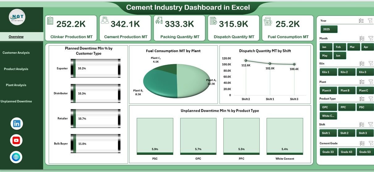
1. Overview Page – What Does It Show?
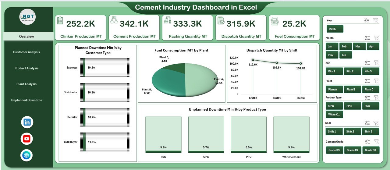
The Overview Page is the first screen of the dashboard. It shows the most important KPIs at the top in the form of cards. These cards help leaders check performance with one quick look.
Key KPI Cards on the Overview Page
-
Current Production Performance
-
Total Cement Output
-
Total Fuel Consumption
-
Total Dispatch Quantity
-
Unplanned Downtime Percentage
These cards offer a quick snapshot of daily and monthly statistics.
Charts on the Overview Page
The page contains four high-value charts:
-
Planned Downtime Min % by Customer Type – This chart shows which customer category faces the highest planned downtime impact.
-
Fuel Consumption (MT) by Plant – It highlights fuel performance across different plants.
-
Dispatch Quantity (MT) by Shift – It helps teams compare the productivity of each shift.
-
Unplanned Downtime Min % by Product Type – It shows which product category requires immediate attention.
Since the page includes slicers on the right-side panel, users filter the entire page quickly based on plant, customer type, product type, or month.
2. Customer Analysis Page – How Does It Help?
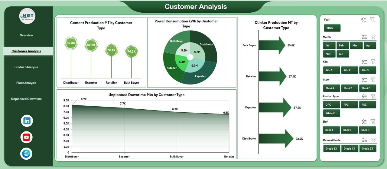
The Customer Analysis Page explains how different customer types influence production and consumption patterns. This page helps sales and production teams align their strategies because they see which customer group creates maximum demand.
Charts on the Customer Analysis Page
-
Cement Production (MT) by Customer Type – It shows customer-wise contribution to total cement output.
-
Power Consumption (kWh) by Customer Type – It reveals which customers drive higher energy usage.
-
Clinker Production (MT) by Customer Type – It helps teams understand how clinker demand flows across customer types.
-
Unplanned Downtime Min by Customer Type – It highlights critical areas where customer requirements clash with production delays.
Since the page includes slicers on the right side, teams explore customer behavior across months, regions, and plants without effort.
3. Product Analysis Page – What Insights Does It Offer?
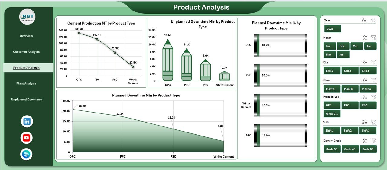
The Product Analysis Page helps teams compare the performance of different cement product categories. Cement plants often produce multiple grades such as OPC, PPC, Slag Cement, White Cement, and more. This page shows how each grade performs through charts and KPIs.
Charts on the Product Analysis Page
-
Cement Production (MT) by Product Type – It compares cement output across all products.
-
Unplanned Downtime Min by Product Type – It shows which product line faces operational issues.
-
Planned Downtime Min % by Product Type – It highlights the scheduled maintenance hours by product category.
-
Planned Downtime Min by Product Type – It offers a deeper view of planned maintenance time.
Since teams use this page every day, they improve planning, maintenance, and resource allocation easily.
Click to Purchases Cement Industry Dashboard in Excel
4. Plant Analysis Page – Why Is It Important?
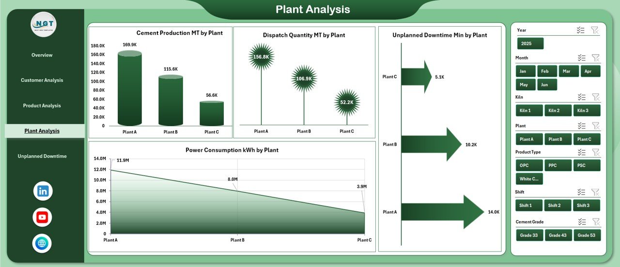
The Plant Analysis Page focuses on plant-wise performance. Most cement companies run multiple plants across regions. Therefore, leaders require a clear view of production, downtime, dispatch, and energy usage at each location.
Charts on the Plant Analysis Page
-
Cement Production (MT) by Plant – It highlights the output of every plant.
-
Unplanned Downtime Min by Plant – It reveals which plants face operational challenges.
-
Power Consumption (kWh) by Plant – It compares each plant’s energy usage.
-
Dispatch Quantity (MT) by Plant – It measures dispatch performance of every location.
Since the page includes a slicer panel on the right side, users filter data by time period, grade, customer type, or region.
5. Unplanned Downtime Min Analysis Page – How Does It Support Maintenance?
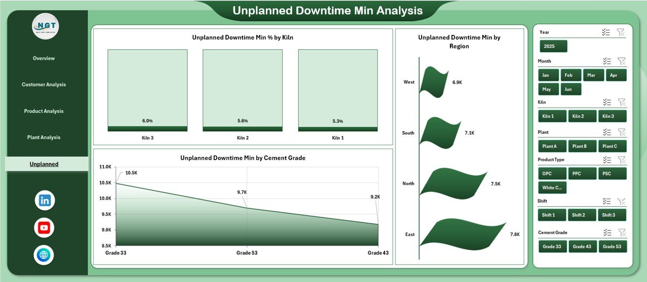
Unplanned downtime affects production cost, fuel usage, dispatch delays, and customer satisfaction. The Unplanned Downtime Min Analysis Page helps teams detect downtime causes, duration, and patterns.
Charts on the Unplanned Downtime Page
-
Unplanned Downtime Min % by Kiln – It shows downtime caused by each kiln.
-
Unplanned Downtime Min by Region – It helps teams compare operational losses across regions.
-
Unplanned Downtime Min by Cement Grade – It highlights downtime patterns for each product grade.
This page supports maintenance teams because it brings every downtime factor together in one view. As a result, teams act faster and reduce future disruptions.
Support Sheets and Data Sheets
The dashboard includes a Data Sheet where users enter all raw information. This sheet stores:
-
Cement production values
-
Clinker output
-
Power consumption
-
Fuel consumption
-
Downtime (planned and unplanned)
-
Dispatch quantity
-
Customer type
-
Product type
-
Region and plant details
The Data Sheet works as the foundation of the dashboard. Since the dashboard formulas pull values from this sheet, users only update data in one place.
Advantages of the Cement Industry Dashboard in Excel
1. Faster Decision-Making
Users see insights instantly because the dashboard shows all KPIs in one clean view. Therefore, decisions become quick and accurate.
2. Reduced Manual Work
Teams avoid manual calculations. The dashboard updates automatically when users load new data.
3. Improved Transparency
Everyone—from supervisors to plant managers—sees the same information. As a result, communication becomes simple and clear.
4. Strong Operational Control
The dashboard shows production, downtime, fuel, power, and dispatch trends. Therefore, teams control plant operations effectively.
5. Easy to Customize
Since the system runs in Excel, teams customize it based on their plant structure, customer base, or raw material setup.
6. Clear View of Downtime
The Unplanned Downtime page highlights failures instantly. Therefore, maintenance teams act before the next breakdown.
7. Better Production Planning
Product-wise and plant-wise analysis helps teams plan output based on demand and capacity.
Best Practices for Using the Cement Industry Dashboard
Follow these practices to get the best output from the dashboard:
1. Update the Data Sheet Daily
Fresh data improves accuracy and helps teams make strong daily decisions.
2. Maintain Clean and Structured Data
Use consistent naming for plants, product types, customer types, and regions. This improves slicer performance.
3. Review Downtime Pages Regularly
Frequent checks help teams detect early warning signs.
4. Track Trends Instead of Single Values
Monthly and product-wise comparisons reveal real performance patterns.
5. Use the Page Navigator for Quick Movement
Switch between pages to connect insights—for example:
Production → Downtime → Dispatch → Customer Impact.
6. Share the Dashboard with Leadership
Decision-makers stay updated and plan resources better.
7. Back Up the Data Weekly
Avoid data loss by keeping a weekly backup of the Data Sheet.
How Does the Dashboard Improve Plant Performance?
Since the dashboard gives a 360° view of operations, plant performance improves in many ways:
-
Production teams balance output across shifts.
-
Maintenance teams react fast to downtime alerts.
-
Managers compare fuel, power, and output to reduce cost.
-
Dispatch teams plan based on real demand.
-
Leadership monitors monthly progress clearly.
Because every insight stays in one place, the dashboard supports long-term improvement.
Click to Purchases Cement Industry Dashboard in Excel
Conclusion
A Cement Industry Dashboard in Excel helps cement companies handle complex operations with clarity and speed. The dashboard offers multiple analytical pages, smart slicers, and powerful charts that help teams track production, fuel, dispatch, downtime, and customer performance. Since it uses Excel, every team member understands it easily and uses it without training.
This dashboard brings structure, accuracy, and transparency into daily reporting. As a result, companies reduce downtime, improve production planning, and make faster decisions. Whether you manage plant operations, production planning, maintenance, or dispatch, this dashboard becomes a valuable tool in your workflow.
Frequently Asked Questions (FAQs)
1. What data do I need to use the Cement Industry Dashboard in Excel?
You need production data, power consumption, fuel consumption, downtime, dispatch quantity, customer details, and product information.
2. Can beginners use this dashboard?
Yes. Since the dashboard runs in Excel, beginners use it easily without training.
3. Can I customize the charts?
Yes. You can edit chart data, labels, slicers, and formatting based on your company’s needs.
4. Does the dashboard reduce manual work?
Yes. The dashboard removes manual calculations because all formulas and charts update automatically.
5. How often should I update the Data Sheet?
Daily updates give the best results, especially for downtime, production, and dispatch tracking.
6. Can I add more plants or product types?
Yes. You can expand the Data Sheet and refresh the pivot tables to support new entries.
7. Does the dashboard help with downtime analysis?
Yes. The dedicated downtime page highlights issues across kilns, regions, and cement grades.
8. Why is Excel the best platform for cement analytics?
Excel offers flexibility, easy customization, and zero learning curve. Therefore, it becomes the best tool for quick reporting.
Visit our YouTube channel to learn step-by-step video tutorials
Click to Purchases Cement Industry Dashboard in Excel