Business continuity has become a critical priority for modern organizations. Unexpected disruptions such as system failures, cyber incidents, natural disasters, or operational breakdowns can stop business activities instantly. Therefore, companies must plan, monitor, and analyze continuity readiness continuously. That is exactly where a Business Continuity Planning Dashboard in Excel plays a powerful role.
In this detailed guide, you will learn what a Business Continuity Planning Dashboard in Excel is, why it matters, how it works, what pages it includes, and how it helps organizations stay resilient. Moreover, this article explains everything in simple language so any professional can understand and use it confidently.
What Is a Business Continuity Planning Dashboard in Excel?
Click to Purchases Business Continuity Planning Dashboard in Excel
A Business Continuity Planning Dashboard in Excel is a ready-to-use analytical template that helps organizations track, monitor, and evaluate business continuity performance in one centralized Excel file.
Instead of managing multiple spreadsheets, reports, and documents, this dashboard combines all critical continuity metrics into structured visuals, KPIs, and trend analysis. As a result, decision-makers can respond faster and plan smarter.
Most importantly, Excel makes this dashboard flexible, easy to customize, and accessible without complex BI tools or coding knowledge.
Why Do Organizations Need a Business Continuity Planning Dashboard?
Every organization faces some level of operational risk. However, without proper visibility, these risks turn into costly incidents. Therefore, organizations increasingly rely on dashboards to monitor continuity health in real time.
A Business Continuity Planning Dashboard in Excel helps organizations to:
-
Track recovery performance across regions and businesses
-
Monitor downtime, incidents, and financial impact
-
Measure active and planned BCP coverage
-
Identify risk-prone areas early
-
Support quick decision-making during crises
As a result, leadership teams gain confidence and clarity in managing disruptions effectively.
How Does a Business Continuity Planning Dashboard in Excel Work?
The dashboard works on a simple yet powerful concept.
First, users enter continuity-related data in a structured Data Sheet. After that, Excel automatically calculates KPIs using predefined formulas. Finally, visuals and cards display insights across multiple dashboard pages.
Because of this structure, users can focus on analysis instead of manual calculations.
Key Components of the Business Continuity Planning Dashboard in Excel
Before exploring individual pages, let us understand the core components of this dashboard.
Page Navigator for Easy Navigation
The dashboard includes a Page Navigator located on the left side. This navigator allows users to move quickly between dashboard pages.
As a result:
-
Navigation becomes smooth
-
Users save time
-
Dashboard usability improves significantly
What Pages Are Included in the Business Continuity Planning Dashboard in Excel?
This dashboard includes five main analytical pages, each designed for a specific continuity perspective.
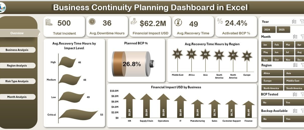
1. What Insights Does the Overview Page Provide?
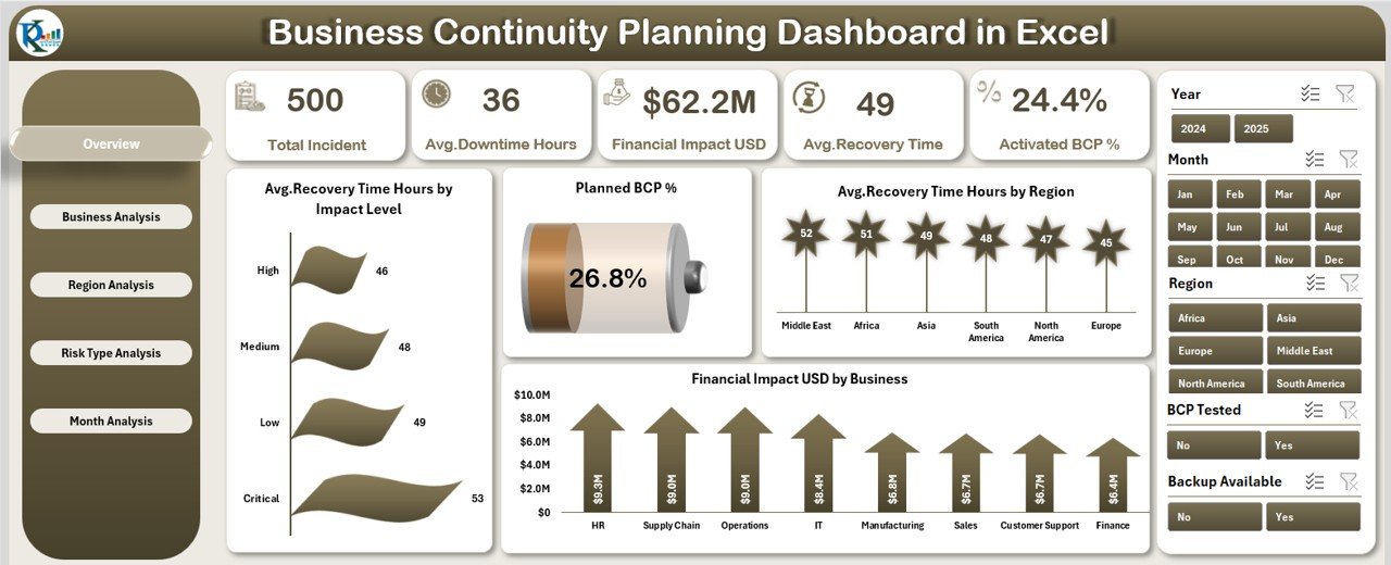
The Overview Page acts as the command center of the dashboard.
Key Design Elements
-
Right-side slicer for filtering data
-
Five KPI cards for high-level performance
-
Four interactive charts
KPIs on the Overview Page
The cards highlight essential continuity metrics such as:
-
Average Recovery Time
-
Planned BCP Percentage
-
Downtime metrics
-
Financial impact overview
Charts on the Overview Page
The following charts provide quick insights:
-
Average Recovery Time (Hours) by Impact Level
-
Planned BCP %
-
Average Recovery Time (Hours) by Region
-
Financial Impact (USD) by Business
Because of these visuals, stakeholders instantly understand current continuity readiness.
2. Why Is the Business Analysis Page Important?
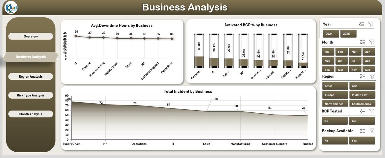
The Business Analysis Page evaluates continuity performance for each business unit.
Key Features
-
Right-side slicer for business-level filtering
-
Three focused charts
Charts Included
-
Average Downtime Hours by Business
-
Active BCP % by Business
-
Total Incidents by Business
Therefore, organizations clearly identify which business units require immediate attention.
3. How Does the Region Analysis Page Help Decision-Makers?
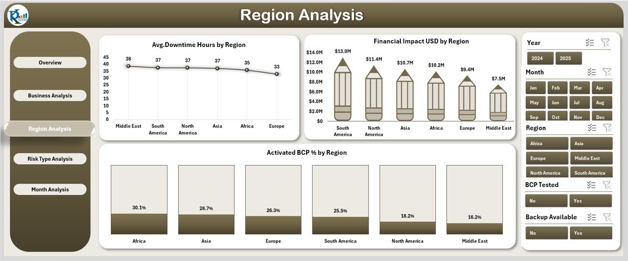
Business disruptions often vary region by region. Hence, regional analysis becomes essential.
Page Highlights
-
Right-side slicer for region selection
-
Three region-focused charts
Charts on Region Analysis Page
-
Average Downtime Hours by Region
-
Active BCP % by Region
-
Financial Impact (USD) by Region
As a result, organizations allocate resources more effectively based on regional risk levels.
4. Why Should Risk Type Analysis Never Be Ignored?
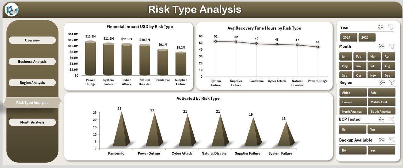
Different risk types affect operations differently. Therefore, understanding them improves preparedness.
Key Elements
-
Right-side slicer for risk type selection
-
Three targeted charts
Charts on Risk Type Analysis Page
-
Active BCP % by Risk Type
-
Financial Impact (USD) by Risk Type
-
Average Recovery Time (Hours) by Risk Type
Because of this analysis, teams can strengthen mitigation plans for high-impact risks.
Click to Purchases Business Continuity Planning Dashboard in Excel
5. What Trends Does the Month Analysis Page Reveal?
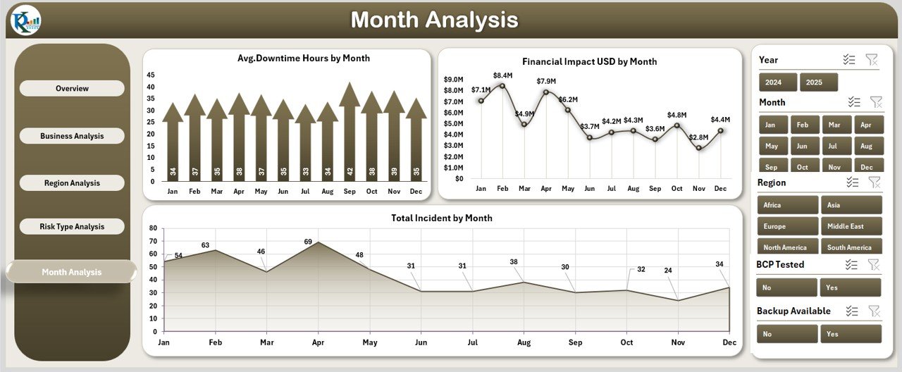
Continuity performance changes over time. That is why monthly trend analysis becomes critical.
Page Structure
-
Right-side slicer for time filtering
-
Three monthly charts
Charts Included
-
Financial Impact (USD) by Month
-
Average Downtime Hours by Month
-
Total Incidents by Month
As a result, organizations track improvements and identify recurring problems.
What Is the Role of the Support Sheet and Data Sheet?
Data Sheet
The Data Sheet stores all raw continuity data such as:
-
Business name
-
Region
-
Risk type
-
Downtime hours
-
Recovery time
-
Financial impact
-
Incident count
All calculations and visuals depend on this structured data.
Support Sheet
The Support Sheet helps:
-
Manage dropdown values
-
Maintain clean references
-
Improve dashboard automation
Together, these sheets ensure accuracy and flexibility.
Advantages of Business Continuity Planning Dashboard in Excel
Organizations gain several benefits from using this dashboard.
✅ Centralized Visibility
All continuity metrics stay in one place. Therefore, management avoids scattered data.
✅ Faster Decision-Making
Visual insights allow teams to act quickly during incidents.
✅ Improved Risk Awareness
Risk-type and region analysis highlight vulnerable areas early.
✅ Cost Optimization
Financial impact analysis helps reduce unnecessary losses.
✅ Excel-Based Simplicity
Users do not need expensive BI tools or advanced technical skills.
Who Should Use a Business Continuity Planning Dashboard in Excel?
This dashboard benefits multiple roles:
-
Business Continuity Managers
-
Risk Managers
-
Operations Leaders
-
IT Managers
-
Compliance Teams
-
Senior Executives
In short, anyone responsible for business resilience will find it valuable.
Best Practices for the Business Continuity Planning Dashboard in Excel
Click to Purchases Business Continuity Planning Dashboard in Excel
Following best practices ensures maximum value from the dashboard.
🟢 Keep Data Updated Regularly
Always update the data sheet on a monthly or real-time basis.
🟢 Define Clear KPIs
Use consistent definitions for recovery time, downtime, and incidents.
🟢 Use Slicers Effectively
Filter by region, business, and risk type before making decisions.
🟢 Review Trends Monthly
Monitor downward or upward trends proactively.
🟢 Validate Data Accuracy
Cross-check inputs to avoid misleading insights.
How Does This Dashboard Support Compliance and Audits?
Regulatory bodies often expect documented continuity practices. This dashboard helps by:
-
Maintaining historical performance records
-
Supporting audit discussions with data
-
Demonstrating proactive risk management
As a result, compliance becomes easier and more transparent.
Can Small and Medium Businesses Use This Dashboard?
Absolutely.
Excel-based dashboards suit small and medium organizations because:
-
They cost less
-
They require minimal setup
-
They grow with business needs
Therefore, both startups and enterprises benefit equally.
How Does Excel Compare to BI Tools for Continuity Planning?
While BI tools offer advanced features, Excel dashboards provide:
-
Faster deployment
-
Lower cost
-
Easier customization
-
Offline availability
Thus, Excel remains a practical and efficient solution.
Conclusion
A Business Continuity Planning Dashboard in Excel acts as a powerful decision-support tool for modern organizations. It brings visibility, structure, and clarity to business continuity management.
By tracking recovery times, downtime, incidents, risk types, and financial impact in one dashboard, organizations improve resilience and response readiness. Moreover, Excel’s simplicity ensures quick adoption without heavy investment.
In today’s uncertain environment, such dashboards are no longer optional—they are essential.
Frequently Asked Questions (FAQs)
1. What is the main purpose of a Business Continuity Planning Dashboard in Excel?
It helps organizations monitor, analyze, and improve business continuity readiness using structured KPIs and visuals.
2. Do I need advanced Excel skills to use this dashboard?
No. Basic Excel knowledge is enough to operate and update the dashboard.
3. How often should I update the dashboard?
Ideally, you should update it monthly or after any major incident.
4. Can I customize this dashboard?
Yes. Excel allows full customization based on business needs.
5. Is this dashboard suitable for audits?
Yes. It provides documented performance data and historical trends.
6. Does this dashboard replace a full BCP document?
No. It complements BCP documents by providing performance insights.
Visit our YouTube channel to learn step-by-step video tutorials