The IT Help Desk Dashboard in Power BI tracks 5 core KPIs across 5 fully interactive report pages, with 16 pre-built visuals and slicer-driven filtering by department, priority, channel, agent, and month. Setup takes under 10 minutes — replace the sample data with your own ticket export and every visual recalculates automatically.
If you run an IT service desk, you already know the problem: tickets pile up in Power BI exports, ServiceNow dashboards, Jira Service Management, or even raw Excel sheets, and senior leadership wants a single weekly view of SLA performance, agent productivity, and CSAT scores. The IT Help Desk Dashboard in Power BI gives you that view, on your data, without paying Freshservice or Zendesk reporting fees.
👉 Click here to Purchase the IT Help Desk Dashboard in Power BI
Key Features of the IT Help Desk Dashboard in Power BI
- 5 KPI cards on the Overview page — Total Tickets, Avg Resolution Time, Avg Response Time, Resolved Tickets, and Avg CSAT Score. Each card auto-refreshes when filters change.
- 16 pre-built visuals across 5 report pages — bar, column, line, and donut charts wired to slicers. Every chart is bookmarked and tooltip-enabled.
- Slicer-driven filtering on every page — filter by Department, Priority, Channel, Category, Agent, or Month. All visuals recalculate in under a second.
- SLA compliance tracking across three angles: by month, by agent, and by priority. Spot whether breaches are a workload, skill, or routing problem.
- CSAT scoring by channel and by agent — identify which channels (email, phone, chat, portal) and which agents are driving customer satisfaction up or down.
- Pre-written DAX measures for Total Tickets, Avg Resolution Time, Avg Response Time, Resolution Rate, SLA Compliance %, and Avg CSAT.
- Power BI Desktop is free — no Pro license required to run the dashboard locally.
Dashboard Pages Explanation
The IT Help Desk Dashboard in Power BI contains 5 distinct report pages. Each one answers a different operational question, and all of them share the same slicer set — so the filters you apply on Overview carry through to every other page.
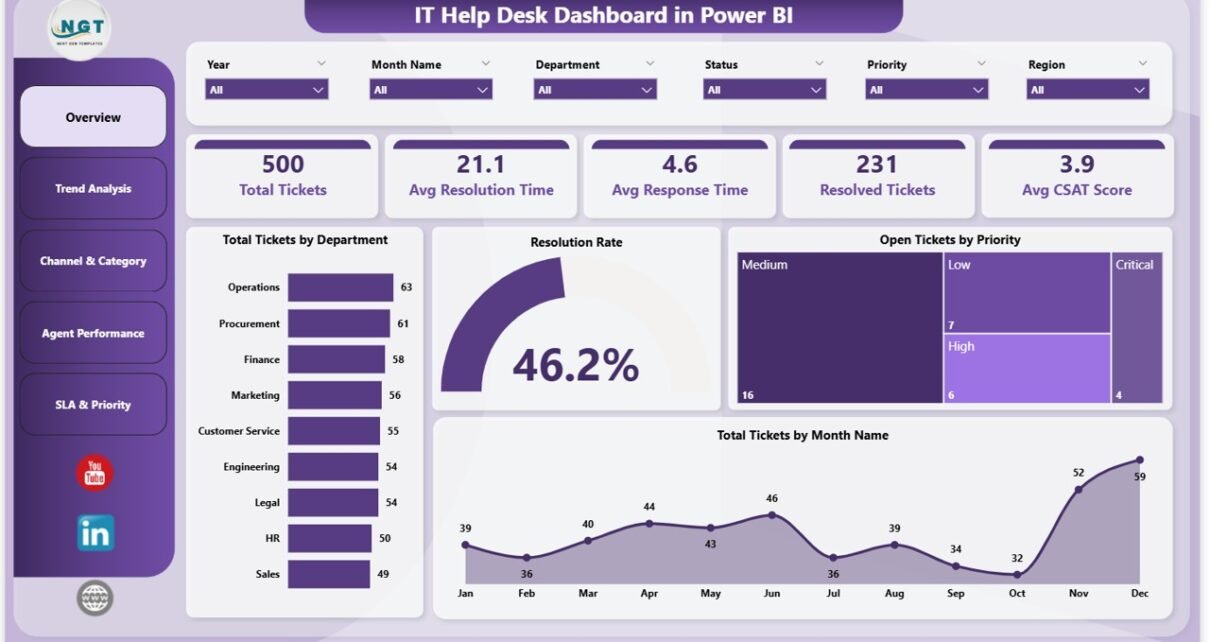
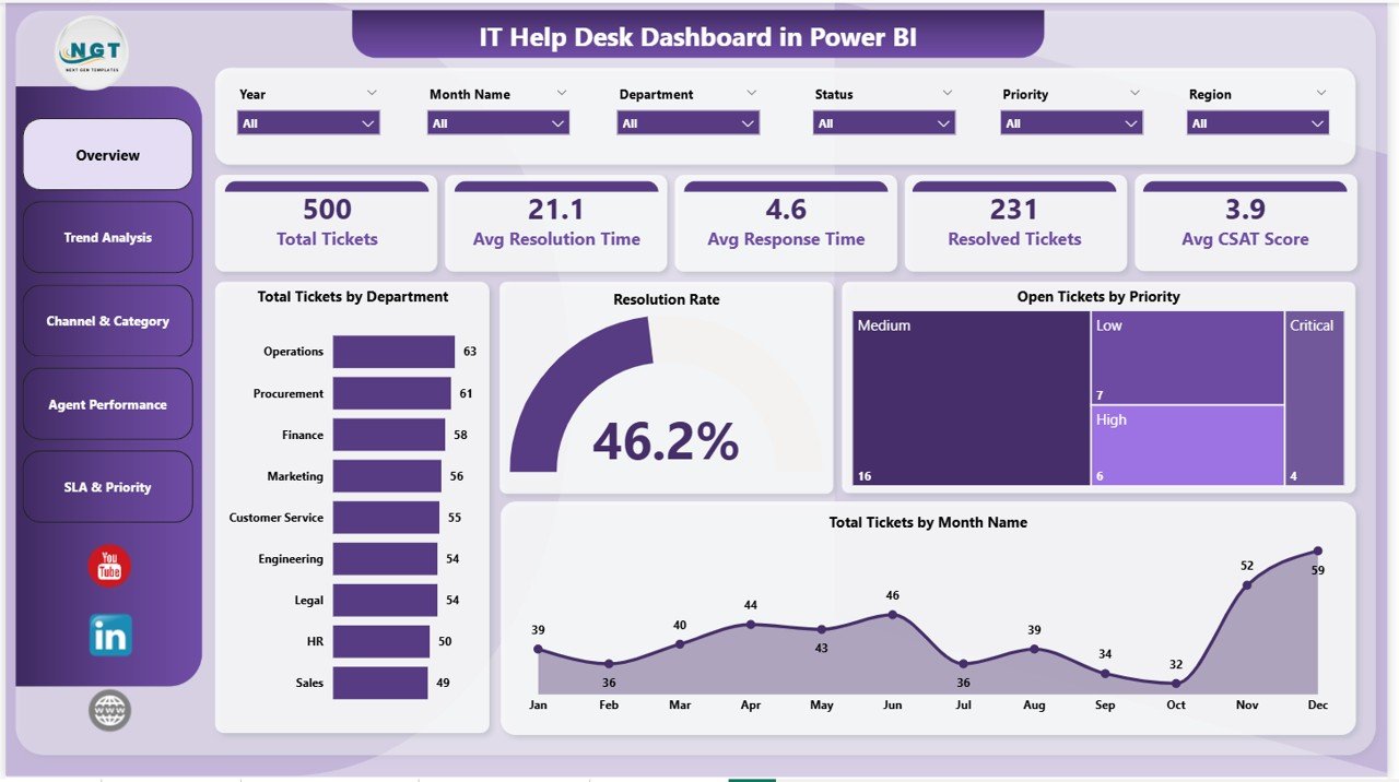
Page 1: Overview
The landing page shows the 5 headline KPI cards — Total Tickets, Avg Resolution Time, Avg Response Time, Resolved Tickets, and Avg CSAT Score — plus four operational charts: Total Tickets by Department, Resolution Rate, Open Tickets by Priority, and Total Tickets by Month Name. Slicers at the top filter every visual instantly so the same page works for a daily standup or a monthly business review.
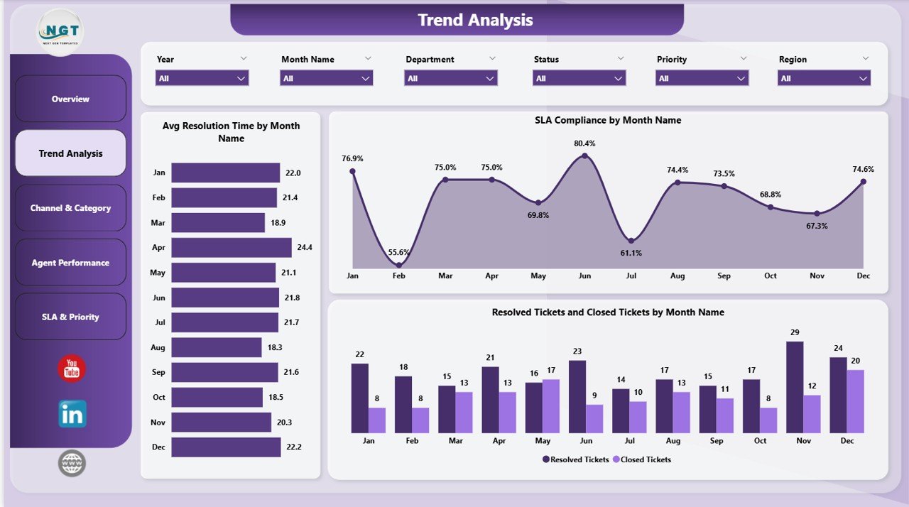
Page 2: Trend Analysis
Tracks how performance changes month over month. Includes Avg Resolution Time by Month Name, SLA Compliance by Month Name, and Resolved Tickets and Closed Tickets by Month Name. This is the page to use when you need to spot seasonality, post-release ticket spikes, or SLA drift before they become quarterly problems.
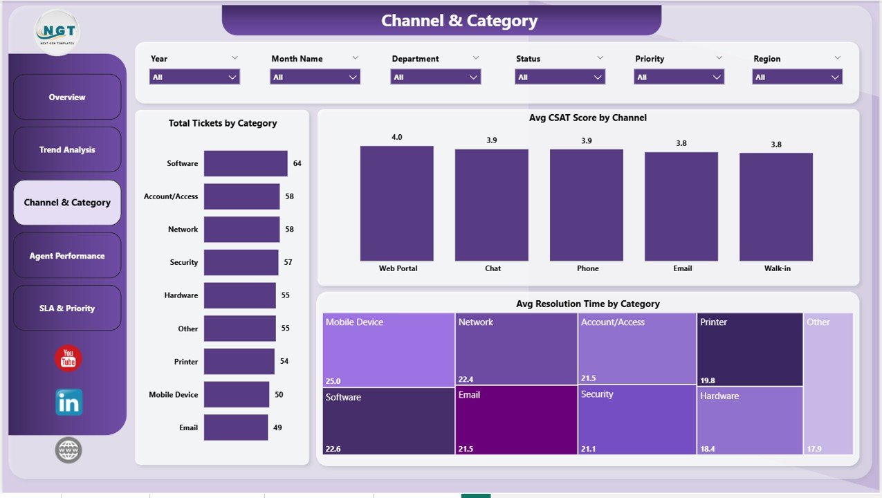
Page 3: Channel & Category
Breaks the ticket mix down by support channel and issue category. Includes Total Tickets by Category, Avg CSAT Score by Channel, and Avg Resolution Time by Category. Useful for identifying which categories eat the most agent time and which channels customers actually prefer over time.
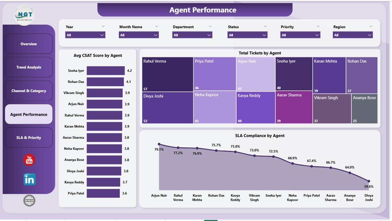
Page 4: Agent Performance
Compares every agent on three dimensions: Avg CSAT Score by Agent, Total Tickets by Agent, and SLA Compliance by Agent. Use it for 1:1 coaching, workload balancing, and quarterly performance reviews — every metric ties back to specific named agents in the underlying data.
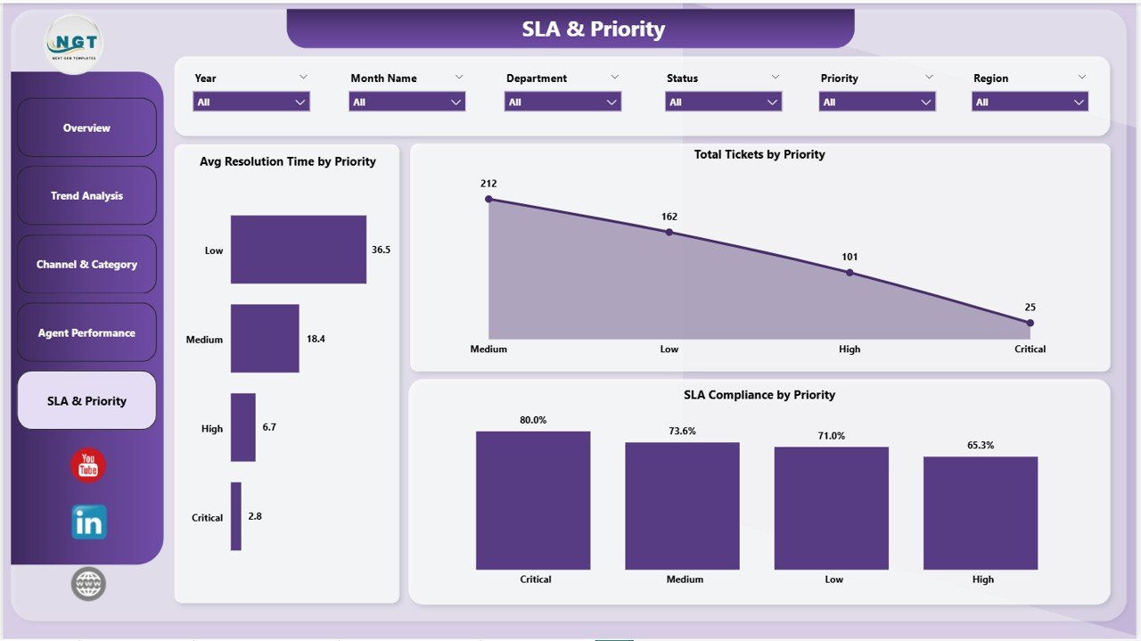
Page 5: SLA & Priority
Cross-cuts SLA compliance against ticket priority. Includes Avg Resolution Time by Priority, Total Tickets by Priority, and SLA Compliance by Priority. Answers the recurring question every IT manager faces: are we missing SLAs on P1 incidents, or just on the long tail of P3 and P4 tickets?
IT Help Desk Dashboard in Power BI vs. Google Sheets vs. Paid IT Service Desk SaaS — Feature Comparison
| Feature | IT Help Desk Dashboard in Power BI | Google Sheets / Excel Equivalent | Freshservice / Zendesk / ServiceNow |
|---|---|---|---|
| Cost | $17.99 one-time | $15–25 one-time | $19–95 / user / month |
| Platform | Power BI Desktop (free) | Excel or Google Sheets | Web app + mobile |
| Setup time | Under 10 minutes | 15–20 minutes | 2–6 weeks |
| Live ticket logging | ❌ Reporting layer only | ❌ Reporting layer only | ✅ Full agent console |
| SLA tracking by priority & agent | ✅ Built-in across 3 pages | ✅ Manual formulas | ✅ Native |
| CSAT by channel & agent | ✅ Pre-built | ⚠️ Requires extra pivots | ✅ Native survey module |
| Customizable visuals | ✅ Full Power BI editing | ⚠️ Native charts only | ⚠️ Templated, vendor-controlled |
| Publish to Power BI Service | ✅ Yes | ❌ Not natively | N/A — vendor-hosted |
| Year-1 cost at 5 agents | $17.99 total | $15–25 total | $1,140–$5,700 |
For IT teams that already have ticket data in Excel, CSV, or a service desk export and just need executive-grade reporting without a SaaS bill, the IT Help Desk Dashboard in Power BI sits in the sweet spot.
Who Should Use This Template
✅ Perfect for:
- IT managers and service desk leads at 10–500 person companies who need monthly reporting without Freshservice or Zendesk reporting fees
- MSPs (Managed Service Providers) reporting client ticket performance back to end customers
- Power BI analysts who already have a ticket export and want a starting layout instead of building from scratch
- Internal IT teams exporting tickets from ServiceNow, Jira Service Management, or Excel
❌ Not a fit if:
- You need live ticket creation, agent queues, or customer portals — this is a reporting layer, not a service desk
- Enterprise IT shops requiring SOC 2 Type II, SAML SSO, or on-prem Power BI Report Server certification
- You have no existing ticket data source to plug in
Real-World Use Cases
Priya runs IT operations at a 90-person SaaS company. Every Monday morning, she opens the IT Help Desk Dashboard in Power BI, filters to last week’s tickets, and reviews SLA Compliance by Priority. When P1 compliance drops below 95%, she schedules a same-day root-cause review with the on-call team. She used to pay $89 per user per month for a SaaS reporting add-on — the dashboard replaced it for $17.99 once.
Marcus is a Power BI consultant building reports for a regional MSP. Instead of designing the layout from scratch, he buys the IT Help Desk Dashboard in Power BI, swaps the sample data for the MSP’s Autotask export, rebrands the colors, and delivers a client-ready dashboard in two days instead of two weeks. He bills the same project rate either way — the template adds straight margin.
Anita is the IT Service Desk manager at a 250-person manufacturing firm. She uses the Agent Performance page in her quarterly 1:1s — Avg CSAT Score by Agent and SLA Compliance by Agent give her concrete numbers to coach against, instead of gut-feel reviews. The page also surfaces who needs additional ITIL coaching based on long resolution times.
Advantages of the IT Help Desk Dashboard in Power BI
- One-time cost vs. recurring SaaS: Year-1 savings of $1,120 vs. Freshservice at 5 agents, $5,700 vs. ServiceNow at the same scale.
- 10-minute setup: Open the .pbix, repoint the data source, click Close & Apply. No vendor onboarding calls, no implementation consultants.
- Works with any ticket data source: ServiceNow, Jira, Freshservice, Zendesk, Autotask, ConnectWise, or plain Excel — anything that exports to CSV plugs in.
- Fully editable: Every visual, every DAX measure, every slicer can be customized in Power BI Desktop. Add KPIs, swap colors, drop new pages.
- Browser-friendly via the Power BI Service: Publish once and share with leadership through a browser — no app to install on their side.
Opportunities for Improvement
Honest call-outs so you know what you’re buying:
- Not a service desk replacement. The dashboard is a reporting layer — it does not log tickets, route them, or run customer-facing portals. Pair it with your existing service desk tool.
- Data refresh is manual unless published. When run from Power BI Desktop, you refresh on demand. Automatic refresh requires publishing to the Power BI Service with a Pro license.
- Single ticket-table schema. The dashboard assumes one flat ticket table with 9 standard columns. If your data spans multiple normalized tables, you’ll need to merge them in Power Query first.
- No on-prem Report Server certification. The .pbix targets Power BI Service / Desktop, not the on-prem Report Server. Enterprise teams with on-prem-only restrictions should validate before purchase.
Best Practices
- Map your column names carefully. The 9 standard columns (Ticket ID, Department, Priority, Channel, Category, Agent, Created Date, Resolved Date, CSAT Score) drive every visual. Match them exactly in Power Query.
- Set SLA targets in DAX, not hard-coded. Edit the SLA Compliance % measure to point at your real SLA hours per priority — usually 4h for P1, 8h for P2, 24h for P3, 72h for P4.
- Use bookmarks for monthly reports. Save filtered views (e.g., “Last Month — All Departments”) as bookmarks. One click during your monthly review.
- Publish to a workspace, not personal. Publishing to a shared Power BI workspace lets you grant access by Azure AD group instead of one-off shares.
- Schedule a refresh. Once published, configure a scheduled refresh (8 times/day on Pro) so leadership always sees current data without you intervening.
Explore Relevant Templates
📌 Also available as: IT Help Desk Dashboard in Excel — same KPIs, same 5-page structure, built in pure Excel for teams that don’t use Power BI. Detailed write-up: IT Help Desk Dashboard in Excel blog post.
If you manage IT operations, these pair naturally:
- Incident Management KPI Dashboard in Power BI — major-incident reporting alongside daily ticket flow. Read the breakdown.
- Customer Support SLA KPI Dashboard in Power BI — deeper SLA breach analysis. Companion post.
- Collaboration Platforms Dashboard in Power BI — usage analytics for Teams, Slack, and Zoom.
Browse the full Power BI Dashboard Templates library — 650+ ready-to-use .pbix files across HR, Sales, Finance, IT, and Operations.
Frequently Asked Questions
What KPIs does the IT Help Desk Dashboard in Power BI track?
The IT Help Desk Dashboard in Power BI tracks 5 core KPIs: Total Tickets, Avg Resolution Time, Avg Response Time, Resolved Tickets, and Avg CSAT Score. Each metric is sliceable by Department, Priority, Channel, Category, Agent, and Month — so the same KPI can answer team-level or company-level questions in one view.
How long does setup take?
Under 10 minutes. Open the .pbix file in Power BI Desktop, point the data source at your own ticket export (Excel or CSV), confirm the column mapping, and click Close & Apply. All 5 report pages in the IT Help Desk Dashboard in Power BI refresh automatically with your data.
How does this compare to Freshservice or Zendesk?
Freshservice and Zendesk are full service desk platforms with agent consoles, customer portals, and reporting — typically $19–95 per user per month. The IT Help Desk Dashboard in Power BI is reporting-only, costs $17.99 once, and is built for teams that either already have a service desk or log tickets in Excel.
Do I need a Power BI Pro license?
No. Power BI Desktop is free from Microsoft and runs the IT Help Desk Dashboard locally without any license. You only need Power BI Pro ($14/user/month) if you want to publish to the Power BI Service and share via browser.
Can I add new KPIs or charts?
Yes. The IT Help Desk Dashboard in Power BI is fully editable — all DAX measures, visuals, and slicers are exposed in Power BI Desktop. Add new measures, swap visual types, or drop additional pages without affecting the existing layout. The bookmark and tooltip settings remain intact.
Will it work with my ticket data from ServiceNow, Jira, or Freshservice?
Yes, as long as you can export tickets to Excel or CSV. The IT Help Desk Dashboard in Power BI uses a single ticket table — the column structure matches the 9 standard fields most service desks export (Ticket ID, Department, Priority, Channel, Category, Agent, Created, Resolved, CSAT). Use Power Query to map your column names if they differ.
Can I share it with my team?
Yes. Share the .pbix file directly with colleagues who have Power BI Desktop, or publish the IT Help Desk Dashboard in Power BI to the Power BI Service (Pro license required) for browser-based access. Both options preserve all slicers, drill-throughs, and tooltips.
About the Author
Built by PK — Microsoft Certified Professional with 15+ years of Excel, Google Sheets, and Power BI experience. Founder of NextGenTemplates, reaching 300K+ subscribers across YouTube channels. Every template is hand-built and tested before release. Subscribe at Youtube.com/@PK-AnExcelExpert for weekly tutorials.
Conclusion
If you run an IT help desk and report into leadership monthly, the IT Help Desk Dashboard in Power BI shortens that reporting cycle from days to minutes — and replaces ongoing SaaS reporting fees with a single $17.99 purchase. You get 5 KPIs, 5 interactive pages, 16 visuals, and slicer-driven filtering on data you already own.
👉 Click here to Purchase the IT Help Desk Dashboard in Power BI
✅ Instant download · One-time payment · No subscription · Lifetime access
🎥 Subscribe for video tutorials: Youtube.com/@PK-AnExcelExpert
📅 Last updated: May 2026