Managing smart city projects without a structured performance monitoring system often creates delays, cost overruns, and weak accountability. However, modern smart city initiatives involve complex infrastructure projects, multiple stakeholders, public funding, strict timelines, and high public visibility. Therefore, project leaders must rely on accurate, real-time insights instead of static reports.
That is exactly why a Smart Cities Project KPI Dashboard in Power BI becomes a critical tool for modern urban governance.
In this detailed and SEO-friendly article, you will learn what a Smart Cities Project KPI Dashboard in Power BI is, why it matters, how it works, its page structure, KPI logic, Excel data design, advantages, best practices, and frequently asked questions. By the end of this guide, you will clearly understand how this dashboard transforms raw project data into actionable insights for successful smart city execution.
Click to buy Smart Cities Project KPI Dashboard in Power BI
What Is a Smart Cities Project KPI Dashboard in Power BI?
A Smart Cities Project KPI Dashboard in Power BI is a ready-to-use analytical reporting solution designed to monitor, analyze, and evaluate key performance indicators related to smart city projects.
Instead of managing scattered Excel files and manual status reports, this dashboard consolidates all project KPIs into a single interactive Power BI report. As a result, decision-makers gain instant visibility into project performance, target achievement, trends, and risks.
Moreover, because the dashboard connects directly to an Excel data source, teams can update project data easily without complex technical skills.
Why Do Smart City Projects Need KPI Dashboards?
Smart city projects differ from traditional projects. They involve technology, infrastructure, sustainability, governance, and citizen impact. Therefore, project monitoring must remain accurate, transparent, and timely.
Key reasons why KPI dashboards matter:
- First, smart city projects involve multiple KPIs across departments
- Second, stakeholders need real-time progress visibility
- Third, public funding requires transparent performance reporting
- Fourth, project delays directly impact citizens
- Finally, manual reporting consumes time and increases errors
Because of these challenges, a Smart Cities Project KPI Dashboard in Power BI becomes an essential decision-support system.
How Does a Smart Cities Project KPI Dashboard in Power BI Work?
The dashboard works by connecting Power BI to a structured Excel file that stores actual values, target values, and KPI definitions. Once data flows into Power BI, predefined calculations automatically generate performance metrics, indicators, and trend charts.
As a result, users can focus on analysis instead of data preparation.
The dashboard workflow includes:
- Entering actual and target values in Excel
- Refreshing data in Power BI
- Selecting month and KPI group slicers
- Reviewing MTD and YTD performance
- Analyzing trends and definitions through drill-through
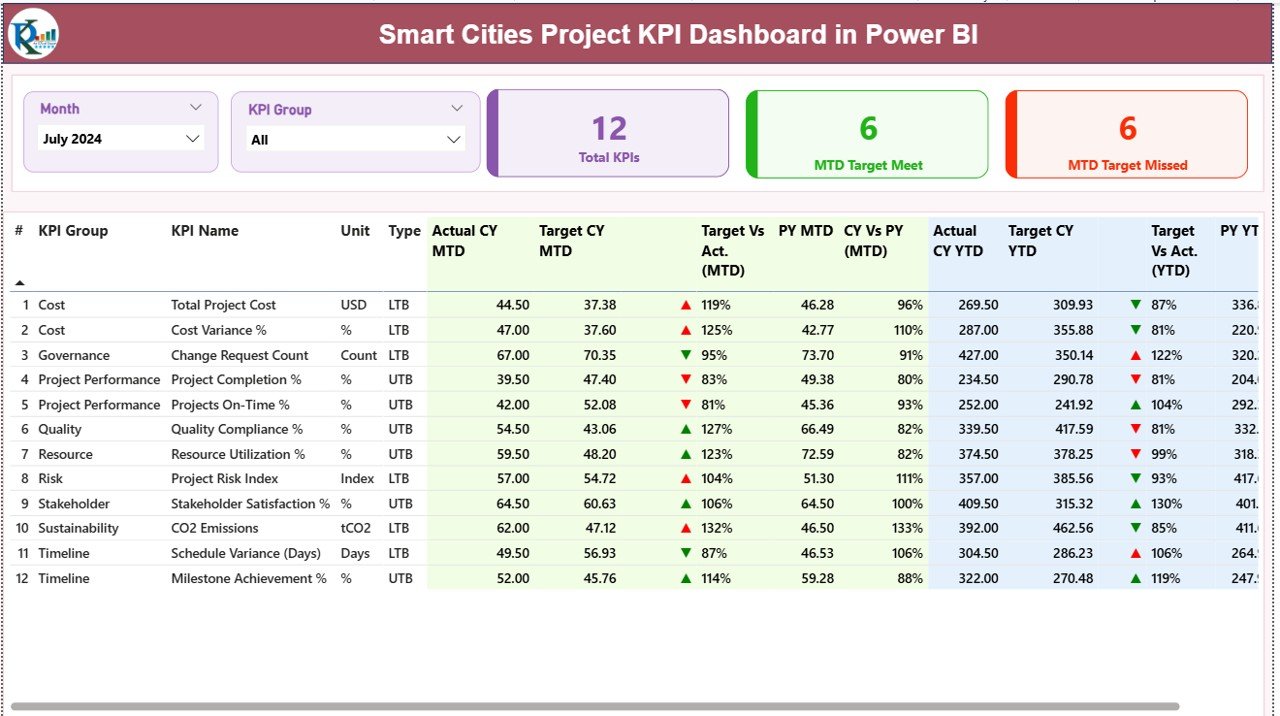
Smart Cities Project KPI Dashboard Page Structure Explained
This dashboard includes three professionally designed pages, each serving a specific analytical purpose.
What Does the Summary Page Show?
The Summary Page acts as the central control panel of the dashboard. It provides a high-level overview of all smart city project KPIs.
Key elements on the Summary Page:
Dynamic Slicers
- Month Slicer for selecting reporting period
- KPI Group Slicer for filtering KPI categories
Because of these slicers, users can instantly focus on specific project areas or time periods.
KPI Cards
At the top of the page, three KPI cards display:
- Total KPIs Count
- MTD Target Met Count
- MTD Target Missed Count
These cards quickly communicate overall project health.
Click to buy Smart Cities Project KPI Dashboard in Power BI
What Information Appears in the KPI Table?
Below the cards, a detailed KPI table provides in-depth performance insights.
KPI Table Columns Explained:
- KPI Number – Unique sequence number of each KPI
- KPI Group – Category or functional group of the KPI
- KPI Name – Name of the performance indicator
- Unit – Unit of measurement
- Type – LTB (Lower the Better) or UTB (Upper the Better)
Month-to-Date (MTD) Metrics:
- Actual CY MTD – Current Year actual MTD value
- Target CY MTD – Current Year target MTD value
- MTD Icon – ▲ or ▼ indicator with green/red color
- Target vs Actual (MTD) – Actual ÷ Target
- PY MTD – Previous Year MTD value
- CY vs PY (MTD) – CY MTD ÷ PY MTD
Year-to-Date (YTD) Metrics:
- Actual CY YTD – Current Year actual YTD value
- Target CY YTD – Current Year target YTD value
- YTD Icon – Performance indicator
- Target vs Actual (YTD) – Actual ÷ Target
- PY YTD – Previous Year YTD value
- CY vs PY (YTD) – CY YTD ÷ PY YTD
Because of this structure, users can instantly identify performance gaps and trends.
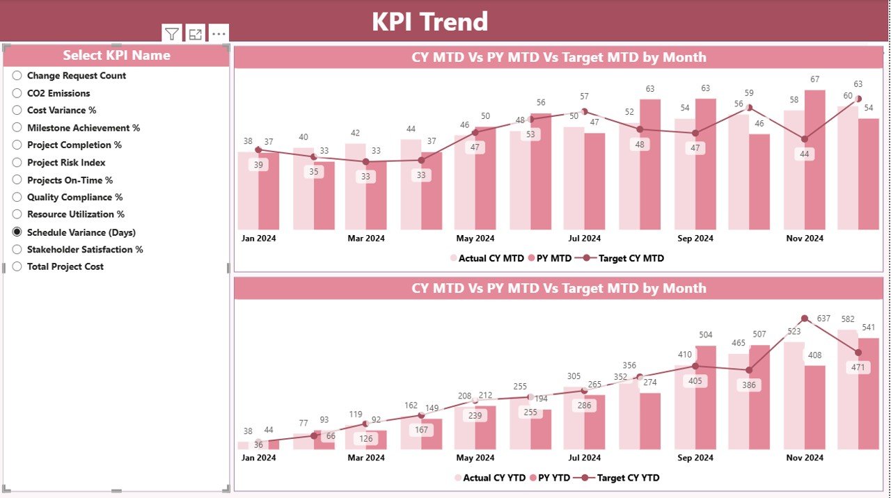
What Is the KPI Trend Page Used For?
The KPI Trend Page focuses on performance trends over time.
Key features of the KPI Trend Page:
- Two combo charts for:
MTD performance
YTD performance
Comparison of:
Current Year Actual
Previous Year Actual
Target values
KPI Name slicer for selecting a specific KPI
As a result, project managers can track performance movement instead of relying only on static numbers.
Click to buy Smart Cities Project KPI Dashboard in Power BI
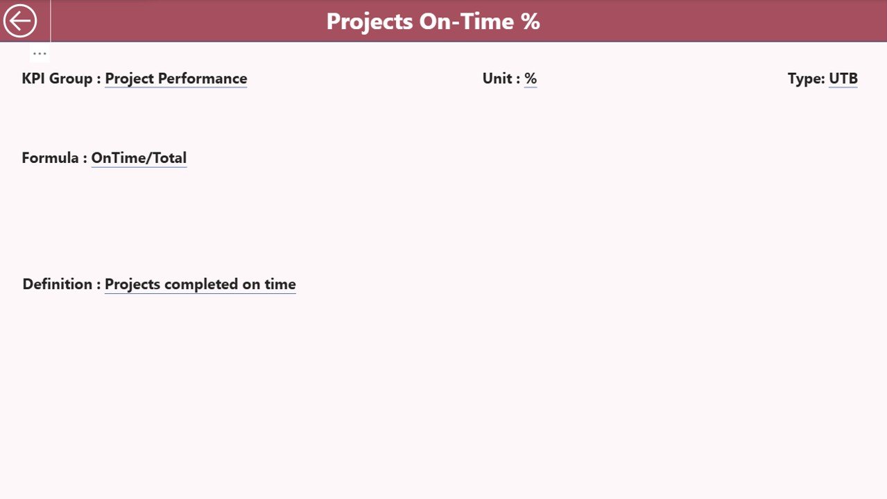
Why Is the KPI Definition Page Important?
The KPI Definition Page acts as a knowledge repository for all KPIs. This page remains hidden and opens through drill-through from the Summary Page.
Information available on the KPI Definition Page:
- KPI Number
- KPI Group
- KPI Name
- Unit
- Formula
- Detailed Definition
- KPI Type (LTB or UTB)
Because of this design, users always understand how each KPI works and how calculations occur.
Click to buy Smart Cities Project KPI Dashboard in Power BI
How Does Drill-Through Improve KPI Understanding?
Drill-through allows users to right-click a KPI on the Summary Page and navigate directly to its definition.
This feature improves:
- Data transparency
- Stakeholder confidence
- Consistency in KPI interpretation
To return, users simply click the back button on the top-left corner.
Excel Data Structure for Smart Cities Project KPI Dashboard
The dashboard uses Excel as its data source. This design ensures flexibility and ease of use.
What Is the Input_Actual Sheet Used For?
In the Input_Actual sheet, users enter actual KPI values.
Required columns:
- KPI Name
- Month (first date of the month)
- MTD Value
- YTD Value
Because the structure remains simple, teams can update data quickly.
What Is the Input_Target Sheet Used For?
In the Input_Target sheet, users enter target KPI values.
Required columns:
- KPI Name
- Month (first date of the month)
- MTD Target
- YTD Target
Targets drive all performance comparisons in the dashboard.
Click to buy Smart Cities Project KPI Dashboard in Power BI
What Is the KPI Definition Sheet Used For?
The KPI Definition sheet stores metadata.
Required columns:
- KPI Number
- KPI Group
- KPI Name
- Unit
- Formula
- Definition
- Type (LTB or UTB)
This sheet ensures standardization across all reports.
Advantages of Smart Cities Project KPI Dashboard in Power BI
- Centralized Project Monitoring
Track all smart city project KPIs from a single dashboard.
- Real-Time Performance Visibility
View updated results immediately after refreshing data.
- Faster Decision-Making
Identify risks and delays early using visual indicators.
- Transparent Reporting
Support governance and compliance requirements.
- Trend-Based Insights
Analyze performance movement instead of static snapshots.
- Easy Excel Integration
Update data without advanced technical skills.
Opportunities for Improvement in Smart Cities KPI Dashboards
- Adding automated data refresh from databases
- Integrating GIS maps for location-based KPIs
- Including predictive analytics for risk forecasting
- Enabling role-based access control
Although the dashboard already delivers strong value, these enhancements can further improve outcomes.
Best Practices for the Smart Cities Project KPI Dashboard in Power BI
- Define KPIs Clearly
Always maintain clear formulas and definitions.
- Align KPIs with Project Objectives
Choose indicators that support strategic goals.
- Update Data Consistently
Refresh Excel inputs monthly without delays.
- Use LTB and UTB Correctly
Apply KPI types carefully to avoid misinterpretation.
- Review Trends Regularly
Focus on trend pages during review meetings.
- Train Stakeholders
Ensure everyone understands how to read KPIs.
How Does This Dashboard Support Smart City Governance?
The dashboard supports governance by:
- Improving accountability
- Enhancing transparency
- Supporting evidence-based decisions
- Reducing reporting ambiguity
Because of this, leadership teams can confidently manage complex urban projects.
Who Should Use a Smart Cities Project KPI Dashboard?
This dashboard benefits:
- Smart city project managers
- Urban planners
- Municipal administrators
- Infrastructure consultants
- Government monitoring teams
Conclusion: Why Smart Cities Need KPI Dashboards in Power BI
Smart city projects demand clarity, speed, and accountability. Manual reporting no longer meets these demands. Therefore, a Smart Cities Project KPI Dashboard in Power BI becomes a strategic asset rather than just a reporting tool.
By combining Excel-based data entry, automated KPI calculations, visual indicators, trend analysis, and drill-through definitions, this dashboard empowers teams to deliver projects on time, within budget, and with full transparency.
Frequently Asked Questions About Smart Cities Project KPI Dashboard in Power BI
What is a Smart Cities Project KPI Dashboard in Power BI?
It is an interactive reporting solution that tracks smart city project KPIs using Power BI and Excel.
Can I customize KPIs in the dashboard?
Yes, you can modify KPIs directly in the Excel input and definition sheets.
Do I need advanced Power BI skills to use it?
No, basic Power BI knowledge is sufficient.
How often should data be upadated?
Ideally, update data monthly for accurate MTD and YTD analysis.
Can this dashboard handle multiple projects?
Yes, by grouping KPIs appropriately, you can monitor multiple projects.
Is Excel mandatory as a data source?
This version uses Excel, but it can later integrate with databases.
Visit our YouTube channel to learn step-by-step video tutorials
Watch the step-by-step video tutorial:
Click to buy Smart Cities Project KPI Dashboard in Power BI