In today’s fast-moving, data-driven world, data science and analytics teams face constant pressure to deliver insights faster, track performance accurately, and explain results clearly to stakeholders. However, many teams still depend on scattered Excel sheets, manual calculations, and static reports. As a result, decision-making slows down and opportunities get missed.
That is exactly where a Data Science and Analytics KPI Dashboard in Power BI becomes a game-changer.
This in-depth article explains everything you need to know about a Data Science and Analytics KPI Dashboard in Power BI—from its purpose and structure to its features, advantages, best practices, and FAQs. Moreover, the language stays simple, practical, and business-focused so that anyone can understand and implement it easily.
Click to Purchases Data Science and Analytics KPI Dashboard in Power BI
What Is a Data Science and Analytics KPI Dashboard in Power BI?
A Data Science and Analytics KPI Dashboard in Power BI is a ready-to-use analytics solution that tracks, monitors, and visualizes key performance indicators related to data science and analytics functions. Instead of reviewing multiple reports, teams can view all KPIs in one interactive dashboard.
Moreover, this dashboard connects seamlessly with Excel data sources. Therefore, you only update the Excel file and refresh Power BI to see updated insights instantly. As a result, reporting becomes faster, cleaner, and more reliable.
Why Do Data Science Teams Need a KPI Dashboard?
Data science teams deal with complex metrics such as model accuracy, deployment timelines, data quality, and business impact. However, raw numbers alone do not tell the full story.
A KPI dashboard helps because it:
-
Centralizes performance metrics
-
Highlights trends and gaps quickly
-
Compares targets vs actuals
-
Tracks progress month-to-date (MTD) and year-to-date (YTD)
-
Builds transparency with leadership
Therefore, a KPI dashboard turns analytics efforts into measurable business value.
Click to Purchases Data Science and Analytics KPI Dashboard in Power BI
How Does a Data Science and Analytics KPI Dashboard in Power BI Work?
This dashboard works on a simple but powerful logic:
-
You enter actual data, target data, and KPI definitions in Excel
-
Power BI reads and models this data
-
Interactive visuals calculate MTD, YTD, and YoY performance
-
Users analyze results using slicers and drill-through pages
As a result, even non-technical stakeholders can understand performance instantly.
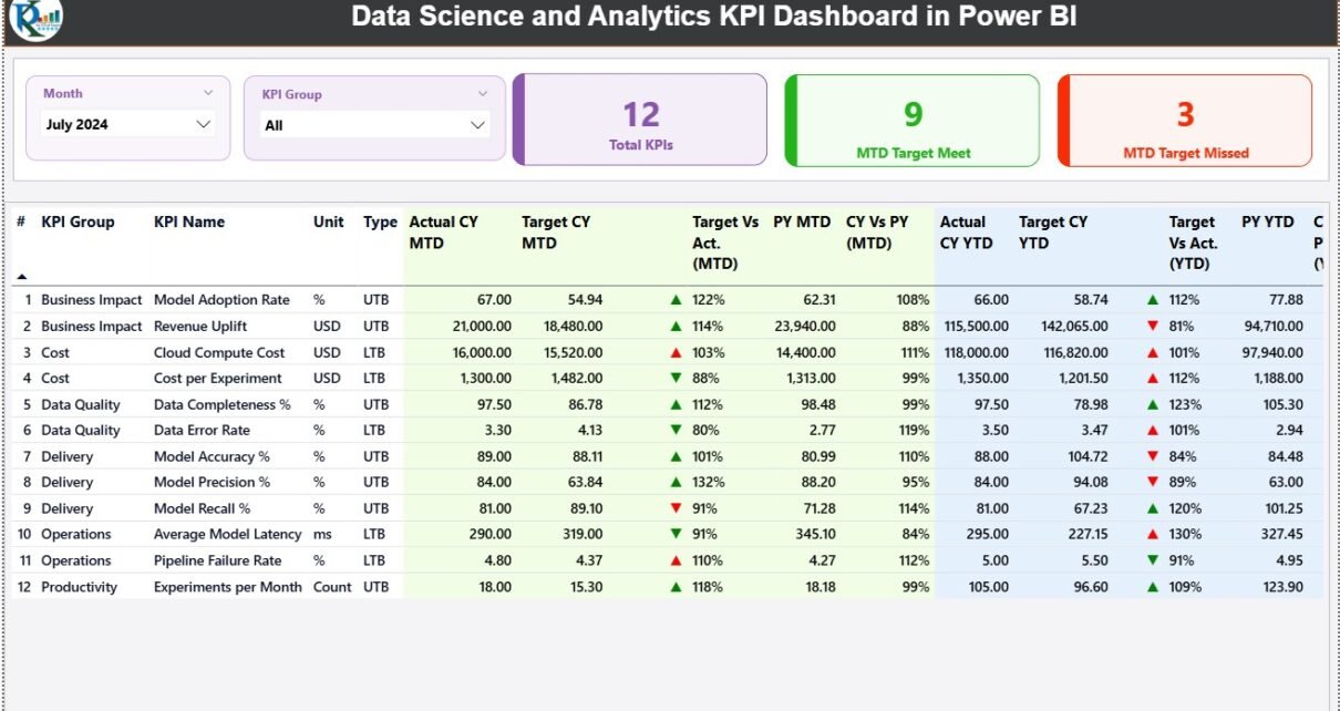
What Are the Key Pages in the Data Science and Analytics KPI Dashboard?
This Data Science and Analytics KPI Dashboard in Power BI includes three well-structured pages. Each page serves a clear business purpose.
What Is the Summary Page and Why Is It Important?
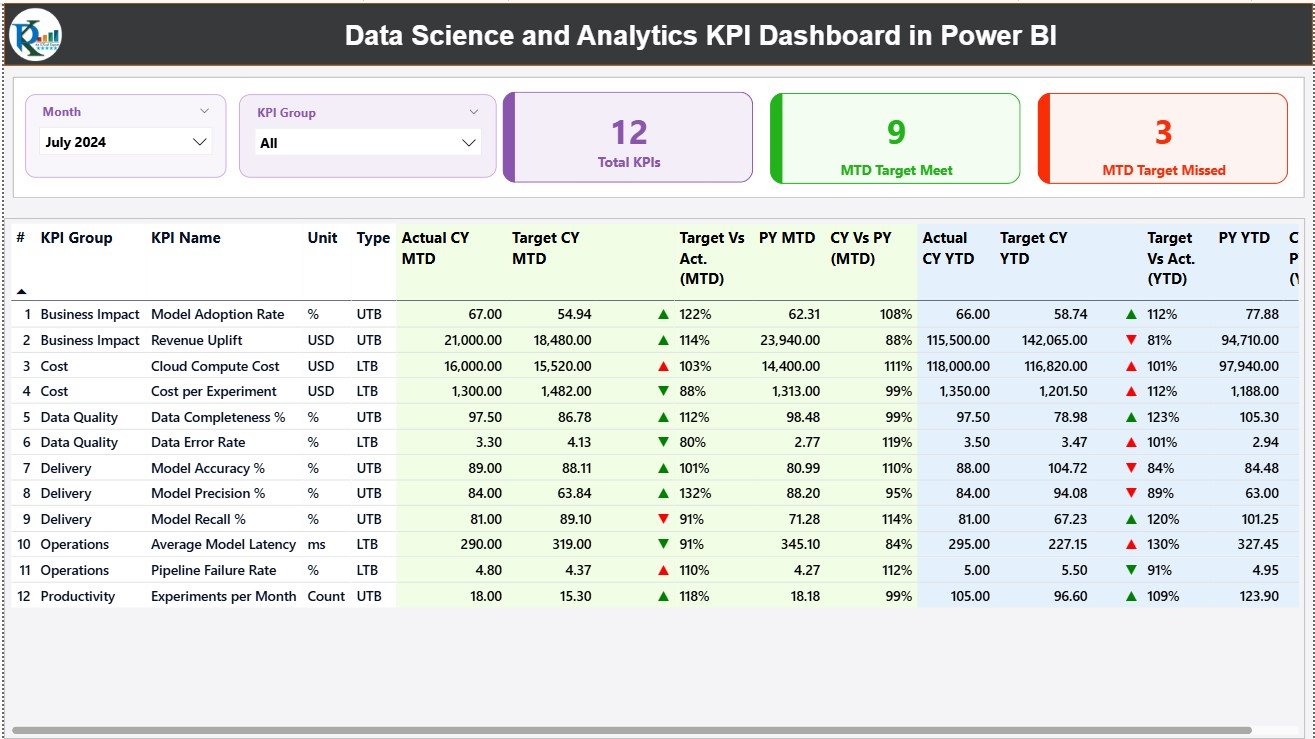
The Summary Page acts as the main landing page of the dashboard. It provides a quick snapshot of overall performance.
Key Elements of the Summary Page
🔹 Slicers for Better Filtering
-
Month slicer to select a specific reporting period
-
KPI Group slicer to filter KPIs by category
Because of these slicers, users can focus on exactly what matters.
🔹 KPI Cards for Instant Insights
At the top of the page, three KPI cards display:
-
Total KPIs Count
-
MTD Target Met Count
-
MTD Target Missed Count
Therefore, performance status becomes visible in seconds.
What Information Does the Detailed KPI Table Show?
Below the cards, a detailed table presents deep insights into every KPI.
Columns Included in the KPI Table
-
KPI Number – Sequential identifier of each KPI
-
KPI Group – Category of the KPI
-
KPI Name – Name of the metric
-
Unit – Measurement unit (%, count, hours, etc.)
-
Type – LTB (Lower the Better) or UTB (Upper the Better)
MTD Performance Metrics
-
Actual CY MTD – Current Year actual MTD value
-
Target CY MTD – Target MTD value
-
MTD Icon – ▲ or ▼ with green/red color for performance status
-
Target vs Actual (MTD) – Actual ÷ Target
-
PY MTD – Previous Year MTD value
-
CY vs PY (MTD) – Current Year MTD ÷ Previous Year MTD
These metrics help teams analyze short-term performance clearly.
How Does the Dashboard Handle YTD Performance?
The dashboard also tracks long-term progress using YTD metrics.
YTD Performance Columns
-
Actual CY YTD – Current Year actual YTD value
-
Target CY YTD – Current Year target YTD value
-
YTD Icon – Performance indicator against target
-
Target vs Actual (YTD) – Actual ÷ Target
-
PY YTD – Previous Year YTD value
-
CY vs PY (YTD) – Current Year YTD ÷ Previous Year YTD
Therefore, teams can compare growth trends and long-term outcomes easily.
Click to Purchases Data Science and Analytics KPI Dashboard in Power BI
What Is the KPI Trend Page and How Does It Help?
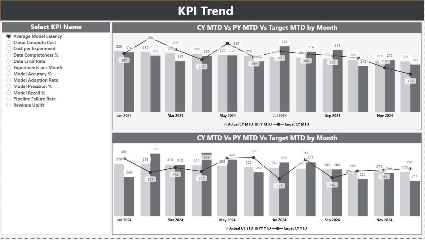
The KPI Trend Page focuses on performance visualization over time.
Key Features of the KPI Trend Page
-
Two combo charts for MTD and YTD trends
-
Displays Current Year Actual, Previous Year Actual, and Targets
-
KPI Name slicer on the left for focused analysis
Because of these visuals, users can spot trends, seasonality, and gaps instantly.
Why Are Trend Charts Critical for Data Science Teams?
Trend charts help teams:
-
Track model performance consistency
-
Identify improvement or decline early
-
Compare targets vs reality visually
-
Communicate results clearly to leadership
As a result, trend analysis supports proactive decision-making.
What Is the KPI Definition Page and Why Is It Hidden?
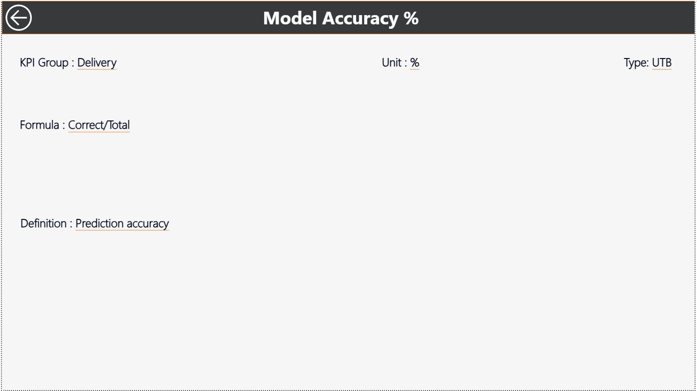
The KPI Definition Page serves as a drill-through reference page.
What Does the KPI Definition Page Show?
-
KPI Formula
-
KPI Definition
-
Unit and Type
This page stays hidden to keep the dashboard clean. However, users can drill through from the Summary Page to view KPI details.
To return to the main page, users simply click the Back button on the top-left corner.
How Does the Excel Data Source Work?
This dashboard uses Excel as its data source. Therefore, it remains simple, flexible, and user-friendly.
Excel Worksheets Used
What Is the Input_Actual Sheet?
In the Input_Actual sheet, users enter:
-
KPI Name
-
Month (first date of the month)
-
MTD Actual value
-
YTD Actual value
This sheet captures real performance data.
What Is the Input_Target Sheet?
In the Input_Target sheet, users enter:
-
KPI Name
-
Month (first date of the month)
-
MTD Target value
-
YTD Target value
This sheet defines performance expectations.
What Is the KPI Definition Sheet?
In the KPI Definition sheet, users define:
-
KPI Number
-
KPI Group
-
KPI Name
-
Unit
-
Formula
-
Definition
-
Type (LTB or UTB)
Therefore, all KPIs remain documented and standardized.
Click to Purchases Data Science and Analytics KPI Dashboard in Power BI
Advantages of Data Science and Analytics KPI Dashboard in Power BI
A Data Science and Analytics KPI Dashboard in Power BI offers several business and operational advantages.
✅ Centralized KPI Monitoring
All analytics KPIs appear in one place, which saves time and avoids confusion.
✅ Faster Decision-Making
Since data updates instantly, leaders act quickly and confidently.
✅ Clear Performance Visibility
MTD, YTD, and YoY comparisons simplify complex analytics.
✅ Reduced Manual Work
Automation eliminates repetitive calculations and reporting errors.
✅ Better Stakeholder Communication
Visuals explain insights clearly, even to non-technical users.
✅ Scalable and Flexible
Teams can add new KPIs without redesigning the dashboard.
Who Can Use This Dashboard?
This dashboard benefits multiple roles, including:
-
Data Scientists
-
Analytics Managers
-
Business Intelligence Teams
-
Product Managers
-
CXOs and Leadership Teams
-
Consulting Firms
Therefore, it fits both technical and business audiences.
Click to Purchases Data Science and Analytics KPI Dashboard in Power BI
Best Practices for Data Science and Analytics KPI Dashboard in Power BI
To get the best results, teams should follow these best practices.
📌 Define KPIs Clearly
Always define formulas and business meaning upfront.
📌 Maintain Data Consistency
Use standard naming conventions and date formats.
📌 Update Data Regularly
Refresh Excel data monthly to keep insights relevant.
📌 Use Meaningful Targets
Set realistic and aligned targets for better performance tracking.
📌 Keep Visuals Clean
Avoid clutter and focus on actionable metrics.
📌 Review Trends Frequently
Monitor trends regularly to identify early warning signs.
How Does This Dashboard Improve Analytics Maturity?
A KPI dashboard shifts analytics from reporting to performance management. Instead of just measuring outcomes, teams start tracking progress, gaps, and improvements continuously.
As a result:
-
Analytics becomes outcome-driven
-
Data science efforts align with business goals
-
Leadership gains confidence in analytics investments
Common Challenges Solved by This Dashboard
Many teams struggle with:
-
Disconnected reports
-
Manual Excel work
-
Inconsistent KPI definitions
-
Delayed insights
This dashboard solves these issues by centralizing, automating, and standardizing performance tracking.
Conclusion: Why Invest in a Data Science and Analytics KPI Dashboard in Power BI?
A Data Science and Analytics KPI Dashboard in Power BI transforms how teams measure, analyze, and communicate performance. Instead of drowning in data, teams focus on insights that matter.
With structured pages, Excel-based inputs, interactive visuals, and drill-through definitions, this dashboard delivers clarity, speed, and confidence. Therefore, it becomes an essential tool for any organization serious about data-driven growth.
Click to Purchases Data Science and Analytics KPI Dashboard in Power BI
Frequently Asked Questions (FAQs)
❓ What is a Data Science and Analytics KPI Dashboard in Power BI?
It is an interactive dashboard that tracks analytics KPIs using Power BI with Excel as a data source.
❓ Do I need advanced Power BI skills to use it?
No. You only need basic Power BI knowledge and Excel data updates.
❓ Can I customize KPIs in this dashboard?
Yes. You can add, modify, or remove KPIs through the Excel sheets.
❓ How often should I update the data?
You should update data monthly or as per reporting needs.
❓ Is this dashboard suitable for small teams?
Yes. It works for startups, mid-size teams, and enterprises.
❓ Can leadership use this dashboard?
Yes. The visuals and KPIs remain easy to understand for executives.
Click to Purchases Data Science and Analytics KPI Dashboard in Power BI
Visit our YouTube channel to learn step-by-step video tutorials