In today’s fast-changing job market, vocational training institutes play a crucial role in building industry-ready skills. However, many training providers still depend on manual reports, spreadsheets, and disconnected systems to track performance. As a result, decision-making becomes slow, reactive, and inaccurate.
That is exactly why a Vocational Training Dashboard in Power BI has become an essential analytics solution. This dashboard converts raw training data into meaningful insights that leaders, administrators, and trainers can understand and act on instantly.
In this detailed guide, you will learn what a Vocational Training Dashboard in Power BI is, why training organizations need it, how each dashboard page works, and how it improves operational efficiency and learning outcomes. Moreover, you will explore its advantages, best practices, and frequently asked questions in a simple and practical way.
Click to Purchases Vocational Training Dashboard in Power BI
What Is a Vocational Training Dashboard in Power BI?
A Vocational Training Dashboard in Power BI is an interactive reporting and analytics tool that visualizes training performance, attendance, fees, assessment scores, and operational metrics in one centralized platform.
Instead of reviewing static Excel files or manual reports, stakeholders can explore data dynamically using slicers, filters, and visual charts. Because of this, leaders can monitor training performance across training centers, course categories, trainers, cities, and months in real time.
This dashboard is built using Microsoft Power BI, which allows organizations to connect multiple data sources, refresh data automatically, and share insights securely.
Why Do Vocational Training Institutes Need a Power BI Dashboard?
Vocational training organizations manage large volumes of data every day. They track enrollments, attendance, course fees, trainer performance, and assessment results. However, when this data stays scattered, institutes face serious challenges.
Common Challenges Without a Dashboard
-
Manual reporting consumes too much time
-
Decision-makers lack real-time visibility
-
Performance issues remain hidden
-
Attendance and assessment trends go unnoticed
-
Financial tracking becomes inaccurate
Because of these challenges, institutes struggle to scale operations and improve learner outcomes.
How Does a Power BI Dashboard Solve These Problems?
A Vocational Training Dashboard in Power BI solves these issues by:
-
Centralizing all training data in one place
-
Automating reports and calculations
-
Providing real-time insights
-
Highlighting trends and anomalies instantly
-
Supporting data-driven decision-making
As a result, training institutes operate more efficiently and improve overall performance.
How Does a Vocational Training Dashboard in Power BI Work?
The dashboard connects training data from Excel files, databases, or cloud systems into Power BI. Then, Power BI processes this data and displays it using interactive visuals.
Users can:
-
Filter data using slicers
-
Drill down into specific training centers or courses
-
Compare performance across periods
-
Monitor trends month by month
Because everything updates dynamically, users always see the latest information.
What Are the Key Pages in a Vocational Training Dashboard in Power BI?
This dashboard includes five powerful pages, each designed to answer specific business questions. Let us explore them one by one.
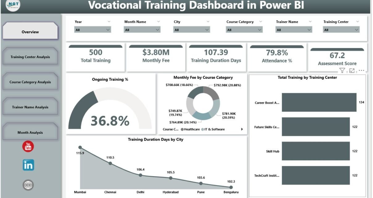
What Insights Does the Overview Page Provide?
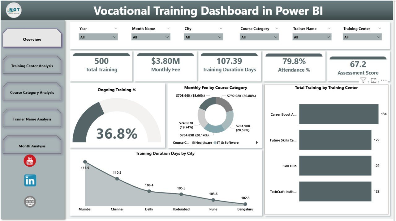
The Overview Page acts as the command center of the Vocational Training Dashboard in Power BI. It gives decision-makers a high-level snapshot of overall training performance.
Key Metrics on the Overview Page
-
Ongoing Training %
Shows how many training programs currently run across centers. -
Monthly Fee by Course Category
Displays revenue distribution across different course types. -
Total Training by Training Center
Highlights training volume handled by each center. -
Training Duration Days by City
Helps compare training intensity across locations.
Why Is the Overview Page Important?
Because leaders need quick insights, this page allows them to:
-
Identify high-performing centers instantly
-
Spot underperforming cities
-
Monitor financial trends
-
Take quick corrective actions
As a result, leadership decisions become faster and more accurate.
How Does the Training Center Analysis Page Improve Operations?
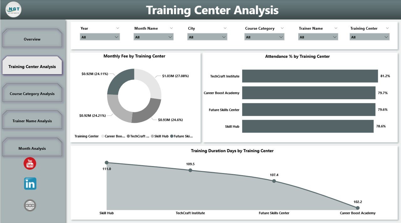
The Training Center Analysis Page focuses on performance comparison across different training centers.
Key Visuals on This Page
-
Monthly Fee by Training Center
Shows revenue contribution of each center. -
Attendance % by Training Center
Highlights learner engagement levels. -
Training Duration Days by Training Center
Compares program length across centers.
How Does This Page Help Administrators?
With this page, administrators can:
-
Compare center performance objectively
-
Identify centers with low attendance
-
Optimize training duration
-
Improve resource allocation
Therefore, training center management becomes data-driven instead of assumption-based.
Click to Purchases Vocational Training Dashboard in Power BI
What Can You Learn from the Course Category Analysis Page?
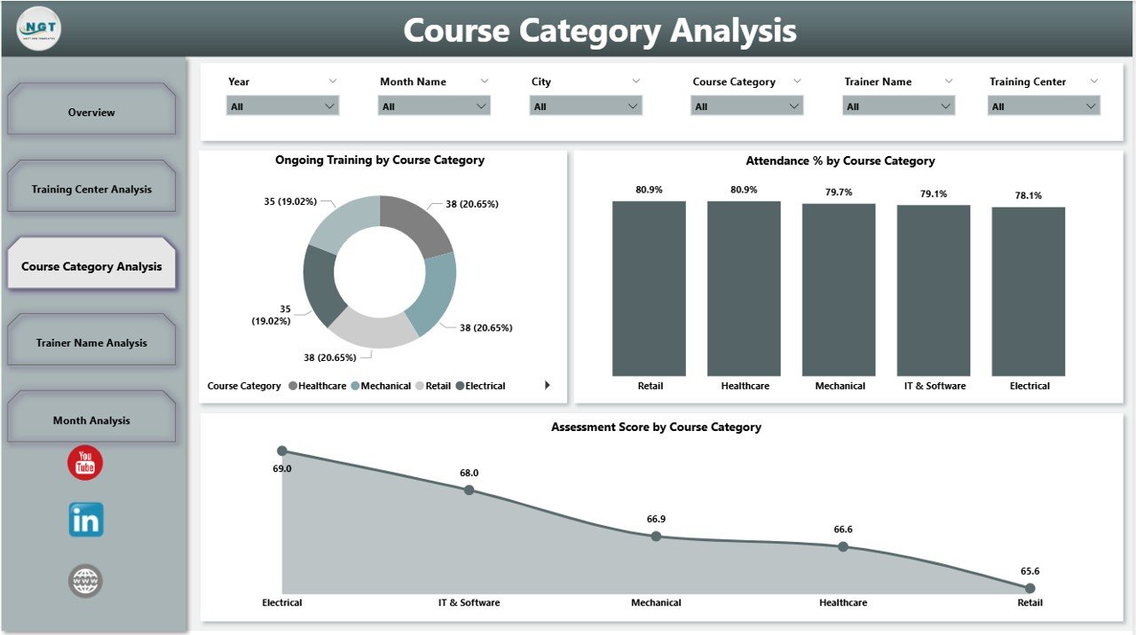
The Course Category Analysis Page evaluates how different course categories perform across the organization.
Key Metrics on This Page
-
Ongoing Training by Course Category
Shows demand for each course type. -
Attendance % by Course Category
Indicates learner engagement by course. -
Assessment Score by Course Category
Measures learning effectiveness.
Why Does Course-Level Analysis Matter?
Because not all courses perform equally, this page helps institutes:
-
Identify popular course categories
-
Improve low-performing courses
-
Redesign course content
-
Align training programs with market demand
As a result, institutes offer more relevant and effective training programs.
How Does the Trainer Name Analysis Page Improve Teaching Quality?
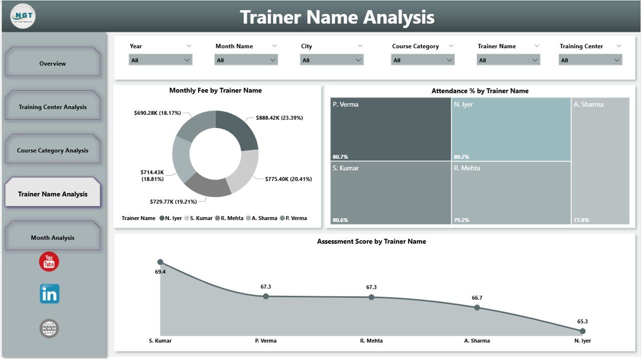
Trainers play a critical role in vocational education. The Trainer Name Analysis Page evaluates trainer performance using measurable metrics.
Key Visuals on This Page
-
Monthly Fee by Trainer Name
Shows revenue generated by each trainer’s programs. -
Attendance % by Trainer Name
Reflects learner engagement. -
Assessment Score by Trainer Name
Indicates teaching effectiveness.
Why Is Trainer Analysis Important?
With this page, institutes can:
-
Recognize high-performing trainers
-
Identify trainers needing support
-
Design targeted training programs
-
Improve overall teaching quality
Consequently, learner satisfaction and outcomes improve significantly.
What Trends Does the Month Analysis Page Reveal?
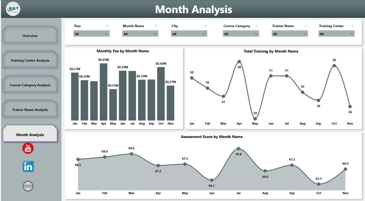
The Month Analysis Page focuses on time-based performance trends.
Key Metrics on This Page
-
Monthly Fee by Month
Tracks revenue trends. -
Attendance Score by Month
Shows engagement fluctuations. -
Total Training by Month
Highlights training volume over time.
How Does Monthly Analysis Help Decision-Making?
This page allows institutes to:
-
Identify seasonal trends
-
Forecast revenue
-
Plan capacity better
-
Schedule trainers effectively
Because trends become visible, long-term planning becomes easier and more reliable.
Click to Purchases Vocational Training Dashboard in Power BI
Advantages of a Vocational Training Dashboard in Power BI
Why Should Training Institutes Use This Dashboard?
A Vocational Training Dashboard in Power BI offers several powerful advantages.
Key Advantages
-
Centralized Reporting
All training data stays in one interactive dashboard. -
Real-Time Insights
Decision-makers always access up-to-date information. -
Improved Transparency
Performance becomes visible across centers, trainers, and courses. -
Better Decision-Making
Leaders act based on data, not assumptions. -
Time Savings
Automated reporting reduces manual effort. -
Scalability
The dashboard grows with your organization.
Best Practices for the Vocational Training Dashboard in Power BI
How Can You Get the Best Results from This Dashboard?
To maximize value, institutes should follow proven best practices.
Best Practices to Follow
-
Define Clear KPIs
Track metrics that align with training goals. -
Maintain Clean Data
Ensure accurate and consistent data inputs. -
Use Standardized Naming
Keep course, trainer, and center names consistent. -
Review Dashboards Regularly
Schedule monthly or weekly performance reviews. -
Train Users Properly
Educate staff on using filters and slicers effectively. -
Update Metrics Periodically
Adjust KPIs as training strategies evolve.
Because of these practices, dashboards remain relevant and impactful.
Who Can Benefit from a Vocational Training Dashboard in Power BI?
This dashboard supports multiple stakeholders across the organization.
Key Beneficiaries
-
Training institute owners
-
Operations managers
-
Academic coordinators
-
Finance teams
-
Trainers and instructors
-
Policy makers and regulators
Each group gains tailored insights that support better decisions.
How Does This Dashboard Support Long-Term Growth?
A Vocational Training Dashboard in Power BI does more than reporting. It supports long-term growth by:
-
Identifying profitable courses
-
Improving learner outcomes
-
Enhancing trainer performance
-
Optimizing operational efficiency
-
Supporting strategic expansion
As a result, institutes build sustainable and competitive training ecosystems.
Conclusion: Why Is a Vocational Training Dashboard in Power BI a Smart Investment?
Vocational training organizations operate in a highly competitive and outcome-driven environment. Without clear insights, they risk inefficiency, poor learner outcomes, and financial losses.
A Vocational Training Dashboard in Power BI transforms raw data into actionable intelligence. It empowers leaders to monitor performance, improve training quality, optimize resources, and plan strategically.
Because data drives modern education, this dashboard is no longer optional. Instead, it becomes a strategic necessity for any vocational training institute that aims to grow, scale, and succeed.
Frequently Asked Questions (FAQs)
What is the main purpose of a Vocational Training Dashboard in Power BI?
The main purpose is to track, analyze, and visualize training performance metrics in one centralized and interactive platform.
Can small training institutes use a Vocational Training Dashboard in Power BI?
Yes, small institutes can use it effectively because Power BI scales easily and supports Excel-based data sources.
Does this dashboard require technical expertise to use?
No, users can interact with slicers and visuals without technical skills once the dashboard is set up.
How often should data be updated in the dashboard?
Institutes should update data weekly or monthly, depending on operational needs.
Can this dashboard support multiple training centers?
Yes, it supports unlimited training centers, course categories, trainers, and locations.
Is the Vocational Training Dashboard in Power BI customizable?
Yes, organizations can customize KPIs, visuals, and layouts based on their requirements.
Visit our YouTube channel to learn step-by-step video tutorials