Running a coaching or tutoring business involves much more than teaching. You manage enrollments, track fees, monitor attendance, review assessment scores, and analyze trainer performance every single day. Because of this, relying on scattered spreadsheets or manual reports slows growth and creates confusion.
That is exactly where a Coaching & Tutoring Dashboard in Excel makes a powerful difference.
In this detailed guide, you will learn what a Coaching & Tutoring Dashboard in Excel is, how it works, why it matters, and how you can use it to make smarter academic and financial decisions. Moreover, this article explains every dashboard page in detail, highlights advantages, shares best practices, and answers the most common questions.
Click to Purchases Coaching & Tutoring Dashboard in Excel
What Is a Coaching & Tutoring Dashboard in Excel?
A Coaching & Tutoring Dashboard in Excel is a ready-to-use analytical solution that converts raw coaching or tutoring data into clear, visual insights. Instead of reviewing long tables, you instantly see performance trends through charts, KPIs, and interactive slicers.
Because the dashboard is built in Microsoft Excel, it remains flexible, familiar, and easy to customize. As a result, even non-technical users can analyze data confidently.
This dashboard typically tracks:
-
Student enrollment and progress
-
Monthly and city-wise fee collection
-
Training duration by subject or trainer
-
Attendance and assessment scores
-
Ongoing and completed training percentages
Why Do Coaching and Tutoring Centers Need a Dashboard?
Coaching centers grow quickly, but manual tracking does not scale well. Therefore, decision-makers need a centralized view of operations.
A Coaching & Tutoring Dashboard in Excel helps because:
-
It shows business and academic performance together
-
It reduces time spent on manual reporting
-
It highlights problems before they grow
-
It supports data-driven planning and expansion
As a result, owners, administrators, and academic heads stay in control.
How Does a Coaching & Tutoring Dashboard in Excel Work?
First, data flows into a structured Data Sheet. This sheet stores all raw records such as student details, city, subject, trainer, monthly fee, attendance, and assessment scores.
Next, Excel formulas, pivot tables, and charts process the data. Then, the dashboard displays results across multiple analytical pages.
Because slicers filter data instantly, users explore trends by month, city, subject, or trainer without changing formulas.
What Are the Key Components of the Dashboard?
This ready-to-use Coaching & Tutoring Dashboard in Excel includes the following components:
-
Page Navigator on the left side for smooth navigation
-
Right-side slicers for interactive filtering
-
Multiple analysis pages for deeper insights
-
Support Sheet for calculations and references
-
Data Sheet for raw data storage
Together, these elements create a clean and professional reporting experience.
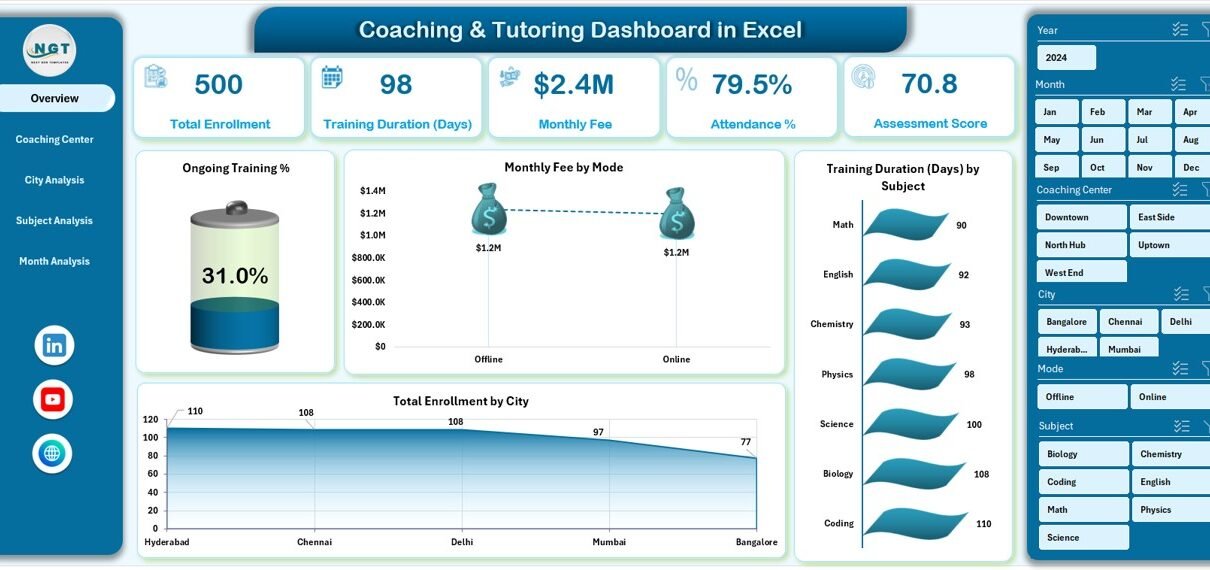
Overview Page: What Does the Business Snapshot Show?
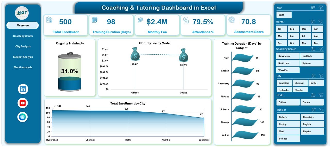
The Overview Page gives a complete high-level picture of coaching operations.
Key Elements on the Overview Page
-
Right-side slicer to filter by time, city, or subject
-
4 KPI cards, such as:
-
Total Enrollment
-
Monthly Fee
-
Ongoing Training %
-
Average Training Duration
-
Key Charts on the Overview Page
-
Ongoing Training % – Tracks active vs completed sessions
-
Monthly Fee by Mode – Compares online vs offline revenue
-
Training Duration by Subject – Highlights time spent per subject
-
Total Enrollment by City – Shows geographic reach
Because this page summarizes everything, managers quickly understand overall performance.
Click to Purchases Coaching & Tutoring Dashboard in Excel
Coaching Center Analysis: How Can You Compare Cities?
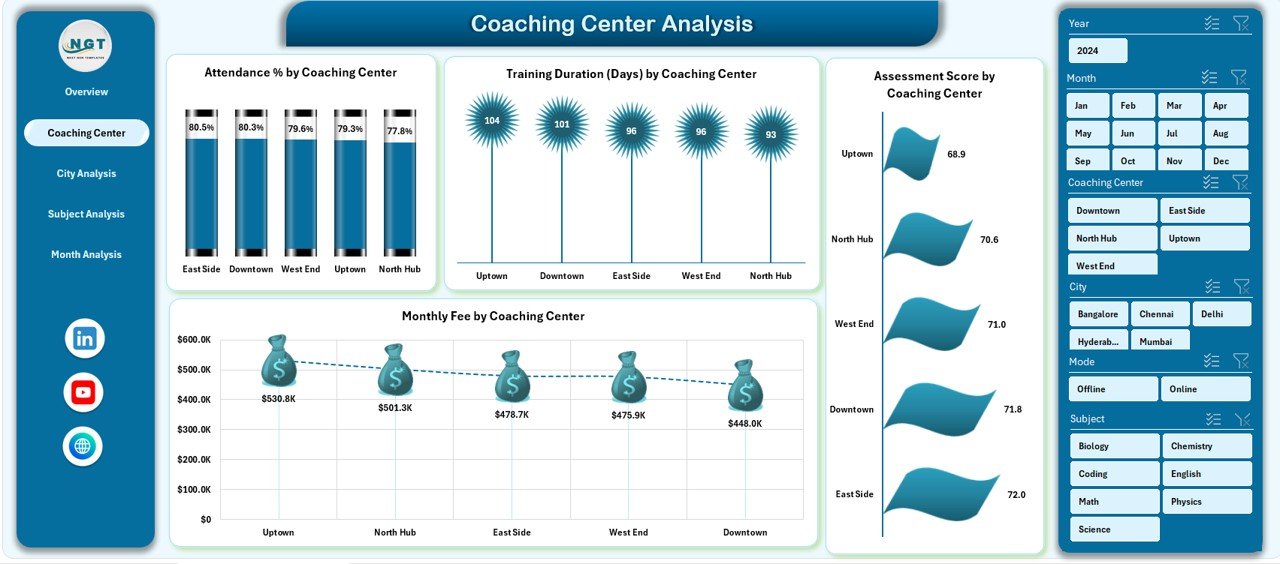
The Coaching Center Analysis page focuses on city-level performance.
Why This Page Matters
Coaching businesses often operate in multiple cities. Therefore, understanding location-wise performance helps allocate resources better.
Charts Included
-
Monthly Fee by City – Identifies top-performing locations
-
Training Duration by City – Compares teaching intensity
-
Ongoing Training % by City – Tracks operational efficiency
-
Assessment Score by City – Measures academic quality
With slicers on the right side, users instantly compare cities and spot gaps.
City Analysis: How Do Course Categories Perform?
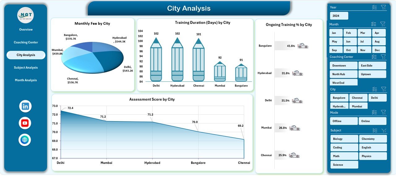
The City Analysis page analyzes performance by course category.
Key Insights from This Page
-
Which course categories generate higher fees
-
Which categories require more training days
-
How attendance and assessment scores vary
Charts on City Analysis Page
-
Ongoing Training % by Course Category
-
Attendance % by Course Category
-
Training Duration Days by Course Category
-
Assessment Score by Course Category
As a result, academic heads adjust curriculum planning effectively.
Subject Analysis: How Can You Evaluate Trainer Performance?
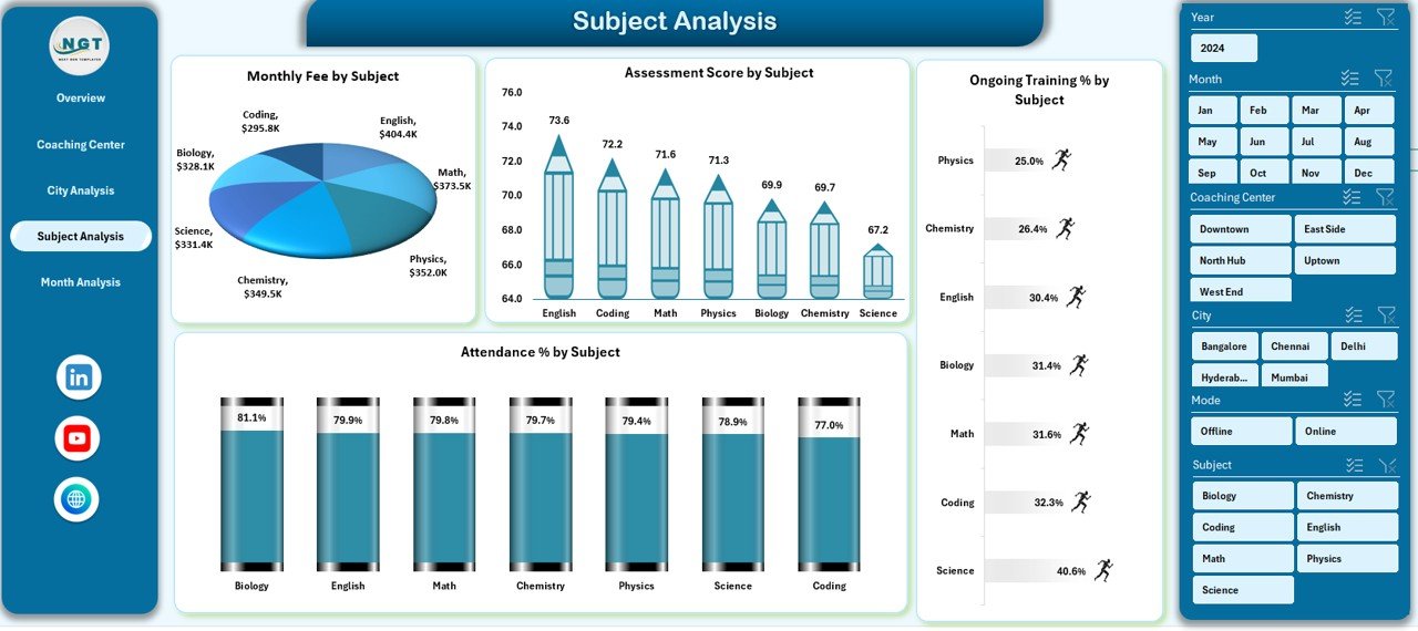
The Subject Analysis page shifts focus from students to trainers.
Why Trainer Analysis Is Important
Trainer performance directly impacts student satisfaction and outcomes. Therefore, monitoring trainer-level metrics ensures consistent quality.
Charts Included
-
Monthly Fee by Trainer Name – Measures revenue contribution
-
Training Duration Days by Trainer Name – Tracks workload
-
Completed Training % by Trainer Name – Shows completion efficiency
-
Assessment Score by Trainer Name – Reflects teaching effectiveness
Because slicers filter by subject or month, performance reviews become data-driven.
Click to Purchases Coaching & Tutoring Dashboard in Excel
Month Analysis: How Do Trends Change Over Time?
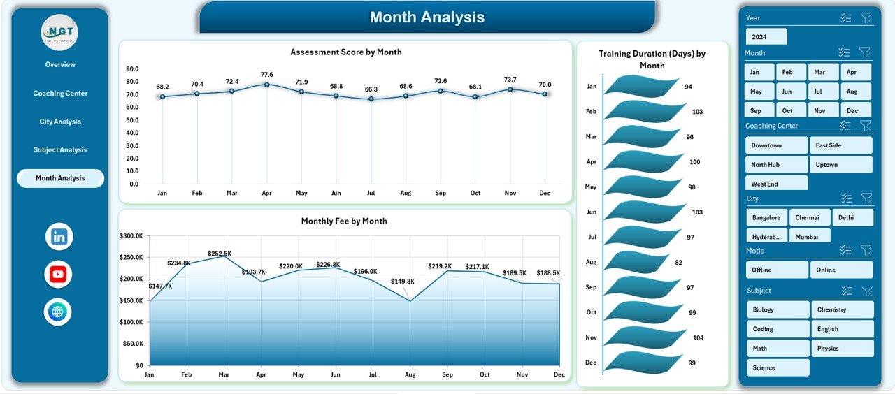
The Month Analysis page focuses on time-based trends.
What This Page Reveals
-
Seasonal enrollment patterns
-
Monthly revenue fluctuations
-
Training duration trends
Charts on Month Analysis Page
-
Monthly Fee by Subject Analysis
-
Training Duration by Month
-
Monthly Fee by Month
With these insights, coaching centers forecast demand and plan batches confidently.
Advantages of Coaching & Tutoring Dashboard in Excel
Using a Coaching & Tutoring Dashboard in Excel delivers clear business value.
Key Advantages
-
📊 Centralized reporting for all academic and financial metrics
-
⏱️ Time-saving automation instead of manual reports
-
🎯 Better decision-making through visual insights
-
📈 Improved performance tracking for trainers and students
-
💡 Scalable structure for growing coaching centers
Because everything stays in Excel, teams adopt it quickly.
Who Can Use This Dashboard?
This dashboard works perfectly for:
-
Coaching institutes
-
Tutoring centers
-
Training academies
-
Skill development centers
-
Online and offline education providers
Whether you manage a single branch or multiple cities, the dashboard adapts easily.
Best Practices for the Coaching & Tutoring Dashboard in Excel
To get maximum value, follow these best practices.
1. Maintain Clean Data
Always enter accurate and consistent data in the Data Sheet. Clean data ensures reliable insights.
2. Update Data Regularly
Update enrollment, attendance, and fees weekly or monthly. Regular updates keep trends relevant.
3. Use Slicers Actively
Apply slicers to explore different perspectives. For example, compare one city against others.
4. Review KPIs Monthly
Track KPI cards monthly to identify early warning signs.
5. Customize Metrics
Adjust KPIs based on your coaching model, such as batch size or course duration.
How Does This Dashboard Support Decision-Making?
Click to Purchases Coaching & Tutoring Dashboard in Excel
Because the dashboard combines academic and financial metrics, leaders make balanced decisions.
For example:
-
If assessment scores drop, managers review trainer workload
-
If monthly fees decline, marketing teams adjust campaigns
-
If training duration increases, schedules get optimized
As a result, decisions rely on facts, not assumptions.
Can You Customize the Coaching & Tutoring Dashboard in Excel?
Yes, customization remains one of the biggest strengths.
You can:
-
Add new subjects or trainers
-
Include additional KPIs
-
Modify charts and layouts
-
Adjust slicers and filters
Because Excel remains flexible, customization requires minimal effort.
Conclusion: Why Is a Coaching & Tutoring Dashboard in Excel Essential?
A Coaching & Tutoring Dashboard in Excel transforms scattered data into structured insights. Instead of guessing performance, you track it visually. Instead of manual reports, you use automated analytics. Therefore, coaching centers gain clarity, control, and confidence.
If you want to grow your coaching or tutoring business efficiently, this dashboard becomes an essential tool.
Frequently Asked Questions (FAQs)
What is a Coaching & Tutoring Dashboard in Excel?
It is an Excel-based analytical tool that tracks enrollment, fees, attendance, training duration, and assessment scores in one place.
Who should use this dashboard?
Coaching institutes, tutoring centers, training academies, and education service providers can all use it.
Do I need advanced Excel skills?
No. Basic Excel knowledge is enough because slicers and charts handle analysis.
Can this dashboard handle multiple cities?
Yes. The dashboard supports city-wise and category-wise analysis easily.
Is the dashboard scalable?
Yes. You can add more data rows, subjects, and trainers without breaking the structure.
How often should I update the data?
Monthly updates work well, although weekly updates provide deeper insights.
Visit our YouTube channel to learn step-by-step video tutorials