Courier and logistics operations move at high speed every day. However, without clear visibility into shipments, delivery performance, costs, and returns, courier businesses struggle to stay profitable and competitive. That is exactly where a Courier Services Dashboard in Excel becomes a powerful and practical solution.
In this detailed guide, you will learn what a Courier Services Dashboard in Excel is, why it matters, how it works, and how each dashboard page supports better operational decisions. Moreover, you will discover its advantages, best practices, and frequently asked questions. By the end of this article, you will clearly understand how this ready-to-use Excel dashboard helps courier companies improve efficiency, reduce costs, and increase customer satisfaction.
Click to Purchases Courier Services Dashboard in Excel
What Is a Courier Services Dashboard in Excel?
A Courier Services Dashboard in Excel is a ready-to-use, interactive, and data-driven Excel reporting tool designed to monitor courier operations in one centralized place.
Instead of managing scattered spreadsheets, manual registers, or static reports, this dashboard consolidates all key courier metrics such as:
-
Total shipments
-
Returned shipment percentage
-
Shipping costs
-
Revenue performance
-
Delivery time analysis
As a result, courier managers, logistics teams, and operations heads can track performance clearly and take faster, data-driven decisions.
Why Do Courier Companies Need a Courier Services Dashboard?
Courier businesses handle thousands of shipments every month. However, without structured reporting, several challenges arise. Therefore, a Courier Services Dashboard in Excel becomes essential.
Common Challenges Without a Dashboard
-
Lack of visibility into returned shipments
-
Rising shipping costs without explanation
-
Difficulty comparing courier partners
-
No clarity on service type performance
-
Delays in identifying problem zones
Because of these challenges, businesses often lose revenue and customer trust.
How the Dashboard Solves These Problems
-
Centralizes all shipment data in one Excel file
-
Provides visual insights using charts and KPI cards
-
Allows month-wise and category-wise analysis
-
Supports faster corrective actions
How Does a Courier Services Dashboard in Excel Work?
The Courier Services Dashboard in Excel works using structured data tables, pivot tables, pivot charts, slicers, and KPI cards.
Here is how it functions step by step:
-
Data gets stored in a structured Data Sheet
-
Pivot tables summarize the data
-
Pivot charts visualize the insights
-
Slicers filter data dynamically
-
KPI cards highlight key metrics instantly
As a result, users can explore data without writing formulas repeatedly.
What Are the Key Features of the Courier Services Dashboard in Excel?
This dashboard includes multiple smart features that improve usability and analysis.
Page Navigator
-
Located on the left side
-
Allows one-click navigation across dashboard pages
-
Saves time and improves user experience
Right-Side Slicers
-
Filter data by Month, Zone, Courier Partner, Service Type, and more
-
Instantly refresh all charts and KPIs
-
Enable interactive analysis without manual work
Visual KPI Cards
-
Highlight critical metrics at a glance
-
Support quick performance reviews
-
Improve executive-level reporting
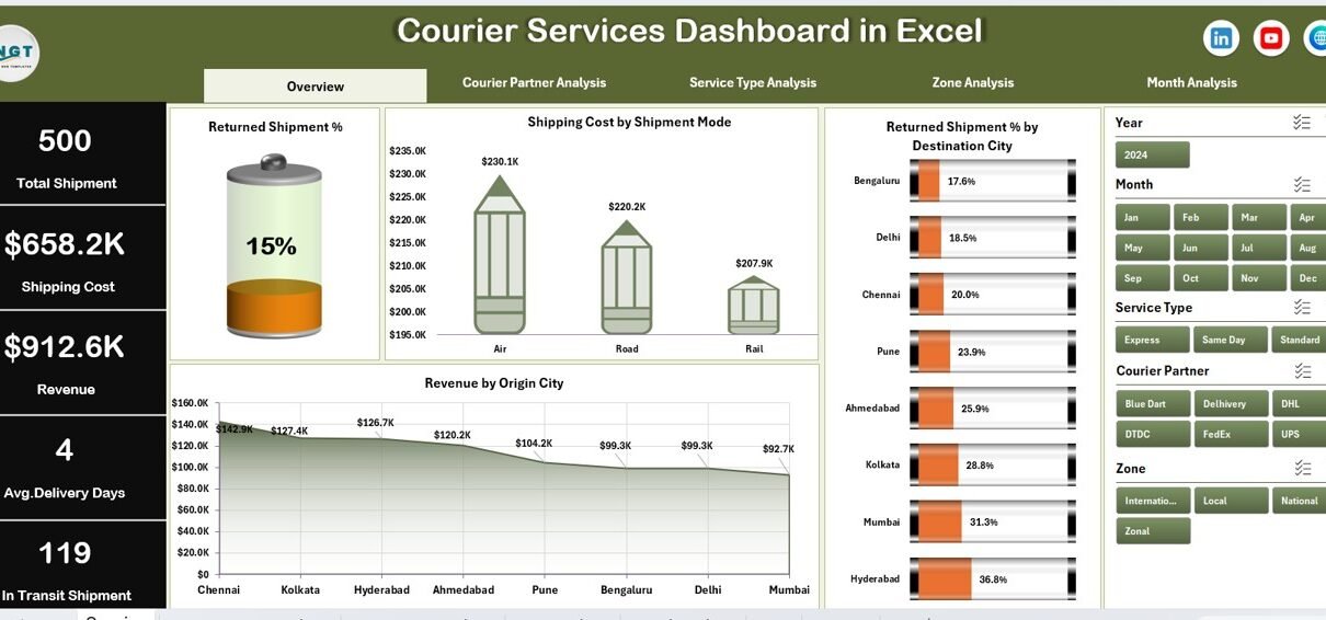
How Does the Overview Page Help in Decision-Making?
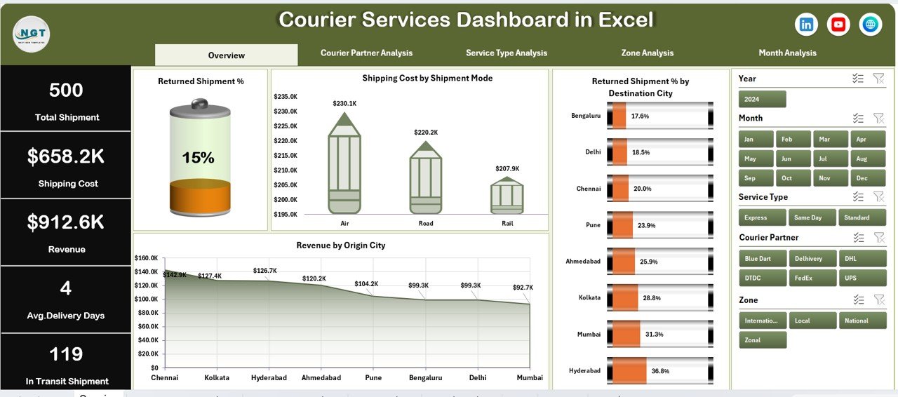
The Overview Page acts as the control center of the dashboard. It provides a quick snapshot of overall courier performance.
Key Elements of the Overview Page
KPI Cards (5 Cards)
-
Total Shipments
-
Total Revenue
-
Total Shipping Cost
-
Returned Shipment %
-
Average Delivery Days
These cards help management understand performance instantly.
Charts on the Overview Page
1. Returned Shipment %
-
Shows overall return rate
-
Helps identify quality and delivery issues
2. Shipping Cost by Shipment Mode
-
Compares air, road, and express modes
-
Highlights cost-intensive shipment methods
3. Returned Shipment % by Destination City
-
Identifies cities with high return rates
-
Helps improve last-mile delivery strategies
4. Revenue by Origin City
-
Shows revenue contribution by city
-
Supports resource allocation decisions
How Does the Courier Partner Analysis Page Improve Partner Evaluation?
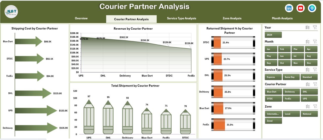
Courier businesses often work with multiple courier partners. Therefore, evaluating their performance becomes crucial.
Purpose of Courier Partner Analysis Page
-
Compare courier partners objectively
-
Identify high-performing and underperforming partners
-
Optimize partner contracts
Charts on Courier Partner Analysis Page
Click to Purchases Courier Services Dashboard in Excel
1. Returned Shipment % by Courier Partner
-
Highlights partners with higher return rates
-
Supports corrective action and renegotiation
2. Shipping Cost by Courier Partner
-
Shows cost efficiency of each partner
-
Helps reduce logistics expenses
3. Total Shipment by Courier Partner
-
Displays workload distribution
-
Identifies dependency risks
4. Revenue by Courier Partner
-
Compares revenue contribution
-
Supports strategic partnerships
Why Is Service Type Analysis Important in Courier Operations?
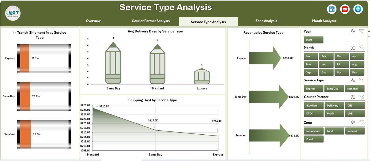
Courier companies offer multiple service types such as standard, express, and same-day delivery. Each service behaves differently.
Benefits of Service Type Analysis
-
Understand delivery speed and cost trade-offs
-
Improve pricing strategies
-
Enhance service quality
Charts on Service Type Analysis Page
1. In Transit Shipment % by Service Type
-
Highlights service delays
-
Improves operational planning
2. Average Delivery Days by Service Type
-
Measures service efficiency
-
Helps meet customer expectations
3. Revenue by Service Type
-
Identifies profitable services
-
Supports service expansion decisions
4. Shipping Cost by Service Type
-
Tracks cost drivers
-
Enables cost optimization
-
Click to Purchases Courier Services Dashboard in Excel
How Does Zone Analysis Support Regional Optimization?
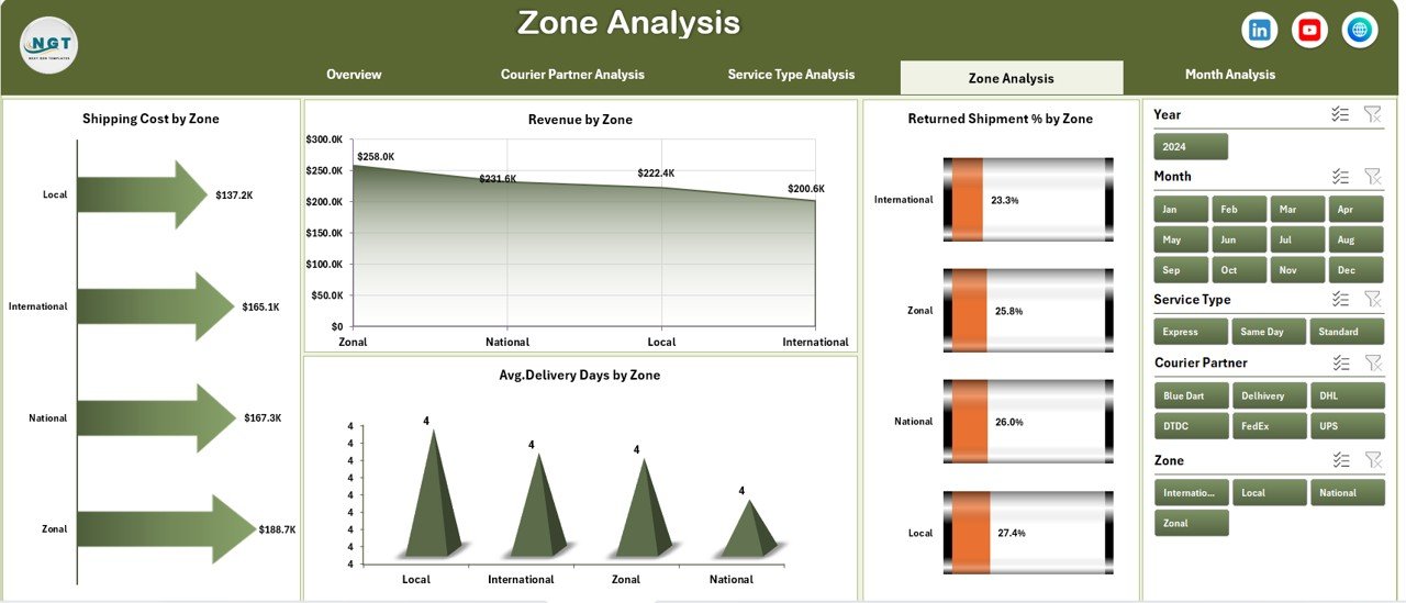
Different zones behave differently due to distance, infrastructure, and demand patterns. Therefore, zone-wise analysis becomes essential.
Purpose of Zone Analysis Page
-
Compare zone-wise performance
-
Improve regional delivery planning
-
Control costs effectively
Charts on Zone Analysis Page
1. Shipping Cost by Zone
-
Highlights high-cost zones
-
Helps optimize routing
2. Revenue by Zone
-
Identifies profitable regions
-
Supports expansion strategies
3. Returned Shipment % by Zone
-
Detects problem areas
-
Improves service reliability
4. Average Delivery Days by Zone
-
Measures delivery speed regionally
-
Enhances SLA compliance
How Does Month Analysis Help in Trend Identification?
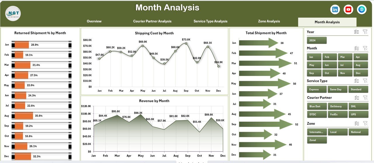
Courier operations change month by month due to demand cycles and seasonal trends.
Why Month Analysis Matters
-
Tracks performance trends
-
Identifies seasonal spikes
-
Supports forecasting
Charts on Month Analysis Page
1. Shipping Cost by Month
-
Tracks monthly cost fluctuations
-
Improves budgeting
2. Revenue by Month
-
Highlights revenue growth or decline
-
Supports sales planning
3. Returned Shipment % by Month
-
Identifies quality issues over time
-
Helps reduce returns
4. Total Shipment by Month
-
Tracks volume trends
-
Improves capacity planning
What Is the Role of the Data Sheet and Support Sheet?
Data Sheet
-
Stores all transactional shipment data
-
Acts as the backbone of the dashboard
-
Supports pivot-based reporting
Support Sheet
-
Contains helper tables
-
Stores lookup values and parameters
-
Improves dashboard performance
Advantages of Courier Services Dashboard in Excel
Using a Courier Services Dashboard in Excel delivers multiple operational and strategic advantages.
Key Advantages
-
Centralized courier performance tracking
-
Real-time insights with slicers
-
Cost and revenue visibility
-
Improved partner evaluation
-
Faster decision-making
-
Easy customization
-
No advanced technical skills required
Best Practices for the Courier Services Dashboard in Excel
Following best practices ensures long-term dashboard success.
Recommended Best Practices
-
Maintain clean and structured data
-
Update data regularly
-
Use consistent naming conventions
-
Limit slicers to essential fields
-
Review KPIs monthly
-
Train users on interpretation
-
Back up the Excel file regularly
Who Can Use a Courier Services Dashboard in Excel?
This dashboard suits multiple roles and industries.
Ideal Users
-
Courier companies
-
Logistics service providers
-
E-commerce businesses
-
Supply chain managers
-
Operations analysts
-
Business owners
How Does This Dashboard Improve Business Performance?
A Courier Services Dashboard in Excel improves business outcomes by:
-
Reducing shipping costs
-
Lowering return rates
-
Improving delivery times
-
Enhancing partner accountability
-
Increasing profitability
Conclusion: Is a Courier Services Dashboard in Excel Worth Using?
Absolutely. A Courier Services Dashboard in Excel transforms raw courier data into meaningful insights. It simplifies tracking, improves visibility, and supports smarter decisions across operations.
Because it uses Excel, businesses can implement it quickly without heavy investment. Moreover, its interactive design ensures continuous improvement in courier performance.
If you want better control over shipments, costs, and revenue, this dashboard becomes an essential tool.
Frequently Asked Questions (FAQs)
Click to Purchases Courier Services Dashboard in Excel
What is a Courier Services Dashboard in Excel used for?
It helps track shipments, delivery performance, costs, returns, and revenue in a centralized Excel dashboard.
Can I customize this dashboard?
Yes, you can easily customize KPIs, charts, and slicers based on business needs.
Does this dashboard require advanced Excel skills?
No, basic Excel knowledge is sufficient to use and update the dashboard.
Can this dashboard handle large data volumes?
Yes, it supports large datasets using pivot tables efficiently.
How often should I update the data?
You should update data monthly or weekly for accurate insights.
Is this dashboard suitable for small courier businesses?
Yes, both small and large courier businesses can benefit from it.
Visit our YouTube channel to learn step-by-step video tutorials