Travel tech startups operate in a fast-moving and highly competitive environment. While innovation drives success, data-driven decision-making sustains growth. However, many founders and operations teams still rely on scattered spreadsheets, manual reports, and inconsistent KPI tracking. As a result, performance reviews become slow, reactive, and error-prone.
That is exactly where a Travel Tech Startups KPI Dashboard in Excel becomes a game-changer.
In this detailed article, you will learn what a Travel Tech Startups KPI Dashboard in Excel is, how it works, its worksheet structure, key features, advantages, best practices, and frequently asked questions. By the end, you will clearly understand how this dashboard helps travel tech startups monitor KPIs, optimize performance, and scale operations with confidence.
What Is a Travel Tech Startups KPI Dashboard in Excel?
A Travel Tech Startups KPI Dashboard in Excel is a centralized, interactive, and ready-to-use performance tracking template designed specifically for travel technology businesses.
Instead of managing multiple Excel files or preparing monthly PowerPoint reports, startups can use one structured Excel dashboard to:
- Track key operational and financial KPIs
- Compare actual vs target performance
- Monitor Month-to-Date (MTD) and Year-to-Date (YTD) results
- Analyze previous year trends
- Identify performance gaps quickly
Because the dashboard runs entirely inside Microsoft Excel, teams can use it offline, update it easily, and customize it without coding skills.
Why Do Travel Tech Startups Need a KPI Dashboard in Excel?
Travel tech startups face constant pressure to grow fast while controlling costs. At the same time, they must track multiple KPIs across operations, finance, marketing, and customer experience.
However, manual KPI tracking creates several challenges:
- Data stays scattered across sheets
- Performance comparisons take too much time
- Errors creep into reports
- Teams lose visibility into trends
- Leadership decisions rely on outdated numbers
A KPI Dashboard in Excel solves these issues by bringing clarity, consistency, and control into one single view.
What KPIs Can Travel Tech Startups Track Using This Dashboard?
Although KPIs vary by business model, this dashboard supports a wide range of startup metrics, such as:
- Booking growth rate
- Revenue per booking
- Customer acquisition cost
- Conversion rate
- Platform uptime
- Customer satisfaction score
- Marketing ROI
- Operational efficiency metrics
Because the KPI list remains configurable, startups can easily adapt the dashboard to their unique business needs.
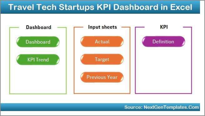
How Is the Travel Tech Startups KPI Dashboard in Excel Structured?
This dashboard contains 7 well-organized worksheets, each serving a specific purpose. Together, they create a complete KPI tracking system.
Let’s explore each worksheet in detail.
What Is the Summary Page in the KPI Dashboard?
The Summary Page acts as the index and navigation hub of the dashboard.
Key Highlights of the Summary Page
- Clean and simple layout
- 6 navigation buttons
- One-click access to all important sheets
- No manual scrolling required
Because navigation matters, this page ensures that users can move across the dashboard quickly and efficiently.
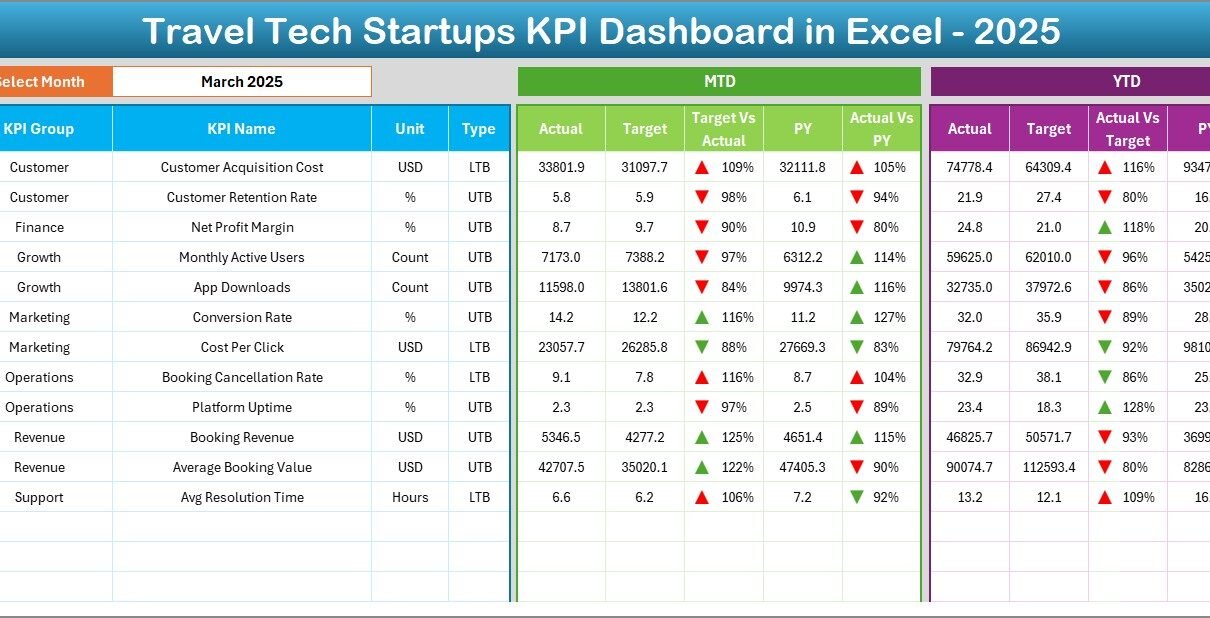
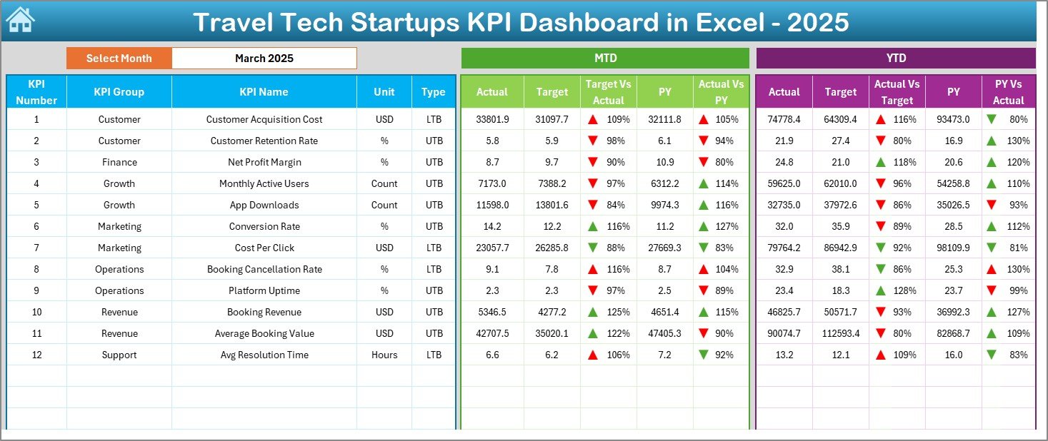
How Does the Dashboard Sheet Work?
The Dashboard Sheet serves as the core performance view of the entire KPI system.
Key Features of the Dashboard Sheet
- Month selection dropdown at cell D3
- Automatic refresh of all KPI values
- Clear separation of MTD and YTD metrics
- Side-by-side performance comparisons
What KPIs Are Displayed on This Sheet?
On this sheet, you can view:
MTD Performance
- MTD Actual
- MTD Target
- MTD Previous Year
- Target vs Actual variance
- Previous Year vs Actual variance
YTD Performance
- YTD Actual
- YTD Target
- YTD Previous Year
- Target vs Actual variance
- Previous Year vs Actual variance
Additionally, conditional formatting uses up and down arrows to instantly show whether performance improves or declines.
As a result, users can understand performance trends at a glance.
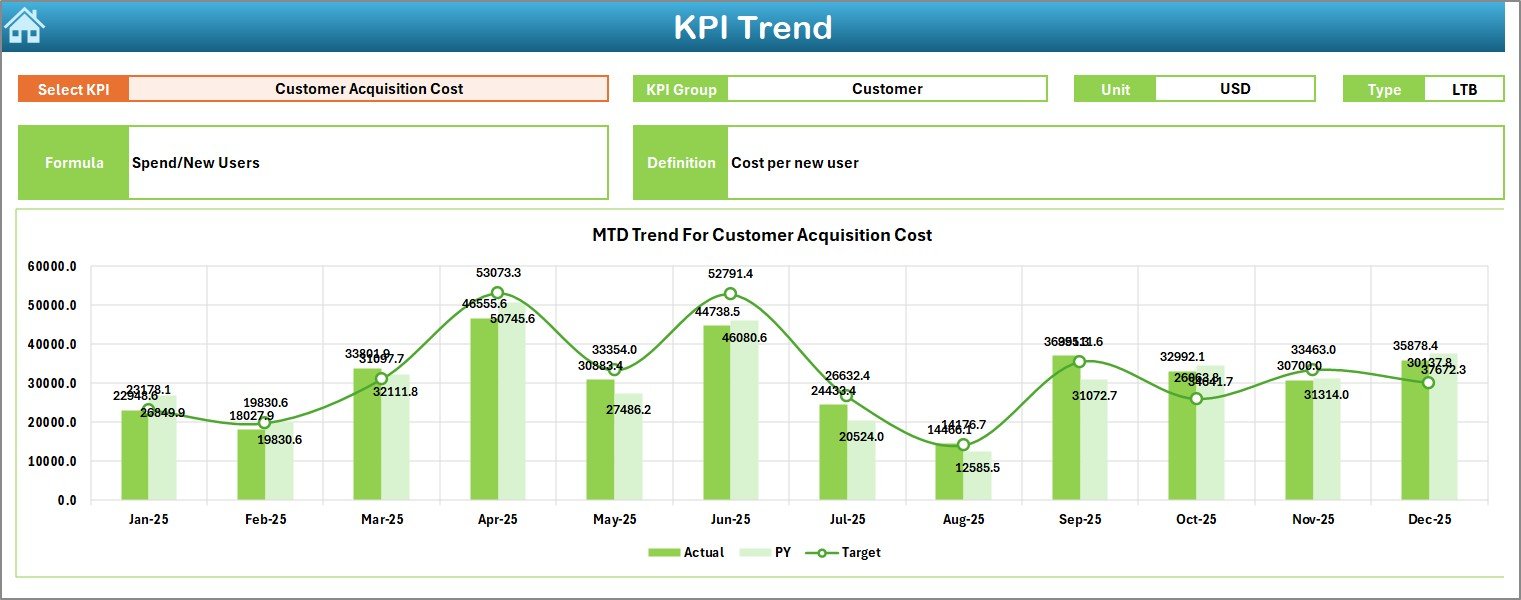
How Does the Trend Sheet Help in KPI Analysis?
The Trend Sheet focuses on deep KPI-level analysis rather than summary numbers.
How Does KPI Selection Work?
- Select a KPI from the dropdown at cell C3
- The dashboard automatically updates all KPI details
What Information Does the Trend Sheet Display?
For the selected KPI, the sheet shows:
- KPI Group
- Unit of Measurement
- KPI Type (Lower the Better or Upper the Better)
- KPI Formula
- KPI Definition
What Charts Are Available?
The sheet also includes:
- MTD trend chart for Actual, Target, and Previous Year
- YTD trend chart for Actual, Target, and Previous Year
Because trend visualization matters, this sheet helps teams identify patterns, seasonality, and performance consistency.
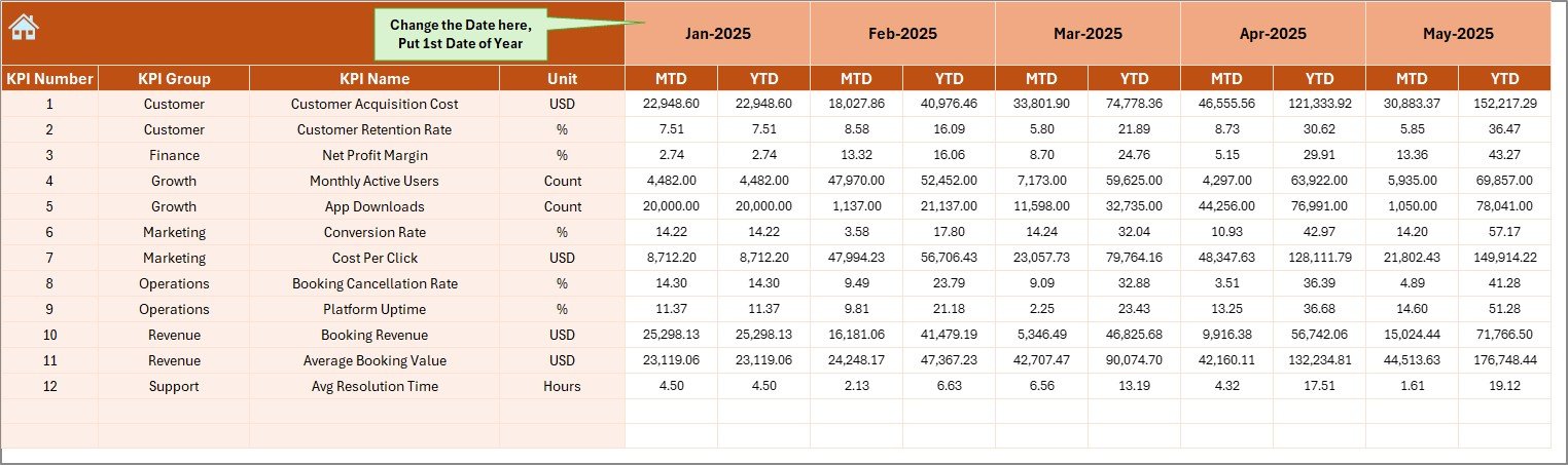
What Is the Actual Numbers Input Sheet Used For?
The Actual Numbers Input Sheet serves as the data entry layer for current performance.
How Do You Enter Data on This Sheet?
- Enter actual KPI values for MTD and YTD
- Set the starting month of the year in cell E1
- Update month values dynamically
Because the dashboard connects directly to this sheet, all visualizations update automatically after data entry.
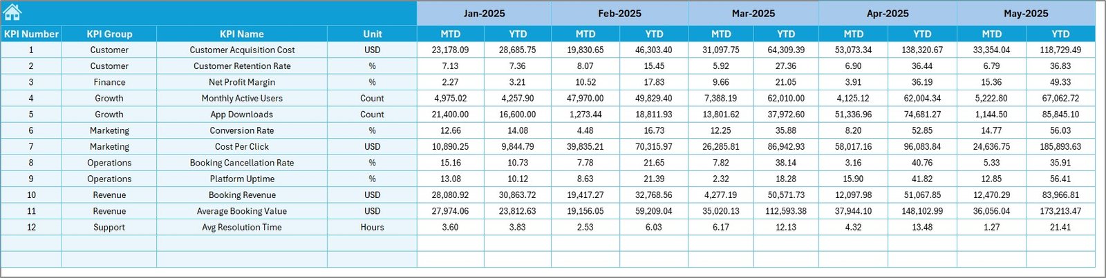
How Does the Target Sheet Support Goal Tracking?
The Target Sheet allows teams to define performance expectations for each KPI.
Key Inputs on the Target Sheet
- Monthly MTD targets
- Monthly YTD targets
- KPI-wise goal tracking
By separating targets from actuals, the dashboard ensures clean comparisons and better accountability.
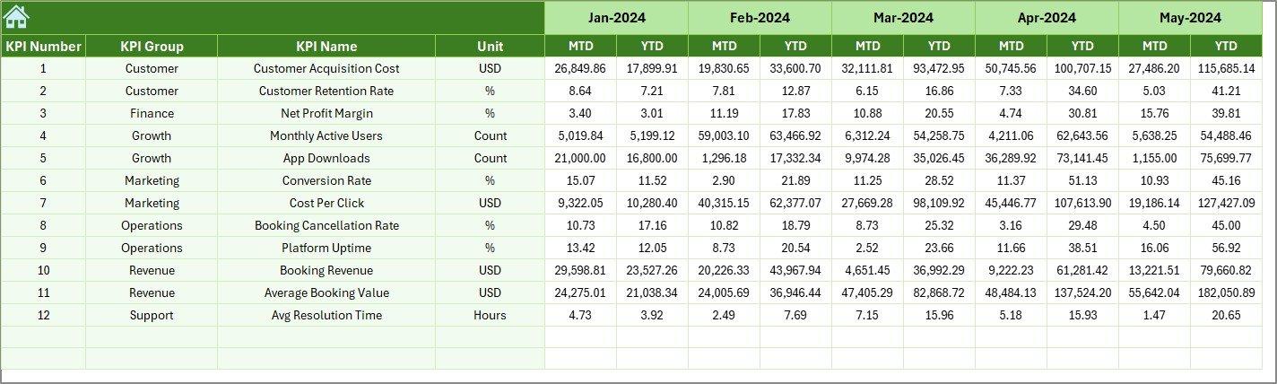
Why Is the Previous Year Number Sheet Important?
The Previous Year Number Sheet enables year-over-year analysis, which is critical for growth evaluation.
What Data Goes Into This Sheet?
- Previous year KPI values
- Same KPI structure as current year
- Consistent month alignment
Because historical context matters, this sheet helps startups understand long-term progress.
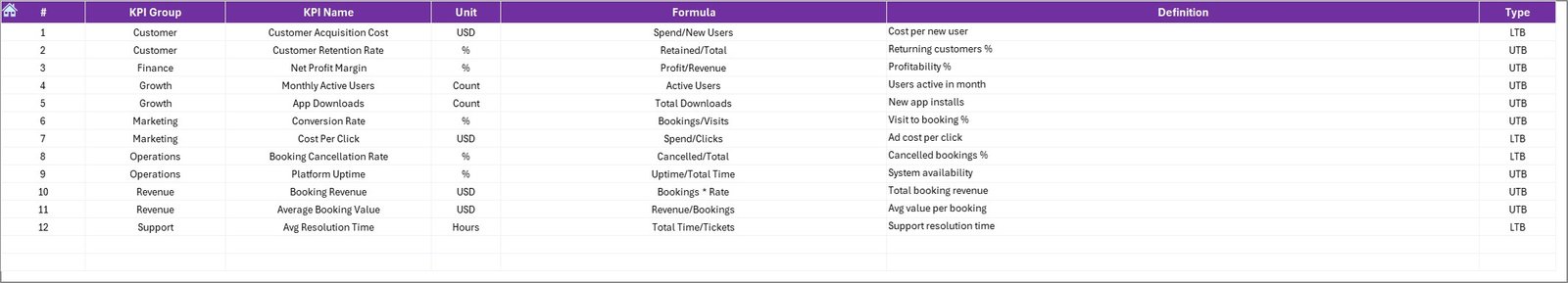
What Is the KPI Definition Sheet and Why Does It Matter?
The KPI Definition Sheet acts as the single source of truth for all KPIs.
Information Stored in the KPI Definition Sheet
- KPI Name
- KPI Group
- Unit of Measurement
- KPI Formula
- KPI Definition
This structure ensures consistency across teams and prevents confusion during KPI reviews.
Advantages of Travel Tech Startups KPI Dashboard in Excel
Using this dashboard delivers multiple business benefits.
Key Advantages
- Centralized KPI tracking in one Excel file
- Faster decision-making through real-time updates
- Clear visibility into MTD and YTD performance
- Easy comparison of Actual vs Target vs Previous Year
- No dependency on external BI tools
- Fully offline and secure
- Simple customization without technical skills
As a result, startups save time, reduce errors, and improve performance management.
How Does This Dashboard Improve Decision-Making?
Because leadership teams need clarity, this dashboard supports smarter decisions by:
- Highlighting underperforming KPIs early
- Showing growth trends visually
- Identifying seasonal patterns
- Supporting data-backed strategy reviews
Therefore, founders and managers can act quickly instead of reacting late.
Best Practices for the Travel Tech Startups KPI Dashboard in Excel
To maximize value, teams should follow proven best practices.
- Define KPIs Clearly Before Data Entry
Always finalize KPI definitions before entering numbers. This approach ensures consistent reporting.
- Update Data Regularly
Frequent updates keep insights fresh and reliable. Monthly updates work best for most startups.
- Review Both MTD and YTD Together
MTD shows short-term performance, while YTD reveals long-term trends. Use both views together.
- Use Trend Analysis During Reviews
Trend charts highlight patterns that static numbers cannot show. Always review trends during meetings.
- Keep KPI Definitions Updated
As business models evolve, update KPI formulas and definitions accordingly.
Who Should Use a Travel Tech Startups KPI Dashboard in Excel?
This dashboard suits multiple stakeholders:
- Startup founders
- Operations managers
- Finance teams
- Product leaders
- Growth and marketing teams
Because Excel remains widely used, teams can adopt this dashboard quickly.
How Is This Dashboard Different From Traditional Reports?
Traditional reports rely on static tables and manual updates. In contrast, this KPI dashboard:
- Updates automatically
- Shows trends visually
- Supports instant comparisons
- Reduces reporting time significantly
Therefore, teams spend less time preparing reports and more time improving performance.
Can This KPI Dashboard Be Customized?
Yes, customization remains one of its strongest features.
Users can:
- Add or remove KPIs
- Change KPI groups
- Modify targets
- Adjust formatting
- Expand trend analysis
Because the dashboard uses Excel formulas, customization stays simple and flexible.
Conclusion
A Travel Tech Startups KPI Dashboard in Excel provides a powerful yet simple way to track performance, analyze trends, and make smarter business decisions. Instead of juggling multiple reports, startups gain a single, structured, and visual system for KPI management.
By combining MTD and YTD tracking, trend analysis, target comparisons, and clear KPI definitions, this dashboard helps travel tech startups scale with confidence and clarity.
When startups track the right KPIs the right way, growth becomes measurable, manageable, and sustainable.
Frequently Asked Questions About Travel Tech Startups KPI Dashboard in Excel
What Is the Main Purpose of This KPI Dashboard?
The main purpose is to track, compare, and analyze travel tech startup KPIs in one centralized Excel file.
Do I Need Advanced Excel Skills to Use This Dashboard?
No. Basic Excel knowledge is enough to update and use the dashboard effectively.
Can I Add New KPIs to the Dashboard?
Yes. You can easily add new KPIs by updating the KPI Definition, Target, and Input sheets.
Does the Dashboard Support Year-Over-Year Analysis?
Yes. The Previous Year Number sheet enables clear year-over-year comparisons.
Is This Dashboard Suitable for Early-Stage Startups?
Yes. Both early-stage and growing startups can use this dashboard effectively.
Can I Use This Dashboard Offline?
Yes. Because it runs entirely in Excel, no internet connection is required.
How Often Should I Update the KPI Data?
Monthly updates work best, although you can update it more frequently if needed.
Visit our YouTube channel to learn step-by-step video tutorials
Watch the step-by-step video tutorial: