Healthcare organizations constantly strive to improve patient care, operational efficiency, and financial performance. Dialysis centers, in particular, must carefully monitor multiple performance indicators because they handle life-sustaining treatments for patients with kidney failure. Therefore, dialysis center administrators need accurate and real-time insights to ensure that operations run smoothly and patients receive the highest level of care.
However, many dialysis facilities still rely on manual reports, disconnected spreadsheets, and delayed performance tracking systems. As a result, decision-makers often struggle to analyze treatment efficiency, patient outcomes, and operational performance. Without a centralized monitoring system, it becomes difficult to identify performance gaps, measure improvements, or make data-driven decisions.
Therefore, healthcare managers increasingly use data analytics tools to track operational performance. One powerful solution is the Dialysis Centers KPI Dashboard in Power BI. This interactive dashboard allows dialysis center administrators to monitor key performance indicators, analyze trends, and improve operational efficiency.
Click to Purchases Dialysis Centers KPI Dashboard in Power BI
In this article, you will learn everything about the Dialysis Centers KPI Dashboard in Power BI, including what it is, why dialysis centers need it, how it works, its key features, advantages, best practices, and frequently asked questions.
What is a Dialysis Centers KPI Dashboard in Power BI?
A Dialysis Centers KPI Dashboard in Power BI is a data visualization and performance monitoring tool designed to track important metrics related to dialysis center operations.
This dashboard collects operational data from structured sources such as Excel files and transforms it into interactive charts, tables, and KPI indicators. Consequently, healthcare managers can quickly evaluate the performance of dialysis centers and identify areas that need improvement.
Because Power BI provides powerful data visualization capabilities, dialysis centers can easily monitor important metrics such as:
-
Patient treatment volumes
-
Dialysis machine utilization
-
Treatment success rates
-
Infection control metrics
-
Patient satisfaction indicators
-
Operational efficiency KPIs
Moreover, the dashboard organizes data into visual reports that allow administrators to analyze monthly performance, yearly trends, and comparisons with previous years.
As a result, healthcare teams gain better visibility into dialysis center operations and can make faster decisions based on real-time data insights.
Why Do Dialysis Centers Need a KPI Dashboard?
Dialysis centers manage critical treatments for patients suffering from chronic kidney disease or kidney failure. Therefore, even small operational issues can significantly impact patient health and treatment outcomes.
However, traditional reporting systems often create several challenges:
-
Manual data collection consumes significant time.
-
Reports often become outdated before decision-makers review them.
-
Data remains scattered across multiple systems.
-
Managers struggle to identify performance trends quickly.
Therefore, dialysis centers need a centralized dashboard that consolidates all performance metrics in one place.
A KPI dashboard built in Power BI solves these problems by providing:
Click to Purchases Dialysis Centers KPI Dashboard in Power BI
-
Real-time monitoring of dialysis center performance
-
Clear visualization of operational KPIs
-
Quick identification of performance gaps
-
Data-driven decision-making capabilities
Consequently, healthcare organizations can improve both operational efficiency and patient outcomes.
Key Features of the Dialysis Centers KPI Dashboard in Power BI
The Dialysis Centers KPI Dashboard in Power BI is a ready-to-use analytics tool designed to simplify performance monitoring.
The dashboard consists of three main pages that provide a comprehensive view of dialysis center performance.
1. Summary Page – The Main Dashboard
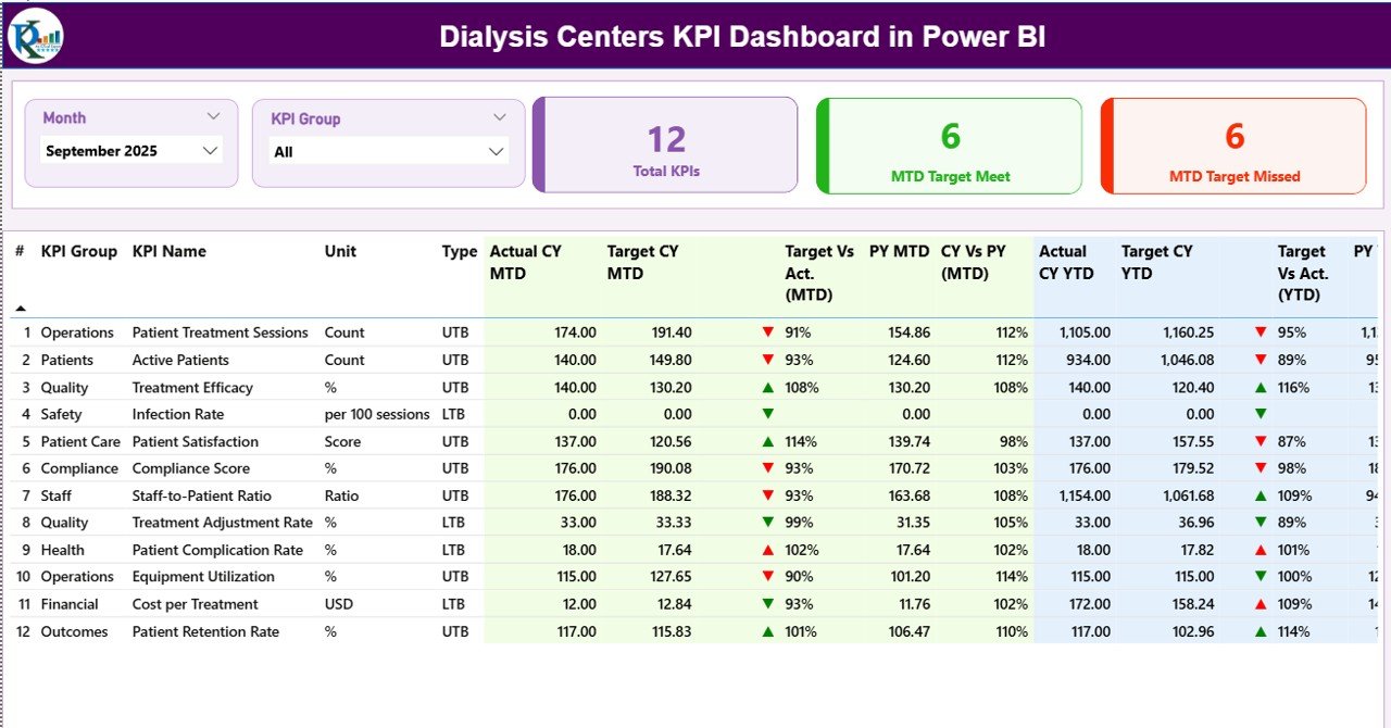
The Summary Page serves as the main dashboard where users can view the overall performance of all KPIs.
At the top of the dashboard, users can select:
-
Month slicer
-
KPI Group slicer
These filters allow users to quickly analyze performance for specific time periods or KPI categories.
KPI Cards on the Summary Page
The dashboard displays three important KPI cards:
-
Total KPIs Count – Shows the total number of KPIs being tracked.
-
MTD Target Meet Count – Indicates how many KPIs achieved their monthly targets.
-
MTD Target Missed Count – Displays the number of KPIs that failed to meet their targets.
These KPI cards provide an instant overview of overall performance.
Detailed KPI Performance Table
Below the KPI cards, the dashboard displays a detailed performance table containing important KPI information.
The table includes the following fields:
KPI Number
This column shows the sequence number assigned to each KPI.
KPI Group
This column identifies the category or group to which the KPI belongs.
KPI Name
This column displays the name of the performance indicator.
Unit
This field indicates the unit used to measure the KPI.
KPI Type
The dashboard categorizes KPIs into two types:
-
UTB (Upper the Better) – Higher values indicate better performance.
-
LTB (Lower the Better) – Lower values represent better performance.
Actual CY MTD
This column shows the current year Month-to-Date actual value for the KPI.
Target CY MTD
This column displays the monthly target value for the KPI.
MTD Icon
The dashboard uses visual indicators to highlight KPI performance:
-
▲ Green icon – KPI achieved or exceeded the target
-
▼ Red icon – KPI missed the target
These icons help users quickly identify KPI status.
Target vs Actual (MTD)
This field calculates the performance percentage using the formula:
Actual MTD ÷ Target MTD
Previous Year MTD (PY MTD)
This column displays the MTD value for the same period in the previous year.
CY vs PY (MTD)
This field compares the current year MTD performance with the previous year MTD value.
Click to Purchases Dialysis Centers KPI Dashboard in Power BI
Year-to-Date KPI Metrics
In addition to monthly performance, the dashboard also tracks yearly performance metrics.
These include:
-
Actual CY YTD – Current year YTD actual value
-
Target CY YTD – Target YTD value
-
YTD Icon – Visual indicator showing KPI status
-
Target vs Actual (YTD) – Percentage comparison of YTD values
-
Previous Year YTD – Last year’s YTD data
-
CY vs PY (YTD) – Comparison of current and previous year performance
These metrics help administrators evaluate long-term operational performance.
2. KPI Trend Page – Performance Trend Analysis
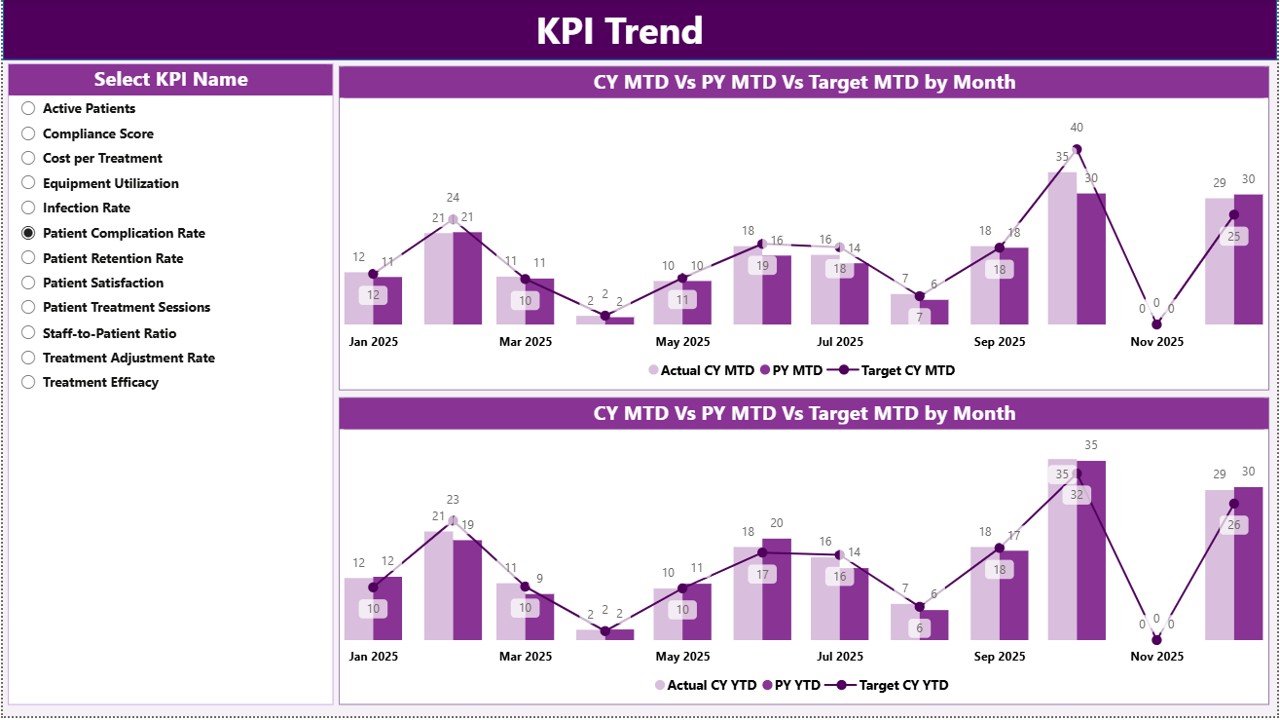
The KPI Trend Page focuses on analyzing KPI trends over time.
This page includes two combo charts that display:
-
Current Year Actual values
-
Previous Year Actual values
-
Target values
The charts analyze both:
-
MTD (Month-to-Date) trends
-
YTD (Year-to-Date) trends
Users can select any KPI using the slicer on the left side of the page. Once a KPI is selected, the dashboard automatically updates the trend charts.
Consequently, administrators can easily analyze performance improvements or declines across months.
3. KPI Definition Page – KPI Details and Documentation
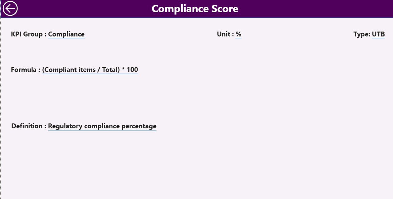
The KPI Definition Page serves as a drill-through page that provides detailed information about each KPI.
This page remains hidden in the dashboard interface, but users can access it by drilling through from the Summary Page.
The page displays important KPI details such as:
-
KPI formula
-
KPI definition
-
KPI unit of measurement
-
KPI category
-
KPI calculation logic
After reviewing the details, users can return to the main dashboard using the back button located in the top left corner.
This feature ensures that users understand how each KPI is calculated and interpreted.
Excel Data Source for the Dashboard
Click to Purchases Dialysis Centers KPI Dashboard in Power BI
The Dialysis Centers KPI Dashboard in Power BI uses an Excel file as the primary data source.
The Excel file contains three worksheets where users enter the required data.
1. Input_Actual Sheet
In this worksheet, users enter the actual KPI values.
The sheet includes the following fields:
-
KPI Name
-
Month (first date of the month)
-
MTD value
-
YTD value
Once users update this data, Power BI automatically refreshes the dashboard.
2. Input_Target Sheet
This worksheet stores the target values for each KPI.
Users must enter:
-
KPI Name
-
Month
-
Target MTD value
-
Target YTD value
These values allow the dashboard to calculate KPI performance against targets.
3. KPI Definition Sheet
This worksheet contains metadata related to each KPI.
Users must enter the following details:
-
KPI Number
-
KPI Group
-
KPI Name
-
Unit
-
Formula
-
Definition
-
KPI Type (LTB or UTB)
This information helps the dashboard generate meaningful performance analysis.
What KPIs Can Dialysis Centers Track in This Dashboard?
Dialysis centers can monitor several important healthcare KPIs, including:
Operational KPIs
-
Dialysis machine utilization rate
-
Treatment session completion rate
-
Average treatment duration
-
Staff productivity metrics
Clinical KPIs
-
Dialysis adequacy (Kt/V)
-
Infection rates
-
Patient hospitalization rate
-
Treatment complications
Patient Experience KPIs
-
Patient satisfaction score
-
Waiting time for treatment
-
Treatment adherence rate
Financial KPIs
-
Revenue per patient
-
Cost per dialysis session
-
Resource utilization efficiency
By tracking these KPIs, dialysis centers can continuously improve their performance.
Advantages of Dialysis Centers KPI Dashboard in Power BI
Organizations gain several benefits when they implement this dashboard.
Real-Time Performance Monitoring
Administrators can instantly review dialysis center performance without waiting for manual reports.
Improved Decision Making
Interactive charts and visual indicators help decision-makers identify problems quickly.
Better Patient Care
When healthcare teams monitor treatment KPIs regularly, they can improve patient outcomes.
Efficient Data Analysis
Power BI automatically transforms raw data into meaningful visual insights.
Centralized Performance Tracking
The dashboard consolidates operational, clinical, and financial KPIs in one place.
Time Saving
Healthcare managers no longer need to prepare manual reports every month.
Best Practices for the Dialysis Centers KPI Dashboard in Power BI
Organizations should follow several best practices to maximize the value of this dashboard.
Define Clear KPIs
Healthcare teams should select KPIs that truly represent dialysis center performance.
Ensure Data Accuracy
Teams must regularly verify data entries in the Excel input sheets.
Update Data Frequently
Frequent updates ensure that decision-makers always view the latest performance metrics.
Use Consistent KPI Definitions
Standardized KPI definitions prevent confusion among healthcare teams.
Train Staff on Dashboard Usage
Staff members should understand how to interpret KPI indicators and trend charts.
Monitor Performance Trends
Managers should analyze long-term trends rather than focusing only on monthly results.
How Can Dialysis Centers Improve Performance Using KPI Dashboards?
Dialysis centers can significantly improve their performance when they actively use KPI dashboards.
First, administrators can identify operational bottlenecks quickly. For example, if machine utilization drops, managers can adjust scheduling or staffing.
Second, healthcare teams can detect clinical risks early. When infection rates increase, staff can review treatment procedures and implement corrective actions.
Third, the dashboard helps financial teams control operational costs by monitoring resource usage and treatment efficiency.
Consequently, dialysis centers can improve both operational efficiency and patient satisfaction.
Conclusion
Dialysis centers operate in a highly sensitive healthcare environment where performance monitoring plays a critical role in patient safety and treatment quality. Therefore, healthcare administrators must use reliable analytics tools to monitor operational and clinical performance.
The Dialysis Centers KPI Dashboard in Power BI provides a powerful solution for this challenge. It transforms raw operational data into clear visual insights that help healthcare managers evaluate performance quickly.
The dashboard includes three powerful pages: the Summary Page, KPI Trend Page, and KPI Definition Page, each designed to provide valuable performance insights. Moreover, the dashboard uses structured Excel data sources that make data entry simple and efficient.
By implementing this dashboard, dialysis centers can improve decision-making, enhance operational efficiency, and ultimately deliver better care to patients.
Frequently Asked Questions (FAQs)
What is a Dialysis Centers KPI Dashboard?
A Dialysis Centers KPI Dashboard is a performance monitoring tool that tracks operational, clinical, and financial metrics for dialysis facilities.
Why should dialysis centers use Power BI dashboards?
Power BI dashboards provide interactive visualizations, automated calculations, and real-time insights that help healthcare administrators make faster decisions.
What data source does this dashboard use?
This dashboard uses an Excel file that contains actual KPI values, target values, and KPI definitions.
Visit our YouTube channel to learn step-by-step video tutorials