In today’s fast-paced office environment, managing internal issues efficiently plays a critical role in maintaining productivity and employee satisfaction. However, many organizations still rely on scattered emails, manual logs, or disconnected spreadsheets to track workplace issues. As a result, delays increase, communication gaps widen, and decision-making becomes difficult.
So, how can you streamline issue tracking and improve resolution efficiency?
The answer is the Office Issues Management Dashboard in Power BI.
This powerful and interactive dashboard helps organizations monitor, analyze, and resolve office issues in real time. Moreover, it converts complex operational data into clear visual insights, enabling faster and smarter decisions.
In this detailed guide, you will learn everything about this dashboard, including features, structure, advantages, best practices, and frequently asked questions.
What is an Office Issues Management Dashboard in Power BI?
An Office Issues Management Dashboard in Power BI is a centralized analytics tool designed to track and manage workplace issues such as IT problems, facility complaints, HR concerns, and operational challenges.
Instead of managing multiple Excel sheets or emails, you can bring all issue-related data into one interactive dashboard. Therefore, you can:
- Track issue status in real time
- Monitor response and resolution time
- Identify bottlenecks across departments
- Improve employee satisfaction
- Optimize internal processes
Moreover, Power BI enables dynamic filtering, drill-down analysis, and automated reporting. As a result, managers gain full visibility into issue management performance.
Why Do You Need an Office Issues Management Dashboard?
Managing office issues manually often leads to inefficiencies. For example, teams may miss deadlines, overlook escalations, or fail to prioritize critical requests.
However, with a structured dashboard, you can:
- Improve response speed
- Reduce issue backlog
- Increase accountability
- Enhance employee experience
- Make data-driven decisions
Therefore, adopting a Power BI dashboard becomes essential for modern organizations.
Key Features of the Office Issues Management Dashboard in Power BI
This dashboard contains 5 powerful pages, each designed to provide deep insights into issue management.
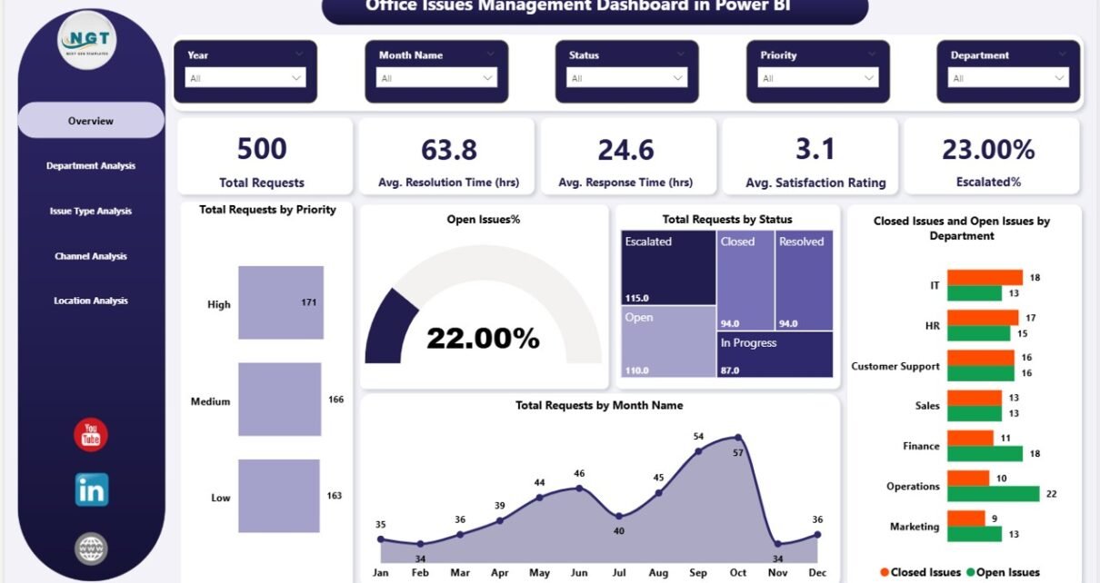
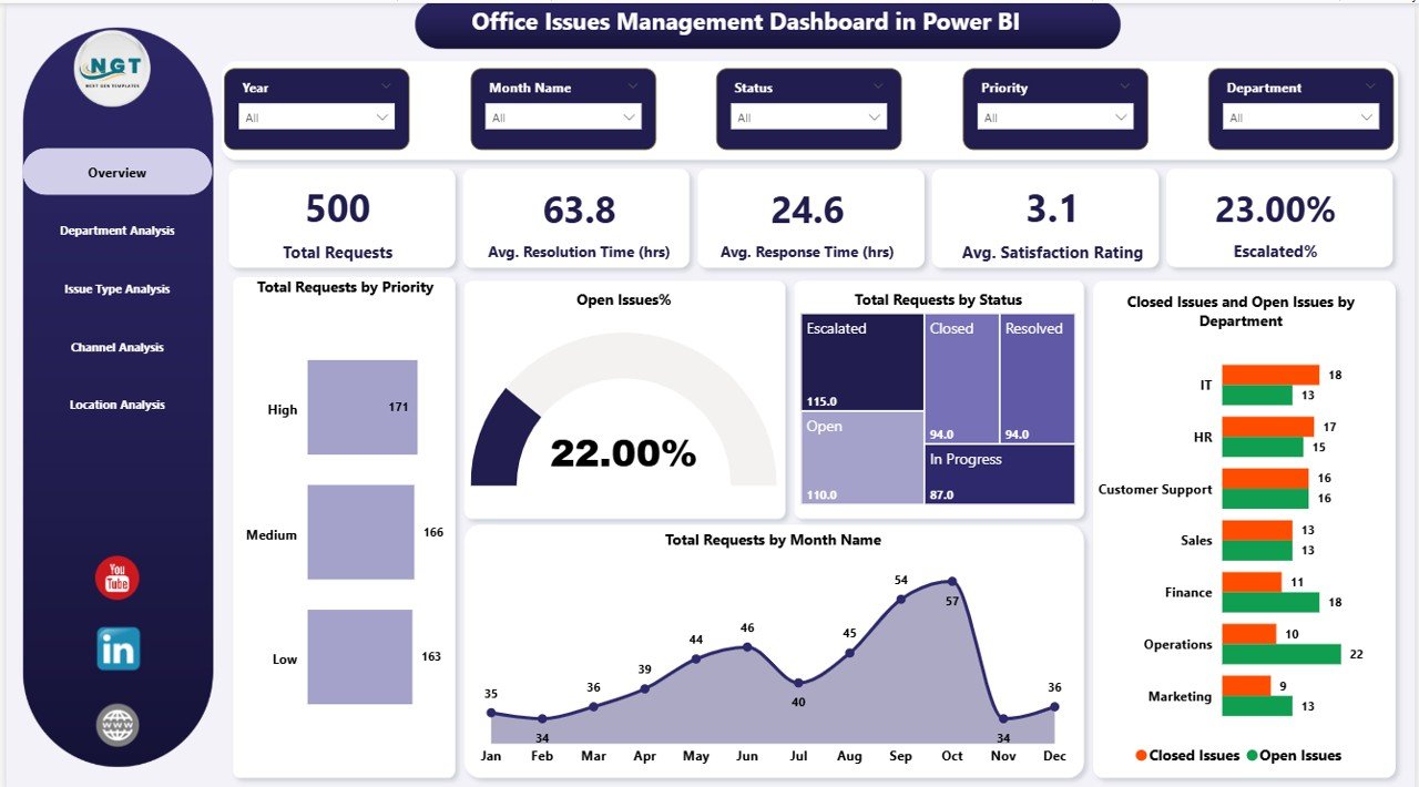
Overview Page – Get a Complete Snapshot 📌
The Overview Page acts as the central hub of the dashboard. It provides a quick summary of all key metrics.
KPI Cards:
- Total Requests
- Average Resolution Time (hrs)
- Average Response Time (hrs)
- Average Satisfaction Rating
- Escalated %
Charts:
- Total Requests by Priority
- Open Issues %
- Total Requests by Status
- Closed vs Open Issues by Department
- Total Requests by Month
As a result, managers can instantly understand overall performance and identify urgent areas.
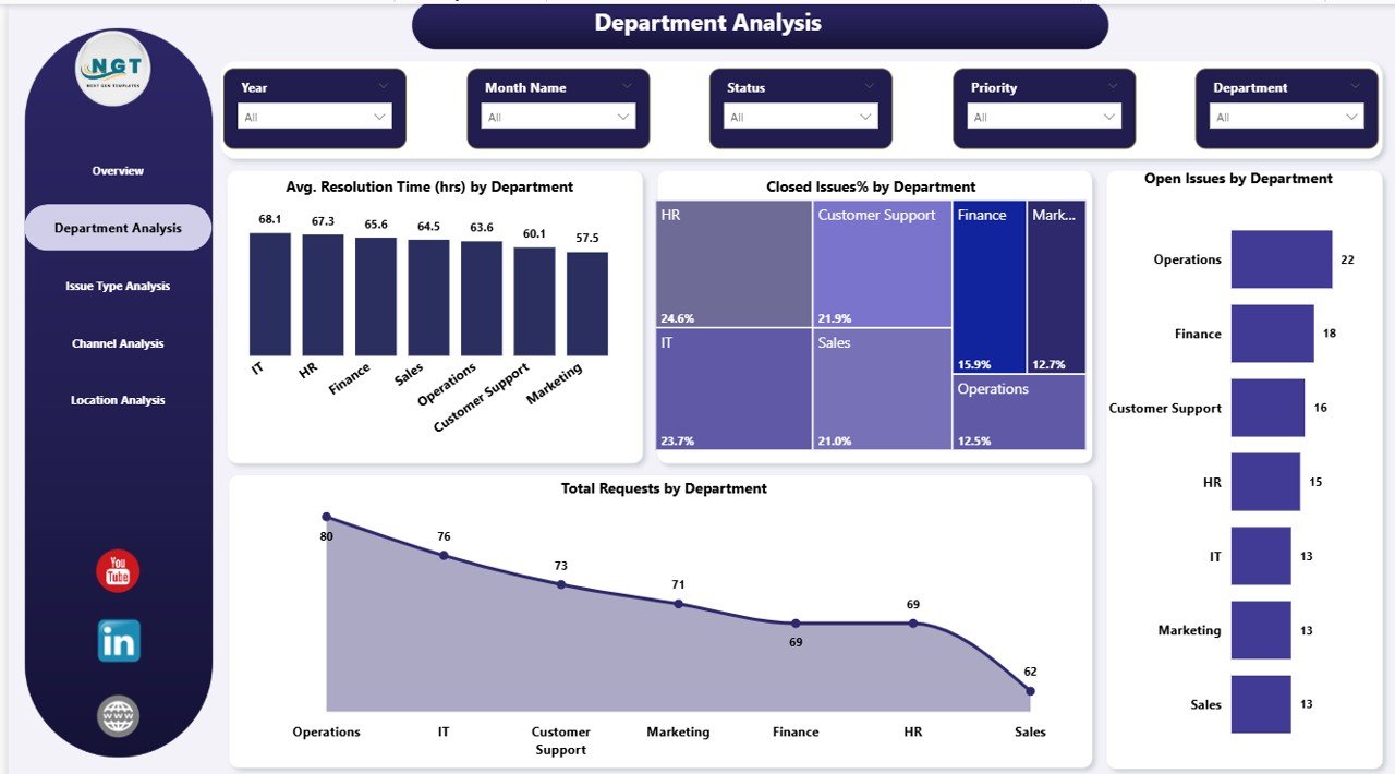
Department Analysis – Identify Performance Gaps
The Department Analysis Page helps you evaluate how different departments handle issues.
Charts Included:
- Average Resolution Time by Department
- Closed Issue % by Department
- Open Issues by Department
- Total Requests by Department
Therefore, you can quickly identify which departments perform well and which need improvement.
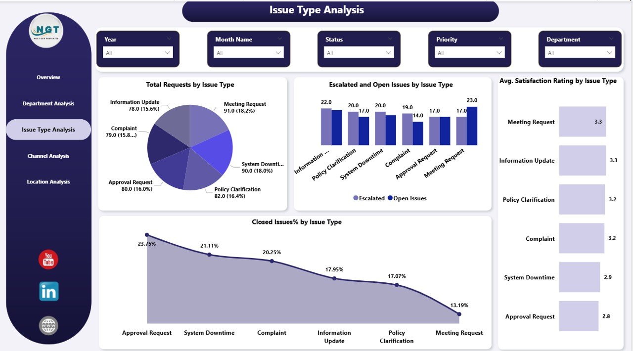
Issue Type Analysis – Understand Problem Patterns
Different types of issues require different handling strategies. This page helps you analyze trends based on issue categories.
Charts Included:
- Total Requests by Issue Type
- Escalated & Open Issues by Issue Type
- Average Satisfaction Rating by Issue Type
- Closed Issue % by Issue Type
Consequently, you can prioritize high-impact issue types and improve resolution strategies
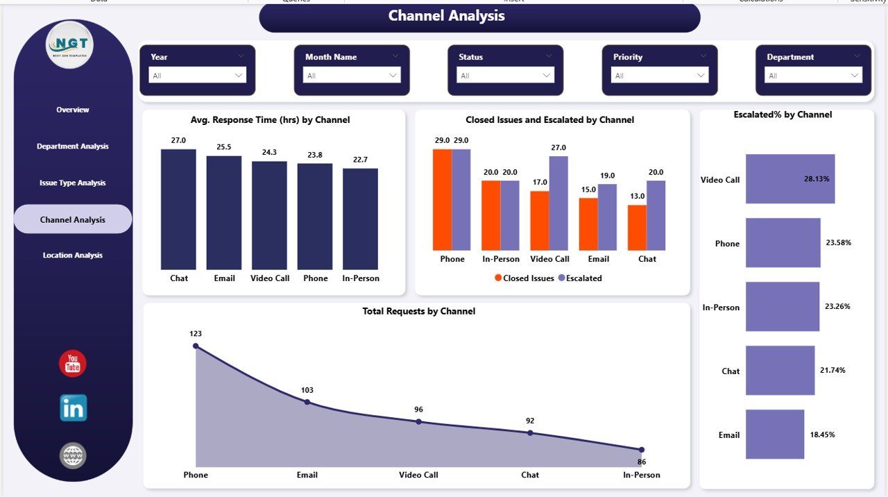
Channel Analysis – Optimize Communication Channels
Employees raise issues through multiple channels such as email, phone, or ticket systems. This page evaluates channel performance.
Charts Included:
- Average Response Time by Channel
- Closed vs Escalated Issues by Channel
- Escalated % by Channel
- Total Requests by Channel
Thus, you can identify the most efficient communication channels and improve response workflows.
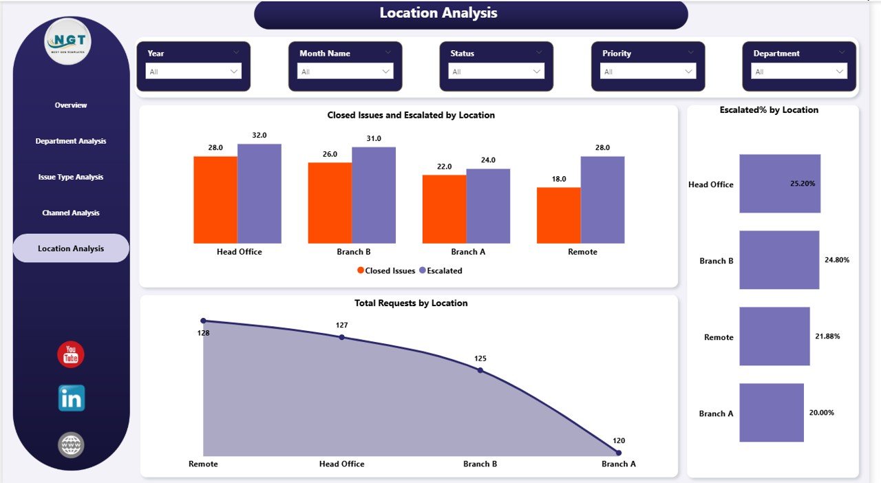
Location Analysis – Monitor Regional Performance
The Location Analysis Page provides insights into issue handling across different locations.
Charts Included:
- Closed vs Escalated Issues by Location
- Escalated % by Location
- Total Requests by Location
As a result, organizations with multiple offices can ensure consistent performance across all locations.
What Insights Can You Gain from This Dashboard?
This dashboard not only displays data but also delivers actionable insights.
For example:
- Which department has the highest resolution time?
- Which issue type causes the most escalations?
- Which location struggles with issue management?
- Which channel provides the fastest response?
- How does satisfaction rating vary across issue types?
Therefore, decision-makers can take proactive actions instead of reactive ones.
Advantages of Office Issues Management Dashboard in Power BI
Using this dashboard offers several powerful benefits.
Improved Decision-Making
- Real-time data enables faster decisions
- Clear visuals reduce confusion
- Managers can act immediately
Increased Efficiency
- Teams resolve issues faster
- Workflows become more structured
- Manual tracking reduces significantly
Better Accountability
- Departments become more responsible
- Performance tracking becomes transparent
- Escalations get proper attention
Enhanced Employee Satisfaction
- Faster resolutions improve employee experience
- Issues get tracked properly
- Feedback becomes measurable
Data Centralization
- All issue data in one place
- No need for multiple spreadsheets
- Easy access and reporting
How Does This Dashboard Improve Workplace Productivity?
When organizations manage issues efficiently, productivity increases automatically.
For example:
- Employees face fewer disruptions
- Teams spend less time tracking issues
- Managers focus on strategic tasks
- Delays reduce significantly
Moreover, consistent monitoring ensures continuous improvement.
Best Practices for the Office Issues Management Dashboard
To get the best results, you should follow these best practices:
Keep Data Clean and Consistent
- Use standardized issue categories
- Avoid duplicate records
- Maintain accurate timestamps
Define Clear KPIs
- Set measurable targets
- Track response and resolution time
- Monitor escalation rates
Use Filters Effectively
- Analyze data by department, location, and channel
- Drill down into specific issues
- Focus on critical insights
Update Data Regularly
- Ensure real-time or daily updates
- Avoid outdated information
- Maintain dashboard reliability
Train Your Team
- Teach employees how to use the dashboard
- Encourage data-driven decisions
- Promote accountability
Who Can Benefit from This Dashboard?
This dashboard serves multiple roles within an organization:
- Office Administrators
- HR Managers
- IT Support Teams
- Operations Managers
- Facility Management Teams
Therefore, it becomes a versatile solution for any organization.
How to Use the Office Issues Management Dashboard?
Using this dashboard is simple and effective.
Step-by-Step Process:
- Import your issue data into Power BI
- Connect data sources and refresh
- Use slicers to filter information
- Analyze KPIs and charts
- Identify bottlenecks
- Take action based on insights
As a result, you can improve issue resolution continuously.
KPIs You Should Track in This Dashboard
Tracking the right KPIs ensures better performance.
- Total Requests
- Average Resolution Time
- Average Response Time
- Escalation Rate
- Satisfaction Rating
- Open Issues %
- Closed Issues %
Therefore, you can measure success effectively.
Future Scope of Issue Management Dashboards
As technology evolves, dashboards will become even more powerful.
For example:
- AI-based issue prediction
- Automated ticket prioritization
- Real-time alerts and notifications
- Integration with CRM and ERP systems
Moreover, organizations will rely more on data-driven tools.
Conclusion
The Office Issues Management Dashboard in Power BI is not just a reporting tool—it is a complete solution for managing workplace issues efficiently.
By using this dashboard, you can:
- Improve response and resolution time
- Reduce escalations
- Enhance employee satisfaction
- Make smarter business decisions
Therefore, if you want to transform your office operations, this dashboard is a must-have tool.
Frequently Asked Questions (FAQs)
- What is the main purpose of this dashboard?
This dashboard helps organizations track, analyze, and manage office issues efficiently.
- Can I customize this dashboard?
Yes, you can easily customize it based on your business needs, KPIs, and data sources.
- Does this dashboard support real-time data?
Yes, Power BI supports real-time data updates, depending on your data source.
- Who should use this dashboard?
Office managers, HR teams, IT support teams, and operations managers can use it.
- What tools are required to use this dashboard?
You need Microsoft Power BI Desktop and your issue-related dataset.
- How does this dashboard improve productivity?
It reduces delays, improves tracking, and helps teams resolve issues faster.
- Can small businesses use this dashboard?
Yes, both small and large organizations can benefit from it.
Visit our YouTube channel to learn step-by-step video tutorials