In today’s rapidly growing urban landscape, city gas distribution companies manage massive volumes of operational, financial, and safety data every single day. However, handling this data manually often leads to confusion, delays, and costly errors. So, how can you track billing, revenue, maintenance, safety, and performance—all in one place?
The answer is simple: City Gas Distribution Dashboard in Power BI
This powerful and interactive dashboard transforms complex gas distribution data into clear, actionable insights. Moreover, it helps utility companies monitor performance, reduce risks, and make faster decisions. As a result, you gain complete control over your operations while improving efficiency and profitability.
In this detailed guide, you will learn everything about this dashboard, including its features, benefits, best practices, and much more.
Click to buy City Gas Distribution Dashboard in Power BI
What is a City Gas Distribution Dashboard in Power BI?
A City Gas Distribution Dashboard in Power BI is a data visualization tool designed to track and analyze the performance of gas distribution networks across multiple cities and regions.
Instead of relying on scattered spreadsheets, this dashboard allows you to:
- Monitor billing, revenue, and costs in real time
- Talyze leak incidents and safety performance
- C Identify trends for better planning and forecasting
As a result, decision-makers can easily identify issues, optimize operations, and improve service delivery.
Why Do You Need a City Gas Distribution Dashboard?
Managing a gas distribution network involves multiple moving parts. However, without a centralized system, companies often struggle with visibility and control.
Therefore, this dashboard becomes essential because it helps you:
- Gain real-time insights into operations
- Reduce operational risks and leak incidents
- Improve billing efficiency and revenue tracking
- Enhance safety and compliance monitoring
- Make faster, data-driven decisions
In addition, it ensures that your organization stays competitive in a fast-changing energy market.
Key Features of City Gas Distribution Dashboard in Power BI
This dashboard comes with 5 powerful and interactive pages, each designed to provide deep insights into different aspects of gas distribution.
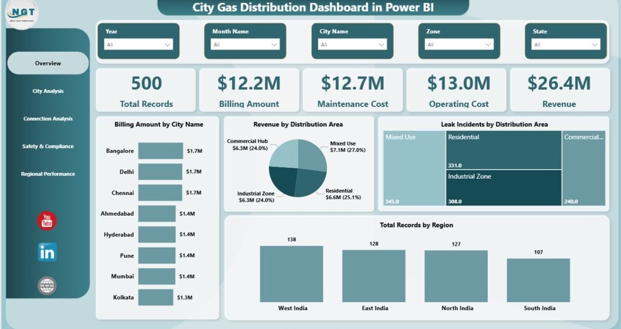
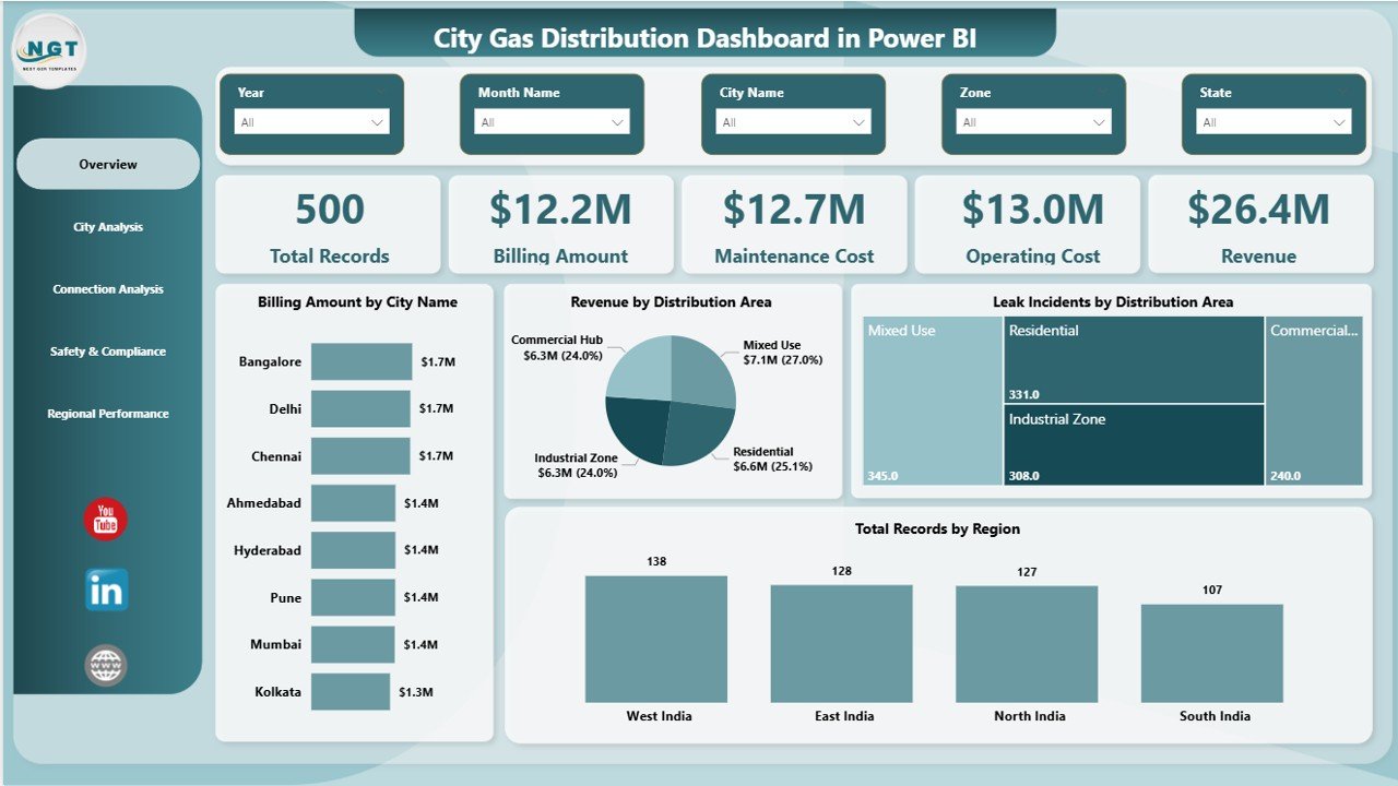
Overview Page – What Does the Dashboard Snapshot Show?
The Overview Page acts as the central hub of the dashboard. It provides a high-level snapshot of key metrics and performance indicators.
KPI Cards
- Total Records
- Billing Amount
- Maintenance Cost
- Operating Cost
- Revenue
Visual Insights
- Billing Amount by City Name
- Revenue by Distribution Area
- Leak Incidents by Distribution Area
- Total Records by Region
Filters (Slicers)
- City
- Region
- Time Period
As a result, users can quickly understand the overall performance and drill down into specific areas.
Click to buy City Gas Distribution Dashboard in Power BI
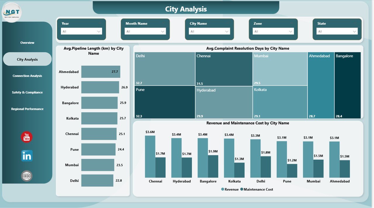
City Analysis – How Does Each City Perform?
The City Analysis Page focuses on city-level performance metrics. It helps identify operational efficiency and service quality across locations.
Key Charts
- Average Pipeline Length (km) by City
- Average Complaint Resolution Days by City
Therefore, you can easily compare cities and identify areas that need improvement.
Click to buy City Gas Distribution Dashboard in Power BI
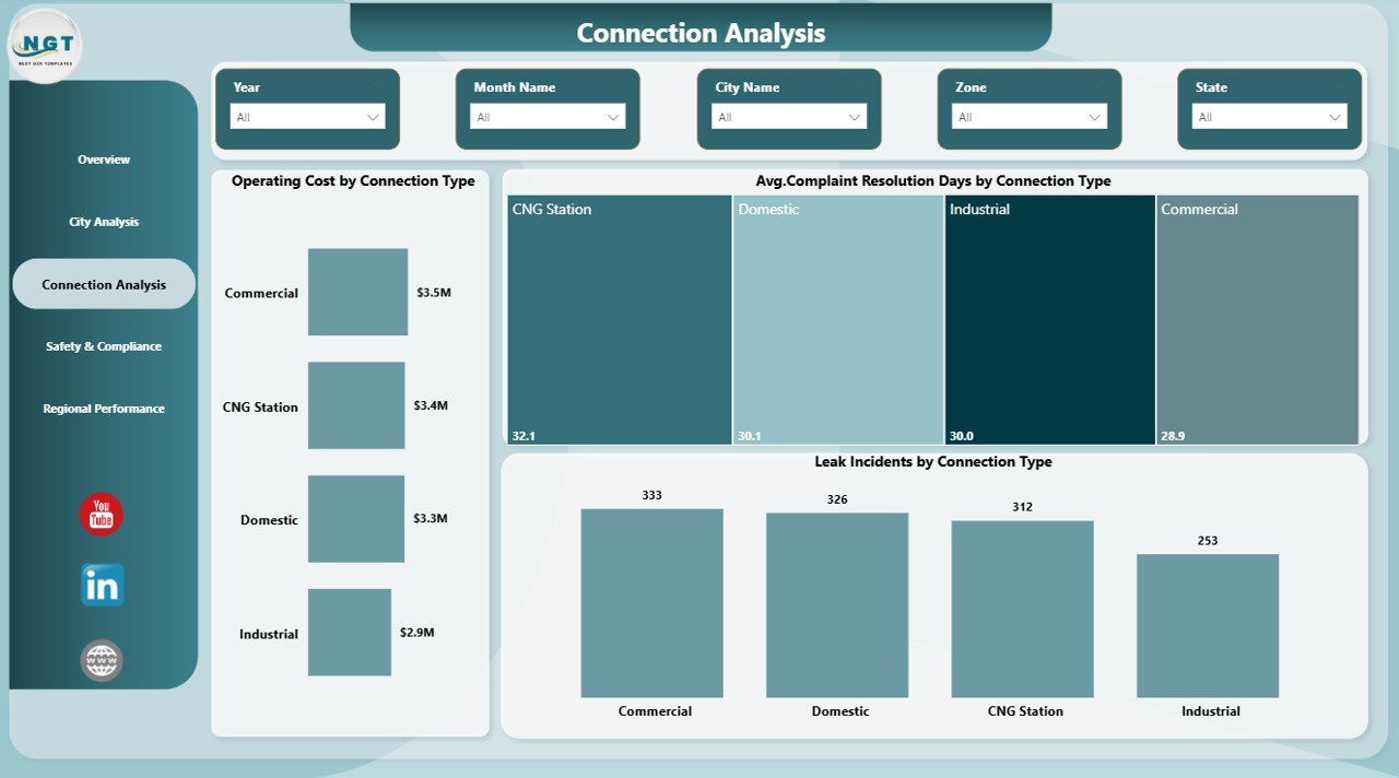
Connection Analysis – How Do Connection Types Impact Performance?
The Connection Analysis Page provides insights into different connection types such as residential, commercial, and industrial.
Key Charts
- Operating Cost by Connection Type
- Average Complaint Resolution Days by Connection Type
- Leak Incidents by Connection Type
As a result, you can optimize service delivery and reduce costs for each connection category.
Click to buy City Gas Distribution Dashboard in Power BI
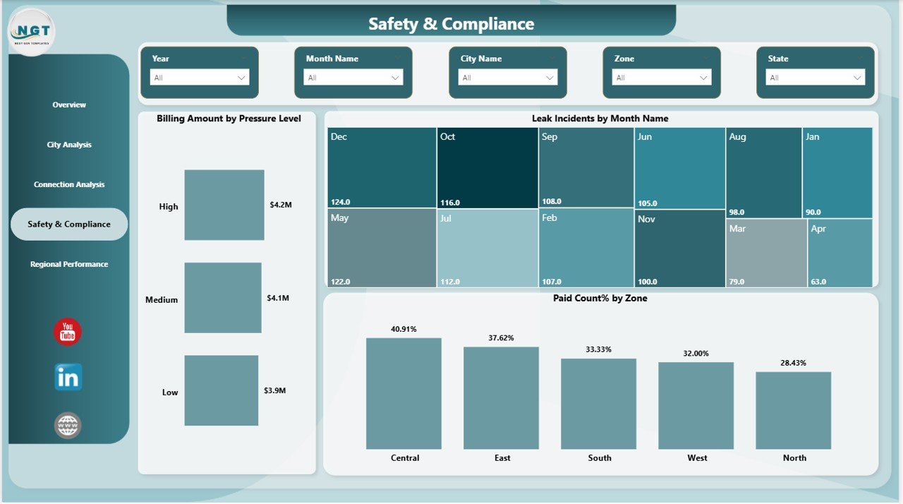
Safety & Compliance – How Safe is Your Gas Network?
Safety plays a critical role in gas distribution. Therefore, the Safety & Compliance Page helps monitor risk factors and compliance metrics.
Key Charts
- Billing Amount by Pressure Level
- Leak Incidents by Month
- Paid Count % by Zone
Consequently, you can identify high-risk areas and take preventive actions before issues escalate.
Click to buy City Gas Distribution Dashboard in Power BI
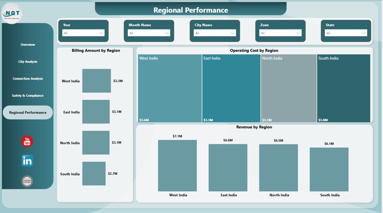
Regional Performance – Which Regions Perform Best?
The Regional Performance Page helps you analyze performance across different regions.
Key Charts
- Billing Amount by Region
- Operating Cost by Region
- Revenue by Region
As a result, you can compare regional performance and allocate resources more effectively.
Click to buy City Gas Distribution Dashboard in Power BI
How Does This Dashboard Work?
This dashboard uses Power BI’s advanced data visualization capabilities to convert raw data into meaningful insights.
Step-by-Step Process
- Upload your data into the Excel or data source file
- Connect the data to Power BI
- Refresh the dashboard
- Use slicers to filter data
- Analyze charts and KPIs
Therefore, even non-technical users can easily use this dashboard without any complexity.
Advantages of City Gas Distribution Dashboard in Power BI
Using this dashboard provides several advantages that significantly improve operational efficiency.
1Real-Time Monitoring
- Track performance instantly
- Identify issues without delays
- Improve response time
Better Decision-Making
- Use data-driven insights
- Reduce guesswork
- Improve planning accuracy
Improved Safety Management
- Monitor leak incidents
- Identify high-risk zones
- Take preventive actions
Cost Optimization
- Track operating and maintenance costs
- Identify cost-saving opportunities
- Improve profitability
Enhanced Customer Service
- Track complaint resolution time
- Improve service delivery
- Increase customer satisfaction
Opportunities for Improvement in the Dashboard
While this dashboard is powerful, you can further enhance it by adding more advanced features.
Suggested Improvements
- Add predictive analytics for demand forecasting
- Include real-time IoT data integration
- Create automated alerts for leak incidents
- Add mobile-friendly dashboard versions
- Include customer segmentation analysis
Therefore, continuous improvement ensures long-term value.
Best Practices for the City Gas Distribution Dashboard in Power BI
To get the most out of this dashboard, you should follow some proven best practices.
Keep Data Clean and Structured
- Use consistent formats
- Avoid duplicate records
- Validate data regularly
Update Data Frequently
- Refresh data daily or weekly
- Ensure real-time accuracy
- Avoid outdated insights
Use Slicers Effectively
- Filter by region, city, or time
- Focus on specific insights
- Improve analysis speed
Focus on Key KPIs
- Track only important metrics
- Avoid unnecessary clutter
- Improve dashboard clarity
Ensure Data Security
- Restrict access to sensitive data
- Use role-based security
-
Protect critical information
Who Can Benefit from This Dashboard?
This dashboard serves multiple stakeholders in the gas distribution industry.
Target Users
- Gas Distribution Companies
- Utility Managers
- Operations Teams
- Safety & Compliance Officers
- Financial Analysts
As a result, it becomes a versatile solution for various business needs.
How Does This Dashboard Improve Business Performance?
This dashboard directly impacts business performance by improving efficiency and visibility.
Key Business Benefits
- Faster decision-making
- Reduced operational risks
- Improved financial tracking
- Better resource allocation
- Enhanced safety compliance
Therefore, it helps companies stay competitive and profitable.
Common Challenges Without This Dashboard
Without a structured dashboard, companies often face several challenges.
Common Issues
- Scattered and inconsistent data
- Slow decision-making
- Poor safety tracking
- High operational costs
- Lack of transparency
However, this dashboard eliminates these problems effectively.
Future of City Gas Distribution Analytics
As technology evolves, gas distribution companies must adopt advanced analytics tools.
Future Trends
- AI-driven predictive analytics
- IoT-based real-time monitoring
- Smart city integration
- Automated reporting systems
- Advanced data visualization
Therefore, adopting Power BI dashboards today prepares you for the future.
Conclusion
The City Gas Distribution Dashboard in Power BI is a powerful tool that simplifies complex data and turns it into actionable insights. Moreover, it helps companies monitor operations, improve safety, and optimize costs.
By using this dashboard, you can gain complete visibility into your gas distribution network. As a result, you make smarter decisions, reduce risks, and improve overall performance.
If you want to modernize your operations and stay ahead in the energy sector, this dashboard is a must-have solution.
Frequently Asked Questions (FAQs)
What is a City Gas Distribution Dashboard?
It is a Power BI tool used to track and analyze gas distribution performance, including billing, costs, and safety metrics.
Can I customize this dashboard?
Yes, you can easily customize it based on your business needs and data structure.
Is this dashboard suitable for small companies?
Yes, both small and large companies can use it effectively.
How often should I update the data?
You should update the data daily or weekly for accurate insights.
Does this dashboard require technical skills?
No, basic knowledge of Power BI is enough to use this dashboard.
Can I integrate real-time data into this dashboard?
Yes, you can integrate IoT and live data sources for real-time monitoring.
Click to buy City Gas Distribution Dashboard in Power BI
Visit our YouTube channel to learn step-by-step video tutorials