Virtual Concerts Dashboard in Power BI is a professionally designed, ready-to-use analytics template that empowers virtual event organizers, music production companies, streaming platforms, and artist management teams to monitor ticket sales, revenue, platform costs, artist fees, audience engagement, and profitability — all inside one powerful interactive Power BI report. If you are managing virtual concert data across disconnected spreadsheets and manual reports, this dashboard will completely transform the way you track, analyze, and optimize your virtual concert business.
The entertainment industry has rapidly shifted toward virtual and hybrid events, creating a massive need for data-driven decision-making tools. This Power BI dashboard template addresses that need by bringing together 5 interactive analysis pages covering financial overview, genre performance, streaming platform comparisons, regional breakdowns, and monthly trend tracking — all with dynamic slicers and filters for instant data exploration.
Click here to Purchase Virtual Concerts Dashboard in Power BI
Key Features of Virtual Concerts Dashboard in Power BI
This dashboard includes 5 interactive pages with high-level KPI cards, dynamic charts, and advanced filtering capabilities designed specifically for virtual concert analytics. The template tracks 5 key performance indicators including Total Cost USD, Revenue USD, Profit USD, Profit Margin %, and Avg. Audience Rating across genre, streaming platform, region, and monthly dimensions.
- 5 Interactive Dashboard Pages – Overview, Genre Analysis, Streaming Platform Analysis, Region Analysis, and Monthly Trends for complete virtual concert visibility.
- High-Level KPI Cards – Instantly monitor Total Cost USD, Revenue USD, Profit USD, Profit Margin %, and Avg. Audience Rating on the overview page.
- Dynamic Slicers and Filters – Filter data by genre, region, streaming platform, ticket type, and payment mode with one click.
- Revenue and Profit Tracking – Monitor financial performance across multiple dimensions including genre, region, and streaming platform.
- Genre Performance Insights – Compare Marketing Cost, Revenue, and Profit Margin % across different music genres.
- Streaming Platform Evaluation – Analyze Platform Cost, Revenue, and Tickets Sold by Streaming Platform.
- Regional Performance Analysis – Track Total Viewers, Marketing Cost, and Profit by Region.
- Monthly Trend Monitoring – Spot seasonal patterns with Profit Margin %, Total Cost, and Avg. Audience Rating trends by month.
Dashboard Pages Explanation
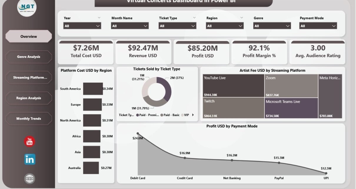
1. Overview Page
The Overview Page serves as the main command center for virtual concert monitoring. At the top, dynamic KPI cards display Total Cost USD, Revenue USD, Profit USD, Profit Margin %, and Avg. Audience Rating for instant executive-level insights. Below the cards, interactive charts present Platform Cost USD by Region showing how spending is distributed across geographic markets, Tickets Sold by Ticket Type breaking down sales across different ticket categories, Artist Fee USD by Streaming Platform comparing artist costs across streaming channels, and Profit USD by Payment Mode revealing which payment methods generate the highest profitability. Multiple slicers on the page allow instant filtering for focused analysis.
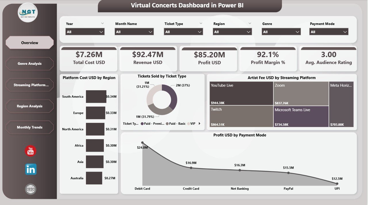
Overview Page
2. Genre Analysis
The Genre Analysis page helps you understand which music genres drive the most revenue and which ones eat into your marketing budget. This page features three powerful visualizations: Marketing Cost USD by Genre comparing promotional spending across music categories, Revenue USD by Genre identifying top-earning genres, and Profit Margin % by Genre revealing which genres deliver the highest returns on investment. Use this page to optimize your genre strategy and allocate marketing budgets more effectively. For similar analytics in a spreadsheet format, explore the Virtual Concerts Dashboard in Excel.
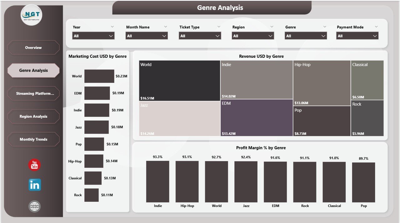
Genre Analysis
3. Streaming Platform Analysis
The Streaming Platform Analysis page evaluates the effectiveness of different streaming channels for your virtual concerts. Charts include Platform Cost USD by Streaming Platform tracking operational costs per platform, Revenue USD by Streaming Platform comparing revenue generation across channels, and Tickets Sold by Streaming Platform measuring audience reach across platforms. This page is essential for deciding where to invest your streaming resources and which platforms deliver the best return on investment. Also explore the Music and Performing Arts Dashboard in Power BI for broader entertainment analytics.
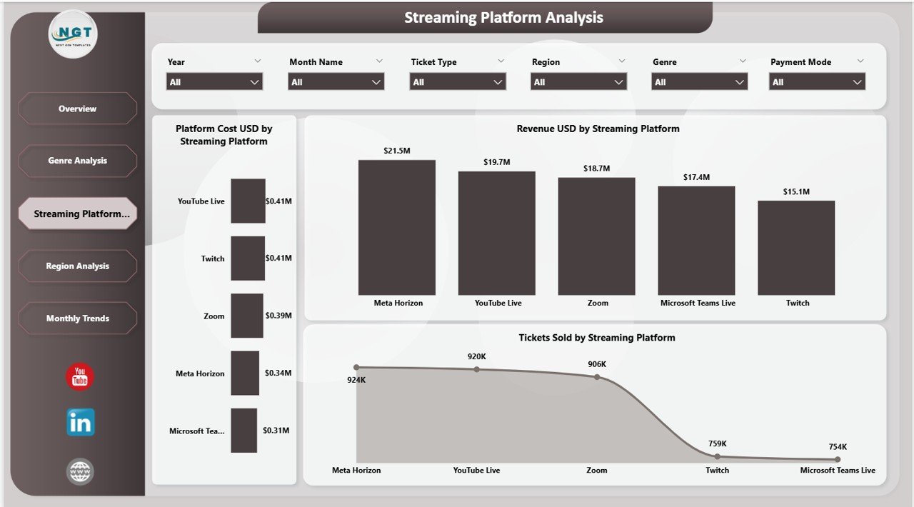
Streaming Platform Analysis
4. Region Analysis
The Region Analysis page provides geographic performance insights for your virtual concert operations. Charts display Total Viewers by Region measuring audience reach across different geographies, Marketing Cost USD by Region tracking promotional spend by location, and Profit USD by Region identifying your most profitable markets. This page helps event organizers understand which regions deliver the best audience engagement and highest profitability for virtual events. Browse more Power BI Dashboard Templates for additional analytics solutions.
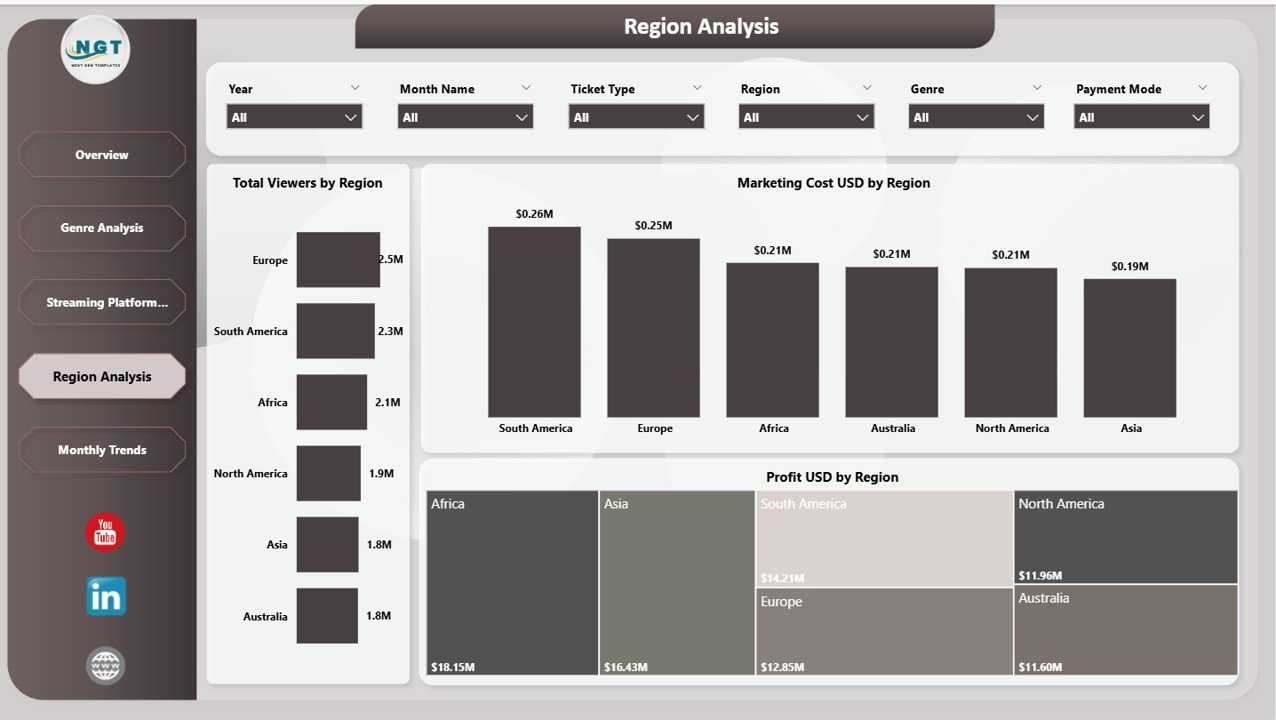
Region Analysis
5. Monthly Trends
The Monthly Trends page tracks time-based performance patterns for your virtual concert operations. Charts include Profit Margin % by Month Name monitoring profitability trends over time, Total Cost USD by Month Name tracking expense patterns across the year, and Avg. Audience Rating by Month Name measuring viewer satisfaction trends. This page is essential for seasonal planning, identifying peak performance months, and making long-term strategic decisions for future virtual events.
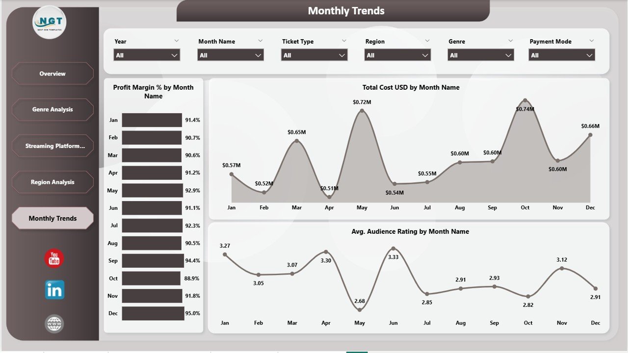
Monthly Trends
Advantages of Virtual Concerts Dashboard in Power BI
- Centralized Analytics – Eliminates the need for multiple spreadsheets by bringing all virtual concert metrics into one interactive dashboard.
- Instant Decision-Making – KPI cards and dynamic charts provide real-time insights for faster business decisions.
- Multi-Dimensional Analysis – Analyze performance across genre, platform, region, payment mode, and time dimensions simultaneously.
- Cost Optimization – Identify which platforms and genres deliver the best ROI to optimize spending and maximize profitability.
- Cloud Publishing – Publish to Power BI Service for team-wide access, collaboration, and automated data refresh.
Opportunities for Improvement
- Adding individual artist-level performance tracking would help artist managers evaluate specific talent performance metrics.
- Including a comparison view between virtual and in-person events could help hybrid event organizers make better format decisions.
- A sponsor revenue page could add value for organizations that monetize virtual concerts through sponsorship deals.
Best Practices
- Update your data regularly to keep KPI cards and trend charts current and actionable.
- Use slicers strategically to focus on specific genres, platforms, or regions during team meetings and reviews.
- Compare monthly trends year-over-year to identify growth patterns and seasonal opportunities.
- Share the published Power BI report with stakeholders for collaborative decision-making across departments.
- Refer to Microsoft Power BI documentation for advanced customization and data connection tips.
Explore Relevant Templates
- Virtual Concerts Dashboard in Excel – The Excel version with pivot-powered charts and interactive slicers for offline analysis.
- Music and Performing Arts Dashboard in Power BI – Track concerts, theatre shows, and live events with venue utilization analytics.
- Boutique Hotels Dashboard in Power BI – 5-page Power BI dashboard for hospitality analytics with revenue, guest, and property tracking.
Frequently Asked Questions
What is the best Power BI dashboard template for tracking virtual concerts?
The Virtual Concerts Dashboard in Power BI from NextGenTemplates is one of the best templates available. It includes 5 interactive pages covering financial overview, genre analysis, streaming platform comparisons, regional performance, and monthly trends with KPI cards and dynamic slicers.
How do I use a virtual concert dashboard in Power BI?
Download the .pbix file, open it in Power BI Desktop, replace the sample data with your actual virtual concert records, and click Refresh. All charts, KPI cards, and slicers update automatically with your data.
Can I compare streaming platform performance with this dashboard?
Yes. The dedicated Streaming Platform Analysis page lets you compare Platform Cost, Revenue, and Tickets Sold across different streaming platforms to determine which channels deliver the best return on investment.
What KPIs does this virtual concert dashboard track?
The dashboard tracks Total Cost USD, Revenue USD, Profit USD, Profit Margin %, and Avg. Audience Rating. These metrics are analyzed across genre, streaming platform, region, ticket type, payment mode, and monthly dimensions.
Is this dashboard suitable for music production companies?
Absolutely. Music production companies can use the Genre Analysis and Streaming Platform Analysis pages to identify their most profitable music genres, optimize marketing budgets, and evaluate which streaming platforms deliver the highest audience engagement and revenue.
Do I need coding skills to use this Power BI template?
No coding is required. The template is fully pre-built with charts, slicers, and KPI cards. Simply connect your data source, refresh, and start analyzing your virtual concert performance immediately.
Conclusion
The Virtual Concerts Dashboard in Power BI is an essential analytics tool for anyone managing virtual concerts, online music events, or hybrid live entertainment operations. With 5 interactive pages, powerful KPI tracking, genre and platform analysis, regional insights, and monthly trend monitoring, this dashboard gives you everything you need to make smarter, faster, and more profitable decisions.
Click here to Purchase Virtual Concerts Dashboard in Power BI
Visit our YouTube channel for step-by-step video tutorials: Youtube.com/@PK-AnExcelExpert