Brand Consulting Dashboard in Power BI is a powerful, ready-to-use Power BI dashboard template designed for brand consultants, marketing agency owners, strategy professionals, and consulting firms who need instant visibility into project fees, profitability, service analysis, regional insights, and consultant performance. This interactive Power BI dashboard includes 5 dedicated analysis pages that track key metrics including Total Project Fee, Total Cost, Profit, Total Records, and Profit Margin% — giving you complete visibility into your brand consulting operations at a glance.
Whether you are a Brand Consultant, Marketing Director, Agency Owner, or Strategy Lead, this ready-to-use template lets you analyze service type distribution, track profit margins by consultant, compare project fees across industries, and monitor regional performance — all from a single Power BI file. In this detailed blog post, we will walk you through every page and feature of the Brand Consulting Dashboard in Power BI so you can understand exactly what this template offers before you download it.
Click to buy Brand Consulting Dashboard in Power BI
Key Features of Brand Consulting Dashboard in Power BI
The Brand Consulting Dashboard in Power BI includes 5 interactive dashboard pages — Overview, Service Analysis, Regional Insights, Consultant Performance, and Project Tracking — that provide a 360-degree view of your brand consulting operations. The Overview page displays 5 KPI cards (Total Project Fee, Total Cost, Profit, Total Records, and Profit Margin%) along with charts showing Total Project Fee by Industry and Total Project Fee and Total Cost by Month Name. Multiple slicers allow instant filtering across all dimensions including industry, service type, region, and consultant.
The dashboard is built for Power BI Desktop and requires no coding — simply open the .pbix file, replace the sample data with your own, and click Refresh to see all visuals update instantly. This makes it ideal for both beginners and experienced Power BI users who want a professional consulting analytics solution without building one from scratch.
Dashboard Pages Explanation
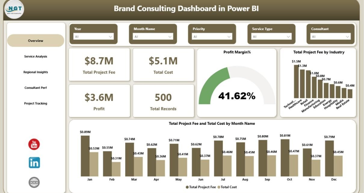
1 — Overview Page
The Overview page is the main executive summary view of the Brand Consulting Dashboard in Power BI. At the top, you will find 5 high-level KPI cards that display Total Project Fee, Total Cost, Profit, Total Records, and Profit Margin% — providing an instant snapshot of your consulting business health. Below the cards, the page features two key charts: Total Project Fee by Industry shows which sectors generate the most revenue for your consulting practice, while Total Project Fee and Total Cost by Month Name reveals monthly revenue trends and cost patterns. Multiple slicers are available on this page to filter the entire dashboard by industry, service type, region, consultant, or time period.
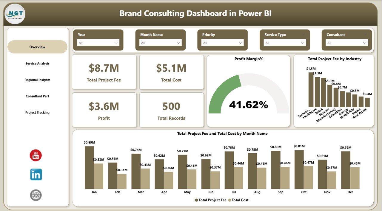 Brand Consulting Dashboard in Power BI
2 — Service Analysis
The Service Analysis page provides a deep dive into your consulting services performance. It features three analytical views: Total Records by Service Type breaks down the volume of engagements across different service categories like brand strategy, visual identity, market research, and digital branding. Total Records by Priority shows how projects are distributed across High, Medium, and Low priority levels. Total Project Fee and Total Cost by Service Type compares revenue and expenses for each service, helping you identify which services are most profitable and where costs may be exceeding expectations.
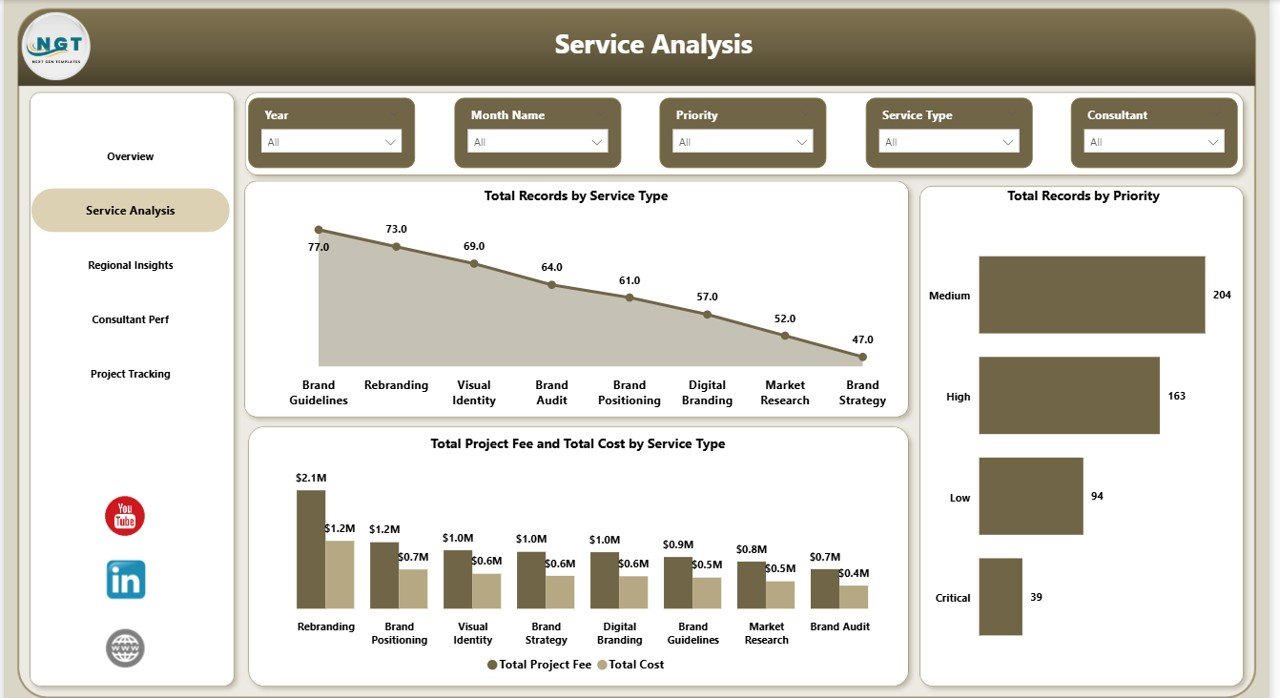 Service Analysis
3 — Regional Insights
The Regional Insights page analyzes geographic performance of your brand consulting operations. It presents three key visualizations: Total Project Fee by Region identifies which regions generate the most consulting revenue. Total Records by Region shows the distribution of consulting engagements across different geographic areas. Completed Count by Region tracks project completion rates by location, helping you understand which regions have the highest delivery efficiency and where operational improvements may be needed.
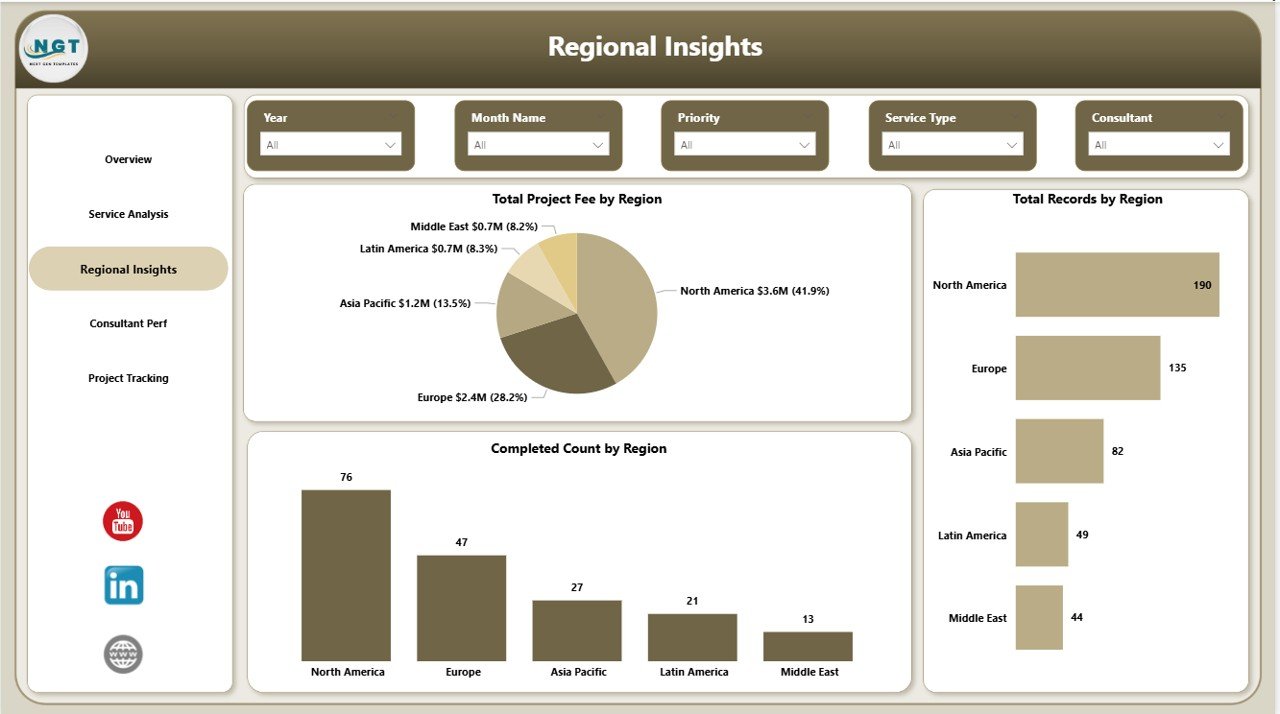 Regional Insights
4 — Consultant Performance
The Consultant Performance page tracks individual team member productivity and profitability. It includes three charts: Total Deliverables by Consultant shows the output volume for each team member. Profit Margin% by Consultant reveals which consultants generate the highest margins on their projects. Total Hours by Consultant displays the time investment for each consultant, enabling you to assess productivity, utilization rates, and identify top performers or team members who may need additional support.
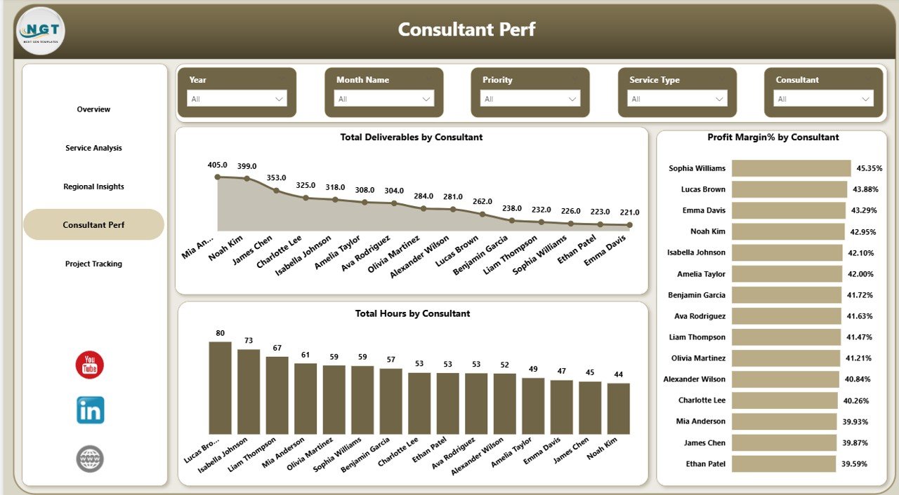 Consultant Performance
5 — Project Tracking
The Project Tracking page monitors project lifecycle metrics to help you manage your consulting pipeline effectively. It features three visualizations: Total Project Fee by Project Phase shows the revenue distribution across different project stages such as Discovery, Strategy, Execution, and Review. Total Records by Project Phase displays the number of projects in each phase. Profit by Project Phase reveals which stages of your consulting workflow are most profitable, helping you optimize resource allocation and pricing strategies across the project lifecycle.
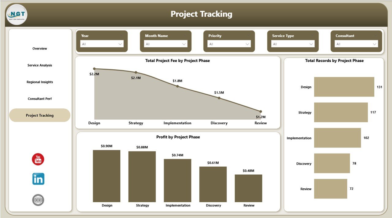 Project Tracking
Advantages of Brand Consulting Dashboard in Power BI
This dashboard centralizes all your brand consulting analytics into a single Power BI file, eliminating the need to review multiple spreadsheets and reports. With 5 dedicated analysis pages and interactive slicers, you can quickly drill down into any dimension — whether it is a specific industry, region, service type, or consultant. The visual KPI cards on the Overview page give executives an instant performance snapshot, while the detailed pages provide the granular insights that operational managers need for day-to-day decision-making.
Because the dashboard runs on Power BI Desktop (free from Microsoft), you do not need any additional software licenses. Simply connect your data source, click Refresh, and all charts update automatically. This makes it a cost-effective analytics solution for consulting firms of all sizes — from solo brand strategists to large marketing agencies managing dozens of consultants across multiple regions.
Opportunities for Improvement
While the dashboard provides comprehensive analytics across 5 pages, users with very large consulting portfolios may want to add additional DAX measures for advanced metrics like client lifetime value, retention rates, or average project duration. The template can be extended with custom calculated columns to support more complex business scenarios. Additionally, connecting the dashboard to live data sources like SharePoint or SQL Server could enable real-time monitoring instead of periodic manual refreshes.
Best Practices
To get the most out of the Brand Consulting Dashboard in Power BI, maintain consistent data entry in your source file — use standardized service type names, region codes, and consultant names across all records. Refresh the dashboard weekly or monthly depending on your reporting cycle. Use the slicer filters strategically to create focused views for different stakeholders — executives may prefer the Overview page, while team leads benefit from the Consultant Performance and Project Tracking pages. Consider publishing the dashboard to Power BI Service for easy sharing with your team.
Explore Relevant Templates
If you found the Brand Consulting Dashboard in Power BI useful, you may also be interested in these related templates from NextGenTemplates:
- Brand Consulting Dashboard in Excel — The Excel version of this dashboard with pivot-powered charts, slicer filters, and 7 sheet tabs including Data Sheet and Support Sheet.
- Cloud Migration Services Dashboard in Power BI — Track cloud migration projects, budgets, platform performance, and industry breakdown.
- Financial Auditing Dashboard in Power BI — Monitor audit progress, risk findings, compliance performance, and departmental analytics.
Browse all Power BI Dashboard Templates on NextGenTemplates.
Frequently Asked Questions
What KPIs does the Brand Consulting Dashboard in Power BI track?
The Brand Consulting Dashboard in Power BI tracks 5 key performance indicators on the overview page: Total Project Fee, Total Cost, Profit, Total Records, and Profit Margin%. Additional metrics across 5 analysis pages include Total Project Fee by Industry, Fee vs Cost by Month, Records by Service Type, Records by Priority, Fee by Region, Completed Count by Region, Deliverables by Consultant, Hours by Consultant, Profit Margin% by Consultant, Fee by Project Phase, and Profit by Project Phase.
Do I need advanced Power BI skills to use this dashboard?
No. Simply open the .pbix file in Power BI Desktop, replace the sample data with your own, and click Refresh. All charts and visuals update automatically with zero coding required.
Can I customize this brand consulting dashboard with my own data?
Yes. Replace the sample data in the connected data source file with your own consulting engagement records. Then click Refresh in Power BI Desktop and all 5 dashboard pages will update automatically with your data.
Is this template suitable for marketing agencies managing multiple clients?
Absolutely. The dashboard includes dedicated pages for Service Analysis, Regional Insights, and Consultant Performance that let you track metrics across multiple clients, regions, and team members simultaneously.
What is the best Power BI dashboard template for brand consulting?
The Brand Consulting Dashboard in Power BI from NextGenTemplates is the best Power BI dashboard template for brand consulting professionals. It includes 5 interactive analysis pages, multiple charts, 5 KPI cards, slicer filters, and dedicated pages for service analysis, regional insights, consultant performance, and project tracking.
How do I download the Brand Consulting Dashboard in Power BI?
You can purchase and download the Brand Consulting Dashboard in Power BI directly from NextGenTemplates. After purchase, unzip the downloaded file, open the .pbix file in Power BI Desktop, and start analyzing your consulting data immediately.
Conclusion
The Brand Consulting Dashboard in Power BI is a comprehensive analytics solution that transforms your brand consulting data into actionable business insights. With 5 interactive pages covering overview metrics, service analysis, regional performance, consultant productivity, and project tracking, this dashboard gives brand consultants, marketing agencies, and strategy professionals everything they need to monitor operations and drive profitability.
Click here to Purchase Brand Consulting Dashboard in Power BI
Visit our YouTube channel for step-by-step video tutorials: Youtube.com/@PK-AnExcelExpert


