Coffee Chains Dashboard in Power BI is an interactive, ready-to-use Power BI analytics template that empowers coffee chain owners, franchise managers, F&B analysts, and retail consultants to monitor orders, revenue, profitability, product performance, regional metrics, and customer channel behavior across multiple coffee chain outlets. This comprehensive Power BI dashboard features 5 dedicated analysis pages — Overview, Chain Performance, Product Analysis, Regional Insights, and Customer & Channel — providing complete visibility into every aspect of your coffee business operations.
Click to Purchases Coffee Chains Dashboard in Power BI
If you are managing a coffee franchise, a network of coffee shops, or even a single high-volume cafe, this Coffee Chains Dashboard in Power BI transforms raw transaction data into actionable visual insights. The dashboard tracks 5 key metrics including Total Orders, Total Revenue, Avg Revenue Per Order, Total Cost, and Completed Orders across 5 interactive pages with dynamic slicers for instant drill-down analysis.
Key Features of Coffee Chains Dashboard in Power BI
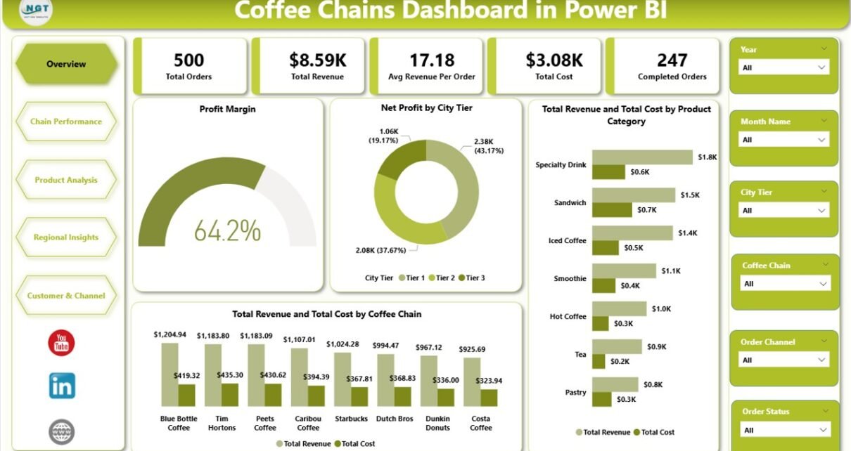
The Coffee Chains Dashboard in Power BI includes 5 interactive dashboard pages that deliver comprehensive analytics for coffee chain operations. On the Overview page, you get 5 dynamic KPI cards showing Total Orders, Total Revenue, Avg Revenue Per Order, Total Cost, and Completed Orders at a glance. The dashboard provides Profit Margin analysis, Net Profit comparison by City Tier, and Revenue vs Cost breakdowns by both Product Category and Coffee Chain — all on the first page itself.
The Chain Performance page offers a dedicated deep-dive into individual chain performance, comparing Net Profit, Avg Revenue Per Order, and Completed Orders across different coffee chain brands. The Product Analysis page covers Total Quantity, Profit Margin, and Total Revenue by Product Category. Regional Insights tracks revenue by City Tier, customer ratings by Region, and Revenue vs Cost by Store Type. The Customer and Channel page rounds out the analytics with Loyalty Member impact, Order Channel satisfaction ratings, and Customer Type revenue distribution.
Multiple interactive slicers on the Overview page allow instant filtering across coffee chains, product categories, regions, city tiers, customer types, and order channels. Every chart and visual auto-updates when you refresh your data source — no coding, no macros, no manual chart edits required.
Dashboard Pages Explained
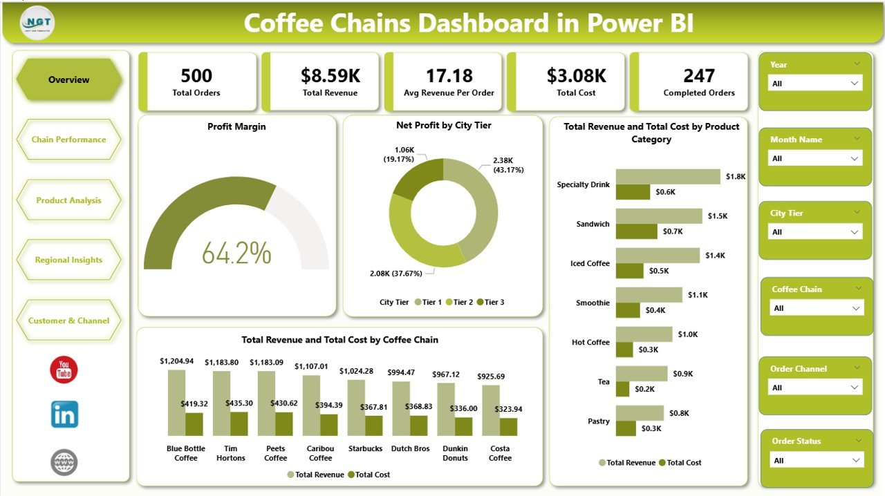
1 — Overview Page
The Overview page serves as the executive summary of your coffee chain analytics. It features 5 KPI cards displaying Total Orders, Total Revenue, Avg Revenue Per Order, Total Cost, and Completed Orders. The charts on this page include Profit Margin showing overall profitability health, Net Profit by City Tier comparing metro vs non-metro profitability, Total Revenue and Total Cost by Product Category revealing which product lines drive the most revenue and where costs are concentrated, and Total Revenue and Total Cost by Coffee Chain comparing financial performance across different chain brands. Dynamic slicers allow you to filter the entire dashboard with a single click.
Coffee Chains Dashboard in Power BI2 — Chain Performance
The Chain Performance page provides a detailed comparison of individual coffee chain brands. It includes charts for Net Profit by Coffee Chain revealing which chains generate the highest profits, Avg Revenue Per Order by Coffee Chain comparing average ticket sizes and spending patterns across brands, and Completed Orders by Coffee Chain measuring order fulfillment volume and operational efficiency across your chain network. This page is essential for identifying top-performing outlets and those that need improvement.
Click to Purchases Coffee Chains Dashboard in Power BI
 Chain Performance
3 — Product Analysis
The Product Analysis page gives you a granular view of product-level performance. It features Total Quantity by Product Category comparing sales volumes across different coffee product types, Profit Margin by Product Category identifying which product lines deliver the highest margins, and Total Revenue by Product Category tracking revenue contribution from each product category. Use this page to optimize your product mix, identify best sellers, and discontinue underperforming items.
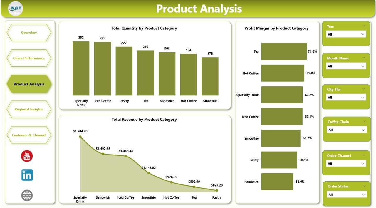 Product Analysis
4 — Regional Insights
The Regional Insights page delivers geographic performance analytics including Total Revenue by City Tier showing how revenue distributes across metropolitan and non-metropolitan markets, Avg Customer Rating by Region measuring customer satisfaction levels across different geographic areas, and Total Revenue and Total Cost by Store Type comparing performance across different store formats such as flagship stores, kiosks, and drive-throughs.
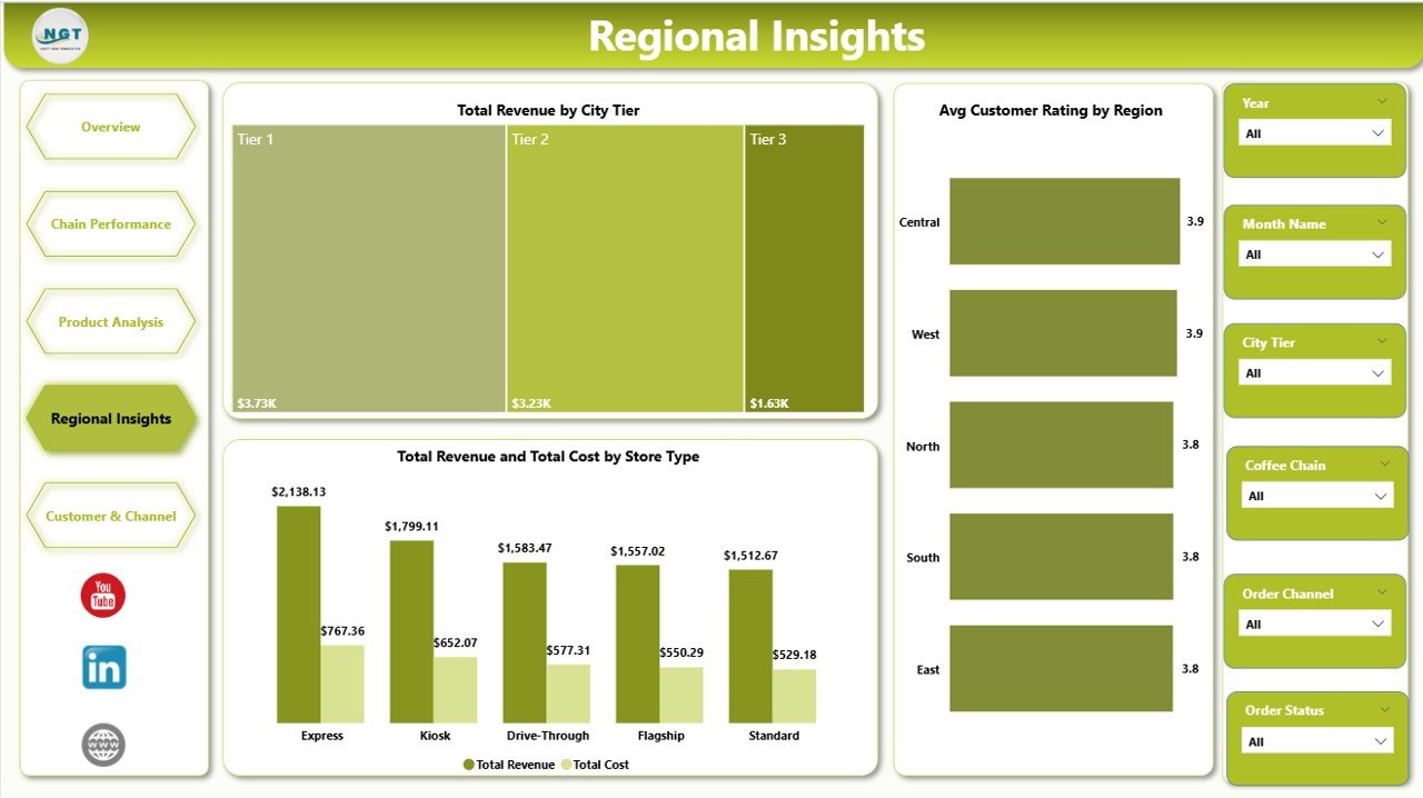 Regional Insights
5 — Customer and Channel
The Customer and Channel page focuses on customer segmentation and ordering behavior. It features Total Revenue and Total Cost by Loyalty Member analyzing the financial impact of loyalty programs on your bottom line, Avg Customer Rating by Order Channel comparing satisfaction levels across online, in-store, delivery, and other ordering channels, and Total Revenue by Customer Type showing how different customer segments such as new customers, returning customers, and premium customers contribute to overall revenue.
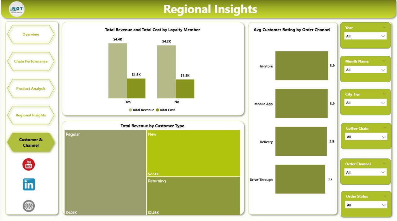 Customer and Channel
Advantages of Coffee Chains Dashboard in Power BI
- Centralized Analytics — All 5 dashboard pages in one .pbix file eliminate the need for multiple spreadsheets and disconnected reports.
- Interactive Filtering — Power BI slicers enable instant cross-filtering across all pages for targeted analysis.
- Zero Coding Required — No DAX formulas or Power Query transformations to configure. Connect your data and refresh.
- Cost-Effective — Uses Power BI Desktop which is free from Microsoft. No enterprise license required to get started.
- Shareable — Publish to Power BI Service for team-wide access and real-time collaboration.
- Complements Excel Version — Works alongside the Coffee Chains Dashboard in Excel for teams that use both platforms.
Opportunities for Improvement
- Adding time-series forecasting visuals to predict future revenue trends based on historical data patterns.
- Incorporating a drill-through page for individual store-level analytics.
- Adding customer cohort analysis to track retention and repeat purchase behavior over time.
- Including a benchmarking page that compares your chains against industry averages.
Best Practices
- Update your data source regularly (weekly or monthly) and click Refresh in Power BI Desktop to keep all visuals current.
- Use the slicers on the Overview page to create focused views for specific chains, regions, or product categories before presenting to stakeholders.
- Export filtered views as PDFs for sharing with team members who do not have Power BI Desktop installed.
- Combine this dashboard with the Excel version to provide both interactive and static reporting options for different audiences.
- Refer to Microsoft Learn Power BI documentation for advanced customization techniques.
Explore Relevant Templates
- Coffee Chains Dashboard in Excel — The pivot-powered Excel version with slicers and 5 dashboard pages for the same coffee chain analytics.
- Food and Beverage Dashboard in Excel — Comprehensive analytics covering the entire food and beverage industry.
- Restaurants & Food Services KPI Dashboard in Excel — KPI tracking for restaurants and food service operations.
- Franchise Performance KPI Dashboard in Excel — Track franchise-level KPIs with MTD, YTD, and target comparisons.
Frequently Asked Questions
What KPIs does the Coffee Chains Dashboard in Power BI track?
The Coffee Chains Dashboard in Power BI tracks 5 key performance indicators on its Overview page: Total Orders, Total Revenue, Avg Revenue Per Order, Total Cost, and Completed Orders. Additional analytics across 5 interactive pages include Profit Margin analysis, Net Profit by City Tier, revenue and cost breakdowns by Product Category and Coffee Chain, product quantity and profitability by category, regional revenue by City Tier, customer ratings by Region and Order Channel, and loyalty member impact analysis.
Do I need advanced Power BI skills to use this dashboard?
No. Simply open the .pbix file in Power BI Desktop, connect or replace the sample data with your own coffee chain records, and click Refresh. All 5 dashboard pages with charts, KPI cards, and slicers update automatically. No DAX coding or complex modeling is required.
Can I compare multiple coffee chains side by side?
Yes. The Chain Performance page is specifically designed to compare Net Profit, Avg Revenue Per Order, and Completed Orders across different coffee chain brands simultaneously.
How is this different from the Coffee Chains Dashboard in Excel?
The Power BI version provides more interactive filtering, automatic visual updates, drill-through capabilities, and the ability to publish and share dashboards online via Power BI Service. The Excel version uses pivot tables and slicers for similar analytics within Microsoft Excel.
What is the best Power BI dashboard template for coffee chain analysis?
The Coffee Chains Dashboard in Power BI from NextGenTemplates is one of the best available options. It includes 5 interactive pages covering overview KPIs, chain performance comparison, product-level profitability, regional insights, and customer channel segmentation — all in one .pbix file.
Can I customize this dashboard with my own branding?
Yes. Power BI Desktop allows full customization of colors, fonts, chart types, and layouts. You can apply your brand theme to make this dashboard match your company’s visual identity.
Conclusion
Click to Purchases Coffee Chains Dashboard in Power BI
The Coffee Chains Dashboard in Power BI is the ultimate analytics solution for coffee business professionals who want instant visibility into orders, revenue, profitability, product performance, regional metrics, and customer behavior. With 5 interactive pages, 5 KPI cards, dynamic slicers, and zero coding requirements, this dashboard transforms your raw data into professional-grade visual insights in minutes. Download it today and take your coffee chain analytics to the next level!
Visit our YouTube channel for step-by-step tutorials: Youtube.com/@PK-AnExcelExpert
Click to Purchases Coffee Chains Dashboard in Power BI