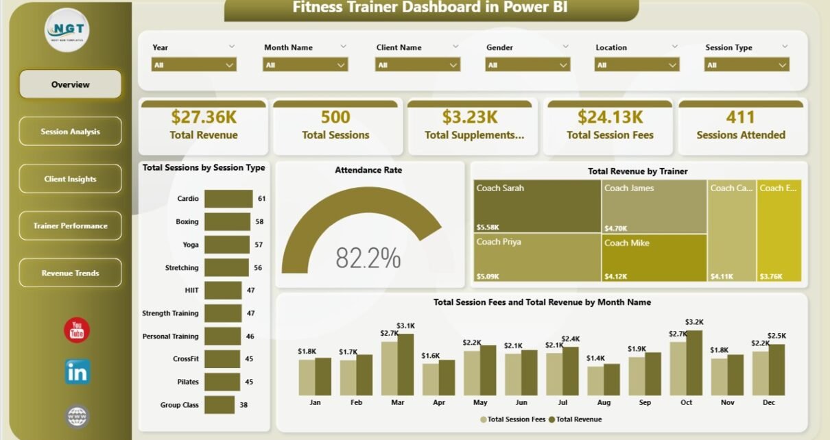
Personal trainers lose track of which trainer, which time slot, and which session type actually pays — 62% of independent fitness operators rely on pen-and-paper or scattered spreadsheets to run their business, and IBISWorld pegs the US personal training market at over $14 billion. The Fitness Trainer Dashboard in Power BI solves that data visibility gap in a single .pbix file: 5 KPI cards, 14 charts, and 5 analysis pages that refresh automatically when you drop in your session records.
This dashboard is built for personal trainers, boutique studio owners, and small gym chains who want trainer-level revenue, attendance, and supplement-sales analytics without paying $129–$349 a month for a full gym management SaaS. Setup takes under 10 minutes — and every filter, slicer, and visual stays synchronized across all five pages.
Key Features of the Fitness Trainer Dashboard in Power BI
The Fitness Trainer Dashboard in Power BI ships with a production-ready data model and five interconnected report pages. Here is what is bundled in the .pbix file:
- 5 High-Level KPI Cards on the Overview page — Total Revenue, Total Sessions, Total Supplements Revenue, Total Session Fees, and Sessions Attended.
- 14 Analytical Charts across five pages covering session type, attendance rate, trainer revenue, equipment utilization, time-slot popularity, age group, referral source, and membership type.
- Trainer-Level Performance Scoring — rank every trainer by Total Calories Burned, Avg Client Rating, and Total Revenue in a single view.
- Separate Revenue Streams — session fees and supplements revenue tracked independently so you always know which part of the business is growing.
- Cross-Page Slicers — filter by trainer, location, session type, membership, or month, and every card, chart, and visual updates instantly.
- Open Data Model — connect to SQL, Excel, Google Sheets, or a CSV export; edit DAX measures; rebrand with your studio colours and logo.
Dashboard Pages Explanation
The Fitness Trainer Dashboard in Power BI is organized into five focused pages. Each page answers a specific category of business question — from top-line health on the Overview, to trainer-by-trainer performance, to monthly revenue forecasting.
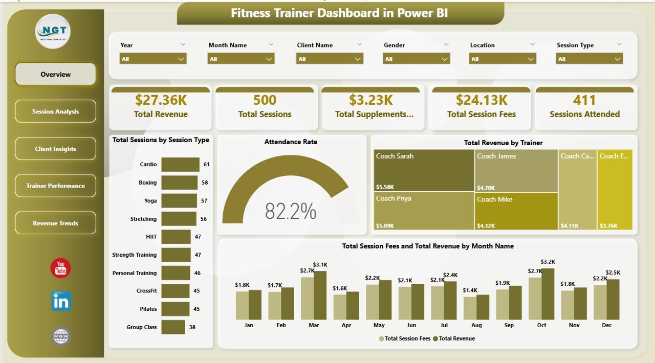
1. Overview Page
The landing page opens with five KPI cards — Total Revenue, Total Sessions, Total Supplements Revenue, Total Session Fees, and Sessions Attended — so you can read the weekly pulse of the business in three seconds. Below the cards sit four analytical charts: Total Sessions by Session Type, Attendance Rate, Total Revenue by Trainer, and Total Session Fees and Total Revenue by Month Name. The slicer pane at the top filters the entire page — pick a trainer, a location, or a date range, and every visual re-renders instantly.
Overview
2. Session Analysis
This page is the operations hub. Total Revenue by Equipment Used shows which machines and equipment drive the most revenue — critical for capex planning. Total Sessions by Time Slot surfaces when the studio is actually busy, and Total Revenue by Session Type compares earnings across personal training, group classes, bootcamps, and speciality formats. Use this page to decide what to buy, when to schedule staff, and which session formats to push in marketing.
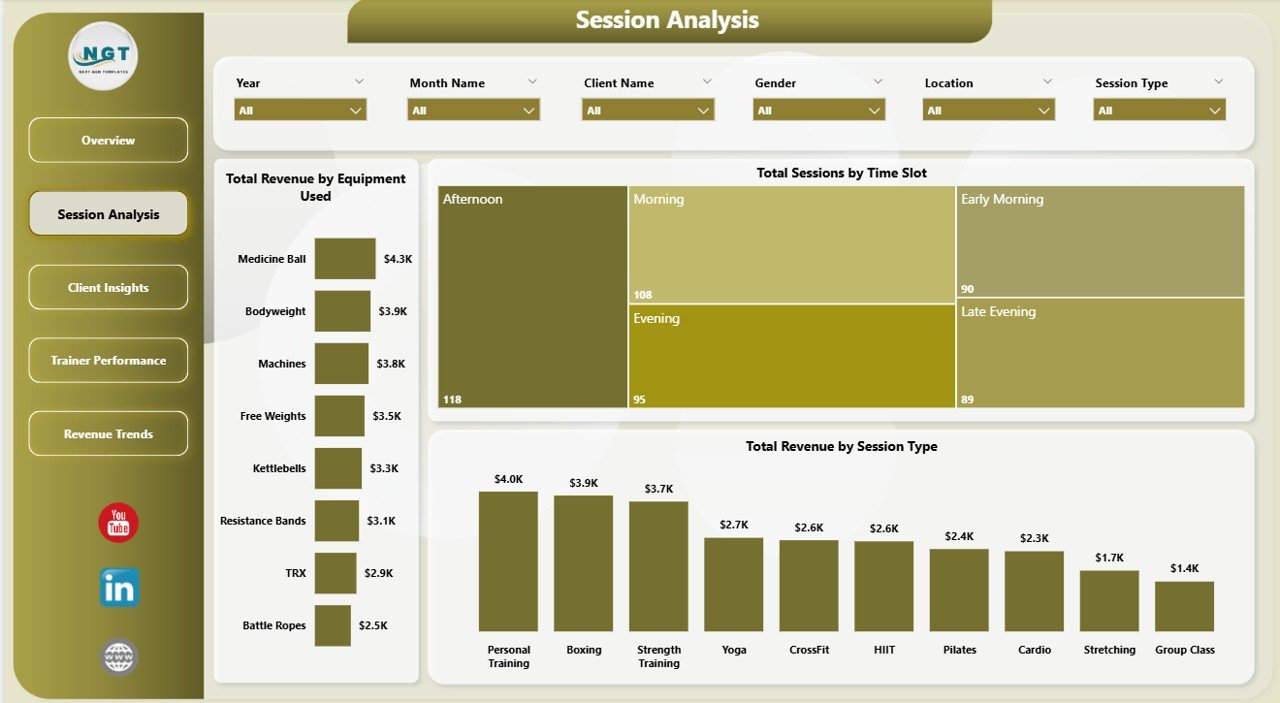
Session Analysis
3. Client Insights
The marketing and retention page. Total Sessions by Referral Source reveals which channel — social, word of mouth, paid ads, or walk-in — actually converts. Total Revenue by Age Group shows which demographic spends the most per session. Total Revenue by Membership Type tells you whether your annual members, monthly subscribers, or drop-ins drive the bulk of revenue. Together, these three visuals inform your acquisition spend and your package design.
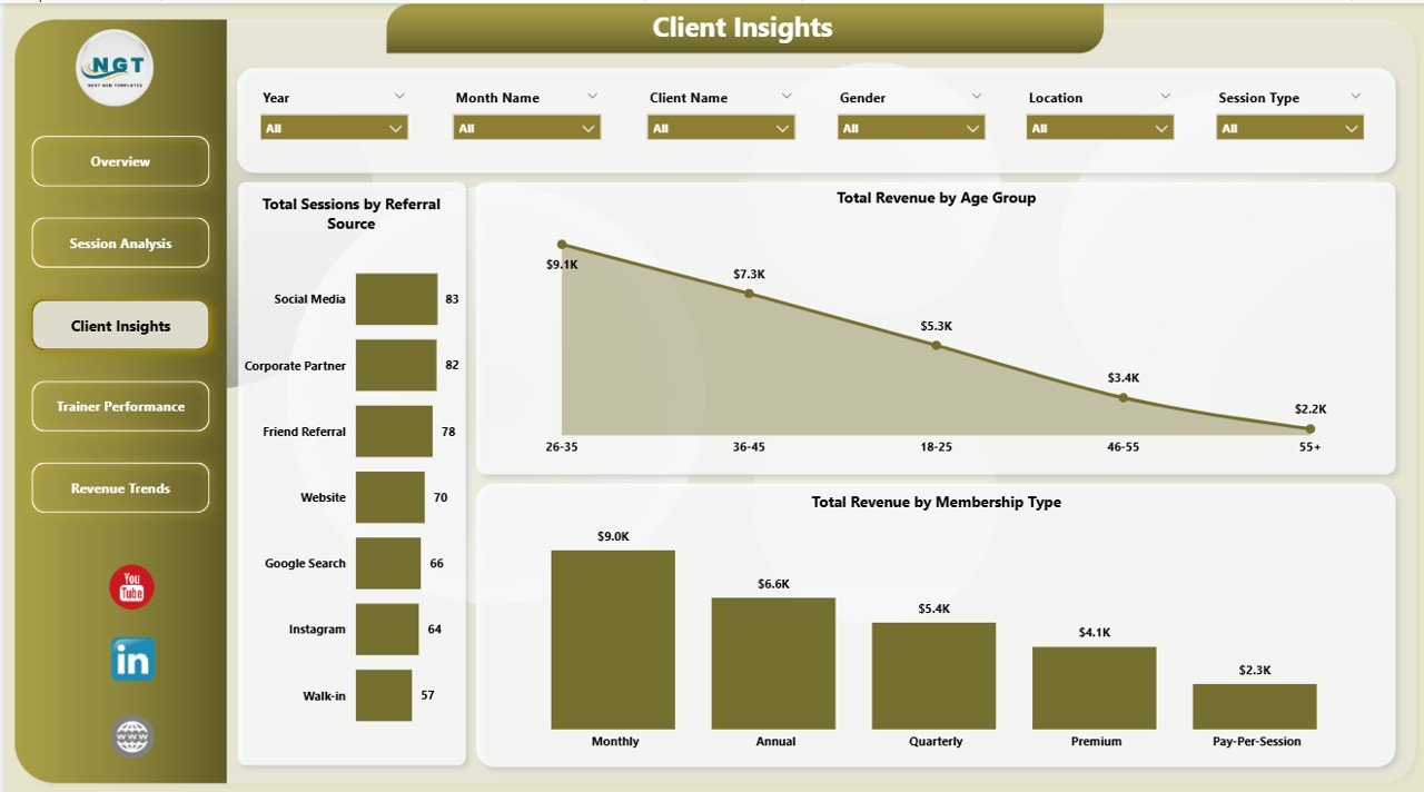
Client Insights
4. Trainer Performance
The team-management page. Total Calories Burned by Trainer surfaces workout intensity per coach — useful for spotting under-utilized trainers. Avg Client Rating by Trainer shows client satisfaction as a direct score. Total Revenue by Location compares outlets side-by-side if you run a multi-site business. This page is ideal for quarterly performance reviews, bonus calculations, and deciding where to invest in trainer development.
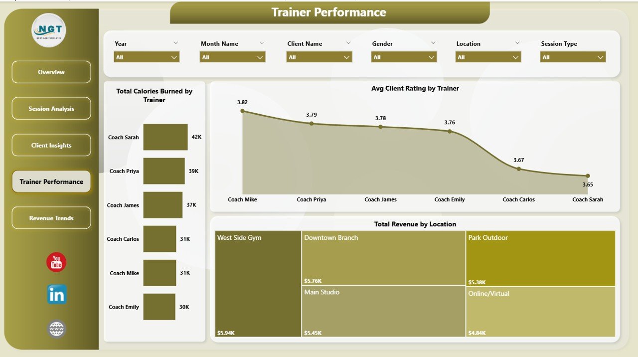
Trainer Performance
5. Revenue Trends
The financial forecasting page. Total Supplements Revenue by Month Name shows the secondary income trend — supplements, merch, protein bars. Total Revenue by Time Slot tells you which hours pay the bills, and Total Revenue by Attendance Status contrasts revenue captured from attended sessions against revenue lost to no-shows and cancellations. Use this page to set cancellation policies, rework pricing, and project next quarter’s cash flow.
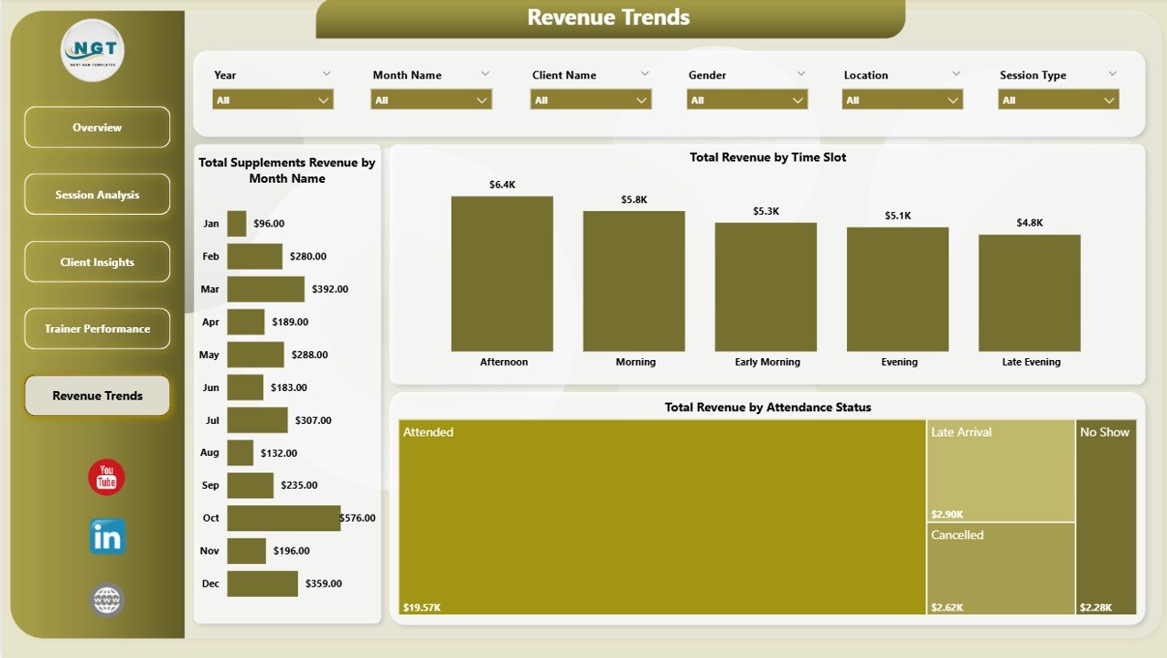
Revenue Trends
Fitness Trainer Dashboard in Power BI vs. Tableau vs. Paid Gym SaaS — Feature Comparison
| Feature | Fitness Trainer Dashboard in Power BI | Tableau / Qlik Equivalent | Paid Gym SaaS (Mindbody / Glofox / Trainerize) |
|---|---|---|---|
| Cost | $17.99 one-time | $70 / user / month | $129–$349 / month per studio |
| Platform | Power BI Desktop (free) | Tableau Desktop (paid) | Cloud SaaS (subscription) |
| Setup time | Under 10 minutes | Hours of data modeling | Days of onboarding + training |
| Pre-built KPIs | ✅ 5 KPIs, 14 charts, 5 pages | ❌ Build from scratch | ✅ But locked to vendor schema |
| Trainer-level revenue | ✅ Included | Build manually | ✅ Higher tiers only |
| Supplements revenue split | ✅ Separate lane | Build manually | ❌ Often bundled |
| Attendance Rate analysis | ✅ Page 1 KPI | Build manually | ✅ Varies by plan |
| Year-1 cost at 5 users | $17.99 total | $4,200 | $1,548–$4,188 |
| Data ownership | ✅ Your .pbix, your data | ✅ Local + cloud | ❌ Vendor-hosted |
For studios and personal trainers who want trainer-level revenue, attendance, and supplements analytics without paying $1,500+ a year for Mindbody or Glofox, the Fitness Trainer Dashboard in Power BI sits in the sweet spot.
Who Should Use This Template
Perfect for:
- Personal trainers managing 20–200 clients tracking sessions in a spreadsheet or CRM export
- Boutique studio owners with 2–15 trainers running quarterly performance reviews
- Fitness franchise operators with 2–10 locations comparing revenue per site
- Bootcamp, yoga, pilates, and crossfit studios selling supplements alongside sessions
- Power BI users who want a finished trainer-analytics template to customize
Not a fit if:
- You run a 50+ location chain needing enterprise SSO, SOC 2, and 24/7 support
- You don’t already keep session records in a spreadsheet, CSV, or CRM export
- You need a client-booking and payments system (this is analytics, not management)
- You aren’t open to installing Power BI Desktop (it’s a free Microsoft download, Windows only)
Real-World Use Cases
Maya runs a 3-trainer personal training studio in Austin. Every Monday morning she opens the Trainer Performance page and reviews Total Revenue by Trainer and Avg Client Rating by Trainer — the two charts show her instantly who is over-delivering and who needs coaching conversations. She replaced a $229/month Mindbody Core plan with the Fitness Trainer Dashboard in Power BI and her quarterly reviews now take 15 minutes instead of two hours.
Arjun owns a small gym chain with four locations across Pune. The Revenue Trends page showed him that one outlet was outselling the largest location on supplements despite half the foot traffic. He re-stocked and doubled that income stream in a quarter. He uses Total Revenue by Location every month to decide where to hire next, and the supplements revenue split is now a standing agenda item at his leadership meeting.
Chloe is a freelance fitness coach with 40 online clients. She drops her weekly Google Sheets export into the Power BI data source, clicks Refresh, and uses Total Sessions by Time Slot plus Attendance Rate to see which time blocks are worth keeping. She dropped three underperforming slots and replaced them with high-rated morning sessions — her attended-sessions count jumped 22% in six weeks.
Advantages of the Fitness Trainer Dashboard in Power BI
- One-time cost, lifetime use. Pay $17.99 once and keep the .pbix forever — no renewal, no per-seat fees.
- Free Power BI Desktop. The editing environment is 100% free from Microsoft; you only pay if you publish to Power BI Service.
- You own the data. Your .pbix sits on your machine. No vendor lock-in, no data migration if you switch tools.
- Under 10 minutes to go live. Drop your data, click Refresh, done.
- Fully customizable. Add measures, rebrand, swap visuals — the data model is open.
- Supplements revenue visibility. Most gym SaaS bundles supplements into a single revenue line; this dashboard splits it out.
Opportunities for Improvement
In the spirit of honest documentation — this template is analytics, not operations. It does not handle client booking, payment collection, or automated SMS reminders. If you need those, pair it with a booking tool like Acuity or Calendly and use the Fitness Trainer Dashboard in Power BI for reporting on top of the exports. Power BI Desktop is Windows-only, so Mac users need Power BI Service (browser-based), Parallels, or Boot Camp to edit. Finally, the sample data is generic — you’ll need to map your own session records into the dashboard’s data structure before the first Refresh, which is documented in the companion PDF.
Best Practices
- Weekly refresh cadence. Drop a fresh session export into the data source every Monday and review the Overview page before your team huddle.
- Use slicers, don’t filter in the data source. Slicers keep the whole page synchronized — filtering at the source breaks the narrative.
- Compare trainer performance over 3-month windows, not weekly. A single slow week can be noise; three months of Total Revenue by Trainer is signal.
- Tag sessions with attendance status consistently. The Revenue Trends page depends on clean Attended vs. No-Show vs. Cancelled labels to show revenue leakage.
- Publish to Power BI Service once the .pbix is stable. Your trainers can then see their own performance pages on any device.
Explore Relevant Templates
- 🔹 Fitness Trainer Dashboard in Excel — same five pages and KPIs, pivot-driven for Excel users.
- 🔹 Gym Fitness Business Dashboard in Power BI — broader gym-management view with membership and class analytics.
- 🔹 Coaching Business Dashboard in Power BI — for life, health, and business coaches running 1:1 sessions.
- 🔹 Gym Fitness Business Dashboard in HTML — web-based version for embedding in member portals.
- 🔹 Browse all Power BI Dashboard Templates →
Frequently Asked Questions
What KPIs does the Fitness Trainer Dashboard in Power BI track?
The Fitness Trainer Dashboard in Power BI tracks 5 core KPIs — Total Revenue, Total Sessions, Total Supplements Revenue, Total Session Fees, and Sessions Attended — plus 14 analytical charts covering trainer performance, attendance rate, session type, time slot, equipment, referral source, age group, and membership type. Everything updates instantly when you refresh the data.
Do I need a paid Power BI license to use this dashboard?
No. The Fitness Trainer Dashboard in Power BI runs entirely in Power BI Desktop, which is 100% free from Microsoft. You only need a paid Power BI Pro or Premium license if you want to publish the dashboard to Power BI Service for team sharing. Local editing and viewing are always free.
How does this compare to Mindbody or Glofox?
Mindbody and Glofox are full gym management platforms costing $129–$349 per month. The Fitness Trainer Dashboard in Power BI is a $17.99 one-time analytics template. If you already have a booking system, this dashboard surfaces trainer-level revenue, supplements sales, and attendance rate insights that Mindbody’s standard reports don’t expose.
How long does setup take?
Setup takes under 10 minutes. Download the .pbix file, open it in Power BI Desktop, replace the sample data source with your own session records, click Refresh All, and the five pages, five KPI cards, and 14 charts all update automatically. The companion PDF walks through the data mapping step-by-step.
Can I customize the DAX measures and charts?
Yes. The Fitness Trainer Dashboard in Power BI is fully editable. You can modify existing DAX measures, add new charts, change slicer defaults, rebrand with your studio colours and logo, and connect the data model to SQL, Excel, Google Sheets, or any CSV export. The model is open and documented.
Is the dashboard Mac-compatible?
Power BI Desktop runs only on Windows, so editing the Fitness Trainer Dashboard in Power BI requires a Windows machine. Mac users can view the published dashboard through Power BI Service in a browser, or run Power BI Desktop inside Parallels, Boot Camp, or Windows on ARM.
Does the dashboard handle supplements revenue separately?
Yes. The Fitness Trainer Dashboard in Power BI has a dedicated Total Supplements Revenue KPI card on the Overview page plus a Total Supplements Revenue by Month Name trend on the Revenue Trends page — ideal for studios that sell protein, supplements, or branded merchandise alongside training sessions.
About the Author
Built by PK — Microsoft Certified Professional with 15+ years of Excel, Google Sheets, and Power BI experience. Founder of NextGenTemplates, reaching 300K+ subscribers across YouTube channels. Every template is hand-built and tested before release.
Conclusion
The Fitness Trainer Dashboard in Power BI gives personal trainers, studio owners, and small gym chains a complete, refreshable analytics view of their business for a one-time $17.99. Five pages, five KPI cards, 14 charts, trainer-level performance scoring, supplements revenue tracking, and full slicer-based filtering — all in a single .pbix file you own forever.
👉 Click here to Purchase the Fitness Trainer Dashboard in Power BI
✅ Instant download · One-time payment · No subscription · Lifetime access
For step-by-step video tutorials on Power BI dashboards, visit Youtube.com/@PK-AnExcelExpert.
📅 Last updated: April 2026