The Event Management Analysis Dashboard in Power BI is a 5-page .pbix template built for event managers who need to track sponsorship, revenue, spend, attendance, and satisfaction in one interactive report. It tracks 5 headline KPIs on the Overview page and adds 15+ supporting visuals across Event Type Analysis, Regional Performance, Budget Analysis, and Attendance Insights. Setup takes under 10 minutes — replace the sample event data with your own and every visual updates automatically.
🌍 Used by 8,400+ teams in 40+ countries, NextGenTemplates dashboards replace paid event SaaS tools (Cvent, Bizzabo, Eventbrite Pro) with one-time-purchase Power BI, Excel, Google Sheets, and HTML templates. Instant download, no subscription, lifetime access.
Click to buy Event Management Analysis Dashboard in Power BI
Introduction
Event teams live with a messy reality. Sponsorship commitments come from one inbox, ticket revenue from another, actual spend from a third, and attendance numbers from whatever scanner the venue used. When the CFO asks “did the Q2 conference series pay for itself?”, you end up in Excel for two days stitching it together.
The Event Management Analysis Dashboard in Power BI collapses that workflow into a single .pbix file. You drop in your event log, click Refresh, and five fully interactive report pages answer the questions event managers get asked most: which event types make money, which regions under-deliver, where the budget is leaking, and whether attendees actually liked what we put on.
In this post I’ll walk through every page of the dashboard, the KPIs and charts on each, how it compares to Cvent and Bizzabo, who it’s for, real-world use cases, and honest limitations — so you can decide in 5 minutes whether it fits your event program.Event Management Analysis Dashboard in Power BI
Key Features of Event Management Analysis Dashboard in Power BI
📊 5-Page Analytical Structure. Overview, Event Type Analysis, Regional Performance, Budget Analysis, and Attendance Insights — each page focused on a single decision-maker’s questions. No scrolling through one mega-report.
💰 5 Headline KPIs on the Overview. Total Sponsorship, Total Revenue, Total Actual Spend, Completed Events, and Avg Satisfaction Score — all wired to slicers so they recalculate instantly when you filter.
🎯 Budget vs Actual tracking. Side-by-side Total Budget and Total Actual Spend per Event Type, plus Budget Utilization by Category on a separate page. Overruns are visible in seconds, not spreadsheets.
🗺️ Regional and City-level drill-down. Completed vs Cancelled Events by Region, Total Actual Spend by City, Attendance Rate by Region — all on one page. Perfect for quarterly regional reviews.
📣 Marketing Channel ROI. Total Revenue by Marketing Channel maps every dollar of event revenue back to Email, Social, Paid Ads, Partners, or Direct. Your next budget meeting gets a lot shorter.
🎟️ Ticket and satisfaction analytics. Total Tickets Sold by Event Type and Avg Satisfaction Score by Event Type on the same page means you can see which formats are popular AND loved, not just one or the other.Event Management Analysis Dashboard in Power BI
🎛️ 6 cross-filtering slicers. Event Type, Region, Category, Month Name, Marketing Channel, and Venue. Click any element and the rest of the page recalculates.Event Management Analysis Dashboard in Power BI
🔄 Native Power BI Desktop file. Free to open and edit — Power BI Desktop is a free download from Microsoft. No Pro license required unless you want to publish to Power BI Service.
Dashboard Pages Explanation
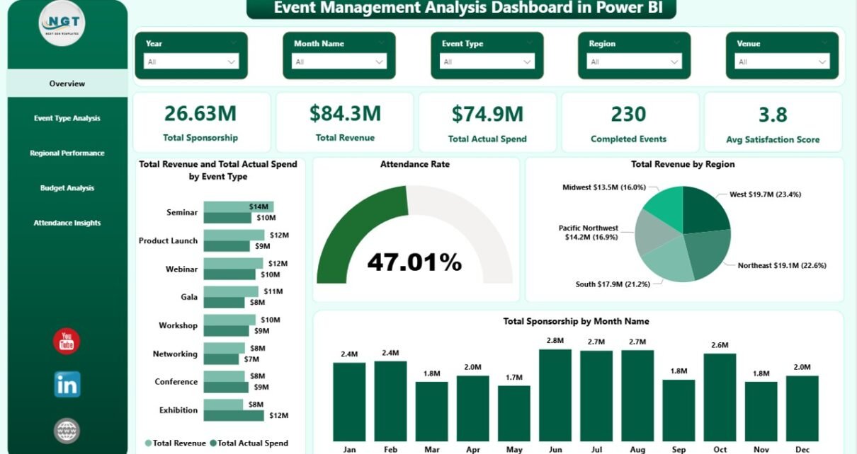
Page 1 — Overview
The Overview is the 30-second executive summary. Five KPI cards sit at the top: Total Sponsorship, Total Revenue, Total Actual Spend, Completed Events, and Avg Satisfaction Score. Below are four analytical visuals: Total Revenue and Total Actual Spend by Event Type (side-by-side for profit visibility), Attendance Rate (sold vs attended summary), Total Revenue by Region (geographic revenue mix), and Total Sponsorship by Month Name (seasonality curve). Six slicers on the right filter the entire page by Event Type, Region, Category, Month, Marketing Channel, and Venue.
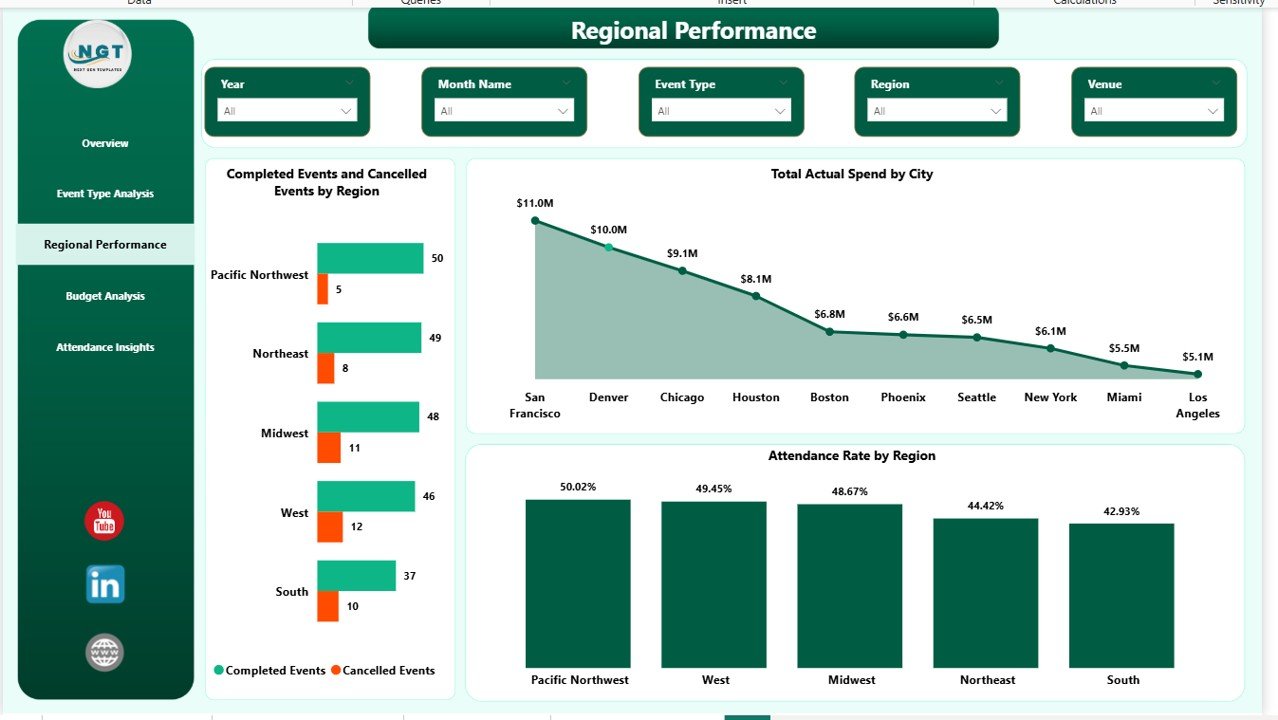
Overview Page
Page 2 — Event Type Analysis
Zooms into per-type performance with four visuals: Completed Events and Cancelled Events by Event Type (stacked bars to see cancellation ratio), Total Tickets Sold by Event Type (volume view), Total Revenue by Category (revenue mix), and Avg Satisfaction Score by Event Type (quality view). Read together, these answer: which event types are profitable, popular, AND loved by attendees?
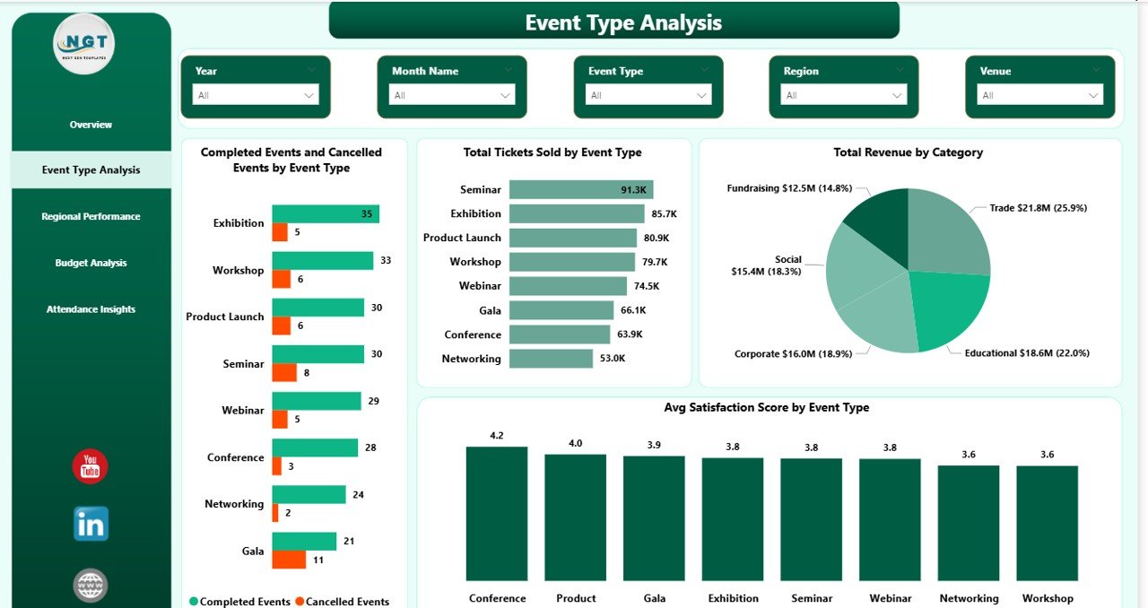
Event Type Analysis
Page 3 — Regional Performance
The geographic lens on your event portfolio. Completed Events and Cancelled Events by Region shows which regions deliver reliably. Total Actual Spend by City surfaces where money is concentrated — often a surprise. Attendance Rate by Region measures how well each region fills the seats it promised. Use this page in regional reviews with local event leads.
Click to buy Event Management Analysis Dashboard in Power BI
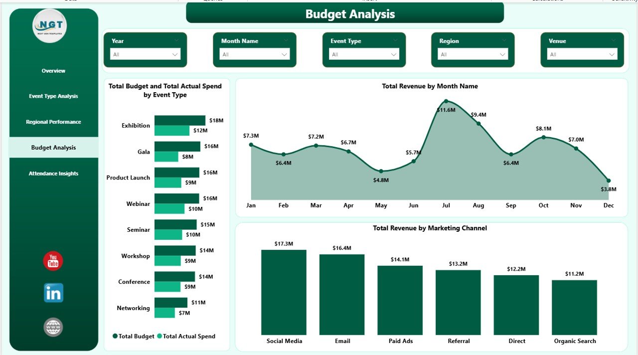
Page 4 — Budget Analysis
The CFO page. Total Budget and Total Actual Spend by Event Type exposes over- and under-budget event categories in one glance. Total Revenue by Month Name shows the revenue seasonality curve (so next year’s calendar isn’t a guess). Total Revenue by Marketing Channel maps spend to return across Email, Social, Paid Ads, Partners, and Direct. Bring this page to your next budget approval meeting.
Budget Analysis
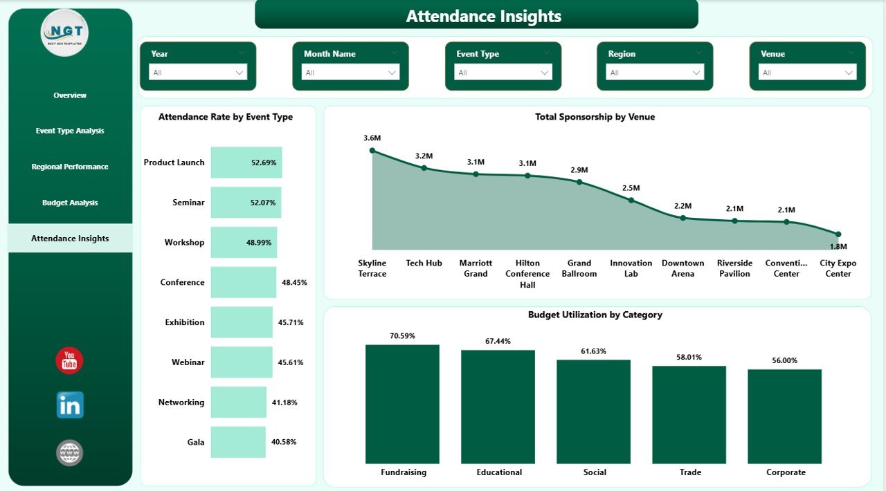
Page 5 — Attendance Insights
The audience-experience page. Attendance Rate by Event Type highlights which formats consistently fill seats (useful when deciding which formats to double-down on). Total Sponsorship by Venue identifies which venues attract the most sponsor money — a great lever in venue contract renewals. Budget Utilization by Category ties back to the budget page with a consumption view. Perfect for post-event retros and vendor negotiations.
Attendance Insights
Event Management Analysis Dashboard in Power BI vs. Excel Dashboard vs. Paid Event SaaS — Feature Comparison
| Feature | Event Management Analysis Dashboard in Power BI | Excel Event Dashboard | Cvent / Bizzabo / Eventbrite Pro |
|---|---|---|---|
| Cost | $17.99 one-time ✅ | $17.99 one-time | $500 – $5,000+ / year |
| Platform | Power BI Desktop (free) ✅ | Microsoft Excel | Web SaaS, vendor-hosted |
| Setup time | Under 10 minutes ✅ | Under 15 minutes | 2–6 weeks onboarding |
| Real-time slicer filtering | Yes — all pages ✅ | Partial (pivot filters) | Yes |
| Pre-built DAX measures | 15+ measures ✅ | No — formulas only | Proprietary metrics |
| Data ownership | 100% local .pbix ✅ | 100% local file | Vendor-hosted cloud |
| Customizable visuals | Fully editable ✅ | Fully editable | Template-locked |
| Year-1 cost at 5 users | $17.99 total ✅ | $17.99 total | $2,500 – $25,000+ |
| Publish to web | Power BI Service (free tier) | Manual export | Built-in |
For event teams that want Cvent-style analytics without the Cvent invoice, the Event Management Analysis Dashboard in Power BI sits in the sweet spot.
Who Should Use This Template
✅ Perfect for:
- Event managers running 10–200 events per year across multiple regions
- Corporate event teams tracking sponsorship, budget, and attendance in one report
- Marketing teams measuring event ROI by channel and category
- Agencies reporting to clients on completed vs cancelled events and satisfaction
- Analysts who already live in Power BI and want a pre-built event data model
❌ Not a fit if:
- You need live attendee check-in and badge printing — use Cvent or Bizzabo
- You’re on Mac without a Windows VM — Power BI Desktop is Windows-only
- You run 1–2 events a year — the setup overhead isn’t worth it
- Your org requires SOC 2, HIPAA, or enterprise SSO on all dashboards
Real-World Use Cases
Priya runs events at a 120-person B2B SaaS company. She uses the Event Management Analysis Dashboard in Power BI to report quarterly on trade-show ROI. Every Monday after a conference wraps, she drops the final event log into the .pbix, filters the Overview page by Marketing Channel, and walks into her Monday leadership meeting with one printable page showing exactly which channels drove the $2.4M in sponsorship pipeline she generated last year. Before the template she spent two days per quarter rebuilding that view in Excel.
David is a regional event director at a hospitality group managing 40 venues. He uses the Regional Performance and Attendance Insights pages as his monthly operating cadence. Completed Events and Attendance Rate by Region tell him which cities are fading. Total Sponsorship by Venue makes venue negotiations easier — he walks into contract renewals with real numbers showing which venues attract sponsors and which don’t. Two venues he was about to renew last quarter got replaced because of what the dashboard showed.
Maya runs a 6-person event agency serving non-profits. She drops each client’s event log into the dashboard, saves a PDF of all 5 pages, and hands it over as a quarterly report — replacing her previous $180/month Eventbrite Pro subscription that she was only using for reporting anyway. For her business that’s a $2,160/year saving on one tool alone, and her clients actually prefer the cleaner PDF output.
Advantages of Event Management Analysis Dashboard in Power BI
💸 One-time cost, not a subscription. $17.99 once versus $2,500–$25,000 per year for paid event SaaS. Break-even is literally the first month.
⚡ Fast to adopt. Under 10 minutes from download to first working dashboard. No onboarding call, no implementation consultant, no 6-week rollout.
🔒 Your data stays on your machine. The .pbix file lives locally. No vendor cloud, no data processor agreement, no GDPR rework.
🎨 Everything is editable. Want a new page? Add it. Don’t like a color? Change it. The DAX measures are exposed and modifiable. You can’t do that with Cvent.
📈 Scales from 10 to 2,000 events. Power BI handles millions of rows without breaking. The same template that tracks 20 events a year tracks 2,000 with no architecture change.
🔄 Works alongside your operational tool. If you already use Eventbrite for ticketing and Cvent for check-in, this dashboard adds analytics on top without replacing anything.
Opportunities for Improvement
I’ll be honest about what this template is NOT:
🔸 It’s analytics-only. It doesn’t replace live event operations — no check-in app, no badge printing, no email campaigns to attendees. You’ll still need Eventbrite, Cvent, Splash, or similar for the live part of the event.
🔸 Power BI Desktop is Windows-only. Mac users need Parallels, VMware Fusion, or a Windows VM to edit. Viewing published reports via Power BI Service works on any browser.
🔸 The template assumes a specific event-log schema (Event ID, Type, Region, City, Budget, Actual Spend, Tickets Sold, Attended, Satisfaction). If your data lives in a very different shape you’ll need to map fields once using Power Query.
🔸 There’s no built-in data source connection — it reads from a table in the .pbix. If you want automatic daily refresh from a SQL database, you’ll need to add that connection yourself (Power BI supports it, but the template ships with static sample data).
Best Practices
📅 Update after every event. The dashboard is only as good as your data cadence. Block 15 minutes on the Monday after every event to update the event log.
🔍 Start on the Overview page in every meeting. Use it as the executive summary, then drill to Regional Performance or Budget Analysis based on the questions that come up.
📊 Standardize your Event Types early. Conference, Webinar, Trade Show, Customer Dinner — pick 6–8 categories and stick to them. The by-Event-Type charts lose power when categories proliferate.
📄 Publish to Power BI Service for leadership access. Push the .pbix to Power BI Service so your CMO can check KPIs on their phone without asking you to send a PDF.
📂 Keep raw data in one table. Don’t split your event log across multiple sheets. One long table per year is easier to filter than 12 monthly tabs.
Explore Relevant Templates
💎 Also available as: Event Management Analysis Dashboard in Excel (same KPIs, native Excel workbook) and Event Management Analysis Dashboard in HTML (browser-based, no install).
🔹 Wedding Budget Dashboard in Power BI — event-adjacent budget tracking for weddings and private events.
🔹 Staffing Agency Dashboard in Power BI — useful if your events team also runs temp staffing.
🔹 Property Management Dashboard in Power BI — for venue owners tracking event bookings.
🔹 Browse all Power BI Dashboard Templates on NextGenTemplates.
Frequently Asked Questions
What KPIs does the Event Management Analysis Dashboard in Power BI track?
The Event Management Analysis Dashboard in Power BI tracks 5 headline KPIs — Total Sponsorship, Total Revenue, Total Actual Spend, Completed Events, and Avg Satisfaction Score — plus secondary metrics like Attendance Rate, Budget Utilization, Total Tickets Sold, and revenue by marketing channel across 4 additional analytical pages.
How does this compare to Cvent or Bizzabo?
Cvent and Bizzabo cost $2,500–$25,000+ per year and focus on live event operations (check-in, badging, attendee apps). The Event Management Analysis Dashboard in Power BI is a one-time $17.99 purchase focused on post-event analytics and reporting. Use it alongside your operational tool, not to replace it.
How long does setup take?
Setup takes under 10 minutes. Open the .pbix in Power BI Desktop, replace the sample event log with your own data keeping the same column headers, click Refresh, and every visual across all 5 pages updates automatically. No DAX rewriting required for basic use.
Do I need a Power BI Pro license?
No. Power BI Desktop is free from Microsoft and runs the entire Event Management Analysis Dashboard locally. Power BI Pro ($10/user/month) is only required if you want to publish the dashboard to Power BI Service and share it on the web with other users.
Can I add my own KPIs and visuals?
Yes. The .pbix file is fully editable — add new DAX measures, visuals, or pages, or modify existing ones. The data model uses standard event columns (Event ID, Type, Region, City, Budget, Actual Spend, Tickets Sold, Attended, Satisfaction), so most additions are drag-and-drop.
Does it work on Mac?
Power BI Desktop is Windows-only, so the Event Management Analysis Dashboard in Power BI needs a Windows machine or a Windows VM (Parallels, VMware Fusion) to open and edit. The published Power BI Service version can be viewed on any browser, including Mac Safari and Chrome.
Is my event data secure?
Yes — 100%. The .pbix file is stored locally on your disk. No data is sent to NextGenTemplates servers, no telemetry, no third-party integrations. Your event data stays on your machine until you choose to publish to Power BI Service.
About the Author
Built by PK — Microsoft Certified Professional with 15+ years of Excel, Google Sheets, and Power BI experience. Founder of NextGenTemplates, reaching 300K+ subscribers across YouTube channels. Every template is hand-built and tested before release.
Conclusion
If you already run events and already use Power BI, the Event Management Analysis Dashboard in Power BI probably saves you a full work-day per quarter on executive reporting alone. At $17.99 one-time that’s a rounding error. If you don’t use Power BI yet, the free Desktop download from Microsoft is enough — no Pro license needed to get value on day one.
🛍️ Click here to Purchase the Event Management Analysis Dashboard in Power BI
✅ Instant download · One-time payment · No subscription · Lifetime access
🎥 For step-by-step video tutorials on Excel, Power BI, and dashboarding, visit Youtube.com/@PK-AnExcelExpert.
Click to buy Event Management Analysis Dashboard in Power BI