The Oil and Gas Analysis Dashboard in Excel is a 7-tab workbook that tracks 5 headline KPIs across 5 interactive dashboard pages — Overview, Production Trend, Regional Analysis, Product Analysis, and Safety Compliance — all driven by pivot tables living in a hidden Support Sheet. Setup takes under 10 minutes: paste your upstream production, cost, and incident records into the Data Sheet, click Refresh All in the Data ribbon, and every chart and KPI on every page rebuilds automatically.
🌍 Join 8,400+ teams in 40+ countries using NextGenTemplates to replace paid SaaS tools with one-time-purchase Excel, Google Sheets, Power BI, and HTML templates. ✅ Instant download · One-time $17.99 · No subscription · Lifetime access.
Overview of the Oil and Gas Analysis Dashboard in Excel
Upstream oil and gas operations generate data across four dimensions at once — production volume, revenue, cost, and safety. Tracking all four in a single view is where most internal Excel trackers fall apart. This dashboard solves that problem by laying out the four dimensions as four separate analysis pages on top of a shared data model. The result is a workbook an operations manager, a finance controller, and an HSE lead can all use off the same Data Sheet without stepping on each other.
Unlike heavy enterprise platforms from vendors tracked in the enterprise ERP space, this dashboard runs entirely inside Microsoft Excel 2016 or later. No Power Query, no macros, no Power BI — just pivot tables, pivot charts, and slicers. If you can refresh a pivot, you can run this dashboard.
Key Features of the Oil and Gas Analysis Dashboard in Excel
🛢️ 5 KPI cards on the Overview page. Total Revenue, Net Profit, Total Production, Total Incidents, and Total Downtime — wired directly to pivot measures so they recalculate on every refresh. These are the same headline metrics upstream leadership committees use every month.
📊 14 pivot-driven charts across 5 pages. Every chart sits on top of a pivot table in the Support Sheet. You never touch chart formatting manually — refresh and the visuals rebuild.
🧭 Multiple slicers on the Overview page. Drill from a global view to a single field, operator, product type, or well type in two clicks. Useful when leadership asks “what did the Permian do last quarter?” mid-meeting.
🗂️ Flat Data Sheet + hidden Support Sheet architecture. Your junior analyst updates one tab. The dashboard rebuilds across all five pages.
🎨 Upstream-industry visual style. Dark navigation bar, card-style KPIs, consistent formatting in millions and percentages, and chart titles named for what they measure (e.g., “Total Revenue by Month” not “Chart 3”).
Dashboard Pages Explanation
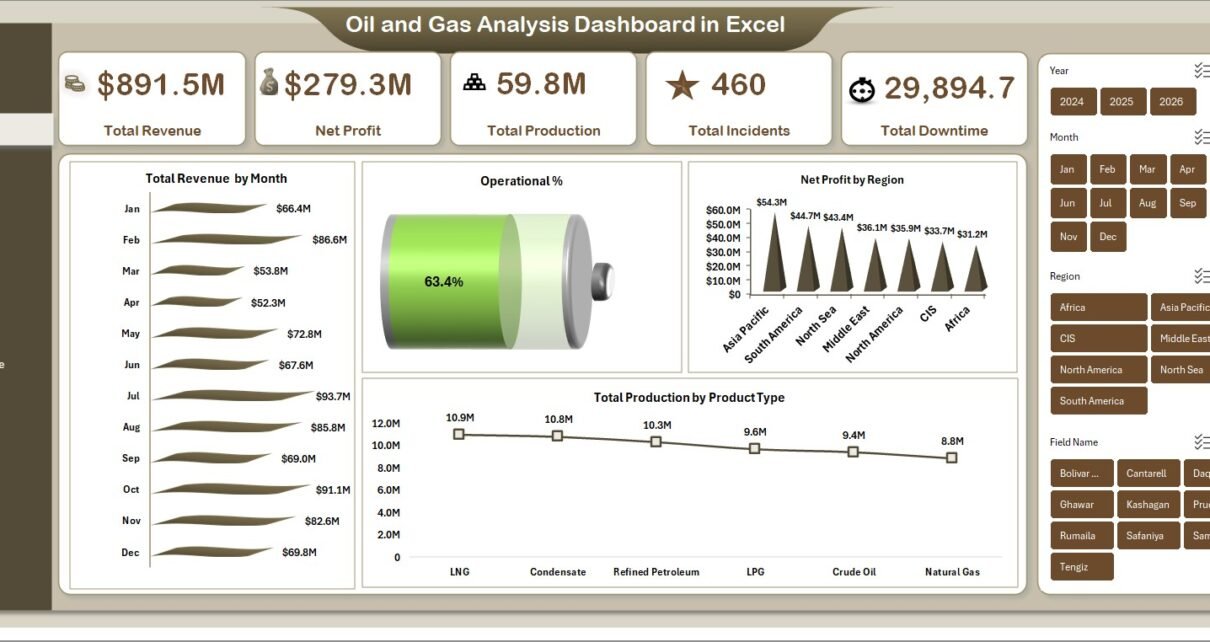
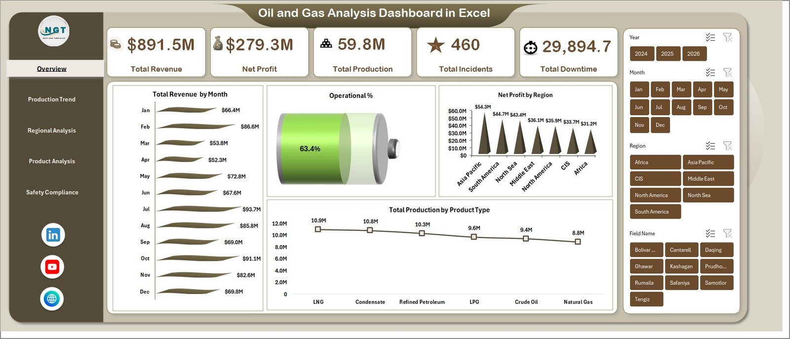
1. Overview Page
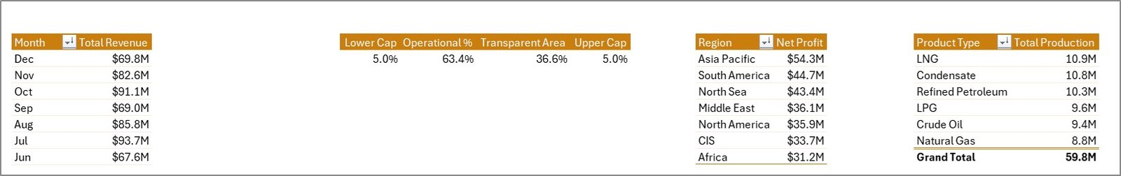
The single-screen executive summary. The top strip shows the 5 KPI cards (Total Revenue, Net Profit, Total Production, Total Incidents, Total Downtime). Below that sit four charts covering Total Revenue by Month, Operational %, Net Profit by Region, and Total Production by Product Type. The slicers on the right let you filter the whole page instantly. This is the page you open first in any monthly or quarterly review.
Overview Page
2. Production Trend
The time-based view. Four charts on this page: Total Production by Month, Net Profit by Year, Profit Margin % by Month, and Total Downtime by Month. Use this page to spot seasonality in output, year-over-year profit direction, and the exact months where unplanned downtime ate into margin.
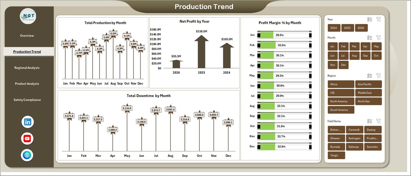
Production Trend
3. Regional Analysis
The geography view. Three charts: Total Revenue vs. Total Production Cost by Region, Total OpEx by Field Name, and Profit Margin % by Region. Regional managers use this to see which basins are carrying the portfolio and which fields are eroding margin through high operating expense.
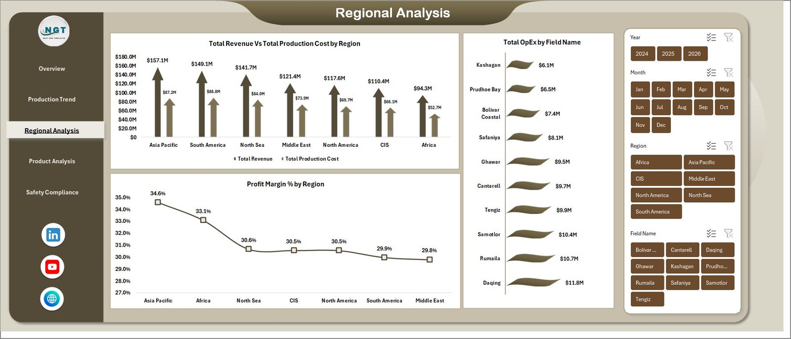
Regional Analysis
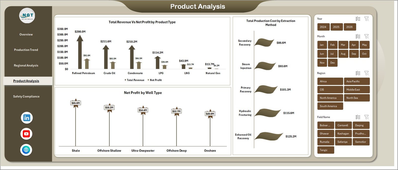
4. Product Analysis
The portfolio view. Three charts: Total Revenue vs. Net Profit by Product Type, Total Production Cost by Extraction Method, and Net Profit by Well Type. This is the page that answers “where do we actually make money?” — crude vs. gas vs. condensate, conventional vs. unconventional wells, and which extraction methods are worth scaling.
5. Safety Compliance
The HSE view. Three charts: Total Incidents by Field Name, Total Records by Safety Rating, and Incident % by Operator. A one-page read of where incidents are concentrated, how safety ratings are distributed across the portfolio, and which operators need attention.
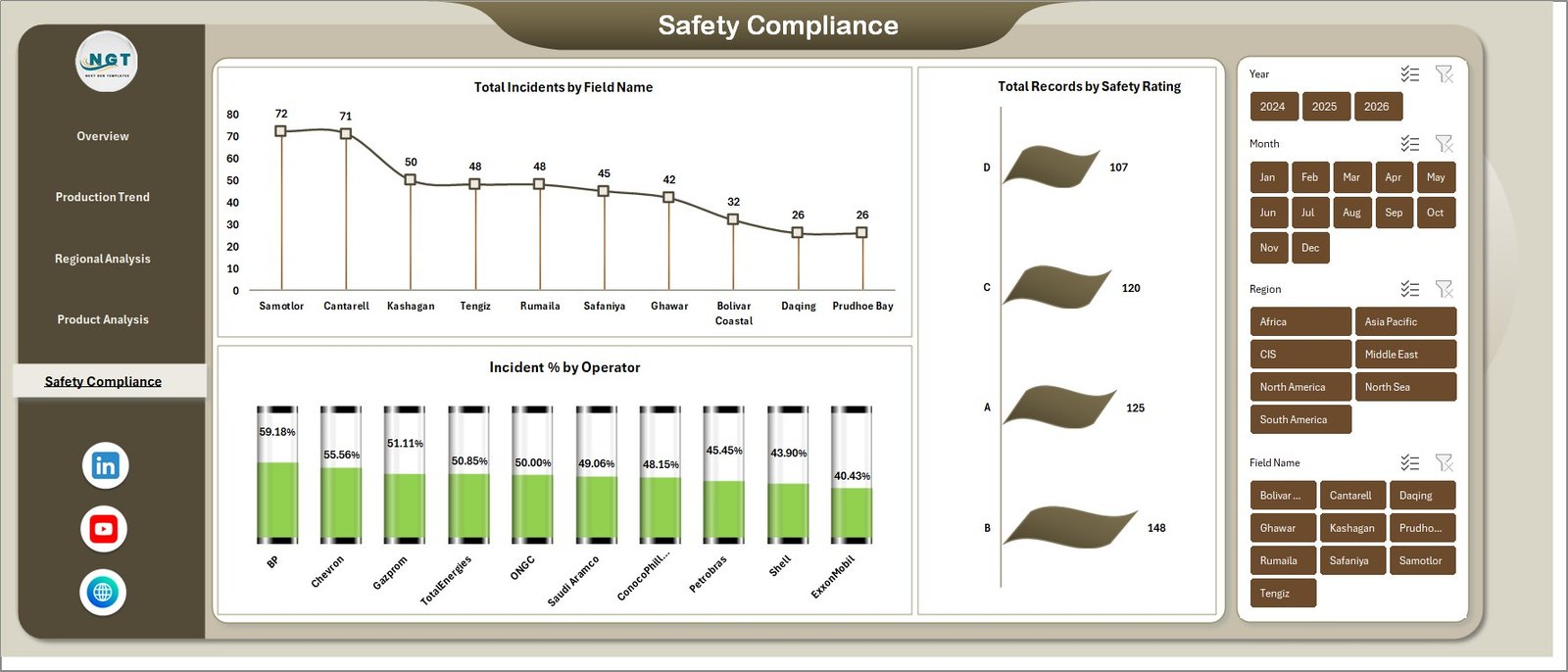
Safety Compliance
6. Data Sheet
The single input table for the entire dashboard. Add your records in the same column format — date, region, field name, operator, product type, well type, extraction method, production volume, revenue, cost, OpEx, downtime hours, incidents, and safety rating. Microsoft’s own Excel Tables guidance is a useful reference if you want to convert the data range into a formal table.
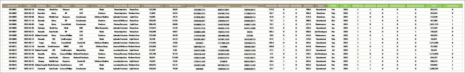
Data Sheet tab
7. Support Sheet
The hidden pivot engine. Holds every pivot that feeds every chart across all 5 dashboard pages. Go to the Data tab in the Excel ribbon and click Refresh All after you update the Data Sheet — every pivot and every chart rebuilds in one step. Right-click the tab and hide it in daily use.
Support sheet tab
Oil and Gas Analysis Dashboard in Excel vs. Power BI vs. Paid Oil & Gas SaaS — Feature Comparison
| Feature | Oil and Gas Analysis Dashboard in Excel | Power BI alternative | Paid Oil & Gas SaaS |
|---|---|---|---|
| Cost | $17.99 one-time | $10–20 per user/month | $30,000–$250,000 per year |
| Platform | Microsoft Excel (2016+) | Power BI Desktop + Service | Cloud SaaS |
| Setup time | Under 10 minutes | 2–5 days | 6–12 weeks |
| Regional & field drill-down | ✅ | ✅ | ✅ |
| Works offline | ✅ | ❌ (Service requires cloud) | ❌ |
| No per-user fees | ✅ | ❌ | ❌ |
| Fully editable formulas | ✅ | Partial (DAX only) | ❌ |
| Year-1 cost at 5 users | $17.99 | $600–$1,200 | $30,000+ |
For operations and finance teams that want upstream-grade KPI tracking without paying enterprise SaaS prices, the Oil and Gas Analysis Dashboard in Excel sits in the sweet spot.
Who Should Use This Template
Perfect for:
- Operations managers at small-to-mid upstream E&P companies tracking 1–20 fields
- Finance controllers at oilfield services firms needing margin-by-region visibility
- HSE leads who want a single Excel view of incidents and safety ratings
- Energy consultants preparing client reviews for oil and gas operators
- Analysts and MBA students building upstream case studies
Not a fit if:
- You’re a supermajor needing real-time SCADA integration
- You need SOC 2 compliance, SSO, or row-level security across thousands of users
- You need downstream refining LP models for blend optimisation
Real-World Use Cases
Amit runs operations at a mid-sized Indian E&P company with 6 onshore fields. He uses the Oil and Gas Analysis Dashboard in Excel to prepare a monthly operations review for the leadership committee — one page on revenue and production trend, one page on regional margin, one page on safety incidents — all off a single Data Sheet his junior analyst updates every month-end. Prep time dropped from 2 days to 2 hours.
Priya is a finance controller at an oilfield services contractor across the Middle East. She uses the Product Analysis and Regional Analysis pages to compare Net Profit by Well Type and Profit Margin % by Region when negotiating new service contracts. She walked away from a $30,000/year enterprise analytics subscription because this dashboard covered the same month-end review need.
Daniel is an energy consultant preparing buy-side due diligence on a small North American upstream operator. He drops the target’s historical production and cost data into the Data Sheet, refreshes, and walks the client through downtime patterns, OpEx by field, and incident concentration — all in under an hour of prep.
Advantages of the Oil and Gas Analysis Dashboard in Excel
💰 Cost. $17.99 once versus $30,000+/year for comparable upstream SaaS. Payback is immediate.
⏱️ Setup speed. Under 10 minutes to go from download to fully populated dashboard. Enterprise analytics implementations typically take 6–12 weeks.
🔌 Works offline. No cloud dependency. Runs on any machine with Excel 2016 or later, including air-gapped laptops used on offshore rigs.
✏️ Fully editable. Every formula, every pivot, every chart is inspectable and editable. You’re not locked into a vendor’s data model.
👥 No per-user fees. Share the workbook with your whole team. One license covers one team.
Opportunities for Improvement
Being honest about what this dashboard doesn’t do helps set expectations:
- Not real-time. This is a monthly or quarterly analysis tool. If you need live streaming well data, you need SCADA integration — this dashboard won’t replace that.
- No predictive modelling. The dashboard reports what happened, not what will happen. Decline curve analysis, production forecasting, and reserves modelling need specialist tools.
- Single-user workflow. Excel’s collaboration is weaker than purpose-built cloud tools. If 10 people need to edit simultaneously, consider the Power BI version instead.
Best Practices
✅ Keep the Data Sheet flat. Don’t insert summary rows, merged cells, or blank rows. One row = one record.
✅ Use consistent naming. “Permian” and “Permian Basin” are different values to a pivot. Standardise your region and field names before pasting.
✅ Refresh after every data update. The dashboard doesn’t auto-refresh on Data Sheet edits. Click Refresh All in the Data ribbon.
✅ Hide the Support Sheet before sharing. Right-click the tab, hide. Cleaner handoff to end users.
✅ Copy charts to build new views. Every chart is a standard pivot chart. Copy one, repoint it to a new pivot field, and you have a new view in 30 seconds.
Explore Relevant Templates
🛢️ Oil and Gas Dashboard in Excel — the original single-page version of this dashboard.
📈 Oil and Gas Dashboard in Power BI — the Power BI version, for teams already on the Power BI Service.
🚇 Pipeline Infrastructure KPI Dashboard in Excel — midstream counterpart focused on pipeline throughput and integrity.
🏭 Refinery Procurement KPI Dashboard in Power BI — downstream procurement view for refinery operators.
⛽ Oil & Gas KPI Dashboard in Power BI — scorecard-style KPI view for oil and gas operators.
Also available as: Oil and Gas Dashboard in Excel · Power BI version · Petroleum Industry KPI Dashboard.
Frequently Asked Questions
What KPIs does the Oil and Gas Analysis Dashboard in Excel track?
The Oil and Gas Analysis Dashboard in Excel tracks 5 core KPIs: Total Revenue, Net Profit, Total Production, Total Incidents, and Total Downtime. It also breaks these down across region, field name, operator, product type, well type, and extraction method on dedicated analysis pages.
How long does the Oil and Gas Analysis Dashboard in Excel take to set up?
Setup takes under 10 minutes. Replace the sample data on the Data Sheet with your own production, revenue, cost, and incident records in the same column format, then click Refresh All in the Data ribbon. Every chart and KPI on all 5 pages updates instantly.
How does this compare to paid oil and gas SaaS?
Paid upstream analytics SaaS typically starts around $30,000 per year with 6–12 week implementations. The Oil and Gas Analysis Dashboard in Excel is a one-time $17.99 purchase, installs in under 10 minutes, works offline, and has no per-user fees. It suits teams that do not need real-time SCADA integration.
Do I need Power BI or any add-ins?
No. The Oil and Gas Analysis Dashboard in Excel runs entirely in Microsoft Excel 2016 or later. It uses pivot tables, pivot charts, and slicers — no macros, no Power Query, no Power BI. If you can refresh a pivot table, you can run this dashboard.
Can I customise the charts and add new KPIs?
Yes. Every chart is a standard Excel pivot chart built on a pivot in the Support Sheet. Add columns to the Data Sheet, extend the pivot fields, drop new measures into existing charts, or copy a chart and repoint it to a new pivot to build additional views.
Is the dashboard suitable for offshore operations?
Yes. The Region, Field Name, and Well Type dimensions work for both onshore and offshore portfolios. Label your fields accordingly in the Data Sheet and the dashboard produces the same revenue, production, and safety analytics.
What Excel version do I need?
Microsoft Excel 2016 or later on Windows or Mac. The dashboard uses pivot tables, pivot charts, and slicers, all standard features in Excel 2016+. It also runs correctly in Microsoft 365.
About the Author
Built by PK — Microsoft Certified Professional with 15+ years of Excel, Google Sheets, and Power BI experience. Founder of NextGenTemplates, reaching 300K+ subscribers across YouTube channels. Every template is hand-built and tested before release. Visit Youtube.com/@PK-AnExcelExpert for step-by-step video tutorials.
Conclusion
The Oil and Gas Analysis Dashboard in Excel is a complete, pivot-driven monthly review tool for upstream oil and gas operations — 5 KPI cards, 14 charts, 5 analysis pages, and a single flat Data Sheet — all for a one-time $17.99 purchase instead of a recurring SaaS subscription.
👉 Click here to Purchase the Oil and Gas Analysis Dashboard in Excel
✅ Instant download · One-time payment · No subscription.