If you run a laundromat, you already know the business is three numbers at once: revenue per location, machine uptime and customer satisfaction. Get any one wrong for a quarter and it shows up in the P&L. The Laundromat Dashboard in Power BI brings all three into a single interactive .pbix file with 5 KPIs, 5 analysis pages and 15+ visuals — so you can spot problems before they cost real money.
This Power BI dashboard template works for a single neighbourhood self-service laundry as well as a multi-location coin-op or card-operated chain. It is built in Power BI Desktop (which is free from Microsoft), so once you point the model at your own transaction data and click Close & Apply, every KPI card, slicer and visual updates in seconds. Click here to Purchase the Laundromat Dashboard in Power BI.
Key Features of the Laundromat Dashboard in Power BI
- 5 interactive Power BI pages — Overview, Location Analysis, Machine Performance, Customer Insights and Revenue Trends.
- 5 KPI cards on the Overview page — Total Revenue, Total Operating Cost, Total Transactions, Avg Customer Rating and Net Profit.
- 15+ interactive visuals covering monthly revenue trends, completion rate, service mix, machine utilisation and multi-location comparisons.
- Dynamic slicers to filter the entire report by location, machine type, service type, membership or payment method.
- Multi-location comparison baked into the Location Analysis page for branch-by-branch operators.
- Machine-level analytics — revenue, transactions and avg cycle duration by machine type.
- Free to edit — Power BI Desktop is free from Microsoft. A paid licence is only needed to publish to Power BI Service.
Dashboard Pages Explanation
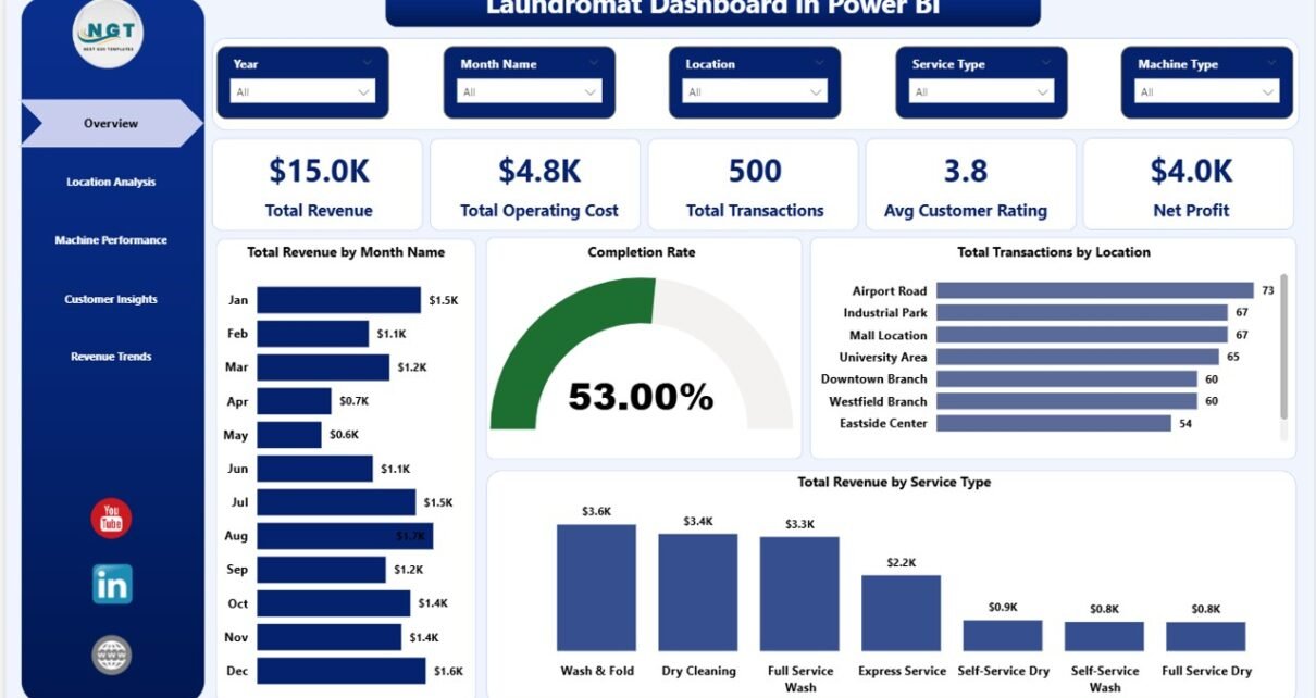
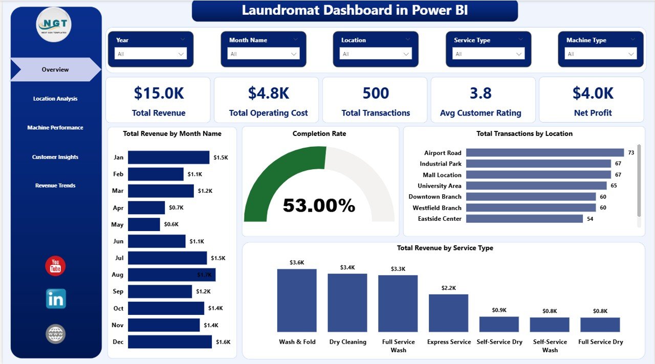
1. Overview Page
The Overview page is the one-glance command centre for the entire laundromat. Five KPI cards sit across the top — Total Revenue, Total Operating Cost, Total Transactions, Avg Customer Rating and Net Profit — and slicers let you narrow the view to a specific location, service or time period.
Below the KPIs, four key visuals paint the full picture:
- Total Revenue by Month Name — spot seasonality, promotion spikes and slow months at a glance.
- Completion Rate — see what percentage of cycles were completed successfully vs aborted mid-cycle.
- Total Transactions by Location — compare raw transaction volume across every outlet.
- Total Revenue by Service Type — break revenue by wash, dry, fold, dry-clean and add-on services.
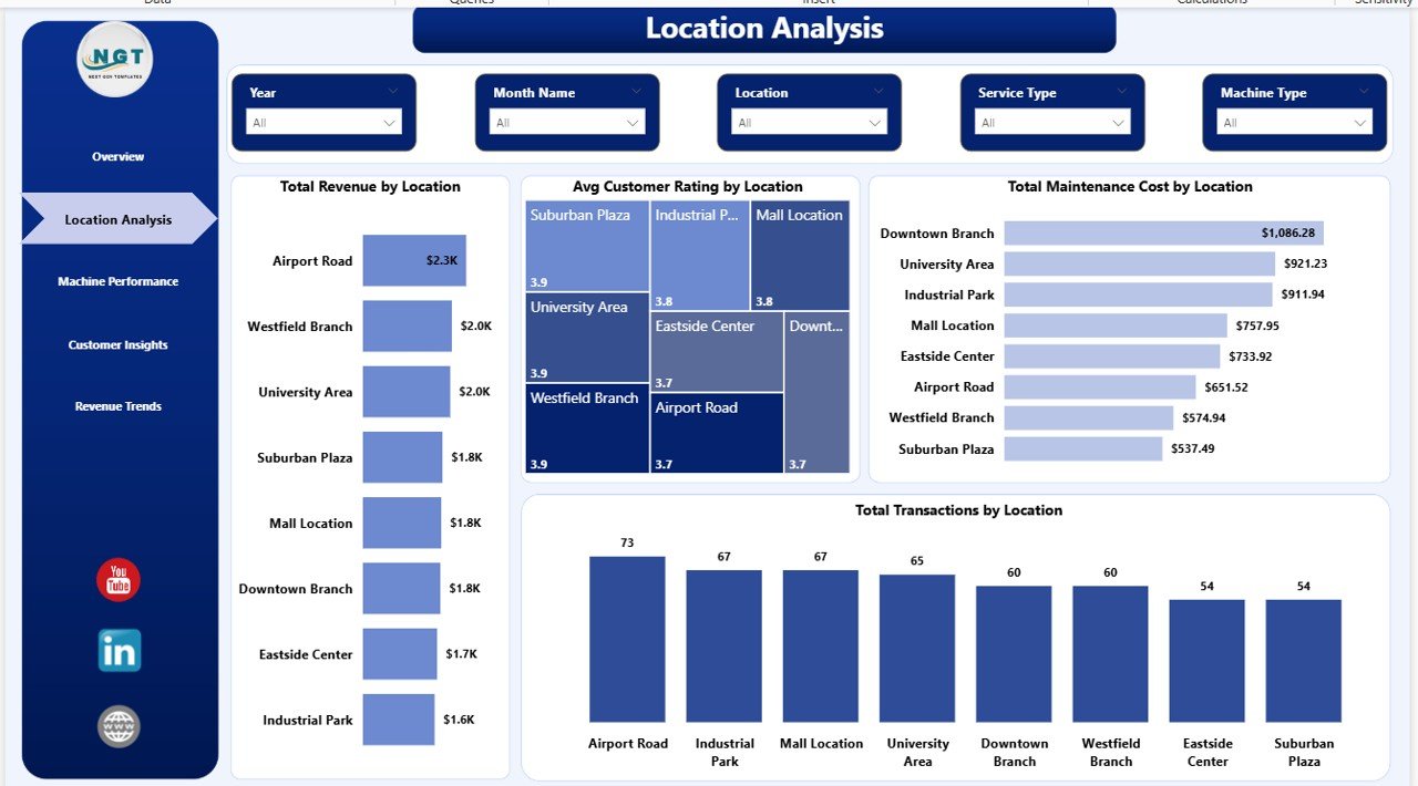
2. Location Analysis
The Location Analysis page is where multi-store operators live. It puts every branch side-by-side so you can immediately see which outlets are pulling their weight. Charts on this page include Total Revenue by Location, Avg Customer Rating by Location, Total Maintenance Cost by Location and Total Transactions by Location. The combination of revenue, maintenance cost and rating makes it obvious where to invest more machines and where to rework the service model.
Click to buy Laundromat Dashboard in Power BI
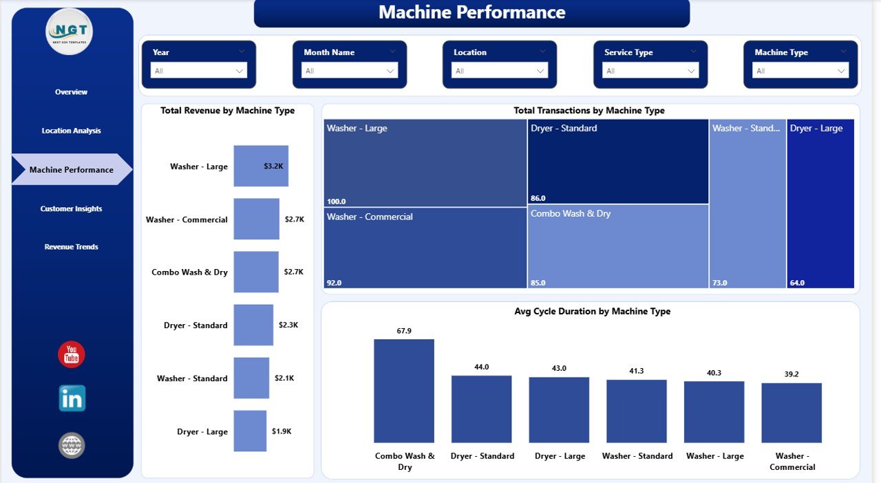
3. Machine Performance
This is the page every operations manager will bookmark. It covers Total Revenue by Machine Type, Total Transactions by Machine Type and Avg Cycle Duration by Machine Type. If a washer is running slower than the fleet average, you will see it here — perfect for scheduling preventive maintenance before revenue leaks.
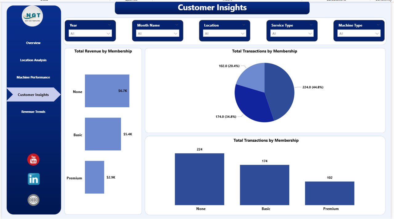
4. Customer Insights
The Customer Insights page answers the “who, how often and how they pay” questions. It splits Total Revenue by Membership so you can see member vs walk-in revenue, then layers on Total Transactions by Membership and Total Transactions by Payment Method. Use it to design loyalty tiers, off-peak discounts and digital payment incentives.
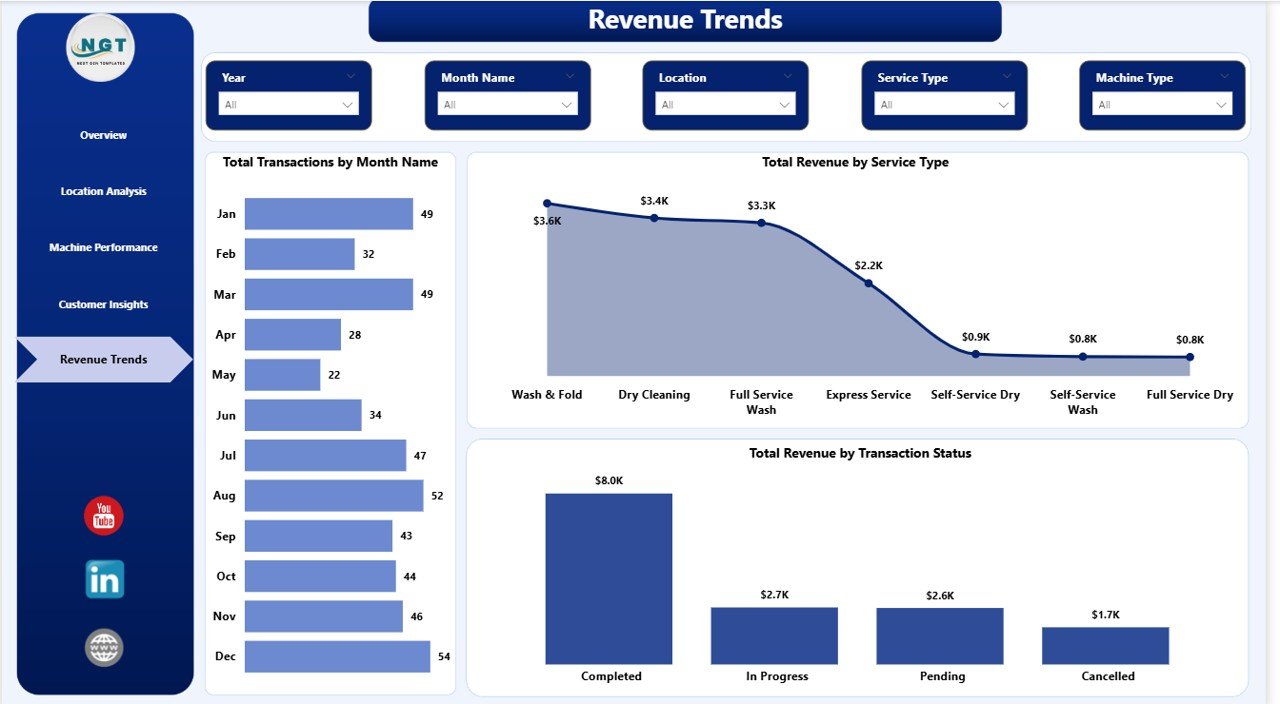
5. Revenue Trends
The Revenue Trends page gives you the big-picture financial story with Total Transactions by Month Name, Total Revenue by Service Type and Total Revenue by Transaction Status. It is the page you will open at every year-end review and every investor update to prove the growth story and explain the service-mix evolution.
Laundromat Dashboard in Power BI vs. Tableau Equivalent vs. CleanCloud / LaundryCard — Feature Comparison
| Feature | Laundromat Dashboard in Power BI | Tableau / Qlik Equivalent | CleanCloud / LaundryCard / SpinXpress |
|---|---|---|---|
| Cost | $17.99 one-time | $70 / user / month | $49–199 / store / month |
| Platform | Power BI Desktop (free) | Tableau / Qlik Sense | Cloud SaaS + POS hardware |
| Setup time | Under 10 minutes | 1–5 days | 1–3 weeks onboarding |
| Multi-location comparison | ✅ Built-in | ✅ (you build it) | ✅ |
| Machine-level analytics | ✅ Revenue, txn, cycle time | ✅ (you build it) | Varies by vendor |
| Customisable visuals & measures | ✅ Full DAX access | ✅ | ❌ (vendor-controlled) |
| Publish to web | ✅ Power BI Service | ✅ | Cloud only |
| Year-1 cost at 5 users | $17.99 total | $4,200 / year | $2,940–$11,940 |
For laundromat owners who want a real BI-grade analytics layer without paying monthly per-seat fees, the Laundromat Dashboard in Power BI sits in the sweet spot.
Who Should Use This Template
Perfect for:
- Laundromat owners running 1–20 coin-op or card-op stores who want deeper analytics than Excel.
- Multi-location chain managers comparing revenue, rating and maintenance cost across branches.
- Franchisees and investors evaluating store profitability before expansion or acquisition.
- Facility and operations managers tracking machine uptime and cycle duration per store.
- Business analysts and consultants supporting laundromat or service-business clients in Power BI.
Not a fit if:
- You do not want to install Power BI Desktop — our Laundromat Dashboard in HTML or Laundromat Dashboard in Excel is a better fit.
- You need live POS hardware integration, card-reader feeds or SOC 2 audit logs — stick with a full SaaS POS.
- You primarily need accounting/bookkeeping rather than analytics.
Real-World Use Cases
Rahul owns a 4-store laundromat chain in suburban Chicago. He uses the Laundromat Dashboard in Power BI every Monday morning to compare revenue, maintenance cost and customer rating across all four locations. The Machine Performance page shows him which store keeps losing cycles to broken washers, so he knows exactly which units to replace next quarter — without paying $149 per store per month for a SaaS POS analytics add-on.
Priya runs a single boutique laundromat offering premium wash-and-fold service. She uses the Customer Insights page to confirm that members generate 58% of her revenue and that Saturday mornings drive the highest transaction volume. Armed with those numbers she aligns staff schedules and loyalty promotions to compound her highest-margin slots.
David is a franchise investor evaluating three laundromat acquisitions. He loads each seller’s transaction data into the Power BI model and uses the Location Analysis and Machine Performance pages to compare gross profit, cycle duration and maintenance cost per location — turning three messy CSVs into a defensible valuation deck in under an afternoon.
Advantages of the Laundromat Dashboard in Power BI
- One source of truth — replace scattered spreadsheets with an interactive report that always agrees with itself.
- Refresh in seconds — Power BI’s in-memory engine recalculates every visual instantly.
- Multi-location ready — a single location column in your source data unlocks branch-level comparisons.
- Operations + finance in one view — revenue, cost, machine status and customer rating live on the same pages.
- Affordable — one-time purchase versus monthly SaaS fees that add up fast at 3, 5 or 10 stores.
- Customisable — you have full access to the data model, DAX measures and visual layouts.
- Publishable — push to Power BI Service to share reports on the web or mobile.
Opportunities for Improvement
No template is a silver bullet. A few things to think about as you adopt this dashboard:
- Data quality is everything — if your POS export is inconsistent, your dashboard will be too. Standardise location and machine-type names before you import.
- Power BI Desktop is Windows-only — if your team is on Mac, you can either run it in a VM or use the web-based Power BI Service to edit reports.
- Cost allocation — the template assumes you can split operating cost by location. If your accounting does not, it is worth setting that up.
- Sharing options — publishing to Power BI Service with viewer access requires at least one Power BI Pro licence. For read-only sharing, export to PDF or PowerPoint.
Best Practices
- Standardise the data source columns once and never change the schema again.
- Import fresh transaction data weekly and always refresh before sharing.
- Use slicers live in operator meetings — it makes the analysis feel alive to stakeholders.
- Screenshot key pages at month-end and drop them into a one-page operator summary.
- For advanced DAX patterns, check Microsoft’s official DAX quickstart guide.
- When publishing to Power BI Service, enable Row-Level Security so each branch manager only sees their own store data.
Explore Relevant Templates
If you like the Laundromat Dashboard in Power BI, you will probably enjoy these related service-business templates on nextgentemplates.com:
- Laundromat Dashboard in Excel — same laundromat analytics, pivot-table powered for Office 365 users.
- Laundromat Dashboard in HTML — browser-based offline version for owners who do not want to install Power BI.
- HVAC Service Dashboard in Power BI — field-service analytics for HVAC contractors tracking technicians and jobs.
- Moving Company Dashboard in Power BI — multi-branch revenue and operations analytics for movers and logistics operators.
- Property Management Dashboard in Power BI — rental and facility analytics for property operators.
Browse the full range of Power BI Dashboard Templates across every industry.
Frequently Asked Questions
What is the best Power BI template for tracking laundromat revenue?
The Laundromat Dashboard in Power BI from NextGenTemplates is a purpose-built template with 5 KPIs, 5 analysis pages and 15+ visuals covering revenue, machine performance, customer insights and location profitability — everything a laundromat operator needs, inside a single interactive Power BI report.
How do I track laundromat machine performance in Power BI?
Use the Machine Performance page of the Laundromat Dashboard in Power BI. It shows Total Revenue by Machine Type, Total Transactions by Machine Type and Avg Cycle Duration by Machine Type. You simply point the data model at your transactions and every visual updates automatically.
Can this Power BI dashboard handle multiple laundromat locations?
Yes. The Location Analysis page and every slicer are built for multi-location operators. Add a location column to your data source and the Laundromat Dashboard in Power BI will automatically compare every branch by revenue, transactions, maintenance cost and average customer rating.
Do I need a paid Power BI Pro licence to use this dashboard?
No. Power BI Desktop is free from Microsoft and is all you need to open, edit and refresh the Laundromat Dashboard in Power BI. A paid Power BI Pro or Premium licence is only needed to publish the report to Power BI Service and share it with colleagues.
How does this compare to paid laundromat POS platforms like CleanCloud?
Paid laundromat POS and SaaS platforms typically charge $49–$199 per store per month. The Laundromat Dashboard in Power BI is a one-time $17.99 purchase. It does not replace POS hardware, but it delivers the same analytics layer — revenue, machine performance, location comparison — for a tiny fraction of the annual cost.
Is the Laundromat Dashboard in Power BI suitable for franchise owners and investors?
Yes. Franchisees and investors use the Laundromat Dashboard in Power BI to benchmark store-level profitability, compare maintenance costs across branches and validate expansion plans using historical revenue trends — all from a single interactive Power BI report.
How long does setup take?
Setup takes under 10 minutes. Open the .pbix file in Power BI Desktop, point the data source at your own transaction file, click Close & Apply and the Laundromat Dashboard in Power BI refreshes with your real data across all 5 pages.
About the Author
Built by PK — Microsoft Certified Professional with 15+ years of Excel, Google Sheets and Power BI experience. Founder of NextGenTemplates, reaching 300K+ subscribers across YouTube channels. Every template is hand-built and tested before release.
Conclusion
A laundromat lives or dies on three numbers: revenue per location, machine uptime and customer satisfaction. The Laundromat Dashboard in Power BI brings all three into a single interactive report, adds the slicers you need to drill into them and gives you full DAX access to customise anything. Whether you own one store or ten, this template will save you hours of manual reporting every month and help you spot problems before they become real money.
👉 Click here to Purchase the Laundromat Dashboard in Power BI
✅ Instant download · One-time payment · No subscription
For step-by-step video walkthroughs of this dashboard and many more Power BI templates, visit our YouTube channel: Youtube.com/@PK-AnExcelExpert.