The mining industry runs on tonnage, time, and tight margins — and the operators who survive volatile commodity cycles are the ones who can see production gaps, cost overruns, and safety incidents before they compound. Industry research consistently shows that mining companies lose 20–30% of potential revenue each year to undetected production shortfalls, equipment downtime, and reactive cost management. According to McKinsey’s mining productivity research, even a 5% lift in equipment utilization can move site EBITDA by double digits.
The Mining Operations Dashboard in Power BI closes that visibility gap with a single, refreshable .pbix file that consolidates production tonnage, revenue, operating cost, profit margin, safety incidents, and equipment performance across every mine site, mineral type, and shift into five interactive pages. This walkthrough shows you exactly how the dashboard is structured — page by page — so you can decide if it fits your operation before you purchase the template.

Why Build This in Power BI Instead of Excel or a Specialist Mining Tool?
Most mining operators still report KPIs in disconnected workbooks emailed weekly between sites, finance, and HSE. By the time a tons-target gap or a safety spike reaches the GM, the window to act has already closed. A Power BI model that pulls all five operating dimensions — production, cost, profit, safety, and equipment — into one canvas turns weekly retrospective reporting into daily forward-looking decisions. Slicers replace pivot rebuilds. DAX measures replace fragile SUMIFS. And the same .pbix can be published to the Power BI Service so site managers, supervisors, and the C-suite see the same numbers at the same time.
If you prefer a pivot-driven Excel build instead, see the companion Mining Operations Dashboard in Excel. If you want a higher-level mining KPI view, look at the Mining Dashboard in Power BI.
Mining Operations Dashboard in Power BI vs Tableau vs Specialist Mining Software
| Capability | This Template (Power BI) | Tableau / Qlik Builds | MineSight / Deswik / Surpac |
|---|---|---|---|
| Upfront cost | $17.99 one-time | $1,500–$5,000+ for custom build | $25,000+ license + implementation |
| Time to first dashboard | Under 15 minutes | 2–6 weeks | 3–9 months |
| Tons, cost, safety, equipment in one view | ✅ Built-in (5 pages) | ⚠️ Custom development | ✅ But siloed in geology/scheduling modules |
| Free runtime for viewers | ✅ Power BI Desktop free | ❌ Paid Tableau Creator/Viewer | ❌ Paid seat licenses |
| Editable DAX, slicers, visuals | ✅ Fully editable | ⚠️ Depends on consultant access | ❌ Locked enterprise system |
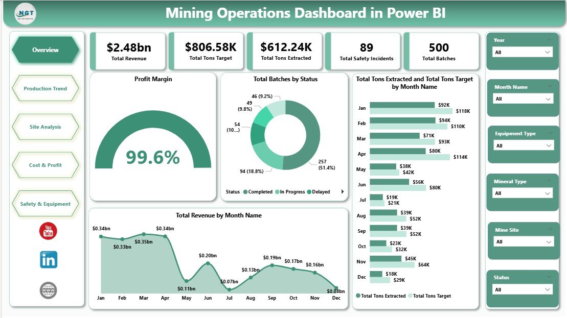
Page 1 — Overview Page
The Overview page is the daily standup view for site GMs and operations directors. It opens with a row of five KPI cards showing the most-asked numbers in any mining leadership meeting:
- Total Revenue — sum of revenue across every mine site, mineral, and batch in the filtered period
- Total Tons Target — planned production tonnage to compare against actual
- Total Tons Extracted — actual tons mined, the headline production number
- Total Safety Incidents — HSE counter that immediately flags any spike
- Total Batches — number of production batches processed in the period
Below the KPI cards, four charts tell the production-versus-plan story at a glance:
- Profit Margin — a gauge that shows portfolio profitability and immediately surfaces whether the period is healthy or under pressure.
- Total Batches by Status — a stacked view of batch outcomes (completed, in-progress, on-hold, rejected) to spot operational bottlenecks before they hit revenue.
- Total Tons Extracted and Total Tons Target by Month Name — a dual-series monthly trend that makes target gaps visible the moment they open.
- Total Revenue by Month Name — monthly revenue curve to read the seasonality and commodity-price effect on the business.
Slicers on top of the page let users filter by mine site, mineral type, mining method, supervisor, region, and month — every card and chart updates instantly.
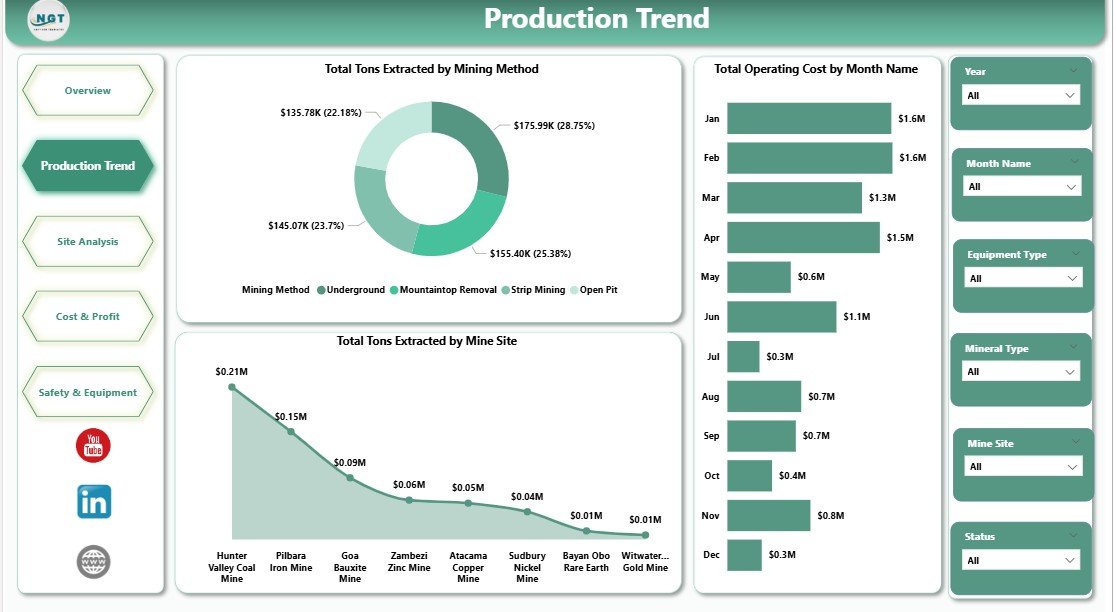
Page 2 — Production Trend
The Production Trend page is built for operations directors and plant superintendents who need to know where production is happening and how. Three charts answer the most important production questions:
- Total Tons Extracted by Mining Method — compares output across surface, underground, open-pit, and other methods to identify which methods are over- or under-delivering.
- Total Operating Cost by Month Name — monthly operating cost trend so finance and operations can see cost drift before it becomes a quarterly surprise.
- Total Tons Extracted by Mine Site — site-by-site production ranking that immediately flags the laggards and the leaders for capex prioritization.
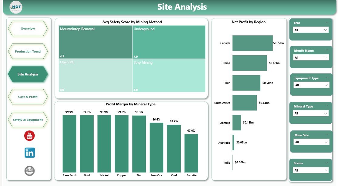
Page 3 — Site Analysis
The Site Analysis page is the portfolio-level view used in monthly leadership reviews to answer one question: where should we invest next?
- Avg Safety Score by Mining Method — connects HSE performance to operational choice, so methods with deteriorating safety scores can be reviewed before incidents escalate.
- Net Profit by Region — regional profitability split that informs geographic capex allocation.
- Profit Margin by Mineral Type — margin analysis across gold, copper, iron ore, coal, and other minerals so portfolio strategy follows the highest-margin commodity mix.
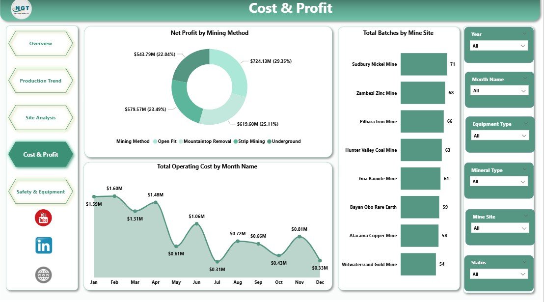
Page 4 — Cost and Profit
The Cost and Profit page is the FP&A view. Three charts isolate where cost leaks form and where profit is actually generated:
- Net Profit by Mining Method — strips out revenue mix to show which method genuinely earns the most after operating cost.
- Total Operating Cost by Month Name — monthly cost curve to detect creep early and pair with the production trend on Page 2.
- Total Batches by Mine Site — batch volume per site, used together with cost to compute cost-per-batch and cost-per-ton at the site level.
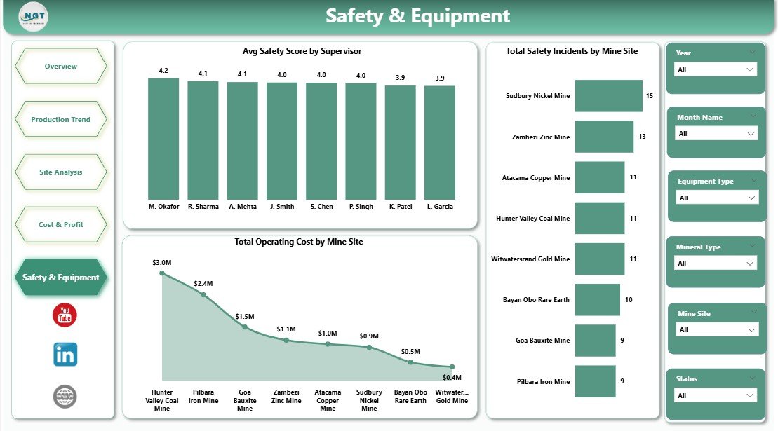
Page 5 — Safety and Equipment
The Safety and Equipment page is the HSE and Operations view that closes the loop between safety culture, supervisor performance, and operational cost. Three charts make the connections that most spreadsheet reports miss:
- Avg Safety Score by Supervisor — supervisor-level accountability so HSE leaders can recognize the strongest performers and coach the weakest.
- Total Safety Incidents by Mine Site — site-level incident counter that pairs with the supervisor view to root-cause incident clusters.
- Total Operating Cost by Mine Site — operating cost per site, surfaced alongside incidents to see whether the most expensive sites are also the riskiest.
How to Use This Power BI Mining Dashboard (5 Steps)
- Download the .pbix file after purchase and open it in Power BI Desktop (free from Microsoft).
- Replace the sample data via Transform Data > Data Source Settings — point the queries at your own production, cost, and safety tables.
- Click Refresh — every card, chart, and slicer recalculates against your live data instantly.
- Filter by mine site, mineral, method, supervisor, or month using the slicers on each page.
- Publish to Power BI Service to share with leadership with role-level access — no more emailed PPT decks.
Frequently Asked Questions
Q1. Do I need a paid Power BI subscription?
No. Power BI Desktop is free from Microsoft and runs the .pbix file fully. A Power BI Pro license is only required if you want to publish to the Power BI Service.
Q2. Can I connect my own SQL / Excel / SharePoint data?
Yes. Open the file in Power BI Desktop, change the data source via Transform Data, and the visuals, slicers, and DAX measures stay intact.
Q3. Will this work for any mineral type — gold, copper, iron ore, coal?
Yes. Mineral Type is a dimension in the data model, so the same template works for metals, energy minerals, industrial minerals, and aggregates.
Q4. Can I add or remove pages and KPIs?
Absolutely. Every visual, slicer, and DAX measure is fully editable in Power BI Desktop.
Q5. How is this different from the Mining Dashboard in Power BI?
The Mining Dashboard in Power BI focuses on overall mining KPIs. This Mining Operations Dashboard goes deeper on operational levers — mining method, mine site, supervisor, batches, cost-per-ton — across 5 dedicated analysis pages.
Q6. Is there an Excel version?
Yes — see the Mining Operations Dashboard in Excel walkthrough on this blog.
Who This Dashboard Is For
Best for: Mine GMs, Operations Directors, Plant Superintendents, FP&A teams in metals & mining, HSE Managers, and BI/analytics teams in mid-market and enterprise mining companies who want a refreshable, editable Power BI starting point.
Not for: Geologists running block models or pit optimization (use specialist software like Surpac or Deswik). Single-pit artisanal operators with no digital data capture. Teams that need real-time SCADA-level streaming.
About the Author
This dashboard was created by PK, a Microsoft Certified Professional with 15+ years of hands-on Excel, Power BI, and Google Sheets experience and the founder of NextGenTemplates. PK’s tutorials reach 300,000+ subscribers across @PK-AnExcelExpert, @NextGenTemplates, and @NeoTechNavigators. Every NextGenTemplates dashboard is QA-tested in Power BI Desktop on Windows before release.
Last updated: May 2026. Compatible with Power BI Desktop (May 2026 release and later) on Windows 10/11.
Click here to Purchase the Mining Operations Dashboard in Power BI
30-day money-back guarantee. Lifetime access. Free updates. Built by a Microsoft Certified Professional.
Watch the Tutorial on YouTube
Subscribe to @PK-AnExcelExpert, @NextGenTemplates, and @NeoTechNavigators for full Power BI mining dashboard walkthroughs and DAX deep-dives.