The global online food delivery market is projected to hit $1.65 trillion by 2027 (Statista, 2025), with operators running across 3-15 platforms on average and tracking 20+ KPIs per location. Yet most cloud kitchens and delivery aggregators still report performance through Excel exports stitched together every Monday morning — losing 4-6 hours of operations time per week and zero ability to drill into rider, zone, or cuisine performance.
The Food Delivery Dashboard in Power BI replaces that weekly stitch-up with a single .pbix report — five themed pages, thirteen interactive visuals, and slicers on every page. Setup takes under ten minutes, the file opens in free Power BI Desktop, and you own the model forever. This post walks through every page, who it’s built for, how it stacks up against paid SaaS, and the practical setup steps.
👉 Click here to Purchase Food Delivery Dashboard in Power BI
Key Features of Food Delivery Dashboard in Power BI
The dashboard packages five operational use cases that food delivery operators reach for every week. Each is built on a Power BI page with slicers, KPI cards, and reactive visuals.
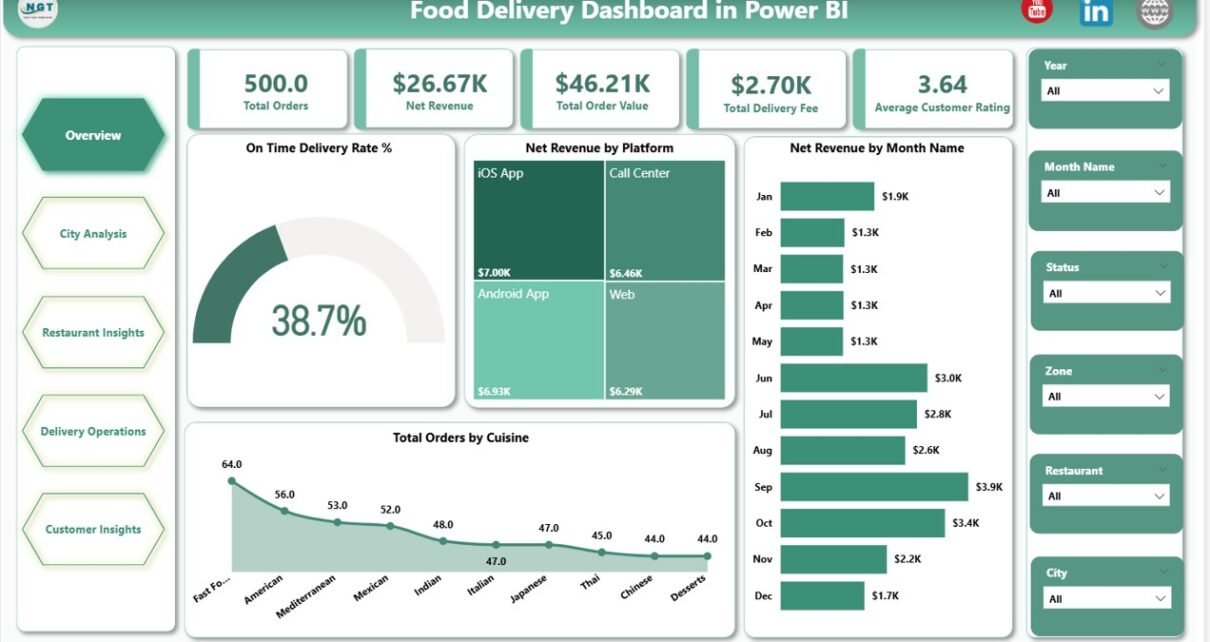
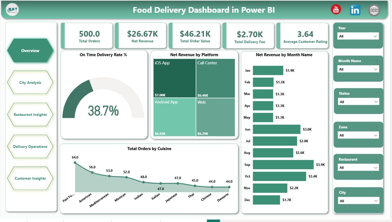
- Five executive KPI cards on page one — Total Orders, Net Revenue, Total Order Value, Total Delivery Fee, and Average Customer Rating — surface the headline numbers leadership reviews in the first three seconds.
- Thirteen interactive visuals across five themed pages covering platform mix, geography, cuisine economics, rider operations, and customer segmentation — every visual responds to the page-level slicers.
- Built-in rider and zone analytics — Average Delivery Time by Top Ten Riders and On Time Delivery Rate % by Zone make rider reviews and zone dispatch decisions data-driven.
- Customer segment and promo analysis — Net Revenue by Customer Segment alongside Cancellation Rate % by Customer Segment exposes which segments and promo codes drive profit versus chargebacks.
- Opens in free Power BI Desktop — no Pro license required to open and edit, only required to publish to Power BI Service for browser and mobile sharing.
Dashboard Pages Explanation
Five report pages, each focused on a different operational stakeholder. The pages are designed to be reviewed in sequence — Overview for the leadership read-out, then drill into the page that matches whichever metric needs attention.
Page 1: Overview
The Overview page combines five headline KPI cards with four charts: On Time Delivery Rate % (operational health gauge), Net Revenue by Platform (channel mix), Net Revenue by Month Name (seasonal trend), and Total Orders by Cuisine. Slicers across the top let you isolate a city, zone, platform, or date range and watch every visual repaint.
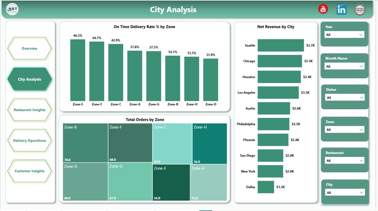
Page 2: City Analysis
Geography-focused page with three charts: On Time Delivery Rate % by Zone, Total Orders by Zone, and Net Revenue by City. Operations managers use it to spot under-performing zones and identify revenue-leading cities at a glance.
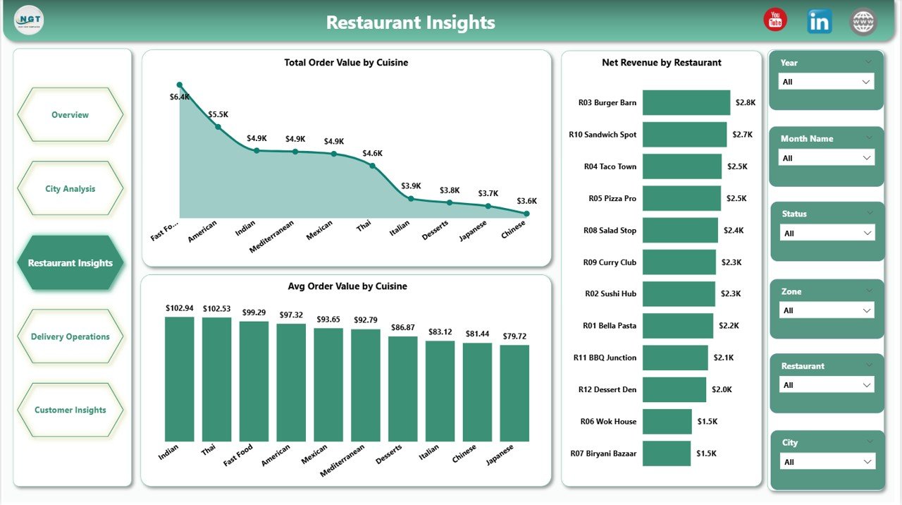
Page 3: Restaurant Insights
Cuisine and restaurant economics in three visuals: Total Order Value by Cuisine, Average Order Value by Cuisine, and Net Revenue by Restaurant. This is the page restaurant partner managers open first — it shows which cuisines drive volume versus margin and which restaurants carry the topline.
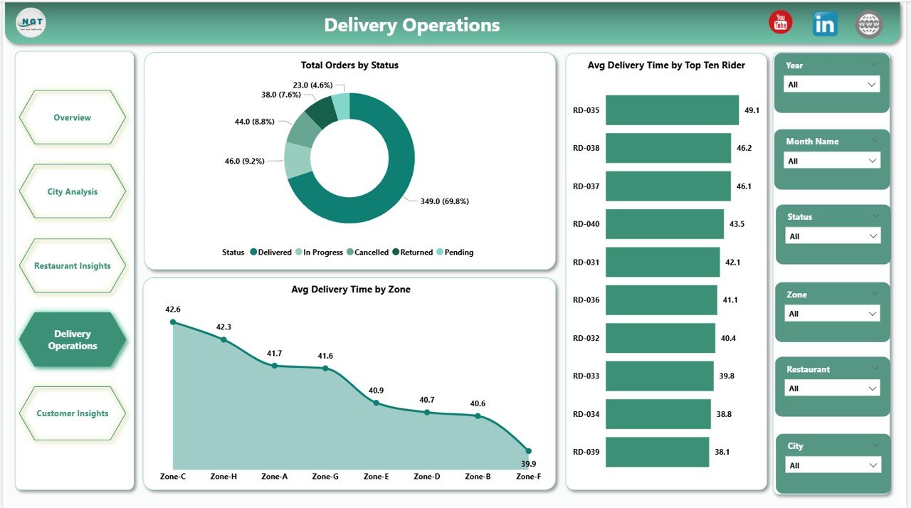
Page 4: Delivery Operations
Operations team page with Total Orders by Status (Delivered, Cancelled, Returned, In-Transit), Average Delivery Time by Zone, and Average Delivery Time by Top Ten Riders. Use it for rider performance reviews, SLA tracking, and zone dispatch planning.
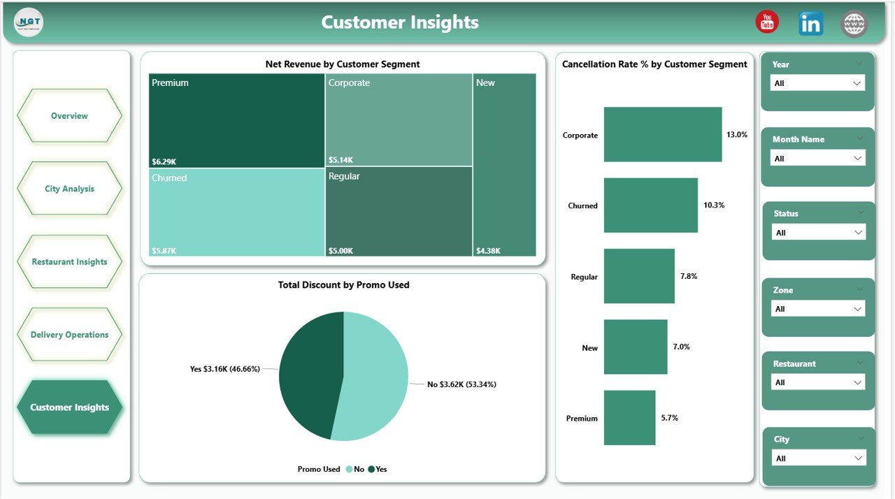
Page 5: Customer Insights
Customer-side analytics page: Net Revenue by Customer Segment (New, Returning, Loyal, VIP), Total Discount by Promo Used, and Cancellation Rate % by Customer Segment. Marketing uses this page to validate which promo codes lift revenue without spiking cancellations.
Food Delivery Dashboard in Power BI vs. Tableau vs. Paid Food-Delivery SaaS — Feature Comparison
| Feature | Food Delivery Dashboard in Power BI | Tableau / Qlik build | Paid SaaS (Otter / Deliverect) |
|---|---|---|---|
| Cost | $17.99 one-time ✅ | $70+ / user / month | $49-249 / location / month |
| Platform | Power BI Desktop (free) ✅ | Tableau Desktop / Cloud | Vendor-hosted SaaS |
| Setup time | Under 10 minutes ✅ | 2-6 weeks of build | 1-3 days onboarding |
| Pages included | 5 themed pages, 13 visuals ✅ | Build from scratch | Fixed vendor templates |
| Customizable visuals & DAX | Full edit access ✅ | Full edit ✅ | Limited vendor settings |
| Mobile access | Power BI mobile app ✅ | Tableau Mobile ✅ | Vendor mobile app ✅ |
| Vendor lock-in | None — you own the .pbix ✅ | Tableau ecosystem | High — data in vendor |
| Year-1 cost at 5 users | $17.99 total ✅ | $4,200+ / year | $2,940-14,940 / year per location |
For food delivery operators who want city, restaurant, rider, and customer analytics without paying SaaS per-location fees or commissioning a multi-week Tableau build, the Food Delivery Dashboard in Power BI sits in the sweet spot.
Who Should Use This Template
Perfect for:
- Cloud and dark kitchen operators running 3-50 outlets who need a unified Power BI view across platforms
- Restaurant chains with in-house delivery fleets tracking riders, zones, and on-time SLAs
- Multi-platform aggregators consolidating Swiggy, Zomato, Uber Eats, DoorDash, and direct-app orders
- Operations analysts replacing CSV-based monthly reports with a refreshable Power BI report
- Founders and category managers presenting weekly performance to investors and partners
Not a fit if:
- You run an enterprise delivery platform needing 10M+ orders/day at sub-second latency
- Your team has no Power BI Desktop access — it’s Windows-only
- You need live POS streaming — this is a refresh-based report, not real-time
- You run a single local restaurant without delivery (try the Catering Business KPI Scorecard instead)
Real-World Use Cases
Priya runs operations for a 12-outlet cloud kitchen brand in Bengaluru. Every Monday morning she loads the previous week’s order export, refreshes the .pbix, and walks her city managers through the Delivery Operations and City Analysis pages. Zone-level on-time rate and top-ten rider delivery time drive that week’s rider reviews and dispatch adjustments. She replaced three Excel files and a weekly slide deck with this single Power BI report.
Marco is a category manager at a regional delivery aggregator in Italy. He opens the Restaurant Insights page to identify which cuisines lift Average Order Value and which restaurant partners are underperforming on Net Revenue. He layers the Customer Insights page on top to confirm that promo spend isn’t driving cancellations in his loyal-customer segment — a hidden chargeback risk his old Excel reports missed entirely.
Sarah is a founder pitching Series A for a dark-kitchen startup. Instead of paying $249 per location per month for Deliverect Analytics, she uses this Power BI report as the operational dashboard in her board pack. On Time Delivery Rate %, Net Revenue by Platform, and Net Revenue by Customer Segment are the three slides her lead investor screenshots every quarter.
Advantages of Food Delivery Dashboard in Power BI
The dashboard pays for itself the moment it replaces a single month of paid SaaS analytics. At $17.99 one-time versus $49-249 per location per month, a 10-outlet operator saves $5,880-29,880 in year one alone. Beyond the cost, the .pbix file is a complete asset you own — no vendor lock-in, no data trapped behind a SaaS API, and free updates whenever the template is improved. Refreshing the data against a new week’s orders takes one click instead of one morning of CSV stitching.
Opportunities for Improvement
This is an honest section because it builds trust. The Food Delivery Dashboard in Power BI is a refresh-based report — it’s not a real-time event stream and won’t replace a POS or order-routing system. It’s Windows-only because Power BI Desktop doesn’t run natively on macOS or Linux (workaround: use a Windows VM or the Power BI Service web editor). And the standard data model assumes Platform, City, Zone, Cuisine, and Rider columns — if your order export uses different field names, you’ll spend an extra 10-15 minutes mapping fields in Power Query the first time.
Best Practices
To get the most out of the Food Delivery Dashboard in Power BI: refresh the data on a fixed weekly cadence (Monday morning is the most common) so the team is always reviewing the same time window; publish the .pbix to Power BI Service so managers can open it on mobile during store visits; and use the slicers to build saved “bookmark” views for each city manager rather than emailing screenshots. Pair this Power BI report with the Food Delivery Dashboard in Excel for offline analysis when traveling or presenting without internet access.
Explore Relevant Templates
The same template is available as the Food Delivery Dashboard in Excel for spreadsheet workflows. For adjacent food-business verticals, see the Food Truck Dashboard in Power BI and the Bakery Business Dashboard in Power BI — both follow the same Power BI structure. Operators tracking smaller-format restaurants may also want the Catering Business KPI Scorecard in Excel and the Bakery KPI Scorecard in Excel. Browse the full Power BI Dashboard Templates collection on NextGenTemplates.
Frequently Asked Questions
What KPIs does the Food Delivery Dashboard in Power BI track?
The Food Delivery Dashboard in Power BI tracks five headline KPIs — Total Orders, Net Revenue, Total Order Value, Total Delivery Fee, and Average Customer Rating — plus 13 visualizations covering platform mix, city and zone performance, cuisine economics, rider delivery time, customer segments, and promo-driven cancellations.
How long does setup take?
Setup takes under 10 minutes for the Food Delivery Dashboard in Power BI. Download the .zip, open the .pbix in Power BI Desktop, point the data source to your delivery orders file, and click Refresh. All five pages and every visual update automatically — no DAX edits required unless you want to add new metrics.
How does this compare to Otter or Deliverect Analytics?
Otter and Deliverect Analytics charge $49-249 per location per month and lock historical data inside their platform. The Food Delivery Dashboard in Power BI is a one-time $17.99 purchase, runs on free Power BI Desktop, and you own the .pbix and the data forever — no per-location fee, no vendor lock-in.
Do I need a Power BI Pro license?
No. The Food Delivery Dashboard in Power BI opens and edits in free Power BI Desktop (Windows-only). A Power BI Pro license is only required if you want to publish to Power BI Service and share refreshable reports with teammates inside your workspace.
Can I add my own platforms and zones?
Yes. The dashboard uses standard Platform, City, Zone, Cuisine, and Rider fields in the source data — add any platform or zone name to your data file and it appears in slicers and charts automatically on the next refresh of the Food Delivery Dashboard in Power BI.
Is the dashboard available in Excel?
Yes. The same template structure is available as the Food Delivery Dashboard in Excel. Many operators buy both — Power BI for in-office and mobile review, Excel for offline editing and presentations.
Will updates be free if the template is improved?
Yes. Customers receive free updates whenever the Food Delivery Dashboard in Power BI is revised — new visuals, DAX improvements, or layout fixes are pushed to existing buyers at no extra cost.
About the Author
Built by PK — Microsoft Certified Professional with 15+ years of Excel, Google Sheets, and Power BI experience. Founder of NextGenTemplates, reaching 300K+ subscribers across YouTube channels. Every template is hand-built and tested before release.
Conclusion
The Food Delivery Dashboard in Power BI is the simplest way to consolidate orders, riders, restaurants, and customers into a single Power BI report — without committing to multi-thousand-dollar SaaS contracts or weeks of custom Tableau work. Five pages, thirteen visuals, slicers everywhere, and a .pbix you own forever for $17.99.
👉 Click here to Purchase Food Delivery Dashboard in Power BI
Instant download · One-time payment · No subscription
For step-by-step video walkthroughs, visit Youtube.com/@PK-AnExcelExpert.
Last updated: May 2026