Running a daycare center is a daily juggling act. Owners and managers must track enrollment, attendance, fees, meal costs, teacher workload, and parent satisfaction — yet most centers still rely on scattered spreadsheets and manual reports. The Daycare Center Dashboard in Power BI brings every one of those moving parts into a single .pbix file with 5 KPI cards, 16+ visuals, and slicer-based filtering across 5 interactive pages. Setup takes under 10 minutes — point the data source at your daycare records and a single Refresh updates the entire report.
In this detailed guide, you’ll learn what’s inside each page of the Daycare Center Dashboard in Power BI, the KPIs it tracks, how to use it day-to-day, where it fits against Tableau/Qlik and paid daycare SaaS, and frequently asked questions about deploying it in real childcare centers.
👉 Click to Purchase the Daycare Center Dashboard in Power BI
Key Features of the Daycare Center Dashboard in Power BI
- 📊 5 Interactive Power BI Pages — Overview, Enrollment Analysis, Attendance Tracking, Financial Overview, and Staff & Activities — each purpose-built for a specific management view inside one .pbix file.
- 🎯 5 Headline KPI Cards — Total Meal Cost, Total Fees, Total Children, Overdue Payments, and Payment Collection % sit on the Overview page for a 10-second center health check.
- 📈 16+ Pre-Built Power BI Visuals — Every chart is driven by the underlying data model, so one Refresh click updates everything on every page at once.
- 🧭 Multiple Slicers — Filter by age group, program, classroom, payment status, or month and watch every visual and KPI card respond instantly via Power BI cross-filtering.
- 📋 Connect Your Own Data — Use Power BI’s Transform Data window to point the source at your Excel or CSV. Keep the column structure and every visual continues working.
- 🔒 One-Time Purchase — No monthly subscription, no per-user fees, no renewal. You own the .pbix file forever.
Dashboard Pages Explanation
The Daycare Center Dashboard in Power BI is organized into five purpose-built report pages. Each page targets a specific management view and shares the same slicer-based filter experience.
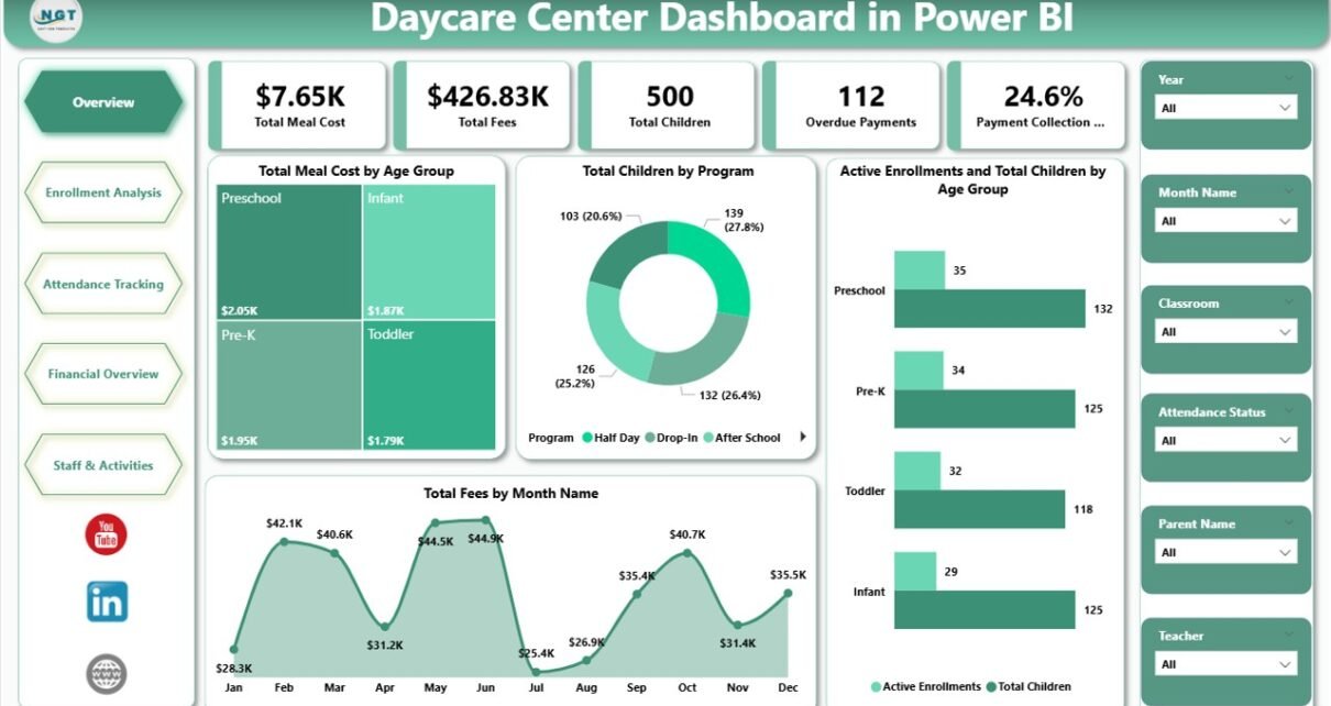
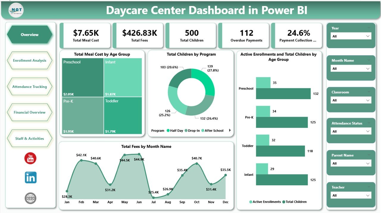
Page 1: Overview Page
The Overview Page is the executive summary. Five KPI cards across the top — Total Meal Cost, Total Fees, Total Children, Overdue Payments, and Payment Collection % — give an instant read on the daycare center’s financial and operational health. Below the cards, four visuals visualize the high-level performance: Total Meal Cost by Age Group (meal expense by toddler/preschool/pre-K cohort), Total Children by Program (enrollment distribution across programs), Active Enrollments and Total Children by Age Group (currently active children compared to total enrolled), and Total Fees by Month Name (revenue trend over the year). Slicers at the top of the page let you filter every visual and KPI card with a single click.
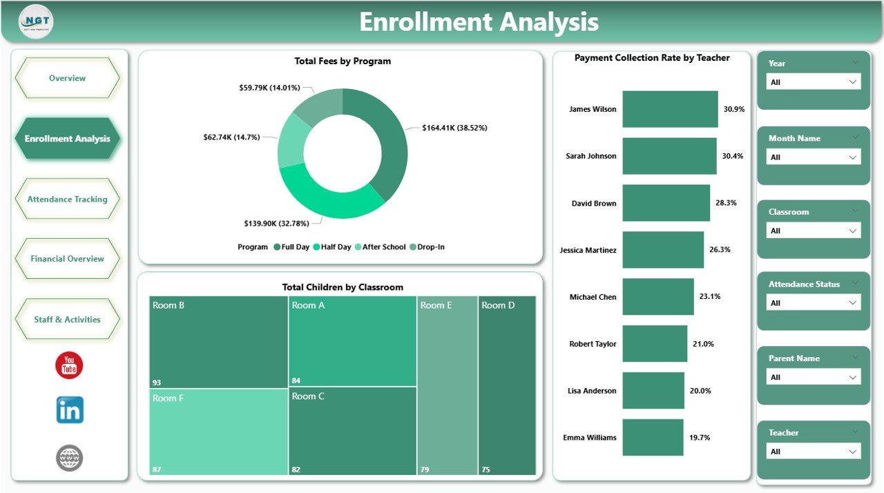
Page 2: Enrollment Analysis
The Enrollment Analysis page focuses on how the center is growing and where capacity is being used. Visuals include Total Fees by Program (revenue contribution of each program), Total Children by Classroom (capacity utilization per classroom), and Payment Collection Rate by Teacher (collection performance against each teacher’s portfolio). This page is the go-to view when planning a new program launch, rebalancing classrooms, or reviewing how individual teachers are tracking on collections.
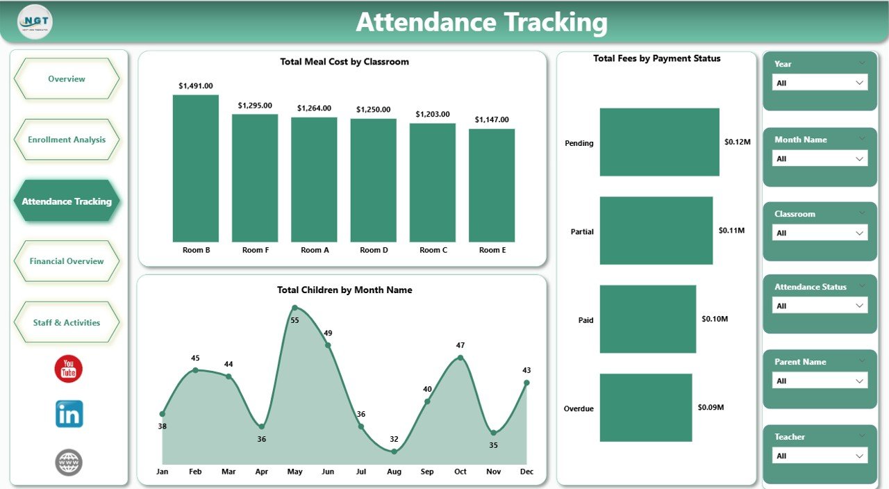
Page 3: Attendance Tracking
Attendance Tracking is the day-to-day operations view. Visuals include Total Meal Cost by Classroom (meal spend at the classroom level), Total Children by Month Name (enrollment seasonality), and Total Fees by Payment Status (paid, pending, overdue split). Use this page to catch meal cost overruns early, see how enrollment moves seasonally, and stay on top of payment delays before they hit cash flow.
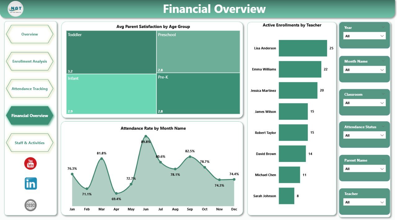
Page 4: Financial Overview
Financial Overview is the blended money-and-experience view. Visuals include Avg Parent Satisfaction by Age Group (satisfaction by cohort), Attendance Rate by Month Name (engagement seasonality), and Active Enrollments by Teacher (workload concentration across staff). This is the page your finance team and leadership will look at most often — it links the financial signals to the parent experience that drives them.
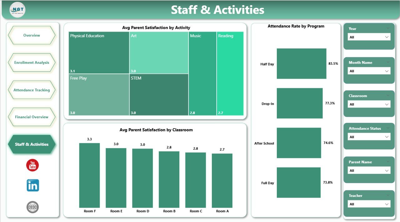
Page 5: Staff and Activities
The Staff and Activities page connects parent satisfaction back to the team and curriculum. Visuals include Avg Parent Satisfaction by Activity (which activities parents value most), Avg Parent Satisfaction by Classroom (room-level parent feedback), and Attendance Rate by Program (engagement by program). Use this page during quarterly staff reviews and curriculum planning sessions to identify activities to keep, expand, or replace.
Daycare Center Dashboard in Power BI vs. Tableau / Qlik vs. Paid Daycare SaaS — Feature Comparison
| Feature | Daycare Center Dashboard in Power BI | Tableau / Qlik Sense | Paid Daycare SaaS (Procare / brightwheel / HiMama) |
|---|---|---|---|
| Cost | $17.99 one-time | $70 / user / month (Tableau Creator) | $59-149 / center / month |
| Platform | Power BI Desktop (free) | Tableau Desktop or Qlik Sense | Web + mobile app |
| Setup time | Under 10 minutes | 2-4 hours to rebuild equivalent | 2-4 weeks onboarding |
| Slicer filtering | ✅ Native Power BI slicers | ✅ Native filters | ✅ Built-in filters |
| Mobile view | ✅ Power BI mobile app (with Pro) | ✅ Tableau Mobile | ✅ Native mobile app |
| Multi-branch view | ✅ Add Location column | ✅ Custom build required | ✅ Native multi-site |
| Per-user fees | ✅ Free for desktop use | ❌ $70+ / user / month | ❌ $5-15 / user / month |
| Year-1 cost at 5 users | $17.99 total | ~$4,200 total | ~$3,540 – $8,940 |
| Cloud sharing (optional) | ✅ Publish to Power BI Service | ✅ Tableau Cloud | ✅ Built-in |
For daycare owners who want operational, financial, and staff visibility without paying $59-149 / center / month, the Daycare Center Dashboard in Power BI sits in the sweet spot.
Who Should Use This Template
Perfect for:
- Daycare center owners running 1-5 locations who want a single .pbix file as their operating dashboard
- Childcare and preschool managers tracking enrollment, attendance, fees, and parent satisfaction in Power BI
- Franchise operators and multi-branch directors who already standardize on Power BI for other reporting
- Education consultants delivering ready-made Power BI dashboards to client centers
- Finance and admin teams at small-to-mid daycare networks producing monthly performance reports
Not a fit if:
- You run a 50+ center daycare chain that needs SOC 2, SSO, and centralized parent-billing — use Procare or brightwheel instead
- You need a parent-facing app for real-time messaging, photos, and check-in/check-out
- You’d rather stay inside Excel and don’t want to install Power BI Desktop — pick the Excel version instead
Real-World Use Cases
Aisha owns a 35-child daycare in Pune. She uses the Daycare Center Dashboard in Power BI to track monthly fees collected against meal costs by age group, identify which classrooms have the highest payment collection rates, and report monthly enrollment trends to her parent investors — without paying ₹6,000/month for a daycare SaaS subscription. Every month-end she exports the Financial Overview page as PDF and shares it in a one-page investor update.
Marcus runs a 3-branch childcare network in Atlanta. He added a Location column to the source data and now uses Power BI slicers to switch between branches. Every Monday his admin team refreshes the data, publishes to Power BI Service, and the leadership team reviews the Financial Overview page on the Power BI mobile app before Tuesday’s weekly ops meeting.
Priya is an education consultant. She delivers the Daycare Center Dashboard in Power BI to four small daycare clients during onboarding and saves about 20 hours of custom Power BI build work per engagement. Clients who need senior-level KPI tracking layer on the Childcare Services KPI Dashboard in Excel for MTD/YTD scorecards.
Advantages of the Daycare Center Dashboard in Power BI
- One-click refresh — Update the source data, click Refresh, and every visual across all five pages is current.
- No subscription — Pay $17.99 once, own it forever. The savings vs $59-149/month SaaS pay for many other improvements in year one.
- Free desktop tool — Power BI Desktop is free from Microsoft. No license to buy unless you choose to publish to Power BI Service.
- Native cross-filtering — Click a bar on any chart and every other visual on the page filters automatically — no scripts or formulas needed.
- Mobile-friendly via Power BI Service — Publish the report once and your leadership can review the Financial Overview on iPhone or Android.
- Connect to live data — Point at a SharePoint folder or OneDrive Excel file and the report can refresh on schedule from Power BI Service.
Opportunities for Improvement
The Daycare Center Dashboard in Power BI is purposely a reporting and analysis tool — it is not a full daycare operations system. Honest limitations to note:
- Requires Power BI Desktop — You need to install the free Power BI Desktop on Windows. There is no Mac-native Power BI Desktop today; Mac users can use Power BI Service in a browser instead.
- No automatic data sync from SaaS — You must export records from your billing system into Excel/CSV. There is no native connector to Procare or brightwheel.
- Pro license needed to share interactively — Power BI Desktop alone is free. Publishing to Power BI Service for web/mobile sharing needs a Power BI Pro license per user.
- No parent-facing app — This dashboard is for internal reporting. For real-time parent messaging, pair it with a dedicated parent app.
Best Practices
To get the most from the Daycare Center Dashboard in Power BI, follow these practices:
- Refresh weekly, not daily — One weekly refresh keeps the dashboard meaningful without becoming a chore.
- Lock the column structure — Don’t reorder, rename, or delete columns in the source file; the data model is bound to those exact names.
- Use a single source of truth — Either Power BI or your daycare SaaS is the master record; don’t try to keep both perfectly in sync.
- Publish a single workspace — If you go to Power BI Service, set up one workspace per center and share the report there instead of emailing .pbix files around.
- Back up monthly — Save a dated copy of the .pbix file at month-end (e.g., Daycare-Center-Dashboard-2026-03.pbix) so you can look back at historical states.
- Pair with the KPI scorecard — Use the Childcare Services KPI Dashboard in Excel for MTD/YTD targets and use this dashboard for operational depth. The Childcare Services KPI Dashboard blog post explains how that scorecard is structured.
For Microsoft’s official guide on publishing reports to Power BI Service, see the Publish from Power BI Desktop article on Microsoft Learn.
Explore Relevant Templates
📌 Daycare Center Dashboard in Excel — Pivot-driven Excel version for teams that prefer to stay inside Microsoft Excel.
📌 Childcare Services KPI Dashboard in Excel — MTD/YTD scorecard companion for senior performance reviews.
📌 School Admin Dashboard in Power BI — Adjacent Power BI dashboard for school admin teams in the same education vertical.
📌 Browse all Power BI Dashboard Templates on NextGenTemplates.
Also available as: Excel version — pick the platform your team already uses.
Frequently Asked Questions
What KPIs does the Daycare Center Dashboard in Power BI track?
The Daycare Center Dashboard in Power BI tracks five headline KPI cards — Total Meal Cost, Total Fees, Total Children, Overdue Payments, and Payment Collection % — alongside 16+ visuals covering meal cost by age group, fees by program, enrollment by classroom, payment collection rate by teacher, attendance rate by month, and parent satisfaction by activity and classroom.
How does this compare to paid daycare SaaS like Procare or brightwheel?
The Daycare Center Dashboard in Power BI is a one-time-purchase analytics report, while Procare and brightwheel are full-service daycare platforms with billing, parent apps, and check-in. At $17.99 vs $59-149/month, the cost difference is significant. Many centers run this dashboard alongside a SaaS for reporting that investors and accountants can consume without a SaaS login.
Do I need a Power BI Pro license to use this dashboard?
No. Power BI Desktop is free from Microsoft and lets you open, edit, and refresh the Daycare Center Dashboard in Power BI on your own machine. You only need a Power BI Pro license if you want to publish to Power BI Service and share interactive reports with teammates via the web or the Power BI mobile app.
How long does setup take?
Setup of the Daycare Center Dashboard in Power BI takes under 10 minutes. Open the .pbix file in Power BI Desktop, click Transform Data to point the source to your daycare Excel or CSV, click Refresh, and every visual and KPI card on the five pages updates automatically.
Can I use this template for multiple daycare locations?
Yes. Add a Location column to your source data, drop records for each branch into the same file, then drag Location onto a slicer on the Overview page. You can also save a separate copy of the .pbix file per branch if you prefer fully isolated reports.
What is the difference between the Excel and Power BI versions of this daycare dashboard?
The Excel version of the Daycare Center Dashboard uses pivot tables, slicers, and Refresh All inside one .xlsx file — best for teams that already live in Excel. The Power BI version uses the same KPI structure but runs on Power BI Desktop, supports a richer data model with Power Query, and can publish to Power BI Service for web/mobile sharing.
Is this a one-time purchase or a subscription?
The Daycare Center Dashboard in Power BI is a one-time purchase with lifetime access — no subscription, no per-user fees, no renewal. You can use the .pbix file on unlimited workstations and across as many centers as you operate.
About the Author
Built by PK — Microsoft Certified Professional with 15+ years of Excel, Google Sheets, and Power BI experience. Founder of NextGenTemplates, reaching 300K+ subscribers across YouTube channels (@PK-AnExcelExpert, @NextGenTemplates, @NeoTechNavigators). Every template is hand-built and tested before release.
Conclusion
The Daycare Center Dashboard in Power BI turns scattered childcare data into a single, slicer-driven decision tool. Five interactive pages, five headline KPI cards, 16+ Power BI visuals, and one-click refresh — all in a .pbix file that costs less than two months of any paid daycare SaaS reporting add-on.
👉 Click here to Purchase the Daycare Center Dashboard in Power BI
✅ Instant download · One-time payment · No subscription · Lifetime access
Visit our YouTube channel for step-by-step video tutorials.
📅 Last updated: May 2026