Personalization is now a core growth lever for startups, but the reporting side is often messy. Campaign exports live in one tool, subscriber reports in another, revenue data sits in a CRM, and A/B test results are reviewed separately. The Content Personalization Startups Dashboard in Excel brings those moving pieces into one structured workbook so founders and marketers can monitor campaigns, impressions, revenue, conversions, subscribers, channels, and model performance without building a dashboard from scratch.
This ready-to-use Excel dashboard includes 5 KPI cards, 5 analytical pages, a Data Sheet, and a Support Sheet powered by pivot tables. It is designed for startup teams that want clear reporting without monthly SaaS dashboard costs. You can replace the sample data, click Data > Refresh All, and start reviewing filtered insights in minutes.
Click here to purchase the Content Personalization Startups Dashboard in Excel
Key Features of Content Personalization Startups Dashboard in Excel
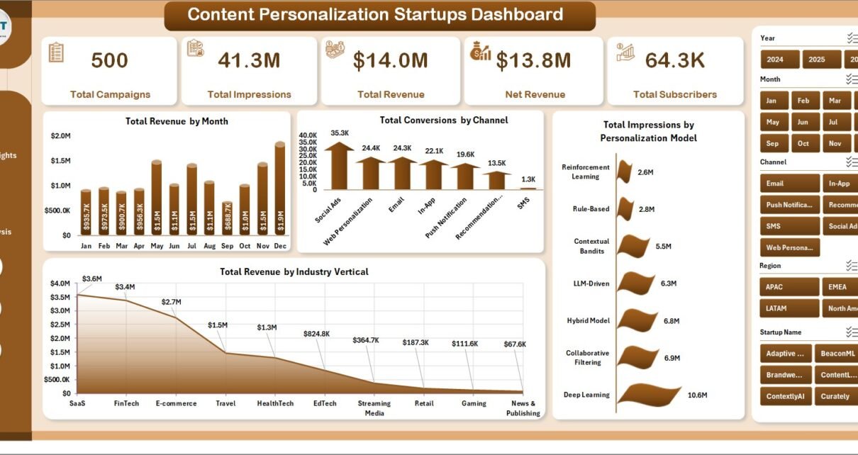
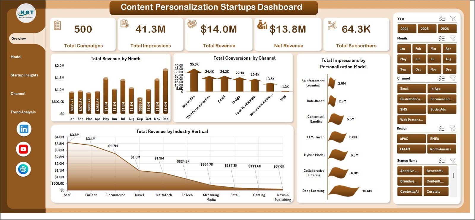
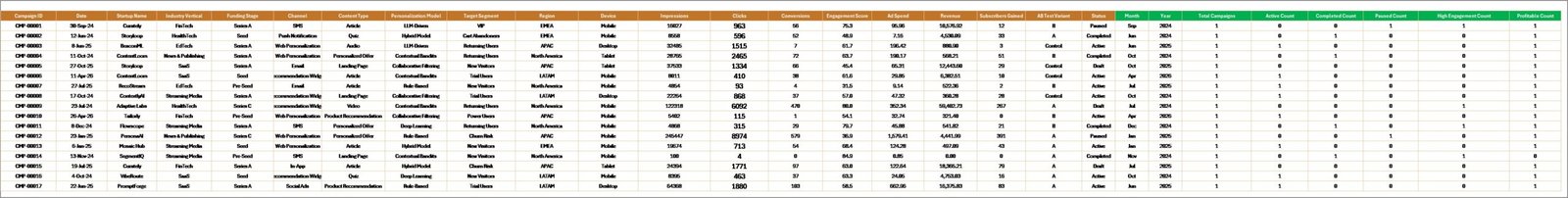
The dashboard gives content personalization teams a practical way to move from scattered campaign exports to visual reporting. It includes 5 headline KPI cards: Total Campaigns, Total Impressions, Total Revenue, Net Revenue, and Total Subscribers. These cards sit at the top of the Overview Page so users can understand campaign scale and commercial performance quickly.
Across the workbook, users get 16 chart views covering monthly revenue, channel conversions, personalization model impressions, industry revenue, A/B test click-through rate, funding stage performance, device clicks, regional revenue, engagement trends, and content type conversion. Slicers help users filter the dashboard by the fields that matter to their startup, including channel, model, segment, region, startup name, funding stage, device, and time period.
The workbook uses Excel’s native pivot table engine. Microsoft explains how pivot tables help summarize and analyze large data lists in Excel, which makes them a good fit for campaign dashboards that need fast filtering and grouped reporting. You can review Microsoft’s overview here: Create a PivotTable to analyze worksheet data.
Click here to purchase the Content Personalization Startups Dashboard in Excel
Dashboard Pages Explanation
1. Overview Page
The Overview Page acts as the main performance snapshot. At the top, it shows Total Campaigns, Total Impressions, Total Revenue, Net Revenue, and Total Subscribers. These cards help founders, marketers, and analysts understand whether personalization activity is producing audience growth and revenue movement.
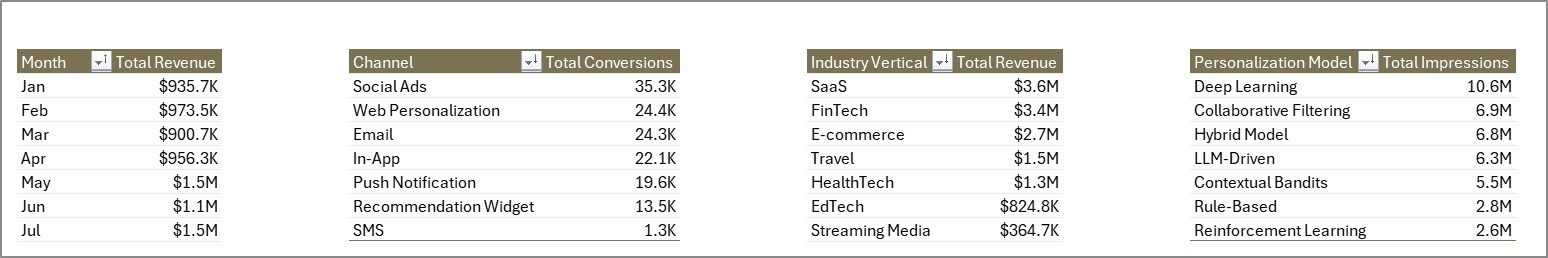
Total Revenue by Month: This chart shows month-by-month revenue movement. It helps you identify growth periods, slower months, campaign seasonality, and the timing of revenue spikes.
Total Conversions by Channel: This visual compares conversion volume across different channels. It helps determine whether email, web, referral, paid, or social campaigns are creating the most action.
Total Impressions by Personalization Model: This chart shows which personalization models are receiving the most exposure. It is useful for checking whether model usage aligns with campaign strategy.
Total Revenue by Industry Vertical: This chart breaks revenue down by customer industry. It helps startup teams decide which verticals deserve more sales focus, content investment, or experimentation.
Click here to purchase the Content Personalization Startups Dashboard in Excel
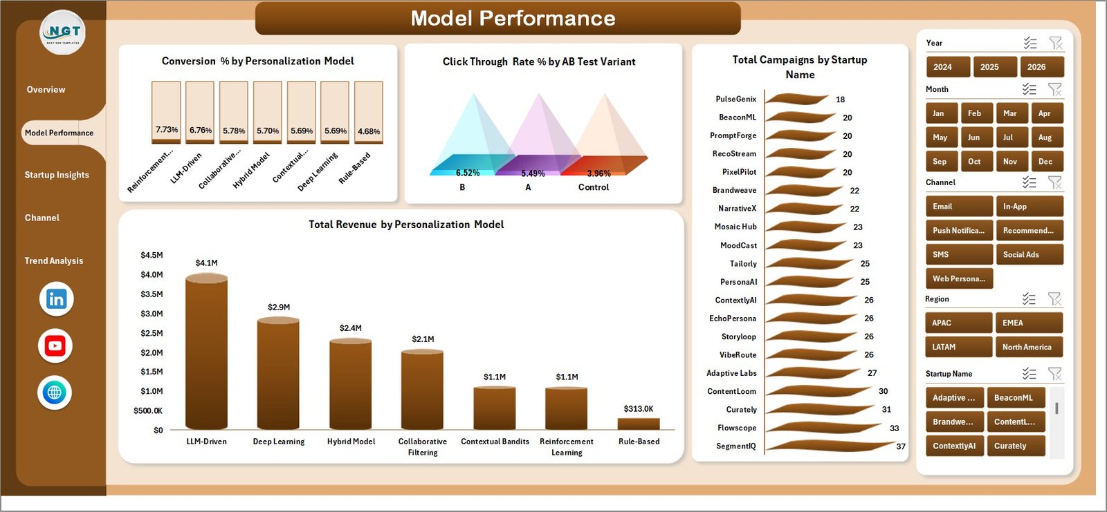
2. Model Performance
The Model Performance page focuses on how different personalization models and A/B test variants perform. Conversion % by Personalization Model helps teams compare which recommendation or segmentation approach produces the strongest conversion rate. Click Through Rate % by AB Test Variant makes campaign testing easier to review at a glance.
Total Campaigns by Startup Name shows which startup or business unit is running the most activity, while Total Revenue by Personalization Model connects model usage to commercial results. This page is useful for weekly growth meetings, model review discussions, and experimentation roadmaps.
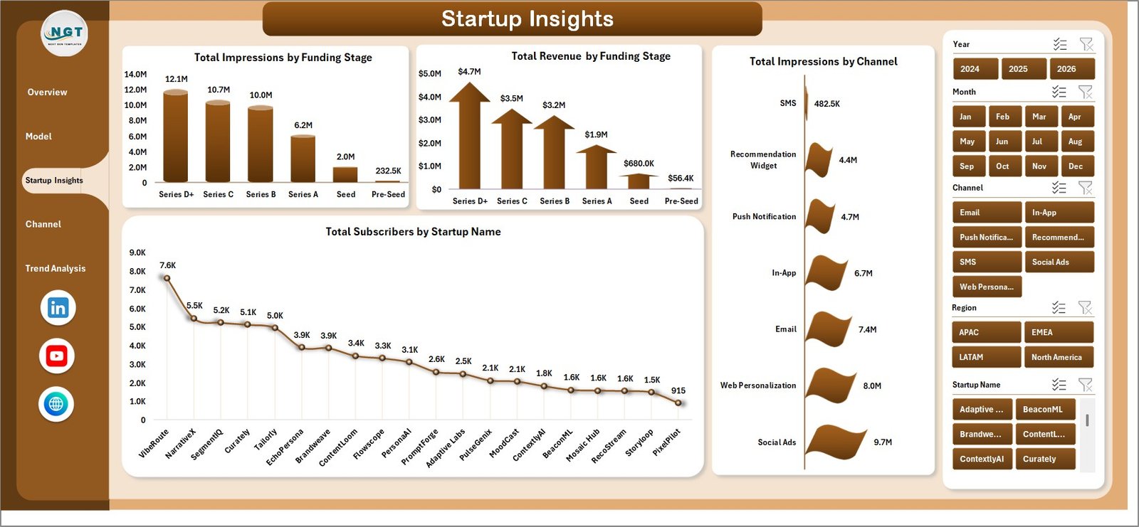
3. Startup Insights
The Startup Insights page connects campaign performance with company maturity and startup-level activity. Total Impressions by Funding Stage and Total Revenue by Funding Stage help teams understand whether early-stage, growth-stage, or later-stage startups are generating stronger market response.
Total Subscribers by Startup Name shows audience growth by startup, while Total Impressions by Channel explains which distribution channels generate the broadest reach. This page is especially helpful for startup accelerators, portfolio teams, marketing agencies, and SaaS founders comparing multiple campaigns or brands.
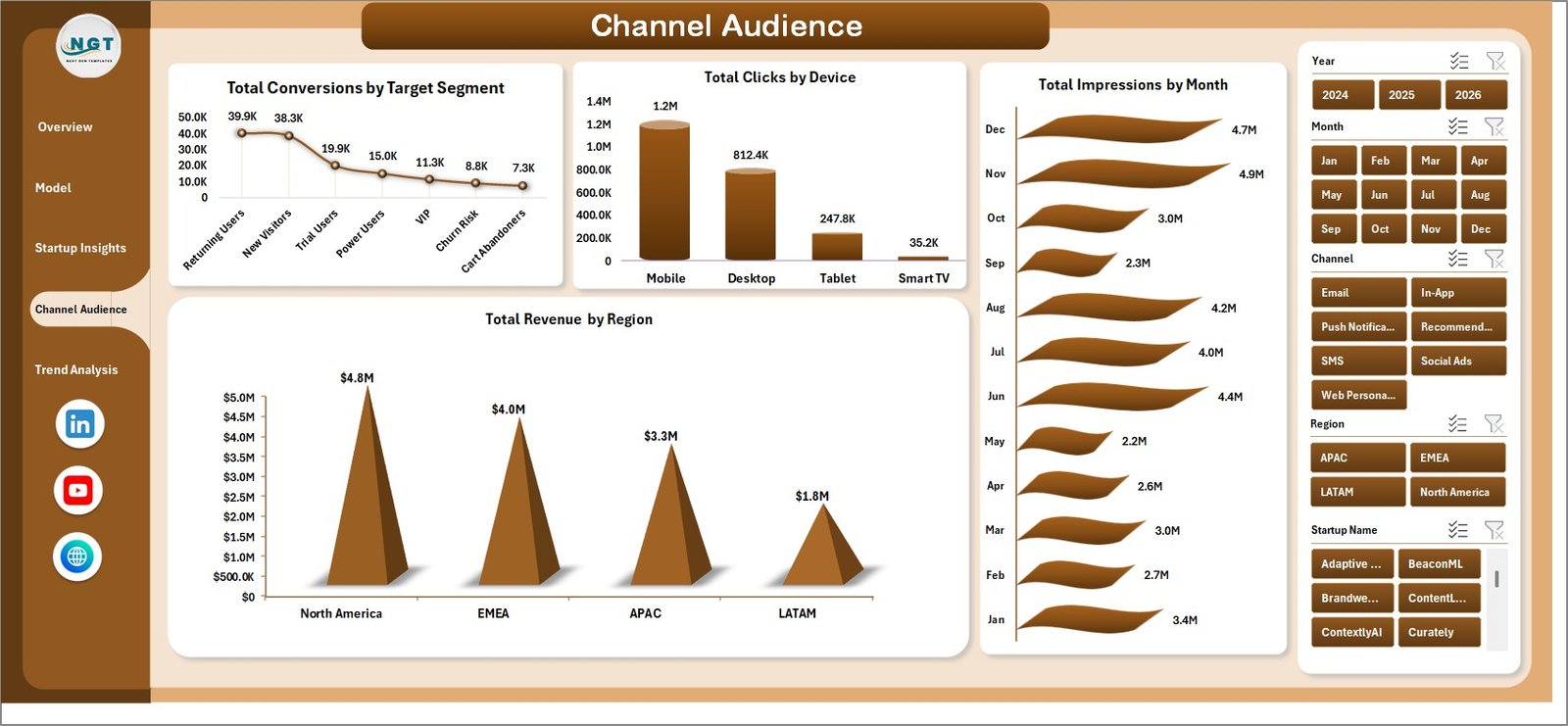
4. Channel Audience
The Channel Audience page shows how audiences respond across segments, devices, regions, and months. Total Conversions by Target Segment highlights which audience group is most likely to act. Total Clicks by Device helps determine whether desktop, mobile, or tablet traffic is creating the most engagement.
Total Revenue by Region explains where monetization is strongest, while Total Impressions by Month provides a reach trend over time. Together, these views help marketers decide where to focus targeting, messaging, and channel budgets.
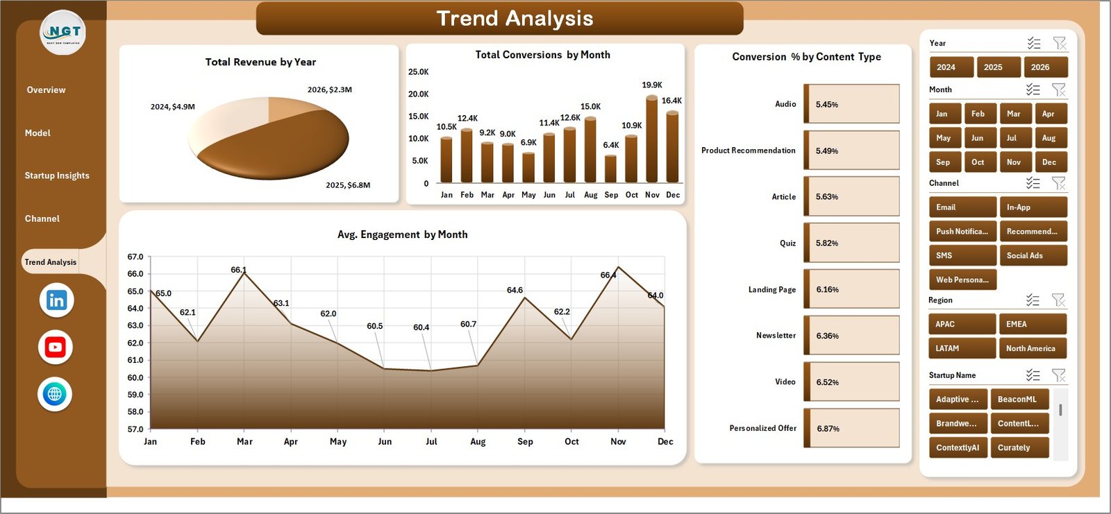
5. Trend Analysis
The Trend Analysis tab is built for performance review over time. Total Revenue by Year gives a high-level growth view, while Total Conversions by Month shows how conversion volume changes across the calendar. Avg. Engagement by Month helps teams understand whether personalized content is becoming more or less engaging.
Conversion % by Content Type compares how formats such as articles, landing pages, email modules, recommendations, videos, or offers convert. This is useful when planning future content experiments and deciding which formats deserve more production effort.
Click here to purchase the Content Personalization Startups Dashboard in Excel
6. Data Sheet Tab
The Data Sheet is where users add or replace campaign records. Each row should follow the same structured format as the sample data so the pivot tables continue to read the correct fields. After updating records, click Data > Refresh All to update the dashboard pages.
7. Support Sheet
The Support Sheet contains the pivot tables behind the dashboard. You do not need to edit it during normal use. After the Data Sheet changes, use Data > Refresh All and the pivots will refresh, which updates the dashboard charts and KPI cards. You can keep this sheet hidden for a cleaner workbook experience.
Content Personalization Startups Dashboard in Excel vs. Google Sheets Dashboard vs. Paid CRM/SaaS – Feature Comparison
| Feature | Excel Dashboard | Google Sheets Dashboard | Paid CRM/SaaS |
|---|---|---|---|
| Cost | $17.99 one-time | Low tool cost, more manual build time | $50-$500+ per month |
| Platform | Microsoft Excel | Google Sheets | Vendor cloud platform |
| Setup time | Under 10 minutes | Depends on formulas and pivots | Requires onboarding or setup |
| Collaboration | OneDrive or SharePoint | Native sharing | Usually seat-based |
| Custom fields | Fully editable | Editable | Limited by plan and permissions |
| Year-1 cost at 5 users | $17.99 total | Low direct cost | $3,000-$30,000+ |
Who Should Use This Template
This dashboard is useful for content personalization startups, SaaS founders, lifecycle marketing teams, CRM analysts, growth agencies, customer engagement teams, and startup accelerators that review campaign performance across multiple segments or brands.
It is not designed to replace a live personalization engine, a CDP, a CRM workflow system, or an enterprise attribution platform. Instead, it is a practical Excel reporting layer for teams that already export campaign data and need a clean dashboard for decision-making.
Click here to purchase the Content Personalization Startups Dashboard in Excel
Real-World Use Cases
Aisha, startup founder: She uses the Overview Page before board updates to explain campaign reach, revenue, net revenue, and subscriber growth.
Daniel, lifecycle marketer: He reviews Model Performance to compare A/B variants and decide which personalization model should be expanded.
Meera, CRM analyst: She updates the Data Sheet each month, refreshes the pivots, and sends Channel Audience snapshots to the growth and product teams.
Advantages of Content Personalization Startups Dashboard in Excel
The main advantage is speed. Instead of building charts manually every month, teams can use the same data structure and refresh the workbook. The dashboard also keeps data ownership simple because the campaign records stay in an Excel file controlled by the user.
Another advantage is flexibility. Because the workbook is editable, teams can change labels, duplicate charts, add fields, or create additional pivot views if their reporting process evolves.
Opportunities for Improvement
Teams can extend the workbook by adding more advanced fields such as customer lifetime value, churn risk score, cohort, source campaign ID, or sales-qualified lead status. Advanced users can also connect the workbook to Power Query if they want to automate imports from CSV files.
Best Practices
Keep the Data Sheet column structure consistent, refresh the dashboard after every update, use slicers during review meetings, and save a backup before making structural changes. If several people update the file, store a controlled master copy in OneDrive or SharePoint.
Click here to purchase the Content Personalization Startups Dashboard in Excel
Explore Relevant Templates
- Career Mentorship Platforms Dashboard in Excel
- Contact Center AI Dashboard in Power BI
- Podcast Audience Insights Dashboard in Google Sheets
- Browse Excel Dashboard templates
Frequently Asked Questions
What KPIs are included?
The dashboard includes Total Campaigns, Total Impressions, Total Revenue, Net Revenue, and Total Subscribers.
Does the dashboard require macros?
No. It uses Excel tables, pivot tables, slicers, and charts.
How do I update the dashboard?
Replace sample data in the Data Sheet, then click Data > Refresh All.
Can I use it for multiple startups?
Yes. The dashboard includes Startup Name and Funding Stage analysis, so it can support portfolio or multi-brand reporting.
Can I customize the dashboard?
Yes. The workbook is editable, although you should keep a backup before changing pivot sources.
About the Author
Built by PK – Microsoft Certified Professional with 15+ years of Excel, Google Sheets, and Power BI experience. Founder of NextGenTemplates, reaching 300K+ subscribers across YouTube channels. Every template is hand-built and tested before release.
Click here to purchase the Content Personalization Startups Dashboard in Excel
Conclusion
The Content Personalization Startups Dashboard in Excel gives startup teams a clear, affordable way to track personalization performance. With KPI cards, slicers, chart pages, a structured Data Sheet, and a pivot-powered Support Sheet, it turns campaign records into decision-ready reporting without subscription overhead.
Visit our YouTube channel to learn step-by-step Excel dashboard tutorials.
Click here to purchase the Content Personalization Startups Dashboard in Excel