The average Cybersecurity Operations Center Dashboard in Power BI users build by hand takes 40-60 hours of DAX work and another 8-12 hours of layout polish. This ready-to-deploy template ships with 5 executive KPIs, 5 interactive pages, 15+ pre-built charts, and multi-dimensional slicers — setup runs under 10 minutes.
For SOC managers, CISOs, MSSPs, and security consultants, the bigger problem is not building the dashboard — it is keeping it consistent across reporting cycles while incident volume grows. This article walks through every page of the dashboard, compares it against Tableau and Splunk Enterprise Security, and shows the persona use cases where it pays for itself in the first reporting cycle.
Key Features of the Cybersecurity Operations Center Dashboard in Power BI
Every visual in this template is wired to a normalized data model. Replace the sample incident table and the entire dashboard updates — KPIs, charts, slicers, and tooltips.
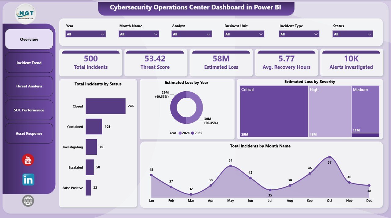
- 5 Executive KPI Cards — Total Incidents, Threat Score, Estimated Loss, Avg. Recovery Hours, Alerts Investigated.
- 15+ Pre-Built Charts covering incident status, source, severity, type, analyst workload, MTTD, MTTC, and financial impact.
- Multi-Dimensional Slicers — every page filters by severity, status, region, business unit, shift, and date range.
- Mean Time to Detect & Contain built into the data model — measure SOC performance against industry benchmarks.
- Threat Score by Source and Incident Type — pinpoint which attack vectors carry the highest organizational risk.
- Estimated Loss by Year, Severity, and Business Unit — quantify financial impact for budget conversations.
- Auto Time Intelligence — quarter, month, and year aggregations are pre-computed.
- Mobile-Ready via Power BI Mobile when published to Power BI Service.
Dashboard Pages Explanation
The .pbix contains 5 linked pages. A filter applied anywhere carries across every page — you can move from executive view to analyst view without losing context.
Page 1: Overview
The Overview page anchors the dashboard with 5 KPI cards — Total Incidents, Threat Score, Estimated Loss, Avg. Recovery Hours, Alerts Investigated — plus four trend charts: Total Incidents by Status, Estimated Loss by Year, Estimated Loss by Severity, and Total Incidents by Month Name. Use it for executive briefings and weekly SOC stand-ups.
Page 2: Incident Trend
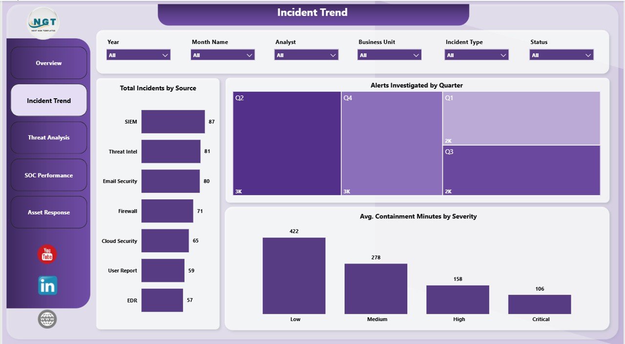
The Incident Trend page surfaces operational rhythm with Total Incidents by Source, Alerts Investigated by Quarter, and Avg. Containment Minutes by Severity. This is the analyst’s view for spotting attack-vector spikes and benchmarking Mean Time to Contain across critical, high, medium, and low severities.
Page 3: Threat Analysis
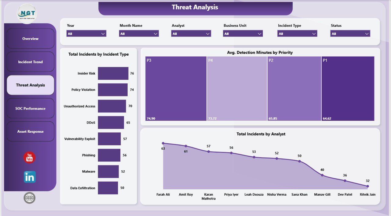
The Threat Analysis page profiles the threat landscape with Total Incidents by Incident Type, Avg. Detection Minutes by Priority, and Total Incidents by Analyst. Identify which attack categories (phishing, malware, DDoS, insider threats) dominate your queue and which analysts are carrying the heaviest load.
Page 4: SOC Performance
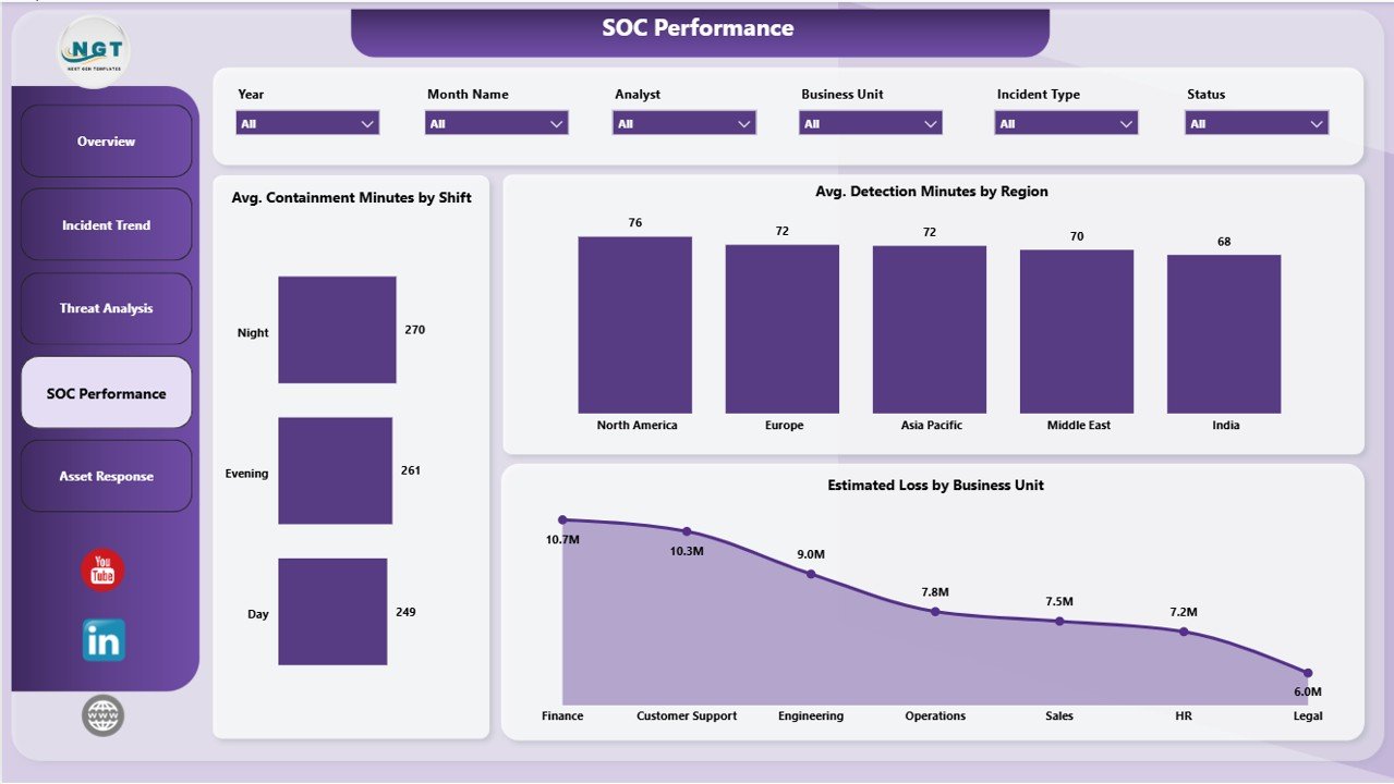
The SOC Performance page measures team effectiveness with Avg. Containment Minutes by Shift, Avg. Detection Minutes by Region, and Estimated Loss by Business Unit. Use it to coach shift leads, justify regional staffing, and show finance which business units carry the most cyber risk.
Page 5: Asset Response
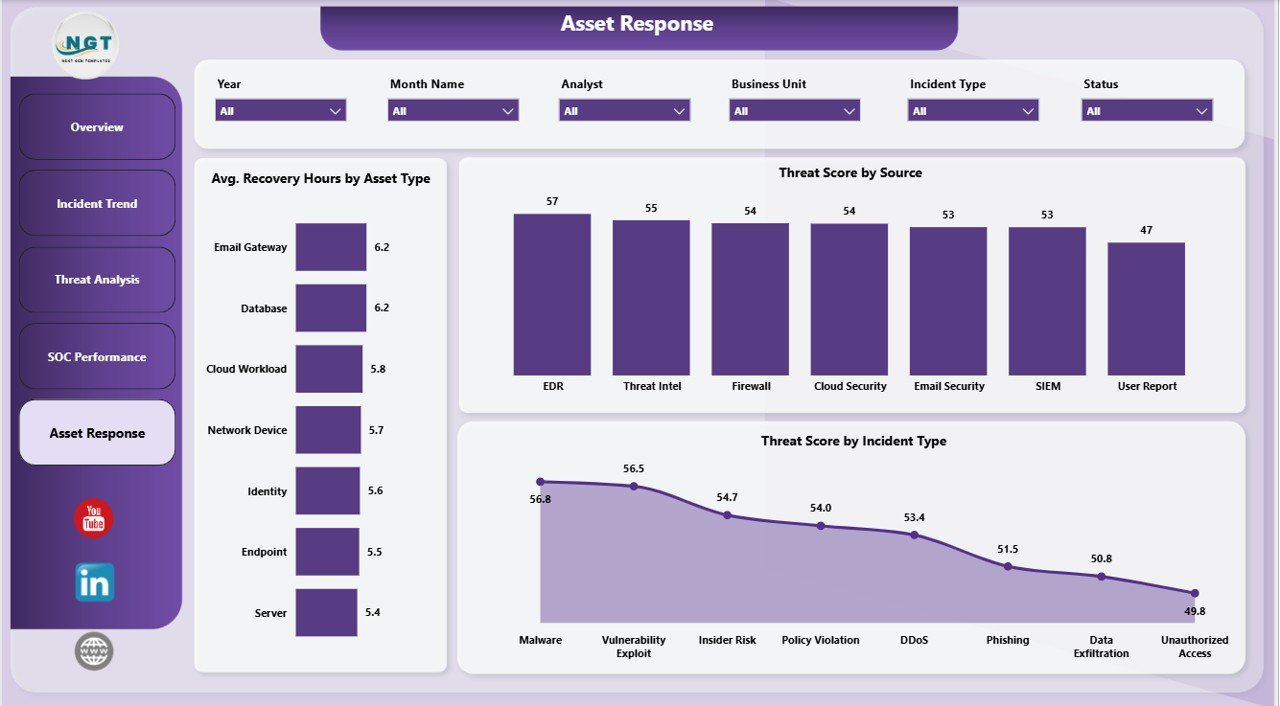
The Asset Response page closes the loop with Avg. Recovery Hours by Asset Type, Threat Score by Source, and Threat Score by Incident Type. This is the resilience view — it tells you how long each asset class takes to bring back online and which sources keep producing the highest-risk events.
Cybersecurity Operations Center Dashboard vs. Tableau vs. Splunk Enterprise Security — Feature Comparison
| Feature | This Power BI Dashboard | Tableau SOC Dashboard | Splunk Enterprise Security |
|---|---|---|---|
| Cost | $17.99 one-time | $75 / user / month | From $1,800 / GB / year |
| Platform | Power BI Desktop (free) | Tableau Desktop / Cloud | Splunk Cloud / On-prem |
| Setup time | Under 10 minutes | 2-4 weeks | 3-6 months |
| Pre-built SOC KPIs | ✅ 5 KPIs + 15 charts | Build from scratch | ✅ Out of the box |
| Custom slicers | ✅ Severity, Status, Region, Shift | ✅ With config | ✅ |
| Mobile access | ✅ Power BI Mobile | ✅ | ✅ |
| Share with link | ✅ Power BI Service | ✅ | Internal only |
| Year-1 cost at 5 users | $17.99 total | $4,500 | $50,000+ |
| Vendor lock-in | None — your .pbix | Tableau ecosystem | Splunk ecosystem |
For SOC teams that want executive-grade visualization without paying enterprise SIEM prices, the Cybersecurity Operations Center Dashboard in Power BI sits in the sweet spot.
Who Should Use This Template
Perfect for:
- SOC managers at small-to-midsize companies (50-2,000 employees) who need board-ready dashboards without enterprise SIEM licensing.
- CISOs and IT directors reporting incident KPIs to executives or audit committees.
- MSSPs and consulting firms building white-label client reports in Power BI.
- Security analysts who export incident data from ServiceNow, Jira, or a SIEM and want a polished visualization layer.
- Cybersecurity bootcamps and instructors teaching SOC metrics in Power BI.
Not a fit if:
- Your SOC needs real-time SIEM correlation and automated SOAR playbooks — use Splunk ES or Microsoft Sentinel instead.
- Your team does not have Power BI Desktop or Power BI Service access.
- You need native ticketing or case management — this is a reporting layer, not a workflow tool.
Real-World Use Cases
Priya runs the SOC at a 400-person fintech in Bangalore. She uses the Cybersecurity Operations Center Dashboard to present weekly incident metrics to her CISO — replacing a 90-minute manual PowerPoint with a 5-minute Power BI walkthrough that filters by severity and business unit live in the meeting. The CISO now starts the conversation from the dashboard instead of asking for it.
Marcus is a security consultant at an MSSP serving 12 mid-market clients. He clones the .pbix per client, drops their monthly incident export into the data table, and publishes a branded Power BI Service link as part of the monthly retainer. Total margin per client improved because he stopped paying for Splunk per-client seats and reinvested the budget into headcount.
Elena teaches a SOC analyst bootcamp at a community college. Students use this template to learn how SOC KPIs (MTTD, MTTC, Threat Score, Estimated Loss) map to raw incident data — and they leave the course with a portfolio-ready Power BI file they can show in interviews.
Advantages of the Cybersecurity Operations Center Dashboard in Power BI
- One-time cost. $17.99 vs $4,500/year for a 5-seat Tableau Creator subscription and $50,000+ for Splunk Enterprise Security.
- 10-minute setup. Replace sample data, click Refresh, publish.
- Full ownership. The .pbix is unlocked — every measure, slicer, and visual is editable.
- Native Microsoft stack. Power BI Desktop is free; Power BI Pro is optional and far cheaper than alternatives.
- Board-ready visuals. KPI cards and trend charts work in executive presentations without further polish.
- Cross-platform reuse. The same Cybersecurity Operations Center Dashboard exists as an Excel version for spreadsheet-native teams.
Opportunities for Improvement
Honest acknowledgments — worth knowing before you buy:
- Not a real-time SIEM. This is a reporting layer over exported incident data, not live event correlation. If you need streaming detections, pair this with Splunk, Sentinel, or Elastic.
- No native ticketing. Pair with a tool like the Incident Tracker and Report Web App if you need a write layer.
- Sample data assumes English column headers. Multilingual incident exports need column renaming in Power Query first.
- No built-in MITRE ATT&CK mapping. You can add an ATT&CK technique column to the data table, but the default model does not enforce it.
Best Practices
- Refresh weekly. Export incident data on the same day each week — trend charts are most useful with consistent cadence.
- Tag every incident with severity and business unit. The Estimated Loss visuals depend on both fields.
- Publish to Power BI Service with row-level security. Executives see all data; analysts see only their region.
- Use the slicers in board meetings. Filter to a quarter live — it builds trust faster than a static PDF.
- Pair with the Excel companion for teams that prefer spreadsheets, so analyst and executive views stay in sync.
- Read the official Power BI documentation for Power Query and DAX customization patterns.
Explore Relevant Templates
- Also available as: Cybersecurity Operations Center Dashboard in Excel — same KPIs and pages, Excel-native.
- Cyber Law Advisory Dashboard in Power BI — cases, advisory hours, and client billing.
- Cloud Hosting Services Dashboard in Power BI — infrastructure availability and SLA.
- Security Company Dashboard in Excel — for physical security operations.
- Incident Tracker and Report Web App — multi-user ticketing companion.
Frequently Asked Questions
What KPIs does the Cybersecurity Operations Center Dashboard in Power BI track?
The Cybersecurity Operations Center Dashboard in Power BI tracks 5 executive KPIs — Total Incidents, Threat Score, Estimated Loss, Avg. Recovery Hours, and Alerts Investigated — plus 15+ supporting charts covering incident status, source, severity, analyst workload, MTTD, MTTC, and business-unit financial impact.
How long does it take to set up the SOC Power BI dashboard?
Setup takes under 10 minutes. Open the .pbix in Power BI Desktop, replace the sample data table with your own SIEM, SOAR, or ticketing export (keeping the column headers), then click Refresh. All 5 pages, KPIs, and 15+ charts update automatically.
How does this template compare to Splunk Enterprise Security?
Splunk ES is a full SIEM at $1,800+ per GB per year, designed for real-time correlation. The Cybersecurity Operations Center Dashboard in Power BI is a $17.99 one-time reporting layer for teams that already have an incident data source and need a clean, executive-friendly visualization without enterprise licensing.
Can I customize the slicers, KPIs, and charts in this Power BI dashboard?
Yes. The .pbix is fully unlocked — every visual, slicer, and DAX measure is editable in Power BI Desktop. Add new KPI cards, rebrand colors, or extend the data model to fit your SOC’s specific incident taxonomy and reporting cadence.
Does this template work for MSSPs serving multiple clients?
Yes. MSSPs and security consultants regularly clone the .pbix per client, swap the data source, and publish branded Power BI Service links. The Cybersecurity Operations Center Dashboard in Power BI carries no per-user or per-client royalty.
Do I need a paid Power BI license to use this dashboard?
No. Power BI Desktop is free from Microsoft and runs the .pbix file completely. Power BI Pro is only needed if you want to publish to Power BI Service and share with viewers — and even then it is far cheaper than Tableau or Splunk per seat.
Is there an Excel or Google Sheets version of this dashboard?
Yes — the same Cybersecurity Operations Center Dashboard is also available as an Excel version for teams that prefer spreadsheet-native workflows. The KPIs, charts, and page structure stay consistent across both.
About the Author
Built by PK — Microsoft Certified Professional with 15+ years of Excel, Google Sheets, and Power BI experience. Founder of NextGenTemplates, reaching 300K+ subscribers across YouTube channels. Every template is hand-built and tested before release.
Conclusion
The Cybersecurity Operations Center Dashboard in Power BI compresses what would otherwise be 40-60 hours of DAX modeling and visual polish into a 10-minute deployment. Five executive KPIs, five interactive pages, 15+ charts, and multi-dimensional slicers — ready for board reporting, MSSP client packages, and SOC stand-ups.
👉 Click here to Purchase the Cybersecurity Operations Center Dashboard in Power BI
✅ Instant download · One-time payment · No subscription · Lifetime access
🎥 Visit our YouTube channel for step-by-step Power BI tutorials — 👉 Youtube.com/@PK-AnExcelExpert
📅 Last updated: May 2026