Defense Equipment Manufacturing Dashboard in Power BI is a ready-to-use reporting template for manufacturers, defense suppliers, quality teams, finance teams, and operations leaders who need a clear view of revenue, units produced, units ordered, cost, net profit, defects, quality score, priority, region, plant, and lead time. Defense equipment manufacturing can involve strict production schedules, contract commitments, quality reviews, and cost control requirements. A structured Power BI dashboard helps teams bring these moving parts into one visual report instead of relying on scattered spreadsheets or manually prepared slides.
This template includes 5 Power BI pages: Overview, Production Trend, Quality Analysis, Customer Analysis, and Operations. Each page includes charts, KPI cards, and slicers so users can filter the report quickly during weekly production meetings, monthly financial reviews, quality audits, and contract performance discussions.
Download the Defense Equipment Manufacturing Dashboard in Power BI from NextGenTemplates.
Defense Equipment Manufacturing Dashboard in Power BI
Key Features of Defense Equipment Manufacturing Dashboard in Power BI
The dashboard is built around 5 connected report pages. The Overview page gives leadership a quick summary with Total Revenue, Total Units Produced, Total Units Ordered, Total Cost, and Net Profit cards. The remaining pages break the story into production trends, quality performance, customer and region analysis, and operational execution.
Because this is a Power BI report, users can interact with charts and slicers instead of looking at static screenshots. You can filter by fields such as plant, product category, contract type, shift, region, priority, status, quarter, or time period depending on the underlying data structure.
The .pbix file can also be edited in Power BI Desktop. You can adjust visuals, rename measures, connect a new data source, change colors, and align the report to your organization’s approved reporting style. For users new to Power BI Desktop, Microsoft explains the tool here: Microsoft Learn – What is Power BI Desktop?
Dashboard Pages Explanation
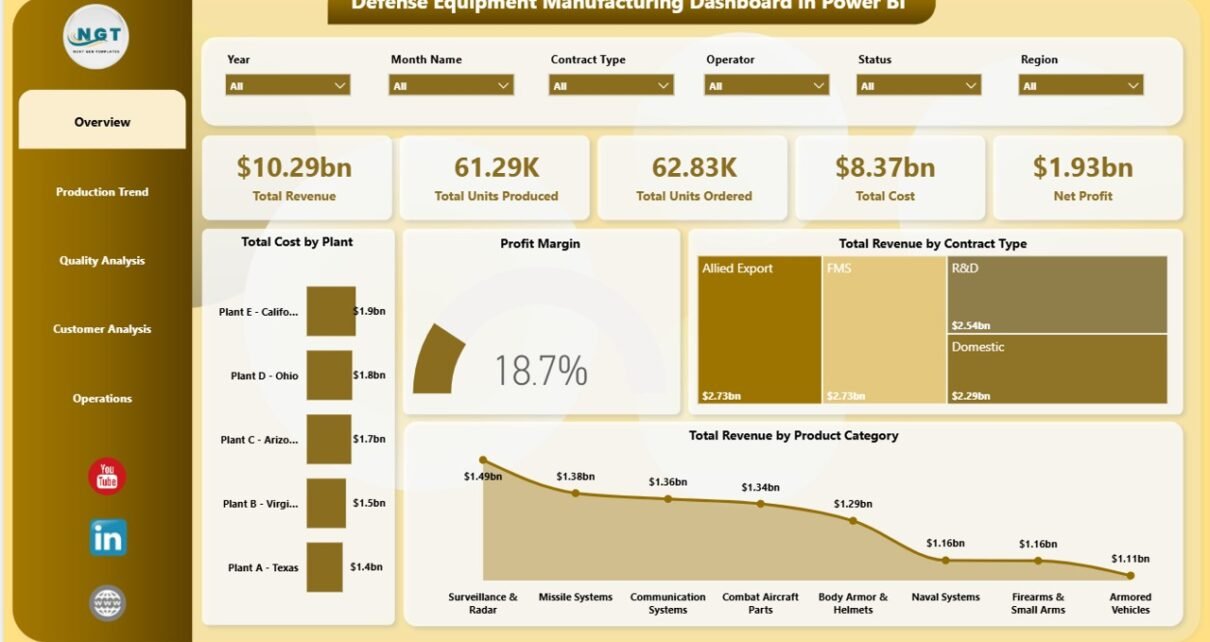
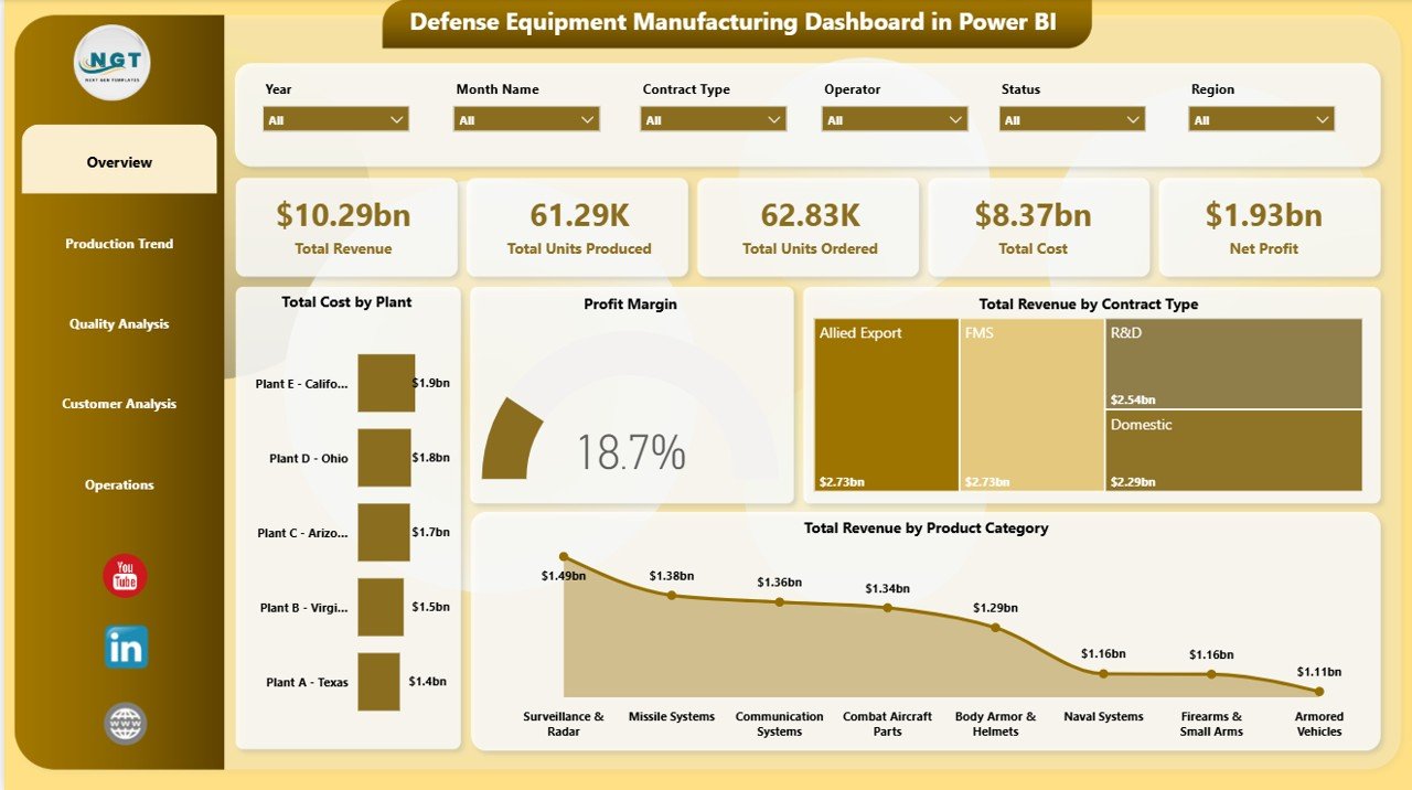
1. Overview Page
The Overview page is designed for fast leadership review. At the top, KPI cards show Total Revenue, Total Units Produced, Total Units Ordered, Total Cost, and Net Profit. These cards help users understand business performance before going deeper into individual charts.
Total Cost by Plant compares manufacturing cost across plant locations. If one plant shows unusually high cost, managers can investigate production mix, material usage, labor allocation, or operational delays.
Profit Margin shows how much profit remains after cost. This is useful for reviewing whether revenue growth is producing healthy financial results.
Total Revenue by Contract Type shows how revenue is distributed across different contract groups. Contract analysts can use this to compare which contract types contribute the most value.
Total Revenue by Product Category identifies the defense equipment categories generating the highest revenue. This supports product portfolio reviews and production planning.
Overview Page
2. Production Trend
The Production Trend page explains how production volume, cost, and defects behave over time and across operational dimensions. It is useful for production managers who need to compare output and cost patterns without building new visuals every month.
Total Units Produced by Product Category shows which equipment categories account for the highest production volume. It helps teams compare output by category and identify capacity pressure.
Total Cost by Quarter tracks cost movement across quarters. This chart helps finance and operations teams understand whether cost increases are seasonal, volume-related, or tied to production changes.
Total Defect Units by Shift compares defect volume by shift. If one shift has higher defect units, quality teams can investigate training, supervision, inspection timing, machine setup, or workload balance.
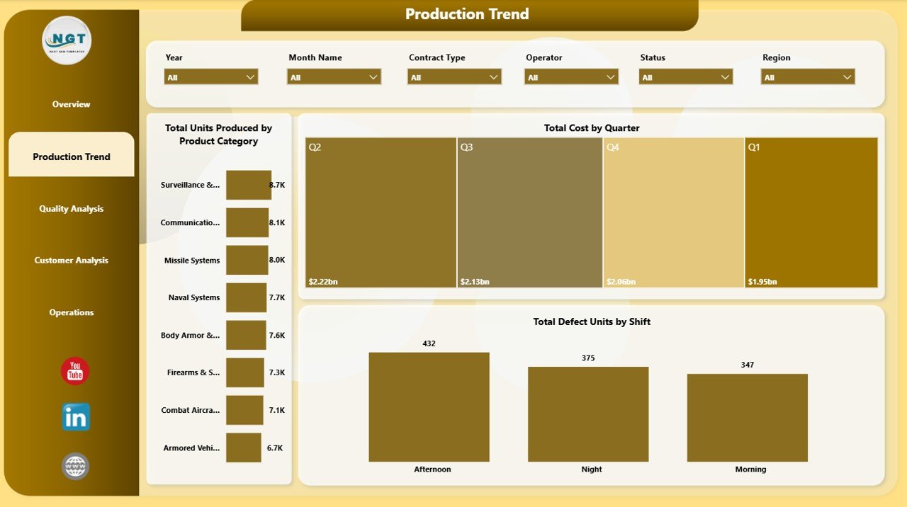
Production Trend
3. Quality Analysis
The Quality Analysis page connects plant quality, shift profitability, and cost by plant. This is useful because quality teams often need to explain not only defects and scores, but also how quality performance affects cost and profit.
Avg Quality Score by Plant compares quality performance across manufacturing locations. It helps teams spot plants that may need process review, supplier checks, or quality training.
Net Profit by Shift shows profitability by operating shift. This can reveal whether certain shifts are producing stronger financial outcomes than others.
Total Cost by Plant supports plant-level cost benchmarking. When reviewed alongside quality score, this view can reveal whether high cost and low quality are concentrated in the same location.
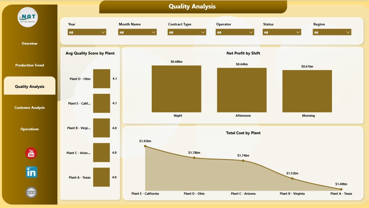
Quality Analysis
4. Customer Analysis
The Customer Analysis page helps teams review production and revenue through customer, region, plant, and priority views. This is useful for contract managers, customer account teams, and finance analysts.
Total Units Produced by Plant compares output across plants. It helps identify which locations are carrying the highest production load.
Total Cost by Region shows regional cost distribution. This can highlight regional differences caused by logistics, suppliers, labor, or plant activity.
Total Revenue by Priority compares revenue by priority level. This helps teams understand how urgent or high-priority work contributes to total revenue.
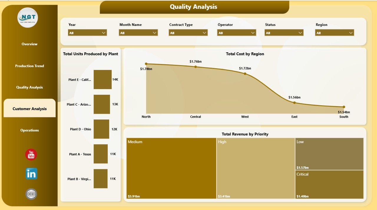
Customer Analysis
5. Operations
The Operations page is built for execution review. It focuses on cost by status, revenue by plant, and lead time by shift so managers can identify bottlenecks and operating differences quickly.
Total Cost by Status shows how cost is distributed across operational statuses. This can help managers see whether delayed, pending, completed, or in-progress work is driving cost.
Total Revenue by Plant compares plant revenue contribution. This is useful for site performance reviews and capacity discussions.
Avg Lead Time by Shift compares cycle time or delivery speed by shift. It helps operations teams identify where process delays may be occurring.
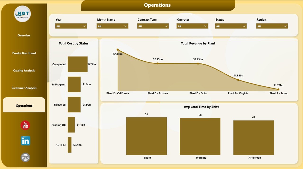
Operations
Defense Equipment Manufacturing Dashboard in Power BI vs. Tableau vs. Paid Manufacturing SaaS – Feature Comparison
| Feature | This Power BI Dashboard | Tableau or Qlik Alternative | Paid Manufacturing SaaS |
|---|---|---|---|
| Cost | $17.99 one-time | License or subscription cost | Monthly or annual vendor cost |
| Platform | Power BI Desktop | BI platform setup required | Vendor cloud or enterprise system |
| Setup time | Open .pbix and connect/replace data | Build workbook and data model | Implementation and configuration |
| Real-time collaboration | Available through Power BI Service if published | Available through platform service | Usually included |
| Mobile access | Possible after publishing to Power BI Service | Possible through vendor apps | Usually included |
| Customizable fields | Editable report and model | Editable with BI skills | Limited by vendor settings |
| Share with link | Possible through Power BI Service permissions | Possible through platform sharing | Vendor controlled |
| Year-1 cost at 5 users | $17.99 plus existing Power BI access | Usually much higher | Often hundreds or thousands |
| Manufacturing KPI structure | Built in | Must be designed | Depends on module coverage |
Who Should Use This Template
This template is best for defense equipment manufacturers, aerospace and defense suppliers, plant managers, production planners, quality assurance teams, finance analysts, contract analysts, and operations managers. It works well when your team already has structured data from Excel, CSV, ERP exports, or approved operational systems and wants a visual reporting layer in Power BI.
It is not a replacement for ERP, MES, PLM, classified systems, controlled technical data environments, or real-time machine monitoring. Use it only with data your organization is authorized to analyze in Power BI.
Real-World Use Cases
Plant Manager: A plant manager reviews Total Units Produced by Product Category, Total Revenue by Plant, and Avg Lead Time by Shift before a weekly operations meeting.
Quality Lead: A quality lead reviews Avg Quality Score by Plant and Total Defect Units by Shift to prioritize inspections and corrective actions.
Contract Analyst: A contract analyst reviews Total Revenue by Contract Type, Total Revenue by Priority, Net Profit, and Total Cost by Region before program performance reviews.
Advantages of Defense Equipment Manufacturing Dashboard in Power BI
The first advantage is speed. The main pages, KPI cards, slicers, and charts are already structured, so teams do not need to start from a blank report.
The second advantage is interactivity. Power BI slicers make it easy to filter visuals by business dimensions and answer follow-up questions during a meeting.
The third advantage is flexibility. Users can connect or replace data sources, edit visuals, adjust measures, and change report design based on internal needs.
Opportunities for Improvement
Larger organizations can improve the dashboard by connecting it to governed data sources instead of manually updating files. This can reduce errors and create a more repeatable reporting process.
Teams may also add measures for on-time delivery, scrap rate, capacity utilization, supplier performance, inspection pass rate, rework cost, backlog, and schedule adherence if those fields are available.
Best Practices
Keep your source data clean and consistent. Use clear column names, consistent date formats, standard plant names, and controlled product category values.
Refresh the report after changing the data source. Review slicers and visuals after refresh to confirm that all pages update correctly.
Limit access according to your organization’s data policy. Defense manufacturing data can be sensitive, so only publish or share the report through approved channels.
Explore Relevant Templates
You may also like Defense and Military Dashboard in Power BI, Defense Equipment Manufacturing Dashboard in Excel, and Cryogenics Dashboard in Excel.
Browse more Power BI Dashboard Templates on NextGenTemplates.
Frequently Asked Questions
What does this Power BI dashboard track?
It tracks revenue, units produced, units ordered, cost, net profit, production by product category, cost by quarter, defects by shift, quality score by plant, revenue by priority, and lead time by shift.
Do I need Power BI Desktop?
Yes. The file is intended to be opened and edited in Power BI Desktop.
Can I use my own data?
Yes. You can replace the sample data or connect your own approved manufacturing data source.
Can I customize the report?
Yes. You can edit visuals, colors, measures, fields, and report pages in Power BI.
Is this suitable for classified defense data?
No. It is a reporting template. Only use data your organization allows in Power BI.
Does it include slicers?
Yes. The dashboard includes slicers for quick filtering and interactive analysis.
About the Author
Built by PK – Microsoft Certified Professional with 15+ years of Excel, Google Sheets, and Power BI experience. Founder of NextGenTemplates, reaching 300K+ subscribers across YouTube channels. Every template is hand-built and tested before release.
Conclusion
The Defense Equipment Manufacturing Dashboard in Power BI gives manufacturing and defense operations teams a structured way to review production, cost, revenue, orders, quality, customer, and operational performance. It is a practical template for teams that want interactive Power BI reporting without building every page from scratch.
Download the template here: Defense Equipment Manufacturing Dashboard in Power BI.
For more tutorials, visit YouTube.com/@PKAnExcelExpert.