The Dialysis Centers Dashboard in Excel gives dialysis center teams a practical way to monitor sessions, revenue, cost, profit, satisfaction, adequacy, treatment mix, and center performance from one editable workbook. A busy dialysis operation may run hundreds or thousands of treatment sessions every month, and manual spreadsheet summaries can easily hide trends that leadership needs to see quickly.
This Excel dashboard includes 5 executive KPI cards, 5 dashboard report pages, 20 pre-built charts, a structured Data sheet, and a Support sheet with pivot tables. You can update the source data, click Refresh All in Excel, and review the refreshed cards, charts, slicers, and report pages without rebuilding the dashboard from scratch. Download the Dialysis Centers Dashboard in Excel here.

Key Features of Dialysis Centers Dashboard in Excel
- 5 KPI cards: Total Sessions, Total Revenue, Net Profit, Avg. Satisfaction, and Completion Rate %.
- 5 dashboard pages: Overview, Monthly Trend, Center Analysis, Clinical Quality, and Treatment Insights.
- 20 analytical charts: Compare month, year, treatment type, region, center name, city, complications, nephrologist, shift, status, and dialyzer type.
- Slicer-driven filtering: Filter dashboard views quickly during management, finance, operations, and clinical review meetings.
- Pivot-powered refresh: Update the Data sheet and click Refresh All to rebuild the dashboard.
- Editable Excel file: Customize fields, charts, labels, colors, and layouts to match your dialysis center reporting process.
Dashboard Pages Explanation
1. Overview Page
The Overview page is the main executive view. The top cards show Total Sessions, Total Revenue, Net Profit, Avg. Satisfaction, and Completion Rate %, giving managers a fast reading of volume, financial performance, patient sentiment, and completion performance.
Total Revenue by Month shows how revenue changes across the year and helps identify seasonal or operational peaks. Total Sessions by Treatment Type compares how different treatment categories contribute to total workload. Profit Margin % by Region highlights which regions are financially stronger or weaker. Total Cost by Month helps finance teams monitor monthly cost pressure.
2. Monthly Trend
The Monthly Trend page focuses on time-based movement. Total Sessions by Month shows whether treatment volume is rising, falling, or staying stable. Total Revenue by Year compares yearly performance for long-term planning. Adequacy Rate % by Month helps clinical teams watch treatment quality trends. Total Revenue by Center Name identifies which centers contribute the most revenue.

3. Center Analysis
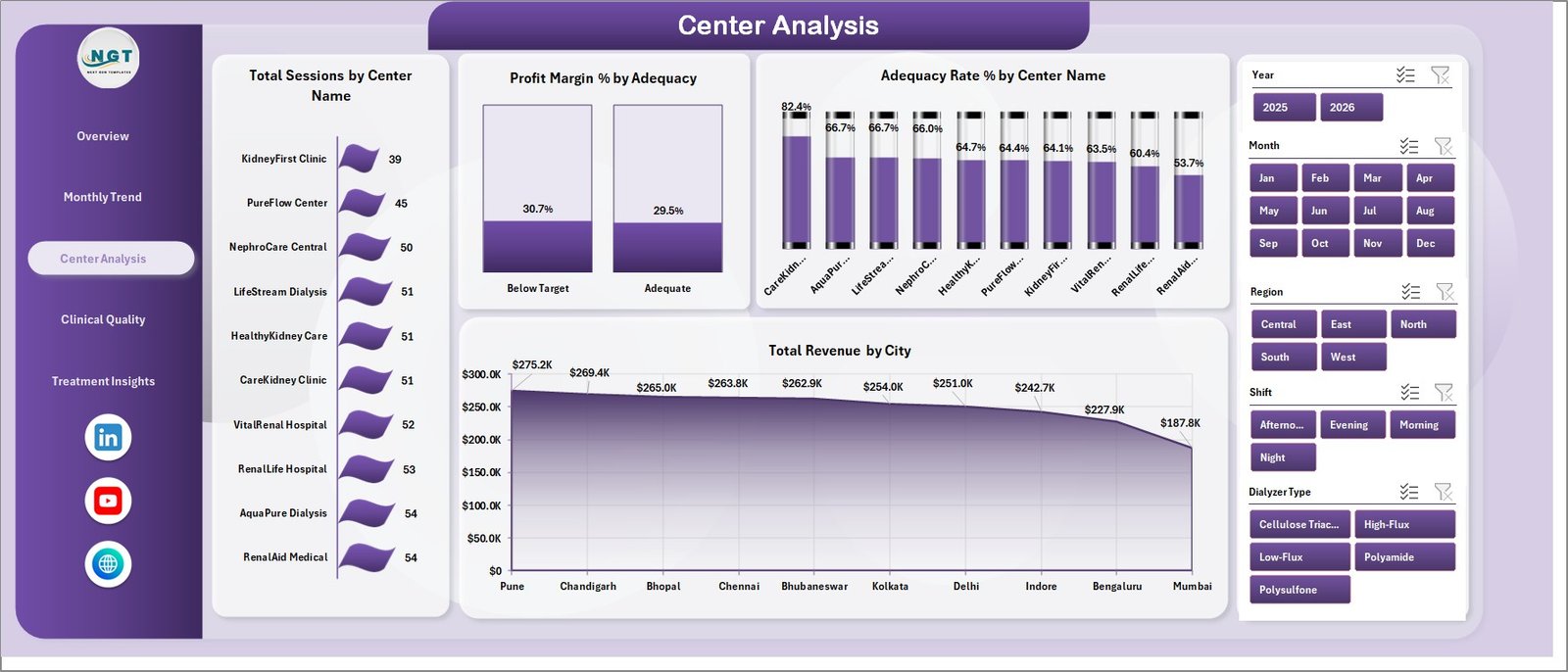
The Center Analysis page is useful for branch-level performance review. Total Sessions by Center Name compares workload by location. Profit Margin % by Adequacy connects clinical adequacy groupings with financial results. Adequacy Rate % by Center Name shows quality performance across locations. Total Revenue by City helps leadership review geographic revenue distribution.
4. Clinical Quality
The Clinical Quality page connects clinical performance, cost, patient profile, and treatment categories. Total Cost by Complications shows how complication categories affect cost. Total Revenue by Patient Age Group breaks revenue down by patient age band. Adequacy Rate % by Nephrologist supports provider-level quality discussion. Total Revenue by Treatment Type compares the financial contribution of each treatment type.

5. Treatment Insights
The Treatment Insights page helps operations teams understand how treatment delivery is performing. Total Sessions by Shift shows workload by shift and supports staffing planning. Adequacy Rate % by Dialyzer Type compares adequacy across dialyzer categories. Total Sessions by Status tracks completed, pending, cancelled, or other session states. Profit Margin % by Month shows profitability trend across the reporting period.

6. Data Sheet Tab
The Data sheet is where you add the source records. Keep the same format, replace the sample records with your own dialysis center data, and refresh the workbook. This structure makes the template reusable for single-center and multi-center reporting.

7. Support Sheet Tab
The Support sheet contains the pivot tables that build the dashboard dynamically. After changing the Data sheet, open the Data tab in the Excel ribbon and click Refresh All. All pivot tables and related charts refresh together. You can keep this sheet hidden during daily use.

Dialysis Centers Dashboard in Excel vs. Google Sheets vs. Paid Healthcare SaaS – Feature Comparison
| Feature | Dialysis Centers Dashboard in Excel | Google Sheets Alternative | Paid Healthcare SaaS |
|---|---|---|---|
| Cost | $17.99 one-time | Manual build or template cost | Monthly or annual subscription |
| Platform | Microsoft Excel desktop | Browser-based Google Sheets | Vendor-hosted web app |
| Setup time | Paste data and refresh | Build charts, formulas, and filters | Implementation and onboarding |
| Real-time team collaboration | Possible through OneDrive or shared drive | Native collaboration | Usually included |
| Mobile access | Excel mobile app | Browser or mobile app | Vendor app or browser |
| Customizable fields | Fully editable | Editable | Limited by vendor settings |
| Share with link | Possible through OneDrive | Native | Login controlled |
| Year-1 cost at 5 users | $17.99 total | Template cost plus build time | Often hundreds or thousands |
| Dialysis operations views | Built in across 5 pages | Must be created | Depends on vendor module |
Who Should Use This Template
This template is useful for dialysis center administrators, nephrology operations teams, healthcare finance managers, clinic owners, clinical quality analysts, regional center managers, and consultants who need an Excel-based reporting layer for treatment sessions, revenue, cost, profit, adequacy, complications, treatment types, patient age groups, shifts, and center comparisons.
It is not a live EHR, patient management system, billing system, appointment scheduler, or clinical decision support tool. It is a management reporting dashboard for approved operational data that has already been prepared for analysis.
Real-World Use Cases
Aisha, dialysis center administrator: Aisha uses the Overview and Treatment Insights pages before weekly operations meetings. She reviews Total Sessions by Treatment Type, Completion Rate %, Total Sessions by Shift, and Total Sessions by Status to understand service delivery.
Rahul, regional finance manager: Rahul compares Total Revenue by Center Name, Profit Margin % by Region, Total Cost by Month, and Profit Margin % by Month to identify centers that need closer financial review.
Maria, nephrology quality analyst: Maria reviews Adequacy Rate % by Month, Center Name, Nephrologist, and Dialyzer Type to support quality improvement discussions and management reporting.
Advantages of Dialysis Centers Dashboard in Excel
- Fast reporting: Update the Data sheet and refresh all pivots instead of rebuilding charts manually.
- Clear management view: KPI cards show volume, revenue, profit, satisfaction, and completion rate in one place.
- Clinical and financial balance: The dashboard covers both adequacy and profitability, which supports more balanced decision-making.
- Editable workbook: Change labels, visuals, fields, colors, and calculations based on your center’s reporting model.
- No recurring software fee: The template is a one-time purchase and runs in Excel.
Opportunities for Improvement
The dashboard is intentionally Excel-based and manual-refresh. That makes it affordable and easy to customize, but it does not replace a live clinical system or automated data warehouse. Larger healthcare groups may eventually connect source exports to Power Query, Power BI, or a governed database if they need scheduled refresh, role-based access, or automated alerts.
Best Practices
- Keep the Data sheet columns consistent when adding new records.
- Refresh all pivots after each update before reviewing charts.
- Use one reporting period definition across all centers so comparisons stay fair.
- Validate revenue, cost, and session data before presenting to leadership.
- Keep the Support sheet hidden during normal use, but do not delete it because it powers the dashboard.
- Use Microsoft Excel desktop for the best PivotTable and slicer experience. Microsoft explains PivotTable and slicer behavior in its Excel help documentation: Microsoft Support: Use slicers to filter data.
Explore Relevant Templates
Related templates include Healthcare Dashboard in Excel, Medical Practice Dashboard in Excel, Home Healthcare Dashboard in Excel, and Dialysis Centers KPI Dashboard in Power BI. You can also browse all Excel dashboard templates.
Frequently Asked Questions
What KPI cards are included in the Dialysis Centers Dashboard in Excel?
The Overview page includes Total Sessions, Total Revenue, Net Profit, Avg. Satisfaction, and Completion Rate %.
How many dashboard pages are included?
The workbook includes five report pages: Overview, Monthly Trend, Center Analysis, Clinical Quality, and Treatment Insights, plus Data and Support sheets.
Do I need macros or VBA?
No. The dashboard is built around Excel charts, slicers, and pivot tables. You refresh it from the Excel Data tab.
Can I add more centers or cities?
Yes. Add new center names or city values in the Data sheet using the same structure, then refresh all pivot tables and charts.
Can this replace my EHR or billing system?
No. This is a reporting dashboard, not an EHR, billing system, scheduling tool, or clinical decision platform.
What Excel version should I use?
Use Microsoft Excel desktop with PivotTable and slicer support, ideally Excel 2016 or later or Microsoft 365.
About the Author
Built by PK – Microsoft Certified Professional with 15+ years of Excel, Google Sheets, and Power BI experience. Founder of NextGenTemplates, reaching 300K+ subscribers across YouTube channels. Every template is hand-built and tested before release.
Conclusion
The Dialysis Centers Dashboard in Excel is a practical reporting tool for teams that want a clear view of dialysis operations without building an Excel dashboard from zero. It combines KPI cards, slicers, pivot-powered charts, data entry structure, and multi-page analysis for revenue, cost, profit, sessions, quality, and treatment trends.
Click here to purchase the Dialysis Centers Dashboard in Excel
Visit our YouTube channel for Excel dashboard tutorials: YouTube.com/@PK-AnExcelExpert
Last updated: June 2026