EV Charging Stations Dashboard in Excel gives EV charging station operators, utility teams, fleet charging managers, and infrastructure planners a ready-to-use Excel reporting workbook for revenue, energy dispensed, charging sessions, operational stations, utilization, uptime, downtime, maintenance cost, connector type, power level, city, region, and network operator performance. EV charging networks often grow faster than reporting processes, which means teams can lose visibility into underused chargers, high-maintenance regions, and downtime patterns. This dashboard brings those views into one structured Excel file with slicers, KPI cards, pivot-driven charts, and refreshable analysis pages.
The template is designed for teams that already have structured EV charging data and want a practical reporting layer instead of building every pivot and chart manually. Open the workbook in Microsoft Excel, replace the sample rows in the Data Sheet, click Data > Refresh All, and review the updated dashboard pages. For official guidance on refreshing workbook connections and data, Microsoft provides documentation for refreshing external data in Excel.
Click to Purchase EV Charging Stations Dashboard in Excel

Key Features of EV Charging Stations Dashboard in Excel
- 7 worksheet tabs: Overview, Usage Trend, Network Ops, Station Mix, Reliability, Data Sheet, and Support Sheet.
- 4 executive KPI cards: Total Revenue, Total Energy, Total Sessions, and Operational Station.
- 20 chart views: Analyze maintenance cost, revenue, energy, sessions, uptime, downtime, utilization, ports, city, region, power level, and operator results.
- Multiple slicers: Filter dashboard pages quickly without rebuilding charts or formulas.
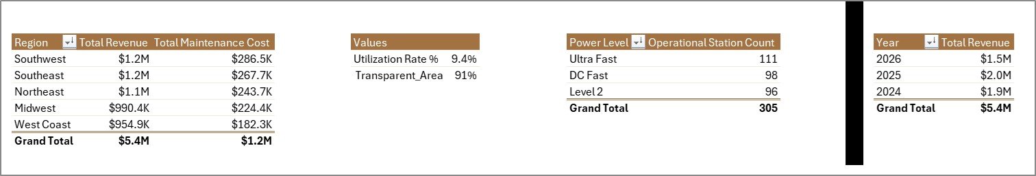
- Pivot-driven support layer: The Support Sheet holds the pivots that refresh the cards and charts dynamically.
- Editable Excel workbook: Adjust fields, slicers, chart labels, worksheet names, and colors based on your reporting needs.
- No subscription reporting: Use the workbook as a one-time-purchase reporting layer for recurring reviews.
Dashboard Pages Explanation
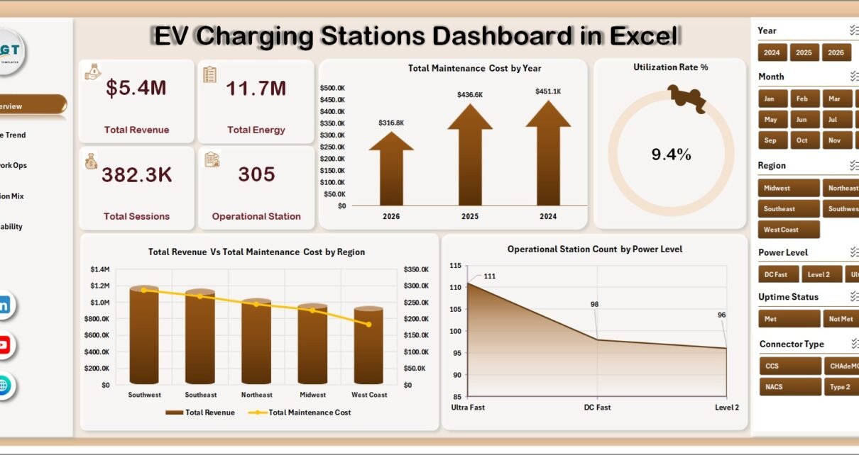
1. Overview Page
The Overview Page gives leadership a high-level snapshot of EV charging network performance. The cards summarize Total Revenue, Total Energy, Total Sessions, and Operational Station so users can review commercial performance, charging volume, activity level, and active station coverage before drilling into deeper views.
Total Maintenance Cost by Year: This chart shows how maintenance cost changes across years. It helps teams see whether asset service cost is rising, stable, or improving over time.
Utilization Rate % by Overall Performance: This chart groups utilization by performance status. It helps managers identify underused chargers, healthy stations, and sites that may be approaching capacity pressure.
Total Revenue Vs Total Maintenance Cost by Region: This comparison shows revenue and maintenance spending side by side by region. It helps identify profitable regions and regions where maintenance cost may be reducing operating margin.
Operational Station Count by Power Level: This chart shows how many active stations belong to each power level. It helps infrastructure teams understand whether the network mix leans toward slow, fast, or high-power charging.
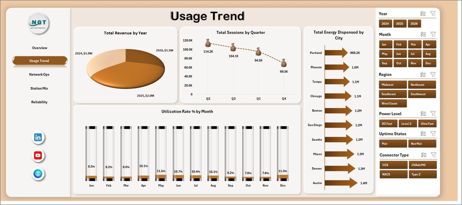
2. Usage Trend
The Usage Trend page is built for demand and utilization review. Total Revenue by Year helps teams see long-term commercial growth or decline. Total Sessions by Quarter highlights seasonal charging activity and busy quarters. Total Energy Dispensed by City identifies cities with stronger charging demand, while Utilization Rate % by Month helps users monitor monthly efficiency and capacity pressure.
3. Network Ops
The Network Ops tab focuses on reliability and operator performance. Uptime Compliance % by Uptime Status shows whether stations are meeting expected availability levels. Avg. Downtime Hours by Status identifies where downtime is concentrated. Operational Station Count by Region compares active network coverage, and Total Revenue Vs Total Maintenance Cost by Network Operator helps benchmark operator performance.

4. Station Mix
The Station Mix sheet explains how the charging network is structured. Utilization Rate % by Power Level shows whether specific charger classes are used more heavily. Total Ports by Connector Type reviews connector coverage and compatibility. Total Ports by City shows infrastructure density by location, and Total Revenue by Location Type compares commercial performance across public, workplace, fleet, highway, or other site types.

5. Reliability
The Reliability page helps teams connect station availability with cost and infrastructure decisions. Total Station Records by Region shows where reporting data is concentrated. Uptime Compliance % by Network Operator compares operator reliability. Total Maintenance Cost Vs Total Revenue by Power Level helps teams understand profitability by charger class, and Operational Station Count by Location Type shows how active sites are distributed.

6. Data Sheet Tab
The Data Sheet is where users enter EV charging station data in the same format. Keep the headers consistent, replace the sample records with your own data, and refresh the workbook. This structure keeps the dashboard simple for recurring monthly or weekly reporting.

7. Support Sheet
The Support Sheet contains multiple pivot tables used to create the dashboard dynamically. After updating the Data Sheet, go to the Data tab in the Excel Ribbon and click Refresh All. All pivots and charts refresh together. You can keep this sheet hidden in user-facing copies.
EV Charging Stations Dashboard in Excel vs. Google Sheets vs. Paid CRM/SaaS – Feature Comparison
| Feature | This Excel Dashboard | Google Sheets Alternative | Paid Charging SaaS |
|---|---|---|---|
| Cost | $17.99 one-time | Low direct cost, manual build time | Monthly or annual subscription |
| Platform | Microsoft Excel | Google Sheets browser workflow | Vendor cloud platform |
| Setup time | Replace records and refresh pivots | Build formulas, charts, and pivots manually | Configuration, onboarding, and integrations |
| Real-time team collaboration | Available through OneDrive or SharePoint | Native collaboration | Usually included by account license |
| Mobile access | Possible through Excel mobile or cloud storage | Available in browser and mobile app | Usually available through vendor app |
| Customizable fields | Fully editable workbook | Editable if built manually | Limited by vendor settings |
| Share with link | Possible through Microsoft cloud storage | Built in | Usually login controlled |
| Year-1 cost at 5 users | $17.99 plus existing Excel access | Low software cost, higher build time | Often hundreds or thousands |
| EV station reporting | Included across 5 dashboard pages | Requires custom build | Depends on plan and data access |
Who Should Use This Template
This template is useful for EV charging network operators, energy and utility companies, public charging station owners, fleet charging managers, mobility infrastructure teams, facilities managers, city transportation teams, operations analysts, and finance teams that need clear reporting on charging usage, revenue, reliability, maintenance, infrastructure mix, and regional performance.
It is not designed to replace a real-time charger management platform, payment processing system, live monitoring tool, customer mobile app, OCPP control layer, or automated fault response workflow. It works best as a reporting dashboard when the source data is already structured.
Real-World Use Cases
Priya, network operations manager: Priya reviews Overview and Network Ops every Monday to explain revenue, sessions, uptime, downtime, and region-level station availability.
Marcus, fleet electrification lead: Marcus uses Usage Trend and Station Mix to compare energy dispensed, charging sessions, power level utilization, and connector coverage before recommending expansion.
Asha, utility reporting analyst: Asha updates the Data Sheet each month, refreshes the workbook, and sends leadership filtered views by city, region, power level, and operator.
Advantages of EV Charging Stations Dashboard in Excel
- It saves time compared with building an EV charging dashboard from scratch.
- It keeps revenue, usage, station mix, maintenance, and reliability views in one workbook.
- It gives managers a high-level Overview while still supporting deeper operational analysis.
- It is editable, so teams can adapt charts, slicers, labels, fields, and colors.
- It supports recurring performance reviews without a separate dashboard subscription.
Opportunities for Improvement
Larger charging networks may connect the workbook to a managed database, charger management export, Power Query process, or business intelligence model. Teams may also extend the dashboard with charger fault codes, payment success rate, queue time, customer type, tariff class, renewable energy share, or charger-level profitability.
Best Practices
- Keep station IDs, city names, regions, connector names, and operator names consistent.
- Validate Total Revenue, Total Energy, and Total Sessions after every data refresh.
- Review utilization and uptime together so high usage does not hide reliability issues.
- Use slicers during meetings to answer follow-up questions quickly.
- Keep the Support Sheet hidden for regular users, but do not delete it because it powers the dashboard.
Explore Relevant Templates
- EV Charging Stations Dashboard in Excel
- Electric Vehicle Charging KPI Dashboard in Excel
- Electric Utility Maintenance Dashboard in Excel
- Solar Energy Dashboard in Excel
Frequently Asked Questions
What KPI cards are included?
The Overview Page includes Total Revenue, Total Energy, Total Sessions, and Operational Station cards.
How many dashboard pages are included?
The workbook includes five dashboard pages plus a Data Sheet and Support Sheet, making seven sheet tabs in total.
Can I use my own EV charging station data?
Yes. Replace the sample rows in the Data Sheet, keep the same format, and refresh the workbook.
Does this dashboard require macros?
No. It is built with Excel tables, slicers, pivot tables, and charts.
Can I customize the dashboard?
Yes. You can edit charts, slicers, fields, labels, colors, formulas, and worksheet names.
Does this replace EV charger management software?
No. It is an Excel reporting template, not a live station monitoring or control system.
About the Author
Built by PK – Microsoft Certified Professional with 15+ years of Excel, Google Sheets, and Power BI experience. Founder of NextGenTemplates, reaching 300K+ subscribers across YouTube channels. Every template is hand-built and tested before release.
Conclusion
The EV Charging Stations Dashboard in Excel gives charging network teams a practical way to turn station records into clear performance reporting. With KPI cards, slicers, usage analysis, network operations views, station mix charts, reliability reporting, a Data Sheet, and a Support Sheet, it helps teams review revenue, energy, sessions, uptime, maintenance, utilization, and infrastructure mix without starting from a blank workbook.
Visit our YouTube channel to learn step-by-step Excel, Power BI, and dashboard tutorials.
Click to Purchase EV Charging Stations Dashboard in Excel