Franchise Management Dashboard in Power BI is a ready-to-use Power BI dashboard template for franchisors, multi-unit operators, regional managers, and finance teams that need clear reporting on royalty fees, revenue, operating cost, net profit, franchise count, active rate, brand performance, category profitability, franchisee revenue, ownership tier margin, and regional results. The report includes 5 interactive Power BI pages, 5 executive KPI cards, multiple slicers, and 17 analysis visuals. For teams comparing this with a paid franchise management system, the main advantage is simple: you can start reporting quickly with a one-time template instead of waiting through a long SaaS setup cycle.
Download the Franchise Management Dashboard in Power BI from NextGenTemplates.
Key Features of Franchise Management Dashboard in Power BI
- 5 Power BI report pages: Overview, Revenue Trend, Brand Analysis, Region Insights, and Support Quality.
- 5 top KPI cards: Total Royalty Fee, Total Revenue, Total Franchises, Total Operating Cost, and Net Profit.
- Multiple slicers: Filter pages by available franchise dimensions such as region, brand, category, franchisee, ownership tier, and period.
- Financial dashboard views: Compare revenue, cost, profit, margin, royalty fees, and franchise count in a visual report.
- Brand and region analysis: Review which brands, categories, franchisees, ownership tiers, and regions are performing better.
- Editable PBIX file: Open the report in Power BI Desktop and customize visuals, colors, fields, relationships, and DAX measures.
Dashboard Pages Explanation
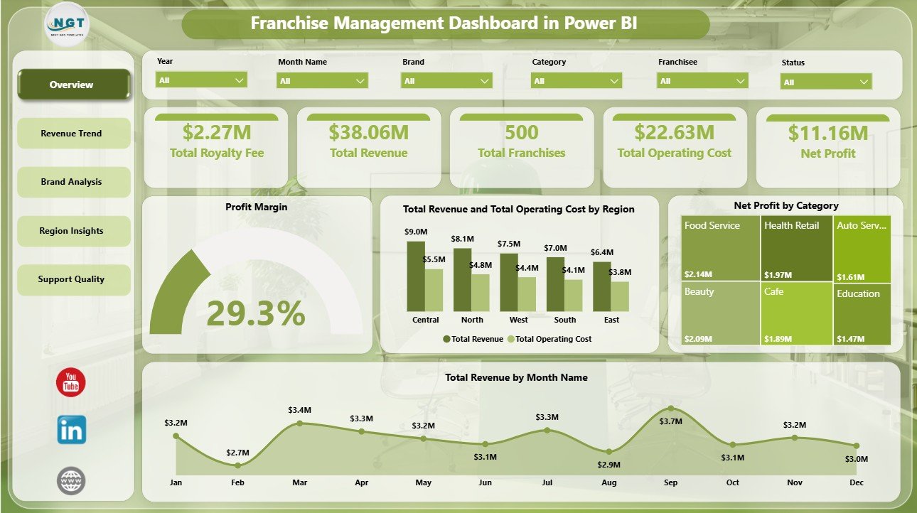
1. Overview Page
The Overview page is built for leadership review. At the top, KPI cards show Total Royalty Fee, Total Revenue, Total Franchises, Total Operating Cost, and Net Profit so users can see the network’s financial and operational position before drilling into details. Slicers make it easy to apply filters and view the dashboard for a specific region, brand, category, or period.
Profit Margin by Overall Franchise Performance: This visual shows whether the franchise network is converting revenue into profit. It helps owners quickly understand whether growth is healthy or cost-heavy.
Total Revenue and Total Operating Cost by Region: This chart compares revenue and cost by geography. It helps regional managers identify areas where high sales are being reduced by high operating cost.
Net Profit by Category: This analysis ranks categories by profit contribution. It supports category-level strategy, expansion planning, and margin review.
Total Revenue by Month Name: This visual shows monthly revenue movement. It helps teams identify seasonal peaks, slow periods, and months that need investigation.
2. Revenue Trend
The Revenue Trend page focuses on financial movement by category, brand, and quarter. It is useful for monthly and quarterly reviews where managers need to explain not only what happened, but where the change came from.
Total Revenue and Total Operating Cost by Category: Compare category revenue and cost side by side. This helps identify categories that look strong by sales but may need cost control.
Net Profit by Brand: Compare brand-level profitability across the franchise portfolio. This helps leadership see which brands are creating stronger returns.
Total Revenue by Quarter: Review quarterly revenue performance to spot growth, decline, or seasonality. It is a useful visual for board updates and executive summaries.

3. Brand Analysis
The Brand Analysis page helps users compare brand, franchisee, and ownership tier performance. This is helpful when the franchise network includes multiple concepts, ownership models, or franchisee groups.
Total Revenue and Total Operating Cost by Brand: Compare income and operating cost by brand. It helps teams find brands with strong revenue but weaker profitability.
Total Revenue by Franchisee: Rank franchisees by revenue contribution. Use it during franchisee reviews, coaching sessions, and recognition discussions.
Profit Margin by Ownership Tier: Compare margin by ownership tier. This can show whether single-unit, multi-unit, or other ownership groups perform differently.

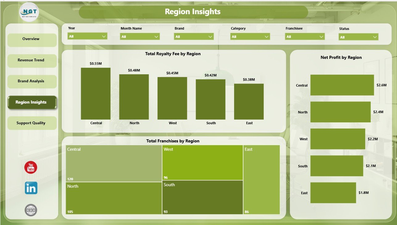
4. Region Insights
The Region Insights page gives a geographic view of network scale and profitability. It helps regional managers and leadership teams compare royalty fees, franchise count, and net profit across territories.
Total Royalty Fee by Region: Compare royalty fee contribution by region. It helps finance teams understand which territories drive stronger recurring revenue.
Total Franchises by Region: Review how the franchise network is distributed geographically. This helps compare network size with revenue and profit output.
Net Profit by Region: Compare regional profit performance. It helps identify territories that deserve expansion and territories that may need support.
5. Support Quality
The Support Quality page looks at active franchise health, category margin, and brand-level active franchise count. It is useful for operations and support teams that need to prioritize where to help first.
Active Rate by Region: Compare active franchise percentage by region. This helps support teams see where network activity may be slipping.
Profit Margin by Category: Compare profitability across categories. This helps managers review pricing, cost structure, and operating models.
Active Franchise Count by Brand: See the number of active franchises by brand. It helps leadership understand brand scale and engagement.

Franchise Management Dashboard in Power BI vs. Tableau vs. Paid Franchise SaaS – Feature Comparison
| Feature | Franchise Management Dashboard in Power BI | Tableau Alternative | Paid Franchise SaaS |
|---|---|---|---|
| Cost | One-time template purchase | License plus dashboard build time | Monthly or annual subscription |
| Platform | Power BI Desktop / Power BI Service | Tableau Desktop / Tableau Cloud | Vendor cloud platform |
| Setup time | Open PBIX, connect or replace data, refresh | Build data model and visuals manually | Implementation and onboarding |
| Real-time team collaboration | Available through Power BI Service if configured | Available through Tableau Cloud | Usually built in |
| Mobile access | Power BI mobile app after publishing | Tableau mobile app after publishing | Vendor app or browser |
| Customizable fields | Editable visuals, fields, relationships, and DAX | Editable with Tableau skills | Limited by plan and permissions |
| Share with link | Possible through Power BI permissions | Possible through Tableau permissions | Usually role-based login |
| Year-1 cost at 5 users | Template cost plus any Microsoft licensing | Usually much higher | Often hundreds or thousands of dollars |
| Franchise-specific views | Royalty fee, revenue, cost, profit, region, brand, category, active rate | Requires custom setup | Depends on module and plan |
Who Should Use This Template
This template is a strong fit for franchisors, franchise owners, multi-unit operators, regional managers, finance analysts, franchise consultants, business intelligence teams, and Power BI freelancers who need a reusable franchise reporting model.
It is not a full franchise CRM, POS, payroll system, royalty collection engine, contract management system, or live operational database. If your team needs those workflows, use a franchise management platform and treat this dashboard as the reporting layer.
Real-World Use Cases
Priya, Franchise Operations Manager: uses the Overview page before monthly review calls to check royalty fee, revenue, operating cost, total franchises, and net profit across the network.
Marcus, Multi-Unit Franchise Owner: filters Region Insights and Brand Analysis to compare net profit, operating cost, and franchisee revenue across territories.
Elena, Franchise Consultant: uses ownership tier margin, category profit, and active franchise count to prepare recommendations for clients planning expansion or turnaround actions.
Advantages of Franchise Management Dashboard in Power BI
Fast start: The report structure is already built, so you can focus on replacing or connecting data instead of designing pages from scratch.
Clear executive summary: The Overview page brings royalty fee, revenue, cost, franchise count, and profit into one place.
Better franchise comparisons: Brand, franchisee, ownership tier, region, and category visuals make performance gaps easier to see.
Lower cost than custom BI work: A one-time PBIX template is much cheaper than building the same dashboard from zero.
Editable Power BI architecture: Advanced users can update DAX, relationships, visuals, and themes to match their reporting process.
Opportunities for Improvement
The dashboard depends on clean source data. If your franchise data is scattered across POS exports, accounting files, and CRM systems, you may need to consolidate it before refreshing the report.
Power BI Desktop is free for individual use, but online sharing through Power BI Service may require Microsoft licensing. For details, review Microsoft Learn’s Power BI documentation.
The template does not automate franchisee communication, fee collection, contract renewals, or legal compliance. It is designed for analysis and reporting.
Best Practices
- Keep source column names consistent so visuals and measures continue working.
- Refresh the report on a monthly or weekly cadence depending on how often franchise data changes.
- Use slicers during review meetings instead of creating separate report copies for every region.
- Review revenue and operating cost together, not separately, so profit margin stays visible.
- Save a backup copy before making structural model or DAX changes.
- Publish to Power BI Service only after validating the data refresh locally in Power BI Desktop.
Explore Relevant Templates
You may also like the Franchise Management Dashboard in Excel, Franchise Management KPI Dashboard in Power BI, Franchise Performance Dashboard in Power BI, and Franchise Management KPI Dashboard in Excel. Browse more Power BI Dashboard templates.
Frequently Asked Questions
What is the Franchise Management Dashboard in Power BI?
It is a ready-to-use PBIX dashboard template for analyzing royalty fees, revenue, operating cost, net profit, franchise count, active rate, brands, categories, ownership tiers, franchisees, and regions.
How many report pages are included?
The dashboard includes 5 pages: Overview, Revenue Trend, Brand Analysis, Region Insights, and Support Quality.
Can I use my own franchise data?
Yes. Replace or connect the source data using the same field structure, then refresh the Power BI model.
Do I need Power BI Pro?
You can open and edit the PBIX file in Power BI Desktop for free. Power BI Pro may be needed if you want to publish and share the report online.
Is this a full franchise management system?
No. It is a reporting dashboard, not a CRM, POS, royalty collection system, or contract management tool.
Can I customize the visuals?
Yes. The report is editable in Power BI Desktop, so you can change visuals, colors, fields, relationships, and DAX measures.
About the Author
Built by PK – Microsoft Certified Professional with 15+ years of Excel, Google Sheets, and Power BI experience. Founder of NextGenTemplates, reaching 300K+ subscribers across YouTube channels. Every template is hand-built and tested before release.
Conclusion
The Franchise Management Dashboard in Power BI gives franchise teams a practical way to monitor royalty fee, revenue, operating cost, net profit, franchise count, active rate, brand results, category margin, franchisee revenue, ownership tier margin, and regional profitability in one interactive report. It is especially useful for teams that want clear Power BI reporting without building a dashboard from scratch.
Download the Franchise Management Dashboard in Power BI from NextGenTemplates and start turning franchise data into clear business insight.
Visit our YouTube channel for step-by-step Power BI and dashboard tutorials.