Fertilizer manufacturing teams manage a fast-moving mix of production volume, batch status, raw material consumption, product quality, downtime, energy cost, and plant-level execution. When these numbers sit in separate spreadsheets, supervisors often spend more time preparing reports than improving the process. A focused Fertilizer Manufacturing Dashboard in Excel solves that problem by turning daily production data into visual pages for overview, production, quality, costing, and operations analysis.
This dashboard includes 7 worksheet tabs, 4 KPI cards, 16 analytical charts, slicers, a data input sheet, and a support sheet with pivot tables. It is designed for teams that already work in Excel and want a clear reporting system without buying a full MRP or manufacturing SaaS platform.
Click here to view the Fertilizer Manufacturing Dashboard in Excel product page.
Fertilizer Manufacturing Dashboard in Excel
Key Features of Fertilizer Manufacturing Dashboard in Excel
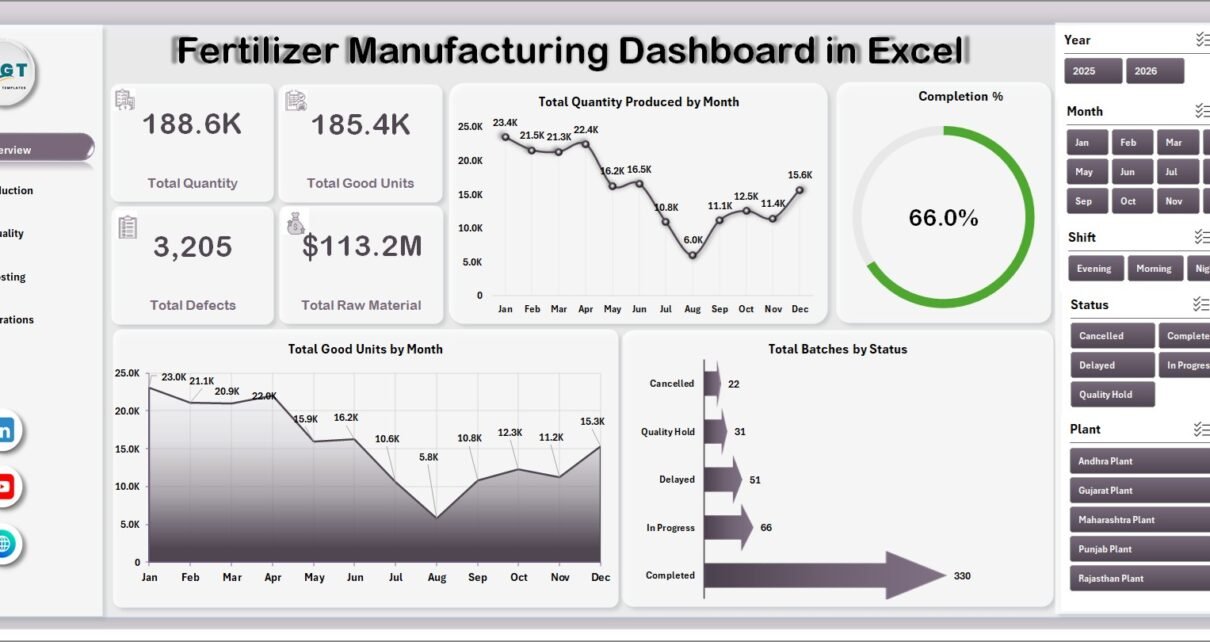
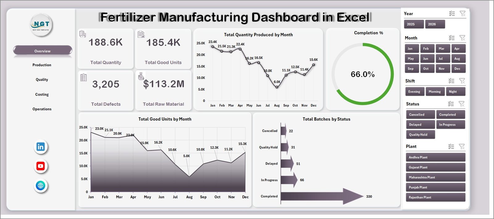
The dashboard is built around practical plant reporting. At the top level, it shows 4 key cards: Total Quantity, Total Good Units, Total Defects, and Total Raw Material. These cards give managers a quick health check before they review the deeper charts.
It also includes multiple slicers so users can filter the dashboard quickly. Depending on the workbook fields, teams can analyze data by product, plant, production line, shift, operator, month, quarter, year, grade, status, or other available dimensions.
The workbook uses a Data sheet and pivot-based Support sheet. After users add new records, they can go to the Data tab in the Excel Ribbon and click Refresh All. Excel then refreshes the pivot tables, cards, and charts. Microsoft also provides guidance on refreshing Excel data connections and pivots in its official Excel refresh documentation.
Dashboard Pages Explanation
1. Overview Page
The Overview page is the executive summary of the workbook. It shows high-level KPI cards for Total Quantity, Total Good Units, Total Defects, and Total Raw Material, then supports those numbers with monthly and status-based charts.
Total Quantity Produced by Month: This chart shows how production volume changes across months. It helps managers identify seasonal trends, capacity pressure, and months where output dropped below expectation.
Completion %: This chart summarizes how much planned production was completed. It is useful for spotting execution delays and understanding whether plants or teams are meeting planned batch targets.
Total Good Units by Month: This chart focuses on accepted output rather than total production. It helps teams compare actual usable output with overall production and identify possible yield problems.
Total Batches by Status: This chart breaks batches by status so managers can quickly see how much work is completed, pending, delayed, or in process. It is especially helpful during daily and weekly production meetings.
2. Production Page
The Production page provides operational analysis across production lines, shifts, plants, and products. It includes Total Quantity Produced by Production Line, Avg. Downtime Hours by Shift, Avg. Quality Score by Plant, and Total Good Units by Product.
This page is useful for supervisors who need to compare lines and shifts. For example, if one shift has higher downtime or one product has fewer good units, the team can investigate process conditions, staffing, machine availability, or material issues.
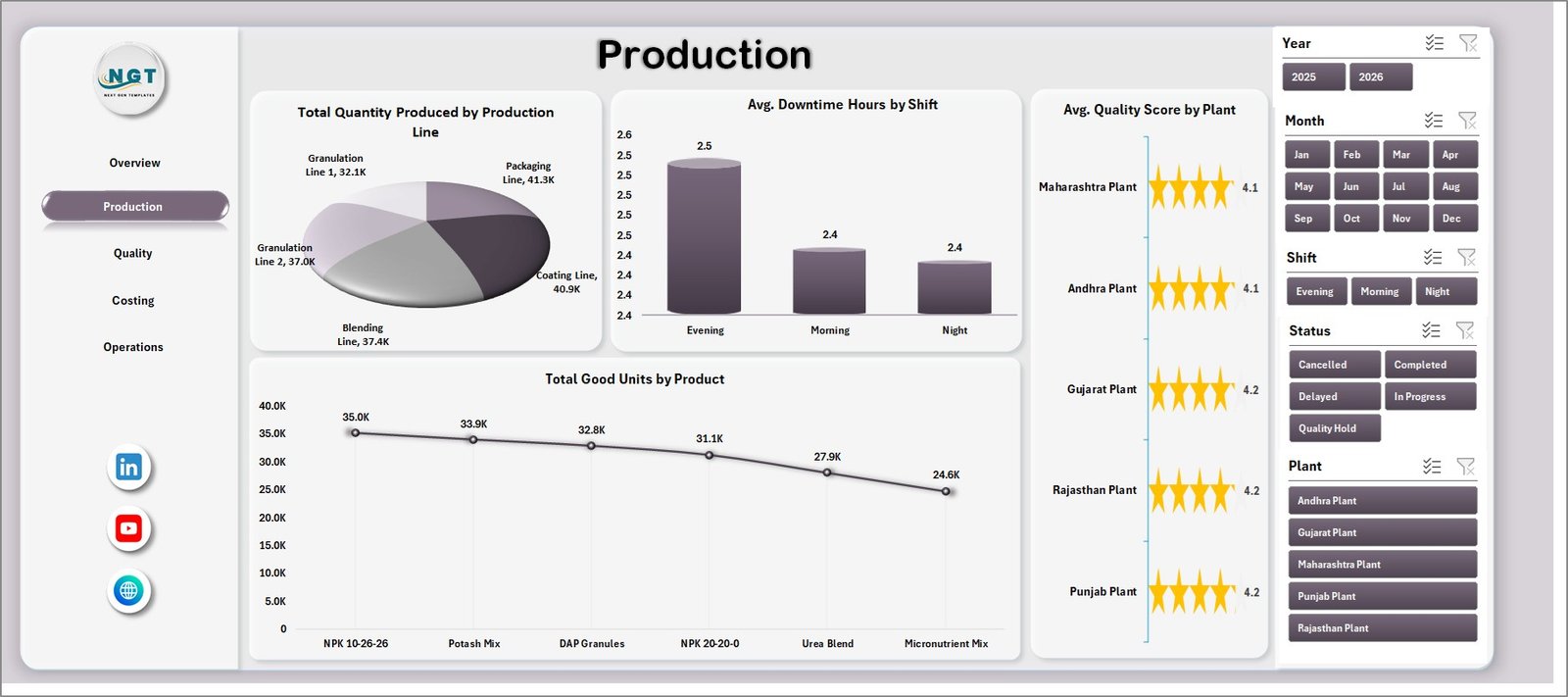
Production Page
3. Quality Page
The Quality page highlights defect rate, defects by grade, raw material cost trend, and operator-level quality scores. It includes Defect % by Product, Total Defects by Grade, Total Raw Material Cost by Month, and Avg. Quality Score by Operator.
Quality teams can use this page to detect which products, grades, or operators need attention. It also connects material cost and quality performance, which helps managers review whether cost increases are linked to process, supplier, or product mix changes.

Quality Page
4. Costing Page
The Costing page focuses on completion and cost visibility. It includes Completion % by Plant, Total Energy Cost by Quarter, Completion % by Product, and Total Raw Material Cost by Product.
This page helps finance and operations teams discuss the cost side of production. Energy cost by quarter supports periodic cost reviews, while raw material cost by product helps teams identify which products consume the highest material spend.
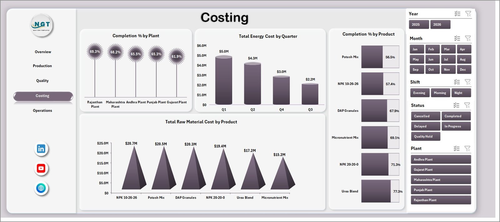
Costing Page
5. Operations Page
The Operations page is built for shift, plant, yearly, and line-level review. It includes Total Batches by Shift, Total Quantity Produced by Year, Total Raw Material Cost by Plant, and Avg. Downtime Hours by Production Line.
Operations managers can use this page to identify which shifts are handling the most batches, whether annual output is improving, which plants carry higher raw material cost, and which production lines have the most downtime.

Operations Page
6. Data Sheet Tab
The Data sheet is the source table for the full dashboard. Users should add production records in the same format as the sample data. Once the data is updated, the dashboard can be refreshed from the Excel Data tab.
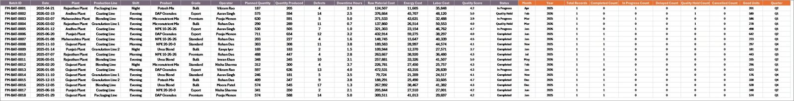
Data Sheet tab
7. Support Sheet Tab
The Support sheet contains the pivot tables that power the dashboard pages. Users can keep this sheet hidden after setup, but it should remain in the workbook because the charts and cards depend on those pivot outputs.
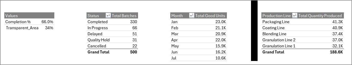
Support sheet tab
Fertilizer Manufacturing Dashboard in Excel vs. Google Sheets vs. Paid CRM/SaaS – Feature Comparison
| Feature | Excel Dashboard | Google Sheets Alternative | Paid Manufacturing SaaS |
|---|---|---|---|
| Cost | $17.99 one-time | Low one-time cost | Monthly per-user fee |
| Platform | Microsoft Excel | Browser-based Google Sheets | Cloud SaaS |
| Setup time | Under 10 minutes | Under 10 minutes | Days or weeks |
| Real-time collaboration | Limited unless using OneDrive | Strong | Strong |
| Mobile access | Limited | Good | Good |
| Customizable fields | High | High | Plan dependent |
| Share with link | Possible with cloud storage | Yes | Yes |
| Year-1 cost at 5 users | $17.99 total | Low one-time cost | Often $3,000+ |
| Pivot-based manufacturing charts | Included | Possible | Vendor dependent |
Who Should Use This Template
This template is best for fertilizer manufacturing companies, production managers, plant heads, quality teams, costing analysts, and operations supervisors who need Excel-based visibility without starting a large software project.
It is not meant to replace a full ERP, MRP, or shop-floor execution system. If a company needs live machine integration, inventory planning, purchase order automation, or role-based approvals, dedicated software will be more suitable.
Real-World Use Cases
Plant review meeting: A plant manager filters the Overview page by month and reviews total production, good units, and defects before the morning meeting.
Quality investigation: A quality lead checks Defect % by Product and Total Defects by Grade to identify which product or grade needs root-cause analysis.
Cost control: A finance analyst reviews raw material cost by product and energy cost by quarter to prepare monthly manufacturing cost commentary.
Advantages of Fertilizer Manufacturing Dashboard in Excel
The biggest advantage is speed. Teams can start using the dashboard quickly because Excel is already familiar to most manufacturing staff. The structure is also transparent: users can inspect the Data sheet, Support sheet, charts, and pivots.
The dashboard also encourages consistent review habits. Instead of preparing a new report each month, users can update the data, refresh the workbook, and review the same dashboard pages repeatedly. That makes monthly comparisons easier and reduces manual reporting work.
Opportunities for Improvement
Teams can extend the dashboard by adding more plant-specific fields, product families, raw material groups, customer segments, or compliance metrics. Advanced Excel users may also add conditional formatting, additional pivot charts, or Power Query imports.
For larger plants, the next improvement step may be connecting Excel to a controlled data source instead of manual copy-paste. This can reduce data entry errors and make reporting more reliable.
Best Practices
- Keep the Data sheet column structure consistent.
- Refresh all pivots after every data update.
- Hide the Support sheet to protect pivot logic from accidental edits.
- Review good units and defects together, not separately.
- Use slicers during review meetings to answer follow-up questions quickly.
- Save a backup copy before making major layout changes.
Explore Relevant Templates
You may also like the Fertilizer Manufacturing KPI Dashboard in Excel, Packaging Machine Downtime Dashboard in Excel, and Contract Manufacturing Dashboard in Google Sheets. You can also browse more Excel Dashboard templates and Manufacturing templates.
Frequently Asked Questions
What is the Fertilizer Manufacturing Dashboard in Excel?
It is a ready-to-use Excel dashboard for analyzing fertilizer production, quality, costing, operations, raw material, defects, and downtime data.
How many worksheets are included?
The workbook includes 7 tabs: Overview, Production, Quality, Costing, Operations, Data, and Support.
Can I update the data myself?
Yes. Add your records in the Data sheet using the same format, then click Refresh All from the Excel Data tab.
Why is there a Support sheet?
The Support sheet contains pivot tables that power the dashboard charts and cards. You can hide it, but it should remain in the workbook.
Does this dashboard use slicers?
Yes. Slicers help users filter the dashboard quickly and review specific views without editing formulas.
Is this suitable for non-fertilizer manufacturing?
The structure may be adapted for similar manufacturing environments, but the chart names and examples are designed for fertilizer production reporting.
About the Author
Built by PK – Microsoft Certified Professional with 15+ years of Excel, Google Sheets, and Power BI experience. Founder of NextGenTemplates, reaching 300K+ subscribers across YouTube channels. Every template is hand-built and tested before release.
Conclusion
The Fertilizer Manufacturing Dashboard in Excel is a practical reporting workbook for teams that want production, quality, cost, and operations insights in one place. With KPI cards, charts, slicers, a clean data sheet, and pivot-backed support tables, it helps managers move from scattered spreadsheets to structured manufacturing analysis.
Visit our YouTube channel for step-by-step Excel dashboard tutorials.